Moos
The Goudvisch Family, a group of bars spread across Amsterdam, welcomes a new member in West Amsterdam: Moos, of which the name, brand identity and interiors were created by Studio Modijefsky.

Moos is located in Spaarndammmerbuurt, a neighbourhood best known for Het Schip, a housing complex designed in the Amsterdam School style. These buildings display all the hallmarks of this early 20th century architectural movement: ornate brickwork, a multitude of decorative elements, overlaying patterns in a variety of materials, and a love of craftsmanship. As an ode to its rich architectural environment, the interior of Moos features red brickwork tones, tiled surfaces arranged in elaborate patterns, floor finishes and refined details that reflect the values of the Amsterdam school.
The outdoor area is the terrace outside. The interior design concept is translated into outdoor elements in the form of colourful parasols, round awnings and long lines of light bulbs. The perimeter is demarcated by a series of wooden windscreens, with textured glass on the upper part that allows the light through and adds tactility to the screens.
By serving as a bridge between the interior and the neighbourhood, the terrace reinforces Moos’s position as a part of the community. Just like the traditional Amsterdam name the bar was given, Moos is a place rooted in the neighbourhood that embodies the best of the city’s values: a warm welcome and sharp style.
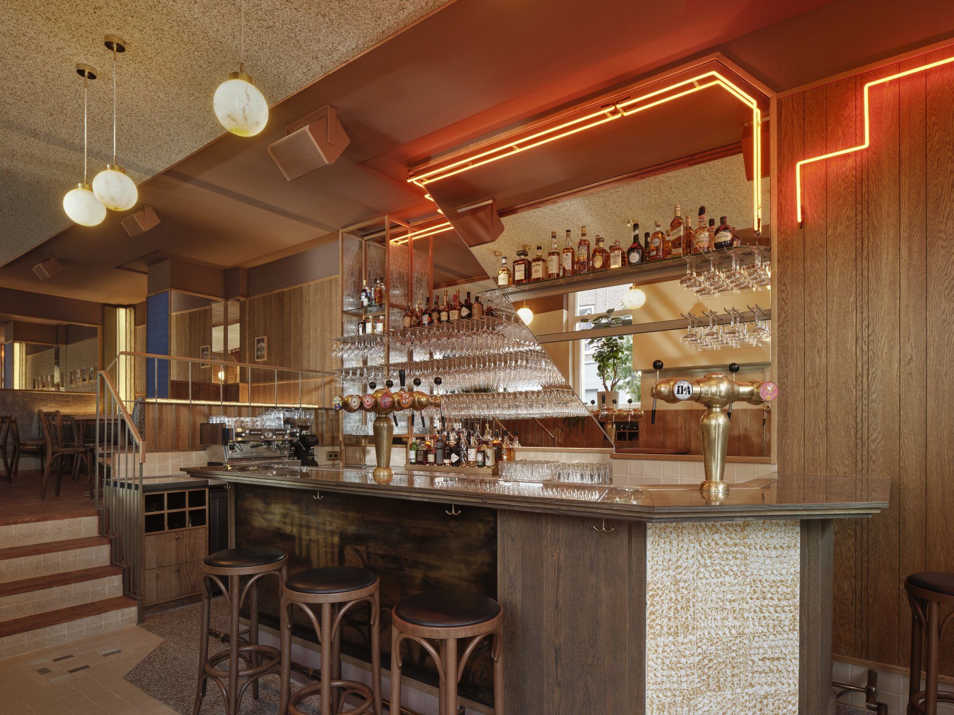
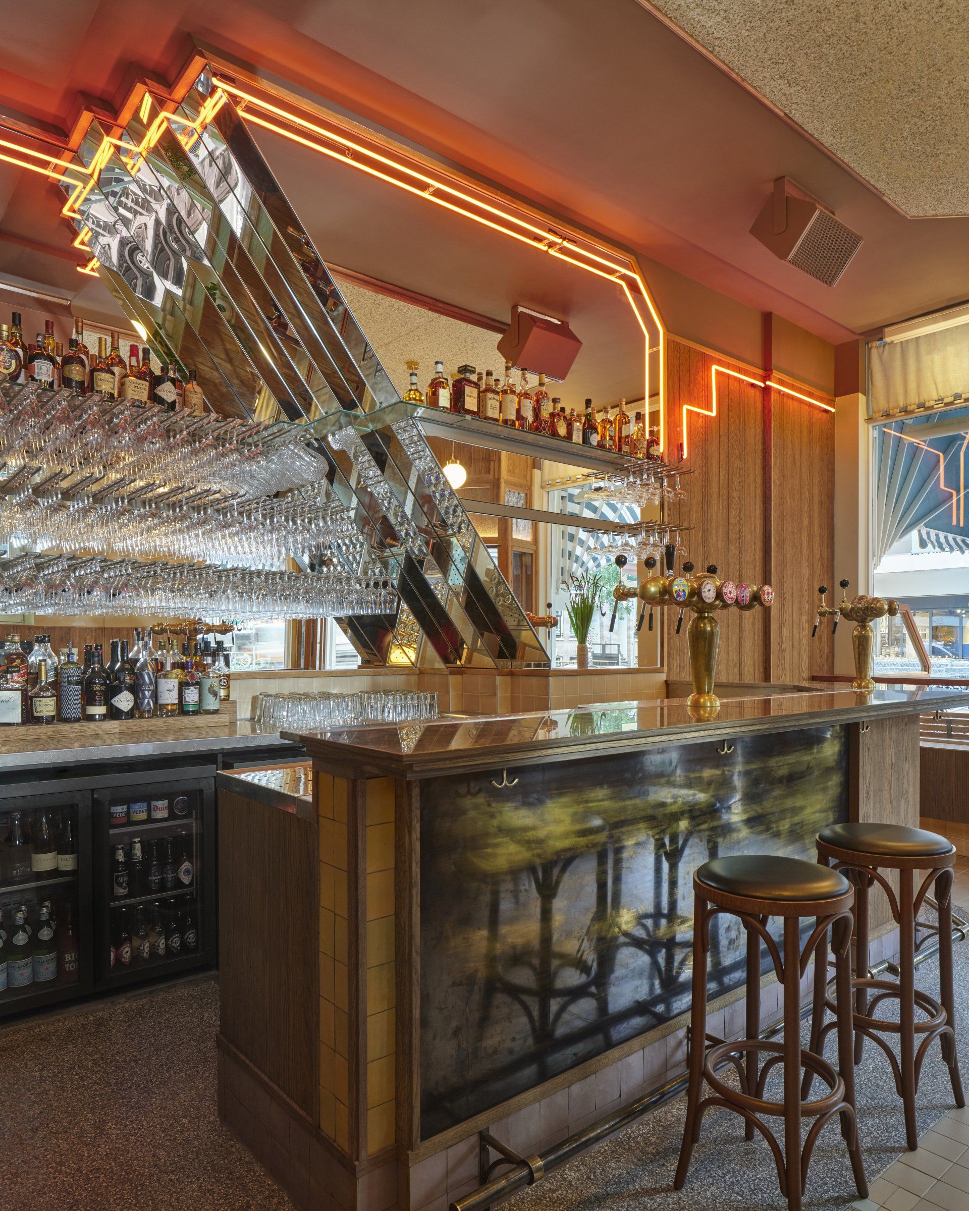
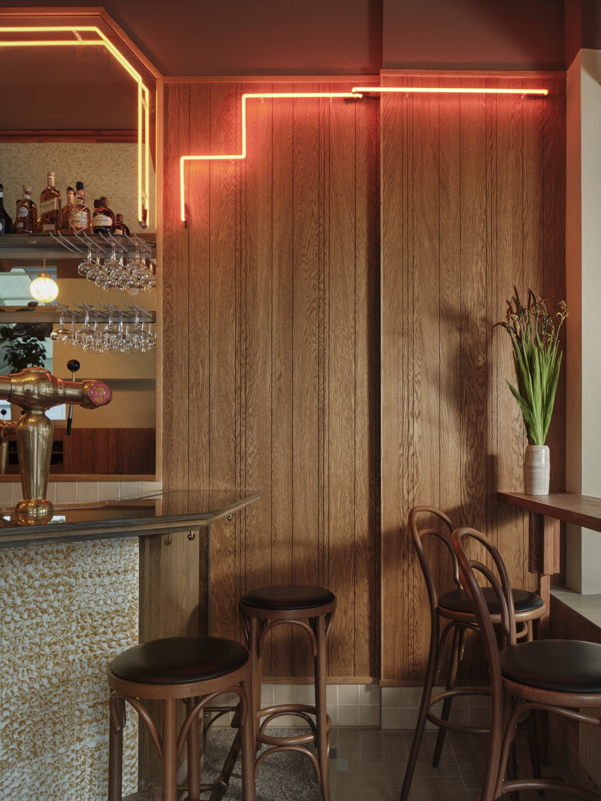
Moos is situated on the ground floor of a corner building that boasts a high ceiling and large windows that flood the space with daylight. Just like its Goudvisch siblings, Moos has the bar as main protagonist; in this case made of marble, combined with brass, wood and pale pink, beige, and bright yellow tiles
A large mirror behind, split by two zigzagging lines of orange and red neon, creates a stunning backdrop. It’s split into two layers, one reaching forward, the other stretching back, to add another dimension to the mirror’s sheer size. A tiled floor pattern creates the perfect base for this centrepiece, with accents of terrazzo flooring outlining the bar’s shape.
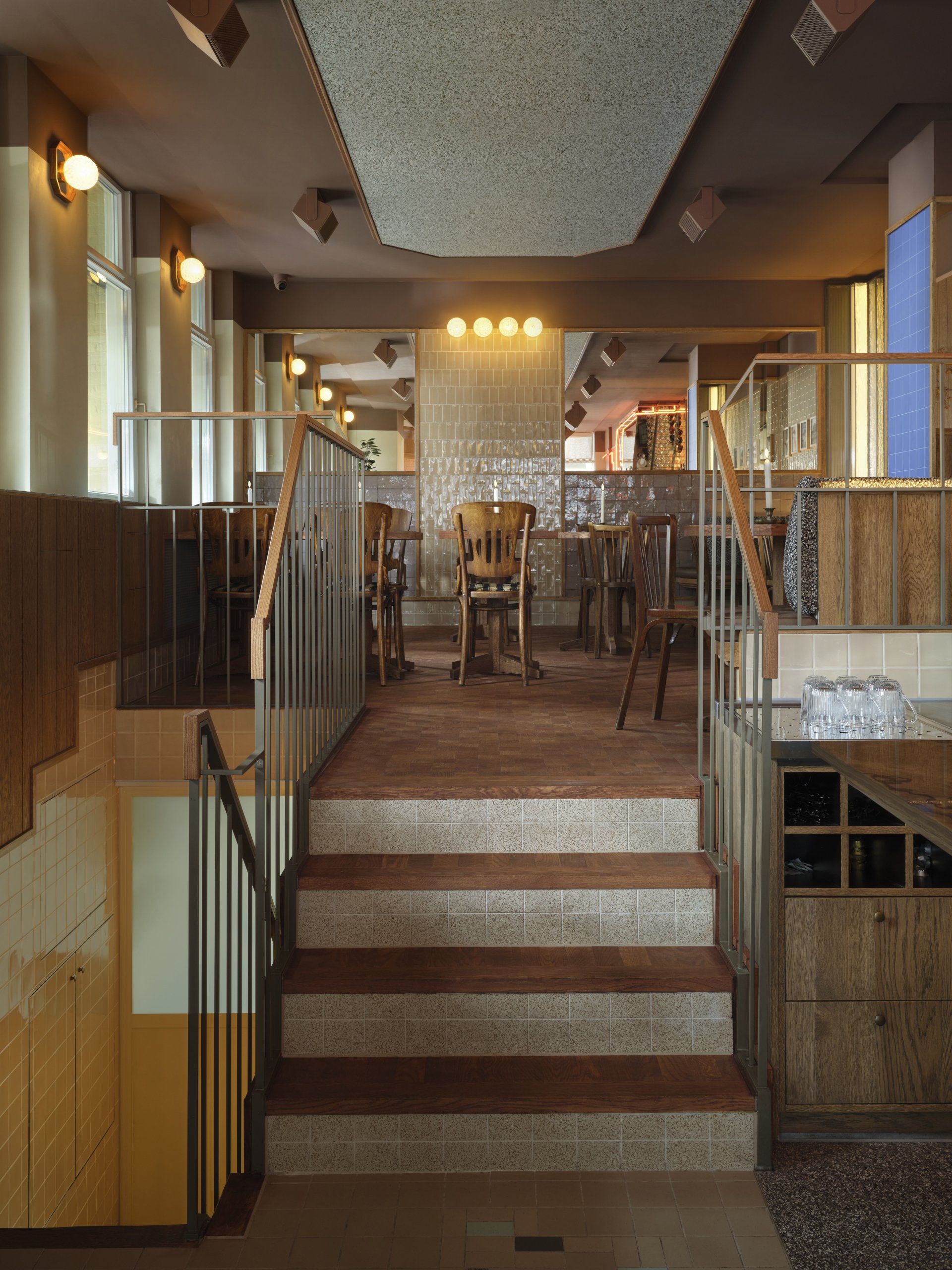
Right above the bar, ceiling lights drop down from acoustic panelling made of rich woven fabric. These hanging lamps trace the length of the interior from the entrance to the very end of the mezzanine level. Illuminated spheres placed on the walls spread a pleasant glow throughout the bar. The warmth of the wooden moulded panelling that traces the entire perimeter is enhanced by the juxtaposition with the darker tone of the ceiling that drops down to define a continuous line around the interior.
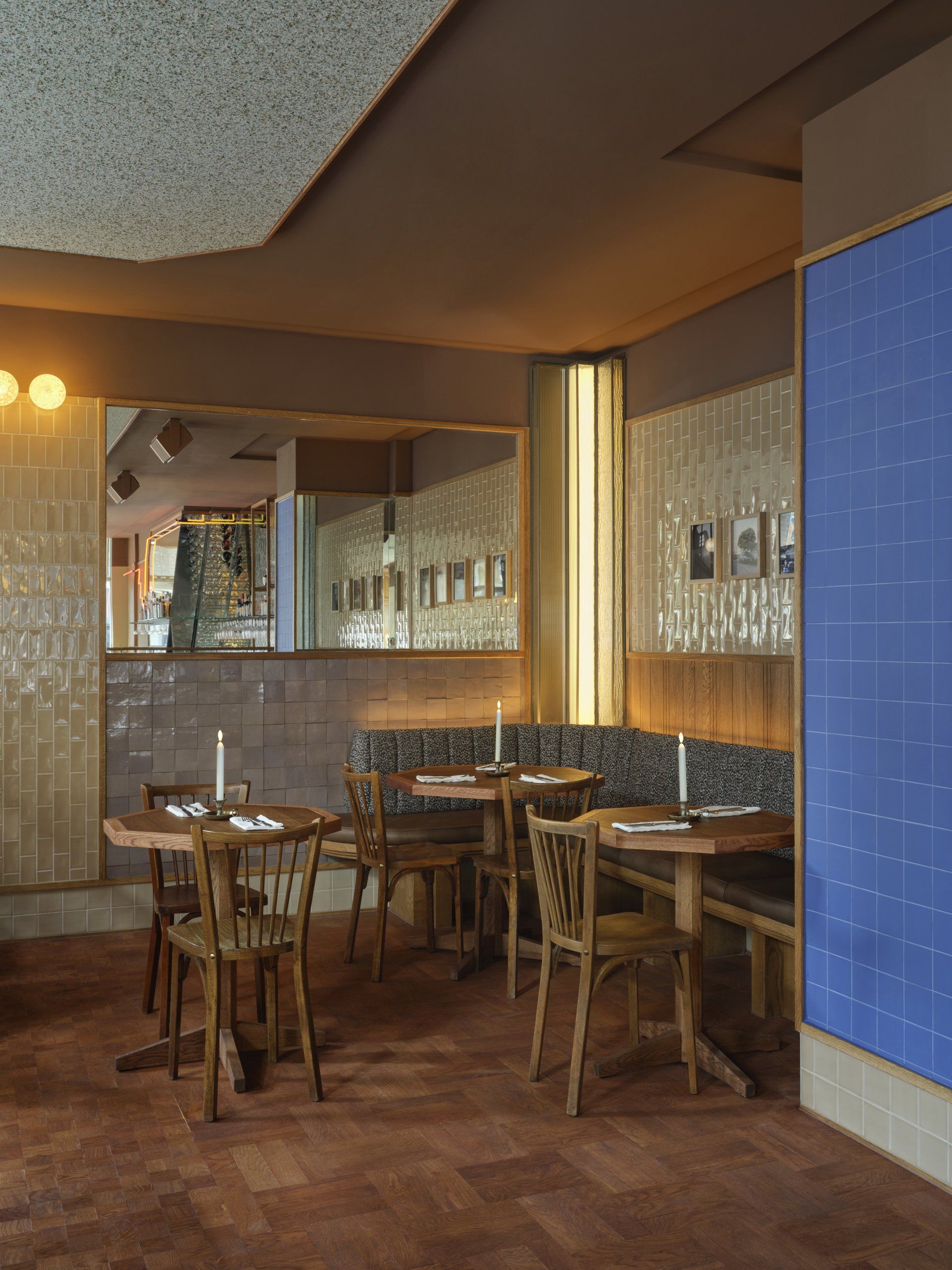
At the back of Moos a staircase leads to a mezzanine floor. Detailed railing and wooden steps create a line of sight that invites guests to walk up to this intimate space, where two corner booth seats finished with leather and fabric await. To reflect its position above the main area below, the cosy mezzanine has a distinct character created by a combination of tiles, wood and a custom light element (stepped like the zigzag element behind the bar) used for the wall cladding.
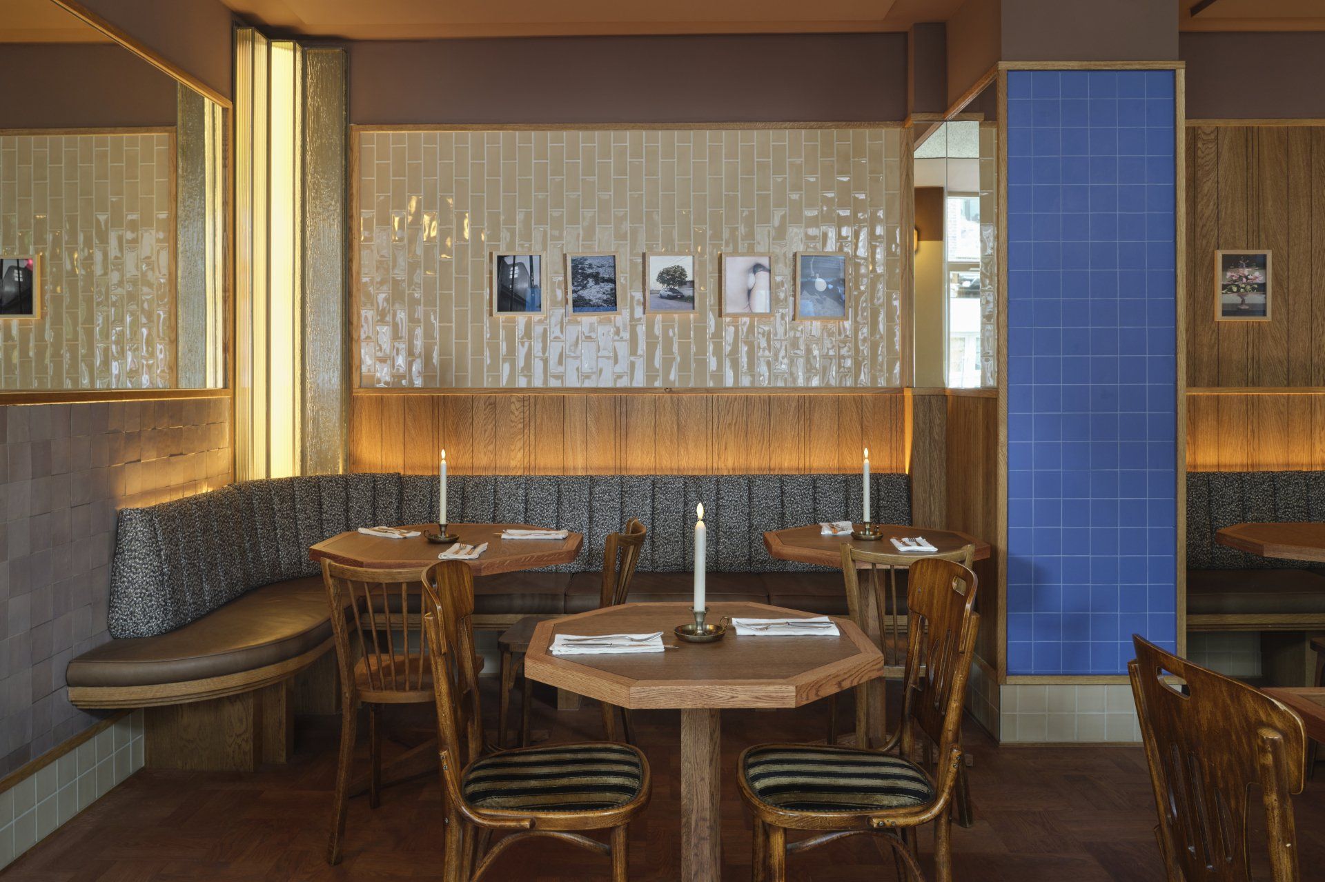
By mixing the traditional – vintage chairs, custom wooden tables, a wooden floor with two different laying patterns, tiles in familiar tones of beige, light brown and pale purple – and the modern – a collection of framed modern photography, tiles in a punchy colour palette of mint, blue and yellow – the mezzanine level couples the warmth of nostalgia with a modern edge.

Bar Moos
Bar address Spaarndammerstraat 53, 1013 - Amsterdam, The Netherlands
Photography
Maarten Willemstein
Interior Design
Studio Modijefsky
SHARE THIS
Latest Edition
Mar / Apr 2026 edition is available now!
Contribute
G&G _ Magazine is always looking for the creative talents of stylists, designers, photographers and writers from around the globe.
Find us on
Latest News

Subscribe
Keep up to date with the latest trends!
Popular Posts
