Eberly
April 18, 2020
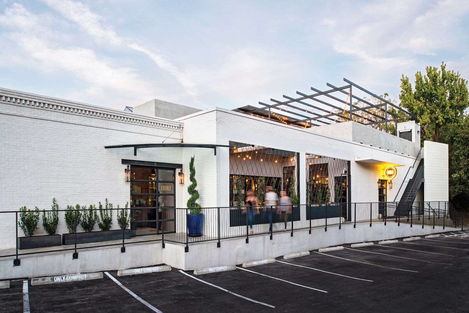
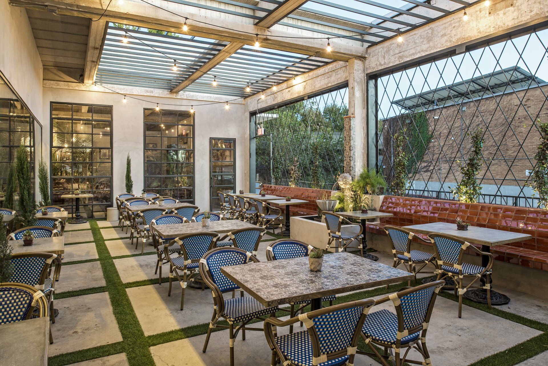
Designed by Clayton & Little and inspired by sources both humble and lofty, Eberly marries a former 1970s print shop building with a salvaged bar from the storied Cedar Tavern in New York’s Greenwich Village to create a sophisticated bar, cafe and restaurant in central Austin.
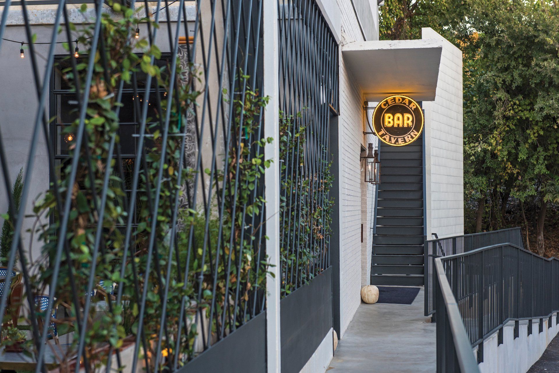
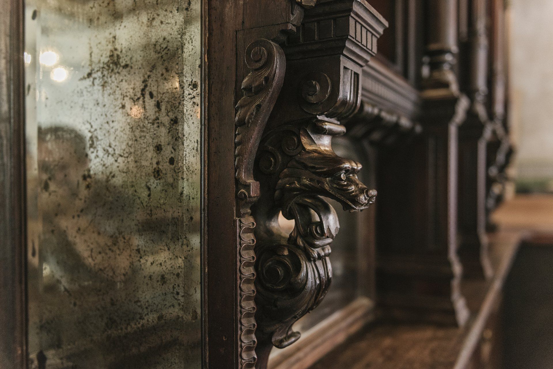
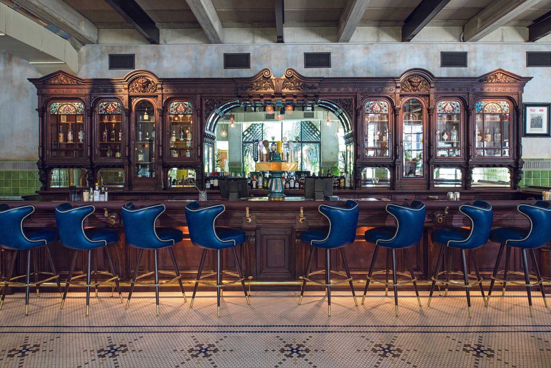
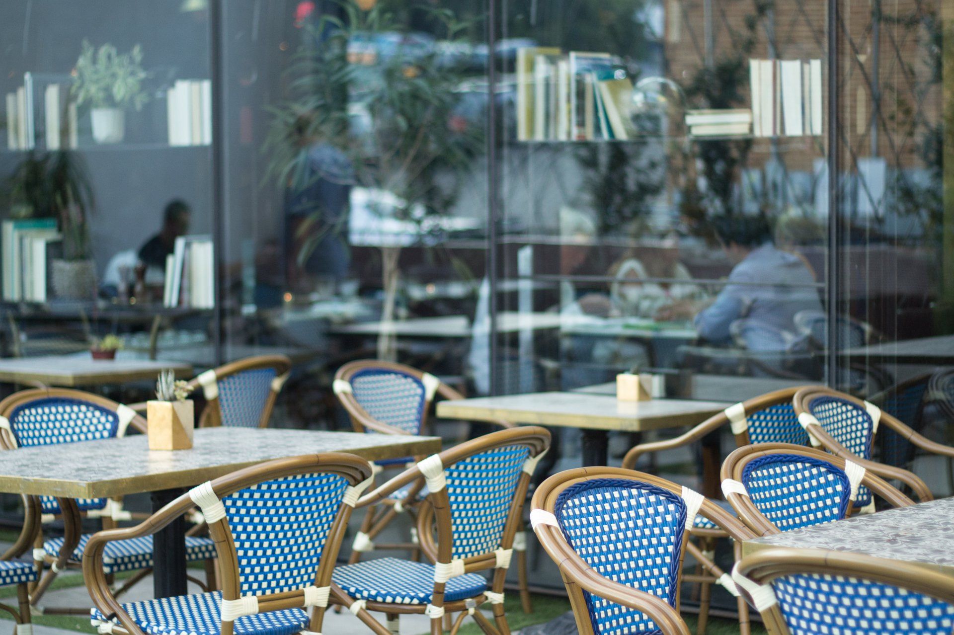
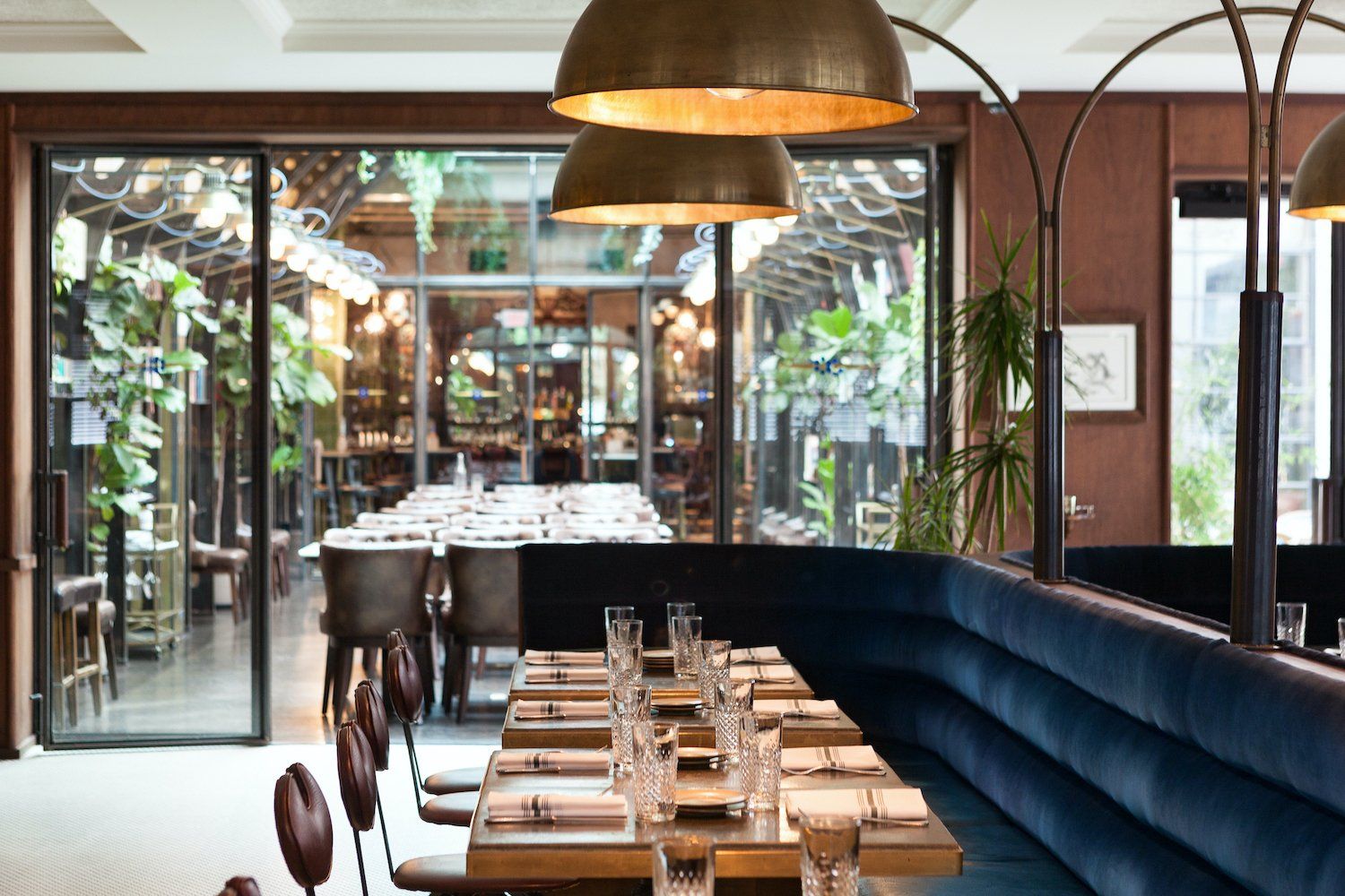
Located just south of the Colorado River, Eberly is within walking distance to numerous retail stores, offices, parks and event centers. The building sits on the edge of downtown Austin and the Zilker Neighborhood. The street-facing Café greets visitors with sleek forms and rich textures. In-spired by English greenhouses, the Study serves as coffee shop by day, filling the large, open plan building with natural light, and as extension of the Tavern at night, with glowing openings to the ad-jacent courtyard and roof-top bar. Following the owner’s purchase of the legendary bar, hand-carved mahogany sections were carefully transported and restored with the goal to again surround the bar top with a creative atmosphere worthy of the original. Working within the raw con-crete and glass context of the print shop, the design team divided the building into three distinct environments: a “restored” Cedar Tavern, a mod Café, and a book-filled Study.
Intended to reflect the Texas capital’s independent spirit, Eberly was conceived as a gathering place where risk takers, creative types, and liberated thinkers could connect and feed off of each other’s energy and creativity. The establishment’s visually layered spaces support this intent. As patrons enter the Café, a dark, almost brooding atmosphere defines the space. The moody darkness is con-trasted by the light-filled Study immediately adjacent to the entry which draws the eye to, and through, the space back to the historic Cedar Tavern.
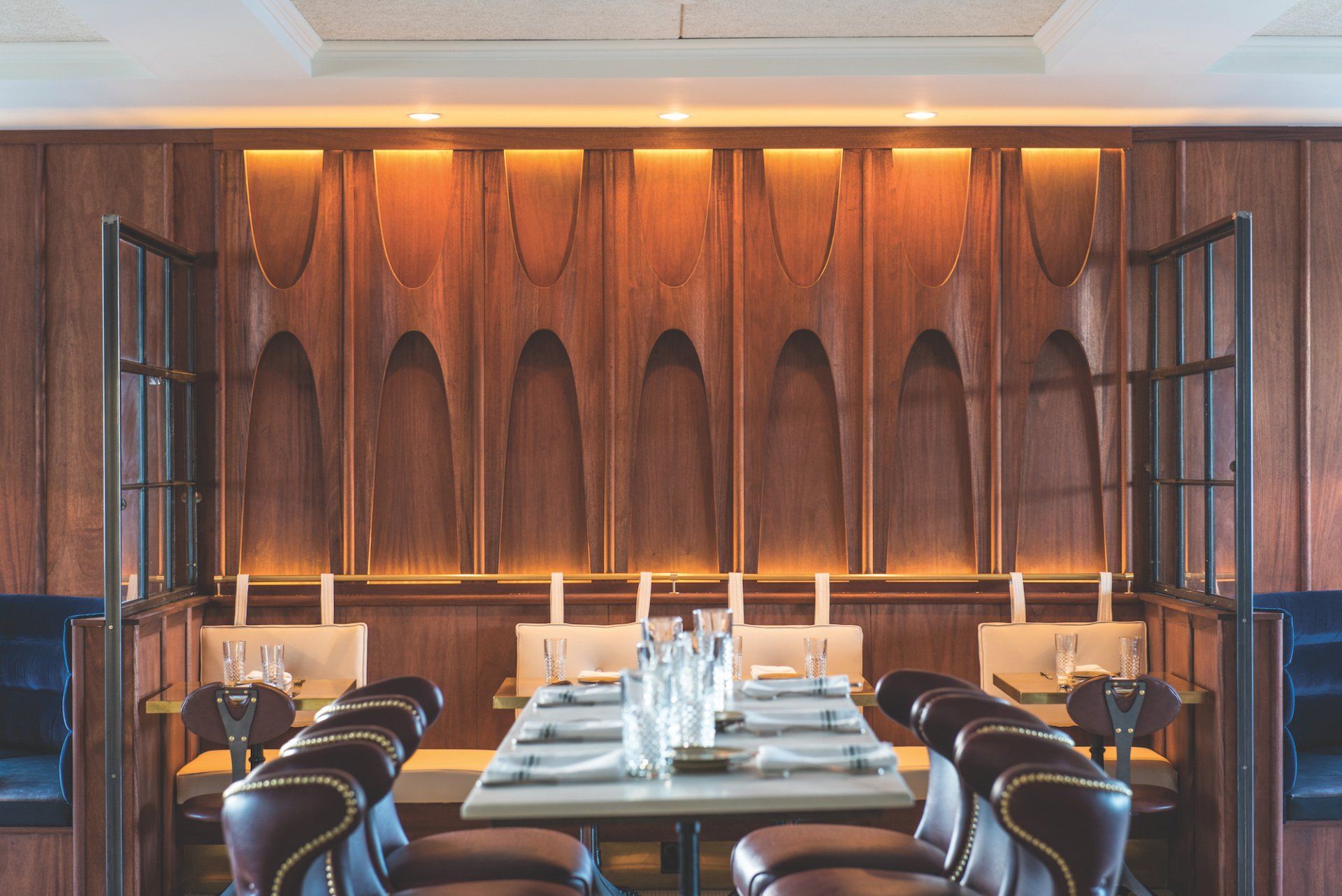
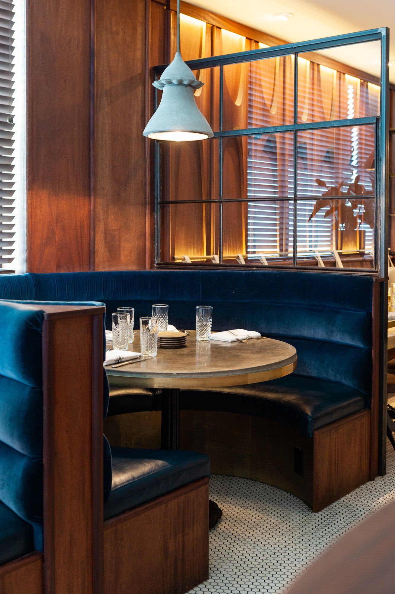
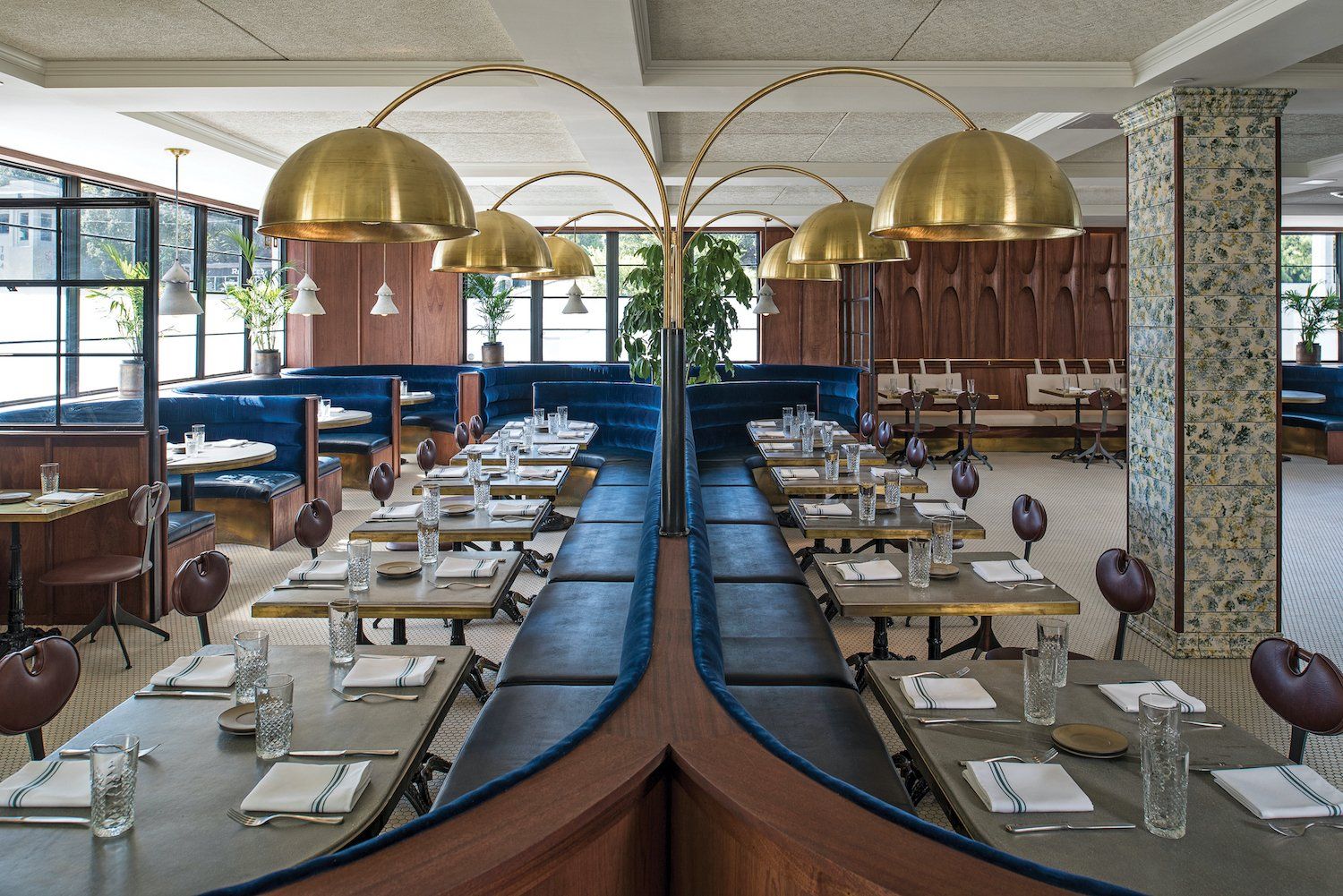
To deliver on the owner’s desire for a more intimate space, the Café features a lowered, coffered ceiling which sets the tone upon entry. The mahogany wood wall panels were inspired by midcentu-ry modern design but with an Art Nouveau twist, bringing a modern take on old contemporary fur-niture and wall paneling. Velvet upholstery covers central and perimeter banquette seating. A large, central banquette accommodates large groups while remaining flexible enough to separate out for smaller parties. Ample banquette seating was chosen to foster the notion of the place as ideal for gathering, thinking, drinking, and dining.
The existing building’s open layout features a regular column grid and CMU walls that largely drove the new spatial division. The dividing wall between the Café and Study share a line that separated the former print shop front offices from the rear floor production. The design works within the ex-isting structural module to create a series of balanced, proportionate spaces.
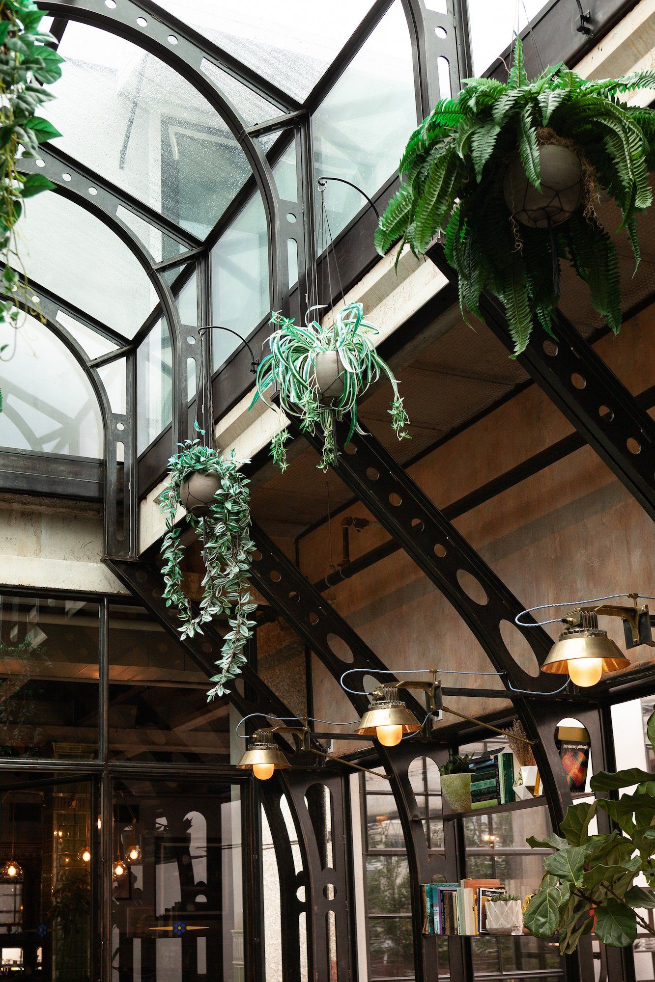
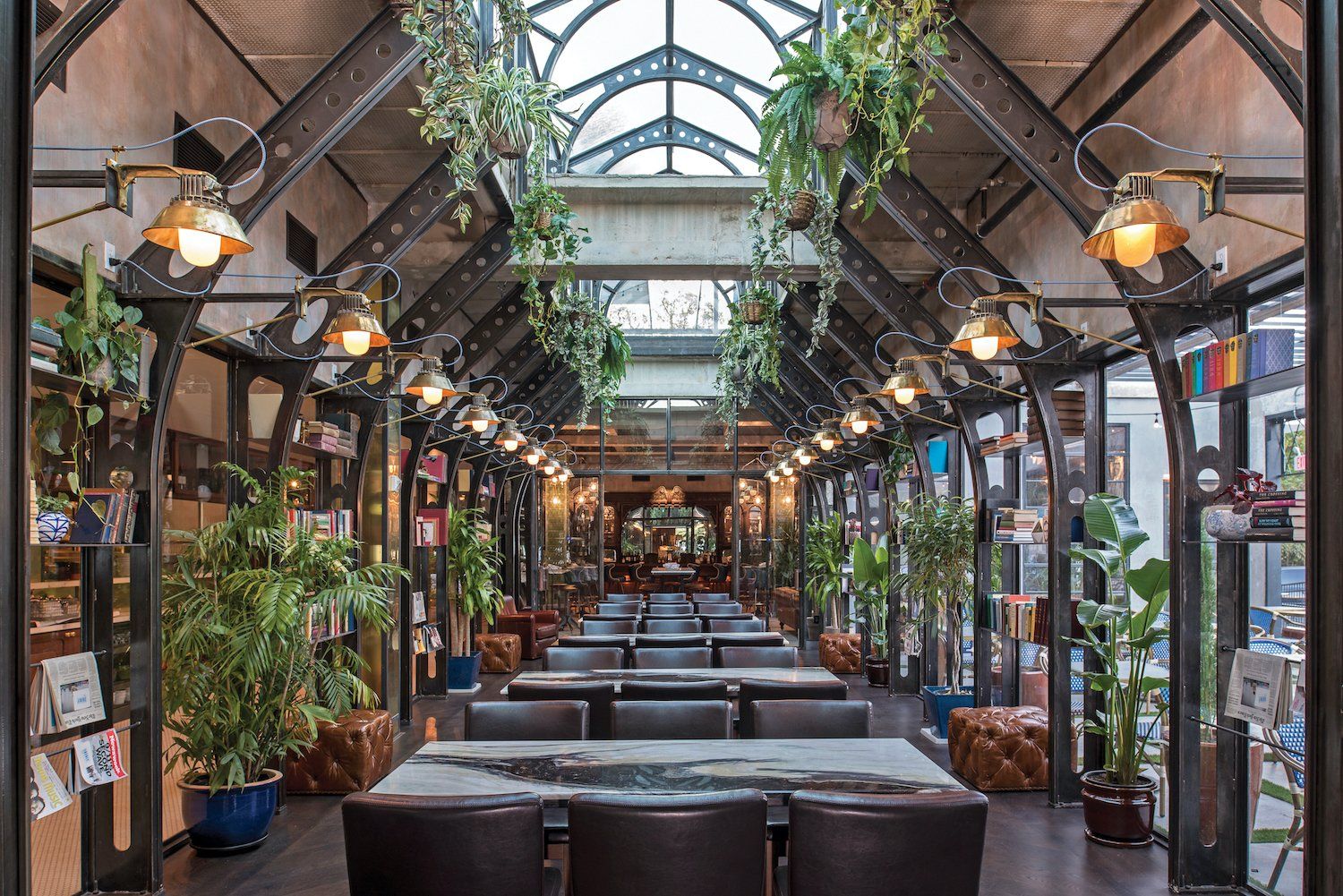
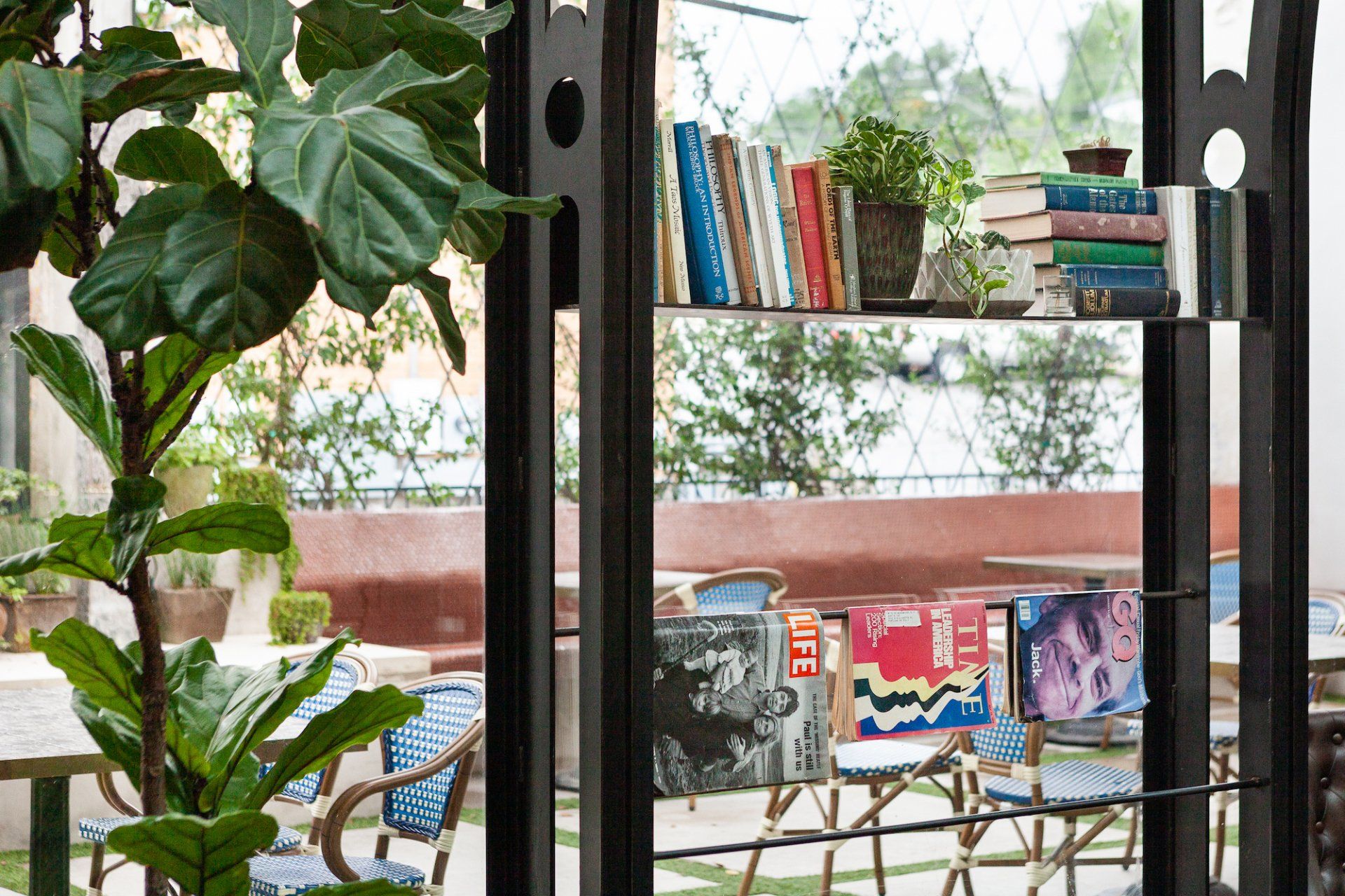
To create an appropriately light-filled Study, the ceiling height was increased and the roof was opened to showcase the new addition of an extended steel skylight monitor above. The monitor adds visual lightness to the space while maintaining the structural integrity. The Study’s furnishings take cues from Cedar Tavern, albeit in simplified forms so as not to detract from the light-filled steel structure. Carefully curated books, curios, and plants adorn the walls creating a sense of a lived-in space. Custom designed and fabricated wall sconces continue the industrial character of the steel and utilize heat sink fins to create the unique style of the lights.
Circulation and flow dictated the secondary organizing principle. The Study and kitchen hallway serve as the central spine connecting the Café back to the Cedar Tavern. Creating a spatial flow to result in a memorable experience necessitated reworking the organization of the 10,000-square-foot building. Visual layering and spatial connectivity along with stylistically distinct yet complementary interiors serve as an invitation for patrons to explore the restaurant.
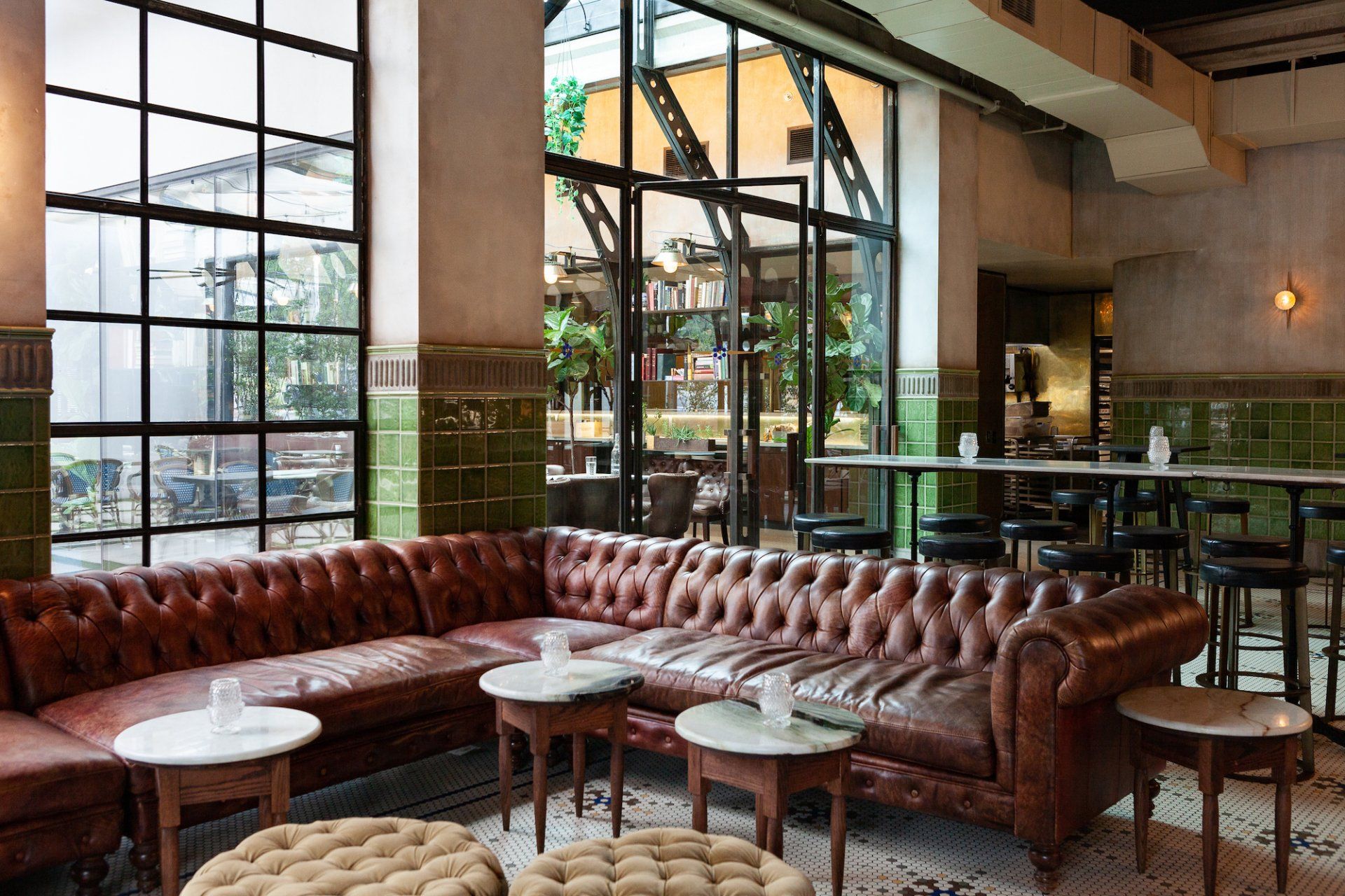
At 30-feet long and 10-feet tall, the Cedar Tavern bar’s presence is impressive notwithstanding its 150-year history of notable patronage, including that of Jackson Pollock and Jack Kerouac. Speak-ing to the rich history of the Cedar Tavern, brown and oxblood tufted leather sofas surround coffee tables in a lounge configuration to promote gathering and conversations. Vibrant blue barstools with brass tacks contrast with the mahogany bar, while gold and purple ottomans are arranged throughout to enliven darker, rich tones. Brass serves to unify all spaces, and is showcased in custom designed and fabricated light fixtures that surround the columns. Exposed steel beams support the additional weight of the new rooftop patio.
The interplay between the Café, Study, and Cedar Tavern is key to changing the mood between spaces, producing varied dining experiences, and options that work together to create a rich experi-ence.
Photography by Merrick Ales & Chloe Gilstrap
Address: 615 S Lamar Blvd, 78704 - Austin, TX, USA
www.eberlyaustin.com
www.claytonandlittle.com
SHARE THIS
Latest Edition
Mar / Apr 2026 edition is available now!
Contribute
G&G _ Magazine is always looking for the creative talents of stylists, designers, photographers and writers from around the globe.
Find us on
Latest News
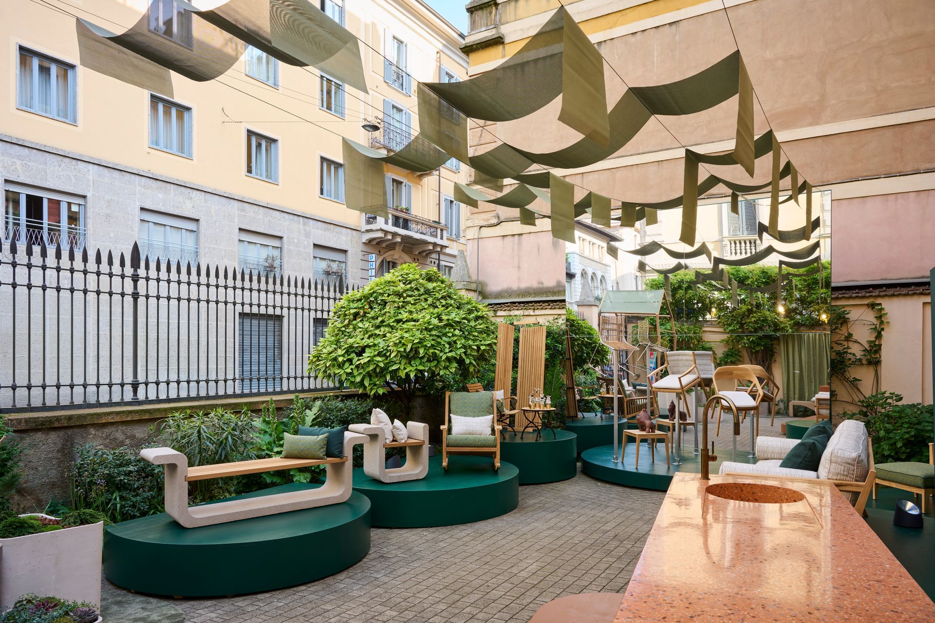
During Milan Design Week, where the city becomes an intricate map of overlapping visions and fleeting installations, Bodo Sperlein delivers a moment of rare coherence and depth with MENU exhibition that transcends the conventional boundaries of design to inhabit architecture as a living, breathing entity.
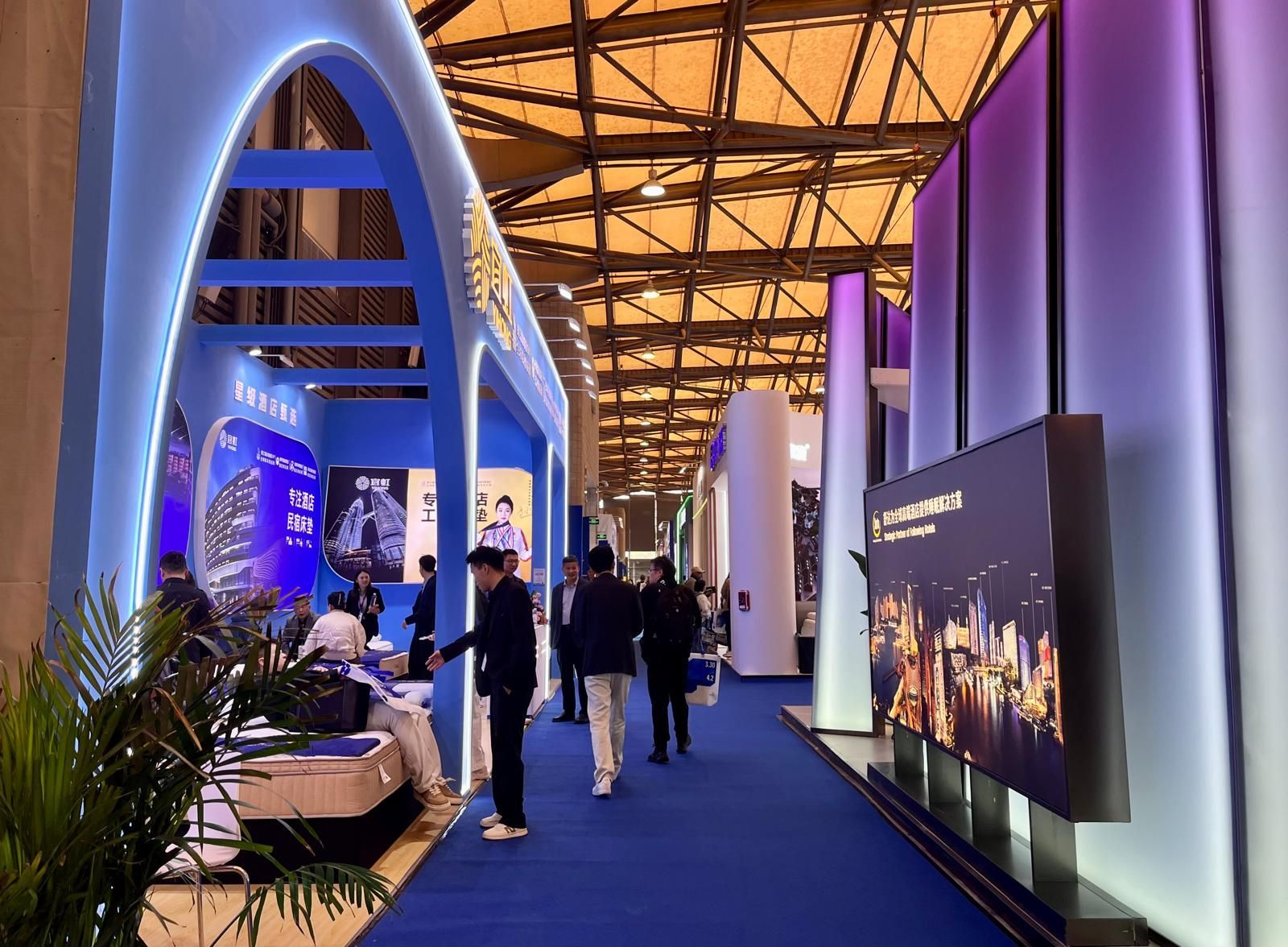
From March 31 to April 3, 2026, at the Shanghai New International Expo Centre, Hotel & Shop Plus 2026 Shanghai unfolded as far more than a trade fair: it emerged as a living, breathing platform where the very notion of travel dissolves, permeating every layer of contemporary lifestyle and spatial design.
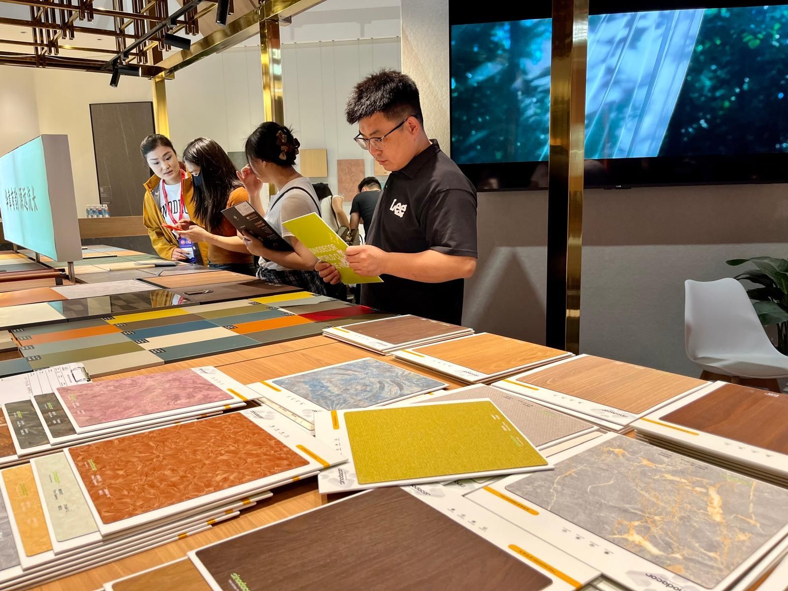
Held in two phases, from March 18–21 and March 28–31 at the Canton Fair Complex, the 57th edition of CIFF demonstrated how design is no longer something merely displayed but something to be fully experienced through the senses: deconstructed, re-engineered and ultimately redefined in its deepest essence: matter .
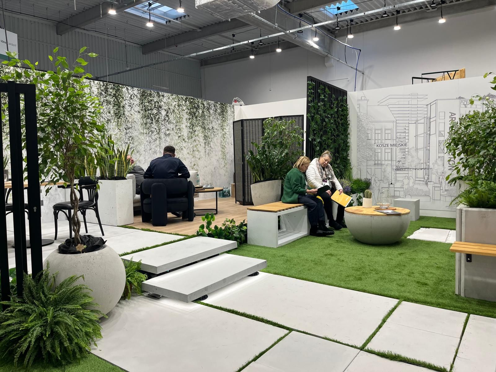
At a time when design is redefining its priorities, the contemporary landscape of interiors, décor, and outdoor living is clearly shifting from a digital-centric vision toward a more human, emotional and nature-driven approach. This transition was strongly evident during the latest editions of Warsaw Garden Expo and Warsaw Gift & Deco Show , held at Ptak Warsaw Expo from 10th to 12th February 2026.
Subscribe
Keep up to date with the latest trends!
Popular Posts
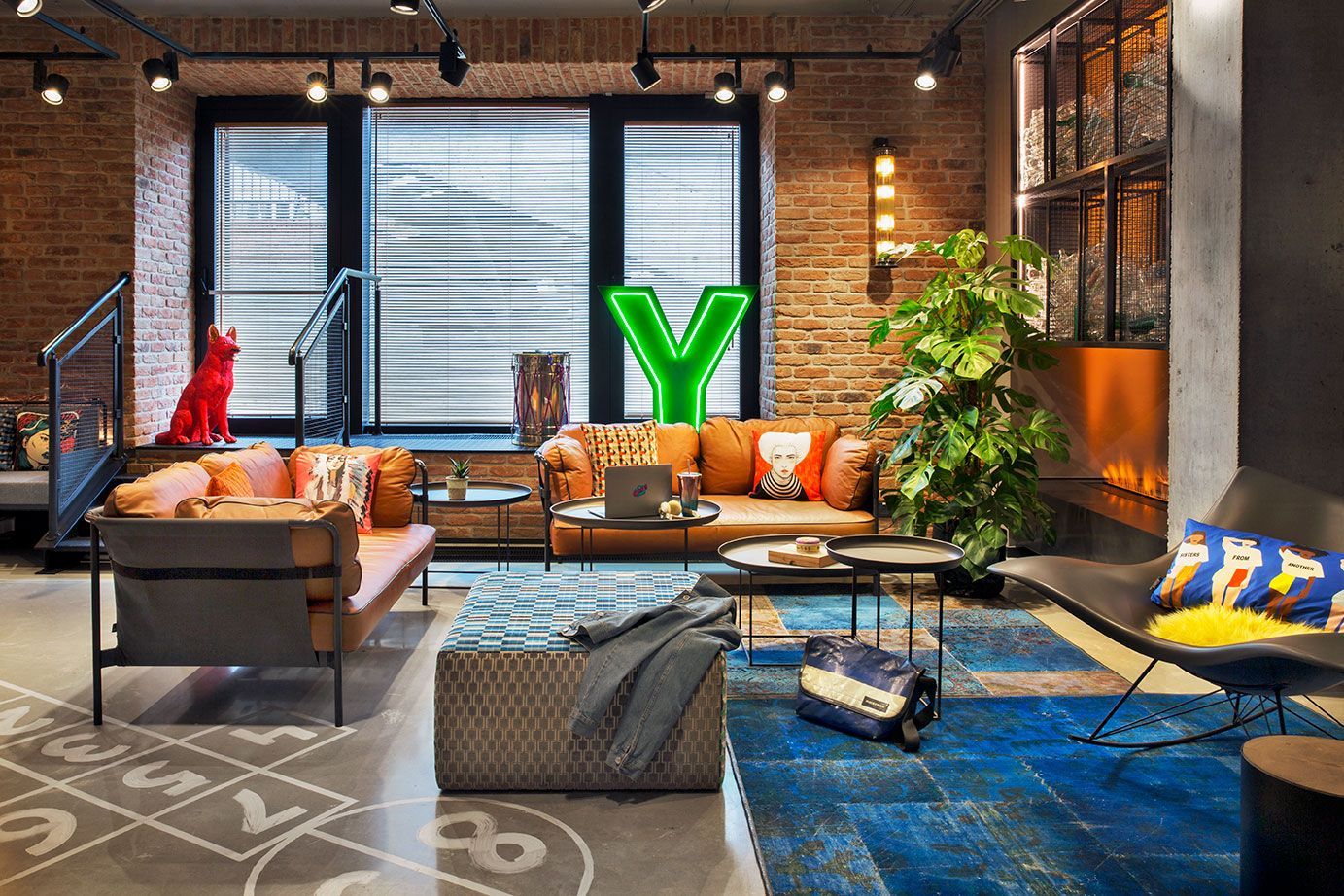
Praga district, once industrial and today filled with galleries, studios, cafés, and cultural spaces, is home to the vibrant Moxy Warsaw Praga . The hotel embraces the spirit of the neighborhood with a modern and playful design (typical of the Moxy Hotels concept) featuring industrial elements that echo the area’s historic character.
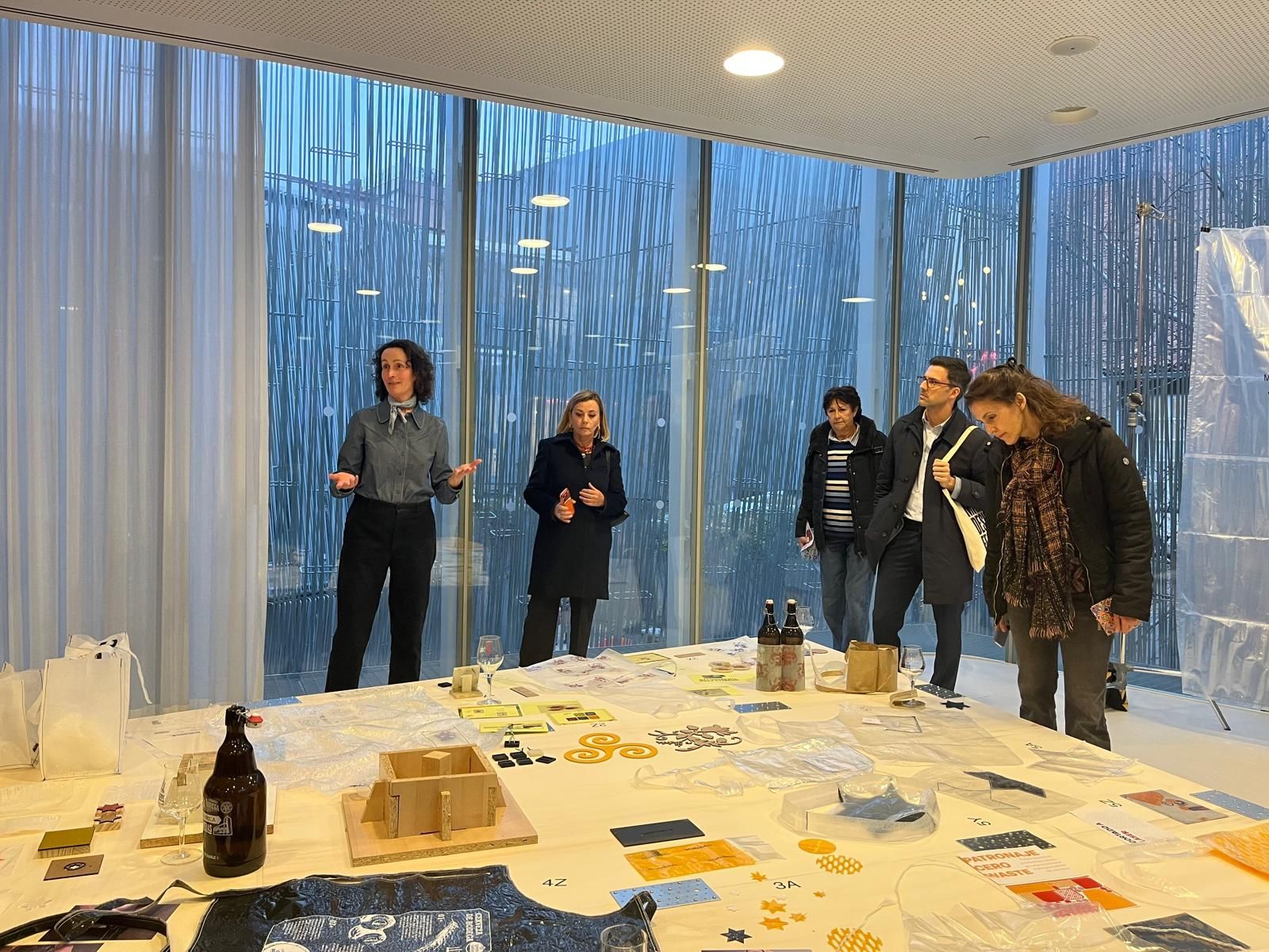
Between February 6 and March 8, Madrid Design Festival 2026 offered an intense program of exhibitions and events across the city. Throughout these days, it was possible to perceive the evolution of the festival, which expanded its program by integrating professional talks and meetings, revealing a strong desire among industry professionals to share the new Spanish approach to design with the world.
