Cobertura: Interview with Pedro Luiz de Marqui
The main requests from the residents were the desire to make an outdoor area more useful and integrated with the house. In addition to having a nice and comfortable place to welcome friends and family and enjoy leisure time at home.
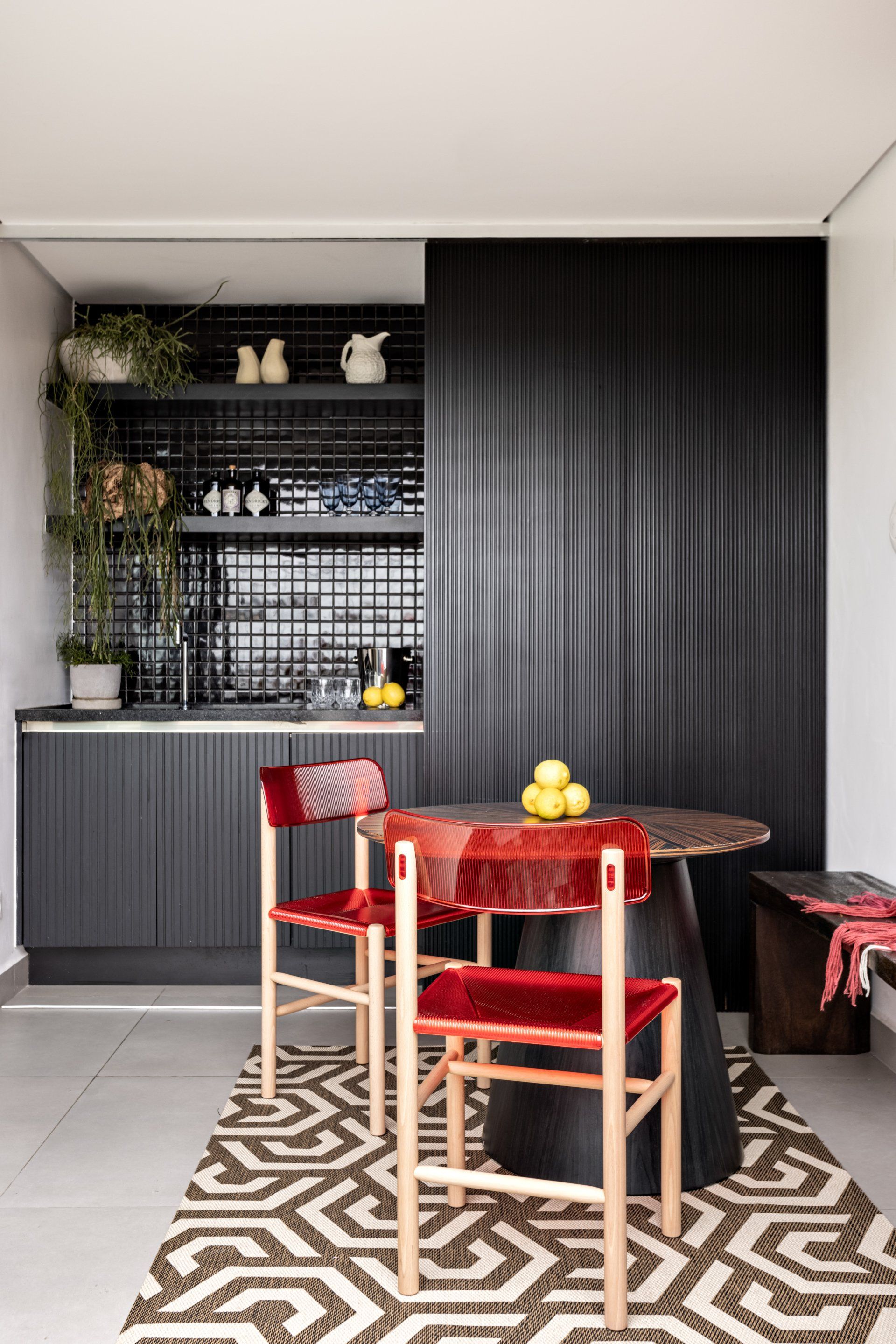
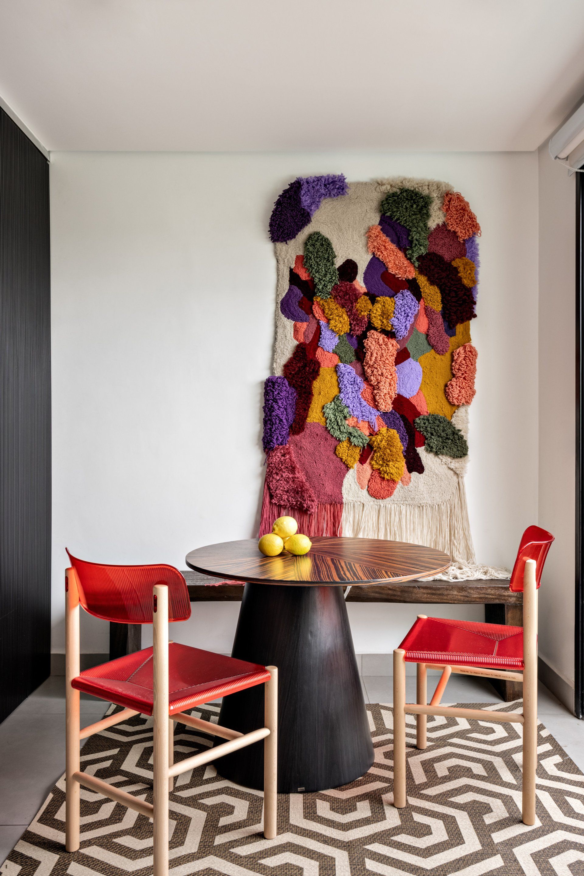
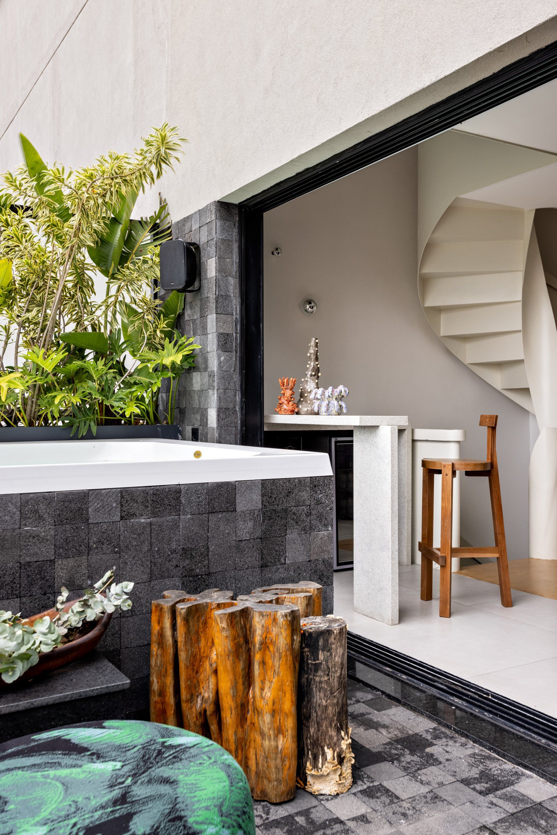
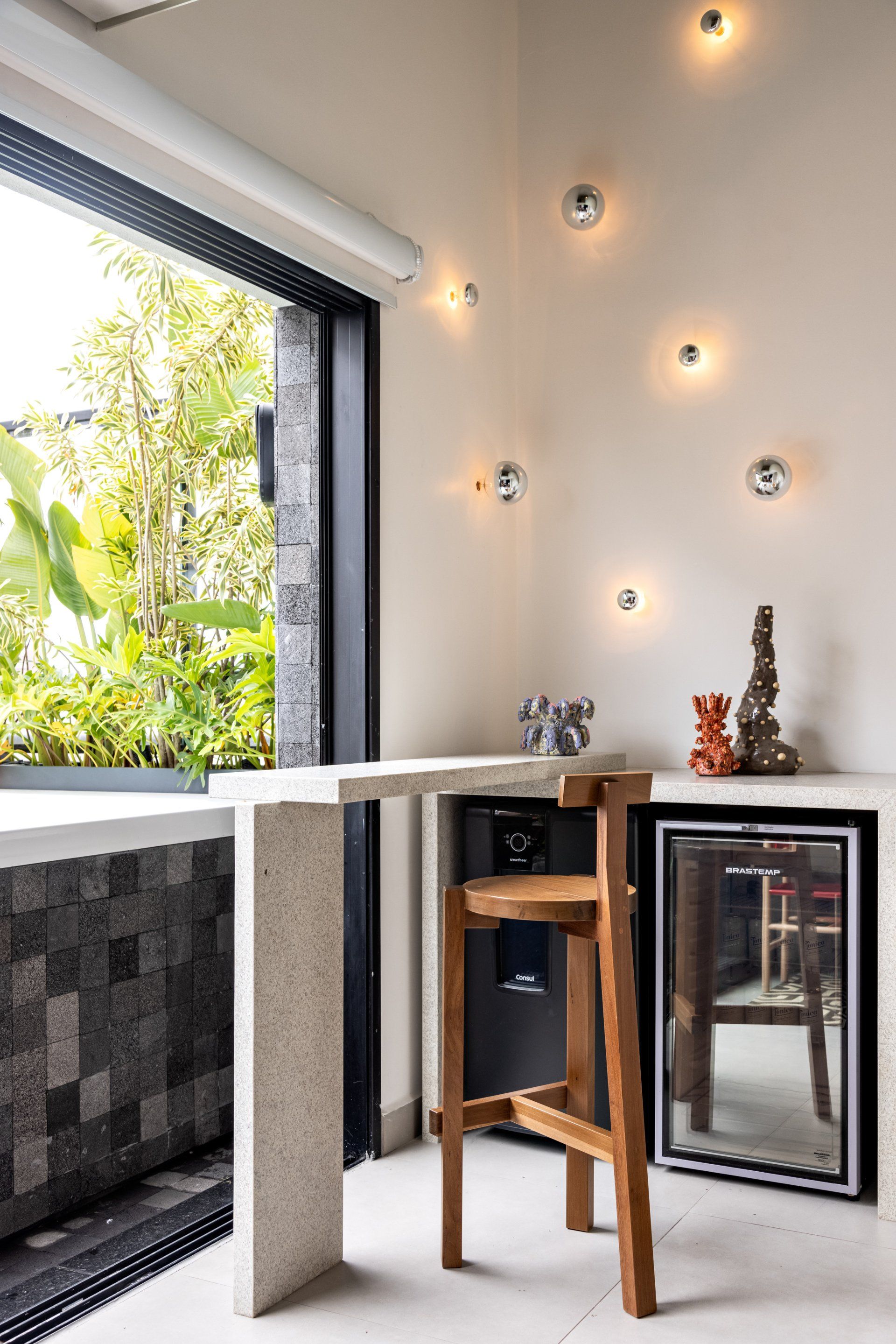
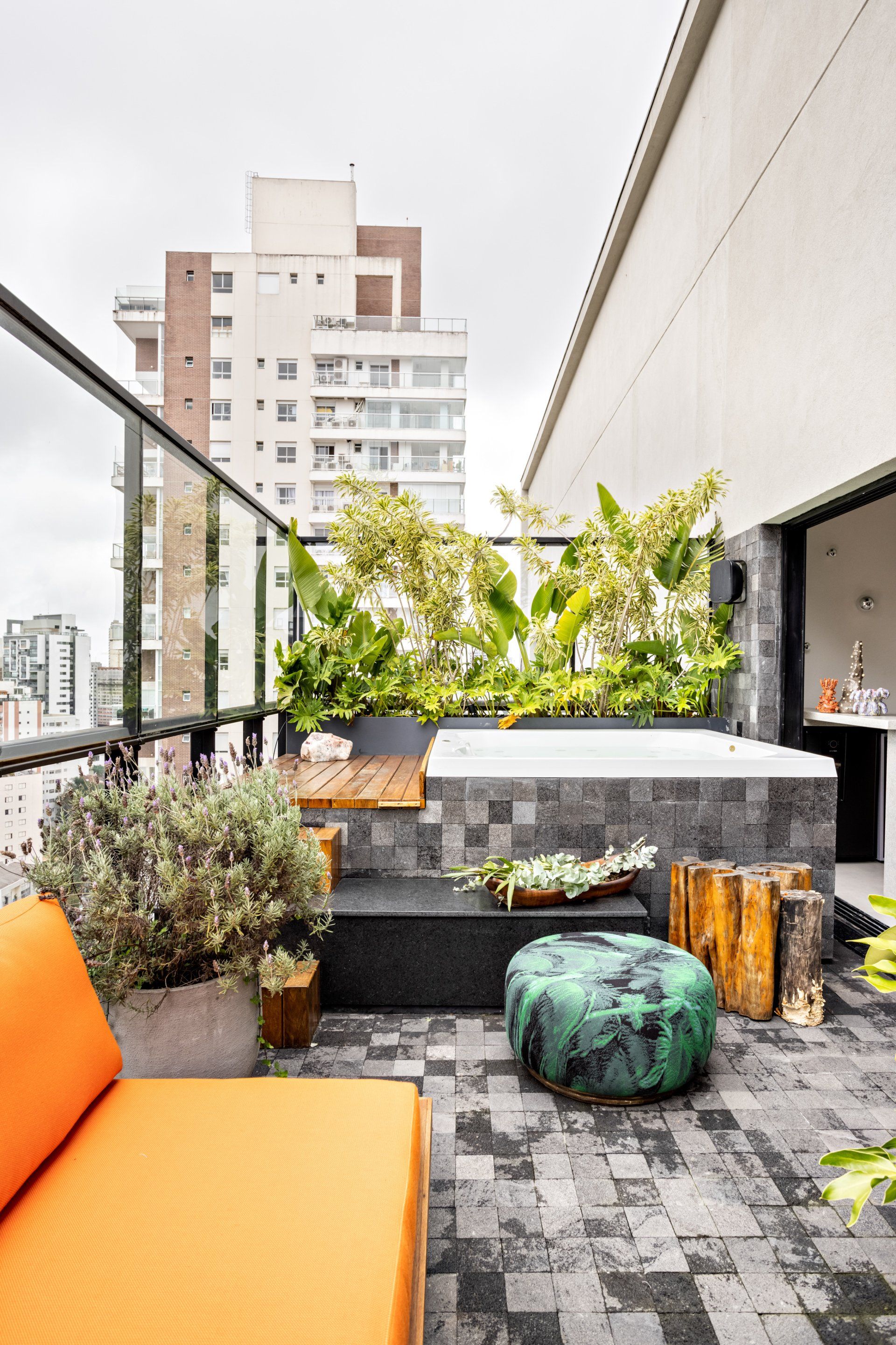
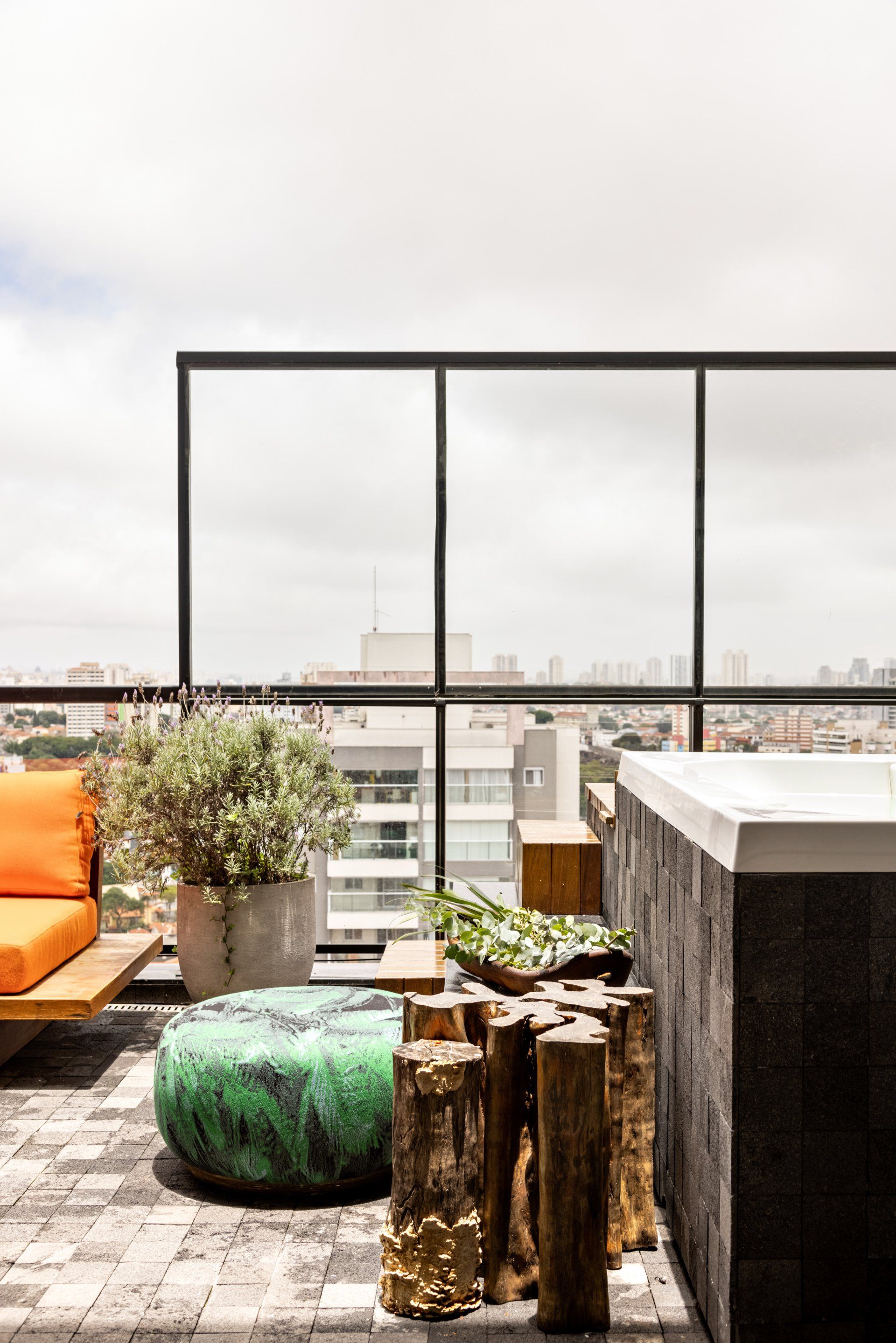
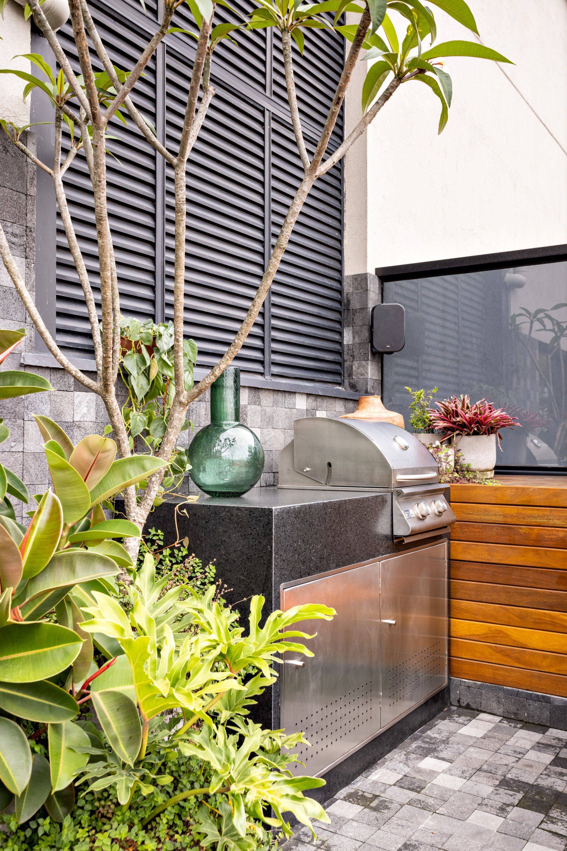
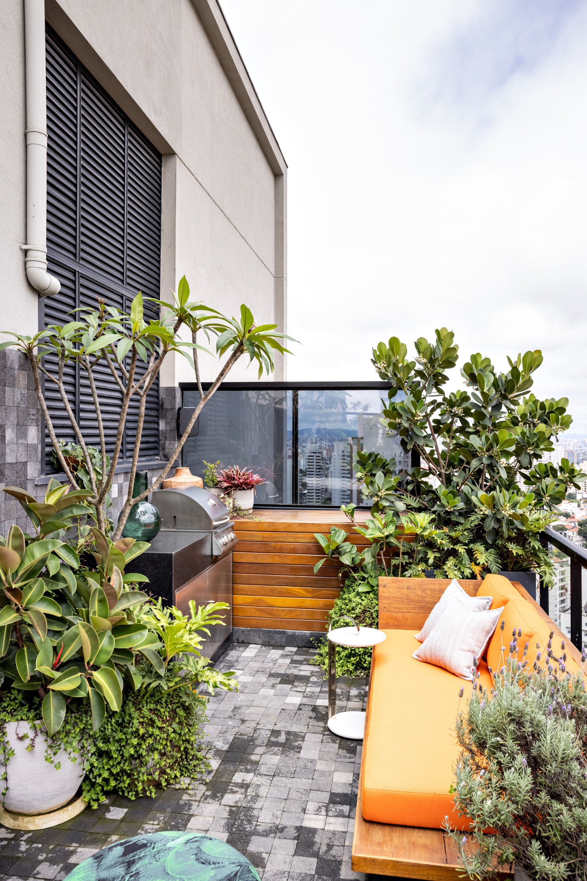
The space separated into two parts has the internal part of the floor, with a more functional area, where the closet to store various items of the house and bench with wet area is. The bench that houses the cellar and brewery, serves as support during the use of the external area and a connection with those who are enjoying the jacuzzi, in addition to bringing a simple solution to solve the void of the double height above it through lighting, which brings an artistic bias towards space. The dining table allows for the comfort of meals during barbecue days. The outside part has a large jacuzzi and a beautiful garden. It is a leisure space that also features a super comfortable sofa, designed by the architect himself, and a barbecue area. There's even an ice machine hidden inside the countertop.
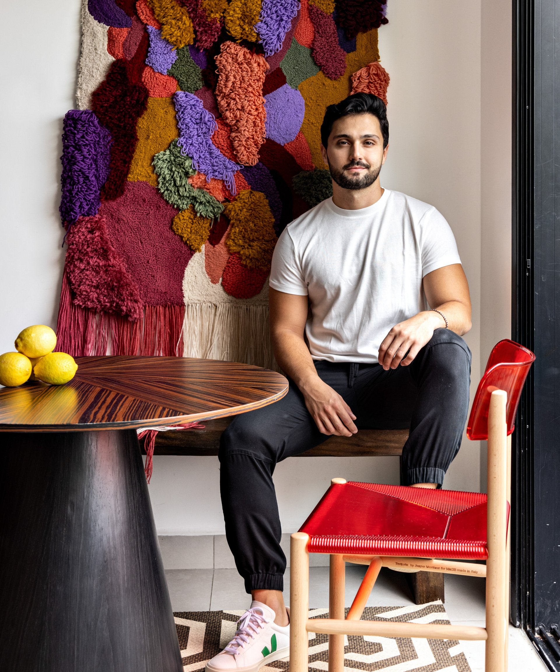
One of the great highlights of the project is the contemporary decor, filled with boldness, through the use of open colors, textures and geometric shapes, along with noble and traditional materials, used in a relaxed way. In addition to bringing national and international design objects.
They wanted to make the outdoor area more useful and integrated with the house. In addition to having a nice and comfortable place to welcome friends and family and enjoy leisure time at home. The main requirements were to have a barbecue, ice machine, beautiful and comfortable sofa in the outdoor area and a space for a wine cellar and brewery.
It had been a little over a year since the owners had moved into the apartment. The terrace floor, where I did the project, was not yet fully completed and customers wanted to make the area more usable and functional, with a barbecue and sofa in the outdoor area. That's what started the project.
Structurally, there wasn't, but we had to remove the jacuzzi, as it was below floor level. So we had to demolish the masonry around it and level the entire floor and then build the base and reinstall the jacuzzi again. In this way, we took the opportunity to change the entire coating of the external area.
No, it wasn't.
It is a contemporary, bold and dynamic decoration, which brings the use of open colors, textures and geometric shapes together with noble and traditional materials, used in a relaxed way. In addition to bringing national and international design objects.
Playful touches, such as the decorative vases by Humberto da Mata located on top of the internal bench, help to compose the aesthetics and style of this decoration.
In terms of furniture, colors, design and comfort guided the choice of pieces, in addition to observing the lifestyle and personality of the residents, which helped me to direct these choices towards a light and lively space.
The sofa, which was all designed by me and each part was executed in a different place. The structure, for example, was made in a workshop in Trancoso, Bahia, using demolition wood. The fabrics, suitable for the outdoor area, were selected from two different stores and the tapestry was executed by a company in São Paulo, all following the office's detailing project.
The internal bench, which houses a wine cellar and brewery, also designed by me, had a design thought to have a greater integration between the internal and external area, using straight shapes with overlays of brushed Itaúnas granite stone.
Also, thinking about bringing an interesting solution to the double height wall, we played with a lighting game, which when turned off, form an artistic intervention on the wall.
The stainless steel doors of the external bench, which houses the barbecue, have small openings for internal air circulation, where we place an ice machine. The execution also followed a drawing of mine where I brought straight and delicate lines to a raw material, which I find super versatile.
It was quite exciting and special to see these items come out of paper and successfully realized!
I used current and everyday materials to natural and traditional materials in a connected and relaxed way. Granites in a brushed finish on the countertops, along with dark volcanic stone in the external area and the use of metals such as stainless steel. The furniture and decoration objects present color.
Photography Fran Parente
Interior Design Pedro Luiz De Marqui
Subscribe
Keep up to date with the latest trends!
Thank you for signing up!
Error
Contribute
G&G _ Magazine is always looking for the creative talents of stylists, designers, photographers and writers from around the globe.
Find us on
Home Projects
Popular Posts
- CURRENT ISSUE -
SEPTEMBER 2024