Burgundy
Amici Buro presents its recent project: a 75 m² apartment with a lot of natural colors and shades in Kyiv.
“Lightness was our concern in this project. A clear zoning of space without the installation of heavy partitions has become the main solution to this problem.”
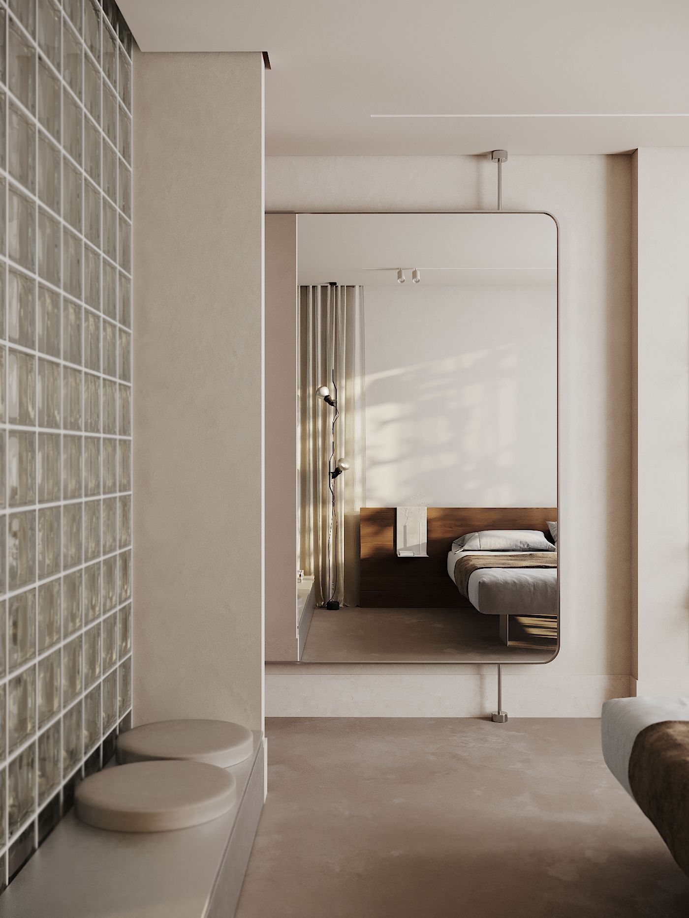
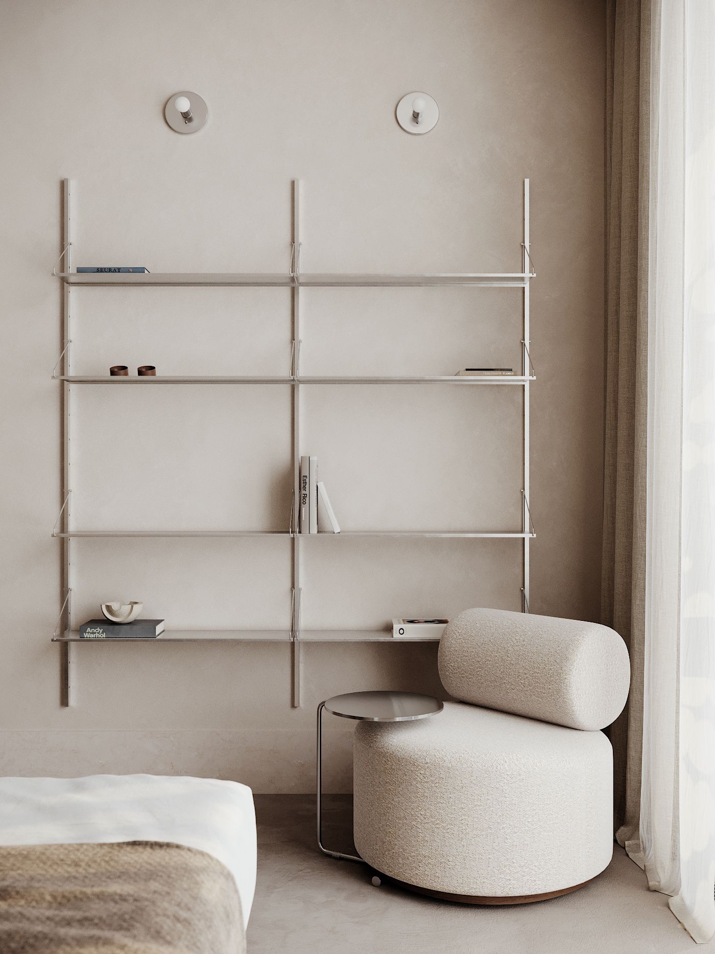
It seems to be like concrete, glass block, metal and stone, but at the same time it is transparent, simple and clean. Conscious consumers contacted us. The end result is an uncluttered living space with no bulky storage. Instead of obvious cabinetry, the designers used hidden storage that looks like wood paneling. Linen fabrics, fine-grained beige plaster and dark warm wood became companions to rather cold materials, so the interior turned out to be cozy. For example, in the corridor the linen curtain separates the kitchen from the hallway. If you wish not to separate these spaces, you can push the curtain and see a two-way mirror to the floor, in the corridor. In addition, the corridor should be a full-fledged part of the design solution, as light and calm as other rooms. The hanging shelves by Frama in steel, together with the De Castelli Marea leather sofa and chest of drawers, fit perfectly into the design concept. And the red doors to the ceiling are one of the accent color schemes in the design of the entire project and companions to the chest of drawers.
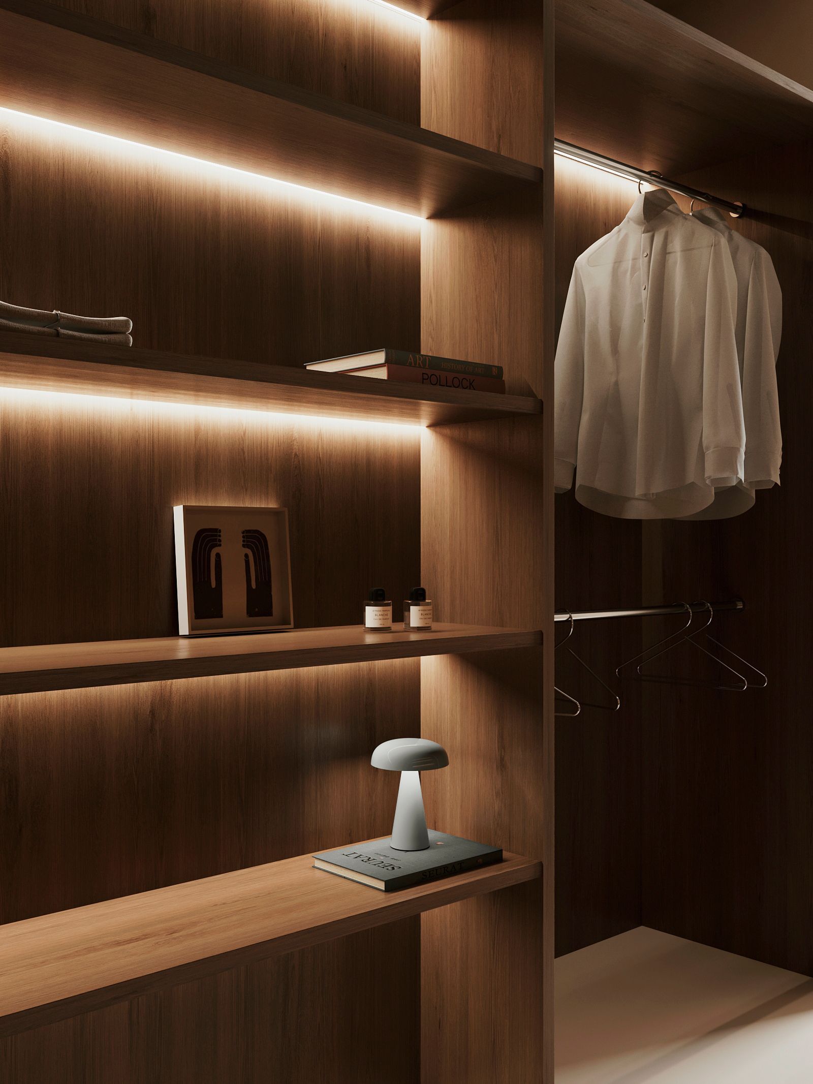
To the left, in the corridor, we find the wardrobe that includes storage space and a small laundry unit for a washer and dryer behind a hidden facade. Veneer color is used consistently in every room. The designers emphasized the geometry of the shelves with highlights.
“Throughout the project, we fought for ease of use of things and for uncluttered storage.”
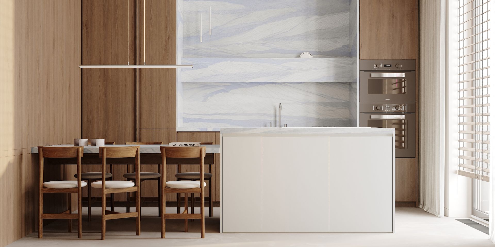
To emphasize the lightness and graphic nature of the idea, the designers designed the lighting fixtures linearly so as not to distract attention from the main idea. Linen fabrics, fine-grained beige plaster and dark warm wood became companions to rather cold materials, so the interior turned out to be cozy. A hanging shelf for storing books, frames and candles is made in the same stone as the kitchen apron. All cabinets are made in the same wood as the cladding panels. This technique helped to visually hide the cabinets and combine the kitchen with the corridor.
The main accent color of the project, despite its name, was blue and its shades. The movement vector in the design was set by the stone of the Italian factory Ariostea. Azul Macaubas wood and stone is the finishing basis of the kitchen. The clients didn't want bar stools, so the designers split the island into two parts: an island work area with a stove, built-in extractor fan, and a dining table with chairs from De La Espada. Chromium is the main metal of the project. The faucet, hanging chandelier above the dining area and decorative elements are all in chrome.

“We fell in love with it and wanted to introduce blue and blue into other areas of the interior. So, we got a blue sofa.”
The customers needed a separate workplace to be able to close, conduct online meetings and not worry about the noise, so we separated the living room and the balcony with a glass partition in a burgundy metal profile.
Wood, metal and concrete have become the main materials of the bedroom. Bolzan's Lago Air Wildwood bed with shelves adds weightlessness to the room thanks to the thin metal legs of the bed. Flos lights on either side of the bed cast their light onto the drapery behind the bed and act as a reading light. Behind the FEST Amsterdam chair are the same Frama shelves as in the hallway, but in a different configuration and size. A chest of drawers with a low height for storing bedding and with soft pillows for animals next to the glass block on the side of the bedroom.
The designers wanted to provide a rather large bathroom with natural light, so they used a glass block between the bedroom and the bathroom. The floor, walls and shower room are clad in white terrazzo stone. The Borghi washbasin by Antonio Lupi has become the color accent of the bathroom. In support of the sink is a flower bed with dried flowers, in the same cladding as the whole room. The mirror in the bathroom can be rotated on its axis for easy use and it also doubles as a towel rack.
Interior Design Amici Buro
SHARE THIS
Latest Edition
Mar / Apr 2026 edition is available now!
Contribute
G&G _ Magazine is always looking for the creative talents of stylists, designers, photographers and writers from around the globe.
Find us on
Latest News
Subscribe
Keep up to date with the latest trends!
Popular Posts
