Very Peri in Interior Design and Architecture
After a long and careful research, G&G _ Magazine found some stunning projects where architects and designers have used Very Peri for their works. Some have reinterpreted it in an original way, some instead preferred to experiment with this versatile hue, creating shades around them.
Bosfor by AD Project Dorohov Architect
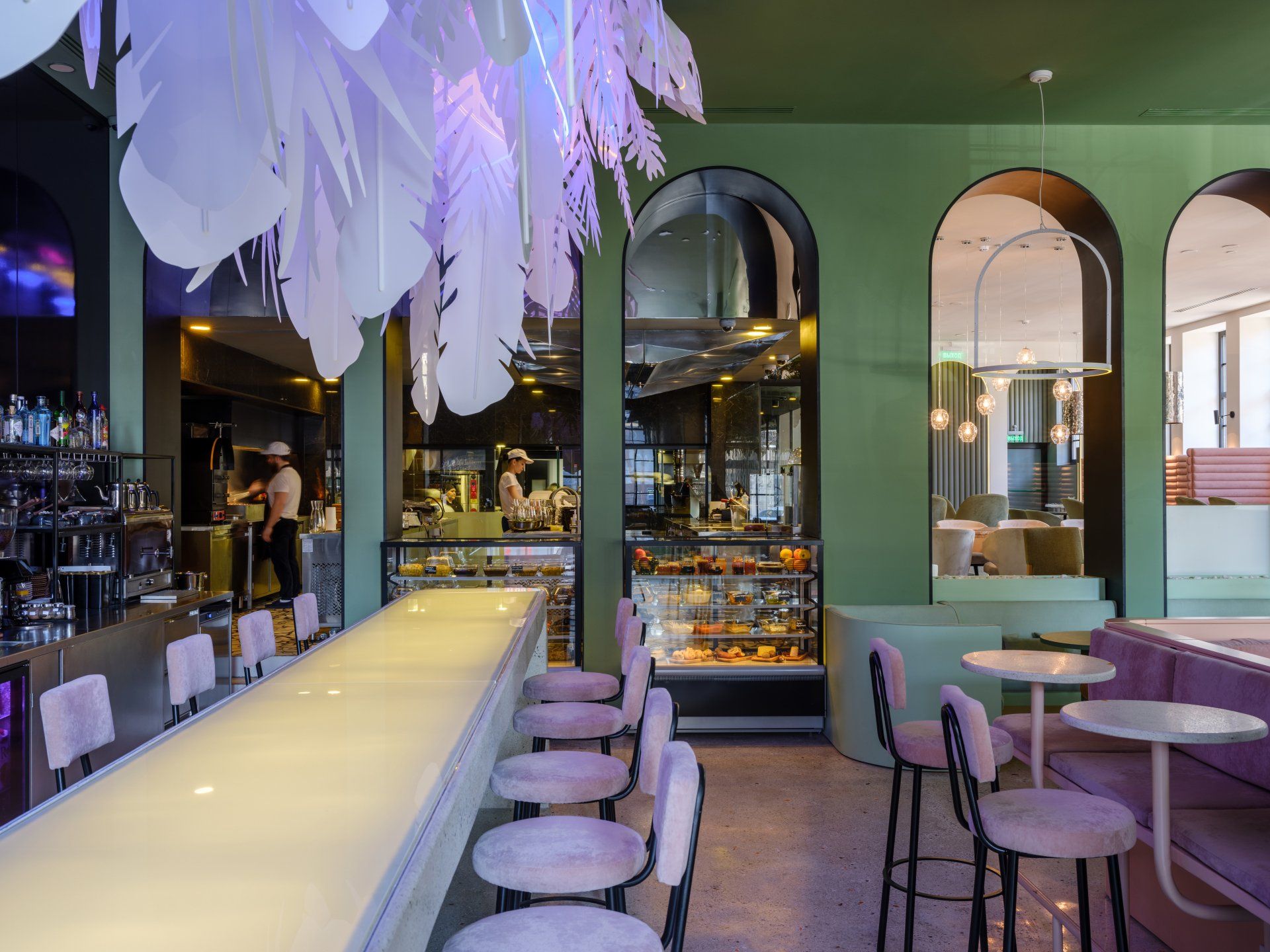
Bosfor Turkish restaurant is a fusion of Asia and Europe. Every detail is important for the atmosphere and the correct perception of the space. Each floor is a separate story with its own flavor and sophistication of the interior. The spirit of oriental culture on the 1st floor is expressed in detail - arched structures, natural stone and smooth lines in a modern interpretation. The open rooftop bar is the highlight of the interior, reflecting Turkish character in a modern twist. Velvet, glass, arches - helped create a modern vision of oriental culture.
Address Ulitsa Maksima Gor'kogo 213, 344000 - Rostov-on-Don, Russia
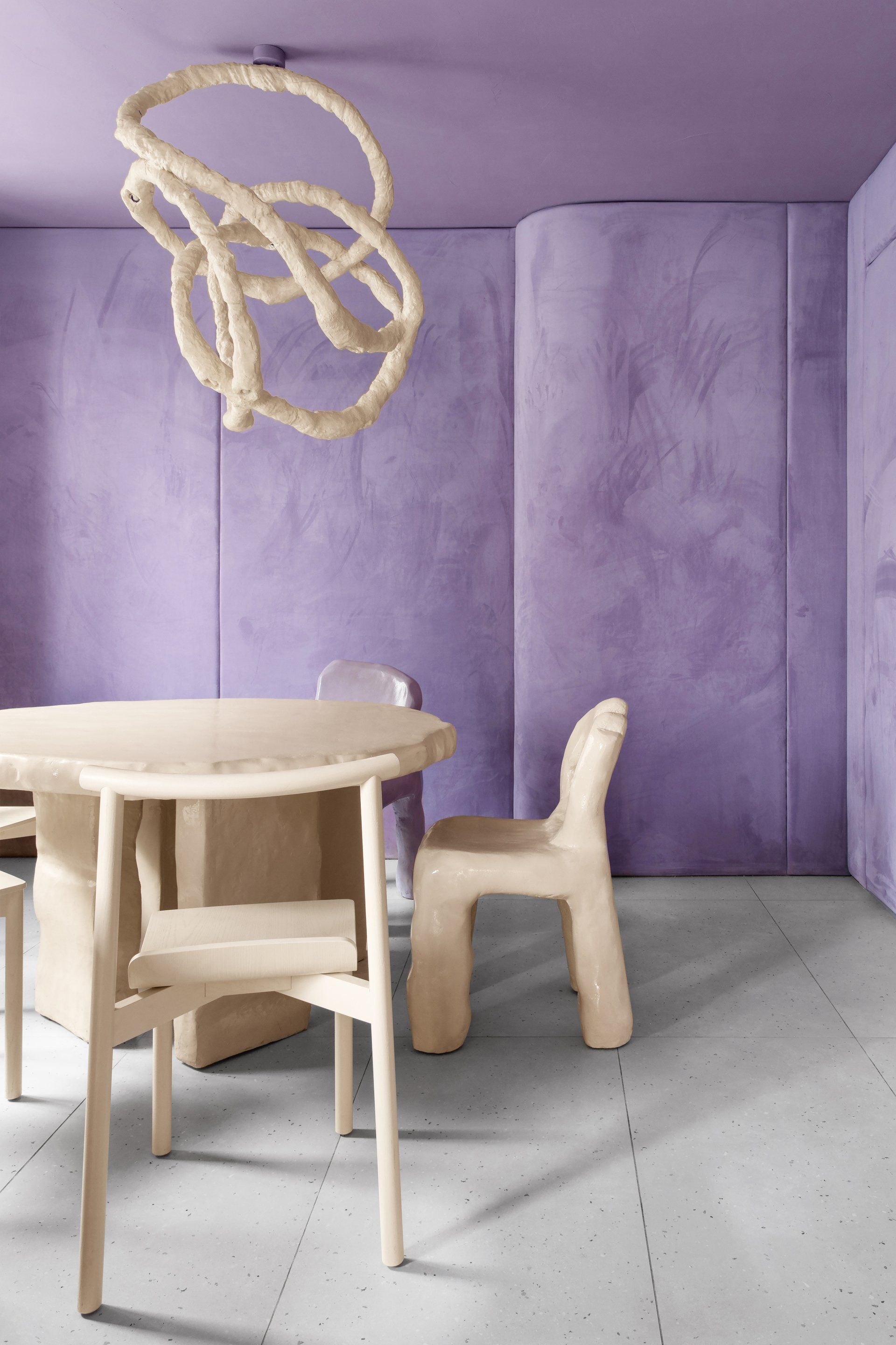
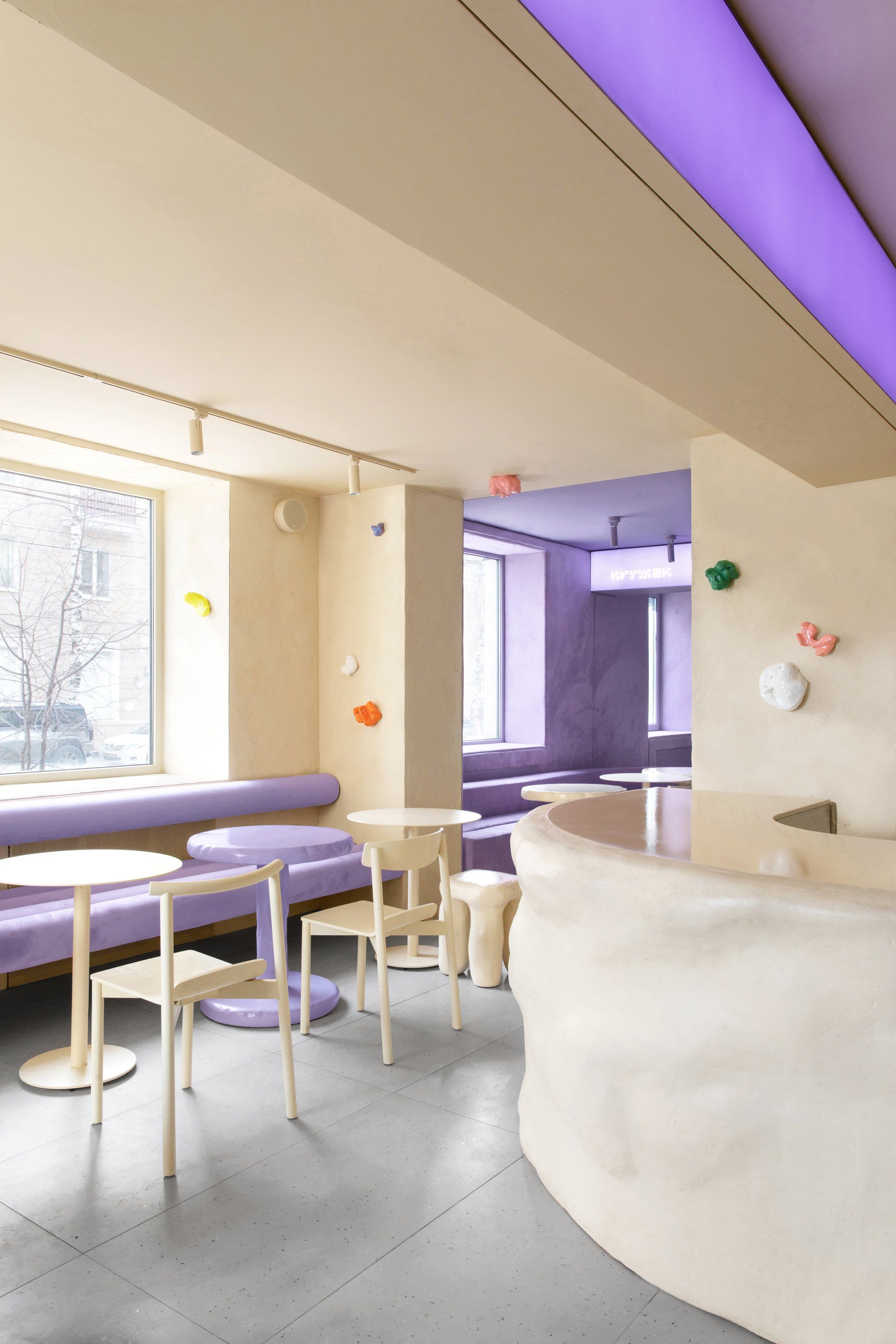
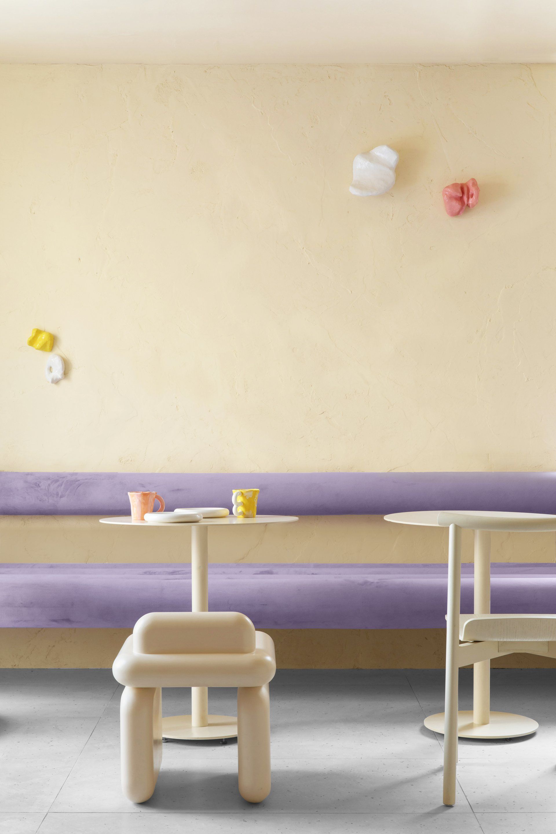
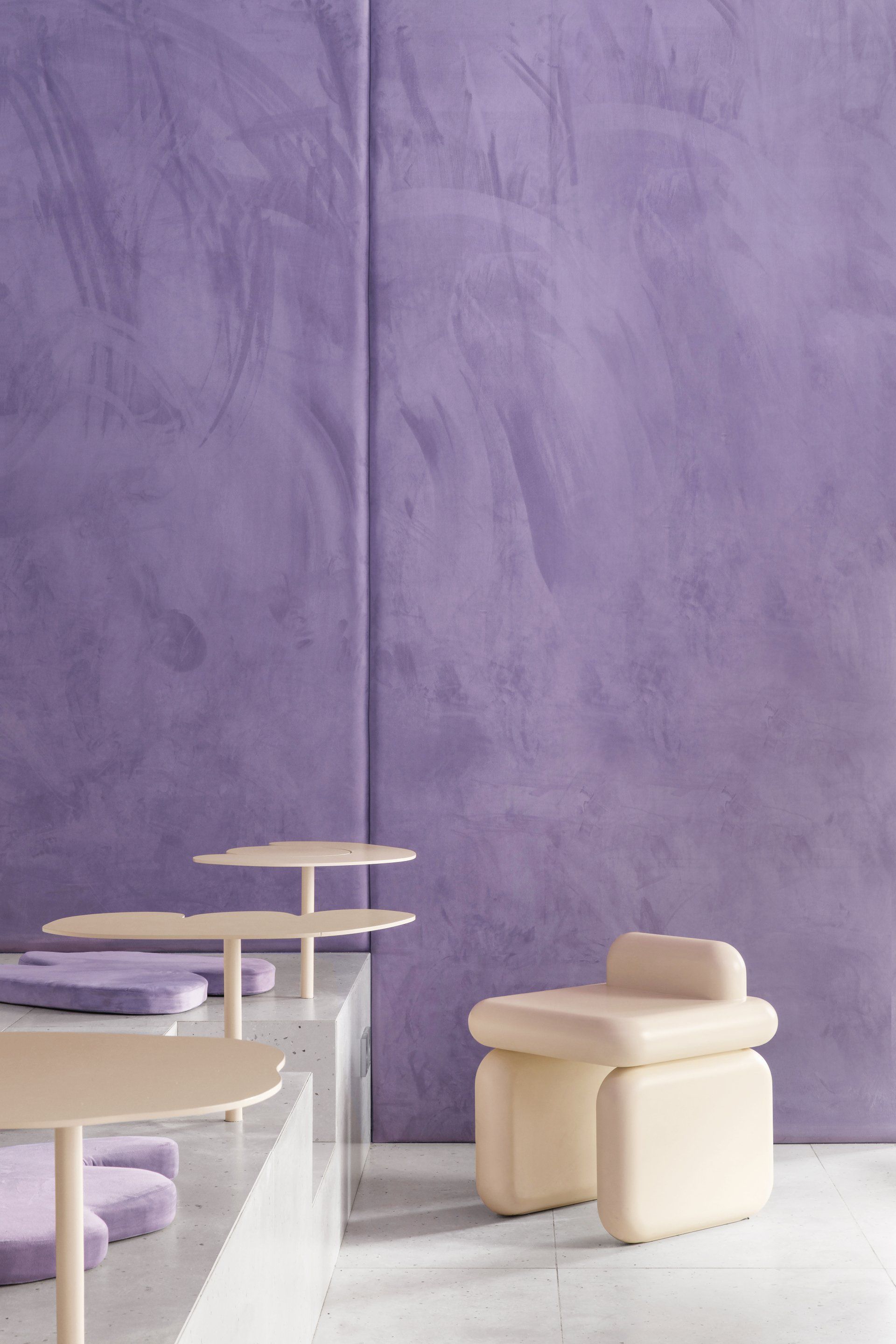
Krujok Cafe by Eduard Eremchuk & Katy Pititskaya
Located at the heart of the Russian city Voronezh, Krujok (a round form of a donut in Russian) Cafe has been designed to take the guests into an imaginary space. When creating a concept, architect Eduard Eremchuk and designer Katy Pititskaya were inspired by airy shapes of the donuts, melting glaze, and cream - the essence of a donut, and take it to another level - a form of hyperreal pastry. The goal was to create an ambiance so each guest could dream his own dream in the world of pastry. Once you are inside, a new reality absorbs you. The pastry is everywhere, it looks and even feels like the cafe is made of dough. Katy and Eduard played with tactility by mixing mystic purple shades with soft velvet fabric, on the walls and accessories. The overall combination of cream shades in the cafe, bright purple lightboxes, together with the crumpled strange shapes brings out a distinctive contrast with the grey concrete surroundings.
Address Teatral'naya Ulitsa 26, 394036 - Voronezh, Russia
Ultima Thule by Stiliyana Minkovska
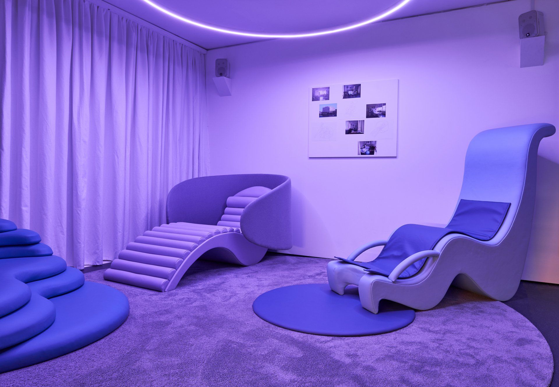
The architect but also, a mother, Stiliyana Minkovska presented an alternative to the hospital birthing environment: Ultima Thule, a sanctuary-like environment for both mother and child. In this space, the mother has greater control over of their delivery and reproductive health. A purple color was chosen for the room to ensure a peaceful environment that gives a sense of relaxation and well-being. The triptych was donated to St Thomas’ hospital in London on 6th of July 2020, where it is currently used by midwives, obstetricians and mothers for training and educational purposes.
Transsensorial Gateway by noa*
The architects from noa* designed an installation for the "Interni Creative Connections" in the Università degli Studi di Milano (IT) showcased during the days of FuoriSalone 2021. The concept, developed together with ewo and ebner Music + Film, proposes a kind of light and sound landscape, which welcomes visitors as they enter the exhibition. On either side of the doorway, a crown of structural light-beams open up, each one at different heights, visually amplifying the sequence of the 17th-century portico that serves as the setting for the installation. The result is a sculptural work that combines various elements, including light, sound and movement, in direct dialogue with people and with the space. The light beams create relationships, building ‘bridges’ between people. The light reacts to the presence of visitors and at the same time interprets the way they relate to each other.
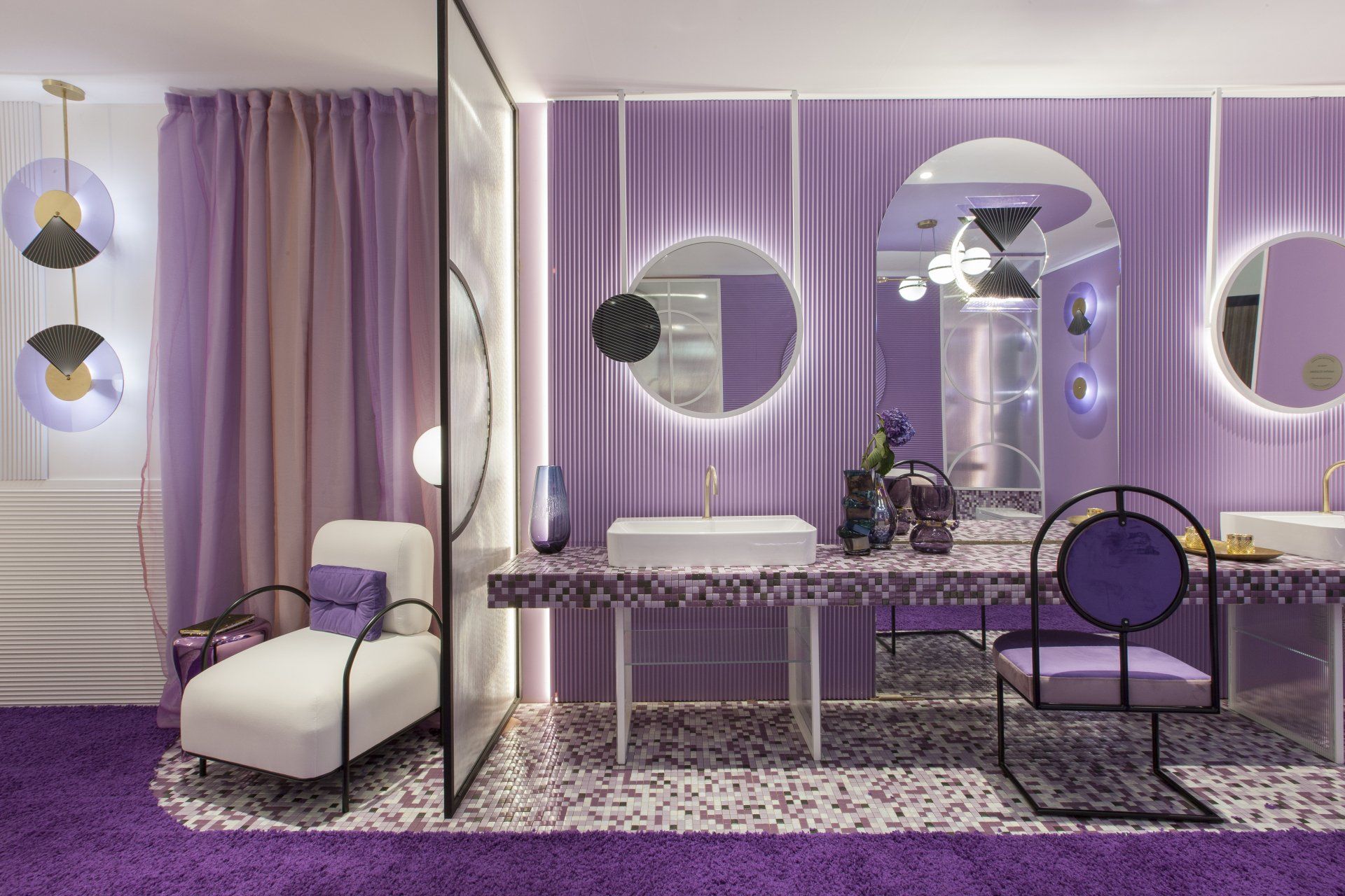
Hotel Boutique Violet Bliss by In out studio
In no other color unlike qualities combine as in the violet, since it represents the mixture of masculine with the feminine (red and blue), and sensuality with spirituality. The union of these opposite meanings is what the designers wanted to reflect in this unusual hotel concept. Each suite has its own personality based on violet. The vibrant and sensual space invites the guest to experience. Its walls covered with three-dimensional materials and careful lighting combine to enhance the senses.
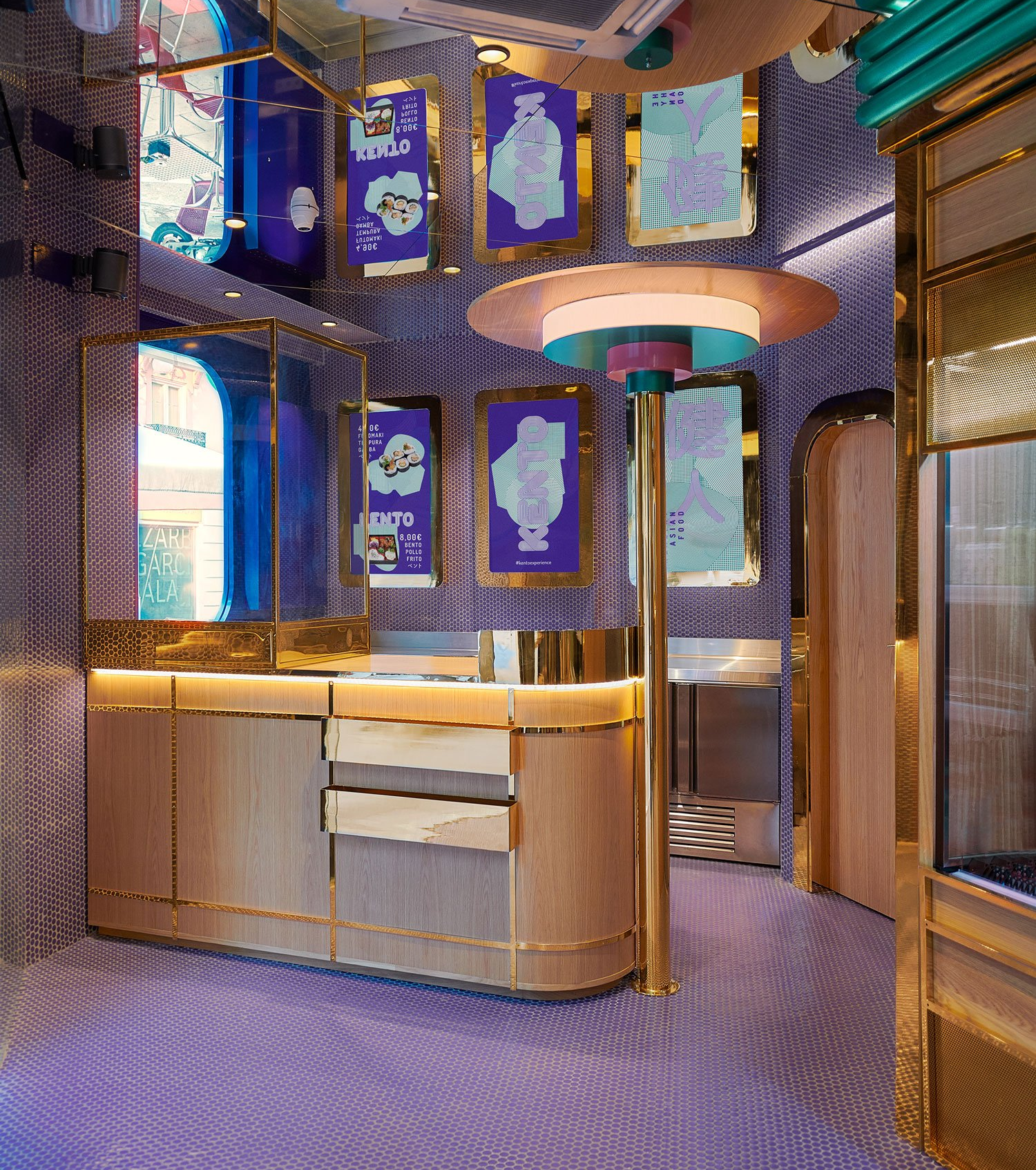
Kento by Masquespacio
The Japanese take away chain, specialized in sushi, has hired the Spain design studio to design another its third shop in Valencia. The design seeks to reflect the avantgarde style of Kento’s shop, taking as a starting point the design realized by Masquespacio for the first shop in 2017. The aim is to represent the brand identity in each project, but with a new character adapted to the requirements of each location. Thereby the brand colors are maintained, but always applied on a different material according to each project.
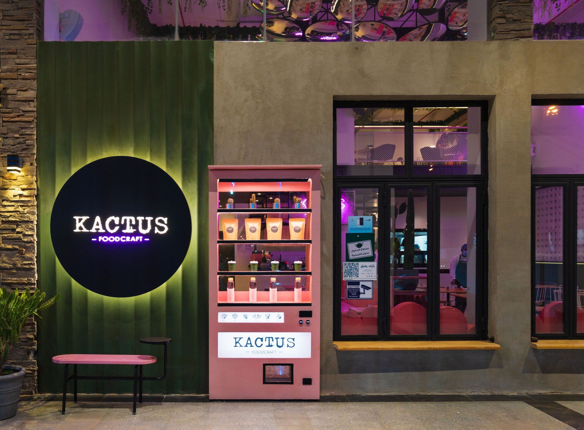
Kactus by 4SPACE
This contemporary café in the heart of Saudi Arabia’s energetic capital, has a modern, chic, tasteful, and contemporary design inspired by the fascinating xerophytes. The studio designed this eatery in highly Instagrammable colours of vintage pinks and greens. The textures and fabrics used to create interest are oak, steel, leather, terrazzo, bold curved mirrors, a wall full of letters, and plenty of cacti. The café is an expression of international and contemporary lifestyles that celebrate youthfulness and culinary abundance.
Address 3227 Northern Ring Rd, Almasiaf, 12468 - Riyadh, Saudi Arabia
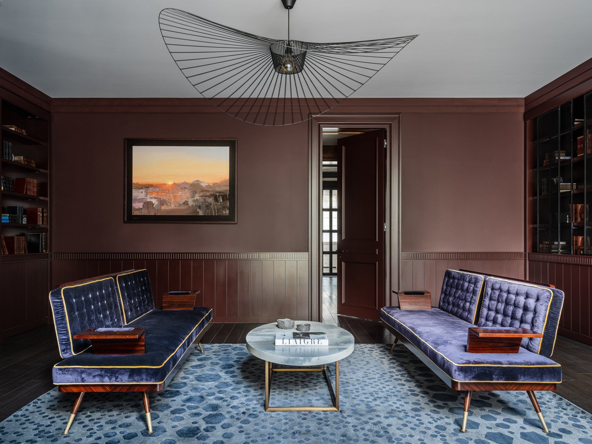
Modern Constructivism by O&A London
In its project in the family house, O&A London opted for the choice of two Very Peri colored sofas with structure in wood and details in metal in a formal sitting room. The upholstery are made of velveteen, so their color changes according to the light: it goes from light lavender to indigo violet.
Bun Bligny by Masquespacio
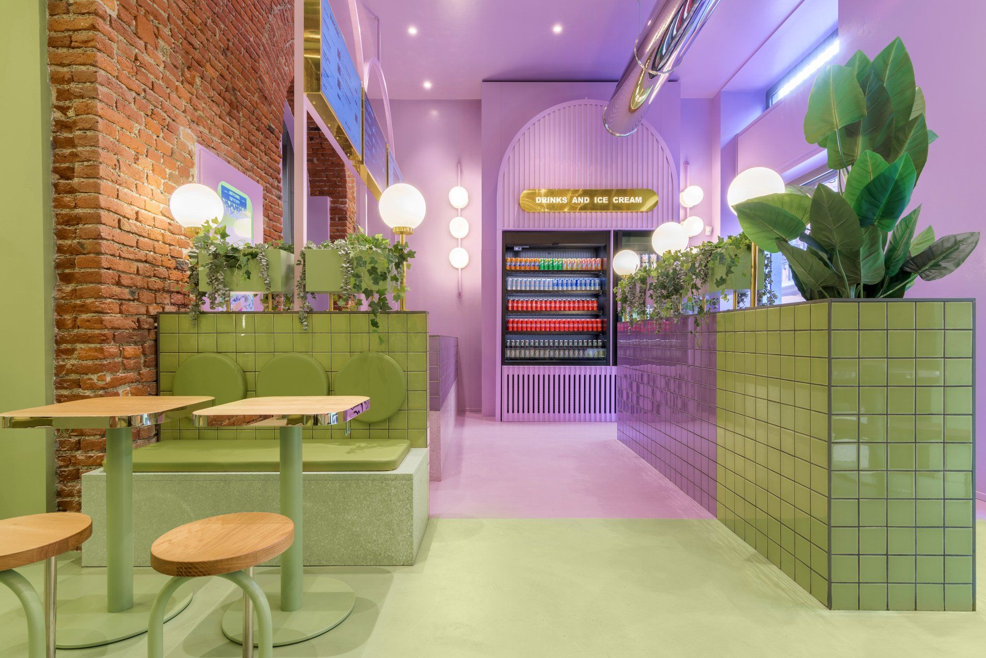
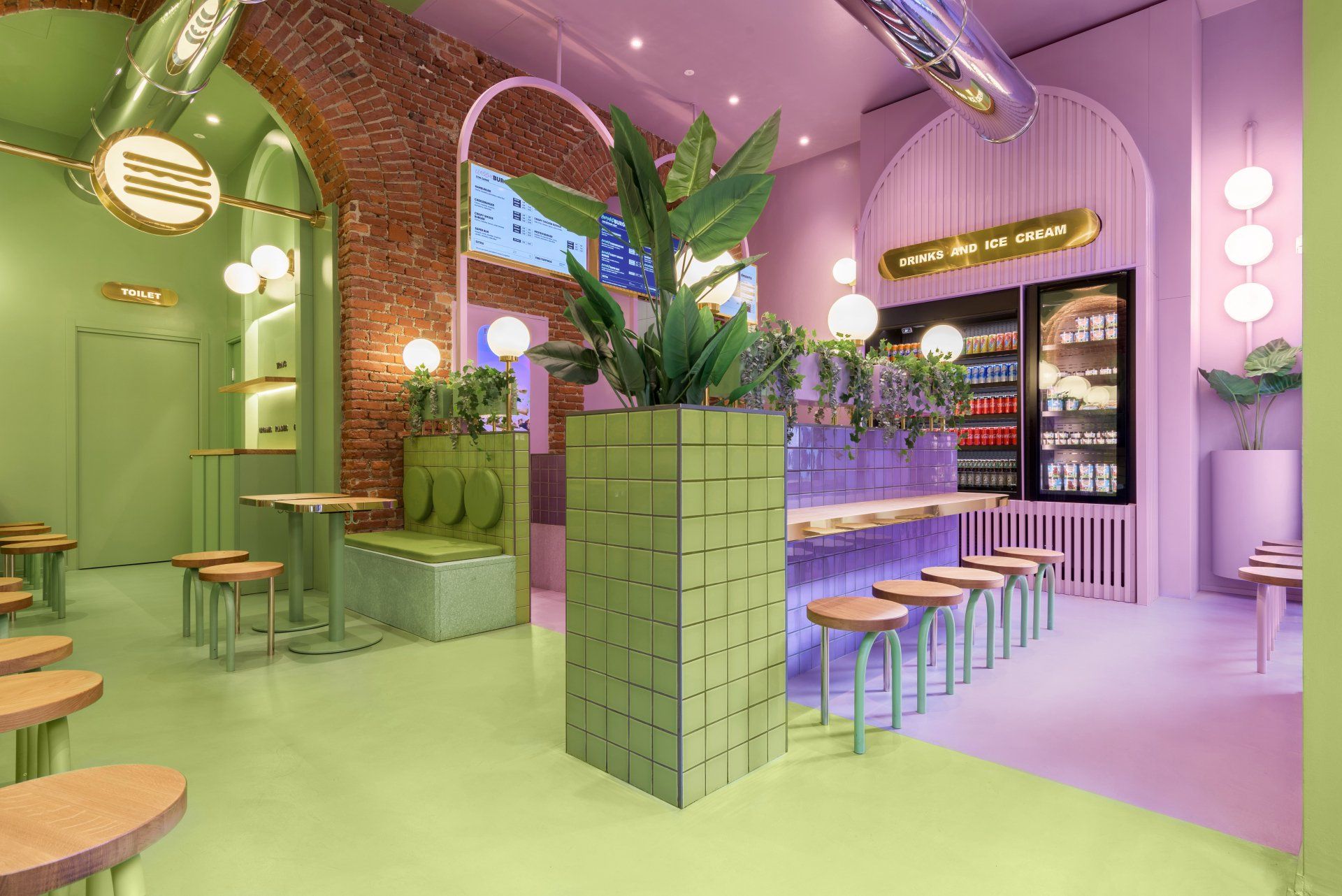
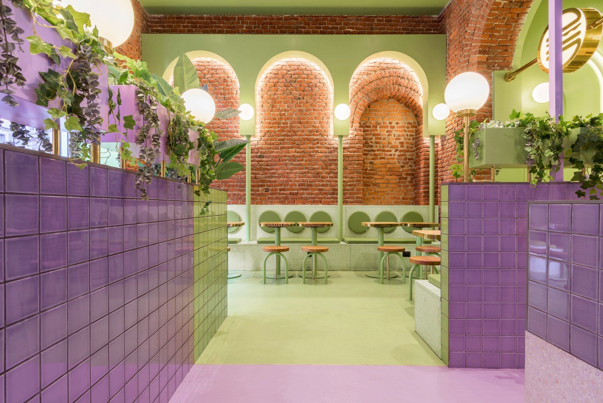
It's the first Masquespacio's interior design project in Milan for the Italian hamburger chain Bun, located at Viale Bligny, next to the Bocconi University. The aim for the project was to create an identity with a clear focus on the younger generations and at the same time rep-resent a more sophisticated approach for a high-quality ham-burger restaurant. This way Masquespacio has used gold touches and terrazzo tiles mixed with a splash of color that creates a sophisticated, but at the same time fresh design.
Address Viale Bligny 19/A, 20136 – Milan, Italy
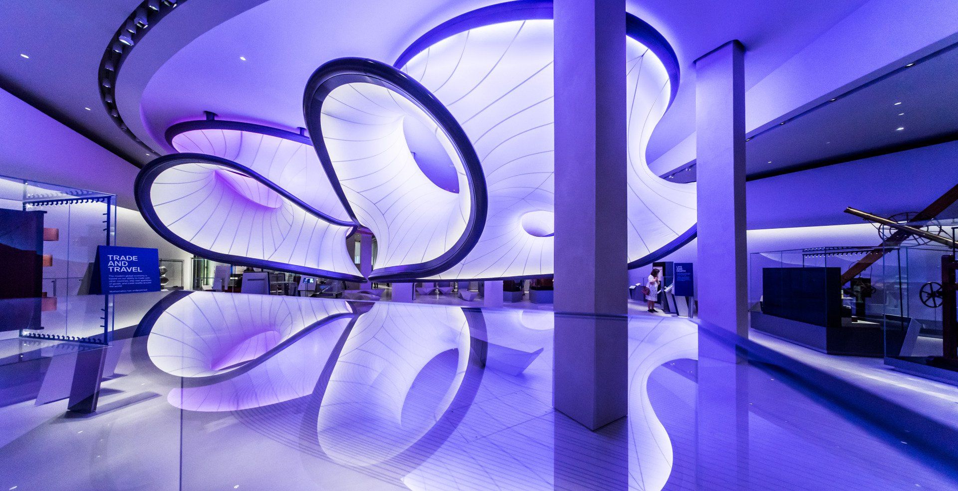
Mathematics: The Winton Gallery at the Science Museum by Zaha Hadid Architects
Zaha Hadid Architects’ design of the Mathematics: Winton Gallery for the London Science Museum responds to the request to present mathematics not as an academic concept, but as a practice that influences technology and enables the environment around us to be transformed. Using the principles of a mathematical approach known as computational fluid dynamics which acts as an organisational guide, the layout of the Gallery allows for the virtual lines of airflow to be manifested physically. The positioning of the more than 100 historical objects, and the production of robust arch-like benches using robotic manufacture, all embody the mathematical spirit of the brief. The resulting spatial experience created by these components within the Winton Gallery enables visitors to see some of the many actual and perceivable ways in which mathematics touches our lives.
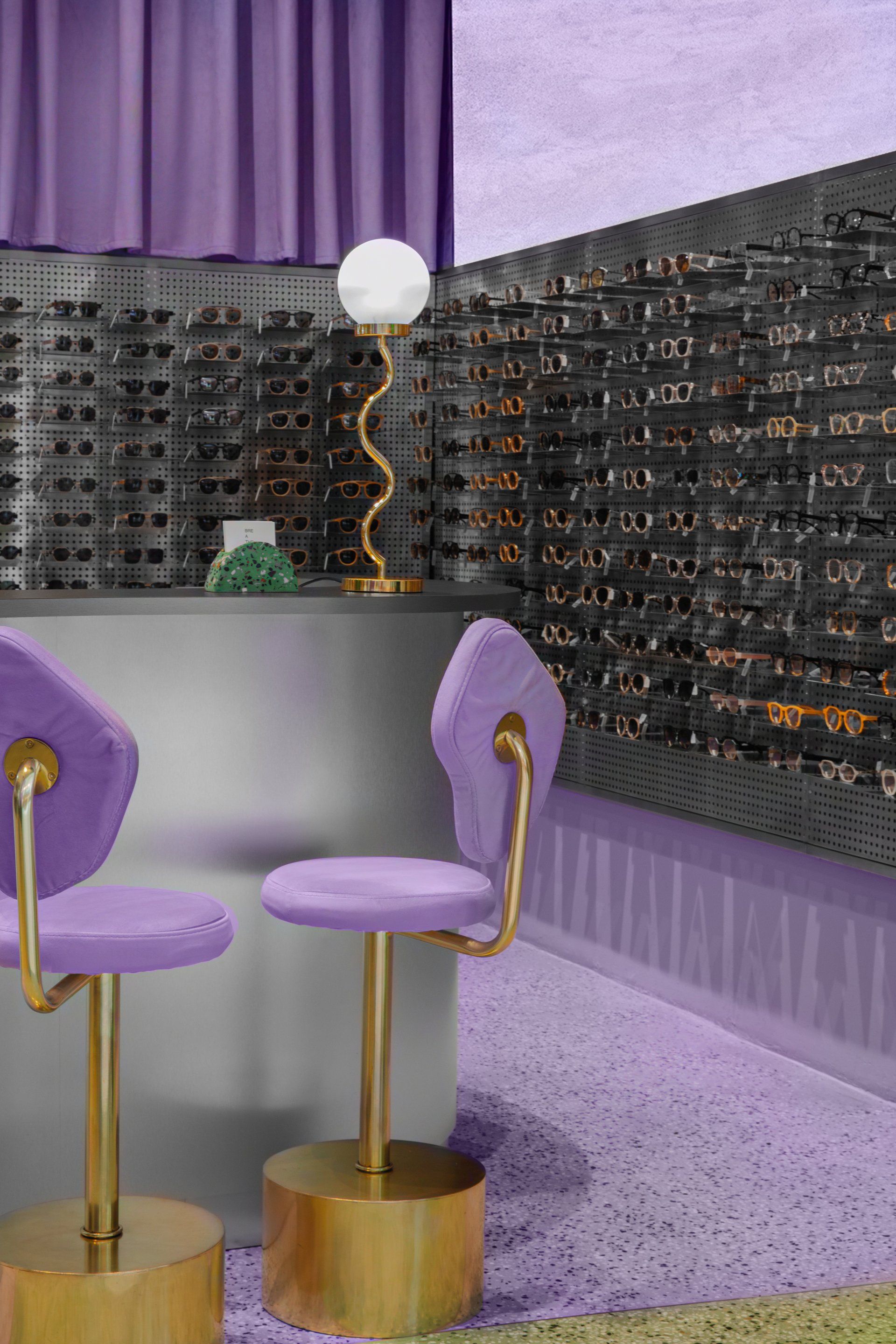
Breathe by Masquespacio
The project consists in a design of the shop for the sun-glasses & frames brand Breathe, in the studio’s creative director Ana Hernández’s native city Bogotá. The design's inspiration was taken from the study of Breathe’s brand values with a clear focus on selling human products. As always in Masquespacio’s designs, Breathe’s store can count with a touch of color, in this case lavender and earth green. Although the chosen colors are less usual, and color has been limited to floors and walls mainly. This way, they can combine easily with the different colors from the products for sale. On the other hand, as always, all elements of the project have been designed by Masquespacio, including the furniture and the decorative lighting.
Address Estudio 101, Ac. 82 ### 12A-04 - Bogotá, Colombia
SHARE THIS
Latest Edition
Mar / Apr 2026 edition is available now!
Contribute
G&G _ Magazine is always looking for the creative talents of stylists, designers, photographers and writers from around the globe.
Find us on
Latest News

Subscribe
Keep up to date with the latest trends!
Popular Posts
