MG House
Maya Sheinberger Interior Design studio renovated a single-family house for a couple in their 40s with three children in Hod Hasharon.
Before the renovation, the house was country-style, dark and old-fashioned. The entrance floor was re-designed along with the outdooor developing of the plot, while opening a new windows and creating full inside-outside connection. The designer also changed the layout of the first floor according to the needs of the family, and added a second floor attic as a bedroom for the eldest daughter.
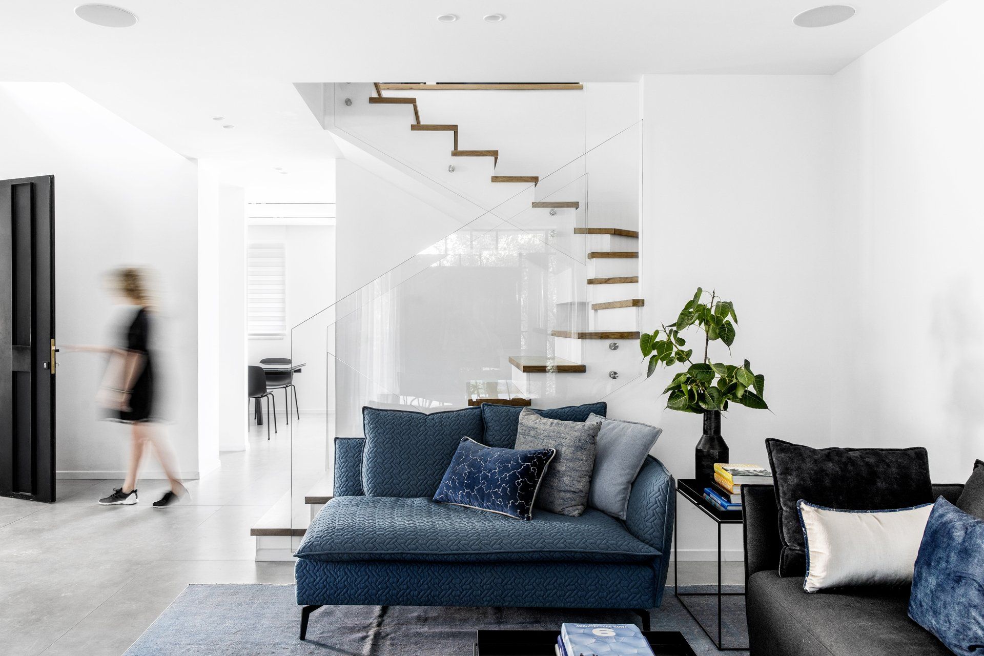
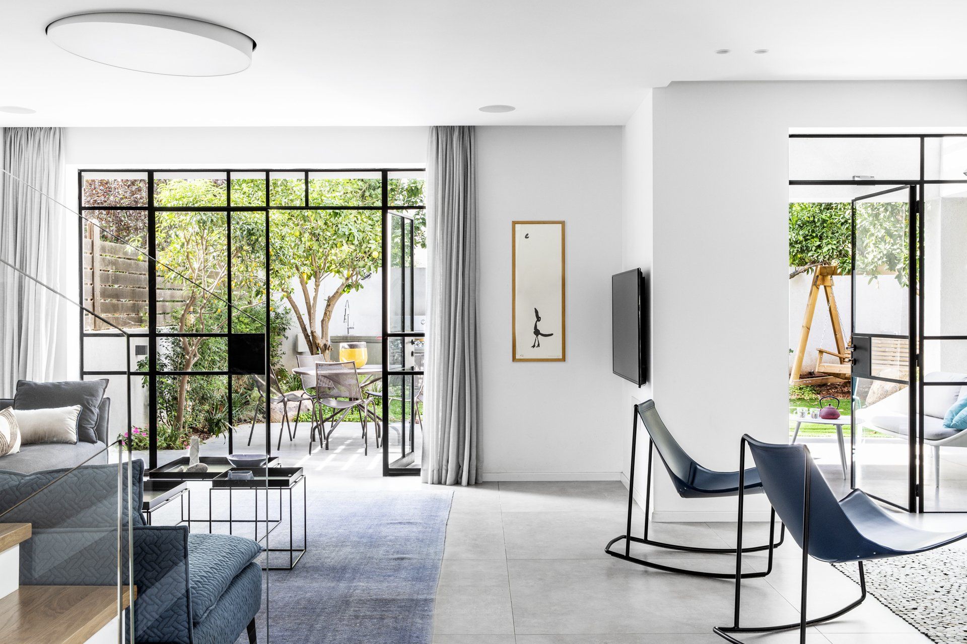
The entrance to the house is made through the front yard, a large surface paved with smoothed concrete with openings for trees and vegetation. The ascent to the entrance level is done by means of a concrete staircase of two shades combined with concrete planters and vegetation. The large entrance door, made of black iron combined with glass, opens in front of the existing staircase, which is covered with oak sidewalks and a new glass railing. To the right of the living room and family corner and backyard, to the left of the kitchen, dining area and guest toilet. The floor is paved with large porcelain granite tiles in a concrete-like gray color that continues the smoothed concrete outside.
The customers wanted a house that on the one hand would give them a feeling of a vacation in a hotel and on the other hand, that would be comfortable, functional and with lots of storage space for a busy life of a young and busy family.
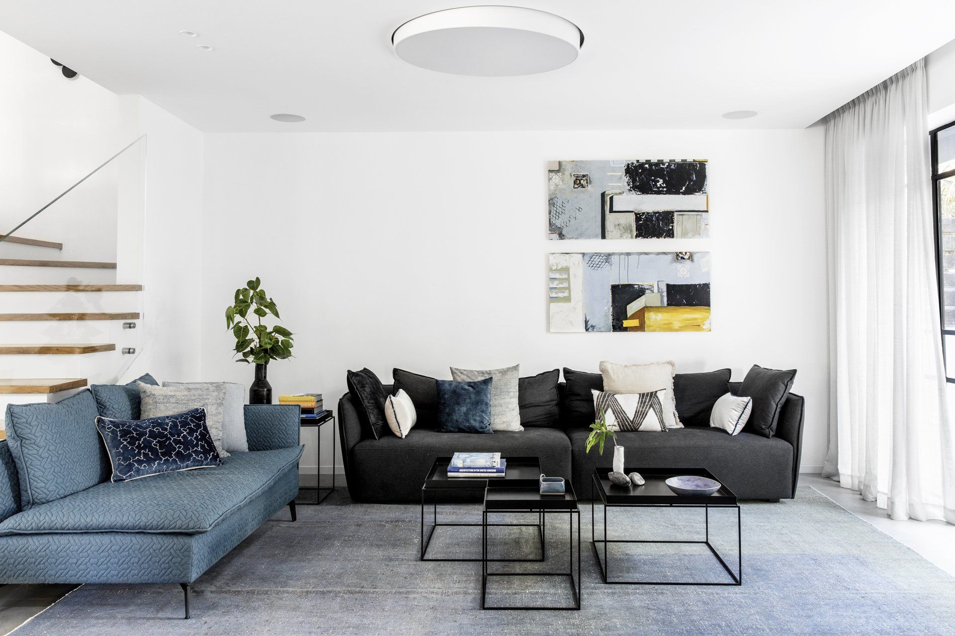
The Belgian iron windows are black, framing the green view of the courtyard from all the windows. The furniture is placed in the open space in front of the windows facing the courtyard. A graphite gray sofa and a denim sofa were purchased. The small coffee tables allow for versatility and practicality in hospitality. A large vintage rug in shades of blue-purple borders the seating area. Linen curtains in a light gray shade were chosen which continue the "effortless" look. Above the sofa are two paintings by the artist Tali Minzer hung asymmetrically.
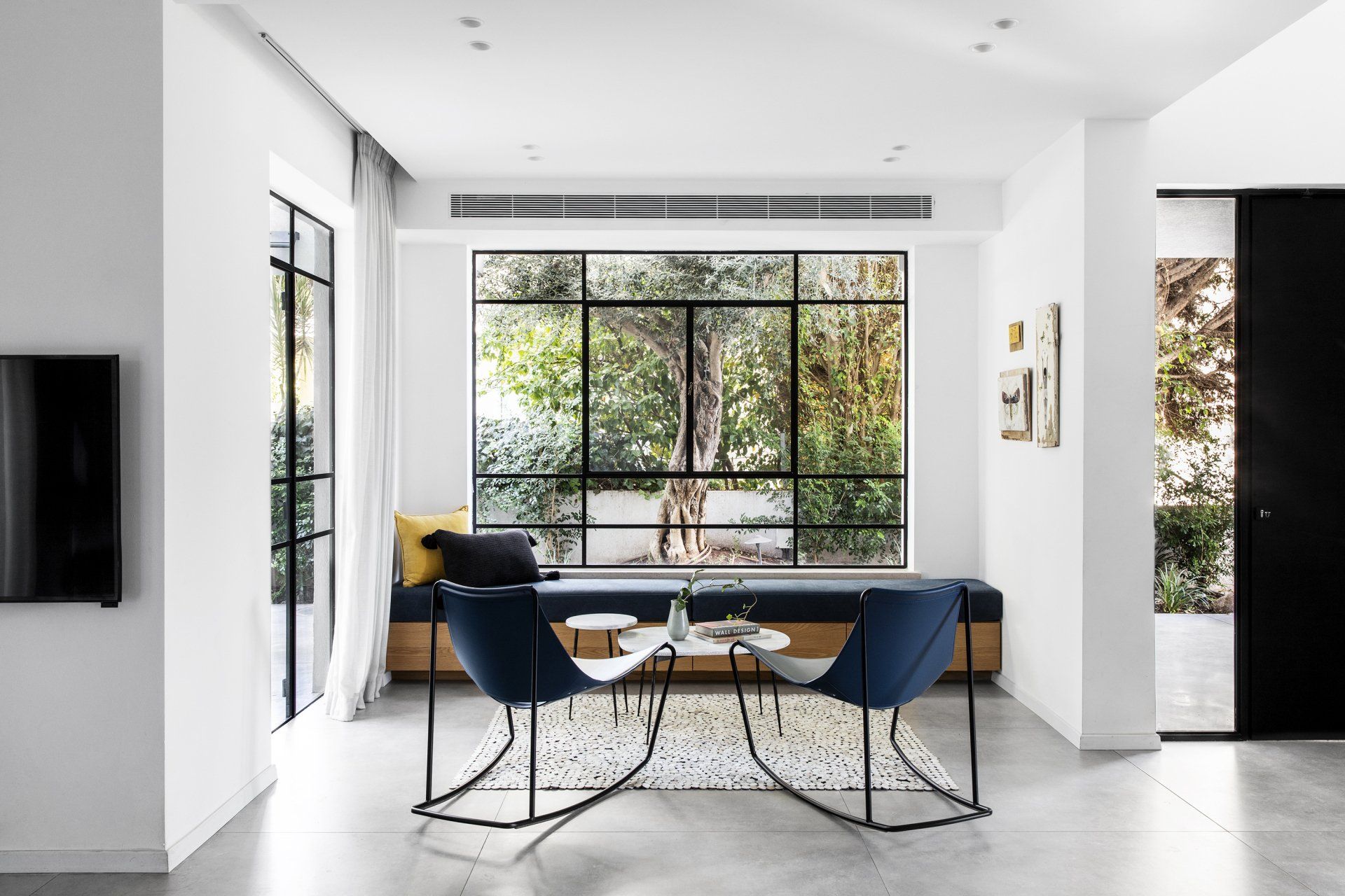
"My favorite area in the house is the family lounge, originally there was closed wall, and I decided to open a huge window with a bench underneath with storage. I moved the olive tree from the entrance of the lot to the center of the new window. The window frames the tree as a picture, so we decided not to add curtains to that window."
In front of the living room is an open family corner with a floating oak bench with a dark blue upholstery and in front of it are leather rocking chairs that are also in blue, white marble tables and light leather carpet. Originally the wall was closed with plaster niches, the designer decided to open a huge window and below it a bench with storage.
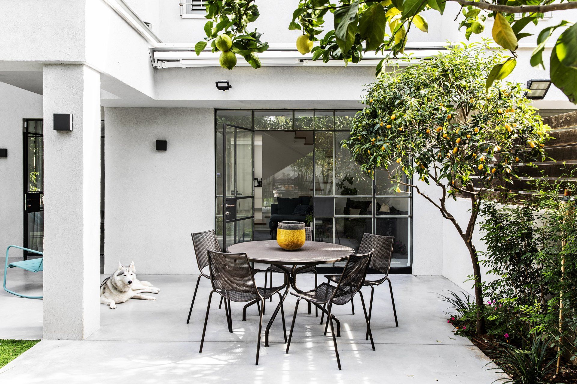
The exit to the backyard is possible from the two large windows in the living room and the sitting area. The yard is paved with smoothed concrete and continues the floor of the floor. A seating area with a sofa and armchairs is located under the pergola and next to it an outdoor dining area, a grill area and a swing bench. Citrus fruit trees were planted and it was decided on synthetic grass for reasons of maintenance and practicality. The design of the yard was done as a continuation of the interior design.
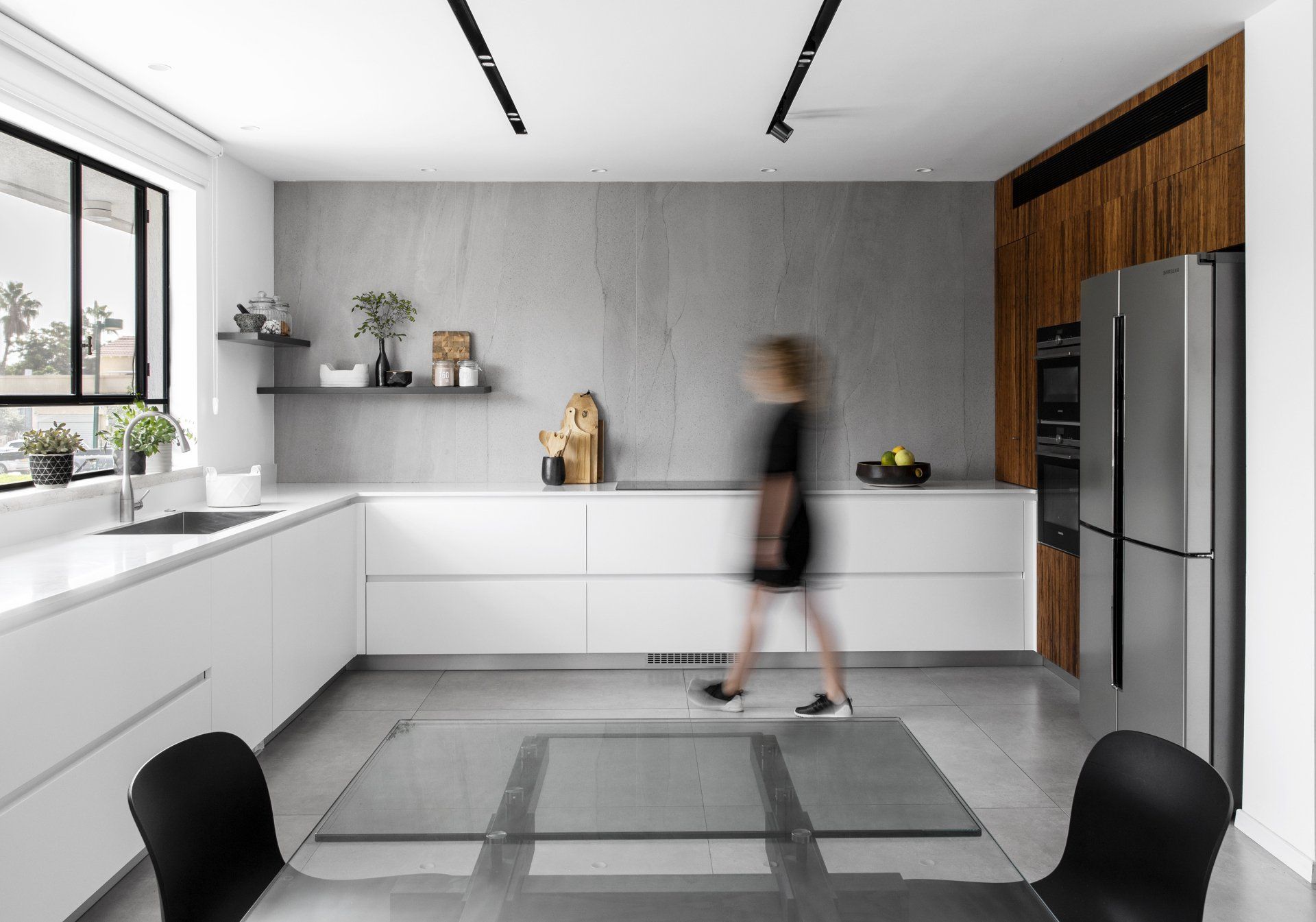
One of the first decisions in the planning was to place the dining area next to the kitchen, rather than producing an overly formal dining area, "that dinners and hospitality will be where you cook."
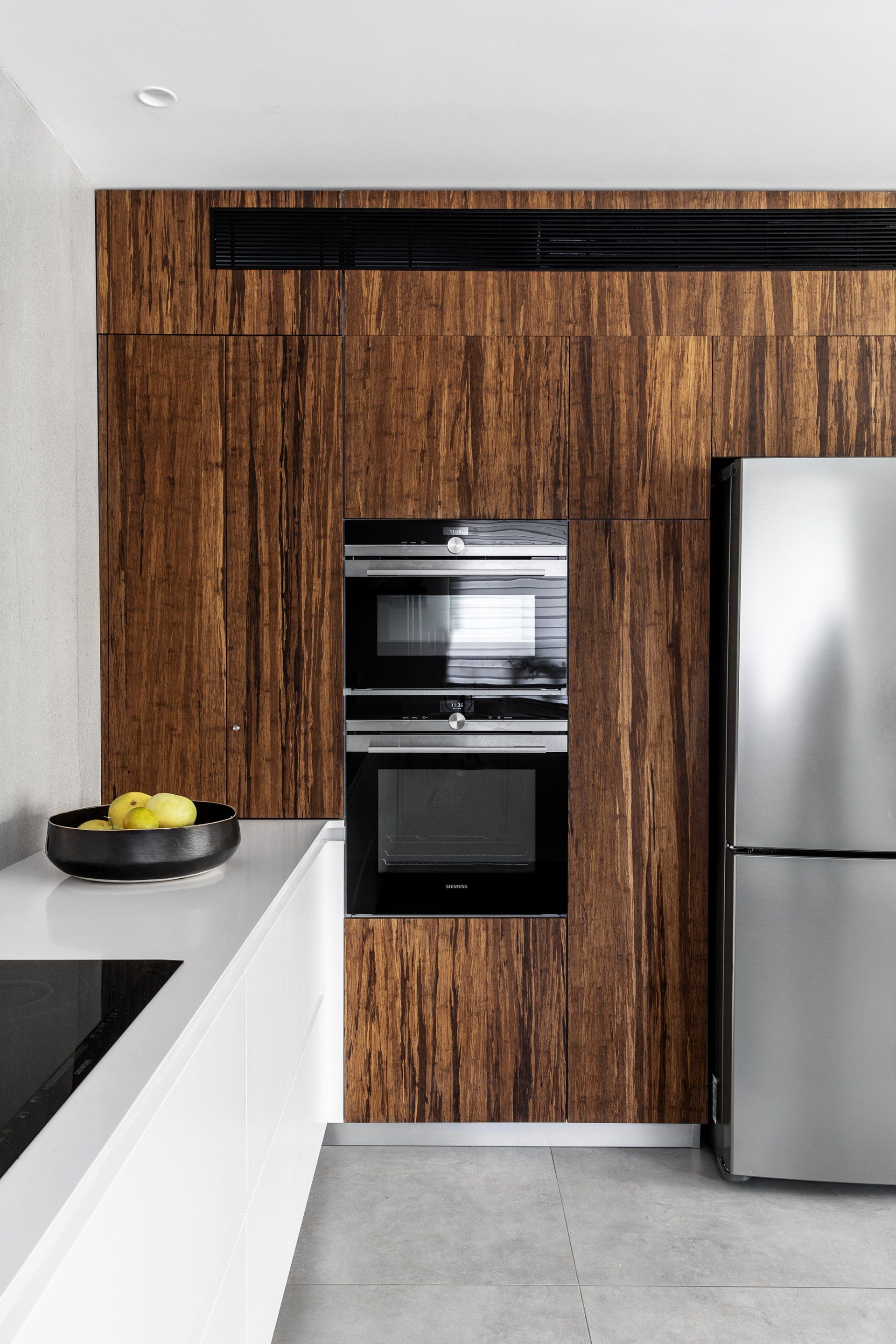
The kitchen is H-shaped, functionally designed with a high wall of bamboo cabinets, and inside is the refrigerator, oven, microwave, air conditioning system and additional storage. And low cabinets with a white marble countertop with sink and hob. A significant element in the look of the kitchen is the impressive wall cladding from thin panels in a shade of gray reminiscent of natural stone and covering the entire wall to the ceiling.
In front of it is a light glass dining area in front of the window combined with black chairs. Recessed lighting fixtures produce a clean and continuous line in the space.
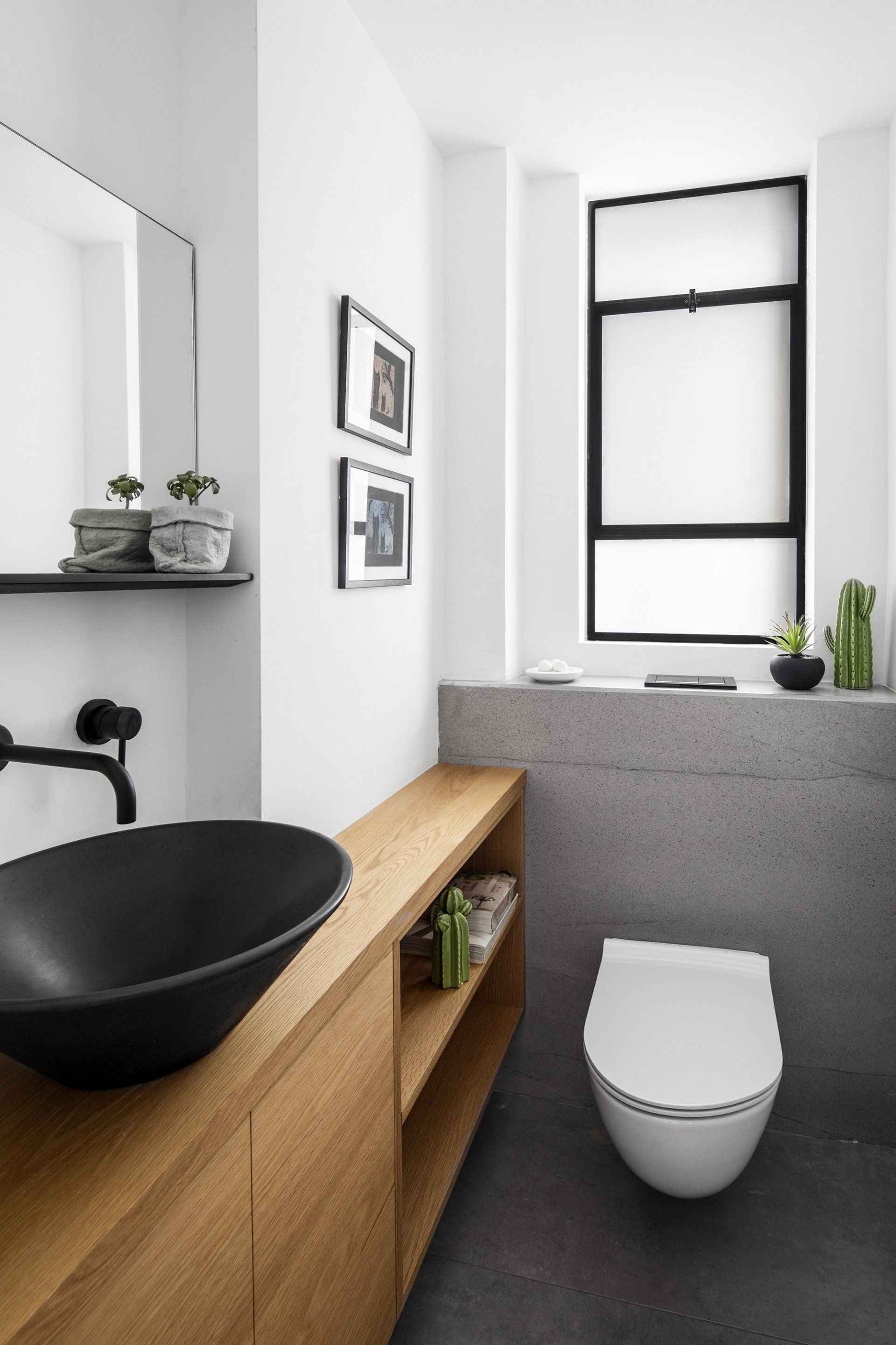
For the guest bathroom, the same cladding for the kitchen was chosen again, combining oak woodwork and a black sink.
"Another space that I love is the boys' study area on the first floor. An open space next to the staircase, where I designed a library of random cubes in three finishes white-balck-oak combined with a desk."
Coming upstairs to the living floor there are on the right a work area, the boys' rooms and a bathroom and on the left the pampering master suite. The entire floor is covered with natural oak parquet, which creates a warm and pleasant feeling.
In both children's rooms there are white wall cupboards in front of the bed and a gray desk. The paintings and prints created by the son were framed and hung around the house.
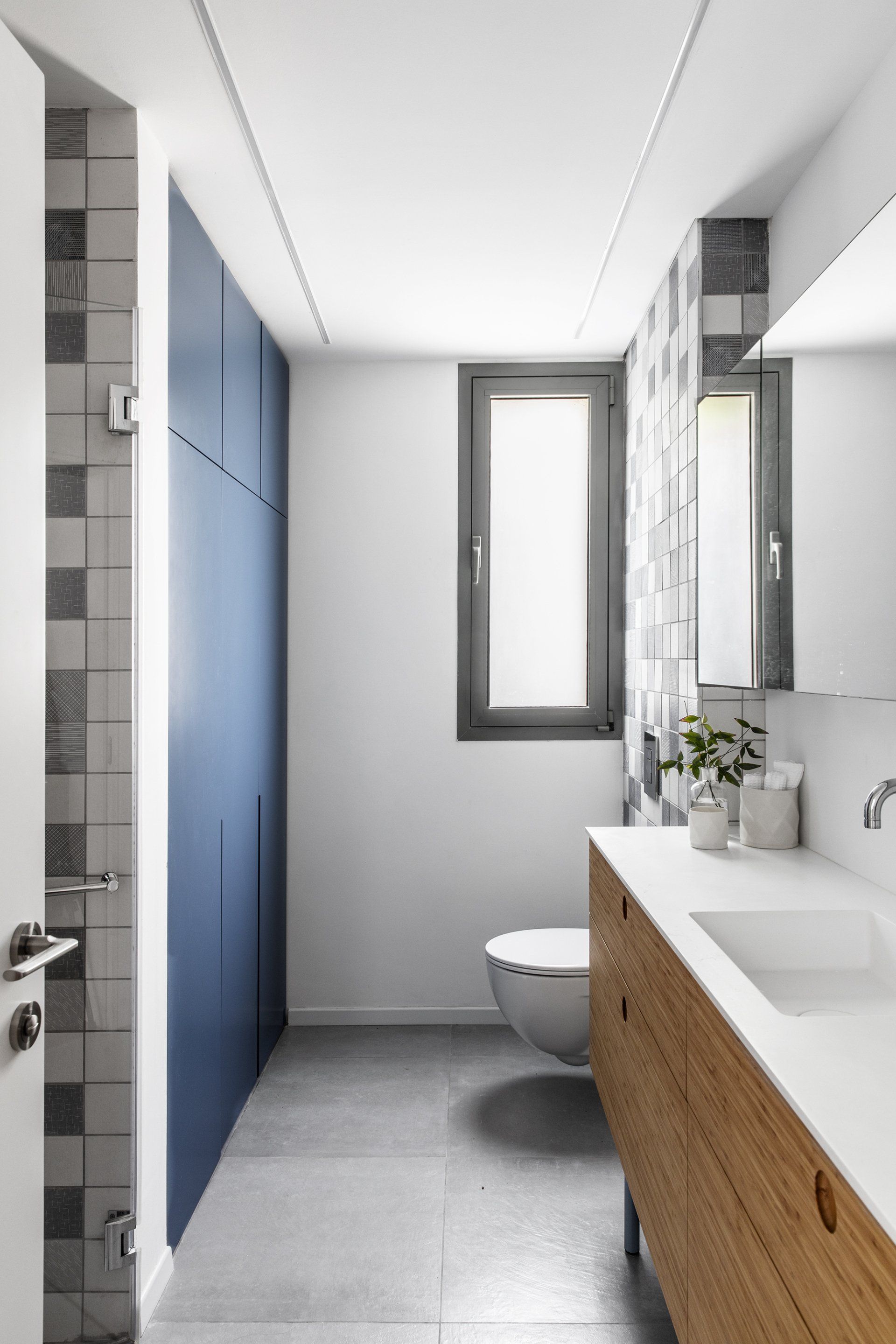
The bathroom is also in shades of gray and blue with a laundry and storage closet, a pampering shower and a large bamboo sink cabinet combined with a Corian countertop and a light blue painted metal leg. The top mirror cabinet incorporates lighting inside and reflects off the shower.
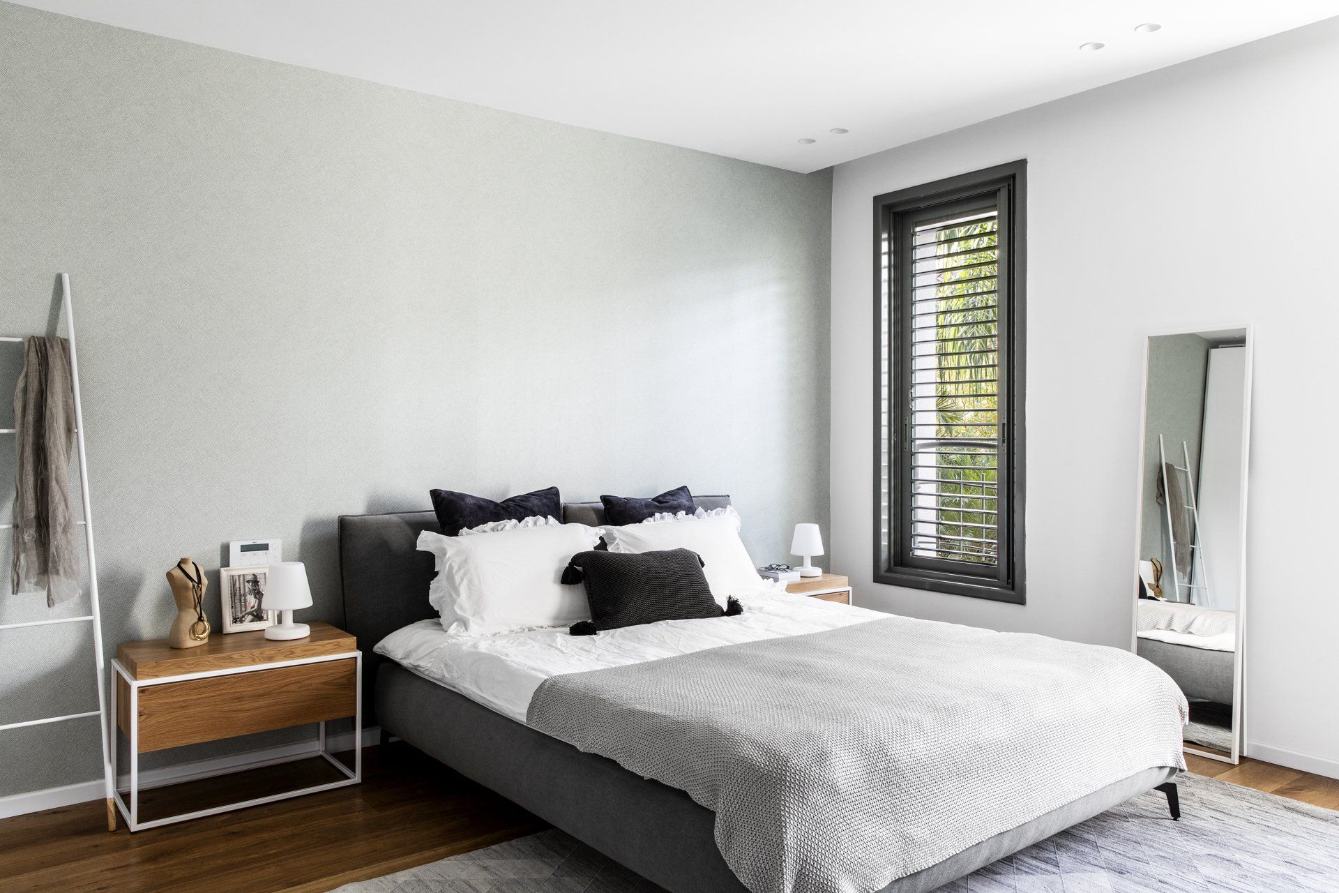
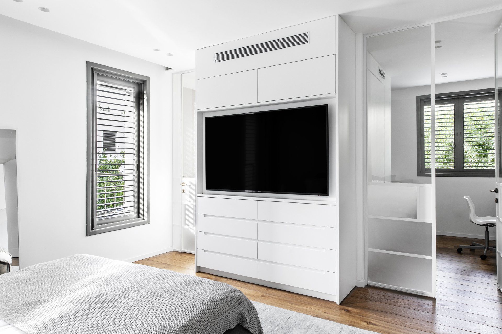
The spacious master suite is divided by a large closet with TV, air conditioning and storage system, the closet combined with doors of white Belgian profile form a division into three areas.
The en-suite bathroom is minimalist with a spacious shower and a sink cabinet in an oak veneer finish combined with Corian.
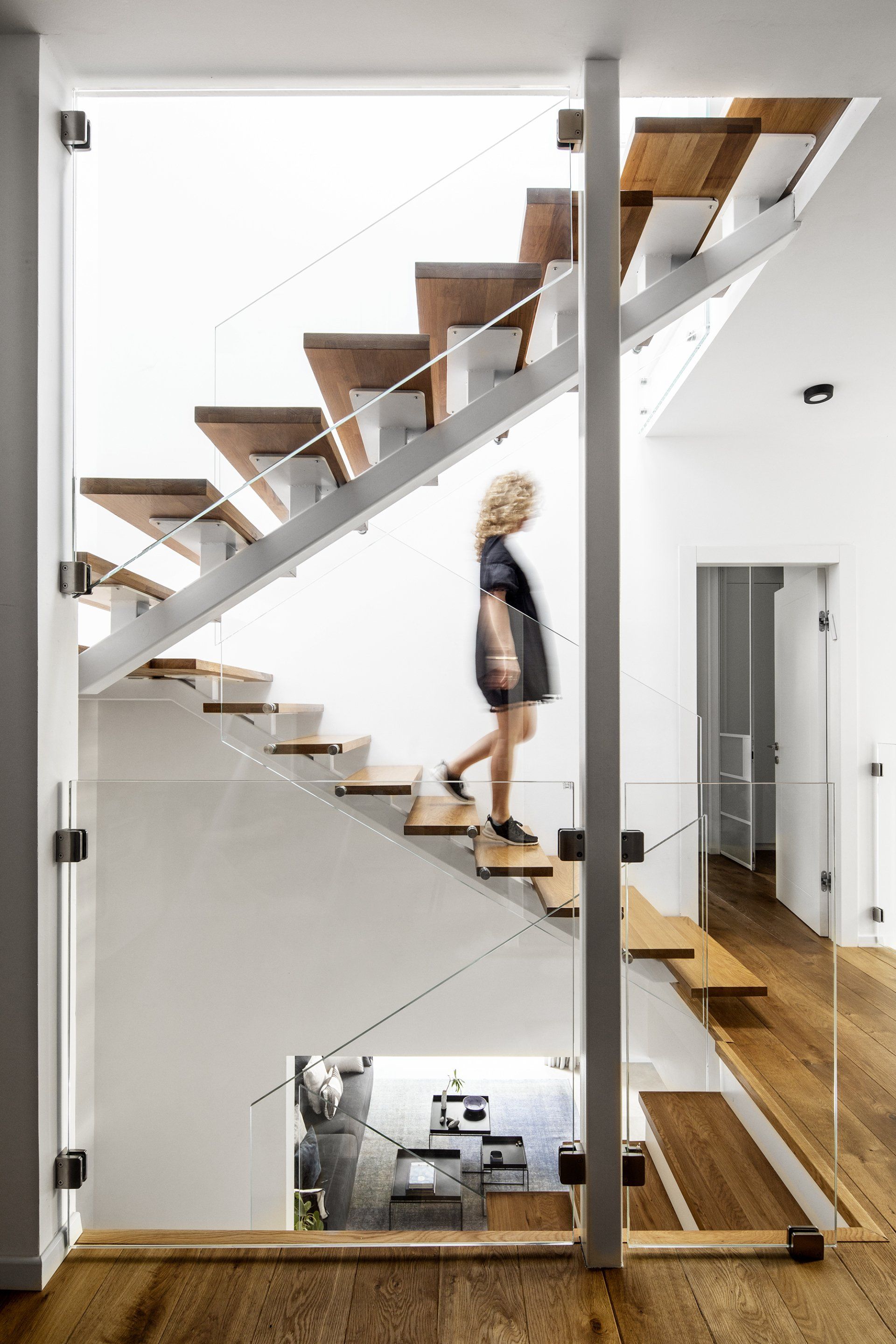
The new staircase is built of white iron construction combined with oak sidewalks and a clear glass railing leading to the roof floor. The roof has a sloping ceiling and a large skylight window that lets in light to the entire stairwell.
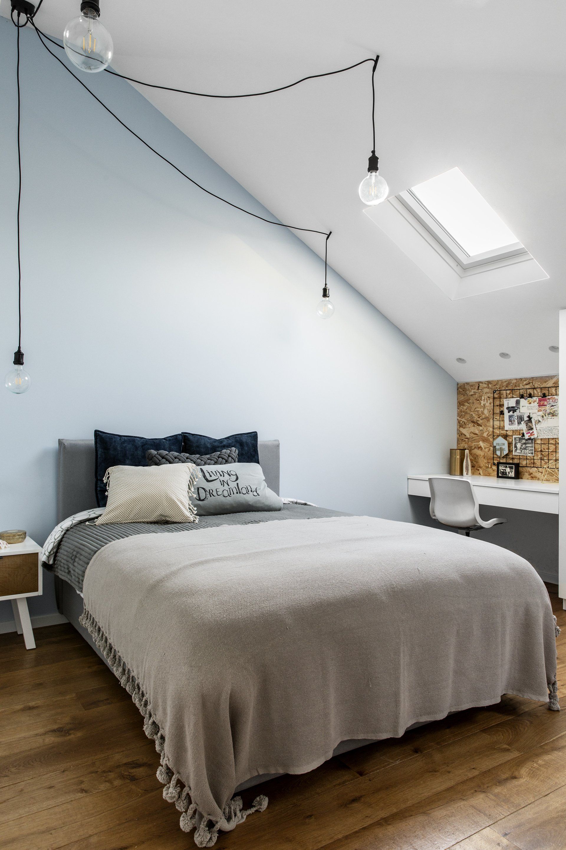
The eldest daughter’s attic room utilizes the ceiling slope in favor of additional storage combined with a work area. A light gray bed combined with a light blue wall create a young and clean look.
The daughter's bathroom is also in blue and gray combined with a bamboo cabinet in a special design that utilizes the sloping space in the optimal way.
Photography
Itay Benit
Interior Design
Maya Sheinberger Interior Design
SHARE THIS
Latest Edition
Mar / Apr 2026 edition is available now!
Contribute
G&G _ Magazine is always looking for the creative talents of stylists, designers, photographers and writers from around the globe.
Find us on
Latest News
Subscribe
Keep up to date with the latest trends!
Popular Posts
