The Magic Box Apartment
In a two stories old family house located in the center of Viladecans, an industrial town located in the Barcelona belt, Raúl Sánchez Architects renovated the ground floor destinated for a couple and their two daughters.
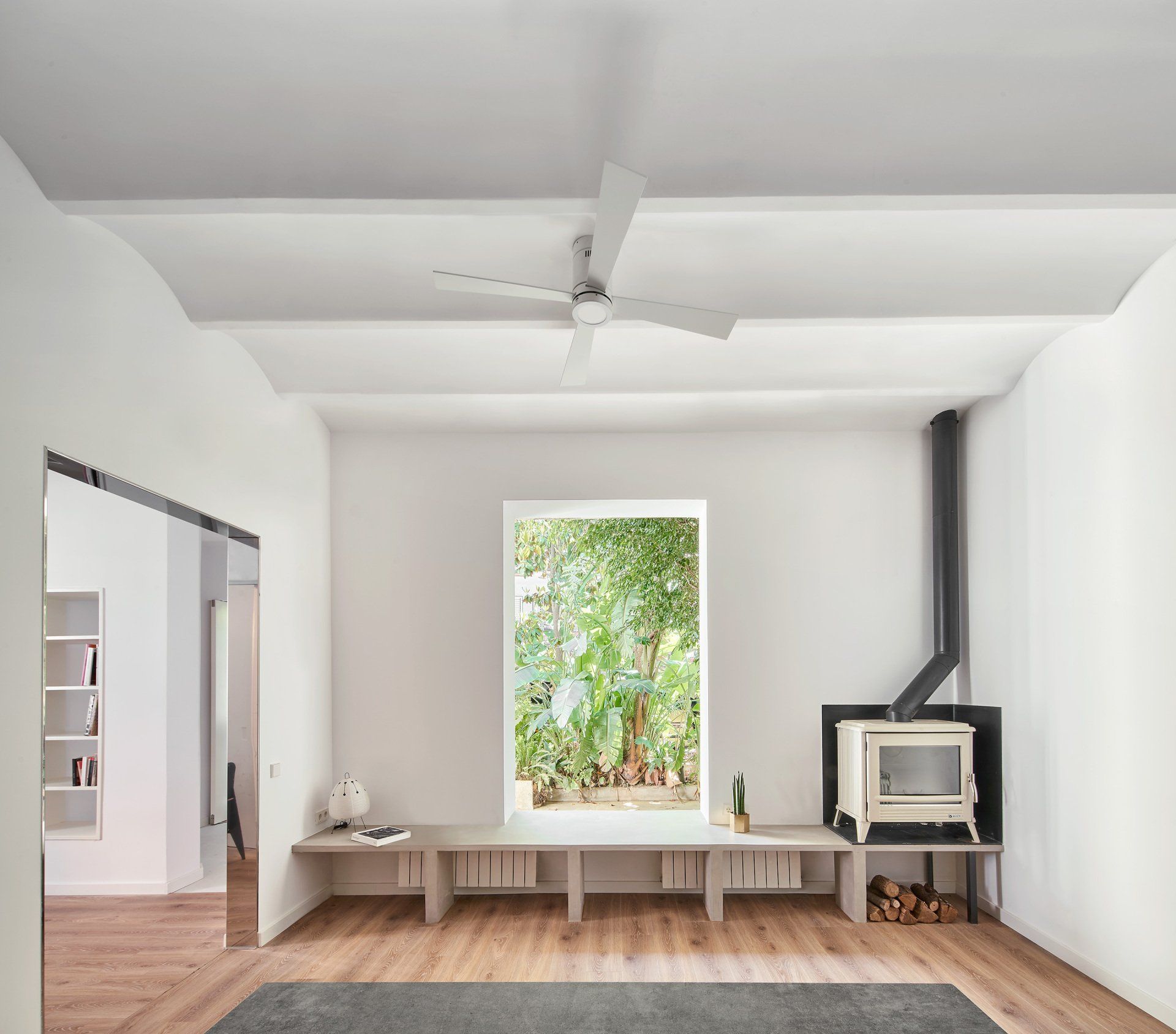
The house, with a corner location, is characterized by a structural wall that runs longitudinally and creates two well-defined bays on each side. From the beginning, it was decided not to intervene on the structure, so this wall became a backbone of the new proposal, which did contemplate the demolition of the rest of the interior partitions. In this way, from the entrance, a spacious hall opens, made up of a series of planes/partitions that twin with each other, announcing from the entrance that it is a new language, also opening gaps in the upper areas to allow the light from outside enters this area. Next, a common kitchen and dining space connects to the outside garden, with profuse vegetation, which was respected, connected to the inside through a longitudinal bench that slides into the window opening (enlarged with respect to its original size). The window itself was placed on the exterior face of the facade plan, turning it invisible from the interior, creating the feeling of being in close contact with the exterior.
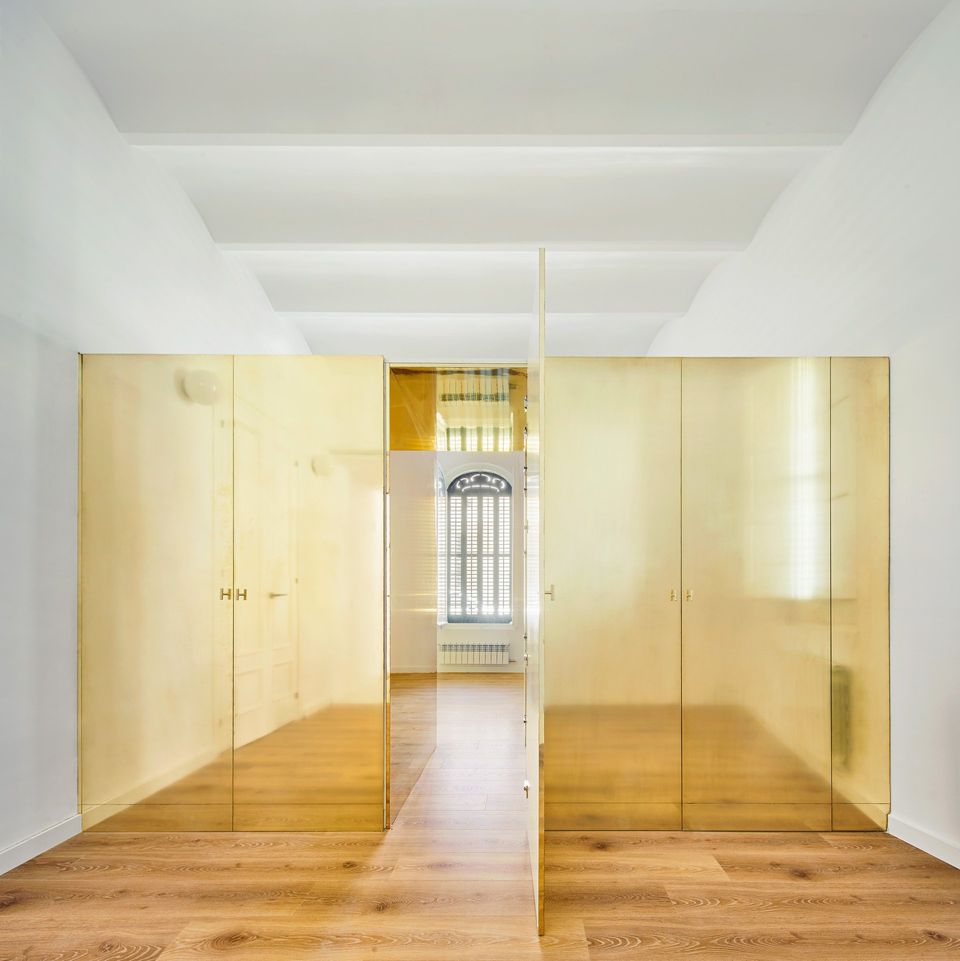
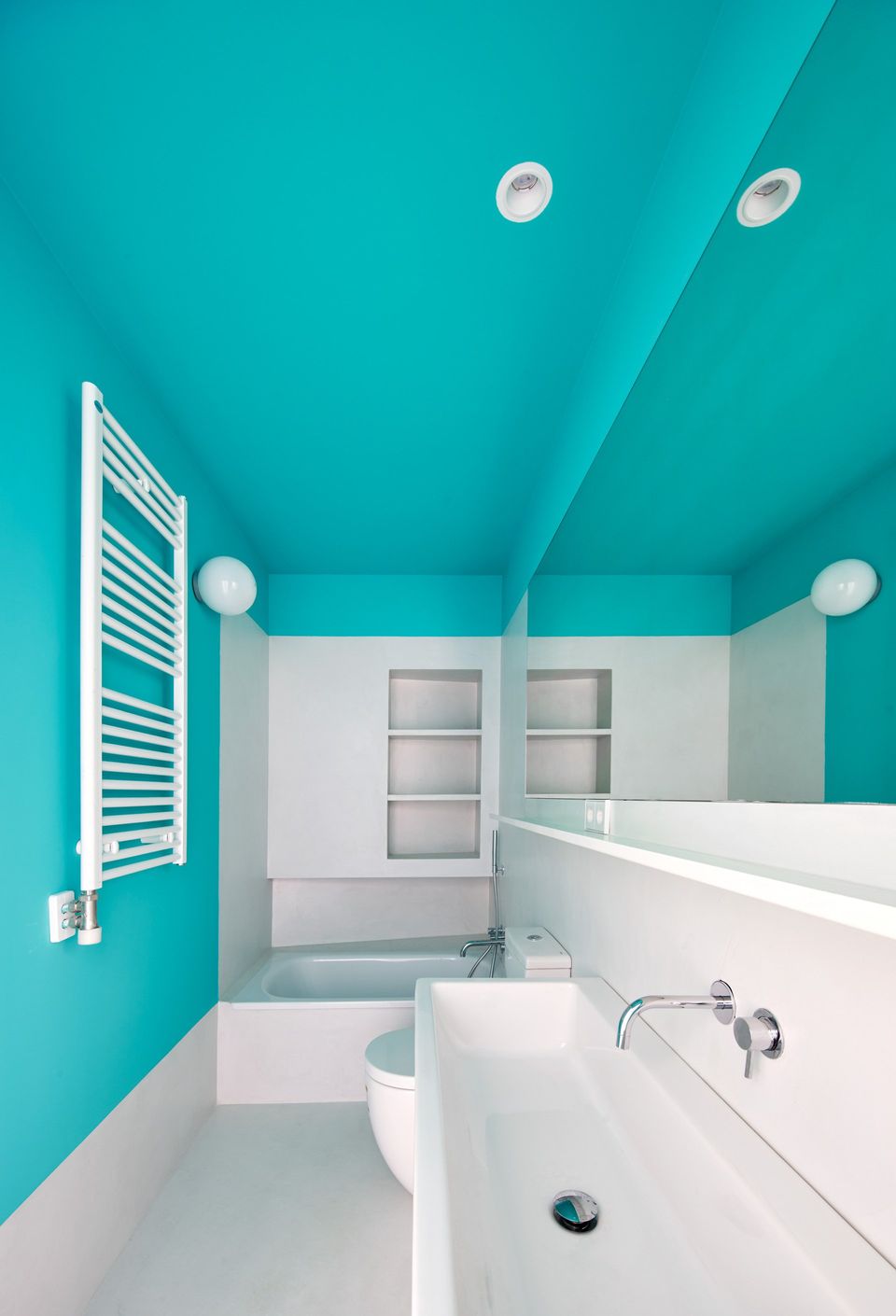
On the other side of the load-bearing wall, a continuum of rooms is developed, which communicate with their own doors with the access area and the kitchen-dining room; but they also communicate with each other by means of alternative connections, which increases the spatial experience and the interior complexity of the house, since there are always two ways to get to the same place. There are four rooms (three bedrooms and a living room) and three service areas between them. The two smaller bedrooms, intended for the daughters, are actually one same space, in which the magic box is located in the middle: an abstract volume, like a jewelry-surprise box, made of brass, golden and shiny, which encloses the wardrobes, but also a secret passage between the two bedrooms through its central door. This magic box has a height of 210cm (the ceilings are 350cm), and can be climbed on top, making it a place for the girls. The requirement to design a special space for the daughters was present from the very first moment of the project, hence the project itself takes its name from this element.
The material strategy is restricted, but it influences the subtle spatial changes of the project: the flooring of the rooms is made of wood, but it changes its direction on either side of the load-bearing wall; in service areas (bathrooms and lobbies between rooms), the floor changes to white microcement, marking the transition between spaces that these areas represent; brass pretends to be a special material of a precious but mysterious object; lintels and jambs are clad in stainless steel to mark the passage of spaces that, despite being open to each other, change their function (the passage from the entrance hall to the kitchen-dining room; the passage from the kitchen-dining room to the living room ). Finally, a few color interventions were carried out, which subtly highlight the transition between spaces, aligning the color marks with the extension of axes, some of them visible (aligned to constructed elements), and others invisible (corresponding to elements of the design process).
Interior Design Raúl Sánchez Architects www.raulsanchezarchitects.com @raulsanchezarchitects
SHARE THIS
Latest Edition
Mar / Apr 2026 edition is available now!
Contribute
G&G _ Magazine is always looking for the creative talents of stylists, designers, photographers and writers from around the globe.
Find us on
Latest News
Subscribe
Keep up to date with the latest trends!
Popular Posts
