Blog Post

Mirror Image: Interview with Shona McElroy

Sep 27, 2023

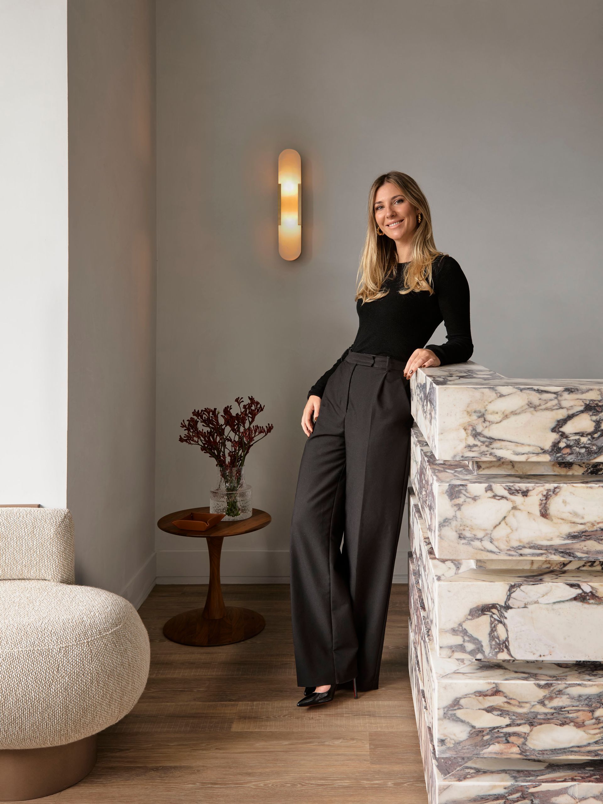
Located in Sydney’s exclusive eastern suburbs, Mirror Image is a family semi-detached house designed by Shona McElroy from Smac Studio.

ο»Ώ

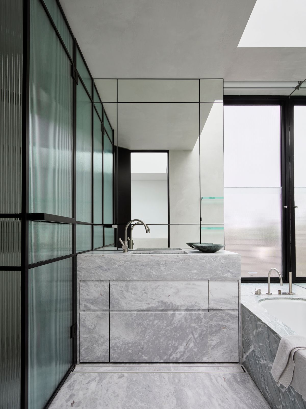
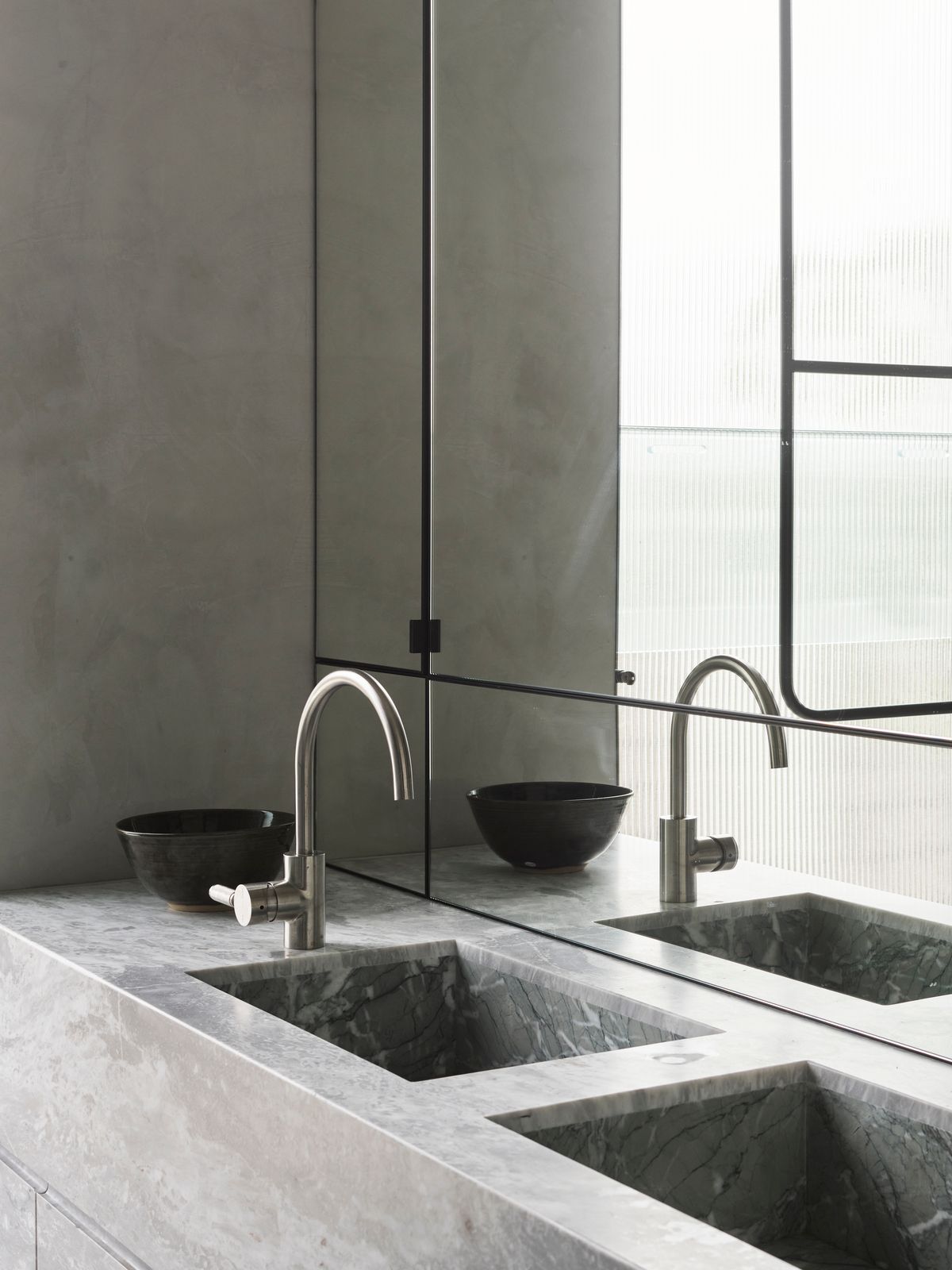
“It’s small and windowless, so I thought rather than trying to brighten it up with white paint I’d lean into the dark, tactile side of things. It’s become quite a playful space with that little optical illusion.”

Shona McElroy

  • What was the design brief for this house?

    So the design brief, funnily enough, was that the client wanted it to look like it came out of a magazine. It needed to be an entertainer's house that was quite impressive. And he said it needed to have a wow factor. And then the brief, which was a little bit of a return brief from my side, it was something we spoke about a lot, was that it needed to feel quite bright. In the other duplexes that they've done before I was brought on after construction had started and everything had all kind of started going ahead. So with this one, I was brought on before the development application went in, and we were able to manipulate a lot of the spaces to increase window size and look out on the landscape setbacks. Yeah. That's pretty much the brief.

  • Did they use any words like modernist or European or Parisian or did they leave the style pretty much up to you?

    They left it pretty much up to me, but they knew my style, and I love, I guess, modern takes on European ancient styles. So having these little design details that nod to something like your Venetian plaster and the margin shaker profile, the chevron floors, the borders and the curves, and there's a few nods to European, but then we made it quite modern with the clean lines and layout. And then I guess, added another layer with all of these contrasting materials.

  • What are the specs of the house? How many bedrooms? How many bathrooms?

    It is two and a half bathrooms, four bedrooms, one car garage, two living rooms, a pool. That covers it.


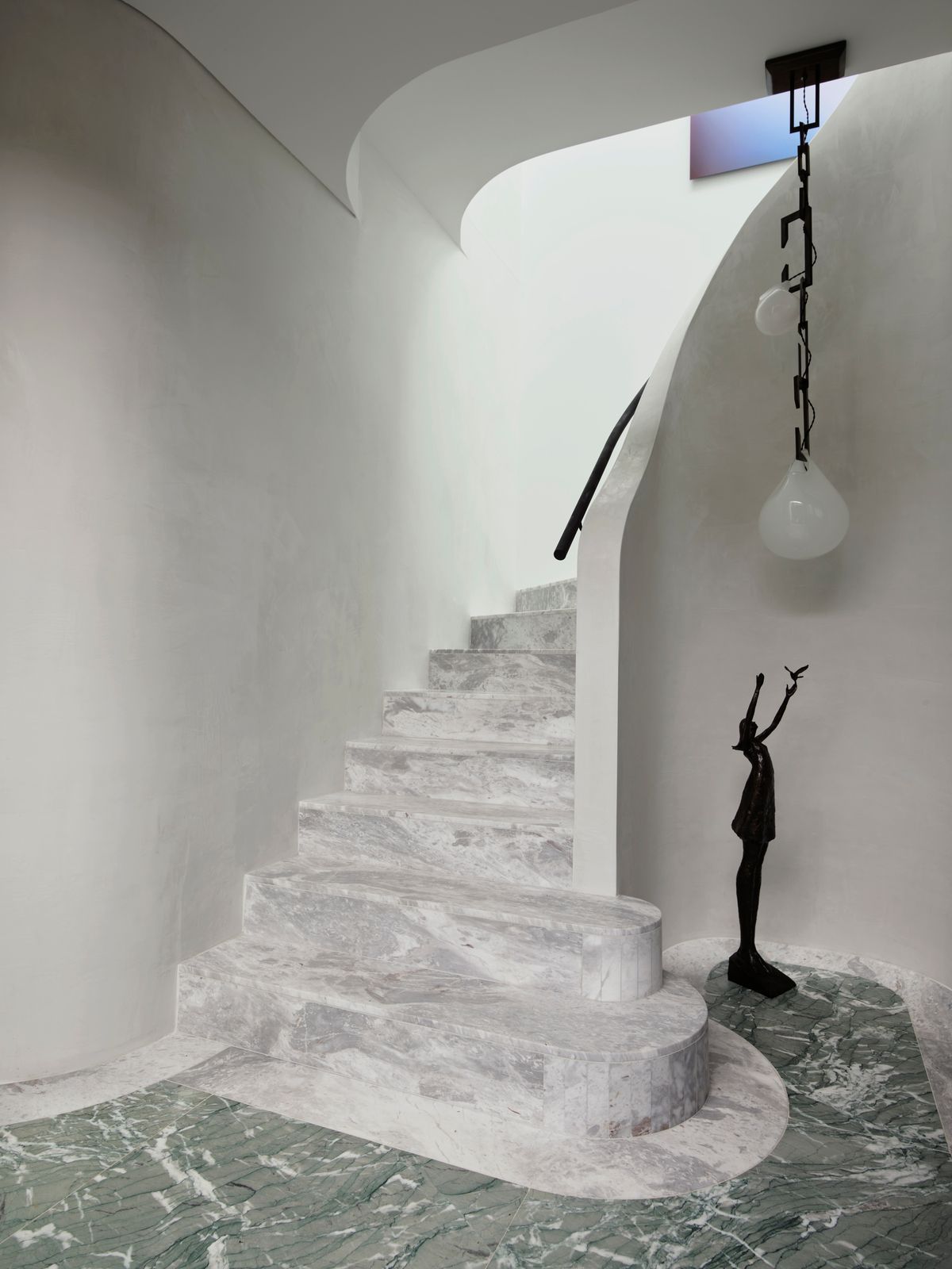
Stairway above heaven

During the design and building phases, the Elba marble staircase at the entrance took priority over all else. To make it work in a home only 4.8-metres wide McElroy and architect Gary Meyers performed some geometric acrobatics, shrinking the powder room and entrance vestibule, as well as reconfiguring the upstairs - not that you’d ever know there was a compromise looking at it now. The staircase is offset by a Nepenthes light by Christopher Boots and Bronze Statue Aurora IV by Tom Corbin. The floor is a solid slab of Verde Antigua marble.


  • Which is your favourite room and why?

    My favourite room is the entry, I think that to create an entrance in a house that narrow, we only had 4.8m of internal width to play with, to create such a formalised entrance, and separate public spaces from the private spaces, and to have it quite grand and just a sense of entrance, I think that was pretty incredible to do. A lot of the semis we'd worked on before had a staircase that I guess cut through the kitchen or cut through another part of the house and was almost like an afterthought. And I like the idea that it breaks up and divides the space. So I find it quite luxurious that you walk from your entertaining spaces, that big kitchen, living dining, external area through this marble forecourt.

    So the design brief, funnily enough, was that he wanted it to look like it came out of a magazine. It needed to be an entertainer's house that was quite impressive. And he said it needed to have a wow factor. And then the brief, which was a little bit of a return brief from my side, it was something we spoke about a lot, was that it needed to feel quite bright. In the other duplexes that they've done before I was brought on after construction had started and everything had all kind of started going ahead. So with this one, I was brought on before the development application went in, and we were able to manipulate a lot of the spaces to increase window size and look out on the landscape setbacks. Yeah. That's pretty much the brie

ο»Ώ

The green grotto

The powder room features Verde Antigua marble on the vanity and skirting, while Elba marble is used in the sink and on the floor. The walls are custom Venetian plaster in a colour based on Dulux “Hailstorm”. Petra Sconce in Pink Onyx by Christopher Boots. Tapware in brushed chrome from AstraWalker and Ostrea Rock Vase in Smoke by Hein Studio.


  • And can you describe any challenges you guys faced with the project and how they were overcome?

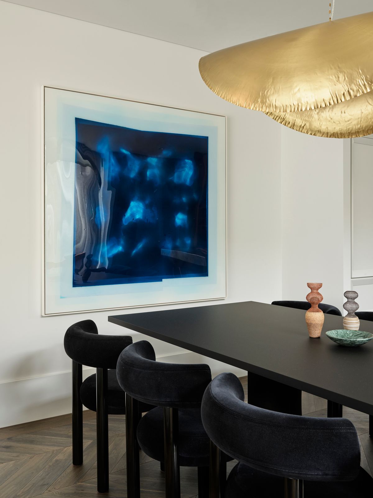
    Yes. So the main challenge from the outset concept was definitely light, and I felt that the spaces were too open plan and kind of lacked formality. So that was a challenge that we then solved and overcame by dividing up that entrance space, I think that was the most helpful, and then came the challenges of actual space. I mean, it's quite narrow and how to visually divide up the living and dining spaces so that they all felt special. We did that with the big Gervasoni pendant light and the artwork, they really ground each area as its own space, and then the kitchen with those beautiful mirrors that hide all of that joinery and just reflect back all of that gorgeous northern garden light. Another challenge we actually had, which turned out, as it sometimes does, to be our greatest achievement, was our little powder room. We really didn't want it to feel like it had been stuck underneath the staircase, but inevitably that's where we had to put it, yeah, so what we ended up doing was relieving all of those staircase lines. You can kind of see that the staircase is going up the back because it's got a piece of plywood curved over the entire roof, so in both of those ending and connecting lines of that staircase, concrete was hidden and therefore it’s you're like encapsulated in this entire big dark green Venetian plaster cave. You can't see any ceiling wall lines.

ο»Ώ

Social island

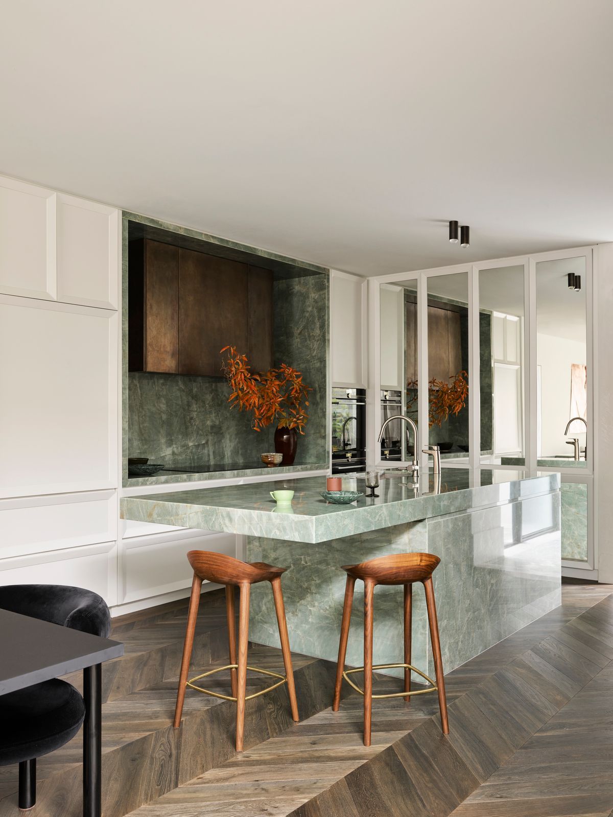
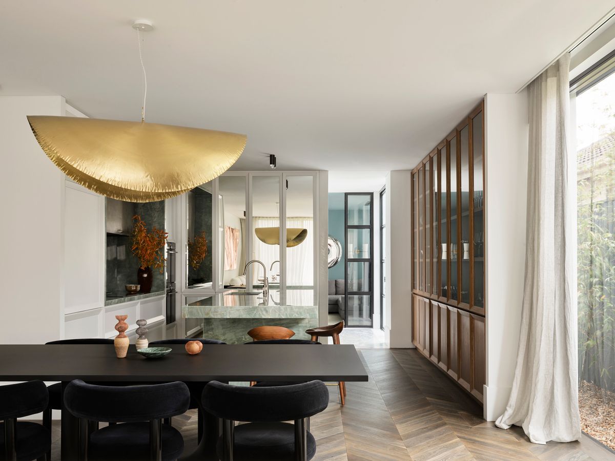
The jewel of the kitchen is the cantilevered island bench in Esmeralda quartzite. Suspended by a steel internal support, McElroy designed the bench to comfortably accommodate four people sitting face-to-face. Stools from Great Dane, Surveillance Downlight by Lost Profile Studio and tapware in brushed chrome by Astrawalker.

The stone on the island is carried through to the stove area, where it frames the solid burnished brass rangehood. The quartz has a kind of bronze veining that echoes the rangehood.

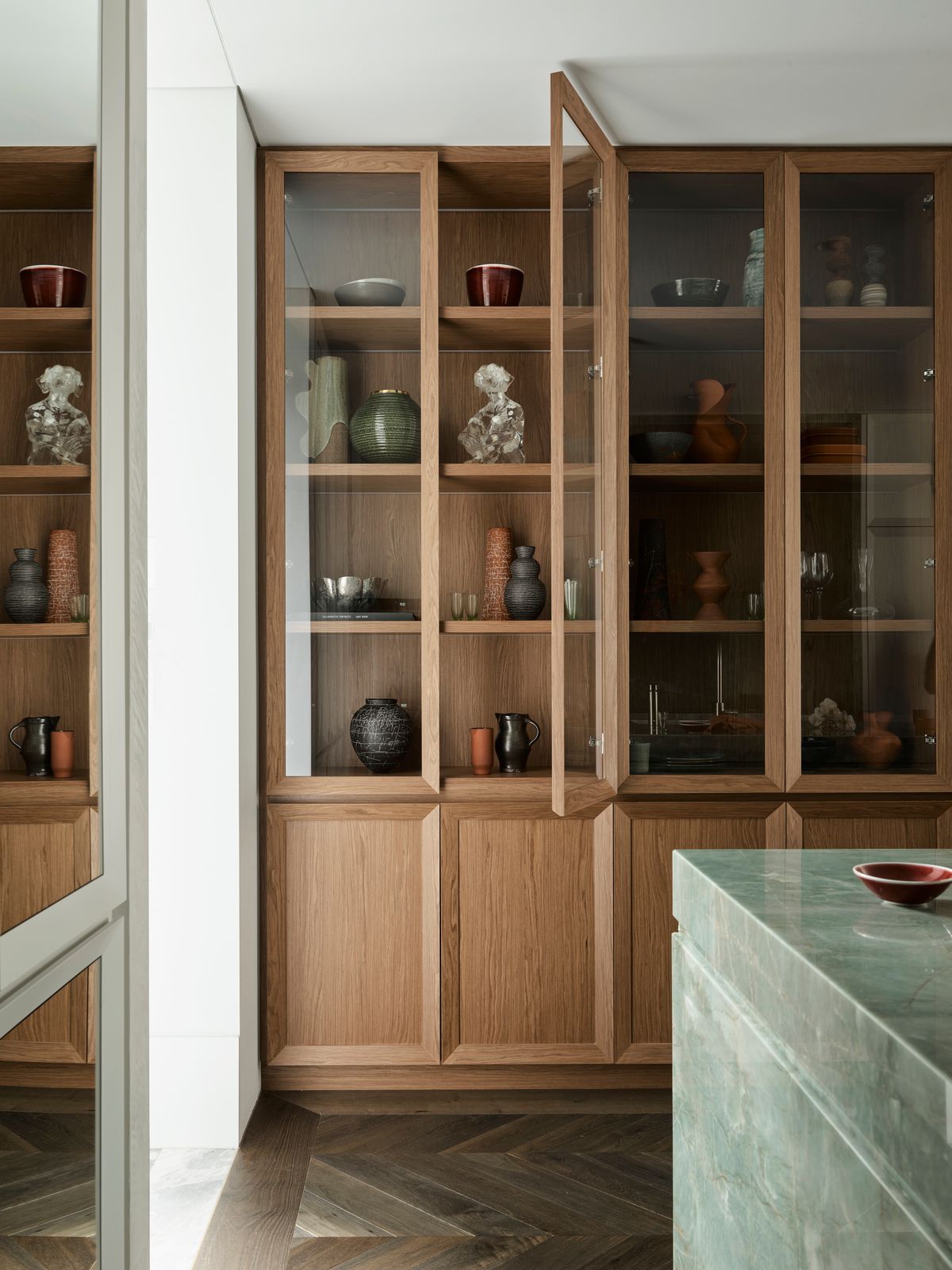
A custom cabinet with glass doors allows the owners to showcase art and photos. The timber is TrueGrain Pinecone by Briggs Veneers and was chosen to complement the herringbone floor in Otta by Tongue in Groove. Vessels and bowls from The Dea Store, Utopia Art Sydney, Palmer and Penn, Tania Rolland, Top 3 By Design, Ignem Terrae Ceramics and Saint Cloche.

To bring more natural light into the kitchen McElroy moved the stove against the shared wall, creating space for a three-metre-wide floor to ceiling window. The mirrors on the shaker cabinetry are also important: they extend the space and reflect landscaping by Dangar Barin Smith. Ingeniously, behind those mirrors is a mini butler’s pantry (complete with power points) hiding appliances and their messy cords. It’s impressive in its practicality, but the room still packs a dramatic punch via a bold Gervasoni brass 96 pendant light from Anibou over a Holo Dining Table from Fanuli.

  • Talk me through the stone choice, specifically in the kitchen.

    The stone choice was a really early love for both myself and the client. We love the fact that it was almost like an onyx. Like, you can kind of see through it, if that makes sense. And it's got this depth and character, but it also is quite airy and light. I always say it's ethereal.

  • That Sage green colour, too. I've only seen it in paint. And to see it in stone.

    Beautiful. I know. It has these little bronzy kind of veining throughout that then speaks back to our range hood. And it's got these kind of greys and white. It's stunning.

ο»Ώ

A room made for living

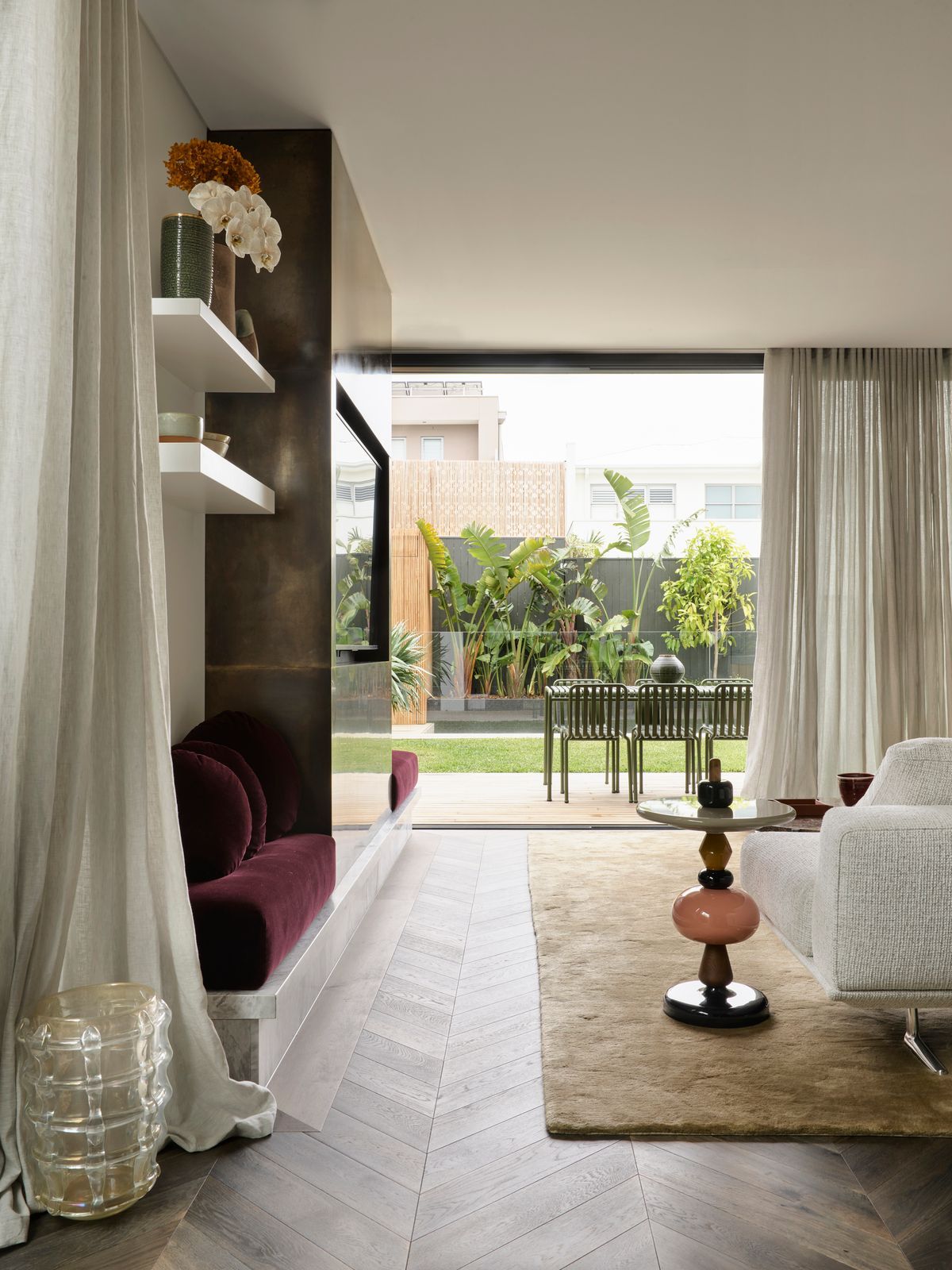
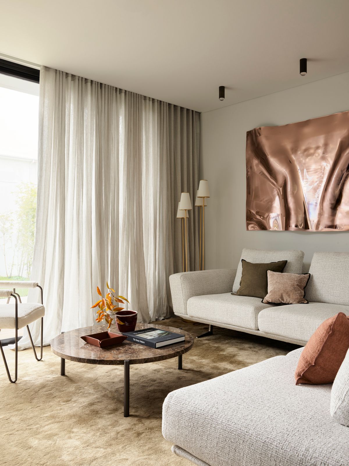
McElroy is passionate about art and believes it brings personality to a space, so Anna Pesce was commissioned to create something bold and reflective for the living room.Appearing metallic but actually made of perspex, the 3D wall sculpture pulls focus and injects levity into a palette that is otherwise neutral. 

Tenero Rug in Old Gold by The Rug Establishment, Belleaire Sofa by King Living, Aerin Montreuil Lamp from Bloomingdales. Cushions are from Spence and Lyda, Tigger Hall Design and Montmartre Store. Coffee Table from Spence and Lyda, leather tray from Great Dane Furniture and side chair from Coco Republic.

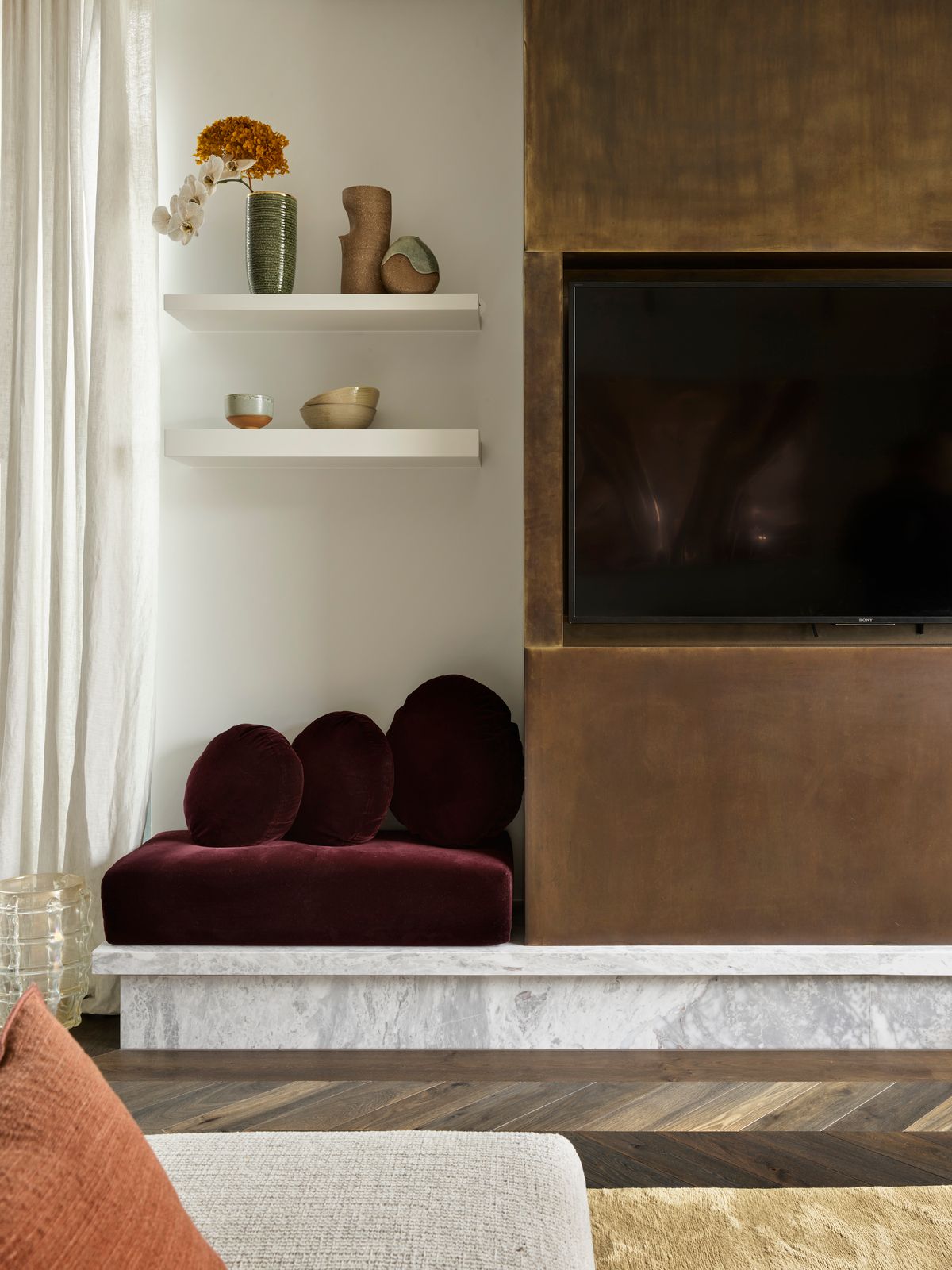
A cheeky velvet bench seat on Elba marble provides extra seating for big parties. Custom upholstery in Rubelli Velvet via South Pacific Fabrics. Custom burnished brass TV cabinet by Smac Studio. Vessels on shelf from Palmer and Penn, Saint Cloche and The Dea Store.


  • How would you describe the final result with Mirror Image?

    I definitely think it's nailed the brief with the wow factor. I think the final result is very striking. It's one of those projects that a lot of people are like, I wouldn't have expected to love this, but I do because it comes off as, like, maybe loud. But when you're in, it has so much personality and warmth. And I guess this mishmash of materials that actually feel so, like, rich but still quite homely.


Photography Anson Smart

Architecture Van Rooijen Meyers Architects (architect Gary Meyers)

Landscape Architecture Dangar Barin Smith

Interior Design  Smac Studio

SHARE THIS

 Subscribe

Keep up to date with the latest trends!

Receive a dose of inspiration directly into your mailbox!

 Contribute

G&G _ Magazine is always looking for the creative talents of stylists, designers, photographers and writers from around the globe.

WRITE US

 Find us on

 Home Projects

By G&G _ Magazine 10 Oct, 2024
Led by Weronika Budzichowska, the design studio To Be Design projected a flat featuring natural materials, subdued colours and breathtaking views from the windows.
By G&G _ Magazine 08 Oct, 2024
Located in a classical building stylized under the Stalinist era in Kyiv, Nastia Mirzoyan designed a 55 m² apartment providing a harmonious blend of interior design with the building's architecture .
By G&G _ Magazine 05 Oct, 2024
Papundekl Architekti projected a small apartment in a Prague block of flats from the late 60s has not been renovated yet.
By G&G _ Magazine 28 Sep, 2024
MAKHNO Studio designed a two-story apartment in the centre of Kyiv that combines various styles, aesthetic directions, and shades of art.
By G&G _ Magazine 26 Sep, 2024
Mario Montesinos Marco projected the apartment inside an old neoclassical building in the heart of Valencia, causing extensive structural damage with a deafening crash.
MORE

 Popular Posts

By G&G _ Magazine 02 Oct, 2024
The first Moxy Hotel in Thailand and the largest in Asia Pacific, Moxy Bangkok Ratchaprasong , sparks boundless joy and infuses energy into the heart of the Thai capital.
By G&G _ Magazine 02 Sep, 2024
Designed by the Miami-based Arquitectonica, with sophisticated interiors by ODADA and lush landscape architecture by VITA, the project occupies one of the last available pieces of land on the South Shore in Honolulu on the Hawaiian island of O‘ahu.
By G&G _ Magazine 14 Aug, 2024
G&G _ Magazine x MEGA SHOW Bangkok

- CURRENT  ISSUE -

SEPTEMBER 2024

Share by:
G&G _ Magazine