Klinker Apartment
May 25, 2020
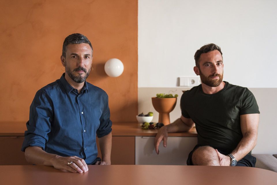
This is a holiday Barcelona apartment with a partial refurbishment and complete interior design realised by Andrea Serboli and Matteo Colombo from CaSA.
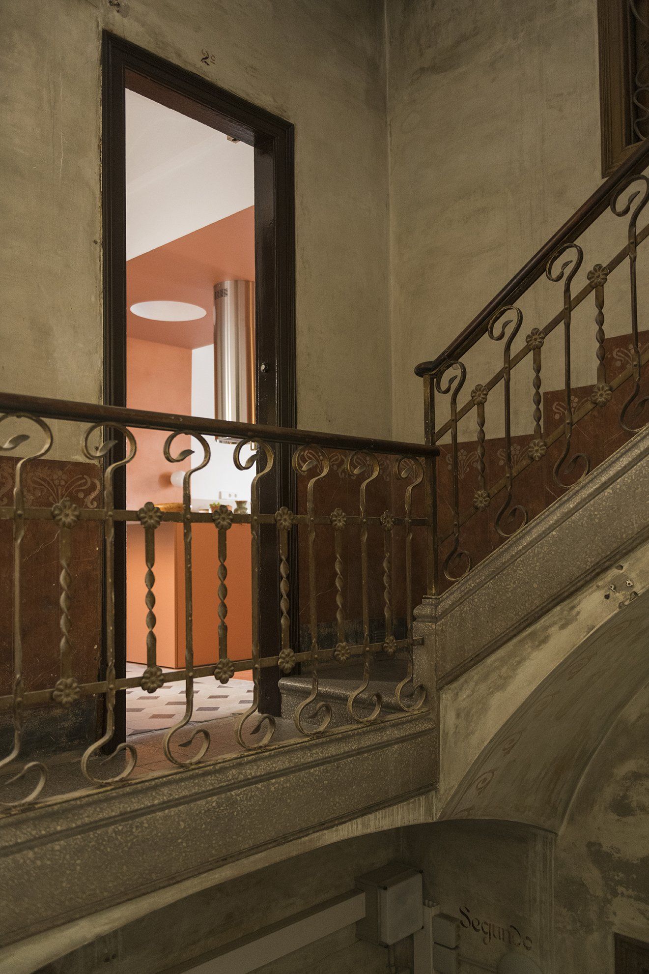
The apartment is located in a nicely featured art nouveau building in hip Born neighborhood, on the top floor. The clients, the Klinkers, are a young family of four, residents of Coronado, California, though Marta is originally from Barcelona. They came to CaSA after a terrible experience: after purchasing the property in order to have a holiday apartment in Barcelona, Marta (an interior designer) wished to refurbish it with her design, partially inspired by CaSA’s projects and relying on a contractor. Disgracefully only one day before inauguration a big explosion burned the flat down, along with a great part of the works recently completed, leaving the clients’ budget to a low and damaging severely some of the property’s ancient features. One year later they contacted CaSA from Coronado, deciding to refurbish it once again, from a distance.
The property needed a major update, after the unfortunate events. The initial brief was to provide a budget-friendly project, due to the loss of the investment in the first burned-down rehabilitation. A clever use of materials was mandatory, as well as making the most of the existing distribution and installations. In spite of that, the apartment had to look dramatically different by the end of the works. Once setup the project’s essentials, other special elements could be evaluated separately and added to it. Both clients and architects wanted the historical features to be preserved or rescued and highlighted, making the most of high ceilings, decorative features, floors, windows, doors.
The initially tight budget restrained architects from demolishing or changing layout and obliged them to keep the existing installations. The challenge was to take the given spaces and make new sense of them, change the meaning and uses without moving walls, a new interpretation of spaces. The original layout already included an open kitchen, living, two bedrooms (for parents and kids) and a small bathroom. Project-wise, most of the thought had to go into making sense of the main area, in order to order the rest of the project. This central area had kitchen installations on the back wall, and a recessed, dark area in the opposite that in the previous project hosted a small dining area.
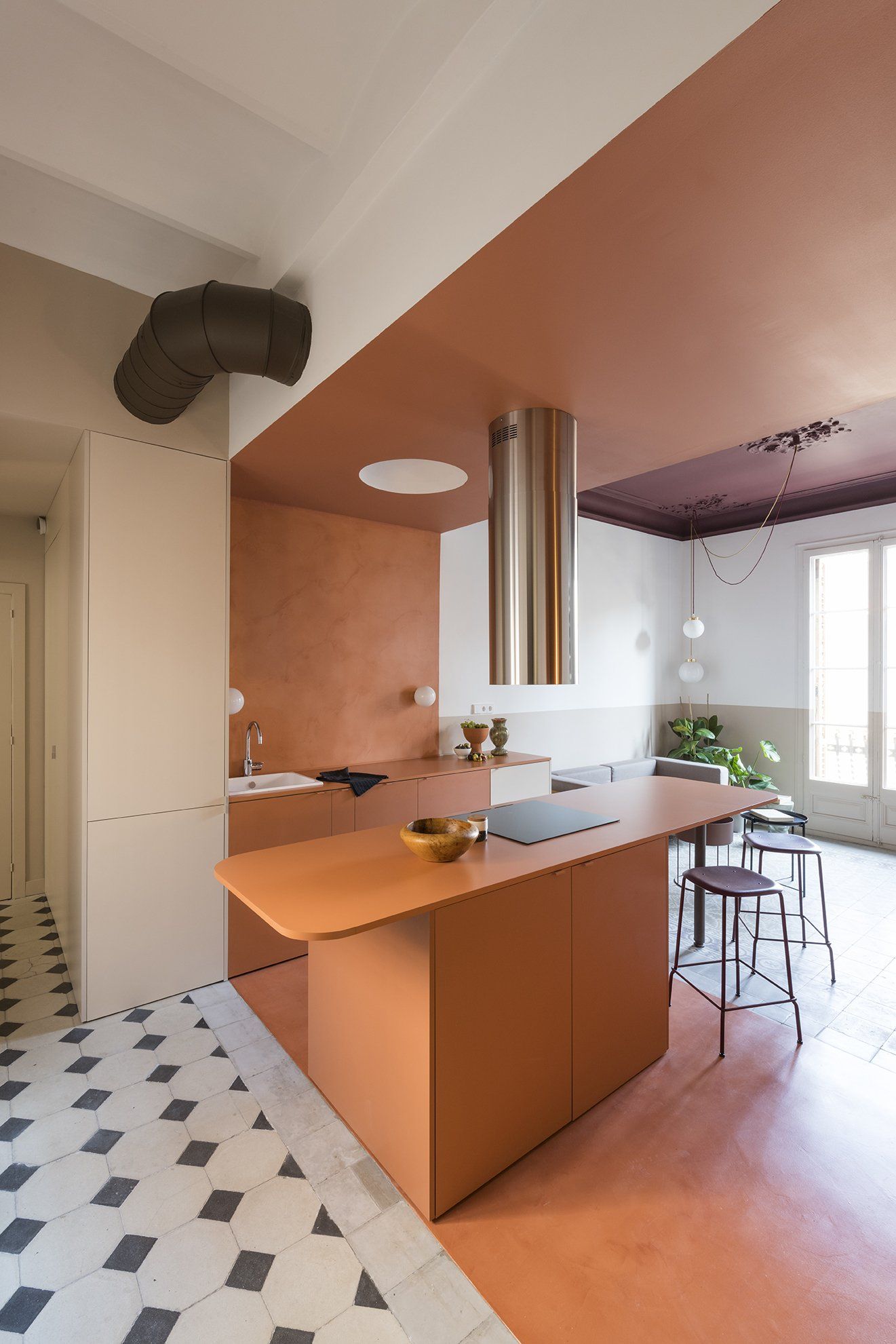
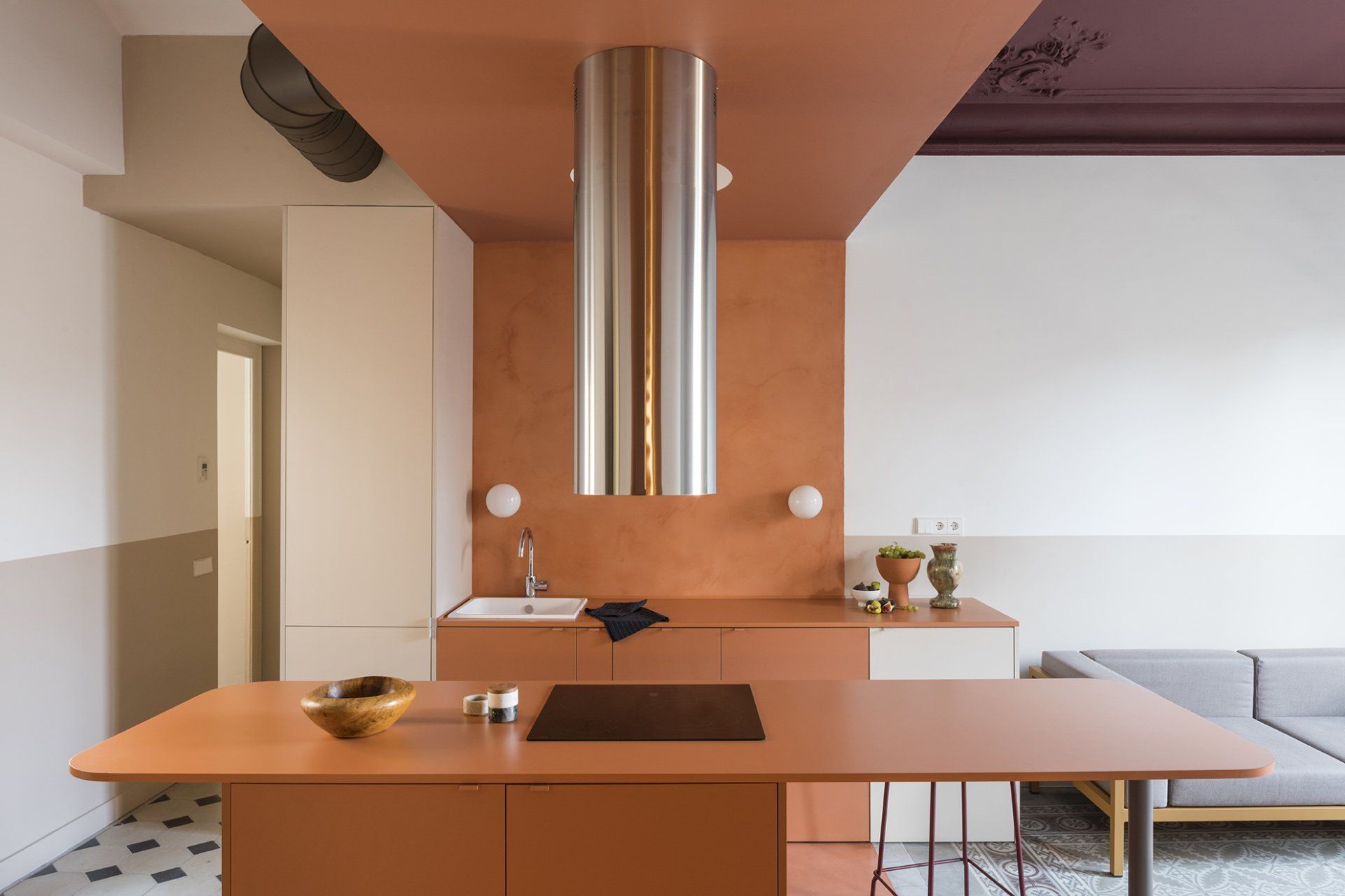
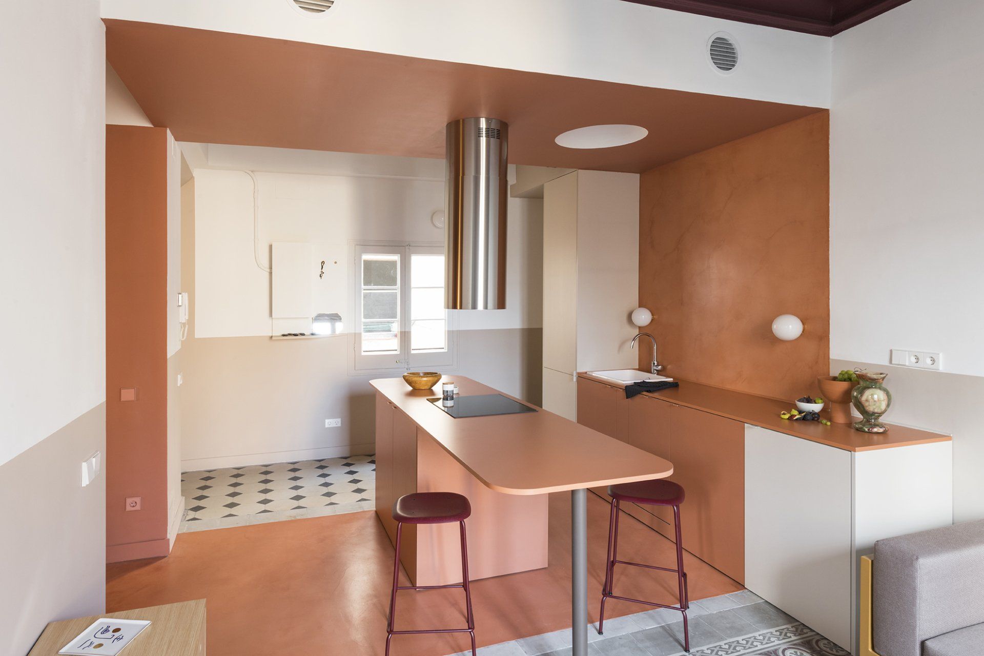
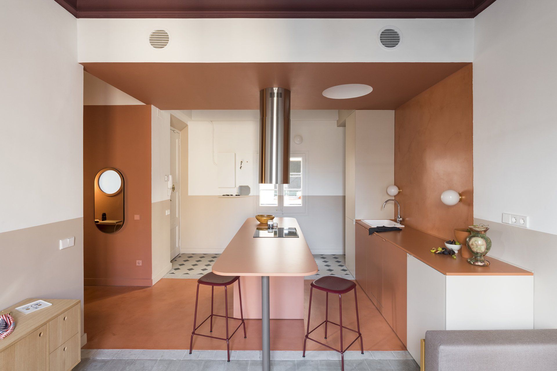
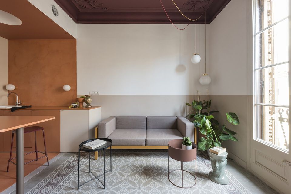
Architects decided to treat the central area as a colour-block. This brick-like core orders the space around itself, embodying several functions (kitchen, dining, studio). To create this distinct area, the architects decided to dip the whole space in a rich terracotta colour, including the recessed area that will be use as a quiet studio corner. The whole ceiling area above the kitchen was dropped, disguising the beam and the air conditioning ducts.
Micro-cement floor of the same hue cover three different types of tiles (the least interesting ones), unifying the block and highlighting the adjoining floors, of greater value, of entrance and living room. The same earthy tone is used for the micro cement backsplash wall, the ceiling, the kitchen cabinets including the long, roundedged central island, as well as for the studio area, desk and shelves. The result is a colour-block area that makes a distinctive statement at the core of the apartment. A long kitchen island doubles as dining table, in axes with the windows and the lane it faces onto. Shiny, steel, kitchen fan cylinder overhauls above the hobs. A bespoke, white plaster dome above the work area disguises a spotlight, replacing a celling lamp. Small globe appliques are placed on the backsplash.
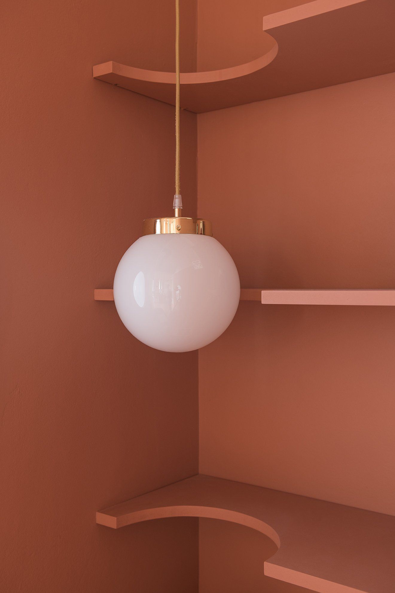
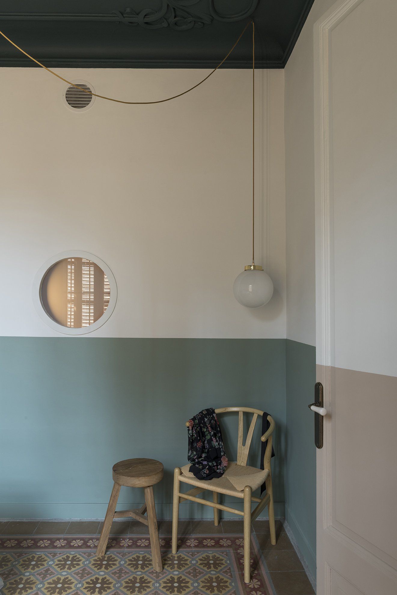
The studio area is nested in a recessed space opposite to the kitchen, with bespoke desk and shelves cut with a circular shape to allow a small globe pendant lamp to hang on them, all in the same colour. A porthole window punctures a wall, bringing a dash of natural light into the space.
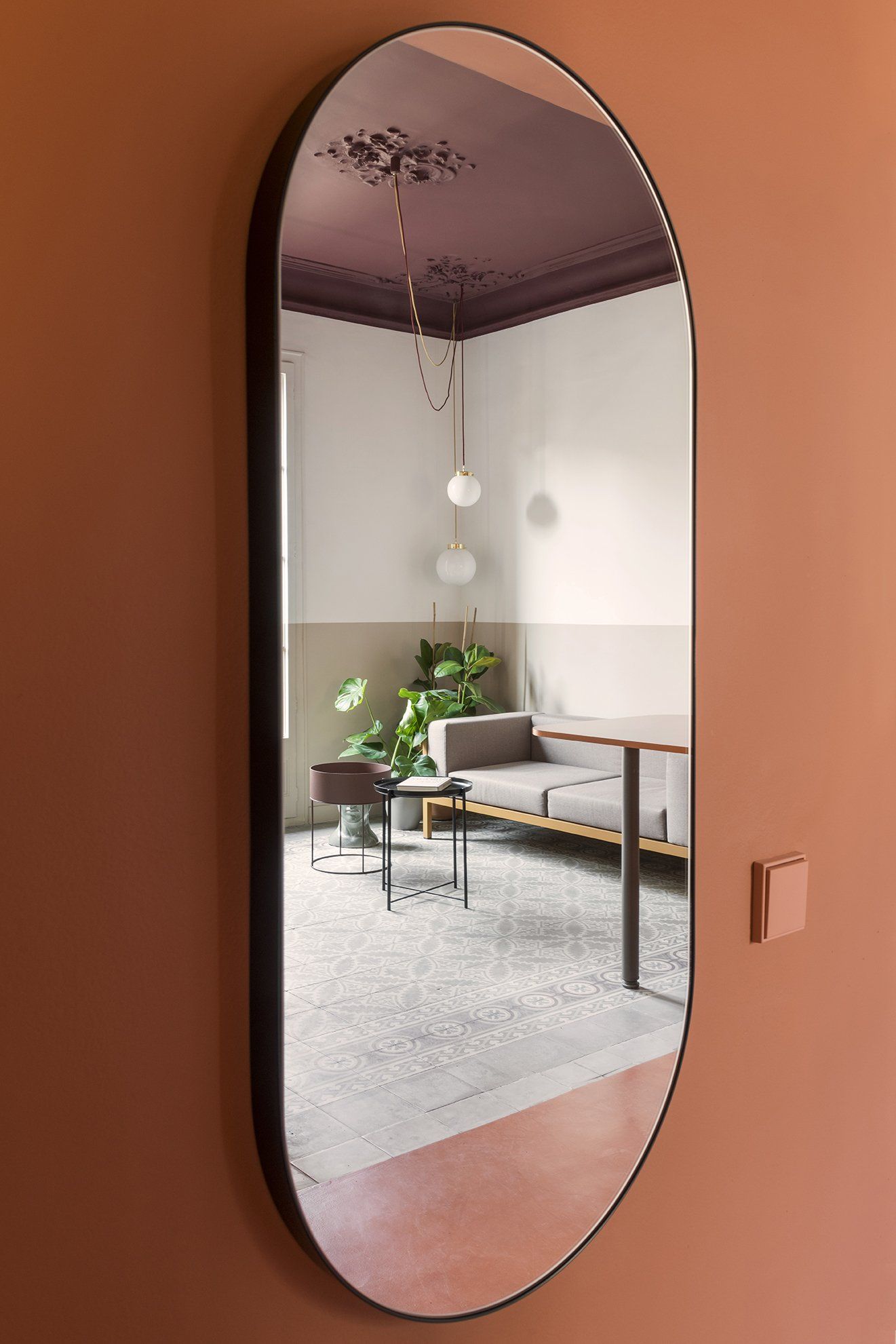
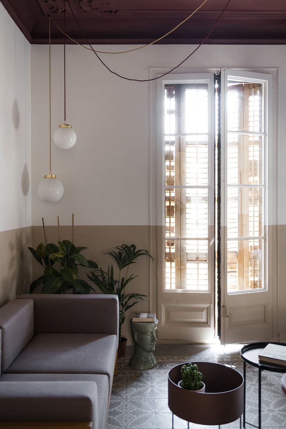
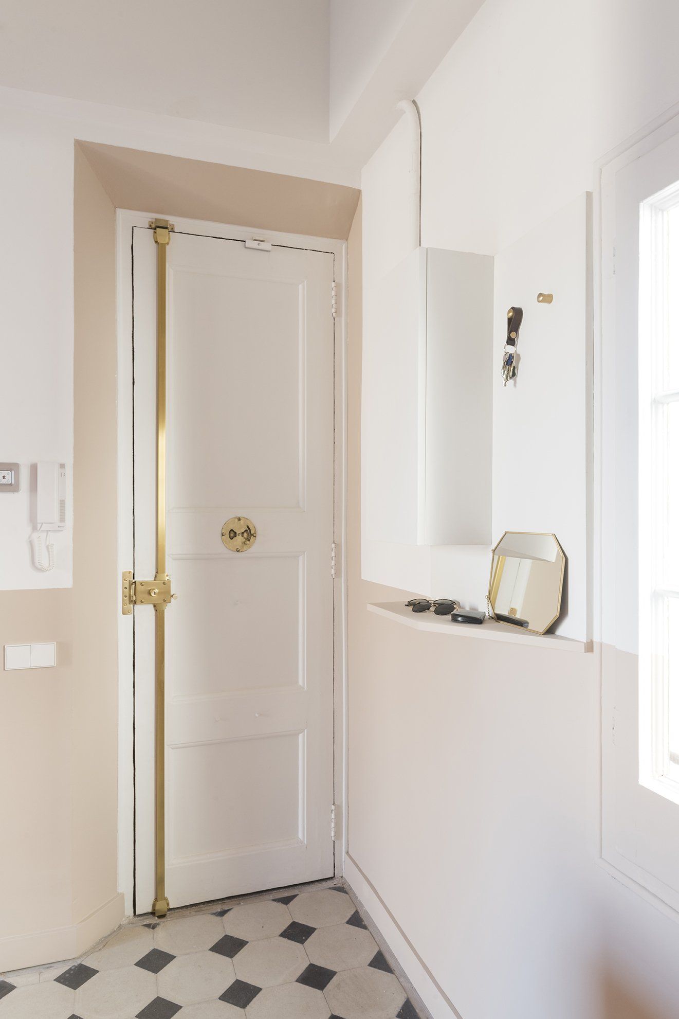
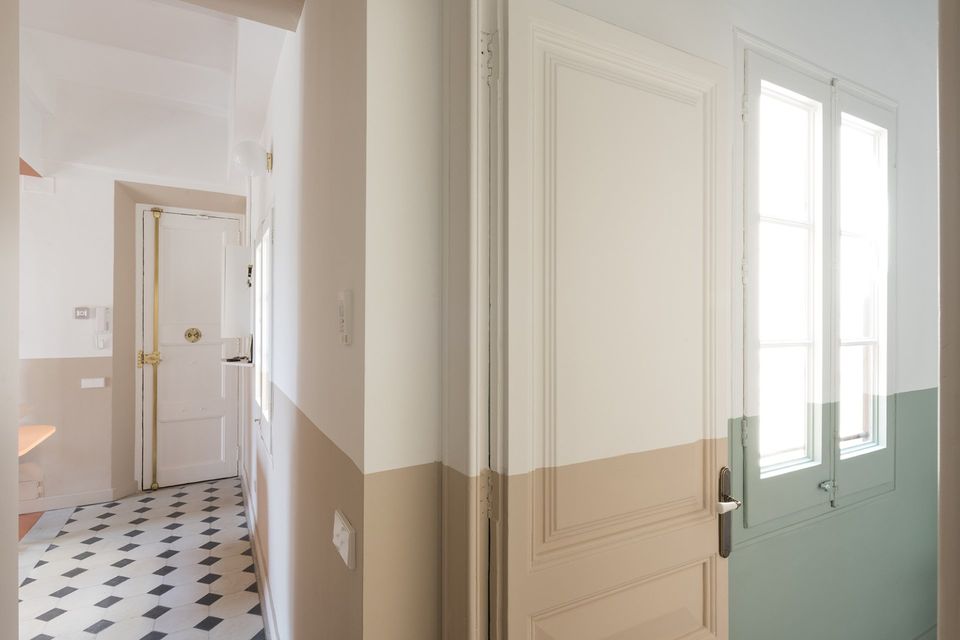
A holiday apartment allows for more daring colour choices. Architects picked a soft palette for the property. Outside of the brick-coloured core, walls are white to maximize light. Even so, a valance runs around walls, doors and windows, giving an artificial horizon, visually widening spaces, in an otherwise vertically proportioned property. This fringe has been chosen based on the spaces and in relation to the colourful, original hidráulico floors: a more neutral sand brings warmth through entrance and living (unifying the spaces on both sides around the the kitchen block), making the burgundy and greys shades of the living floor stand out.
All fixed furniture is bespoke. Cabinets in kitchen have custom-made door handles, lacquered in colours that match their surfaces. Besides the architects chosen the stylish furniture in ech room as stools Edge30 by HAY in the dining island, or Kettal Landscape sofa with mustard coloured frame and mink cushions, a planter by FermLiving and a Handvärk lamp by Studio Floor for the living room. Lights throughout the apartment are done with hanging and sconces globes.
Walls and ceilings, blackened by the fire, needed special care. Most walls had to be scrapped to bricks and newly finished and some of the original art nouveau ceiling features restored or even reproduced and replaced.
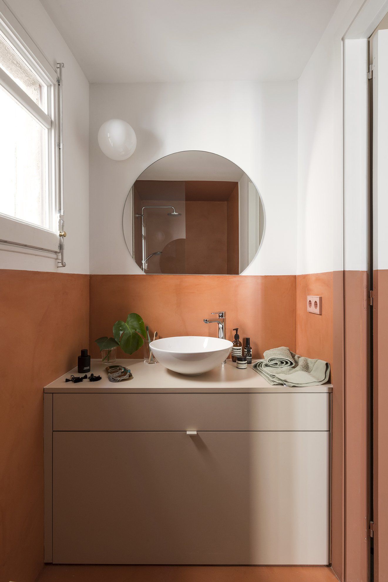
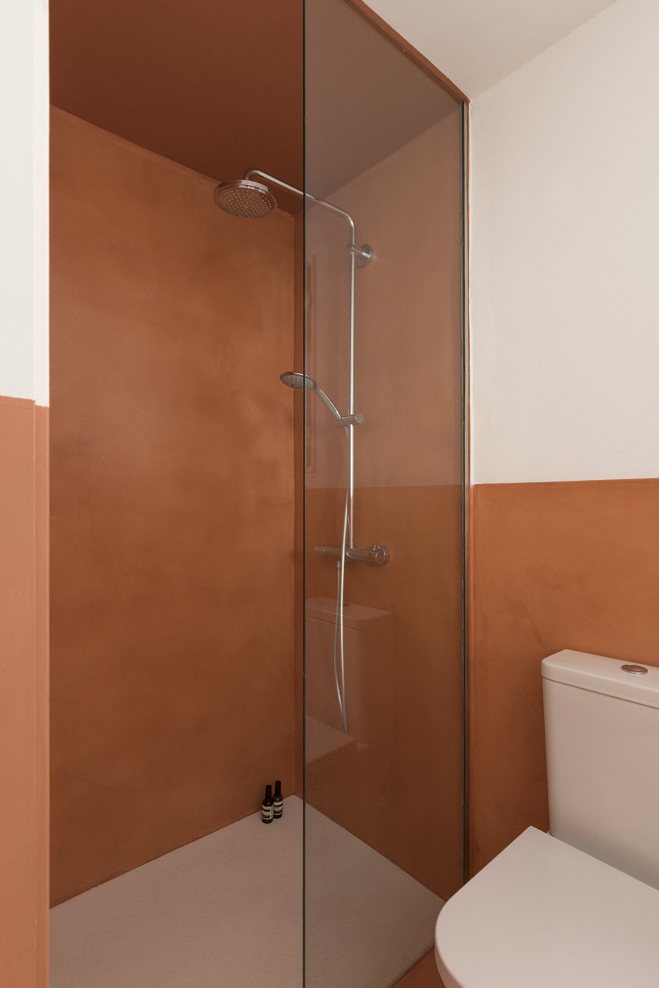
The bathroom is also treated with the brick-red micro-cement, again the valance and invading the shower space.
Bedrooms are simple and clean. In the master bedroom the colour fringe becomes a volume, forming the bedhead that embodies globe lights, light switches and sockets and a niche on the side where a bedside table cannot be placed. The bedroom also features the porthole window that brings light into the studio. The bedroom has access to a small walk-in wardrobe that is part of the brick coloured block.
The children’s room has a built-in wardrobe that follows the wall colours.
Photography by Roberto Ruiz
www.colomboserboli.com
SHARE THIS
Latest Edition
Mar / Apr 2026 edition is available now!
Contribute
G&G _ Magazine is always looking for the creative talents of stylists, designers, photographers and writers from around the globe.
Find us on
Latest News
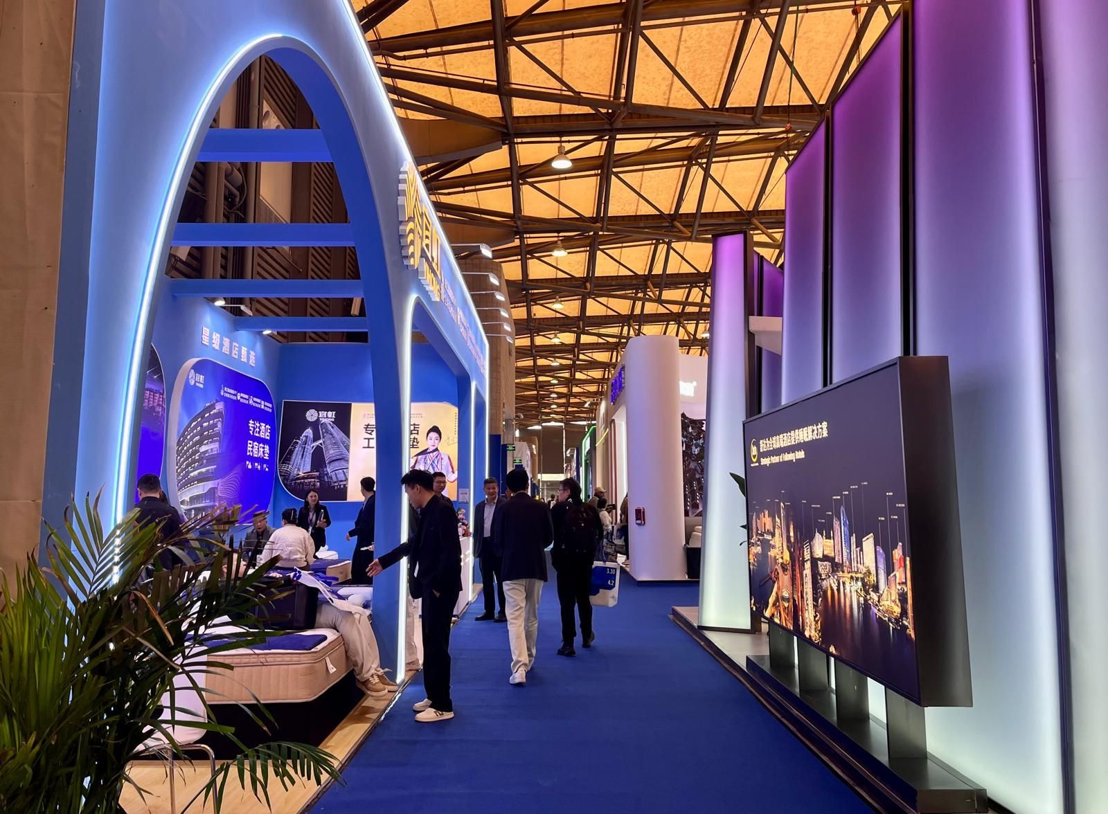
From March 31 to April 3, 2026, at the Shanghai New International Expo Centre, Hotel & Shop Plus 2026 Shanghai unfolded as far more than a trade fair: it emerged as a living, breathing platform where the very notion of travel dissolves, permeating every layer of contemporary lifestyle and spatial design.
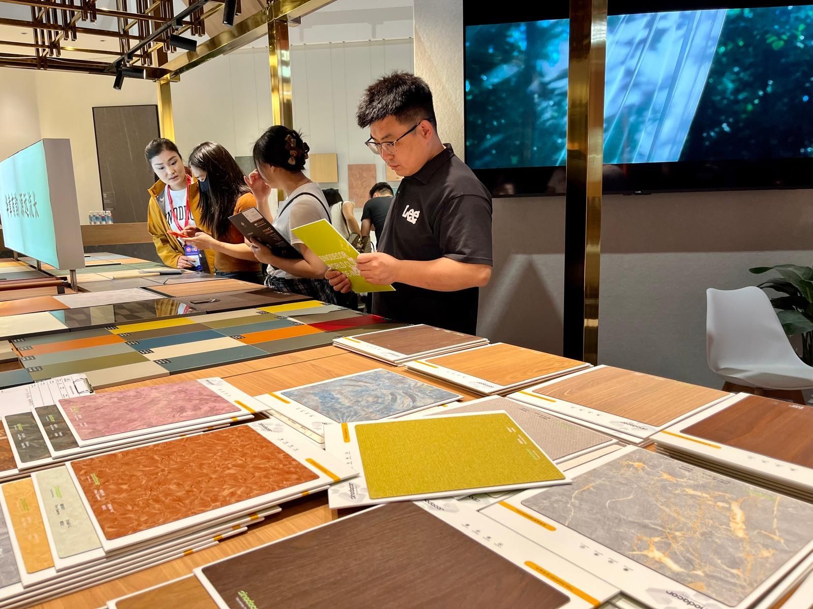
Held in two phases, from March 18–21 and March 28–31 at the Canton Fair Complex, the 57th edition of CIFF demonstrated how design is no longer something merely displayed but something to be fully experienced through the senses: deconstructed, re-engineered and ultimately redefined in its deepest essence: matter .
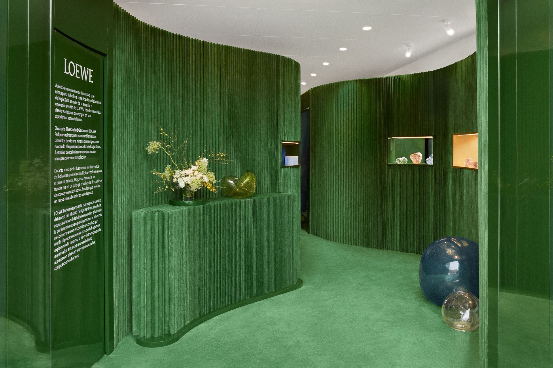
From 5 February to mid-March 2026, across three emblematic locations in Madrid — Institución Libre de Enseñanza, Plaza de Colón and FORMA — LOEWE Perfumes presents Crafted Garden , an immersive installation conceived for Madrid Design Festival 2026 . The project unfolds as a sensory journey inspired by Renaissance gardens, bringing together nature, fragrance and contemporary craftsmanship in a multi-layered exploration of design and olfactory culture.
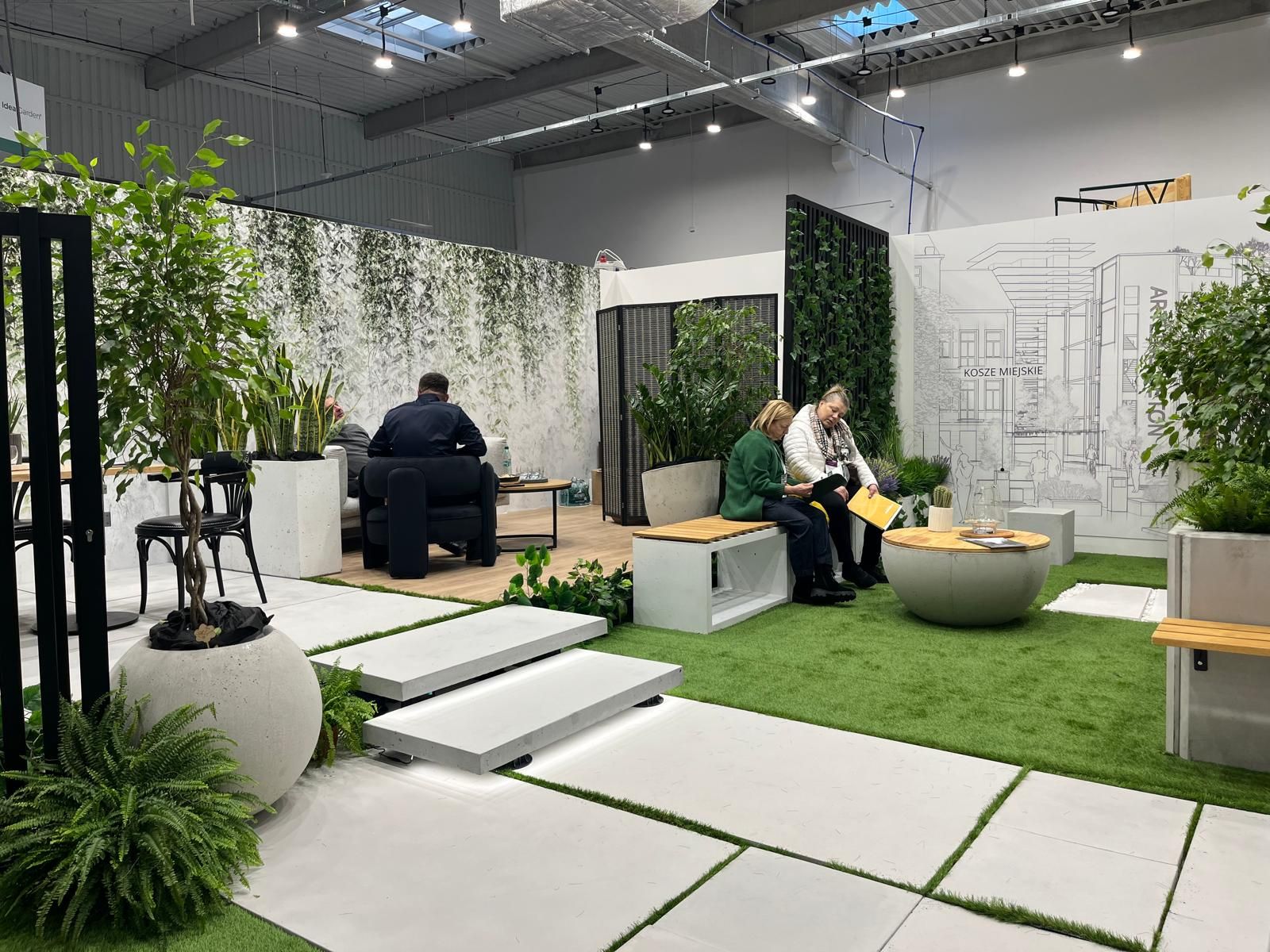
At a time when design is redefining its priorities, the contemporary landscape of interiors, décor, and outdoor living is clearly shifting from a digital-centric vision toward a more human, emotional and nature-driven approach. This transition was strongly evident during the latest editions of Warsaw Garden Expo and Warsaw Gift & Deco Show , held at Ptak Warsaw Expo from 10th to 12th February 2026.
Subscribe
Keep up to date with the latest trends!
Popular Posts
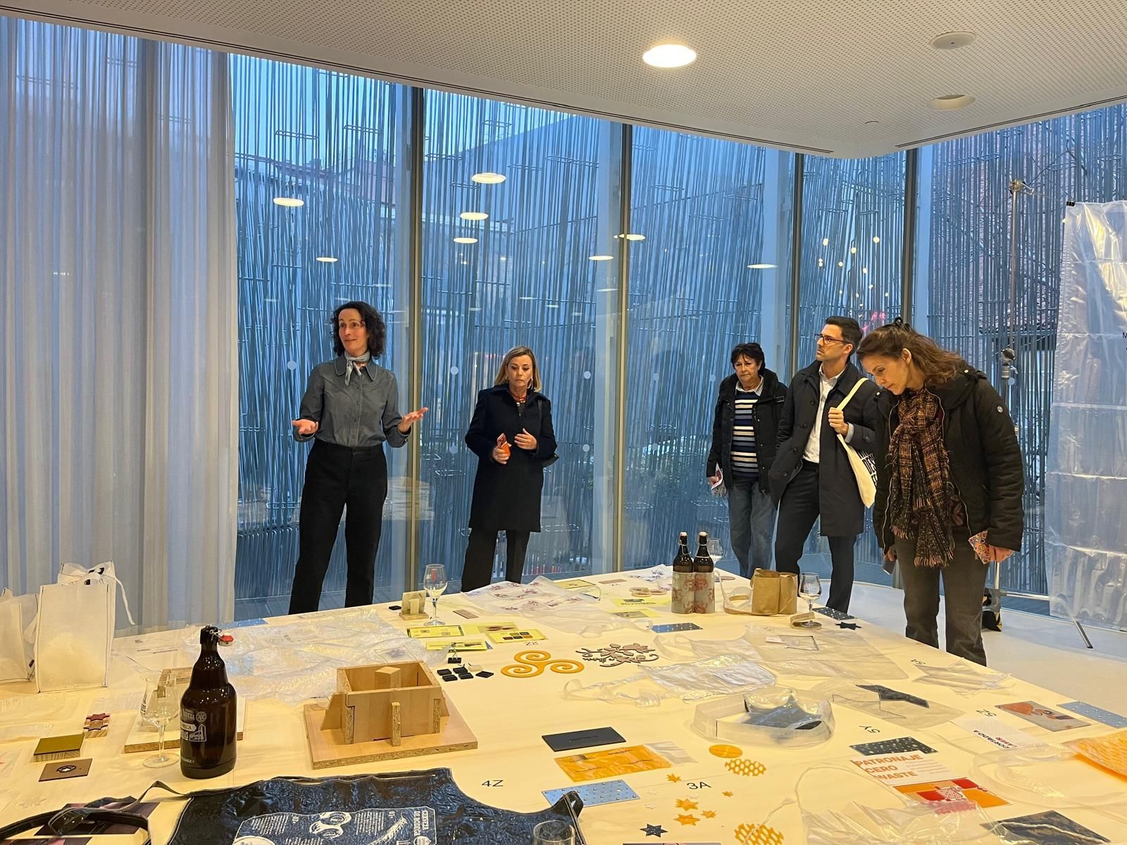
Between February 6 and March 8, Madrid Design Festival 2026 offered an intense program of exhibitions and events across the city. Throughout these days, it was possible to perceive the evolution of the festival, which expanded its program by integrating professional talks and meetings, revealing a strong desire among industry professionals to share the new Spanish approach to design with the world.

From 5 February to mid-March 2026, across three emblematic locations in Madrid — Institución Libre de Enseñanza, Plaza de Colón and FORMA — LOEWE Perfumes presents Crafted Garden , an immersive installation conceived for Madrid Design Festival 2026 . The project unfolds as a sensory journey inspired by Renaissance gardens, bringing together nature, fragrance and contemporary craftsmanship in a multi-layered exploration of design and olfactory culture.
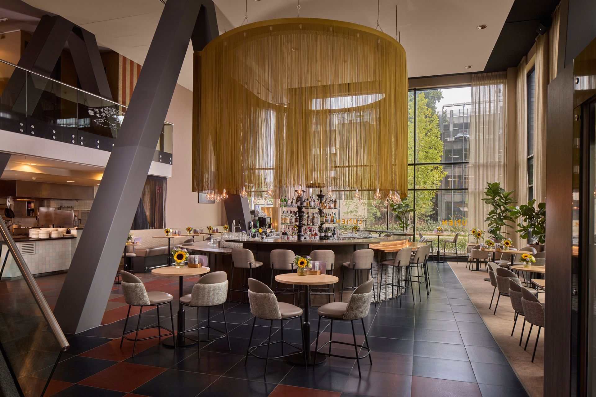
Situated in a prime location in the heart of the city, WestCord Eindhoven reveals its newly renovation that blends heritage, contemporary design, smart technology, and refined hospitality. The hotel’s refreshed identity marks a new chapter where history and innovation coexist, offering guests an elevated stay that feels both stylish and intuitively comfortable.
