First Blush
Led by Shona McElroy, Smac Studio designed a semi-detached house for a busy family with three young daughters and a dog in Sydney.
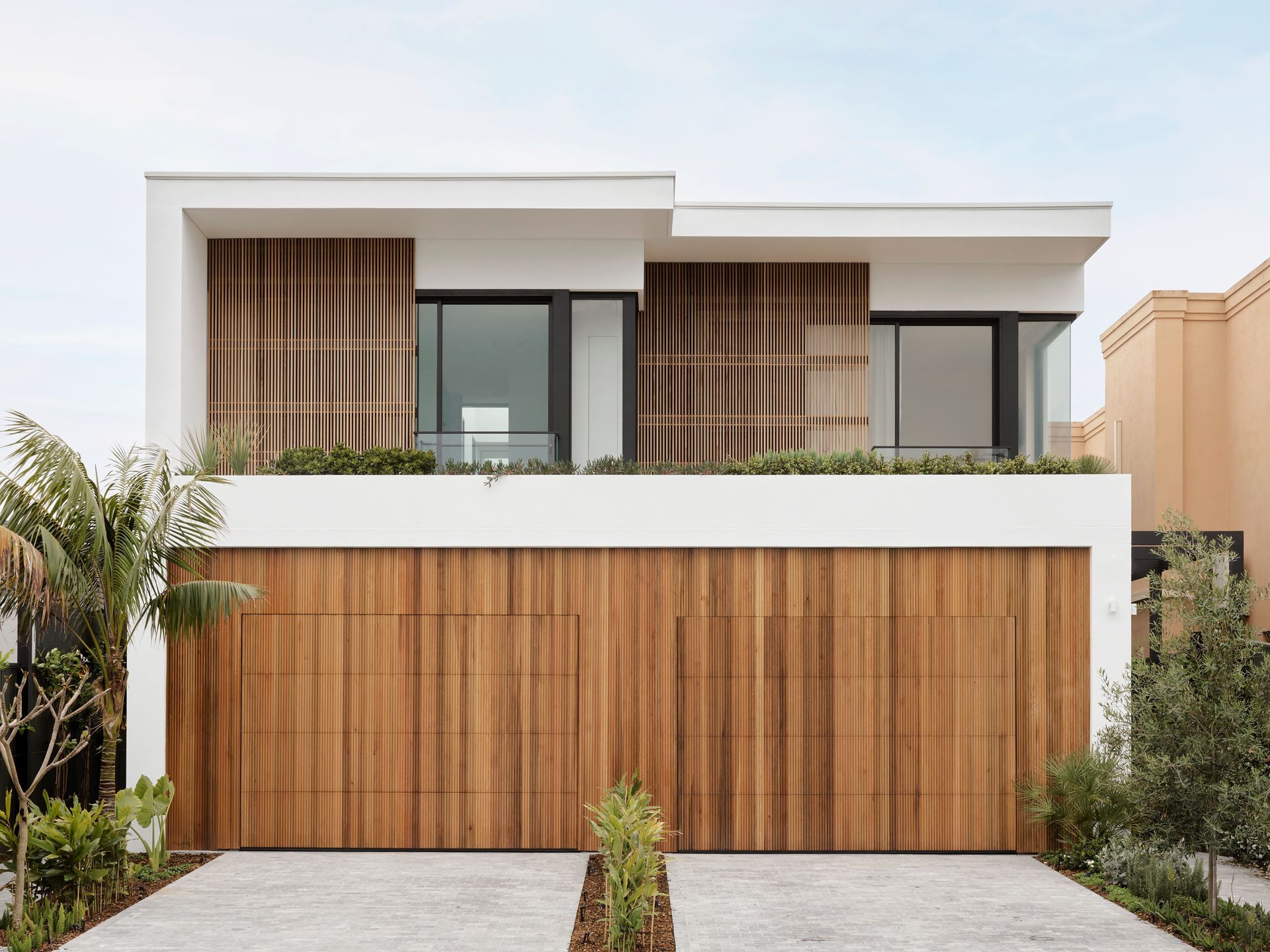
Clients wanted a home that was welcoming and functional as a sanctuary that reflected their family. The owner is really into pretty glam stuff, but she also wanted to feel pretty calm. She definitely spearheaded the restructuring while her husband took a backseat and was happy to let her carry on.
The build space was one of the biggest challenges – trying to cram in four upstairs bedrooms, two bathrooms and a utility room and make this semi-detached house as functional as possible for a family of five. And then also the added factor of wanting to entertain up to 50 people.
“Spatial planning is actually one of my favorite things to do. I like to see how spaces can be better planned to meet different needs and how you can work in the same square meter space and create really different results. And so that was really evident in that project, I think."
Shona McElroy, interior designer and director of Smac Studio
The entrance with the staircase
Smac Studio created a lovely warm feeling welcomes at the entrance, which is not usually done in the duplex/semi properties that they're often involved in. There are the beautiful curves, one to the right of the kitchen and then one up around the staircase.
Powder Room
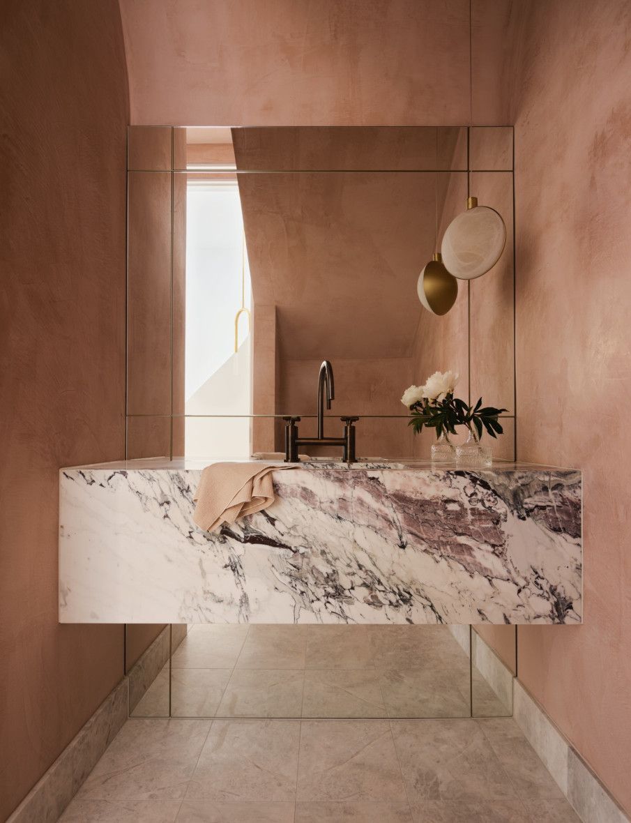
The powder room has been inserted just below the staircase - it's private, it's out of sight, and it just feels so luxurious, especially in a house of this size. It speaks to the entire design, which is overall modern but with a few classical touches that just bring it a little bit more depth. Furthermore, this space has a feminine energy - the Venetian plaster in pink shade was applied to both the ceiling and walls. The paneled mirror is a real feature as well as the beautiful pendant light from Spence & Lyda.
Kitchen
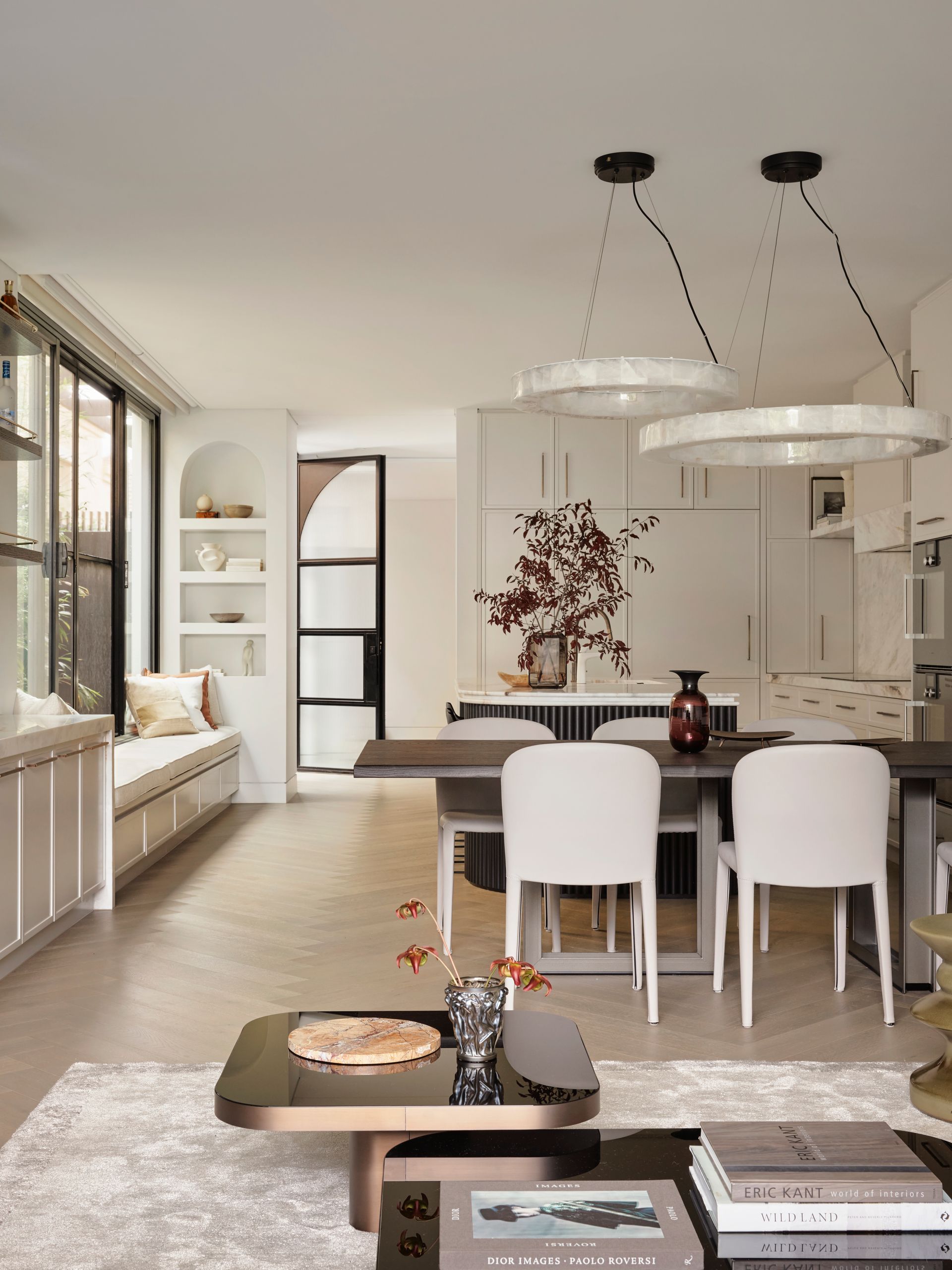
To the right of the entrance, you enter the living area formed by an open scape of kitchen, dining and living areas. To have an inviting effect the designers have chosen the wood floor. It's incredibly warm and cosy, it's elegant and speaks back to the French style with the herringbone.
The full white kitchen has a more traditional style with a curved and inviting island that everyone could come and sit around. There is the fridge with two double doors and a drawer. While on the left of that, on the same plane, on the same side, there are two big double doors that then slide back as pocket cavity sliders: they host a big sort of very functional pantry in there that makes use of the curved space. The designers left the two shelves on either side of the rangehood free, and they're quite nice and thick and structural. An unusual and sculptural choice was to extend the stone also onto the rangehood to create the datum lines throughout that kitchen. The bronze handles and taps complete the design.
The clients wanted a lot of storage: a big bench has been inserted in front of the island. Besides, the homeowners wanted the most space possible to be able to host the most people. And in this way, it's possible to have a few people chatting there while a few people are in the kitchen. In addition, since the clients have a lot of sentimental items and the ability to kind of build their collection of items over time the designers have reserved a few places to showcase some of these gorgeous items. The niche next to the bench seat is specially made to kind of have everything showcased as well as the big shelves above the kitchen.
"We worked around Michael having a big family, hosting a lot and having a lot of sentimental items and the ability to kind of build their collection of items over time. So, we had a few places where we could showcase some gorgeous items. We've got the niche next to the bench seat that is specially made to kind of have everything showcased and also those big shelves above the kitchen. And then everything is also centred around entertaining.”
Living & dining area
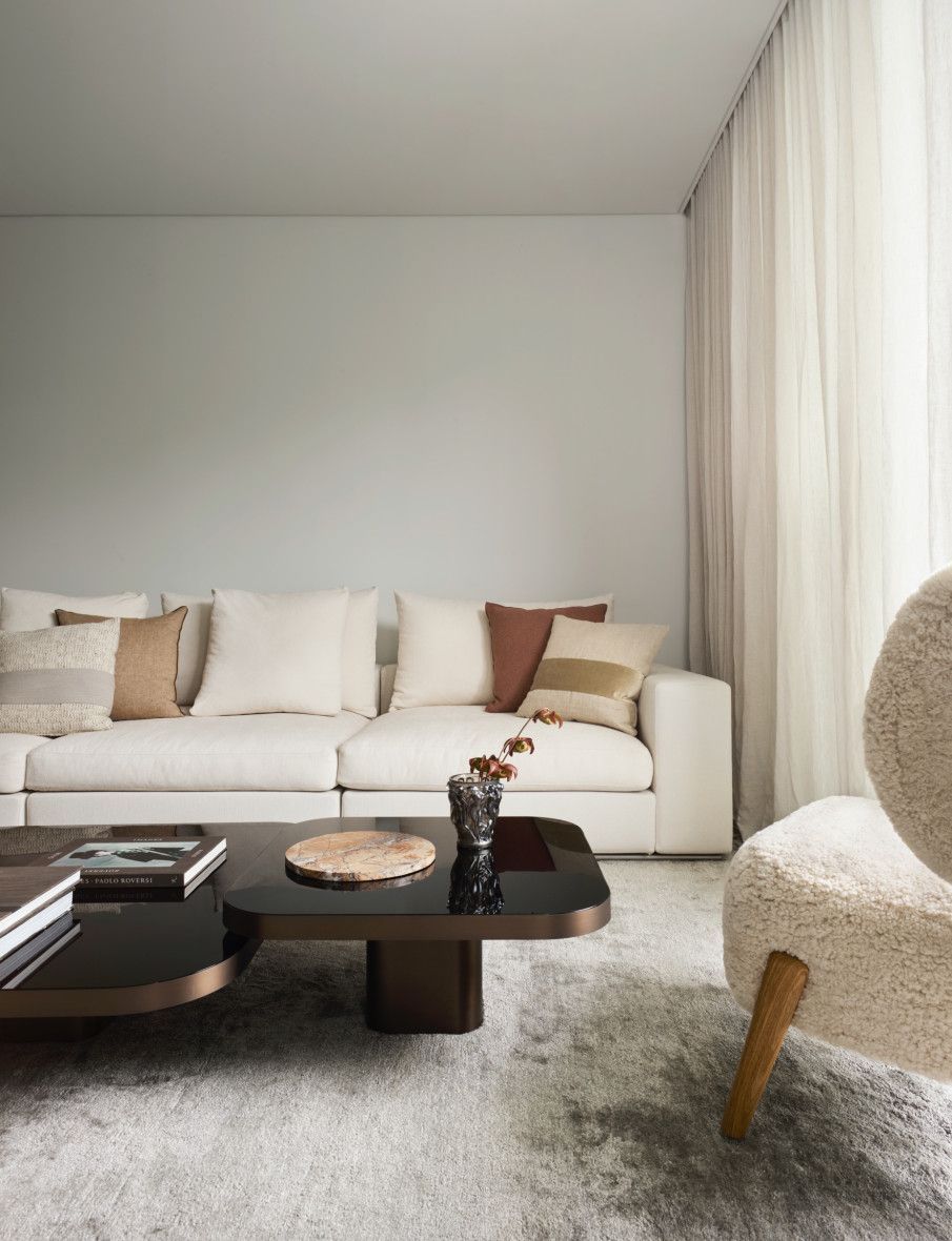
Next to the kitchen there is the dining area including a mirrored bar, and then the living room. The entire space is flooded with natural light: the designers changed around all the windows and the configuration. And that enabled them to open all these side passage windows, which had originally been designed as high- level windows.
The dining table and chairs are from Mizura give an elegant atmosphere. Two big pendant lights are from Coco Republic chosen directly by the clients. Shades of pink are found in the artwork commissioned from Vicki Lee. To give some touch of provincial style the designers put a French mirror behind the bar. It gives a reflective quality to the space; it makes everything feel a little more open. While the shelves with bronze rails give very classic touch. A curvy fireplace has also been inserted next to it. The designers have created one that kind of comes out. But it's still soft thanks to its curves that come from the wall and look as organic as possible in the rendered plaster. And with the stone also into the fireplace, everything merges all nicely.
“There was a challenge with the bar, the kitchen, and the living area, those three spaces, because they were all along the same line. We wanted to make them feel like different spaces, but they had to kind of merge well into one another.”
Bedroom
The bedroom looks so soft and serene. The homeowner needed to have good storage for all their clothes without losing the charm of a large bedroom and very plush. Instead of closing it with a full wall, the designers made the bedhead act as a little wall to the cabinetry behind. They put the linen and the timber veneer on the wardrobes to soften the entire thing. Also, the linen of the bed head and the linen of the cabinets are the same. Then the timber veneer to the cabinets and the bedside, they all match, so it's very all-encompassing as a room together. And the cabinets, like the wardrobes, don't so much look like wardrobes as just a lovely rear paneled wall. Here we find a very particular corner which is that of a dressing table with a large mirror with rounded corners. This intimate space reminds the owner of her grandmother's chest of drawers where she would sit every night while she did her hair.
Upstairs bathroom
The bathroom upstairs is T-shaped with the toilet and the shower kind of hidden between a dividing wall and a bath and a vanity on the other side. The designers added to the side of the bathroom a panel of bronze framed mirrors that goes the entire length and height of the wall - it makes it feel a lot bigger. Off that side panel, the beautiful Murano wall sconces were hung, and the sheer curtains were added. The double vanity trough sink is made of the beautiful stone with all the kind of pink tones through it and the bronze tones through it.
“It feels luxurious and it feels calming and upmarket, like you could just have a bath in there with some candles for hours.”
Photography Anson Smart
Interior Design Smac Studio
Architecture Van Rooijen Meyers Architects
Landscape Architecture Dangar Barin Smith
SHARE THIS
Latest Edition
Mar / Apr 2026 edition is available now!
Contribute
G&G _ Magazine is always looking for the creative talents of stylists, designers, photographers and writers from around the globe.
Find us on
Latest News
Subscribe
Keep up to date with the latest trends!
Popular Posts
