Enclosure
After 9 years of construction, the architect and founder of Design ni Dukaan, Veeram Shah unveils its latest architectural masterpiece in Gujarat, India.
Veeram perceives design as fragments of collective experiences and observations from the mundane to the profound. Veeram travels with his team in a Caravan - he lives the life of a maverick nomadic designer who seeks inspiration from his travels that eventually translate into his designs. He had poured all his savings into building a studio space and then built a team that is experimenting with indigenous materials.
Spread across 2.137 square metres - this project has been no different, and perhaps the most important learning has been one of self-negation.
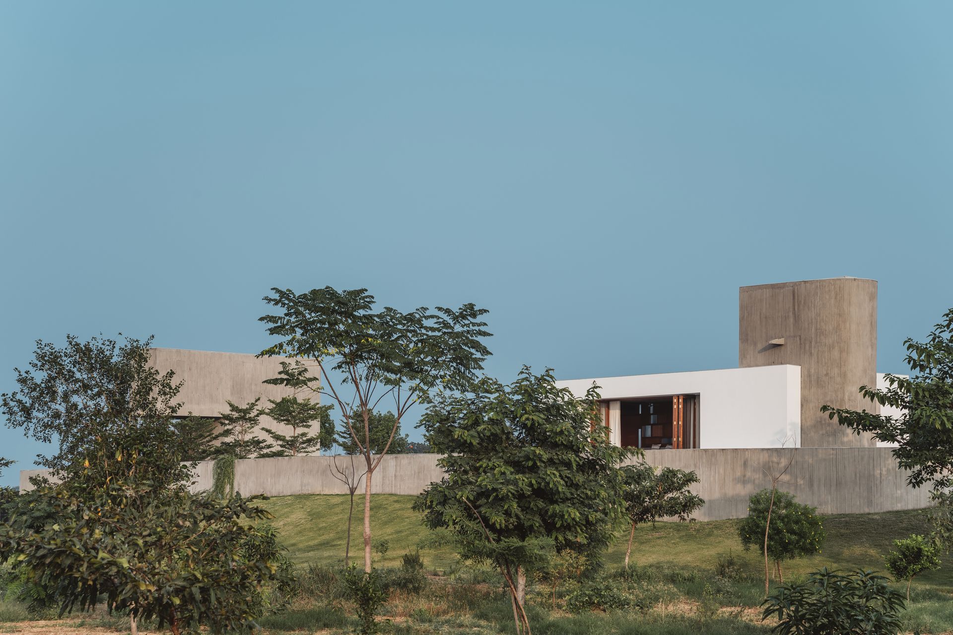
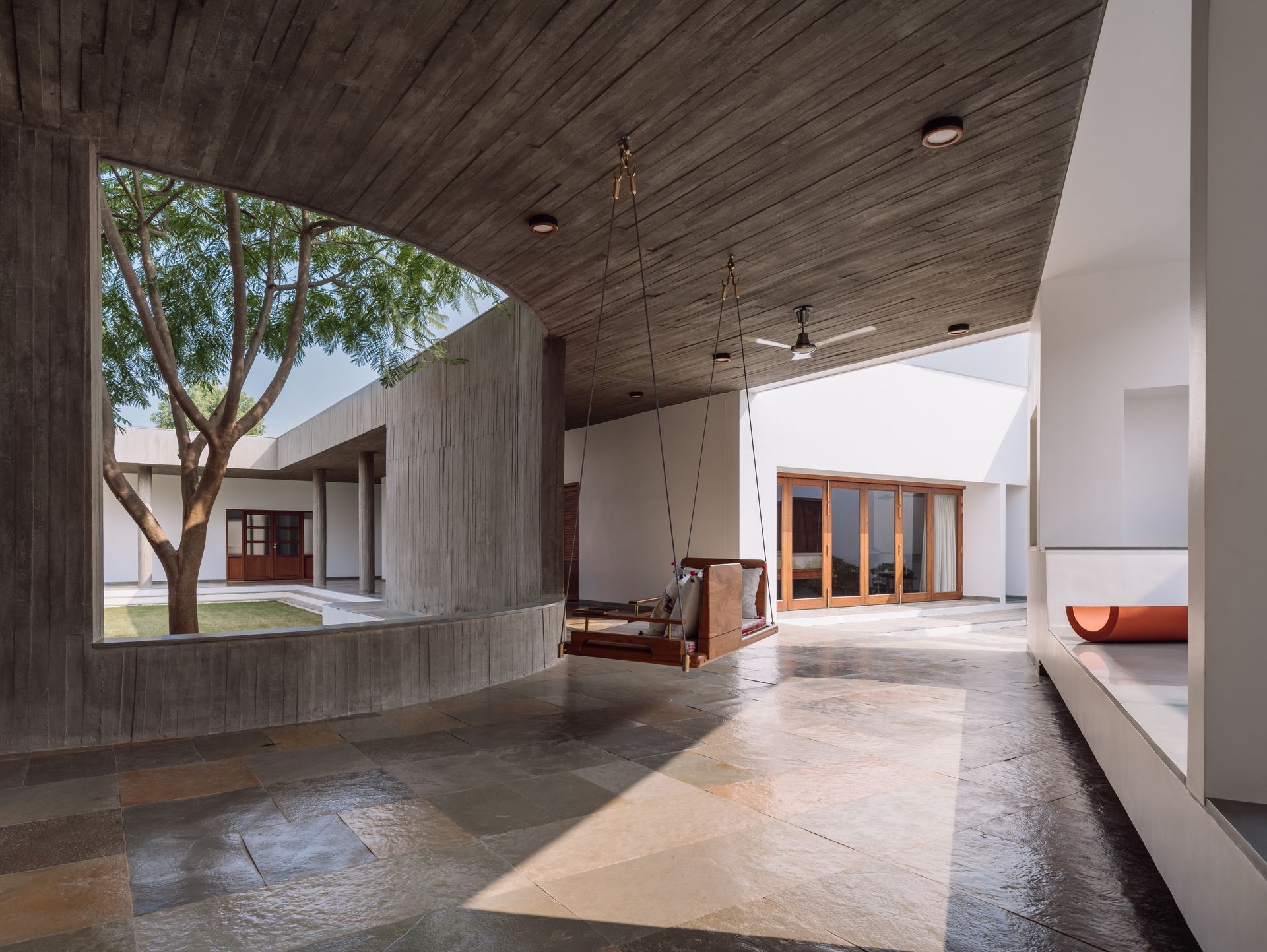
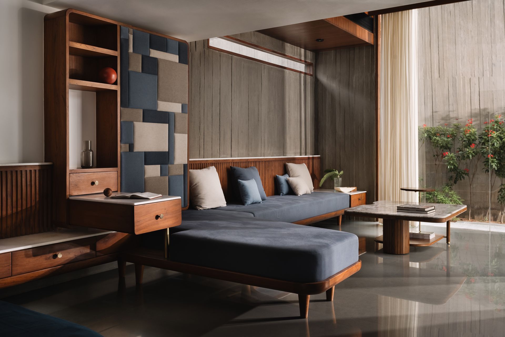
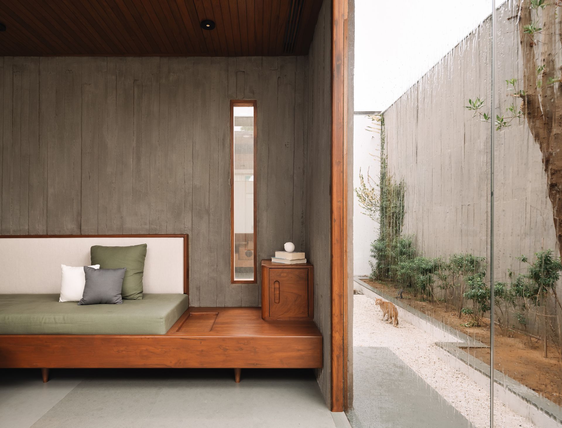
The materiality of the enclosure was the product of a parallel enquiry into the logistics of construction in the remote, rural location. The client, who himself had gone from being a farmer to a successful businessman now returning to his roots, insisted on employing local labour so as an experiment a village contractor was asked to build a sample wall in concrete, and the outcome: an unpredictable but beautiful texture caused by the shifting and warping of unbolted wooden formwork; was fascinating. These "anticipated imperfections" were embraced as part of the construction process, even extending this choice to the use of other materials.
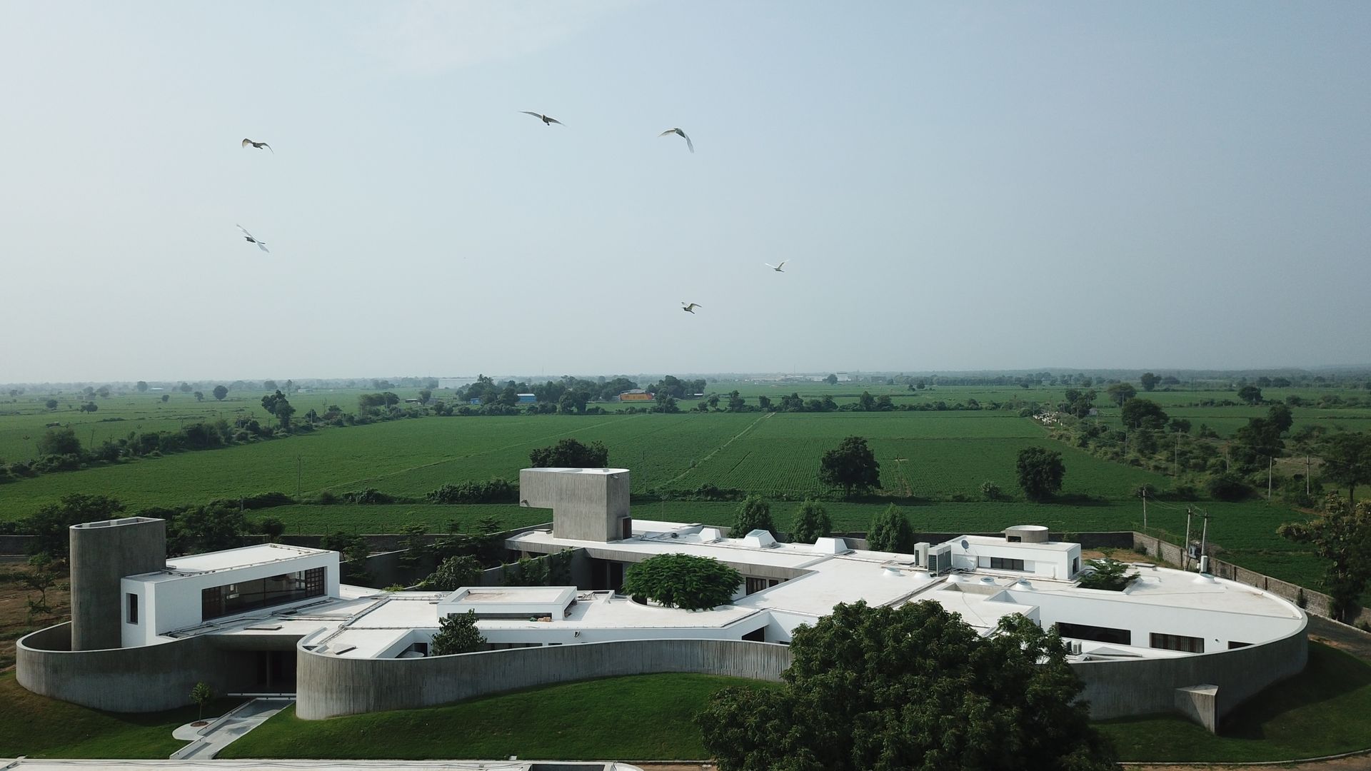
The planning of the footprint attempts to separate public, semi-private and private zones of the house, while still maintaining a continuity of flow around a central open space. All parts of the house open onto this courtyard, via a covered corridor, as well as onto smaller, private courts, ensuring that they get adequate light and ventilation while being protected from the harsh tropical sun and hot winds.
At the very entrance, casual visitors are directed to a formal lounge which opens onto a small, sculpturally dramatic court to the south and a sprawling lawn to the north that ends in a service area, making it conducive to host large events. Below the lounge is a basement with a home theatre, and above, a loft that lends itself to more intimate interactions with creative people.
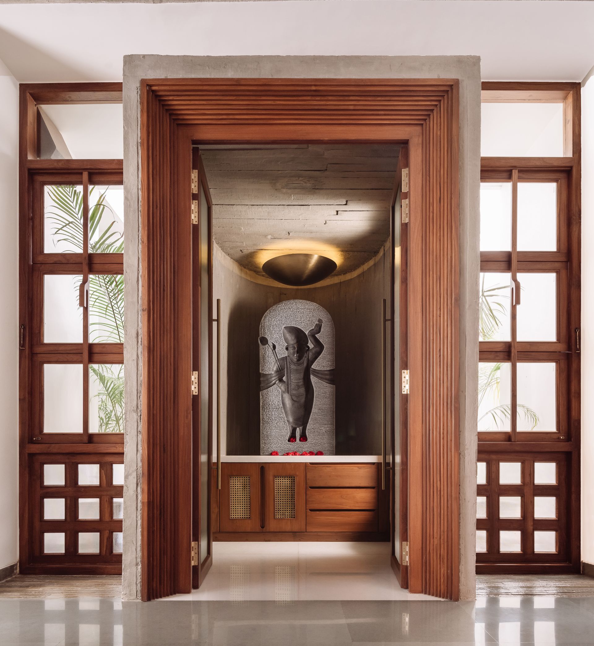
Other guests are directed into the house via a waiting area where the mandir, a later addition to the design, is situated. Imagined as a floating cylinder,this object was the focus of many discussions with the structural engineer who wanted to pin it from above or anchor it to abutting walls, and yet we were quite sure that the weight of God could only be borne by Earth. This was eventually resolved by employing pile foundations, independent of the rest of the structure, to hold it. Within the cylinder sits Shreenathji, not contained in an idol, but rather engraved into a slab of solid black granite, specifically selected to reflect His dark attributes, as though He had left an impression on it.
Across the passage from here is a hall that contains the dining and informal seating area, which in turn opens onto two courts, and is hinged to the visitors’ lounge by the kitchen. Just beyond this the corridor widens, providing a place to pause at the very heart of the house, before proceeding to the more private areas. Defined by a third curved concrete wall that encircles and frames a gulmohar tree, and furnished with a large swing and built-in benches, this is perhaps the part of the house most favoured by the family.
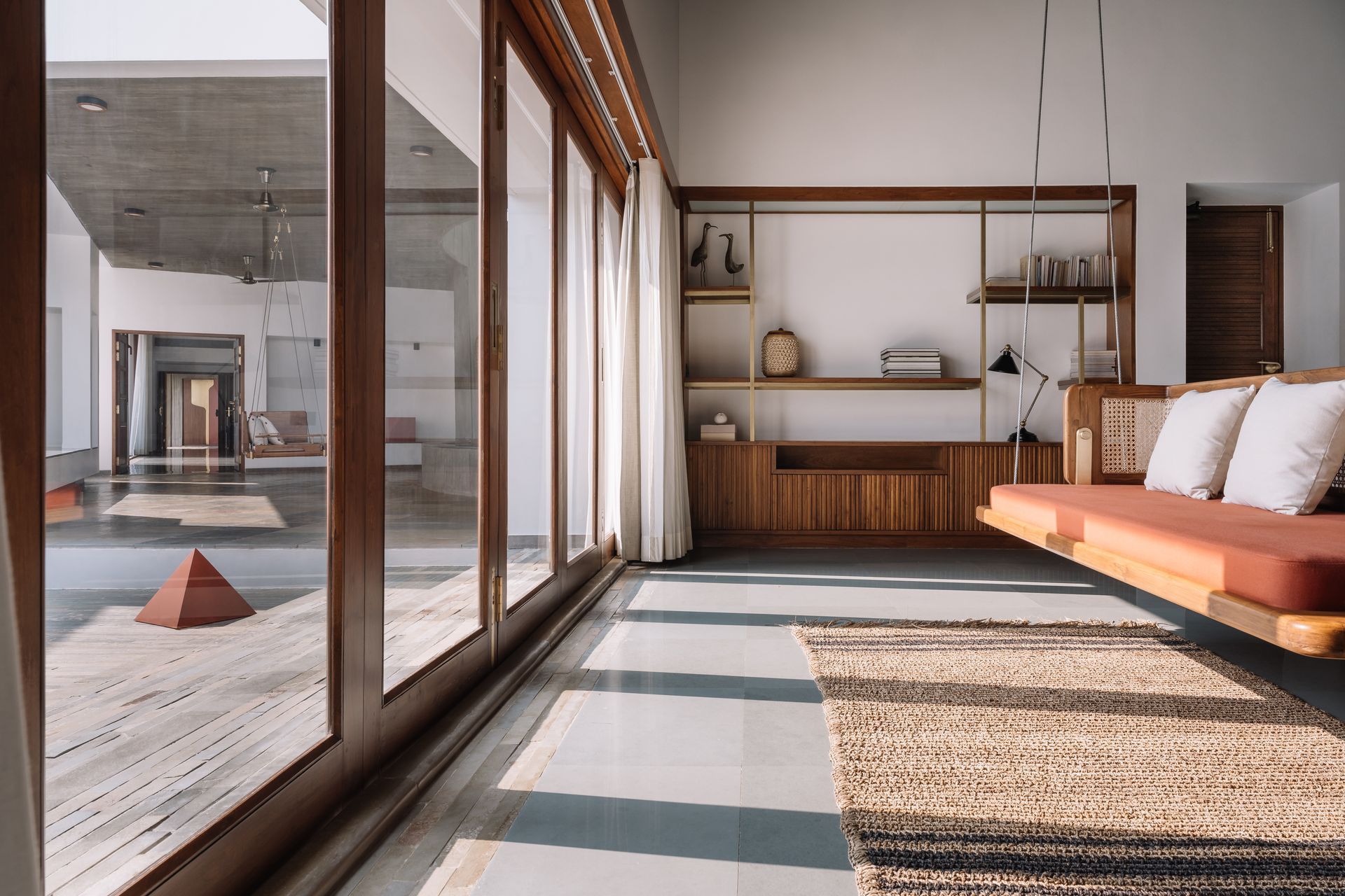
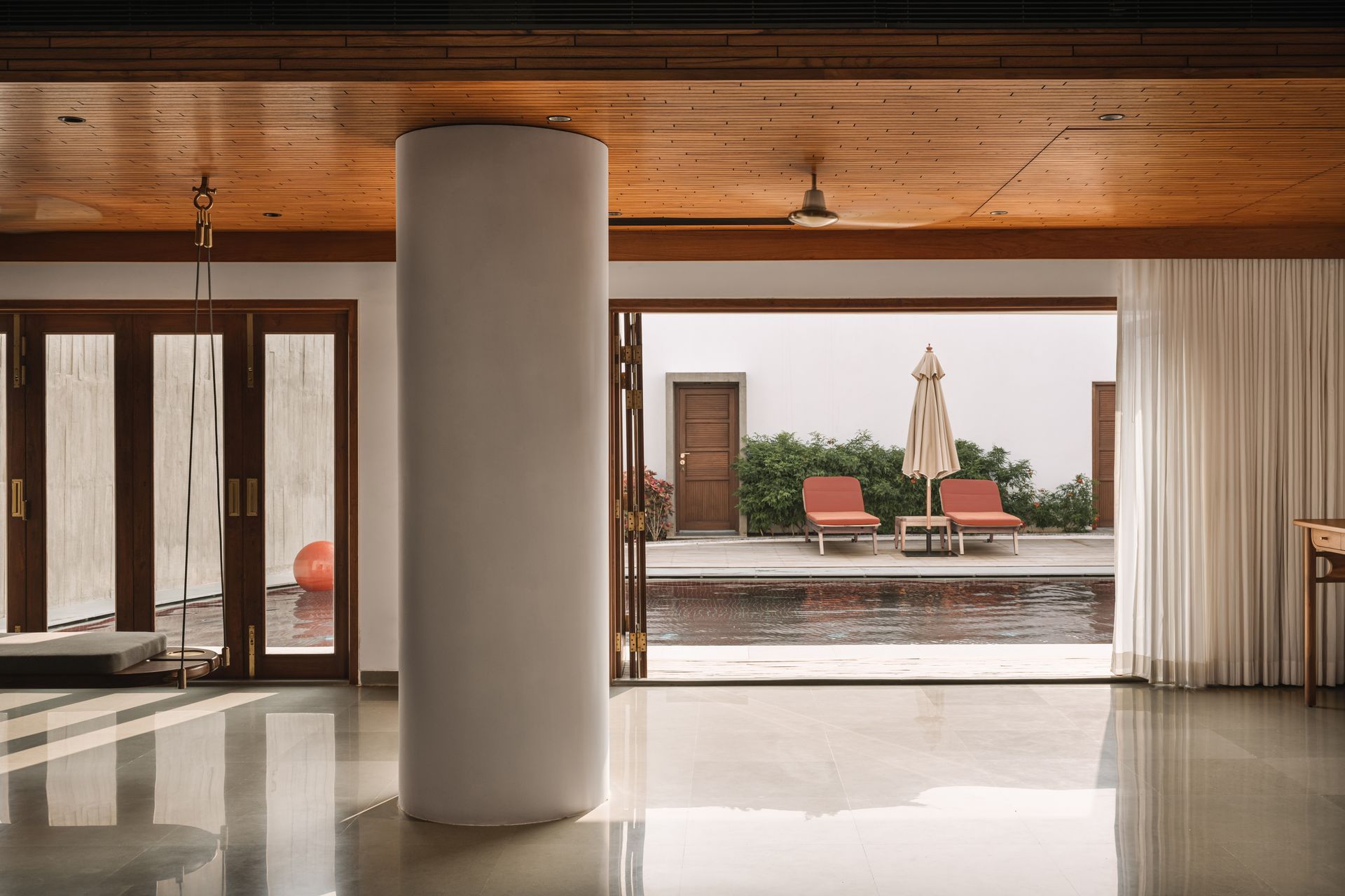
Moving forward, the transition into the house is marked by a floating column, an ode to Roger Anger, the architect of Auroville, who often employed such elements as a means to create tension in his structures. The passage then turns and traverses the eastern edge of the central court, leading to the family’s quarters. A pair of rooms that comprise the master suite: a study that can be converted into an extra room for close friends and the clients’ own bedroom with an attached bath and open shower; squared by another set of suites for their two sons, form a patio for the swimming pool and gym, secluding them from the rest of the house. Conical casements, supplemented by custom-fitted lights, create a dramatic play of shadows in the corridor that crosses between these blocks and culminates in another court that separates the sons’ rooms: the elder’s having a display for his collections and an attic for his son, while the younger’s is characterised by a curved wall that marks the end of the structure. Separated from this area by a pantry kitchen and outdoor dining space, and forming the west wing of the house, are three guestrooms.
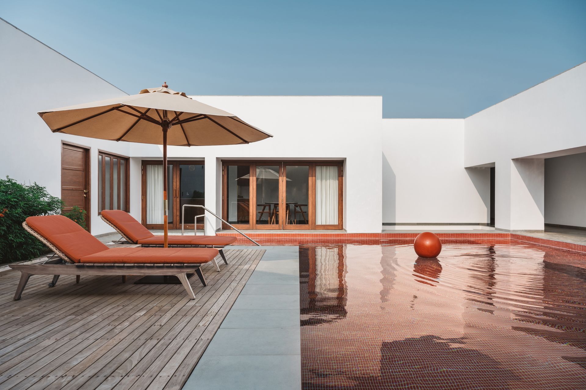
In many ways this project directed the trajectory of our studio during its formative years. Disrupted by several delays, including two lockdowns, the seven and half years it took to complete gave us the opportunity to repeatedly reassess our ideas of what architecture is, of what a design practise should be, and to delve deeper into these questions while still being able to detach from and discard concepts when required.
Just when the plans were being finalised, the client’s business faced a slump, and the project was shelved for almost two years. When it resumed, their requirements had changed and the need for space had increased. Whereas in the original scheme the mass of water tank alone rose above the line of the exterior walls, we were now confronted with the difficult decision of reviewing the plan, which had taken numerous iterations to perfect, or raising other volumes to accommodate the revised brief. We opted for the latter, lifting two more blocks to look beyond the walls: the artists’ loft and the grandson’s attic; and imagined them as three sentinels in conversation, floating above a seamless sea of green once the vegetation had reclaimed the concrete.
The idea for the loft itself was a serendipitous result of this delay. Drawings and models, scattered around our studio for years, occasioned tangential dialogues with various visitors: musicians, artists, designers, poets, writers, and of course, other architects; a process that we have actively integrated since then, to broaden the conversation around projects beyond tectonics. The client noticed this too, and recognising the merits of such exchanges, asked us to include a space where he could invite innovators to work.
As the project progressed, everything from architecture to interiors to landscape was addressed to develop a comprehensive design language, and all elements down to the smallest, including furniture and hardware and light fittings, were rigorously detailed and custom- made by our craftsmen. The project was truly a celebration of the act of creation, which has become for us the essence of our design practise.
Photography Ishita Sitwala - The Fishy Project
Architecture Design ni Dukaan
SHARE THIS
Latest Edition
Mar / Apr 2026 edition is available now!
Contribute
G&G _ Magazine is always looking for the creative talents of stylists, designers, photographers and writers from around the globe.
Find us on
Latest News

Subscribe
Keep up to date with the latest trends!
Popular Posts
