Casa D. Carlos I
CFarquitetos remodelled a house for a large family creating more organised and welcoming spaces with a modern language but respecting the existing architecture in Lisbon.
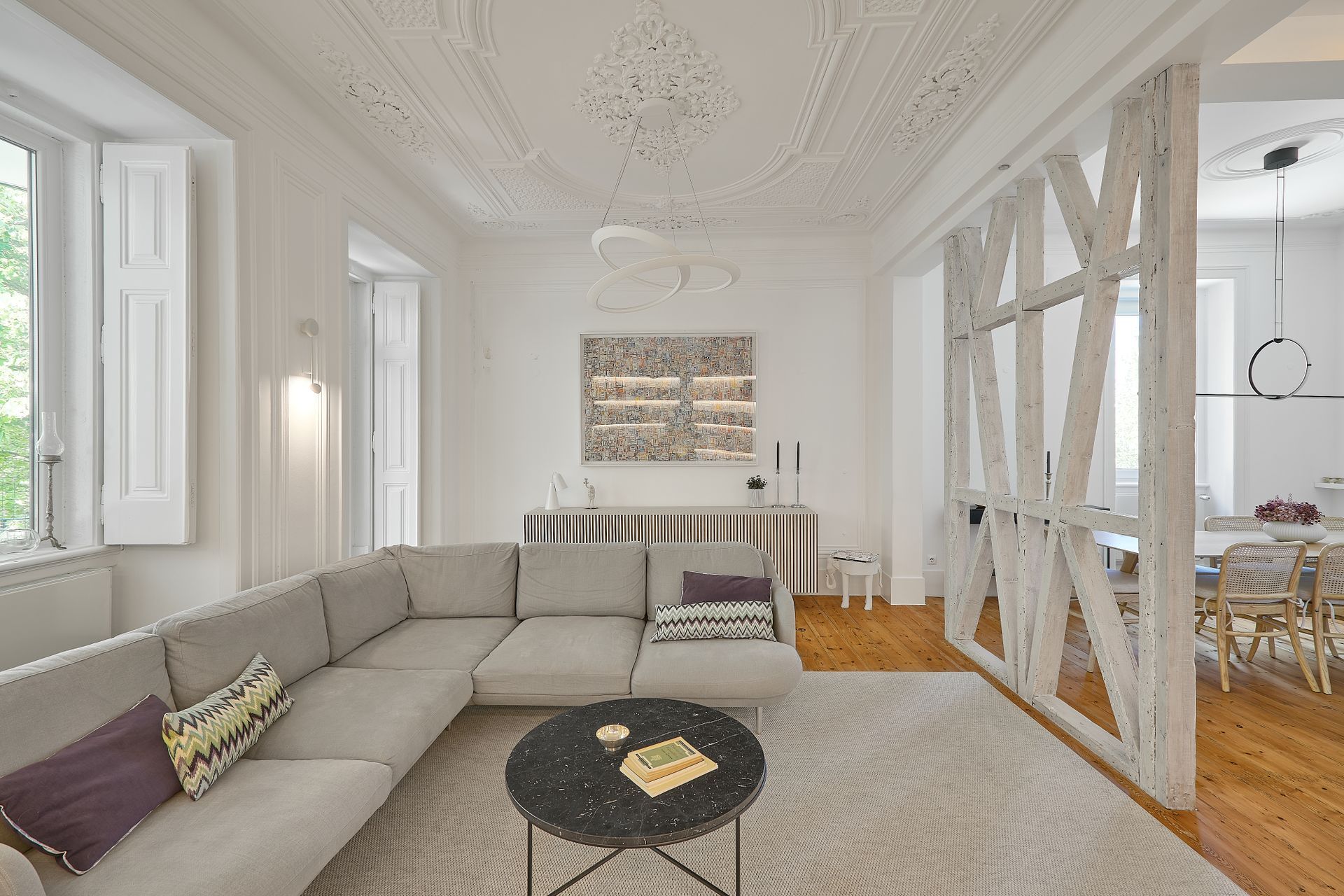
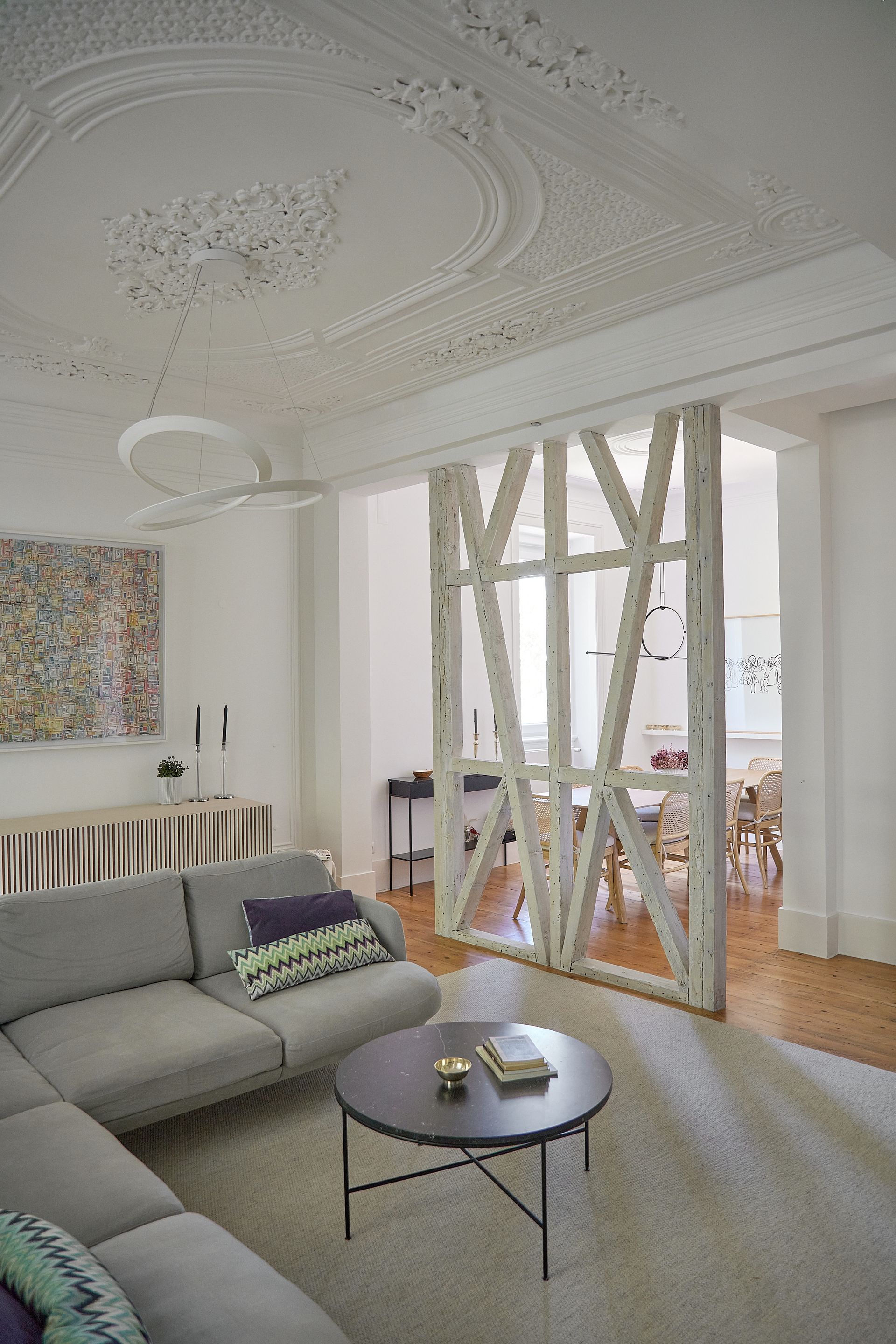
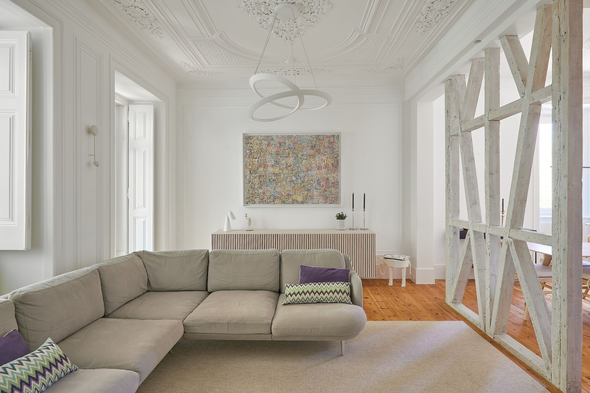
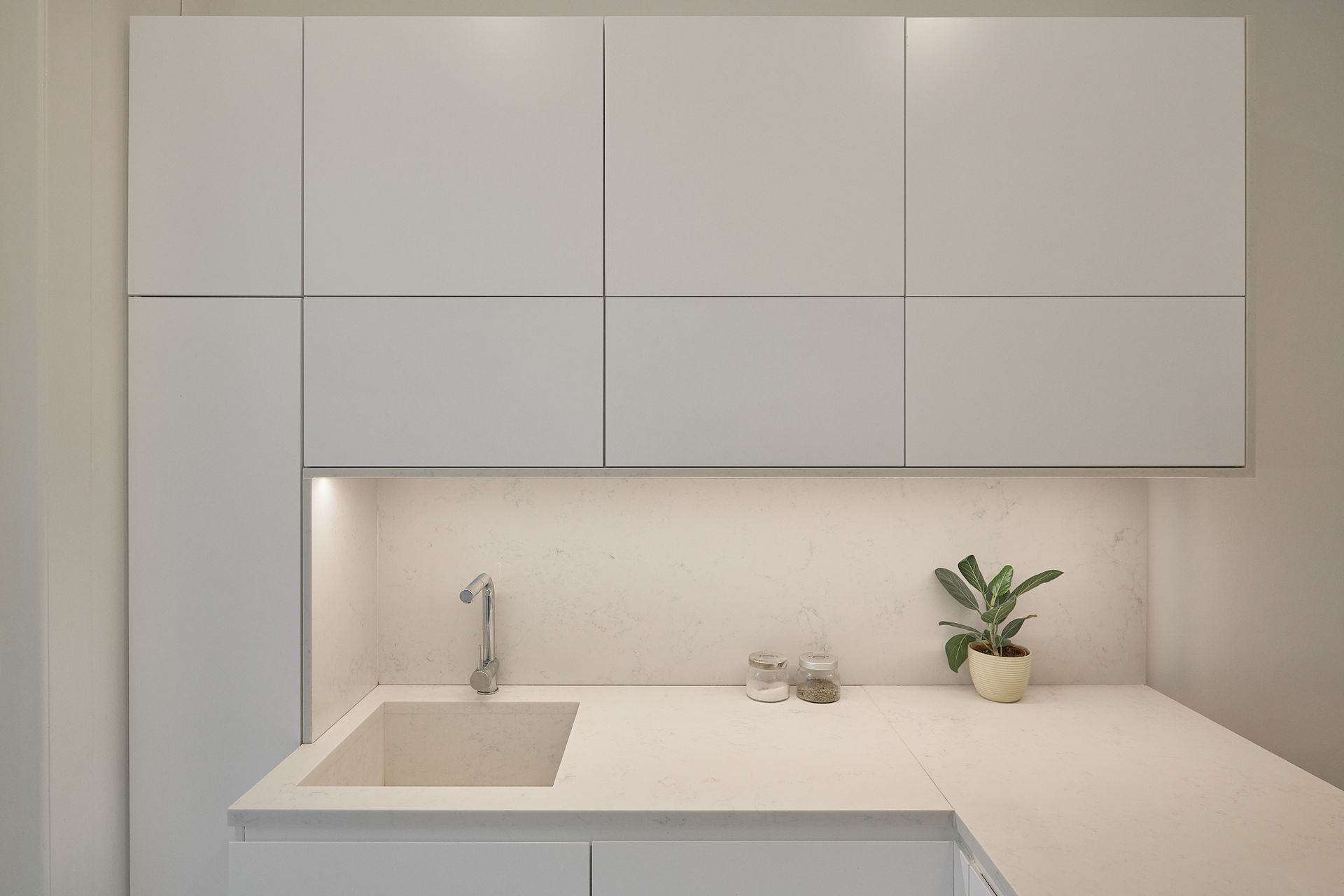
The flat, typically Pombaline, had a beautiful stucco ceiling in the living room and a Pombaline gaiola structure that was kept. The intervention consisted in the complete reformulation of some spaces, such as the kitchen, the bathroom and the children's room, while in other spaces the intervention was essentially at the level of carpentry design.
Light tones predominate in the house in order to provide as much light as possible, because despite having large windows, on one of the façades, the light that enters the house is filtered by a veranda surrounded by trees.
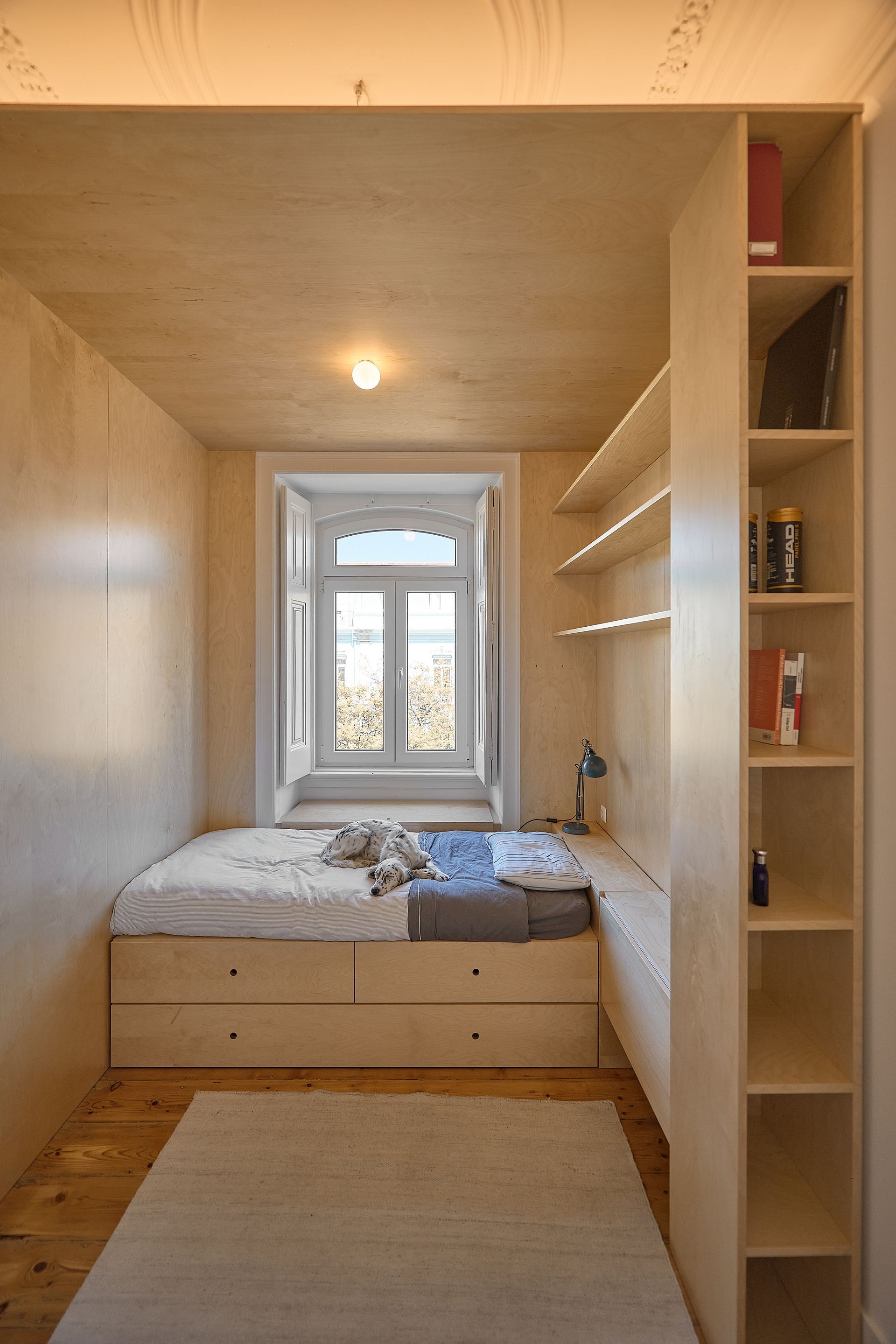
In one of the children's bedrooms, a strategy had to be outlined to accommodate several functions in a single space, besides, the bedroom had a ceiling too high proportionally to its area which caused some discomfort. A wooden box with a lower ceiling was designed to serve as a bed, a guest bed, a bedside table, a desk and a bookcase. With the creation of this box/ niche the designers achieved a very cosy and functional area.
For the daughters' bedroom, a shared work space was conceived, using a single worktop with drawers, over which a structure of shelves and wooden props was created. This division allowed the necessary privacy for individual study, but without hindering communication between them. To hide the presence of this object, which for space reasons had to be placed right at the entrance of the bedroom, a mirror was added to the side wall.
Photography
Ricardo Oliveira Alves
Interior Design
CFarquitetos
SHARE THIS
Latest Edition
Mar / Apr 2026 edition is available now!
Contribute
G&G _ Magazine is always looking for the creative talents of stylists, designers, photographers and writers from around the globe.
Find us on
Latest News

Subscribe
Keep up to date with the latest trends!
Popular Posts
