An Interior surrounded by Nature
The owners of this luxurious resort villa approached designer Yehudit Schneider, the owner of an Architecture and Interior Design studio by the same name, to plan and design the project from start to finish, located in a village in the Upper Galilee.
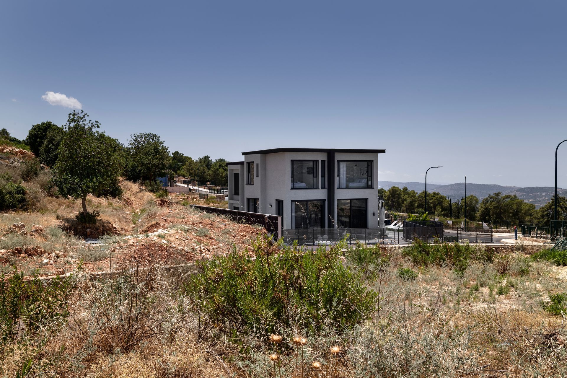
This luxury resort villa is located on an attractive plot of land in the north of Israel and is a true gem in the heart of its surrounding nature. The plot borders a nature reserve, and as such, it is abundant in large openings that overlook the reserve. The unique topography of the plot, and the fact that there are no neighboring properties in sight, allow the villa to embrace the surrounding views. The structure’s northeastern facade is open onto the horizon, and once a neighboring property is developed on the west, it would be done at a comfortable enough distance from the villa to avoid restricting the views.
The surrounding nature embraces the villa in all its glory, creating a calmness of a resort or international boutique hotel. The nearby valley and the mountains surrounding Carmiel, all visible from the property, create a sense of serene intimacy that can be felt upon entering the villa.

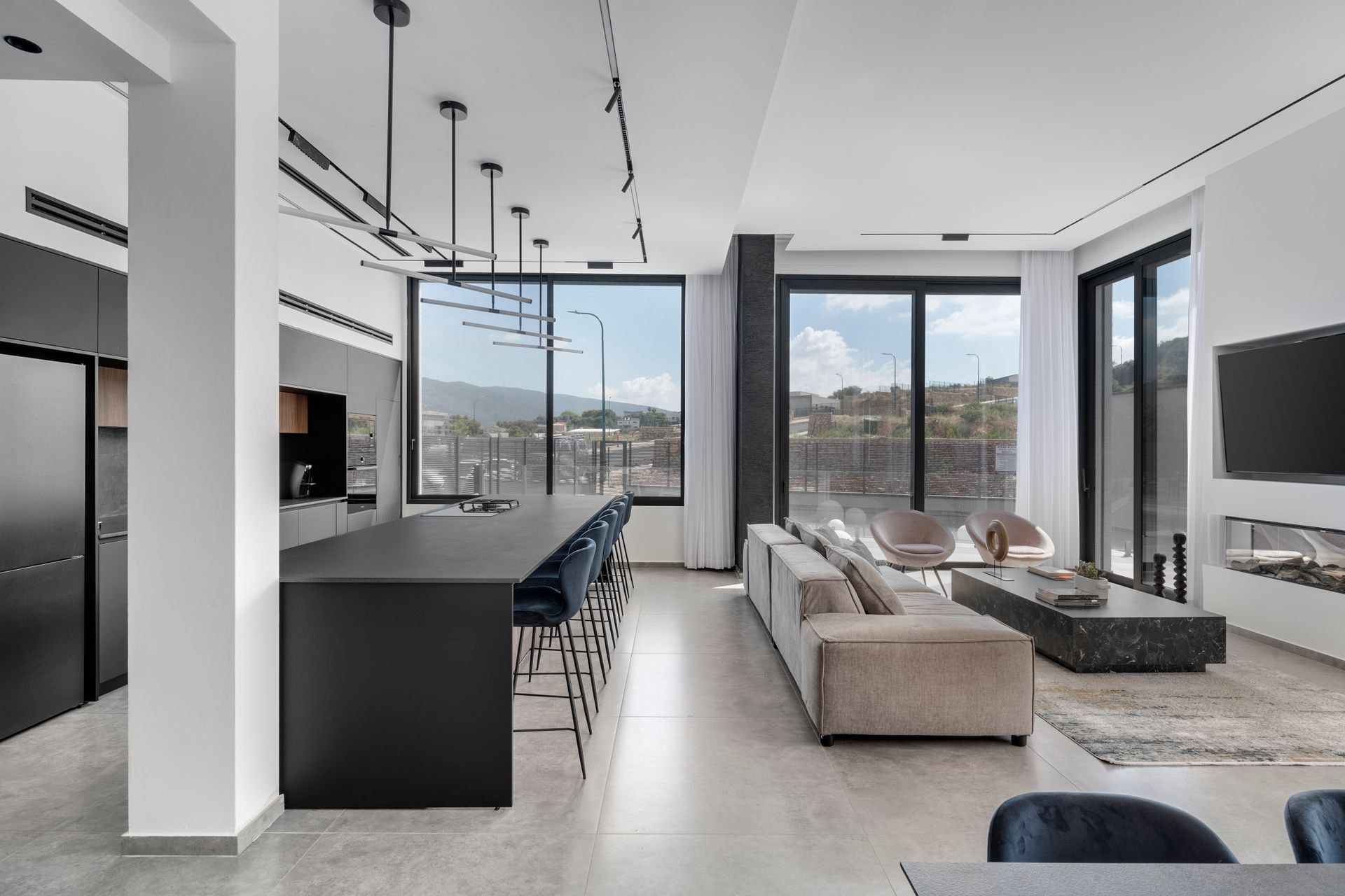
The sizable two-level property includes large pampering family spaces and six fully equipped boutique-style suites. The designer masterfully planned four-meter-high glass windows that run from the floor on the ground level, through to the ceiling on the top level, visually blurring any partition between the indoors and surrounding nature, creating a light, airy and spacious feel. With the intent of maximizing ceiling height, Schneider created a split level that adds extra headroom to the lounge and dining area.
The property was designed in a minimalist style in terms of materials and color scheme, providing a neutral backdrop to the breathtaking view. The clients asked Schneider to create a clean and bright property, in shades of gray and white, combined with wooden materials. The monochrome colors contribute to a minimalist look that sets the stage for the vibrant colors of the nature surrounding the property.
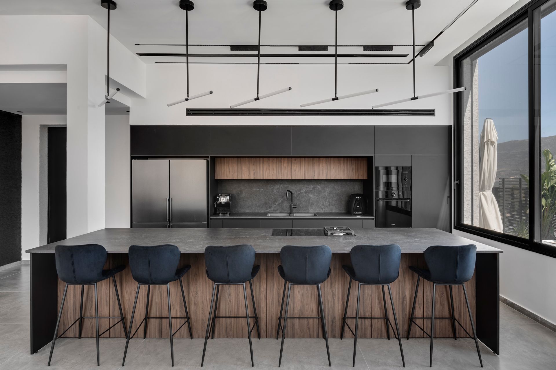
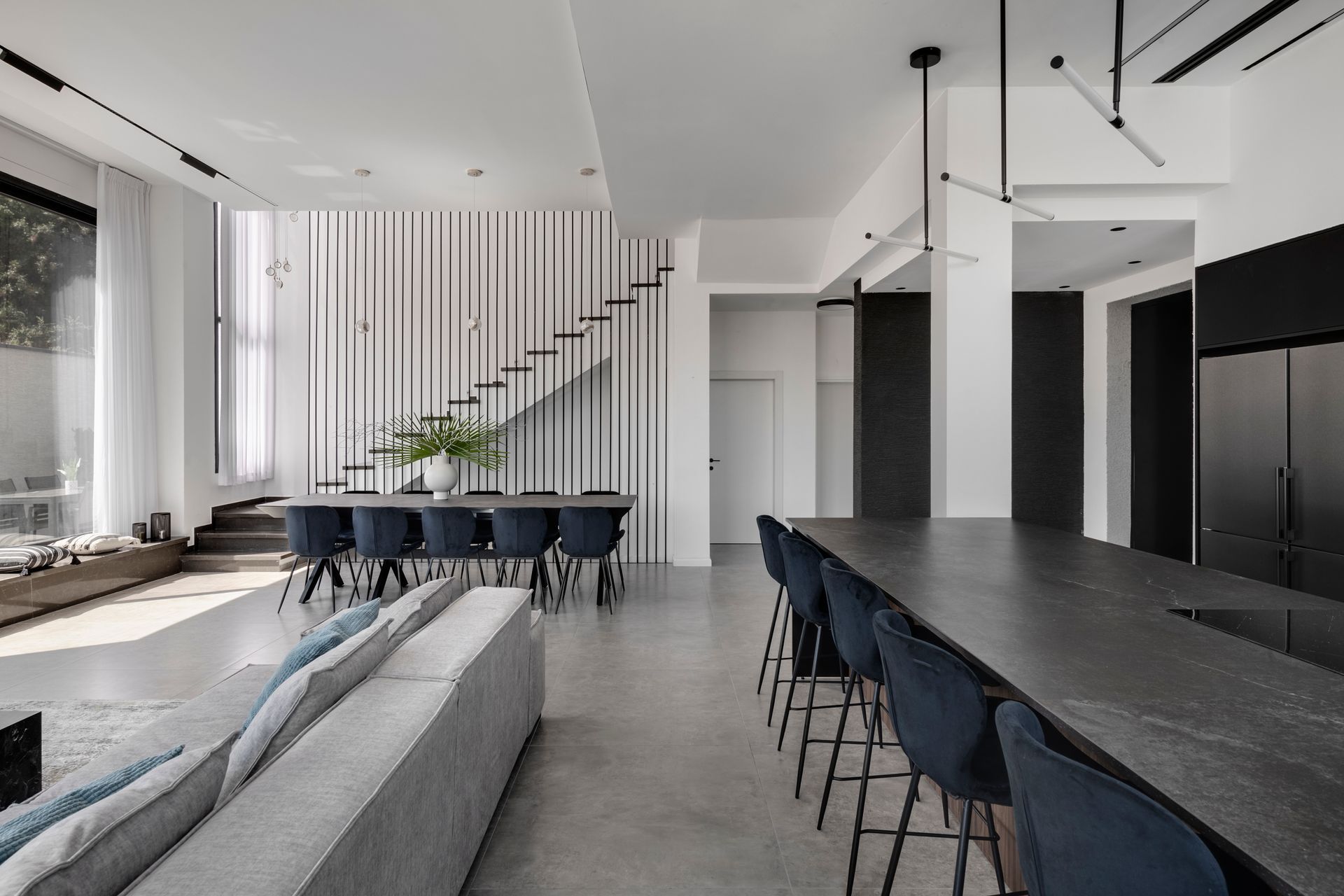
The ground level includes a lounge, kitchen, and dining area. A floating ceiling creates a clean look and adds visual richness along with the lighting fixtures that surround the ceiling and create a halo effect.
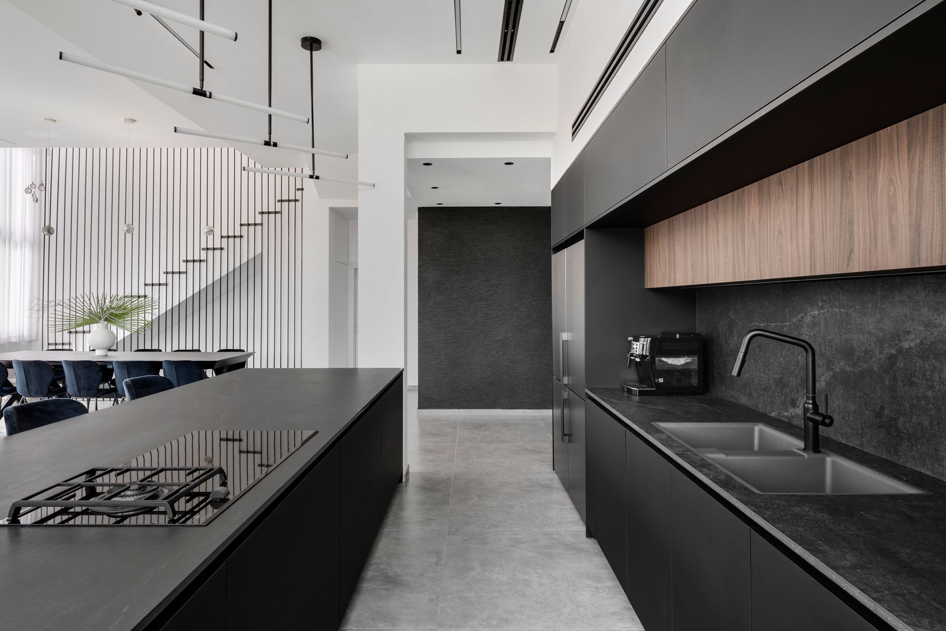
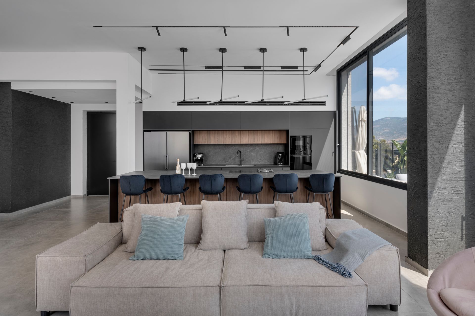
The kitchen combines oak and charcoal nano, also used for the island. The countertop is a delicately veined granite porcelain that incorporates a spacious island, which can accommodate six diners. It was cleverly designed to be practical for events as well as social gatherings. A large extending table was positioned in the adjacent dining area, for easy entertaining. Its color scheme continues that of the kitchen and the island.
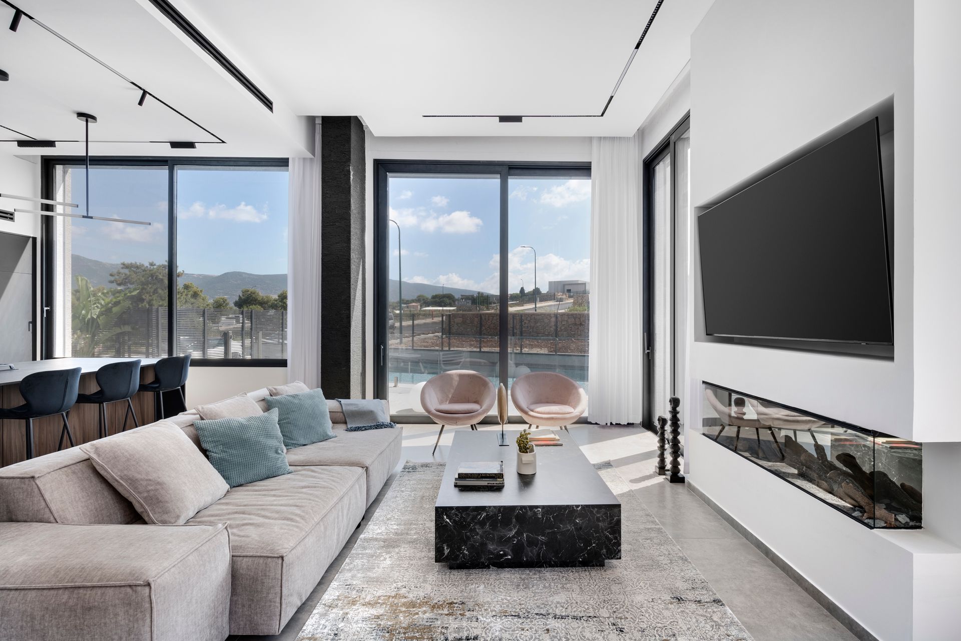
The family space includes an electric fireplace that adds a romantic and cozy touch, and a very large plasma screen tv, all surrounded by glass windows overlooking the view. A wide lounging sofa, with pale-blue scatter cushions, was positioned in the lounge area, alongside a rug in colors that correspond with the blue of the pool reflecting through the windows.
The sculptural staircase emphasizes the wall that connects the levels. The stairs were designed in gray granite stone, a tone darker than the floors, to draw attention to the custom-made banister designed by a local artist. The banister is made of iron poles that were colored and fitted according to the space dimensions and continue the theme of a clean design.
1x1 m exposed concrete-style tiles were used for flooring. Schneider, an ex-dancer, injects influences from the world of dance into the properties she designs. These are manifested in the combination of architecture and movement. Like a dancer that creates lines in space - so does the designer, with the architectural elements. The dominant banister creates lines in the space that resemble light strings that delicately stretch ad infinitum.
According to Schneider, architecture and dance share a common language that touches the physical, form, space, and movement.
“They are both based on textures, colors, and beats. Both are solid manipulations created in space whether through the movement of the body or with the use of raw materials and in using these, the artist either defines the space or breaks its boundaries. One might say that the dance frames the architecture. It focuses the eye of the observer on observing how a shape is perceived when it is positioned in one way or the other and alongside additional shapes and elements. Ultimately, my aim is to achieve harmony of shapes that maximizes the property, and the observer can experience both worlds in paralle.”
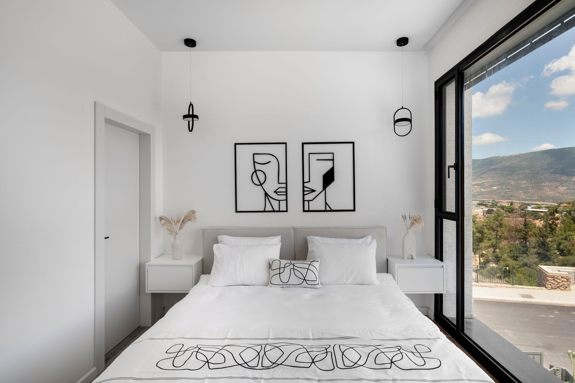
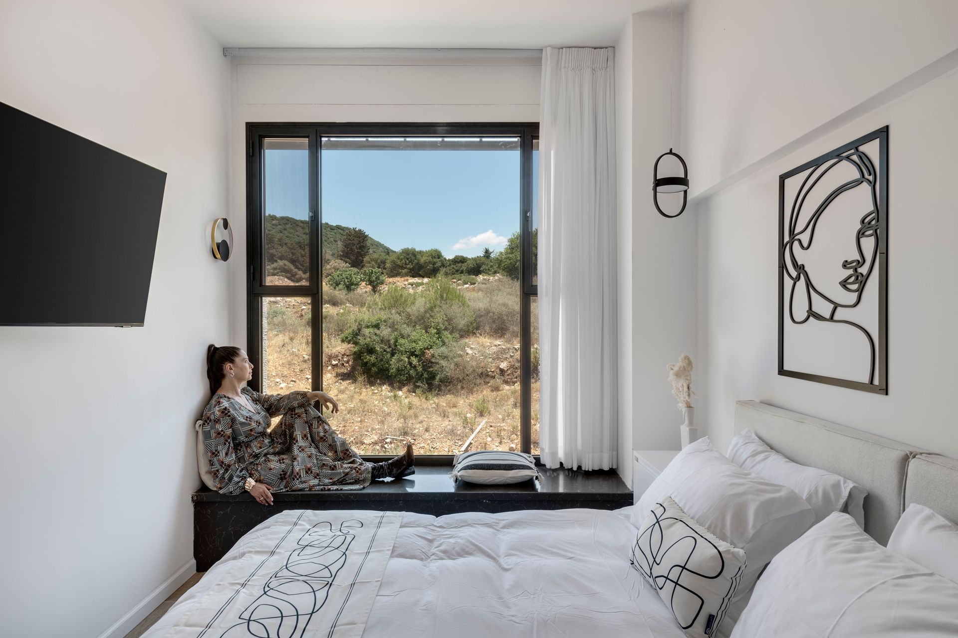
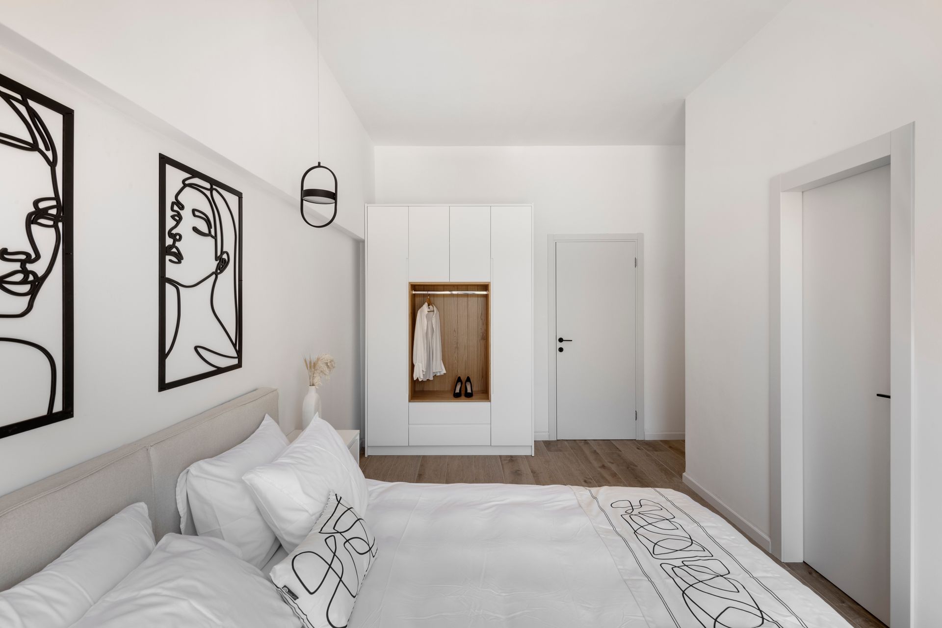
The pampering en-suites are located on the top floor and were designed with attention to the smallest of details. They include double beds adorned in luxury textiles that correspond with the artwork in each room, chosen by Schneider. To complete the vibe, soft translucent curtains were fitted, which can be drawn to expose the view in all its glory through large glass doors. The interior decor adds delicate touches of warmth and includes rugs, accessories, and soft textiles, all minimalist, bright and exact.
Each suite contains a spacious en-suite designed in true boutique-hotel style, to complete the feel of nature and freedom. Floating mirrors were fitted in all the bathrooms, with concealed light fixtures. The tiling, as opposed to that throughout the family space, is white with gray veins.
The sense of freedom continues in the garden with a 4x12 swimming pool, water jets, lighting, speakers, and many seating areas throughout the green and airy space.

Photography Oded Smadar
Architecture & Interior Design Yehudit Schneider
SHARE THIS
Latest Edition
Mar / Apr 2026 edition is available now!
Contribute
G&G _ Magazine is always looking for the creative talents of stylists, designers, photographers and writers from around the globe.
Find us on
Latest News

Subscribe
Keep up to date with the latest trends!
Popular Posts
