Buckle Street Studios London
Located in the Aldgate East neighborhood of London, Grzywinski+Pons designed a new thirteen-story building from the ground up as well as all of the interiors and much of the furniture scattered in 103 compact apartments, a mezzanine
co-working space, a coffee shop, meeting rooms and a concept store.
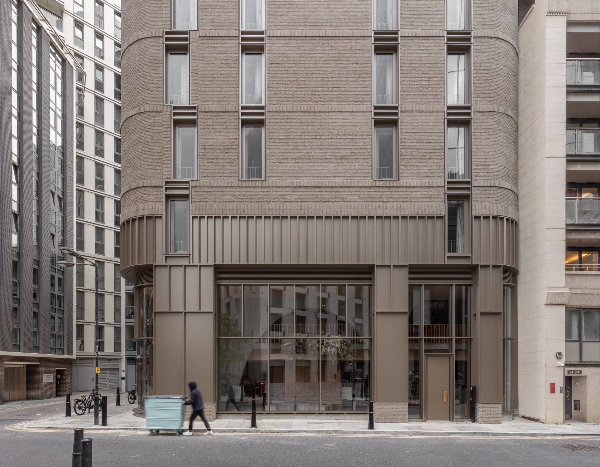
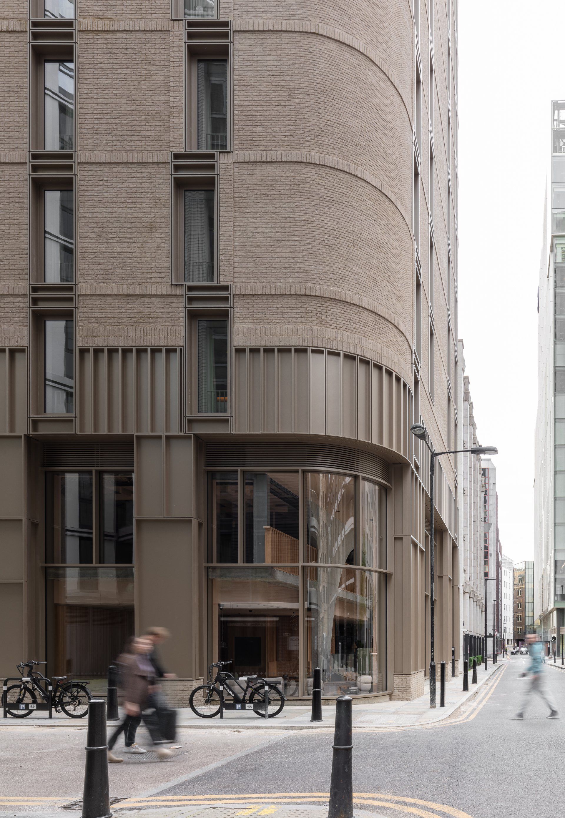
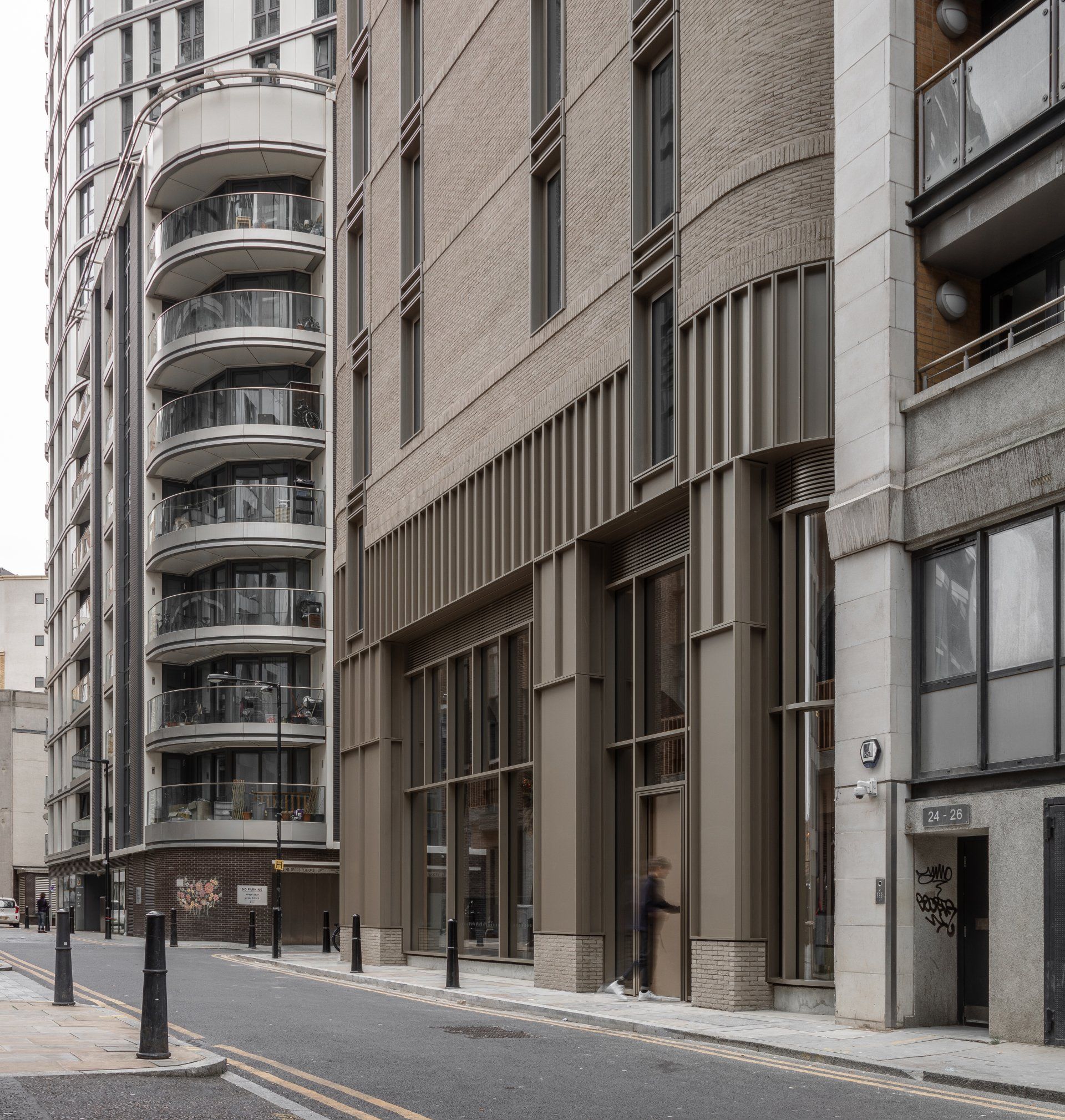
The urban infill site is part of a dense and varied assemblage of buildings in both scale and style. Low-rise heritage structures sit directly adjacent to contemporary high-rises. During the planning process, Grzywinski+Pons worked alongside the municipal authorities to ensure our design fulfilled the aspired role of architectural intermediary both in mass and articulation.
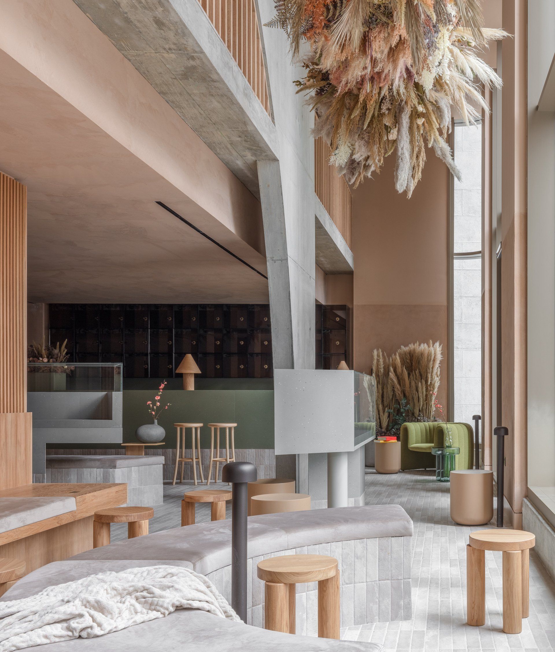
The architects employed radiused corners and transferred much of the scheme’s structural load to an expressionistic double-height parabolic arch at grade to make the building sit softly within its block all the while drawing inspiration from the round headed windows, arched cornices and rounded quoins of the heritage buildings on the neighboring streets.
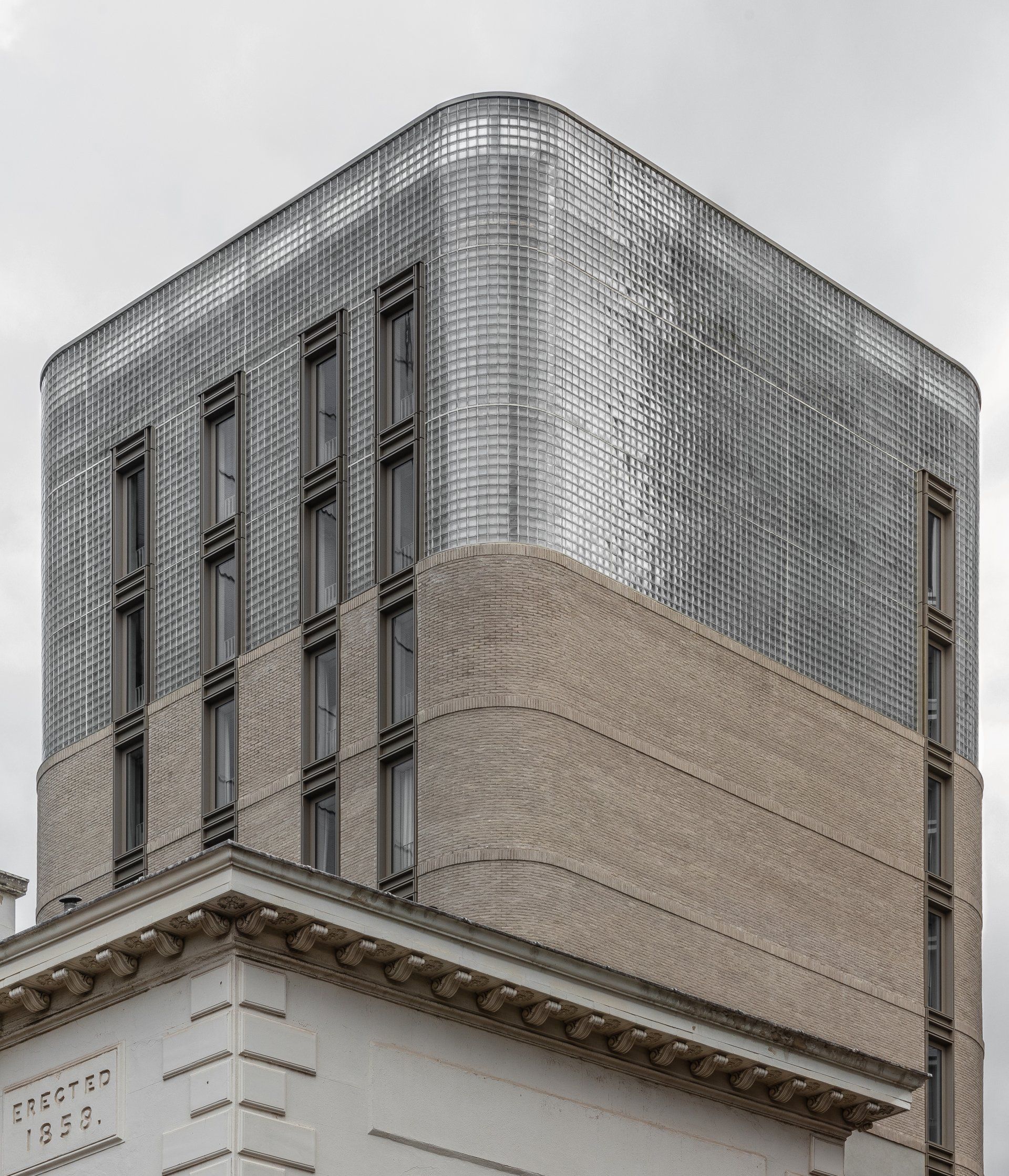
The building’s mass has been articulated in three sections. While the constraints of a small floor plate precluded actual formal setbacks, the architects employed dramatic but ordered material shifts throughout the building’s strata to define a pediment and crown. This tiered approach also allows the building to become more light and transparent as it rises.
The base of the building is clad in rusticated, nickel finished metal panels composed in our modern take on a progressive ordered scale. The fenestration on all three building tiers is comprised of the same nickel finish metal and the coffered panels serve as spandrel covers and artful ventilation grilles while harmonizing the stratified facade.
Above this pediment the architects used a warm grey hand-laid waterstruck brick with projected soldier courses at the spandrels and a projected cornice below the material shift at the base of the crown. The brick spandrels and other transitional detailing imbue the already richly textured skin with even more depth.
The diaphanous crown of the building was designed to be equally proportionate to the base and is clad completely in glass block. The architects specified a winged block (the wings serve to hide the grout joints) that is thermally efficient, beautifully luminous, and like the brick below, has texture, gravity and permanence. The subtle, diffuse luminance of the rooms when lit from within softly animate the crown. The volume feels solid and ephemeral all at the same time and the activation of the interior spaces by residents yields a naturally kinetic glow.
For maximum thermal and acoustic efficiency, the crown’s envelope is a twin-wall assembly with the outer skin acting as both spandrel and parapet. The parapet wall has been raised to completely cover all of the equipment on the roof while it's translucency generates a diffuse and gentle termination of the top of the building into the sky.
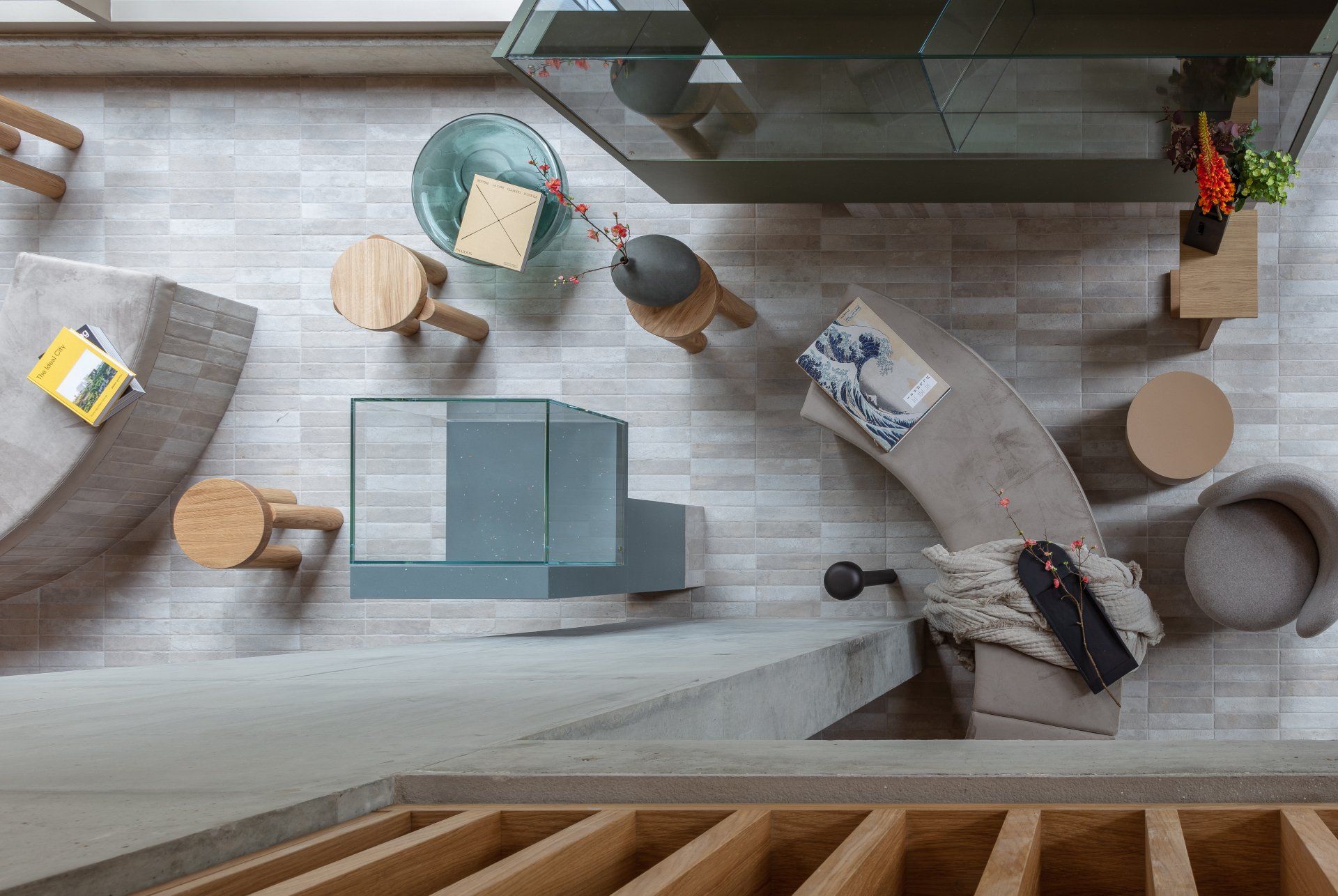
Being able to design the exterior and interior simultaneously afforded a great opportunity to the architects to capitalize on architectural advantages they created and curate a truly integrated experience from within and without.
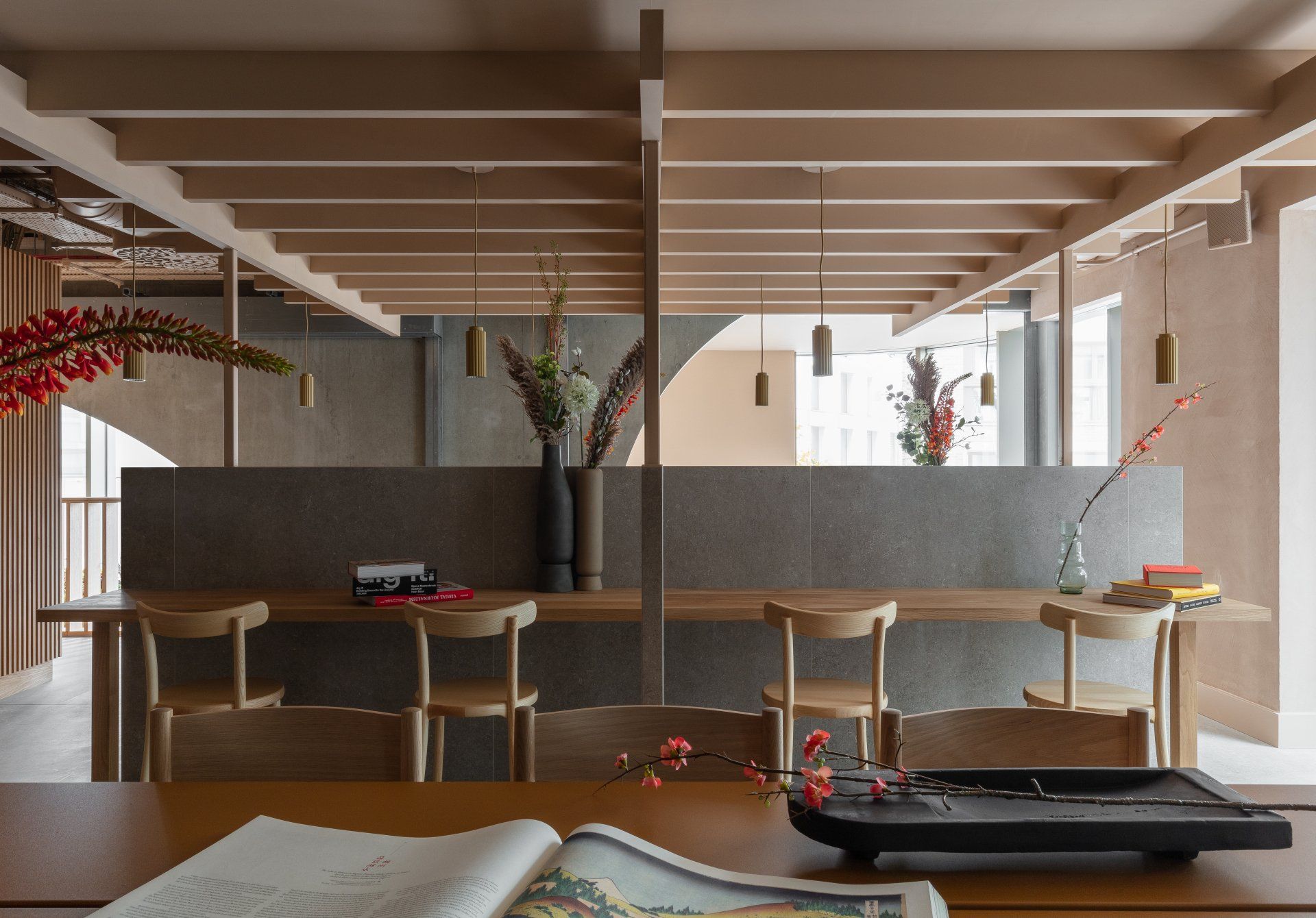
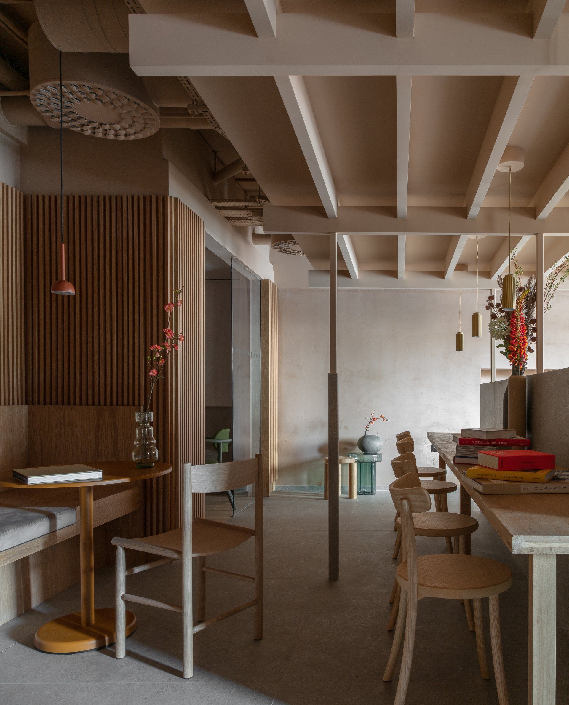
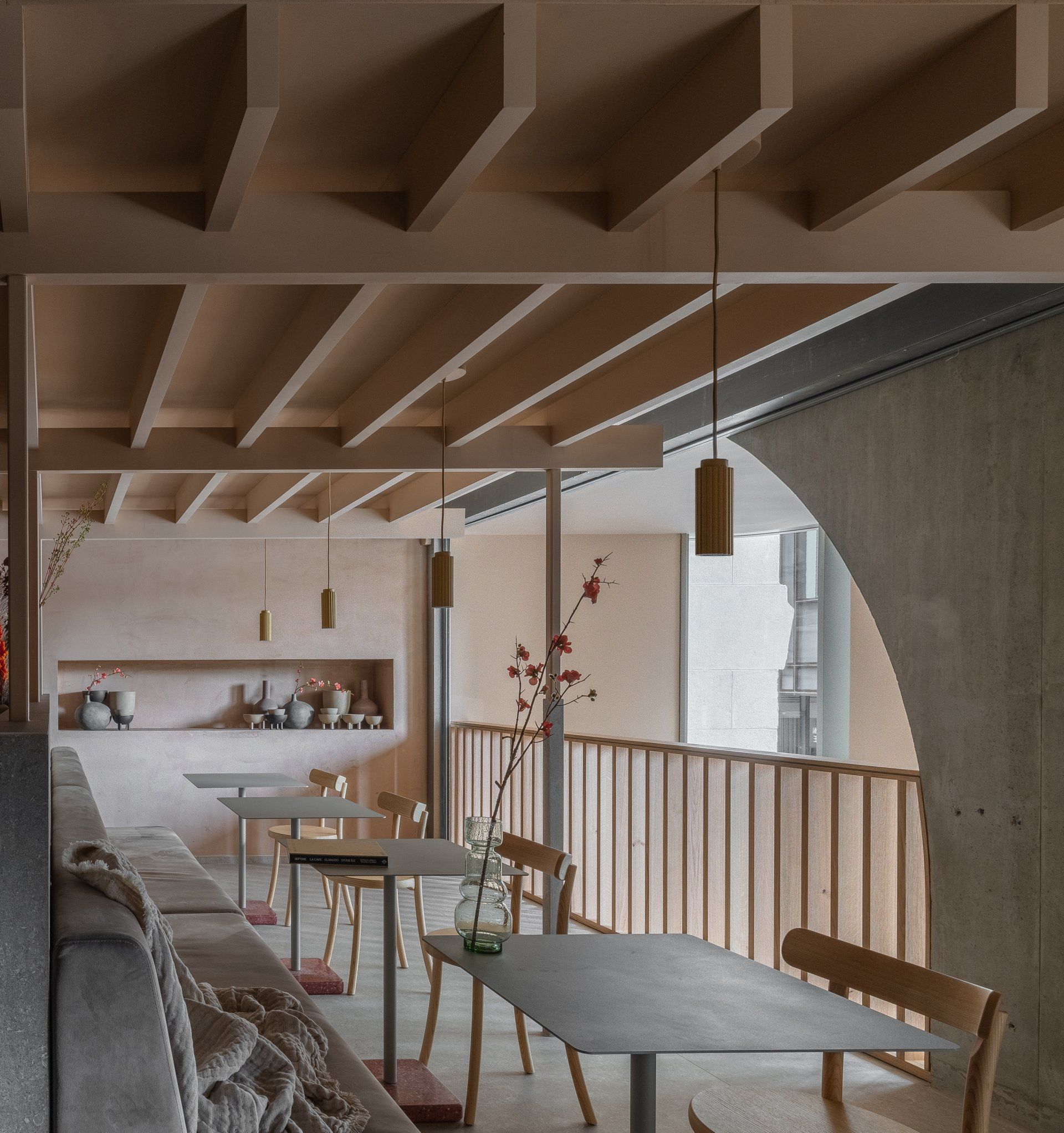
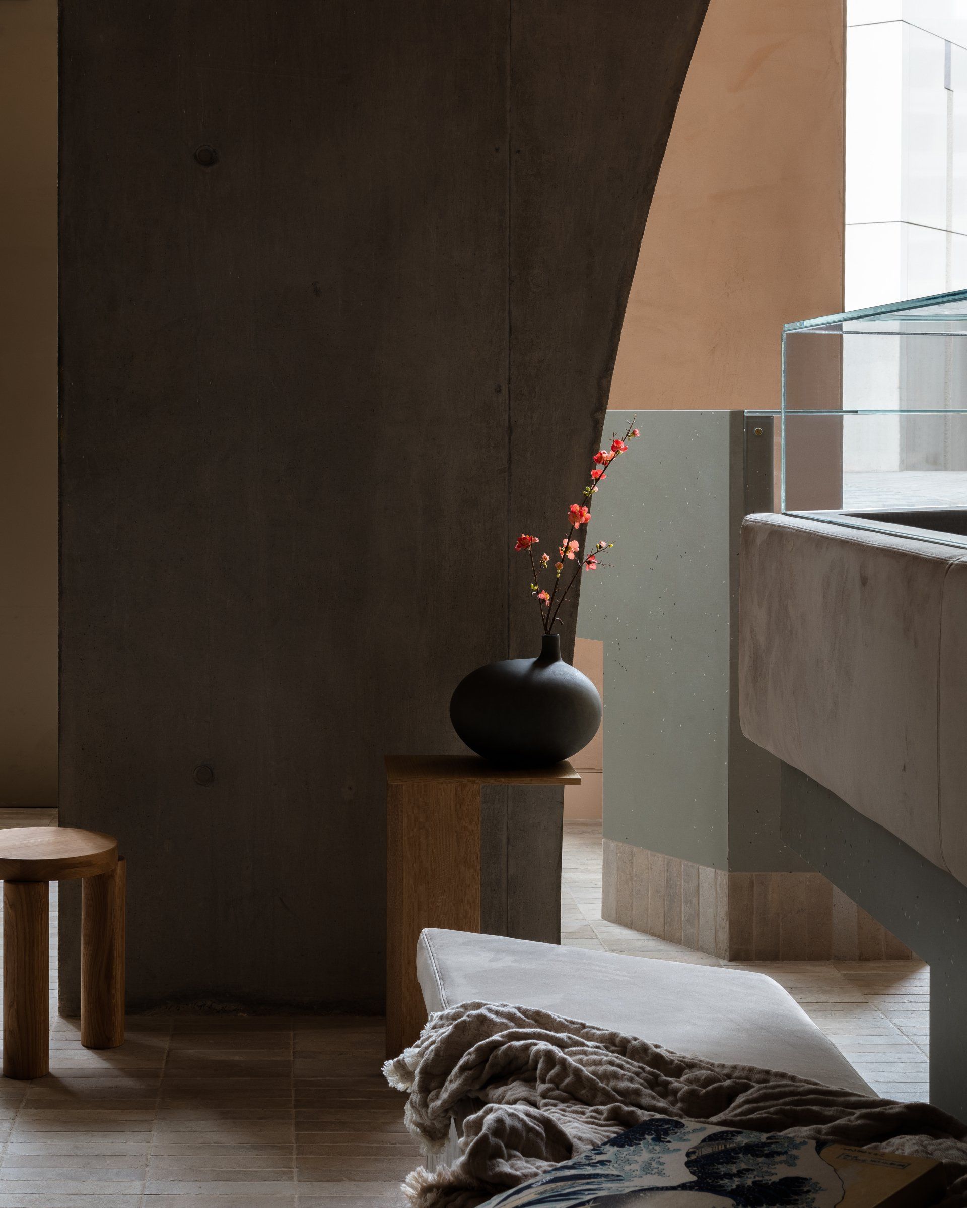
In the public spaces of the project, this integration from the inside out is fundamental. The principle organizing element of these areas is the parabolic arch. Legible from the street through expansive glazing, it also supports and defines the mezzanine within to the double height space at grade while consolidating the load of the front half of the building above. The structural expressionism is softened with an integrated timber balustrade and fluted paneling, clay plaster finishes, dress curtains and soft furnishings. The floors and skirtings of fixed joinery are clad in brick congruent to the building’s facade.
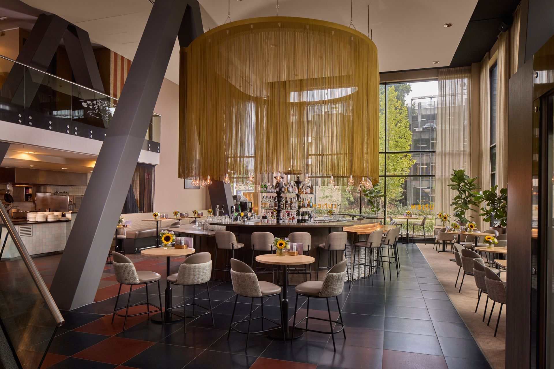
The architects created vitrines from rhombic volumes clad in porcelain and glass to display and elevate the curated merchandise of the concept store and surrounded them with curved banquettes, sofas and soft stools that promote lingering. The space, like the contents of the vitrines, lies at the crossroads of art and commerce. Equal parts gallery, lounge, coffee shop, retail concept and living room, the space beckons to the street and is as welcoming as it is inscrutable.
"It is our hope that passers-by will feel compelled to come inside to further discern what, exactly, it is, and then feel free to get comfortable and stay a while."
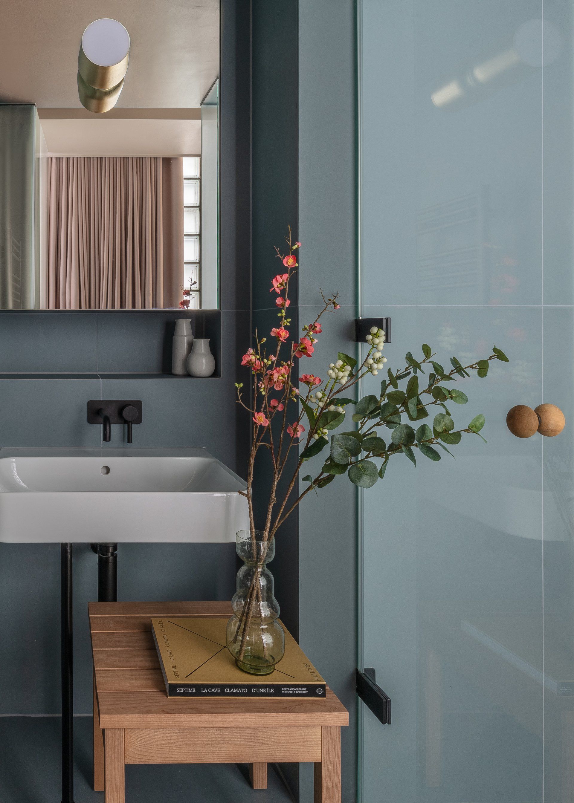
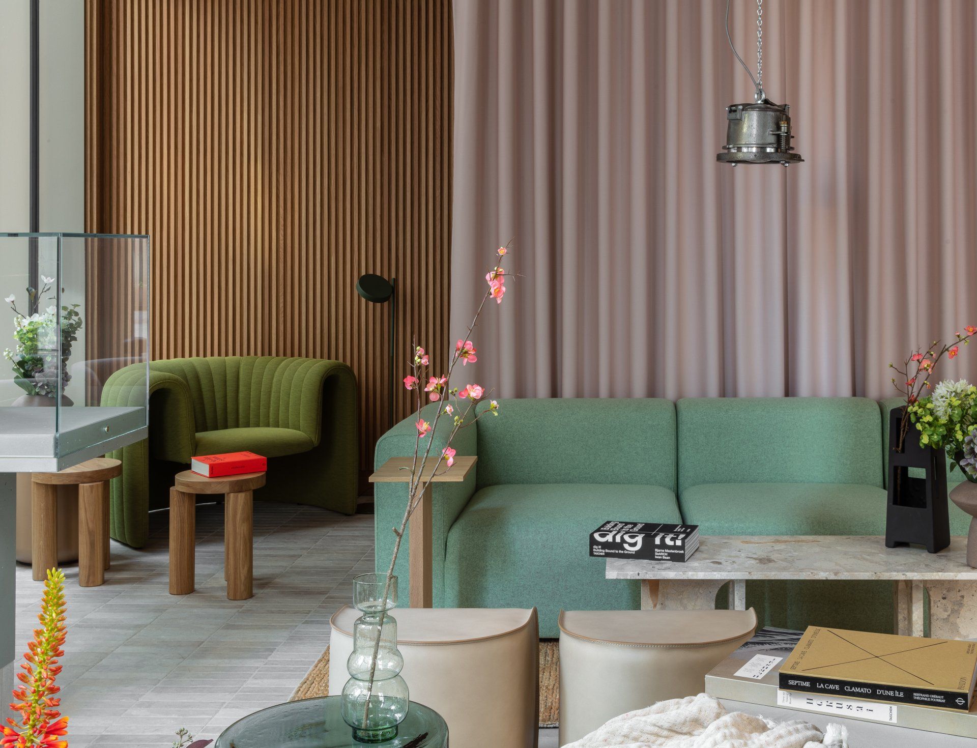
"By linking sumptuous custom sofas to beds and designing compact tiered tables, shallow linear shelves and hanging timber trays, the imperative to efficiently facilitate functionality yielded a comprehensive aesthetic that manages to feel luxurious. The palette: blush tinted clay, sage, timber, jute, creamy stone and velvety neutrals, further contribute to the plush serenity of the studios."
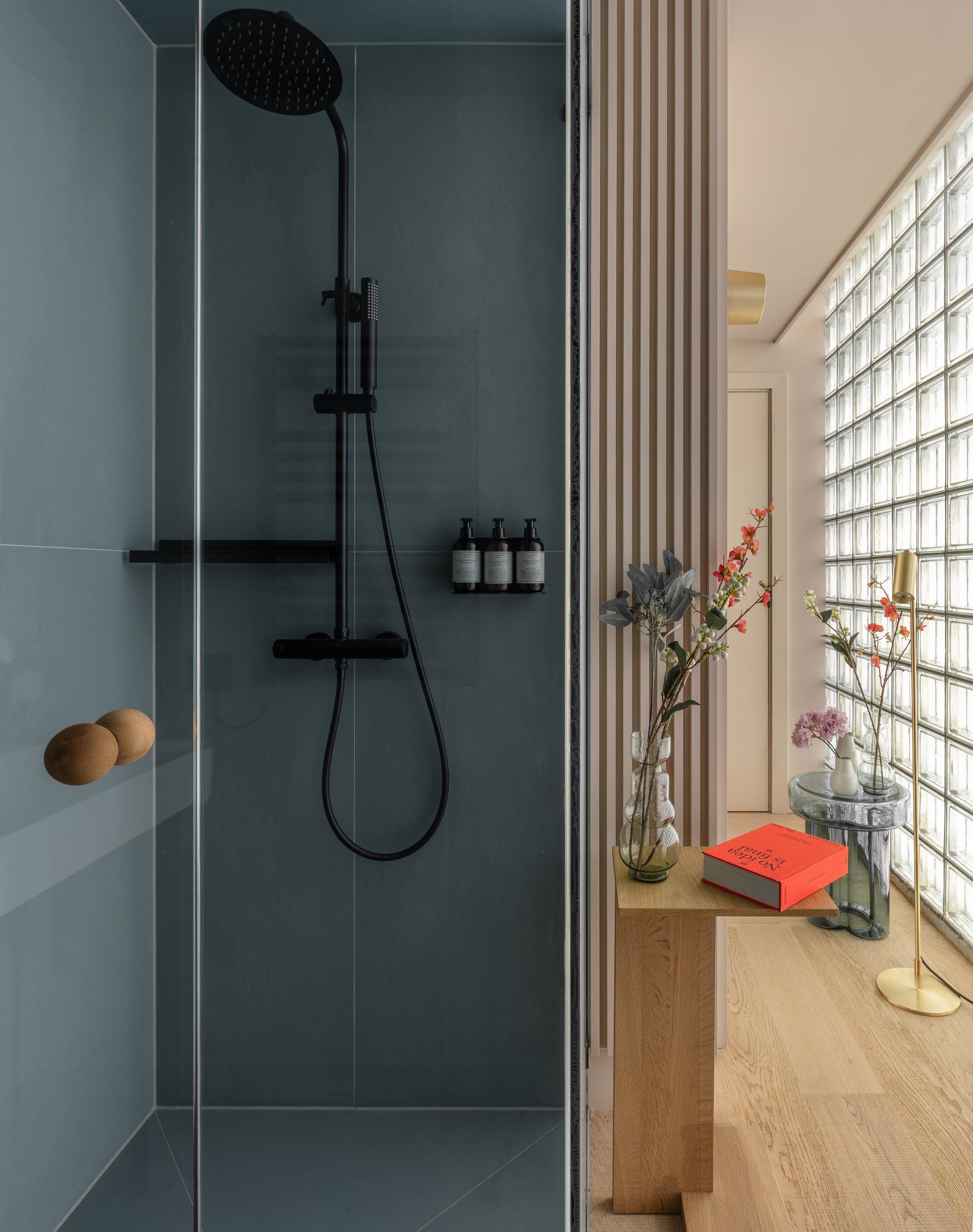
In the apartments in the crown, all the allure and utility of the luminous glazed cladding confers advantages to the interiors. The low iron glass and specular reflective sidewalls of the blocks amplify the warmth and brightness of the space. The architects balanced their glossy cartesian rigor with prodigious billowing curtains, clay plaster walls and cross sawn timber floors. Ultrasuede upholstery and lush bedding further insure the rooms are as comfortable as they are iconic.
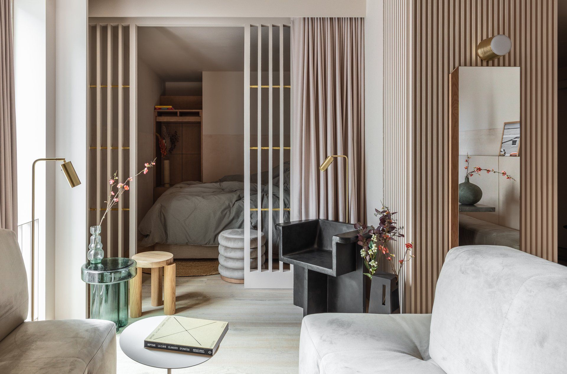
"For us, as architects, and our client, this project also furthers the equally urban and personal interrogation between public and private, residents and visitors. This blend is the very stuff of so many of the most successful and vital communities in London."
An enigmatic yet alluring public space anchoring co-working spaces and aparthotel rooms create an inclusive and inviting context from which the community and visitors can interact with and inspire one another.
Photography
Nicholas Worley
Architecture
Grzywinski + Pons
SHARE THIS
Latest Edition
Mar / Apr 2026 edition is available now!
Contribute
G&G _ Magazine is always looking for the creative talents of stylists, designers, photographers and writers from around the globe.
Find us on
Latest News

Subscribe
Keep up to date with the latest trends!
Popular Posts
