Blue Pepper
Jooca Studio designed the ground-flour of a duplex apartment situated in the north area of Bucharest.
The client bought the apartment with all the finishes installed, but he did not feel like the interior space represented him. The original layout of the ground floor had an open space formed by kitchen and living room, and a separate bedroom. The space was a bit crowded and the client did not need that bedroom, as the apartment has two more bedrooms upstairs.
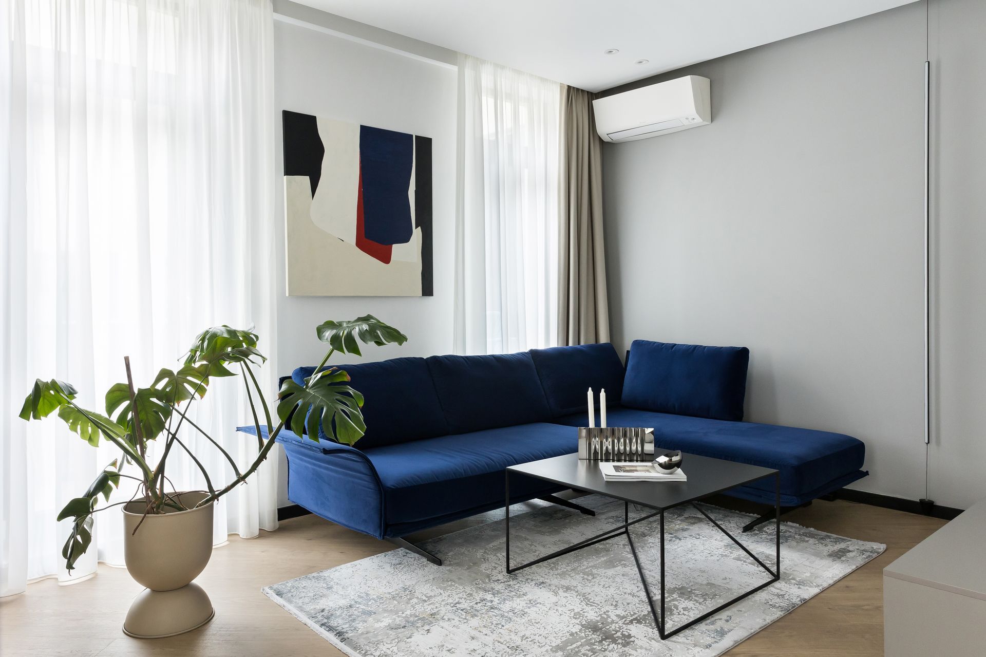
Therefore, the design team redesigned the whole floor plan by creating a bigger open space. The former living room became a dining room, and the bedroom became the living room. Another change was the glass wall and doors on a metallic frame that separates the kitchen and dining room.
The apartment came with some visible concrete walls and ceiling, so the designers decided to go on an industrial style softened with some velvety fabrics. The star of the place is the lamp above the dining table, with its twists and curves that contrast with all the clean straight lines of the space.
The vertical radiator in the new dining room area was replaced with a decorative blue one; for creating symmetry, the designers added a painting in the same size as the radiator on the opposite wall.
The staircase was redesigned by using the original metallic structure that was trembling a bit when you stepped on it: it has been reinforced, painted black, and perforated metal mesh was added to the rail and natural wood steps and brought warmth to the raw structure.
SHARE THIS
Latest Edition
Mar / Apr 2026 edition is available now!
Contribute
G&G _ Magazine is always looking for the creative talents of stylists, designers, photographers and writers from around the globe.
Find us on
Latest News

Subscribe
Keep up to date with the latest trends!
Popular Posts
