A special list for Fashion lovers
July 16, 2020
A selection of clothes stores designed by the best interior design studios: from pastel colours to extravagant interiors to refined details.
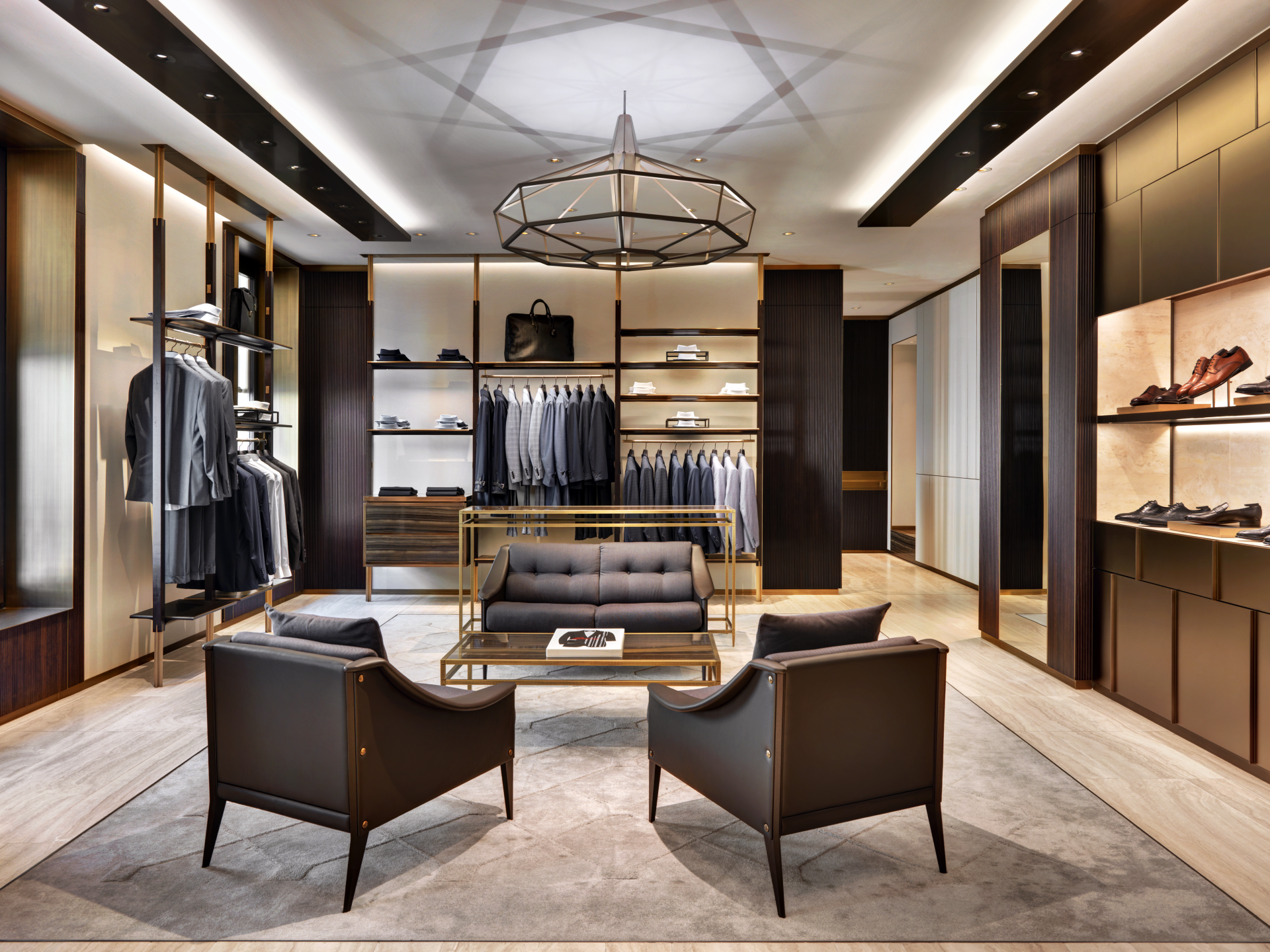
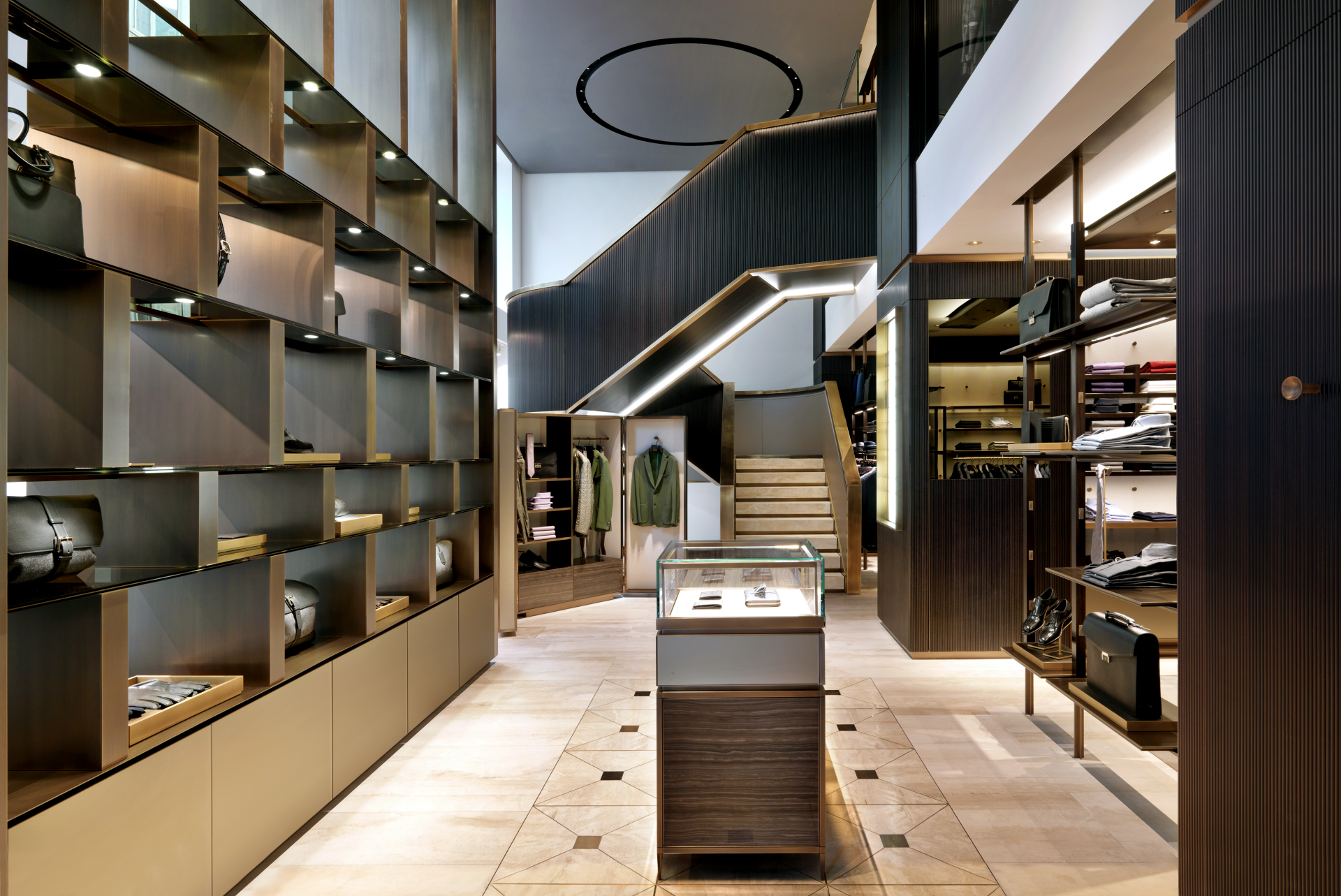
1. Brioni by Park Associati / Milan, Italy
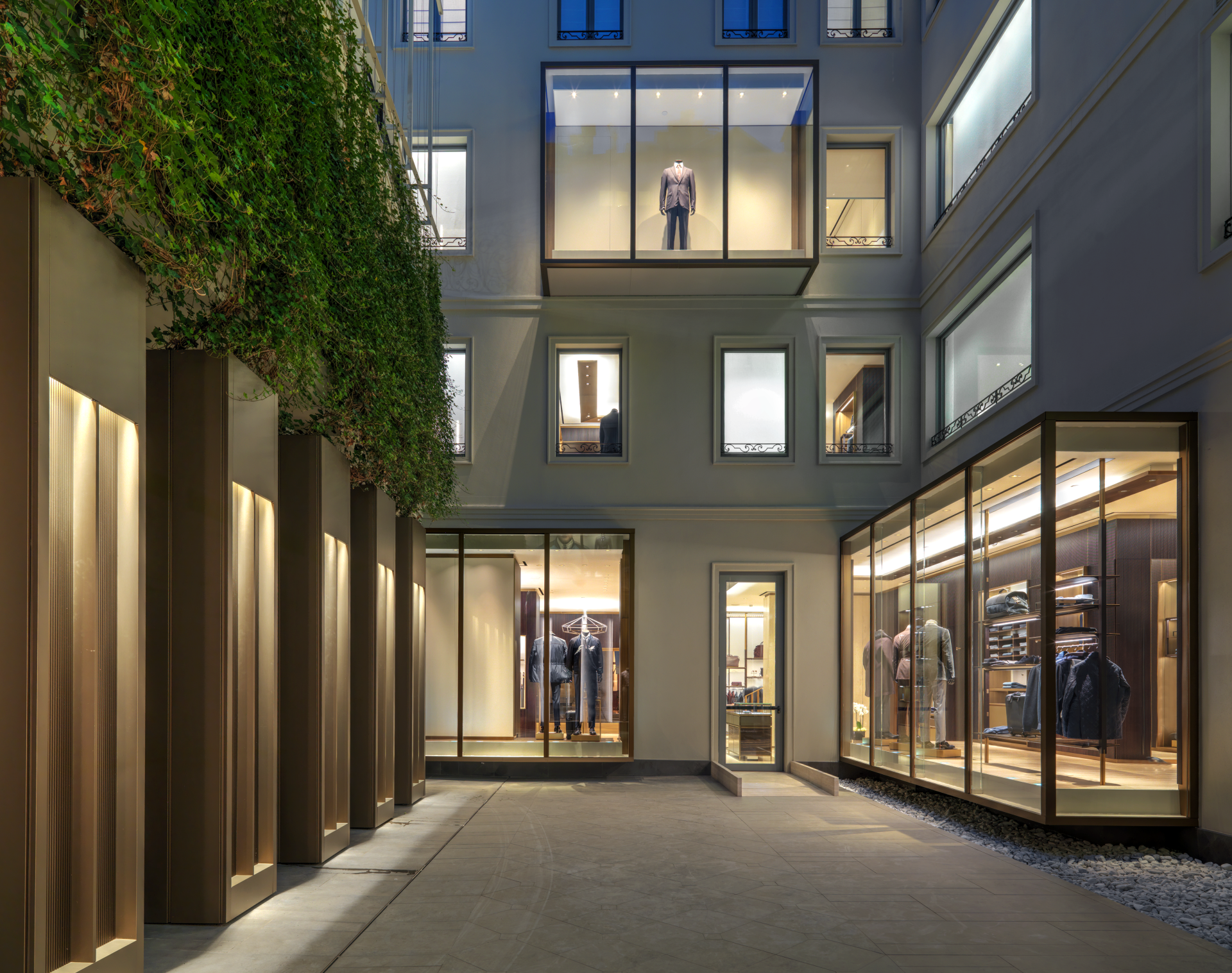
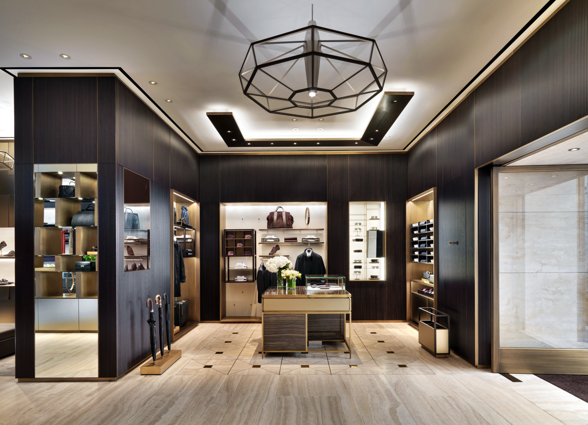
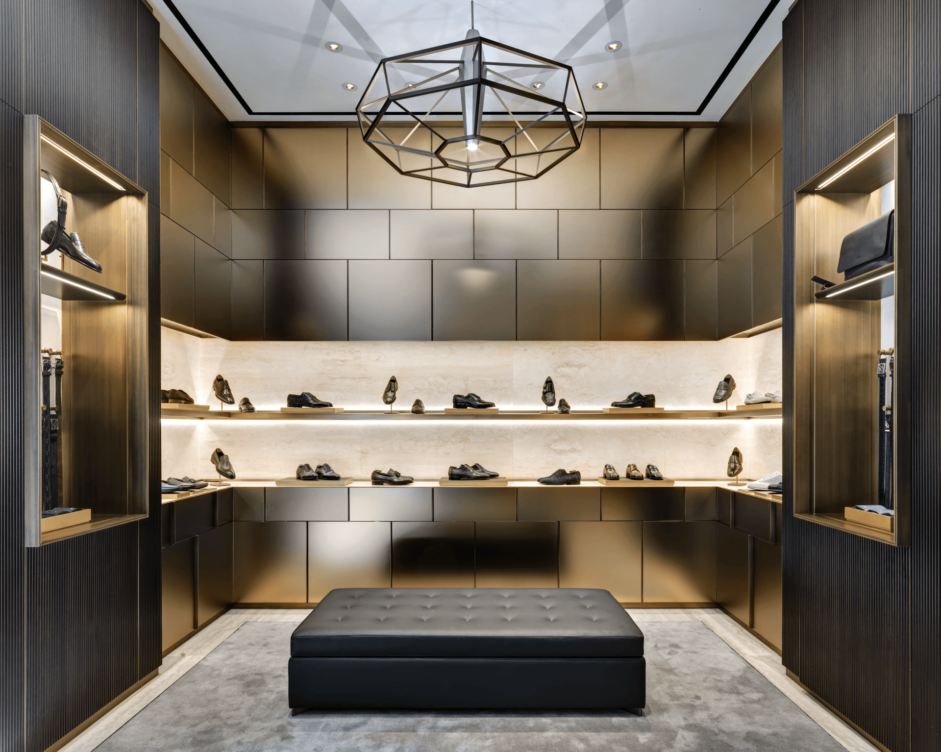
Located in the city’s luxury shopping area, the three-level boutique is housed inside a historical palazzo, entirely renovated by Brioni, and stretches out over 1,200 square meters. It is the largest store to date and the first in Italy to feature the house’s new design concept, masterminded by Creative Director Brendan Mullane and Studio Park Associati of Milan. At once contemporary and luxurious, sleek and airy, the project is characterized by a select choice of prized materials in tonal shades of beiges, taupe and browns. Sanded glass, bronzed brass trimmings, “cannucciato” ribbed Bahia wood, Eramosa marble and Navona travertine floors, evocative of Brioni’s Roman roots, blend seamlessly, creating an elegant play of textures and luxurious matte-shiny finishes, studied down to the last detail.
Address: Via Gesù 2 - Milan, Italy
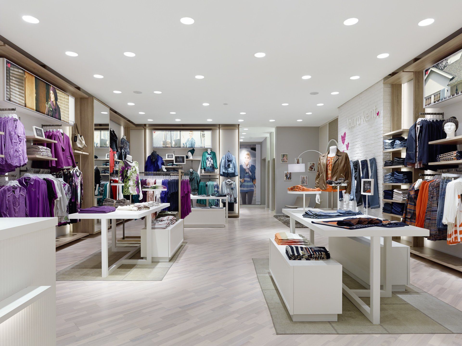
2. Laura Kent Store by Ippolito Fleitz Group / Frankfurt, Germany
The objective was to design a friendly and inviting Corporate Architecture, which particularly appeals to a 50 plus, female target audience. It should be universal and flexible enough to enable varying product presentations, yet reserved enough to give the collections that are arranged by colour a calm and pleasing background. The underlying idea was to translate the homely, private ambience of a walk-in wardrobe into a retail-ready format.
Address: Europa-Allee 6, 60327 - Frankfurt, Germany
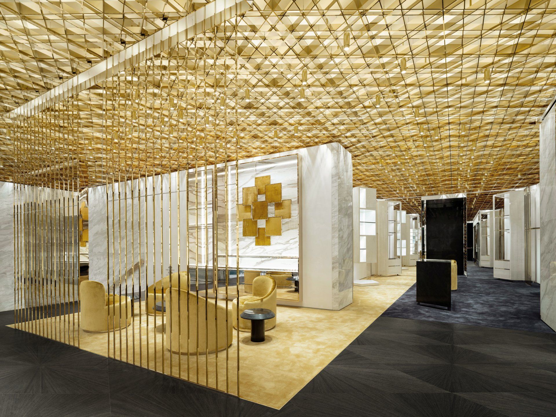
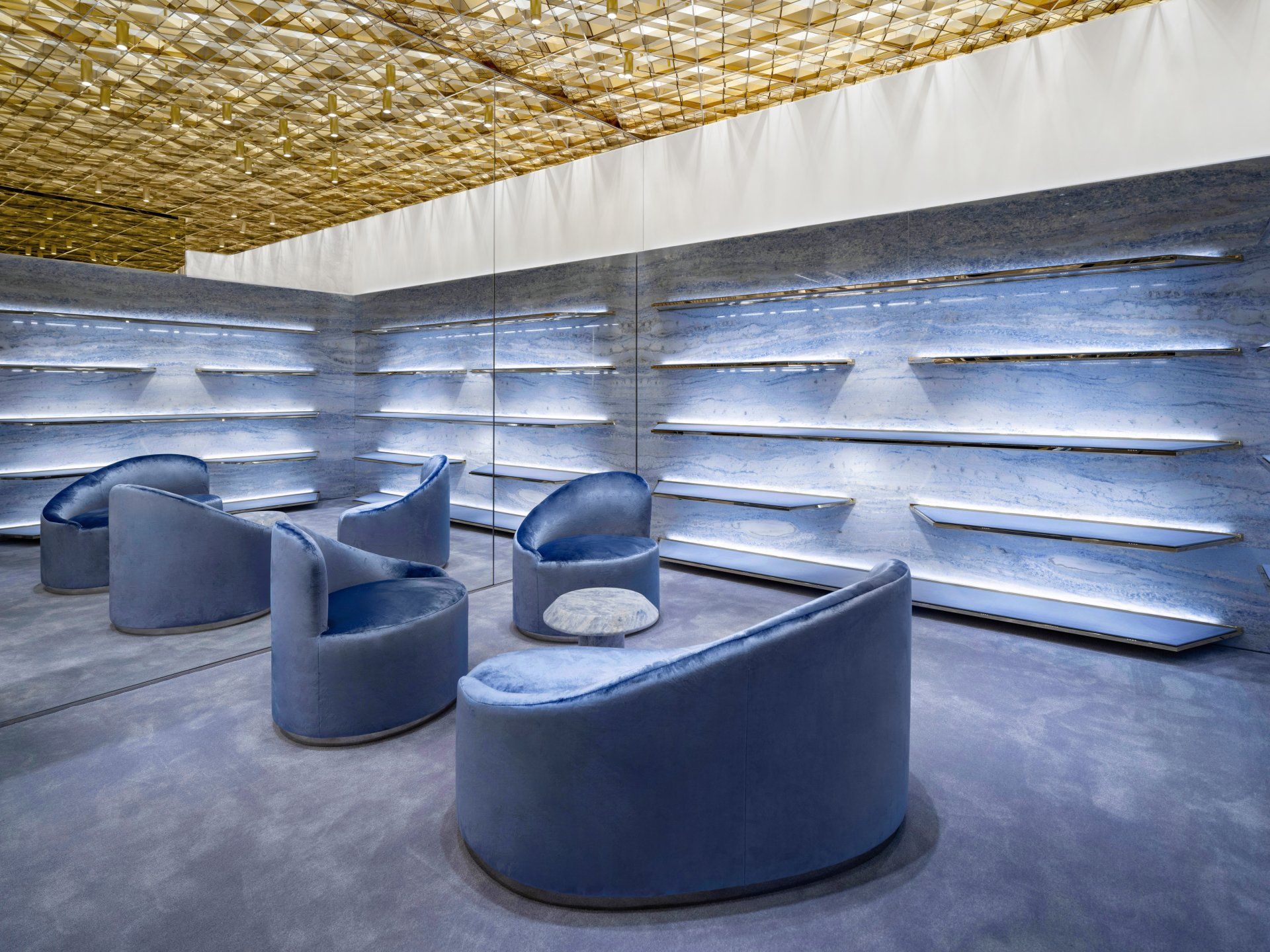
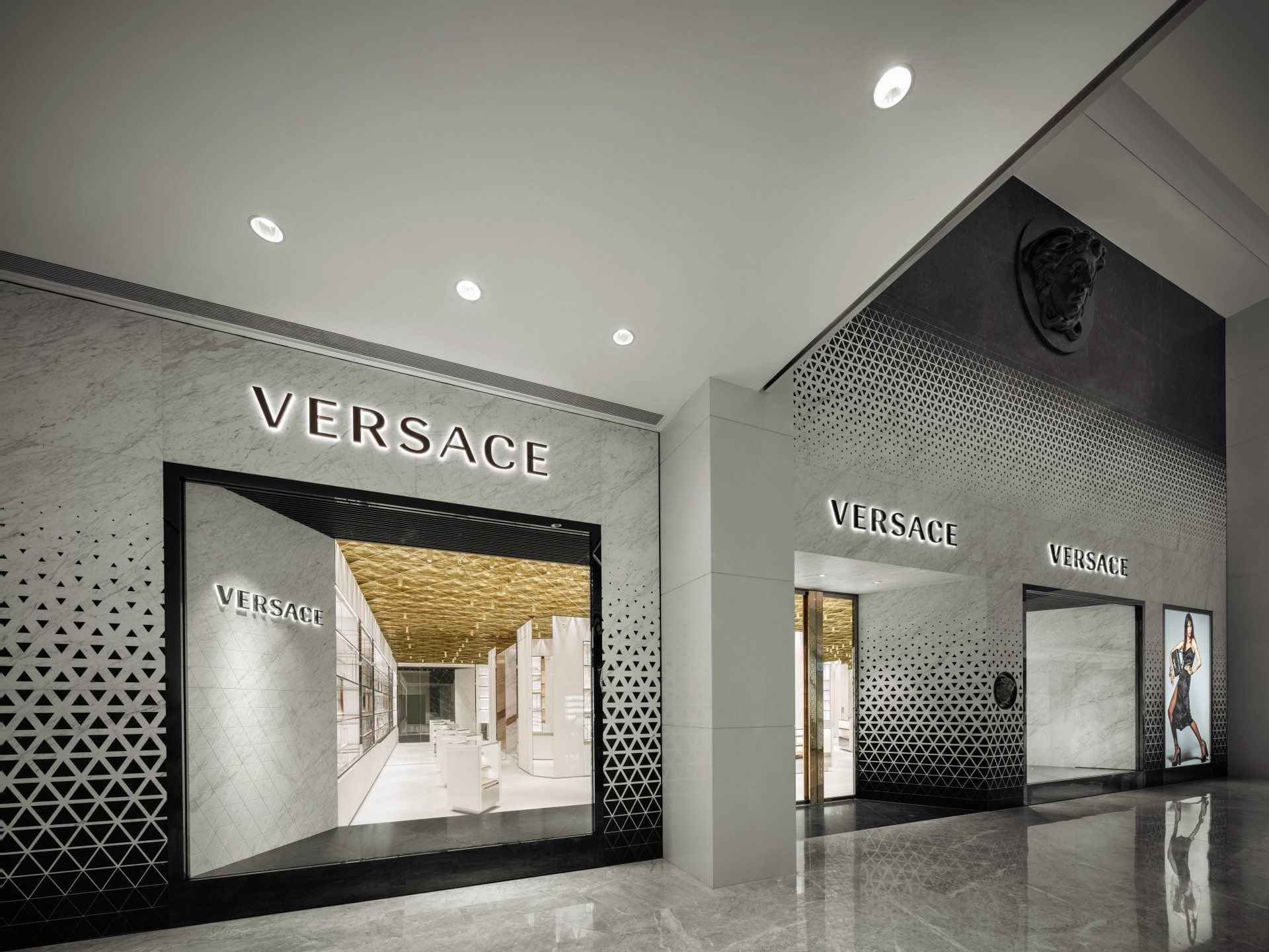
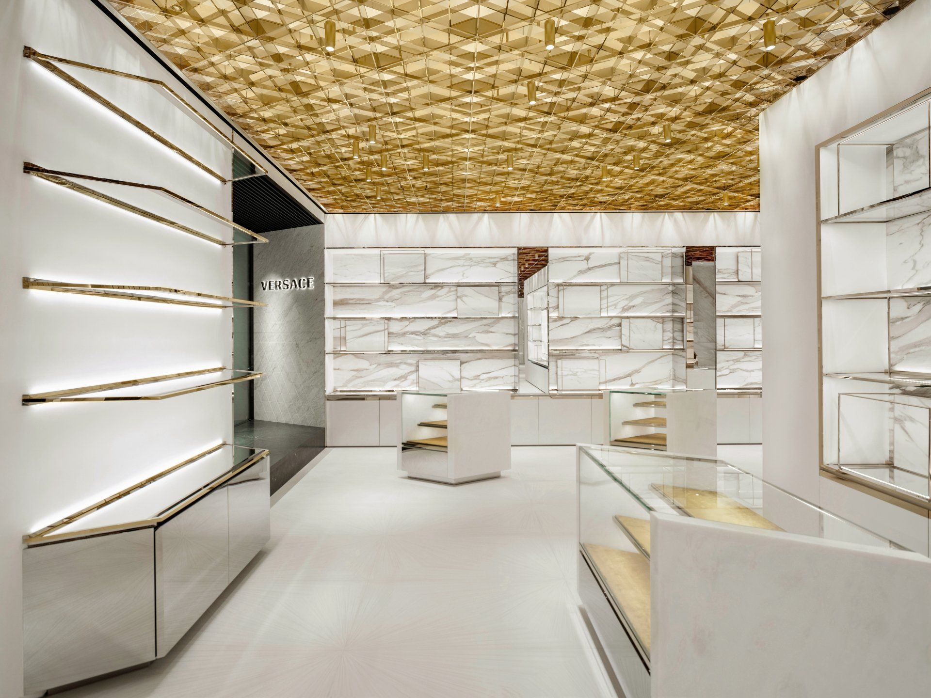
3. Versace by Curiosity / Beijing, China
Located in the Chinese capital’s downtown business district inside the luxe China World Mall, the two-story boutique covers an area upward of 4,300 square feet and features both ready-to-wear and accessories for women and men. The store design was spearheaded by the French but Tokyo-based architect Gwenael Nicolas. The boutique’s exterior is compromised of marble and features a prominent three-dimensional raised Medusa, and much thought was put into its LEED-certification, the brand highlighted.
Address: Shop Sl1019+Sl2026, China World Shopping Mall, 1 Jianguomenwai Avenue, Chaoyang District - Beijing, China
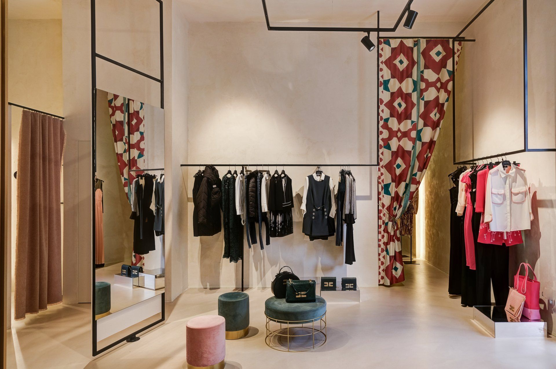
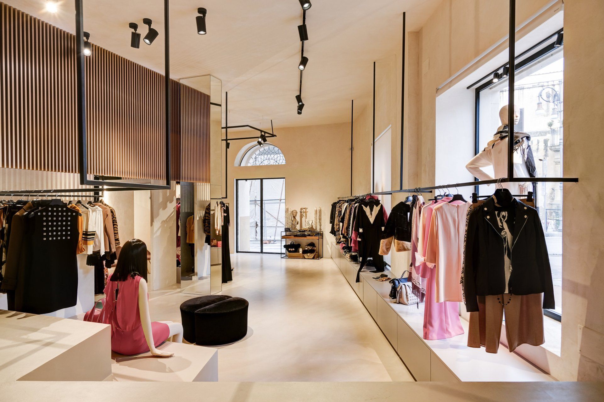
4. MASI Buotique by Gruppo Vid’A / Sciacca, Italy
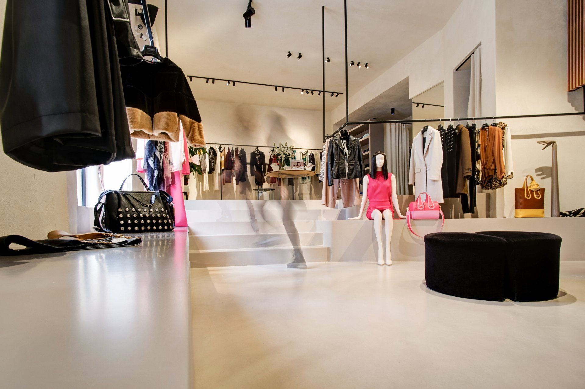
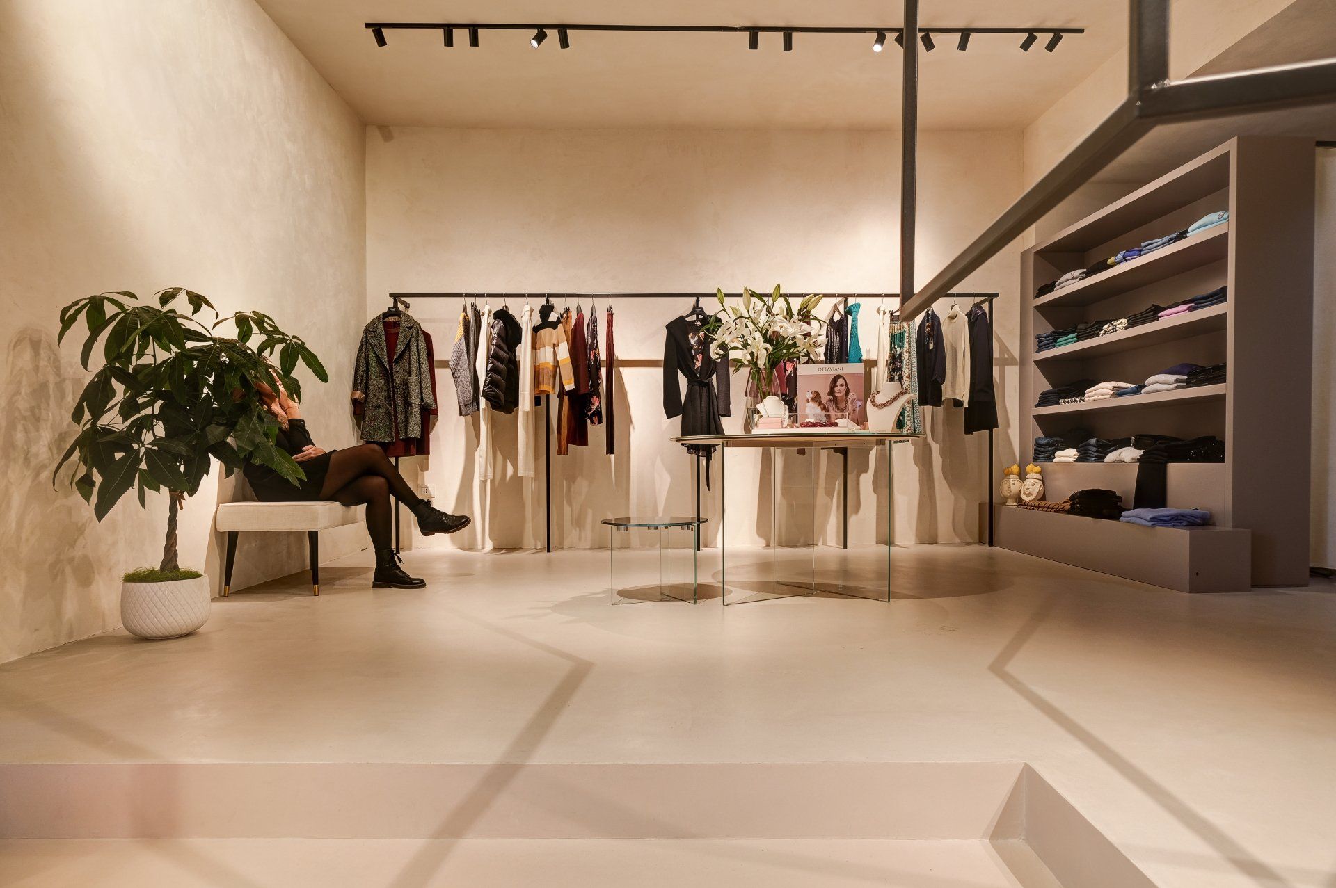
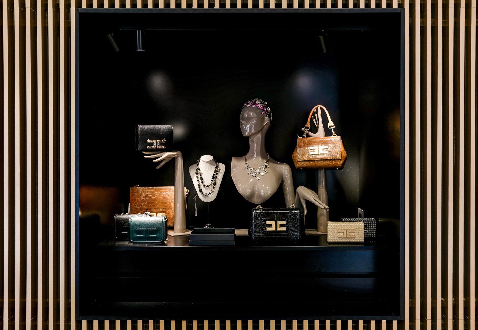
Masi is a Female Boutique in the heart of Sciacca, a beautiful small seaside town in Sicily. Every detail, inside, has been studied to combine the aesthetic appeal with the functionality. Everything is composed to make the people feel like in a catwalk, in which they are the main subject. The meticulous study of the materials and their combinations resulted in the exaltation of the proportions of the space, accentuating its depth and dilating it. Theprotagonist element is a wall of gold rose-colored aluminum strips that develops inside the shop, and in addition to concealing the warehouse, it characterizes its image becoming a symbol of recognition and identification of the place itself. The lighting system is inspired by the illumination of the exhibition galleries, identifying the garments as real works of art.
Address: Via Giuseppe Licata 271, 92019 - Sciacca (AG), Sicily, Italy
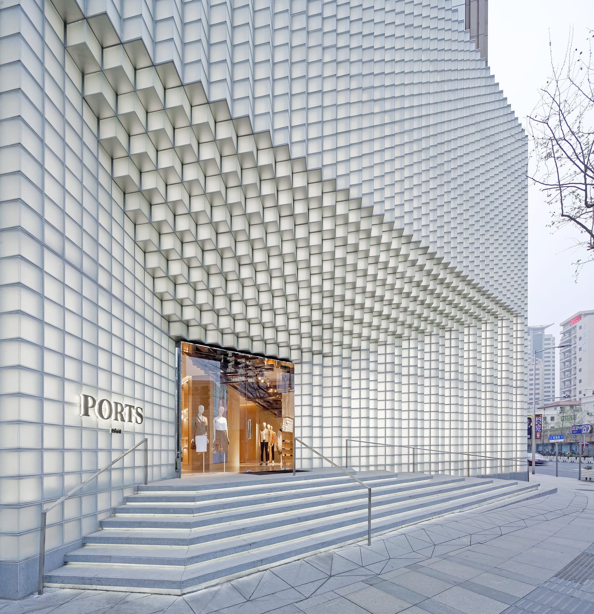
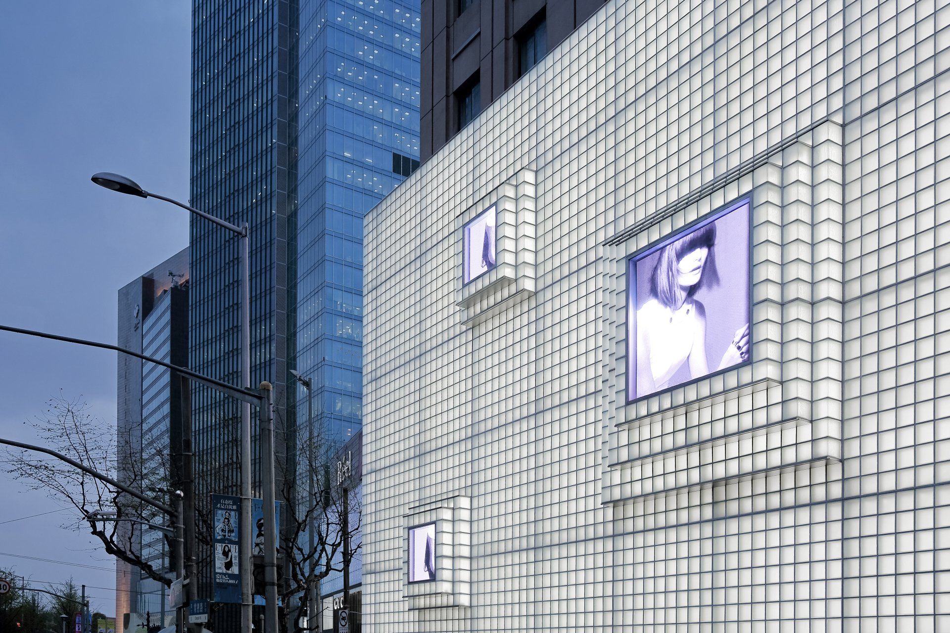
5. Ports 1961 by UUfie / Shanghai, China
Located at a major high-end commercial district at the intersection of Changde Road and Nanjing West Road in Shanghai, a new façade is created for the fashion house Ports 1961’s flagship store. The facade is representative of the future vision of Ports 1961 that brings together its origin and evolution. The design evokes the idea of a landform that resembles an iceberg floating freely in the ocean; the building having a sense of being undulated, expanding and contracting, as if shaped by its environment. The facade demonstrates the possibilities of design experimentation, showing the transformation of form, material and technology, while still bringing aspect of both traditional and contemporary interpretations. The structural grandeur of the building attracts attention while its ambivalent nature is uniquely changing with its surroundings.
Address: 1F-3F, NO. 1576 West Nanjing Road, Jing'an District Shanghai, China
6. Jimmy Choo SoHo by Christian Lahoude Studio / NYC, USA
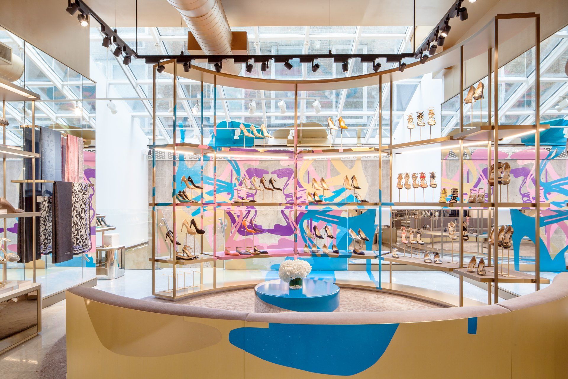
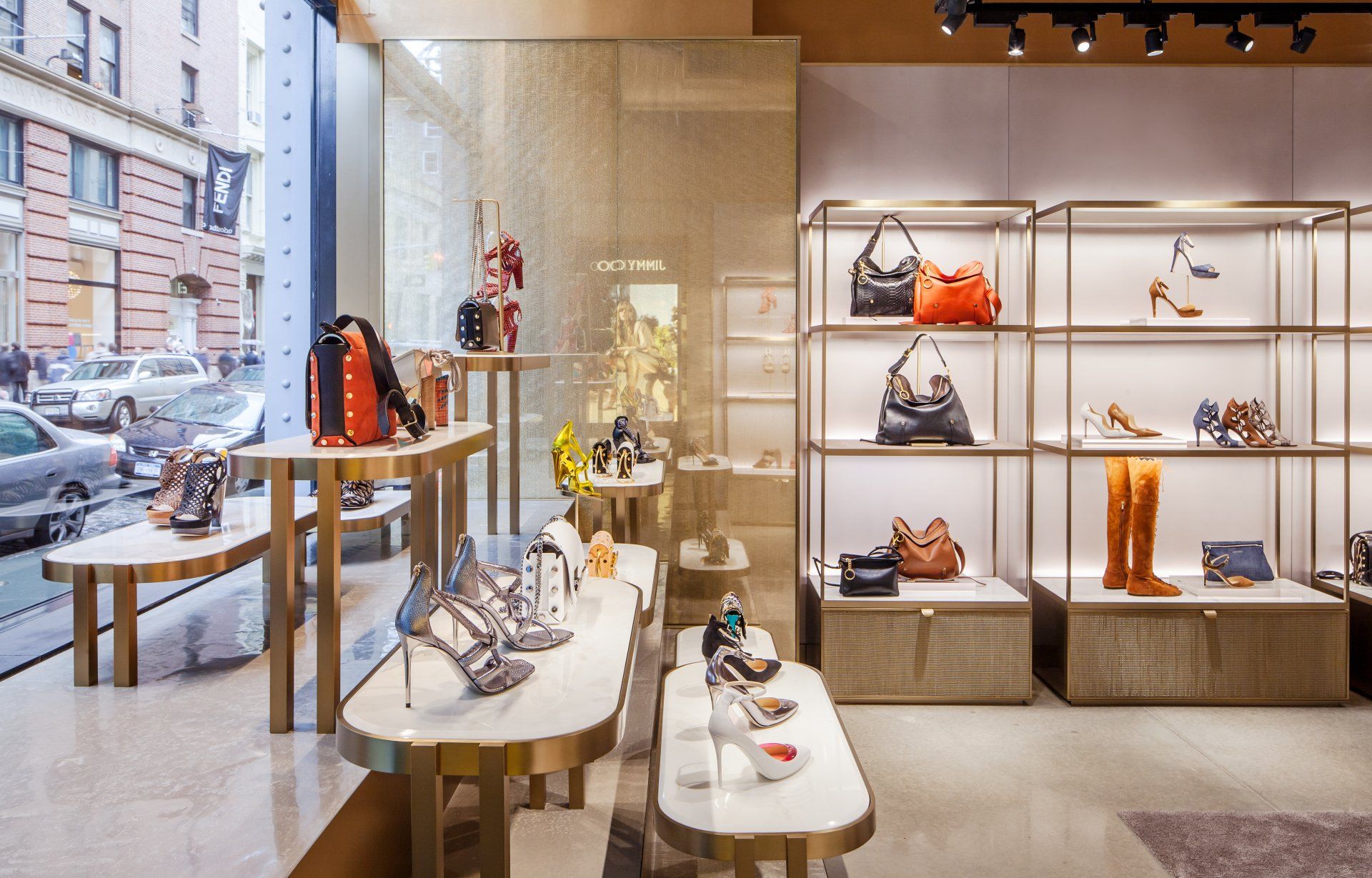
An original façade of glass, cast iron and industrial steel gives way to an adaptation of the Jimmy Choo interior concept specifically crafted to reflect SoHo's extraordinary architectural, cultural and artistic spirit. Rather than traditional rooms dedicated to women's and men's collections, the SoHo location features a continuous open floor plan which encapsulates the ethos of the brand whilst catering to the consumer demographic of the vibrant area. The studio defined the main areas of the store by designing curved displays and seating arranged to establish two consecutive circular footprints, which along with a large skylight that floods the space with natural light, draws the customer towards the back of the store. The mechanical simplicity of the circular displays act as cogs in a wheel, artistically filtering the flow of the customer throughout the store, with freestanding displays running along the perimeter wall playfully engaging them at each and every turn.
Address: 111 Greene St, 10012 – NYC, USA
Address: 111 Greene St, 10012 – NYC, USA
7. Parah Boutique by FORO Studio / Forte dei Marmi, Italy
The innovative and refined boutique, expression of a completely new concept in strategic location such as Forte dei Marmi, an international luxury destination on the Versilia coast. The project focuses on the brand's identity points, such as exclusivity,
luxury and femininity. The colour palette, the materials and the new system of furnishings distinguish the brand giving the right communication support to the products - donating to the boutiques a sophisticated and welcoming allure, suitable for a contemporary customer experience.
Address: Piazzetta Tonini 12, 55042 - Forte dei Marmi, Italy
8. Ambrosia by Ciszak Dalmas Design / Madrid, Spain
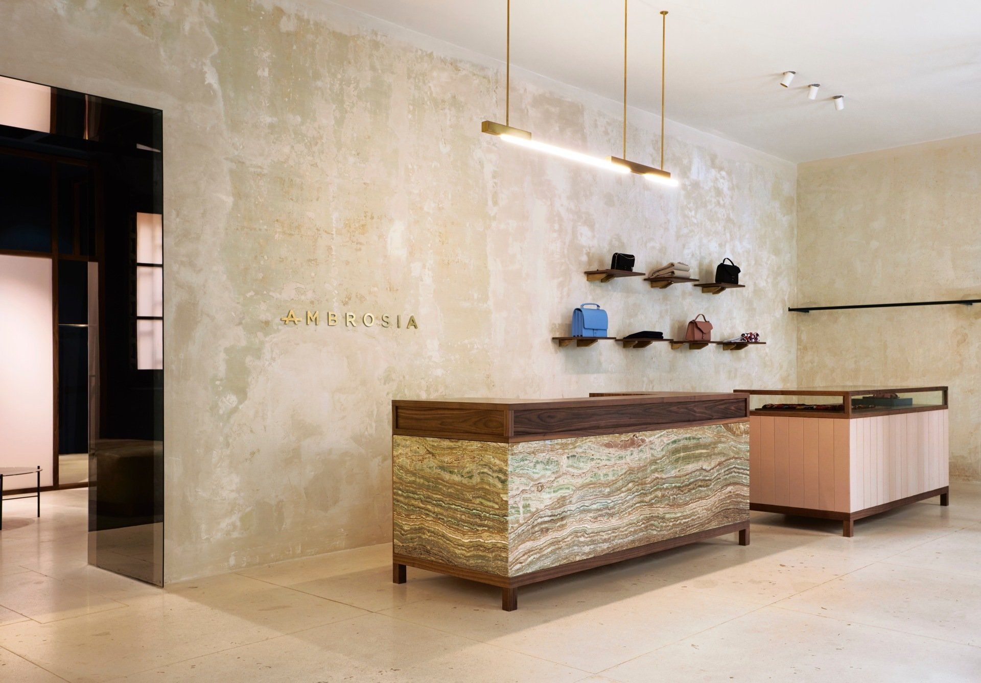
The Ciszak Dalmas and Matteo Ferrari team designed Ambrosia - of the Yusty group - the new multi-brand woman fashion shop in central Madrid. The old walls have been cleaned but they maintain in some sections the original finish, saving the history behind them. The lightness of the display furniture is balanced with the heaviness of the box, a block made of the exotic Onix stone that enjoys breaking the seriousness of the walnut wood. The flexibility of the space and its exhibition elements allow a free composition in the plant, creating an imaginary connection between the displayed products, combining them in harmony within a scenery shining under natural light.
Address: Calle de Lope de Vega, 21, 28014 - Madrid, Spain
9. 4tailors by Ark4lab / Thessaloniki, Greece
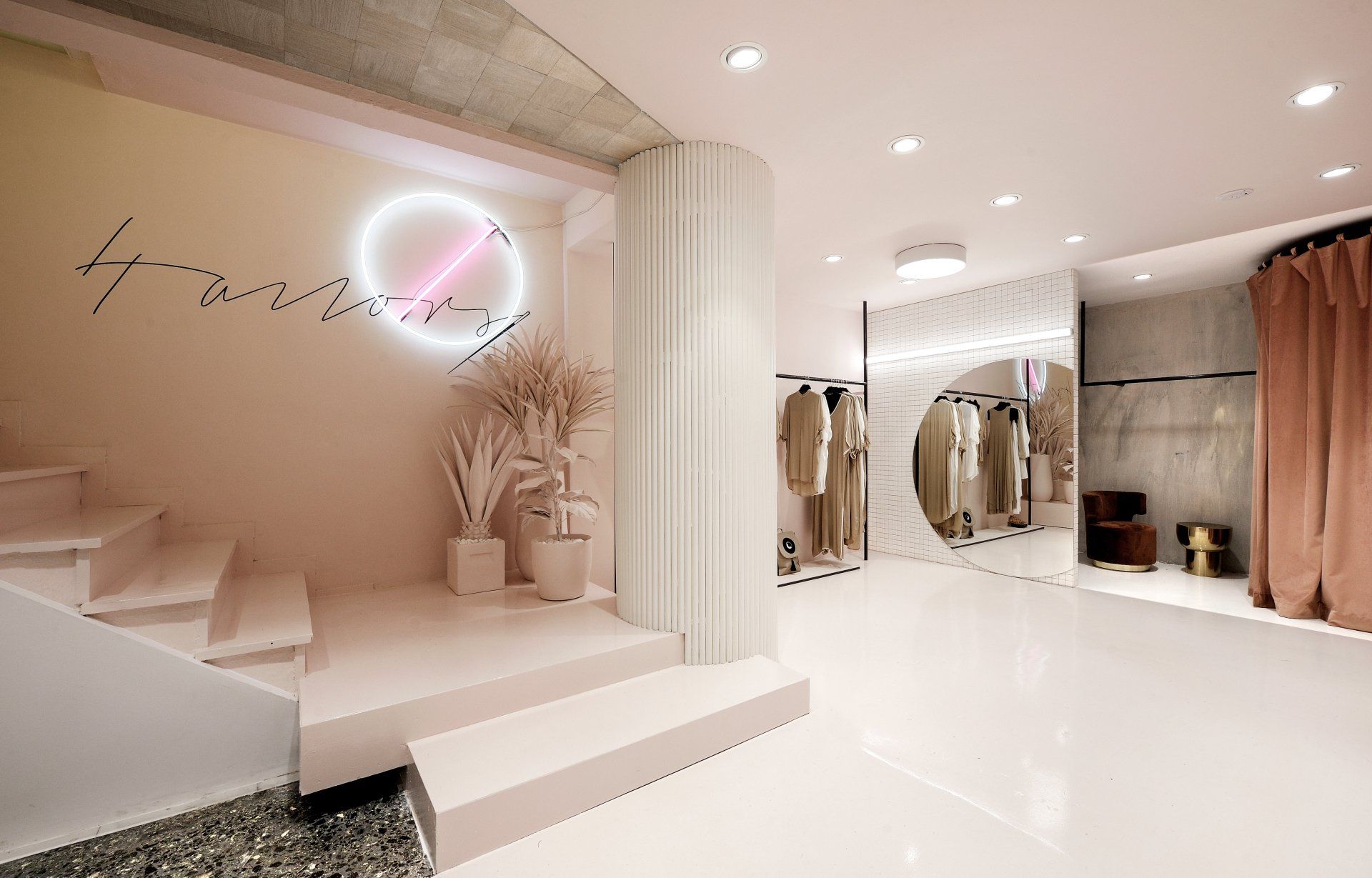
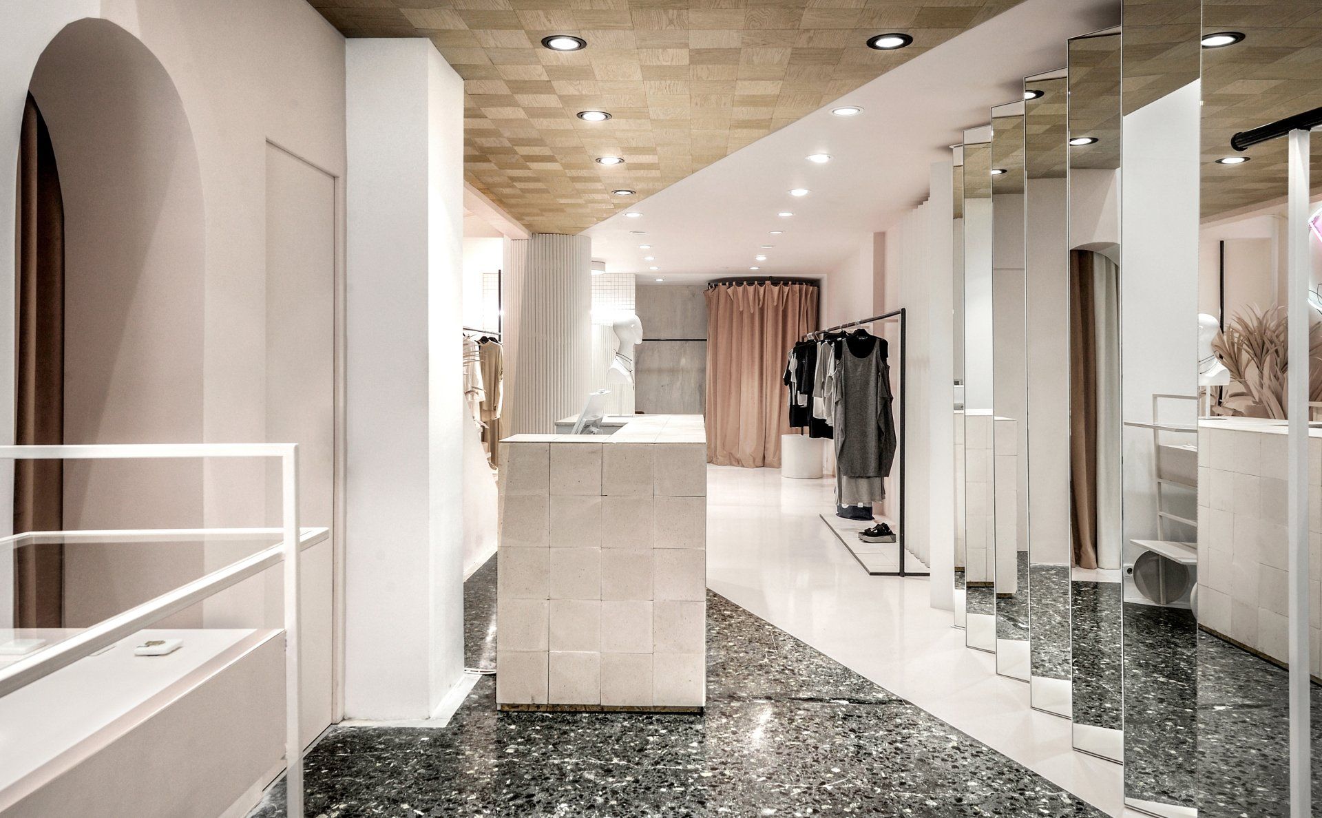
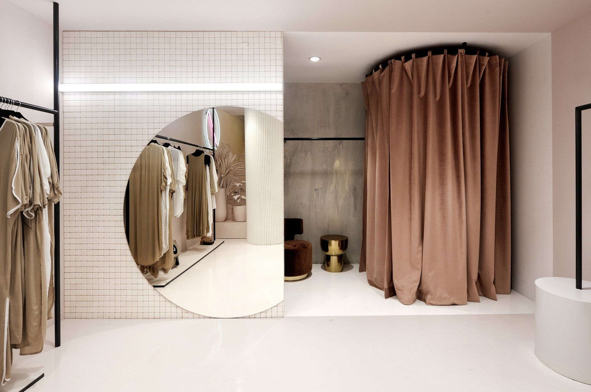
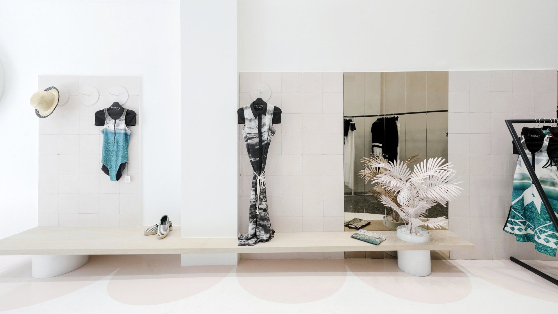
Clean lines and material distinction during the design process, declare the intention to divide the space and lead the viewer to a
different interpretation, beyond the obvious. The clearest color, white is widely used as a canvas that brings out everything that is placed inside it. Pastel touches emphasize smoothly forms and objects, highlighting the clothes. The composition is enriched by disrupting the white clarity with details of the materials that preexisted in the space. The terrazzo floors find their wooden reflections on the ceiling, forming a shape of bold materiality which acts like an extended doorstep that invites the viewer to get deeper in this space.
Address: Mitropoleos 87, 546 22 - Thessaloniki, Greece
10. Dolce & Gabbana by CARBONDALE / Paris, France
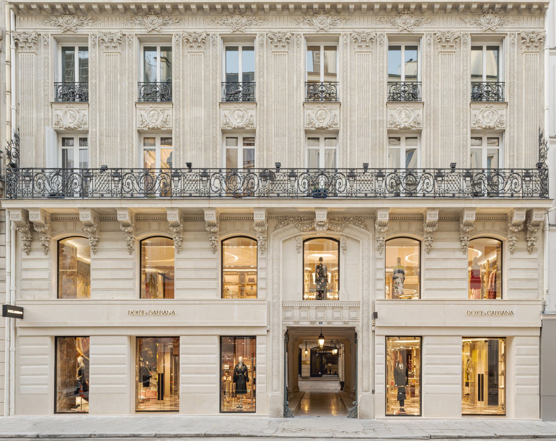
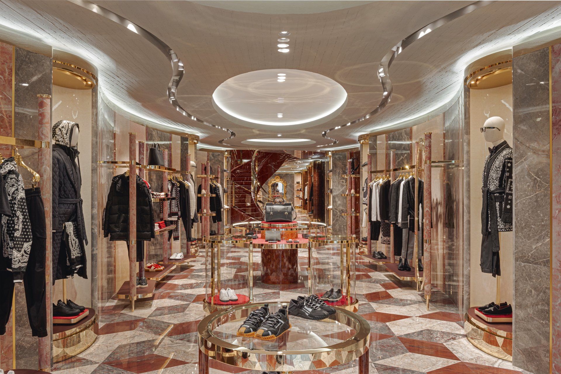
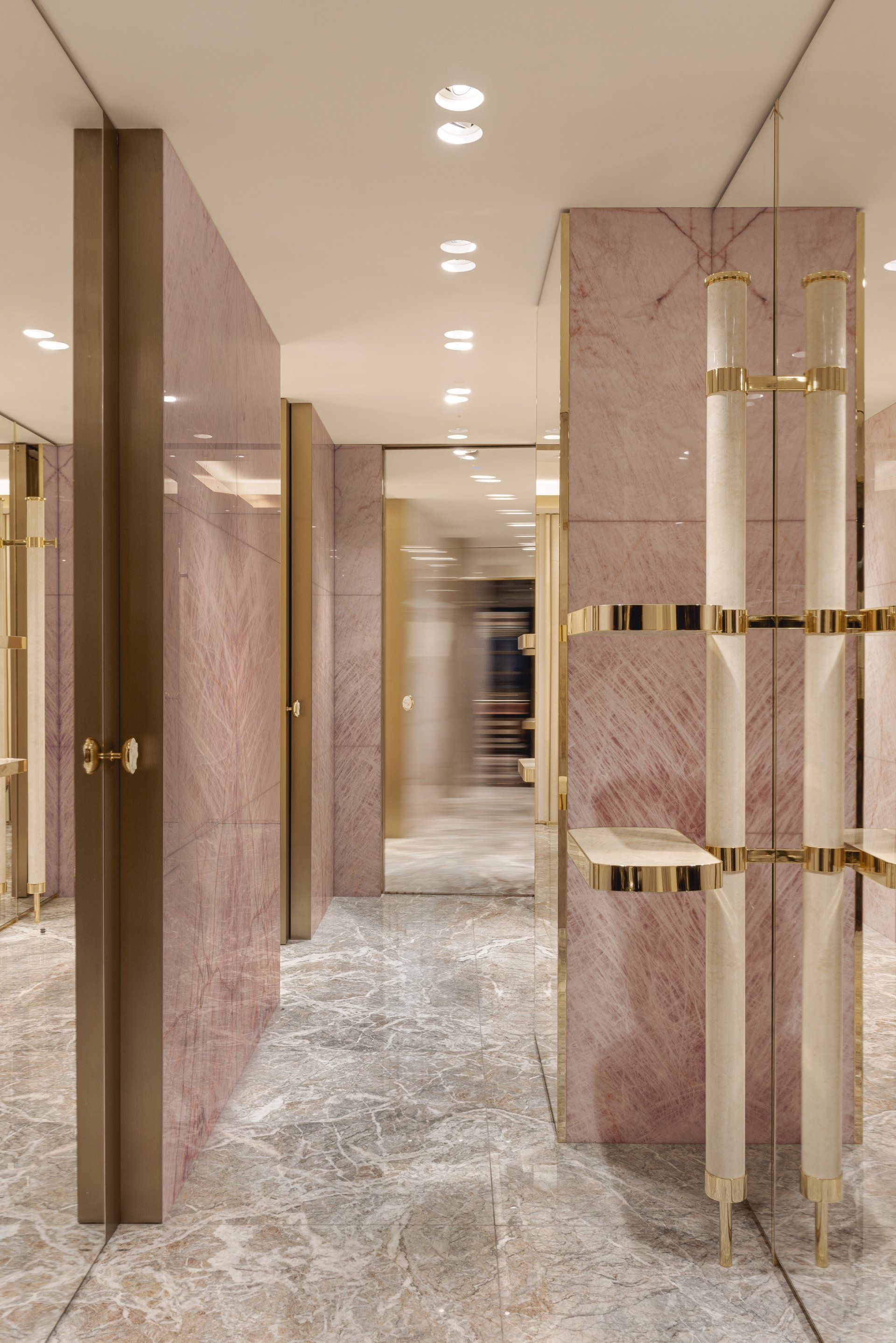
After realizing award-winning designs in Venice, Monte Carlo, Piazza di Spagna in Rome and Via della Spiga in Milan Eric Carlson of CARBONDALE architecture in collaboration with Domenico Dolce and Stefano Gabbana have created the latest architectural gem in the jewel-encrusted crown of boutiques for the brand Dolce & Gabbana. Located on the prestigious rue du Faubourg Saint-Honoré in Paris the new design is an achievement of “unification” for the Italian brand in France. The interior spaces are not designed as distinctive rooms, rather they are conceived as large open areas that flow together creating a soft, sensual, baroque inspired perception of fluidity and movement. Paradoxically the soft, gently rounded walls are carved from solid blocks of Fior de Bosco, Rosa Tea, and Rosa Libeccio marbles. Cylindrical glass jewelry cases are nestled into the curved marble walls, like motionless sentry guards, to symmetrical mark the transitions between the different product areas.
Address: 3/5 Rue Du Faubourg Saint Honoré, 75008 - Paris, France
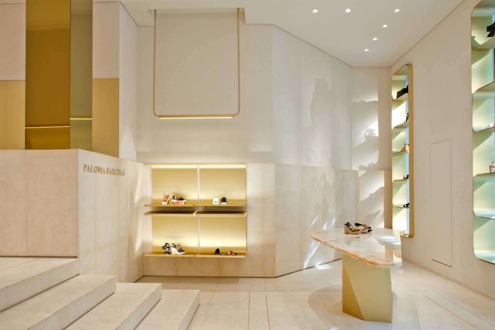
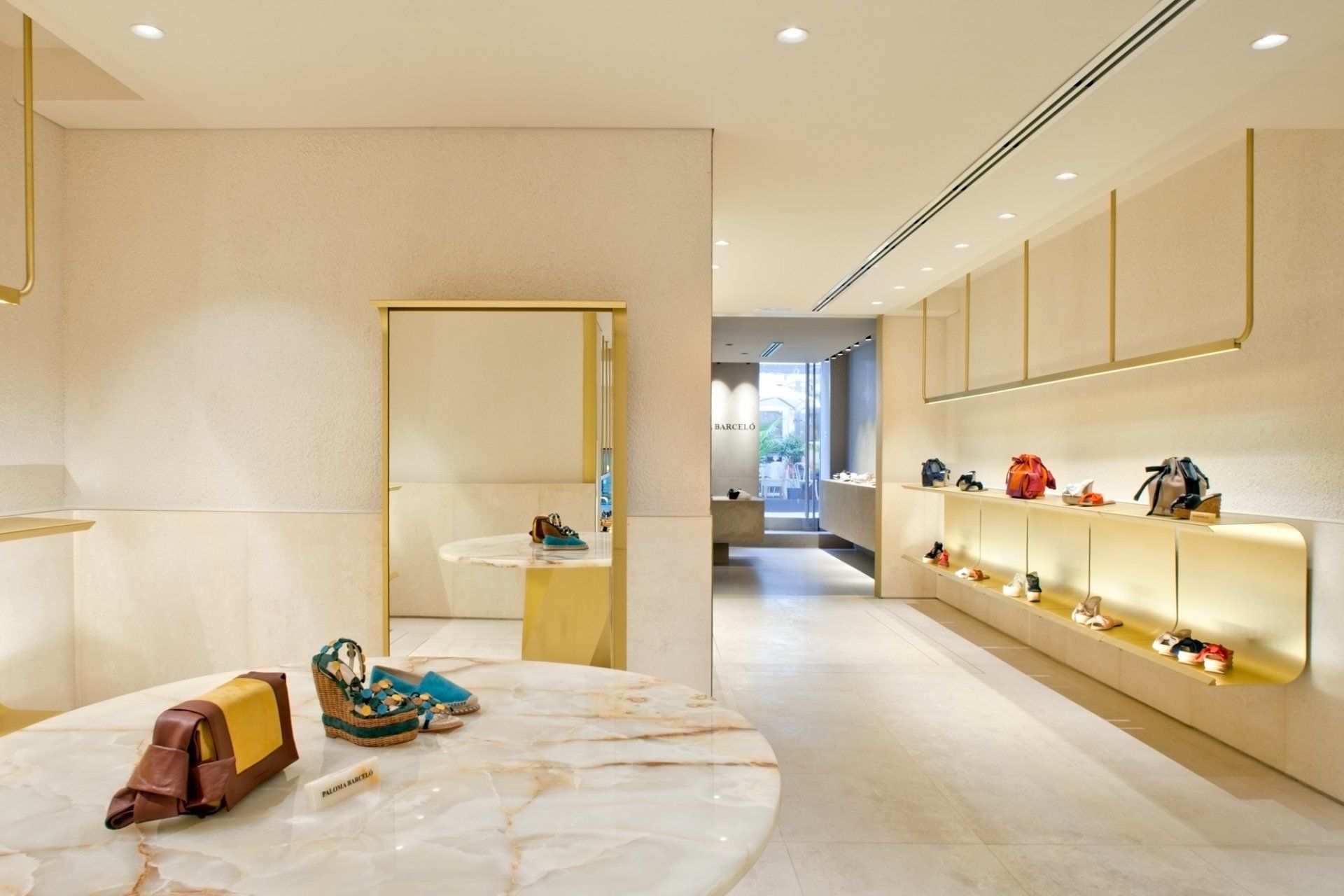
11. Paloma Barcelò by MIDE architetti / Madrid, Spain
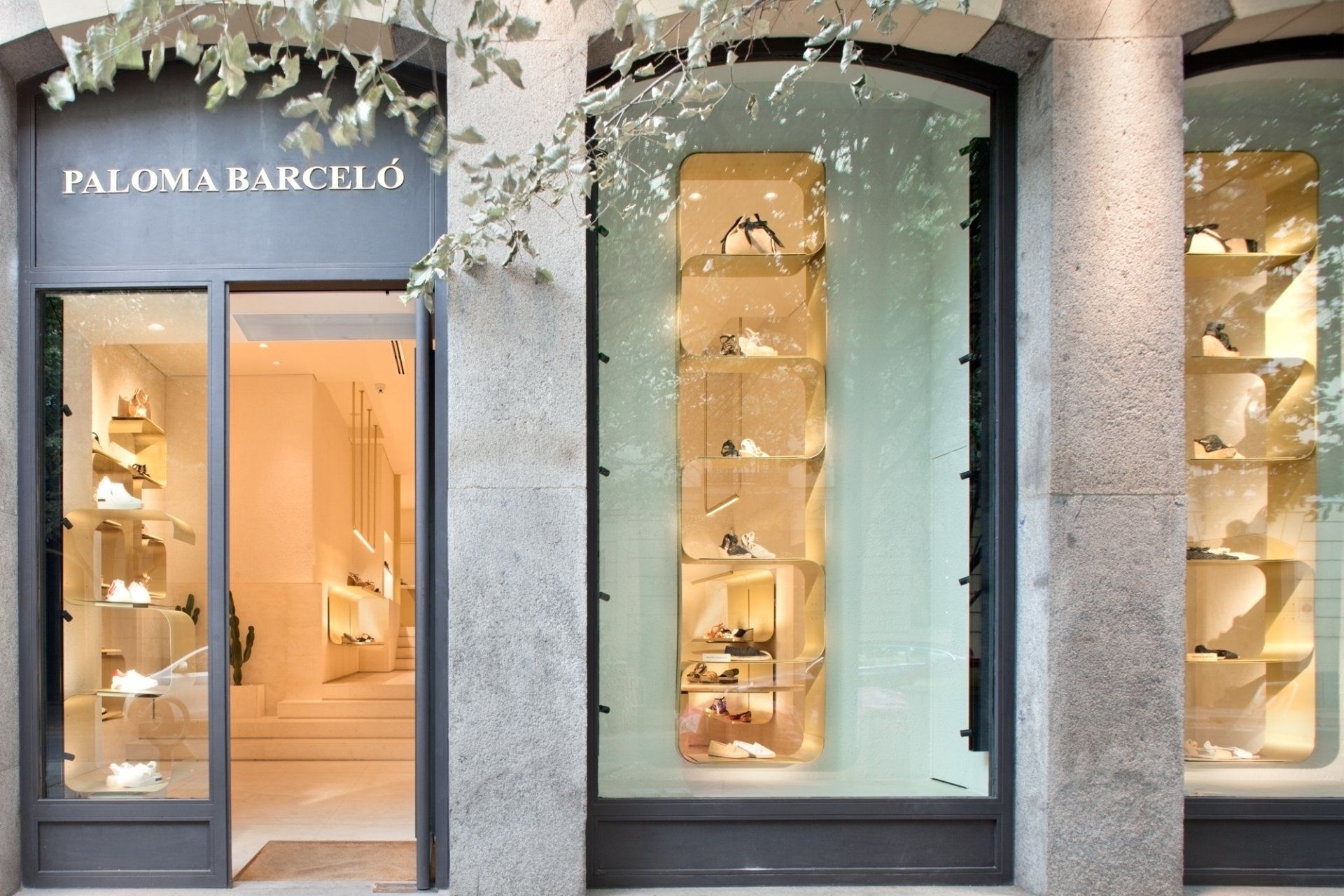
The Paloma Barcelò flagship store by finds space on the ground floor of a historic building in the heart of the city. The project aims to preserve and enhance the morphological features of the existing rooms through a minimal use of materials and furnishing. The result is a display space with a sophisticated and essential air, which embraces the contrast between the golden metal of the furnishings, the rough plaster walls and the stone floor. Sinuous metal sheets, 3 mm thick, support the display, making the products stand out from the neutral background, the custom designed furnishing acts as true architectural devices
that develop and prioritize the interior spaces. The shop consists of a long sequence of spaces at different heights, where the study of materials and lighting aims to recreate a home environment.
Address: Calle de Claudio Coello, 26, 28001 - Madrid, Spain
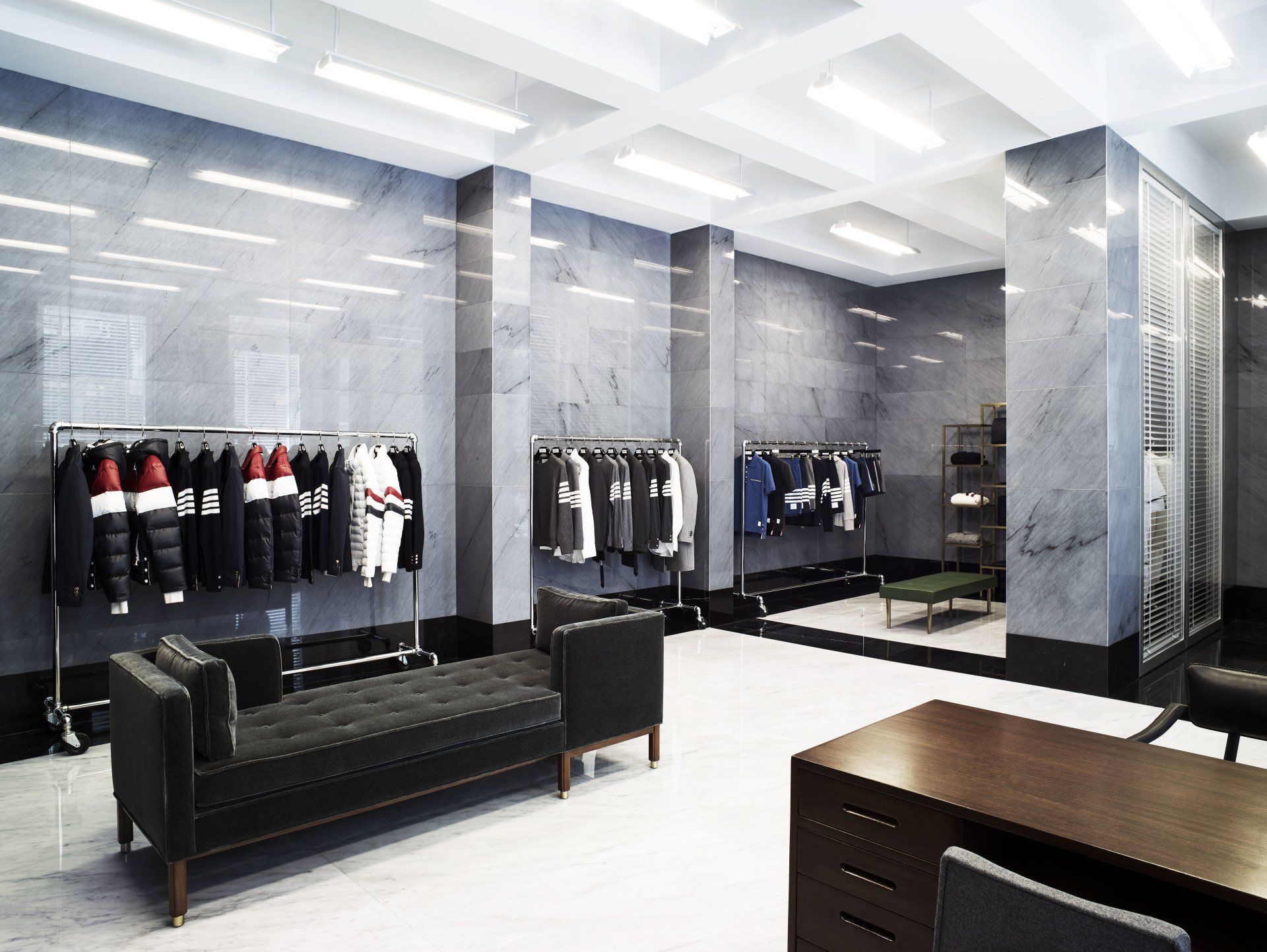
12. Thom Browne by ASA studio albanese / London, UK
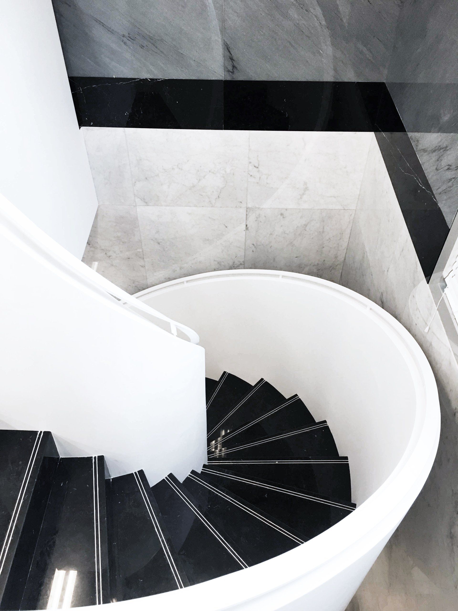
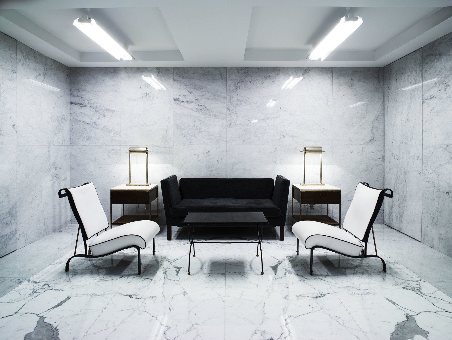
The London store is a 500 m2 unit on two floors connected by a winding staircase. The Venetian blinds on the windows are a typical feature of Thom Browne stores. The interiors recall the rational and symmetrical rigour of the architecture of the 1930s-1950s, distinctive for the contrasting blacks and whites which are brought together by an austere elegance. The furniture comprises original pieces by American and French designers: Edward Wormley, Jacques Adnet and Maison Jansen.
Address: 3 Albemarle St, Mayfair - London, UK
13. Chanel by MVRDV / Amsterdam, The Netherlands
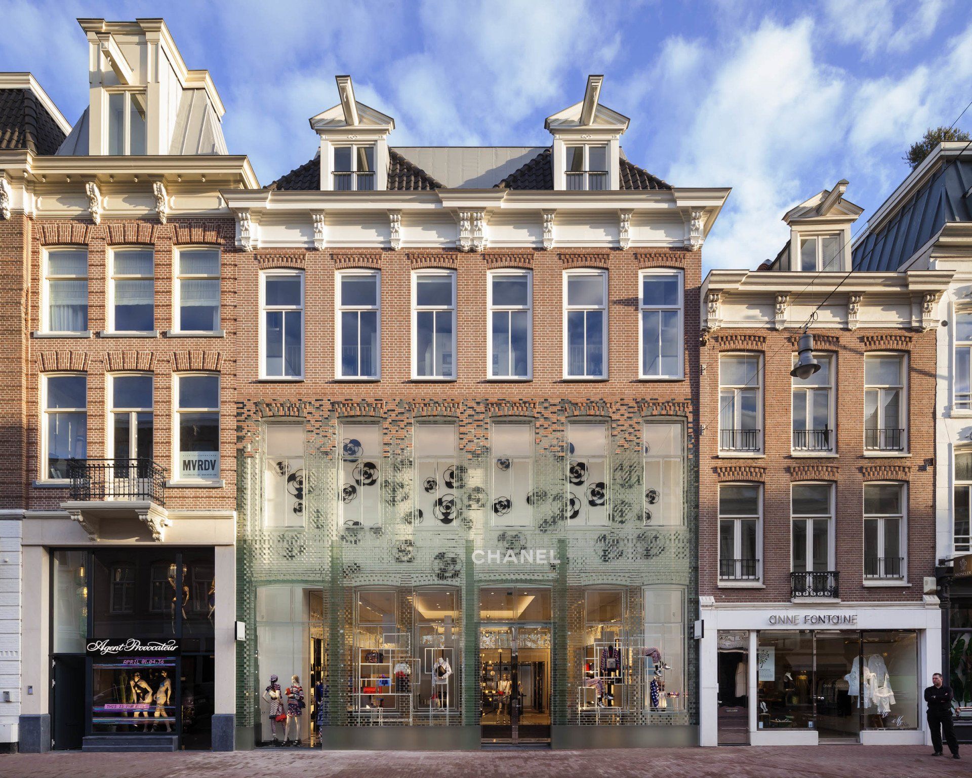
MVRDV designed the high-end flagship store that combines Dutch heritage and international architecture on the PC Hooftstraat, Amsterdam’s one and only luxury brand street that was previously primarily residential. MVRDV wanted to make a representation of the original buildings and found a solution through an extensive use of glass. The near full-glass façade mimics the original design, down to the layering of the bricks and the details of the window frames but is stretched vertically to comply with updated zoning laws and to allow for an increase in interior space. Glass bricks stretch up the façade of the flagship, eventually dissolving into a traditional terracotta brick façade for the apartments (as stipulated in the City’s aesthetics
rules), which appears to be floating above the shop floor.
rules), which appears to be floating above the shop floor.
Address: Pieter Cornelisz Hooftstraat 68, 1071 CA - Amsterdam, The Netherlands
14. The Kape by SUPERFUTUREDESIGN* / Dubai, UAE
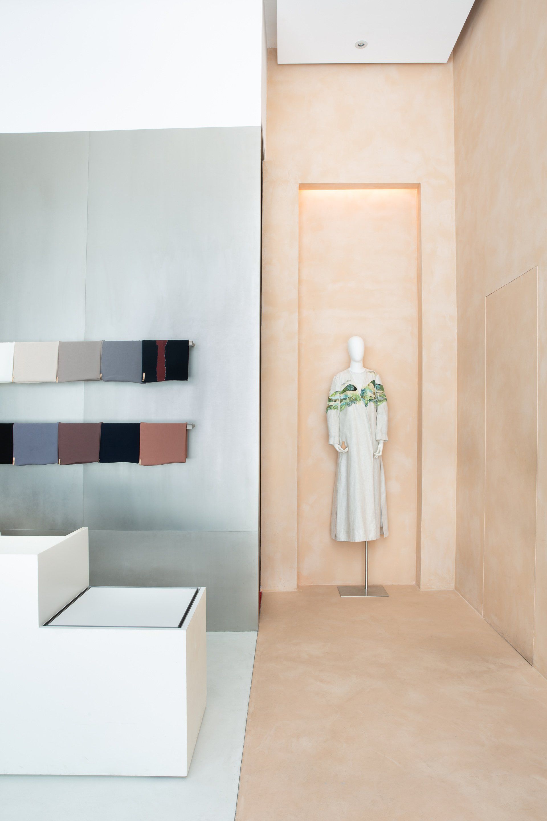
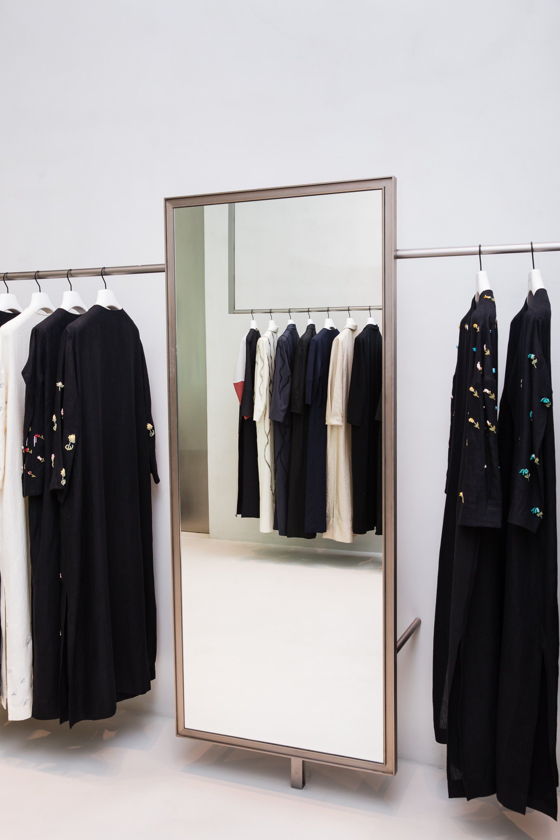
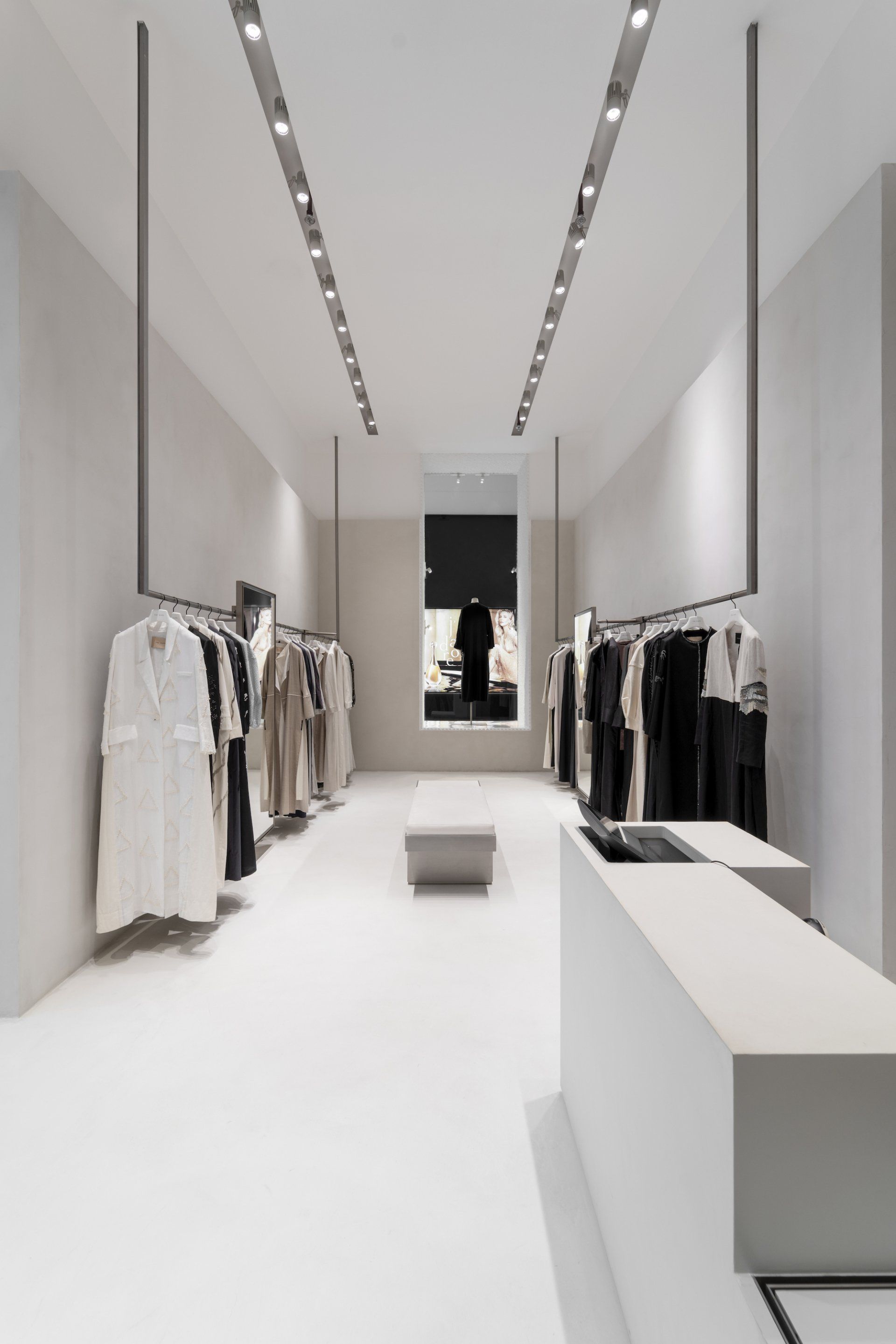
The Kape is a new brand on the scene of modest women’s fashion and has a different approach to garments, specifically the traditional Abaya. The brand needed an impactful interior design at their boutique - for this the design studio SUPERFUTUREDESIGN* was chosen. In the ambient spaces, with an Avant Garde approach, the studio implemented techniques that would result in a relaxing environment. They contributed to a spatial effect that calms the mind, along with balanced elements that enhance the senses. In addition, thanks to the smoother finish of the floors and the use of refined and comfortable sofas, the result is a simple but at the same time elegant design.
Address: Second Floor, Dubai Mall, Financial Center Rd - Dubai, UAE
15. Box by Posti by Fyra / Helsinki, Finland
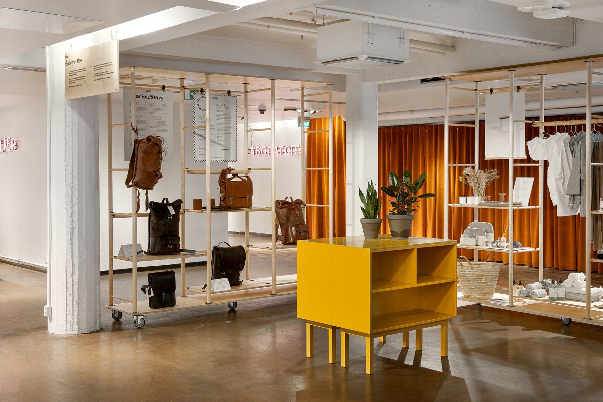
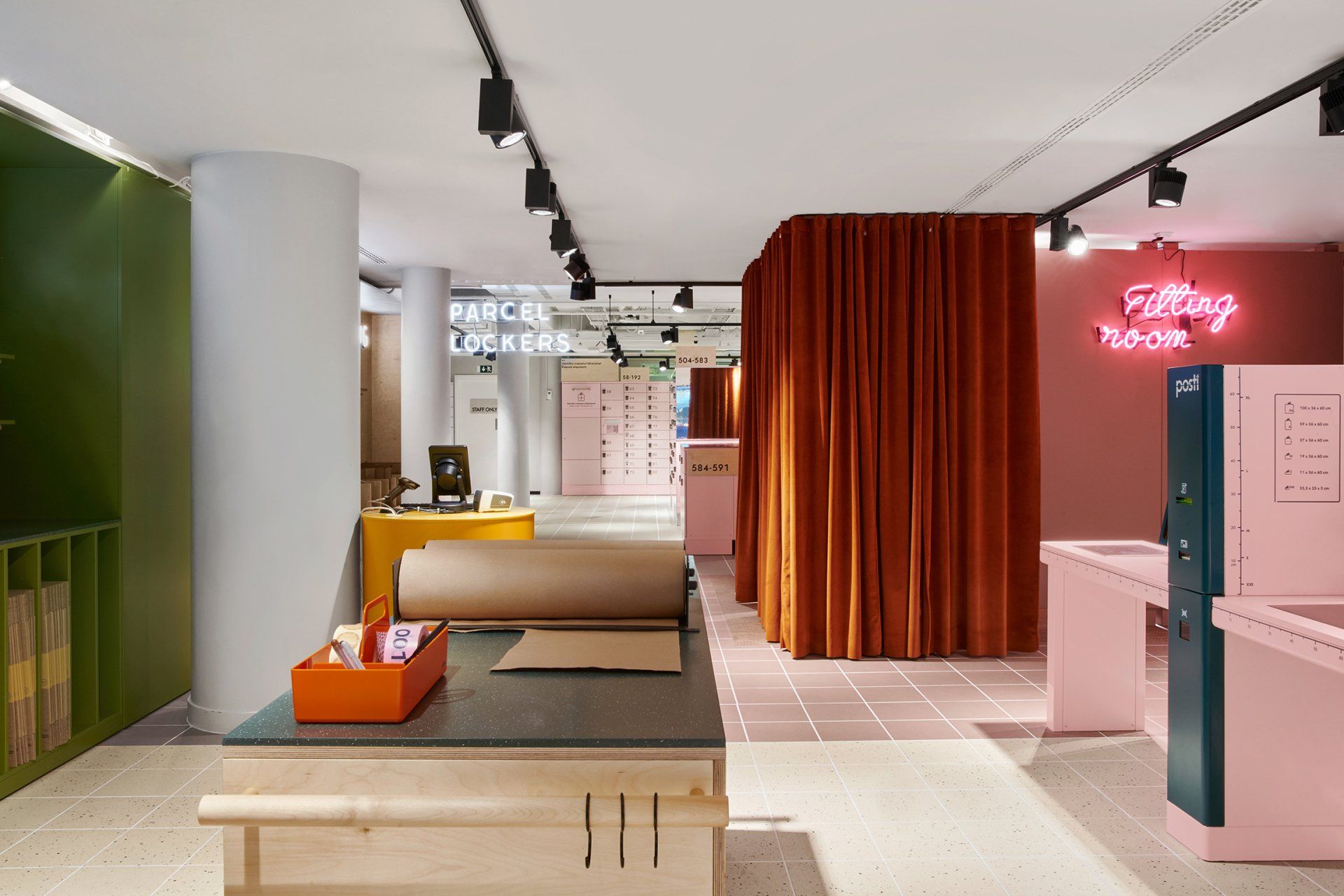
Fyra concentrated on interior architecture and functionality of this store, in close cooperation with Motley for overall concept. The outcome is a harmonious space where the parcel lockers act as a backdrop giving room for the customers to try on their purchases, perhaps make returns and send packages. Special attention has been paid to the recycling of packaging materials. The space is functional as well as intuitive for the user. With different colours assigned to different areas of activity, the customer instinctively follows a path finding their way around the facility.
Address: Keskuskatu 3, 00100 - Helsinki, Finland
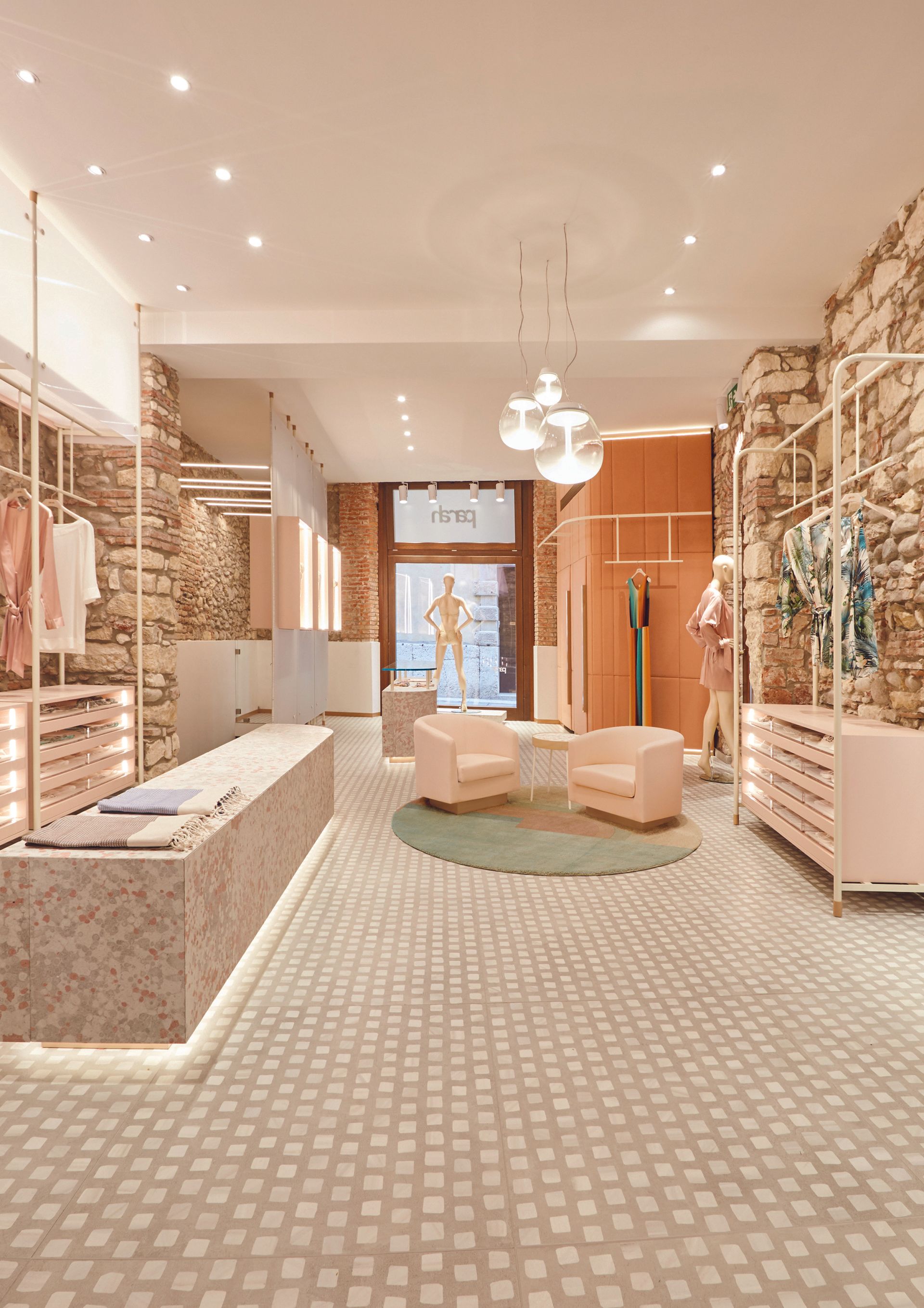
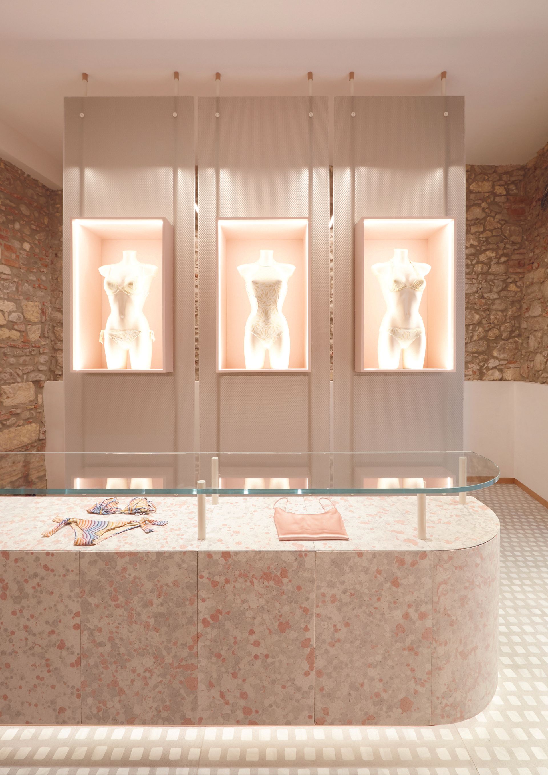
16. Parahy by FORO Studio / Verona, Italy
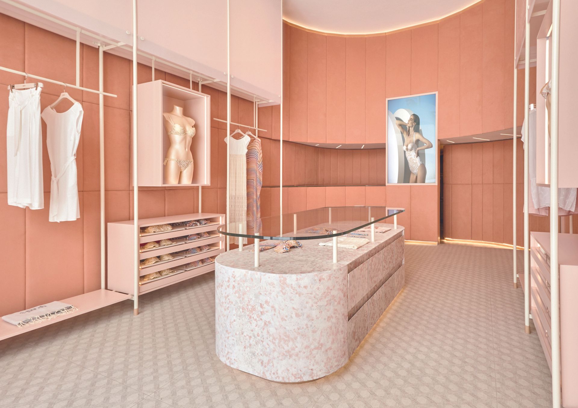
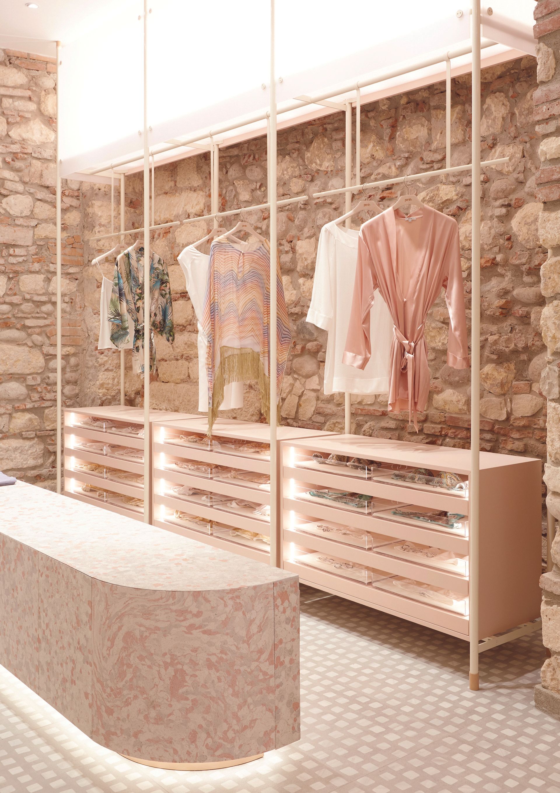
The boutique's perimeter is covered with a padded panelling, dressed with a suede-effect fabric in powder pink and divided into vertical bands, which give rhythmicity to the venue. The muffled environment presents an intimate and reserved allure, suitable for the product category for sale. The type of fabric ensures that the venue has a sophisticated appeal while its pink shade is a reference to the colour of bare skin. This way, the shopping experience recalls a feeling of naturalness and calm. The fabric on the walls is opposed to the horizontal displays in Silipol, a stone compound made of porphyry, granite and fine-grained marble bound by high-resistance white concrete. The material - with an exceptional stained chromatic effect - is cold, but it is characterized by a pleasant velvety and porous hand, which stimulates the touch. The vertical displays showcase a supporting structure, made of ivory-coloured steel, which supports drawers and pink-lacquered display cases. Moreover, a group of light boxes, made of translucent alveolar polycarbonate, crowns these structures. They are real optical machines that, playing with the light emitted from the inside, create particular effects of reflectance.
Address: Via Guglielmo Oberdan, 14A, 37121 - Verona, Italy
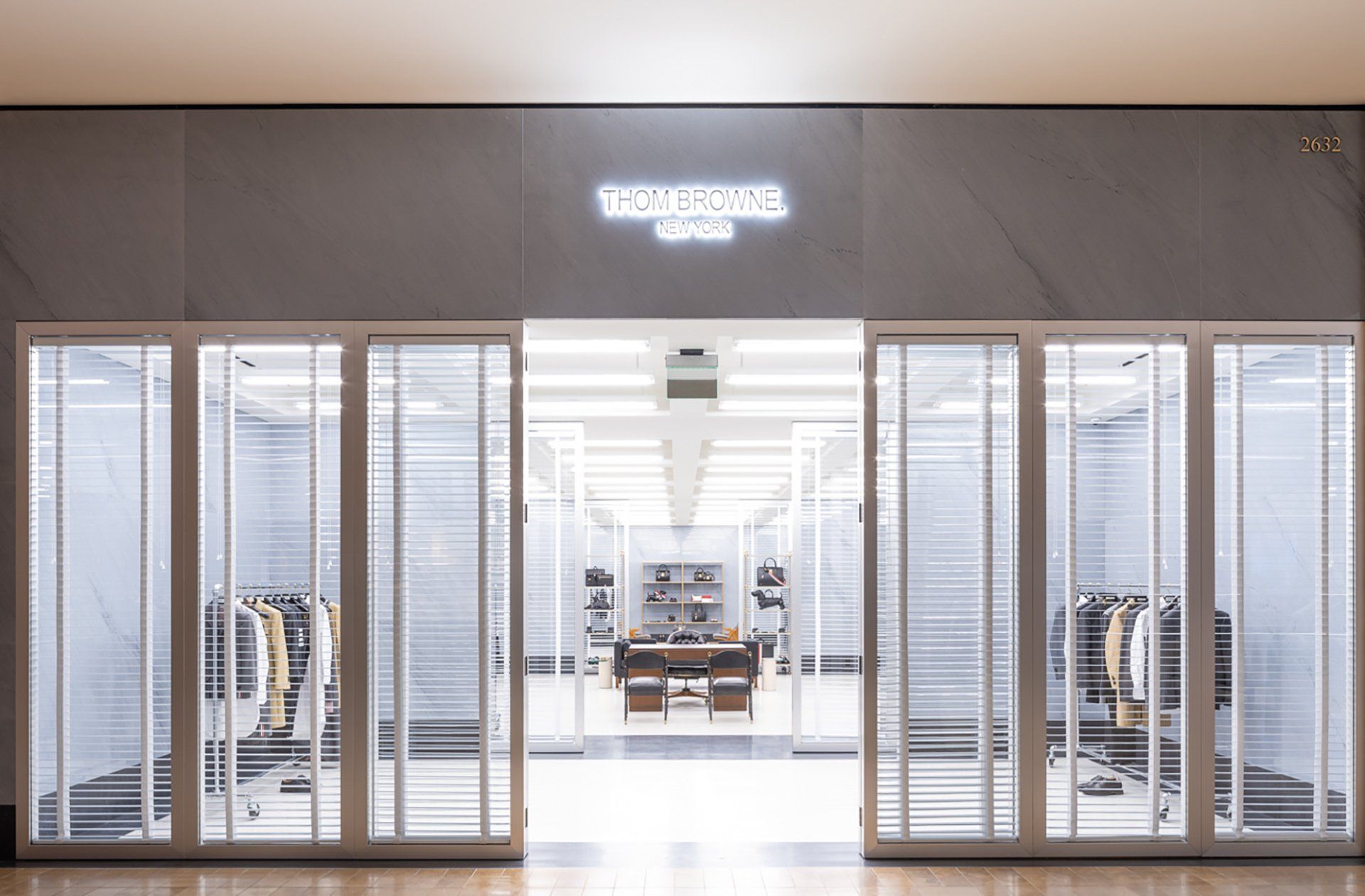
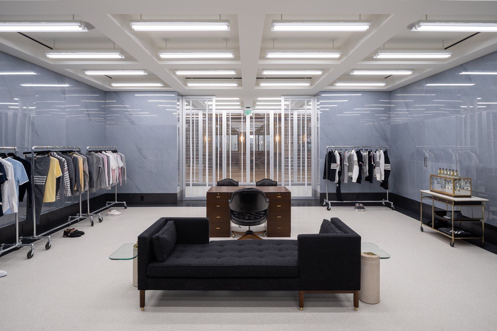
17. Thom Browne NY by ASA studio albanese / Costa Mesa, USA
The Thom Browne space in Orange Country, California is located inside the South Coast Plaza in Costa Mesa. Like all Thom Browne stores designed by Asa Albanian studio, even the Californian one is inspired by the rigorous rationalism of architecture between the 1930s and the 1950s, here with a particular seduction towards the design of offices by Luigi Moretti. In the South Coast Plaza store, the perspective view of the three rooms in succession reproduces the solemn and severe proportions of the other showrooms, with vintage furniture from the 1950s.
Address: 3333 Bristol St, 92626 - Costa Mesa, CA, USA
18. Brioni by Park Associati / Frankfurt, Germany
The men’s high fashion Italian brand, of group Kering , has entrusted to Park Associati the implementation of the new concept for the interior design of the international boutiques of which the store in Frankfurt is currently the most extensive example of square footage in the world. The distribution of the various product areas expressed in this space the classical division , designed by Park Associati to maximize the brand's products , and correspond to the expectations of the customer to welcome the customer in an elegant and linear space, in which the materials enhance their classic taste of a brand that was born in the city of Rome , the heart of European classicism.
Address: Alte Rothofstrasse 9 - Frankfurt, Germany
SHARE THIS
Latest Edition
Mar / Apr 2026 edition is available now!
Contribute
G&G _ Magazine is always looking for the creative talents of stylists, designers, photographers and writers from around the globe.
Find us on
Latest News
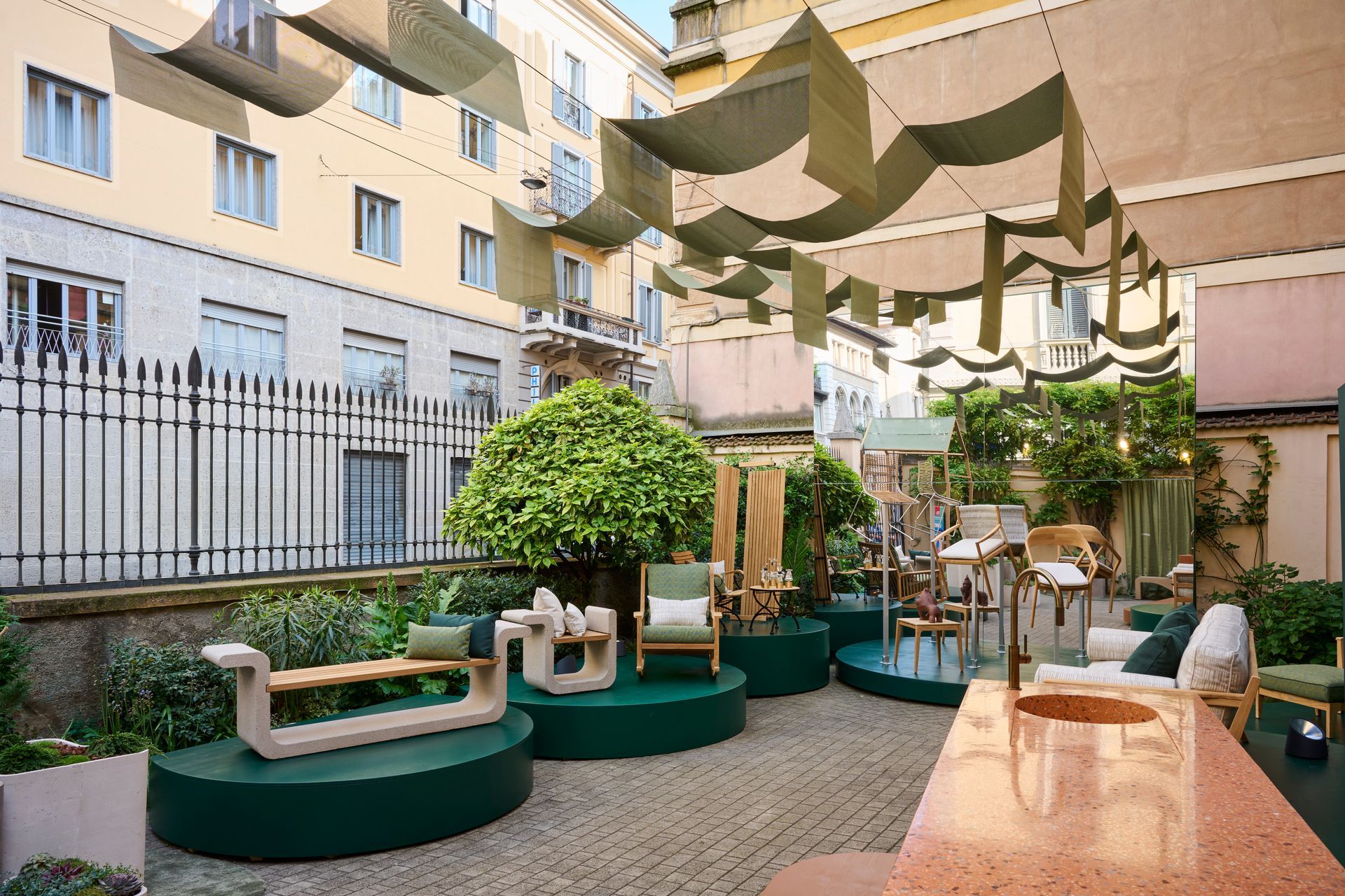
During Milan Design Week, where the city becomes an intricate map of overlapping visions and fleeting installations, Bodo Sperlein delivers a moment of rare coherence and depth with MENU exhibition that transcends the conventional boundaries of design to inhabit architecture as a living, breathing entity.
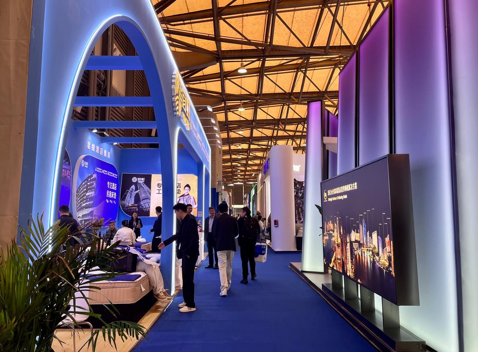
From March 31 to April 3, 2026, at the Shanghai New International Expo Centre, Hotel & Shop Plus 2026 Shanghai unfolded as far more than a trade fair: it emerged as a living, breathing platform where the very notion of travel dissolves, permeating every layer of contemporary lifestyle and spatial design.
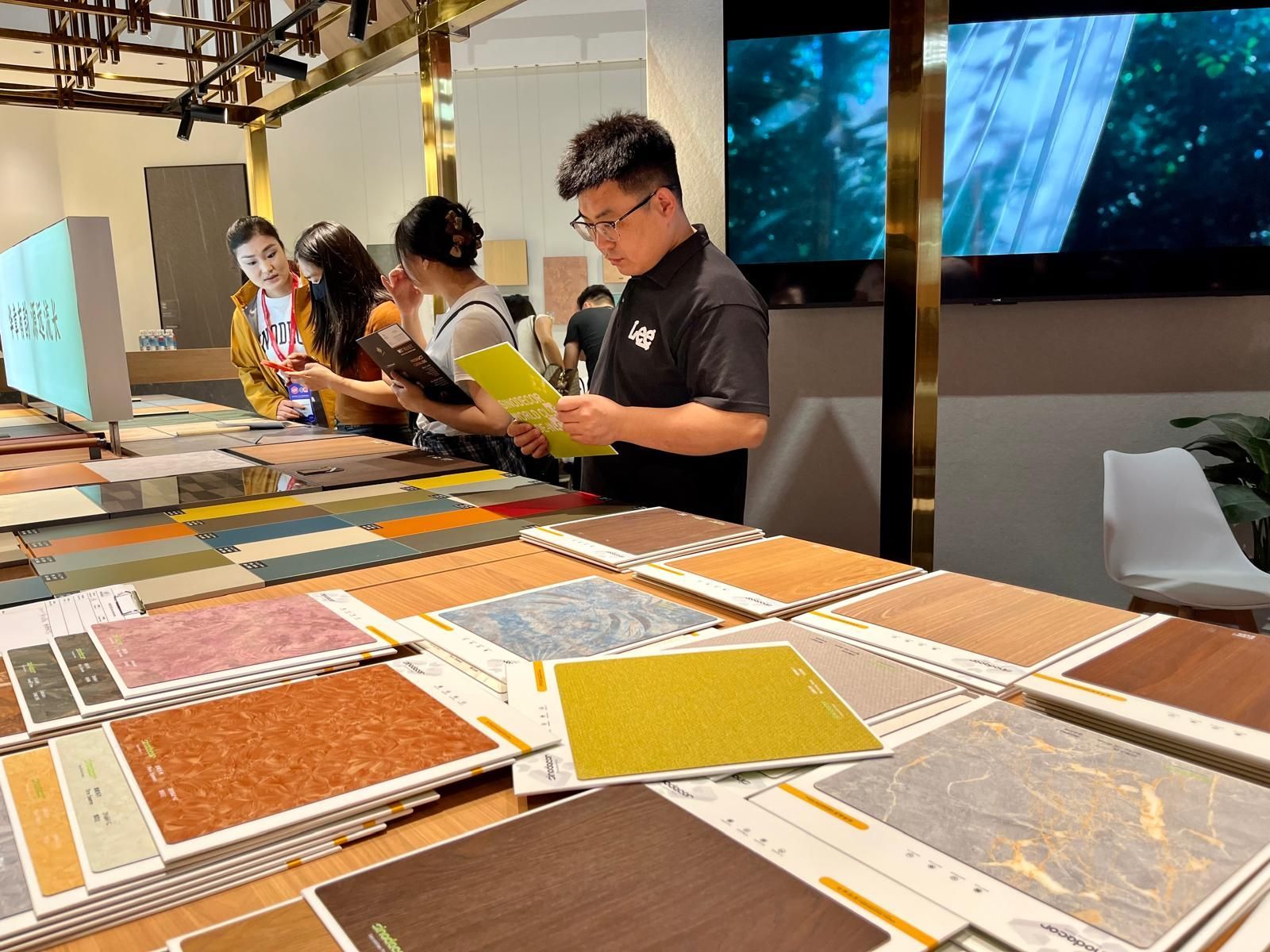
Held in two phases, from March 18–21 and March 28–31 at the Canton Fair Complex, the 57th edition of CIFF demonstrated how design is no longer something merely displayed but something to be fully experienced through the senses: deconstructed, re-engineered and ultimately redefined in its deepest essence: matter .
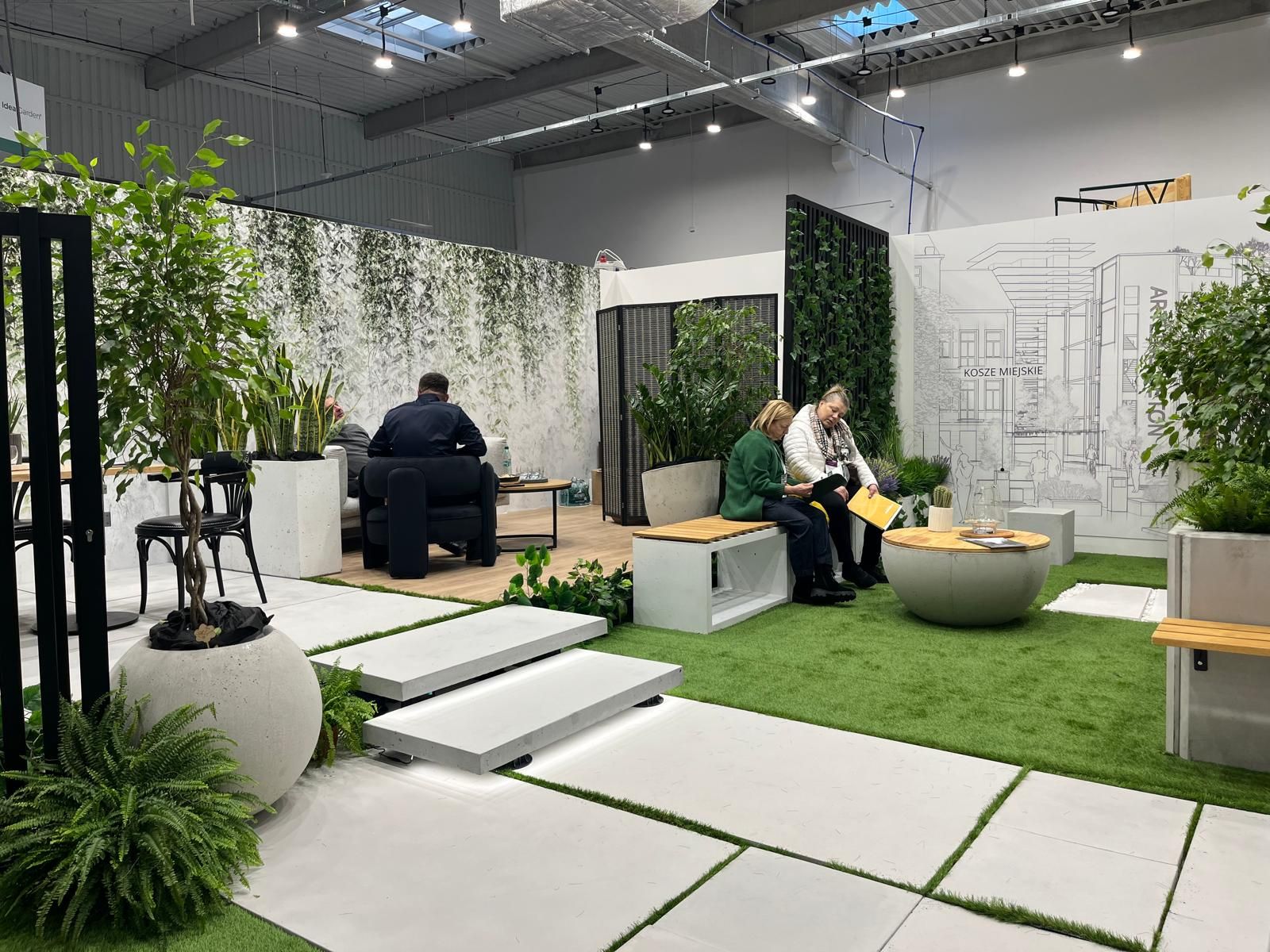
At a time when design is redefining its priorities, the contemporary landscape of interiors, décor, and outdoor living is clearly shifting from a digital-centric vision toward a more human, emotional and nature-driven approach. This transition was strongly evident during the latest editions of Warsaw Garden Expo and Warsaw Gift & Deco Show , held at Ptak Warsaw Expo from 10th to 12th February 2026.
Subscribe
Keep up to date with the latest trends!
Popular Posts
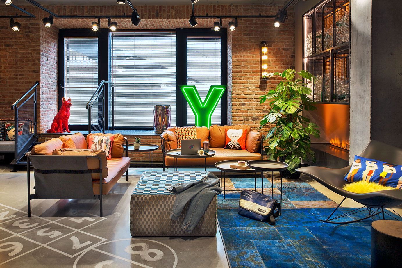
Praga district, once industrial and today filled with galleries, studios, cafés, and cultural spaces, is home to the vibrant Moxy Warsaw Praga . The hotel embraces the spirit of the neighborhood with a modern and playful design (typical of the Moxy Hotels concept) featuring industrial elements that echo the area’s historic character.
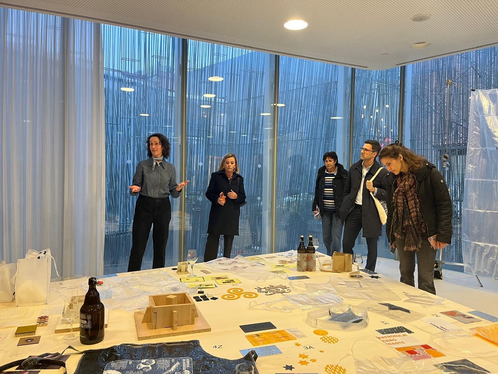
Between February 6 and March 8, Madrid Design Festival 2026 offered an intense program of exhibitions and events across the city. Throughout these days, it was possible to perceive the evolution of the festival, which expanded its program by integrating professional talks and meetings, revealing a strong desire among industry professionals to share the new Spanish approach to design with the world.
