Worrell Yeung expands unique loft in Manhattan's Historic Gilsey House
Worrell Yeung’s Broadway Loft project consists of the gut renovation of a unit in the NoMad neighborhood of Manhattan’s historic Gilsey House building, originally a Beaux Arts style hotel built in 1867, for a couple and their young son.

The family had lived in the apartment for nearly 14 years and had been looking to purchase a new home to solve their growing need for additional space, privacy, and storage. After searching, however, the couple realized they owned a unique space with deep personal significance; it had been with them through multiple life-changing events, including the loss of a child. If redesigned to create more storage, enhanced access to natural light, and an additional bathroom and bedroom, it could be their ideal home—one still filled with important memories, but also embodying their transitions and growth as a family.
The design intervention by Worrell Yeung removed all existing walls to highlight the historic windows, plaster molding, and steel structure of the space. The loft is organized as a large open space in which various programmatic block elements are placed (foyer, stair/bookcase, fireplace, kids bookcase/stair and kitchen), creating harmonious ambiguity between open space and partitioned rooms. Utility and storage was paramount to the design of each programmatic element.
"Exposing the sprinklers and steel structure throughout adds a certain richness to the loft, allowing the reductive forms of the storage elements to be more minimal."
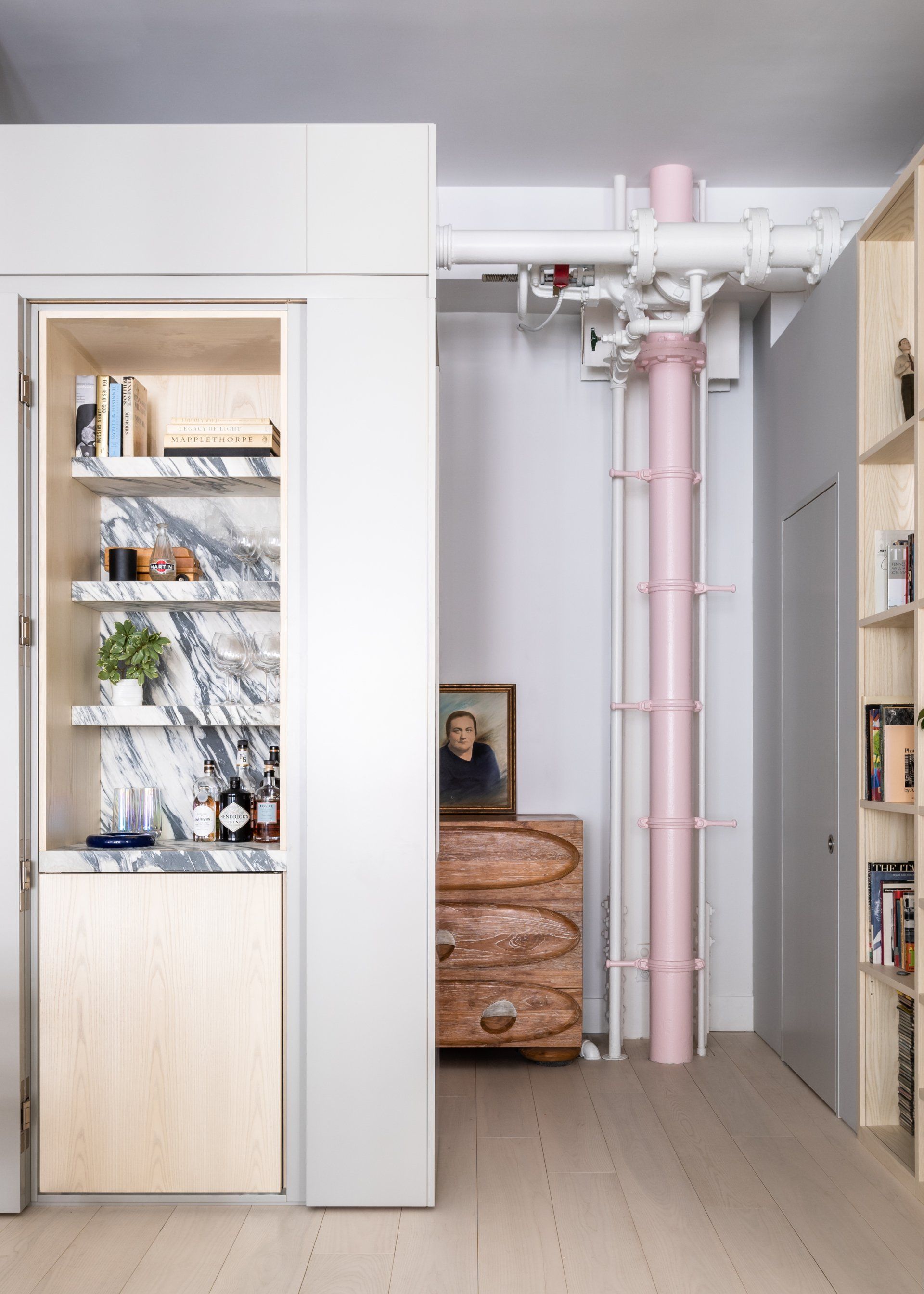
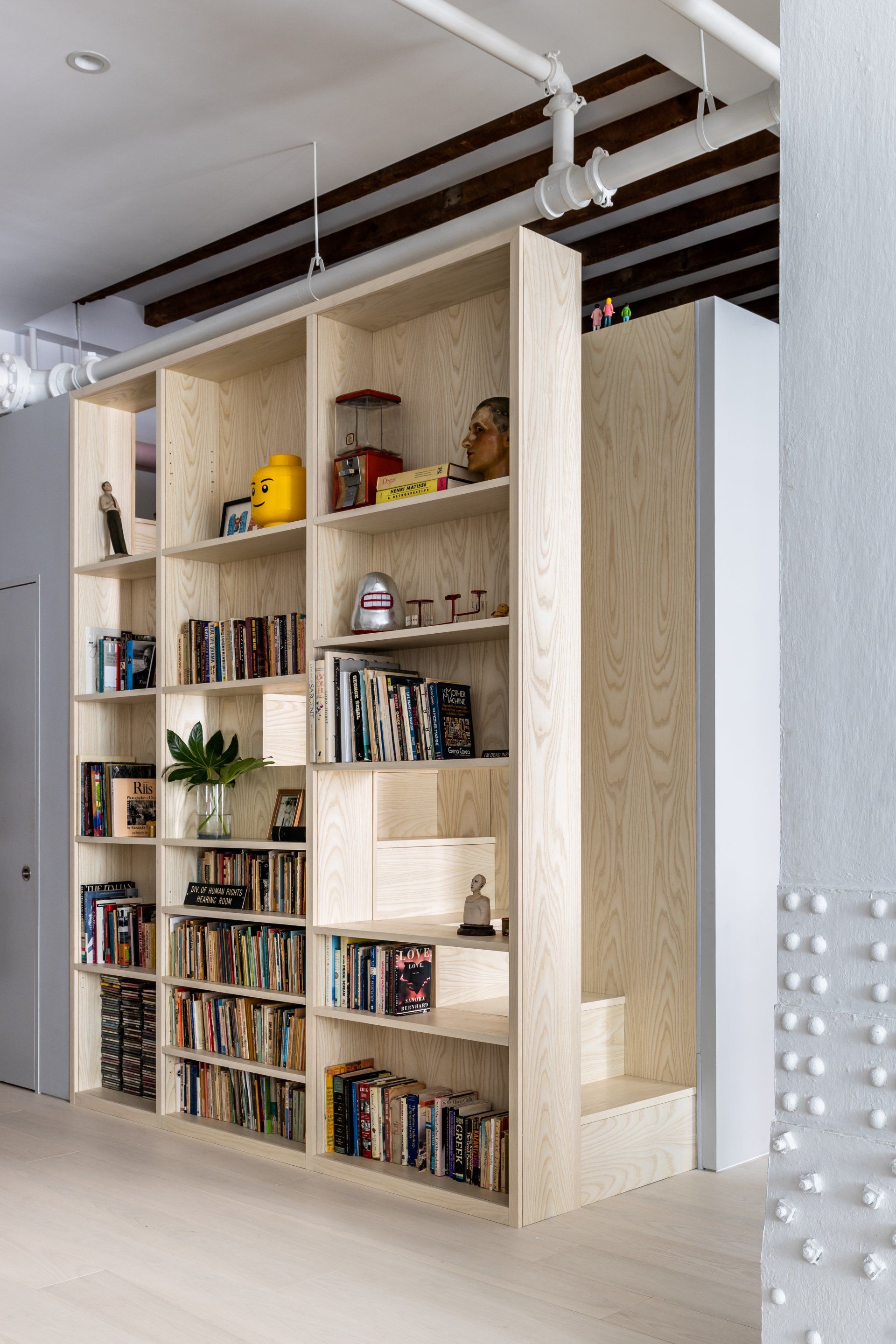
The gray lacquered entry foyer contains a closet, a concealed wet bar, and display niches. A semi-open ash wood bookcase extends to form a staircase leading to a guest sleeping loft above. The neutral, elegant case serves to highlight its contents: the couple’s eclectic collection of books, sculpture, and ephemera. Some objects point to their respective careers in law and acting and one of the owner's early studies as a painter; others embody their mutual interest in art history, vintage games, and theatre.
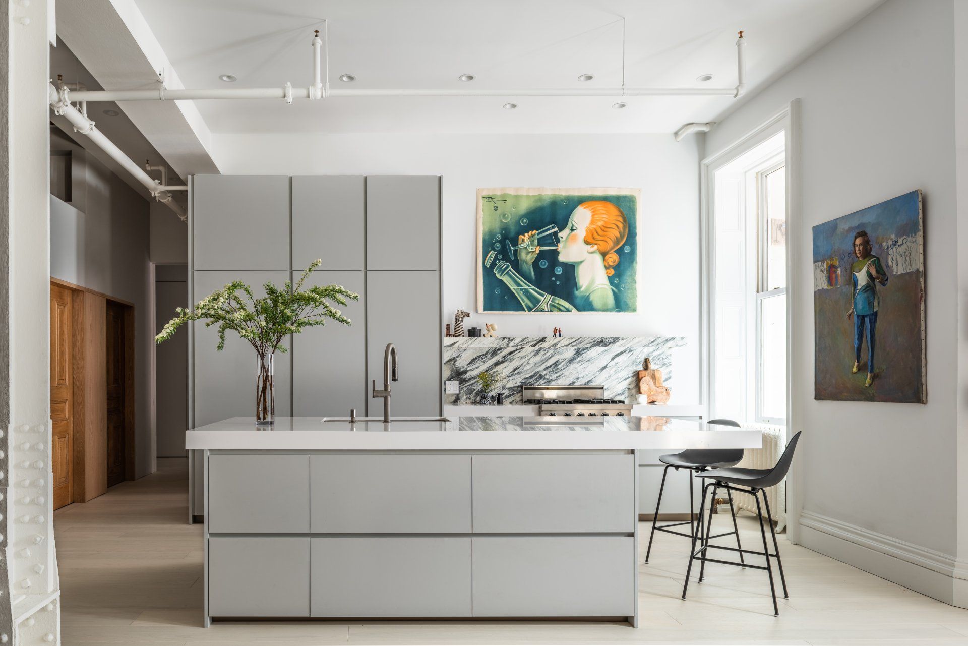
“When we started talking about the material palette, the idea was always to have really beautiful materials, like the bone white floors, but also let it be very neutral. We knew the clients had a lot of art and colorful furniture, so we wanted to let the architecture exist more calmly in the background. The introduction of the ash wood elements, monolithic gray pieces, and calmer marbles and stones are meant to let the art to pop out.”
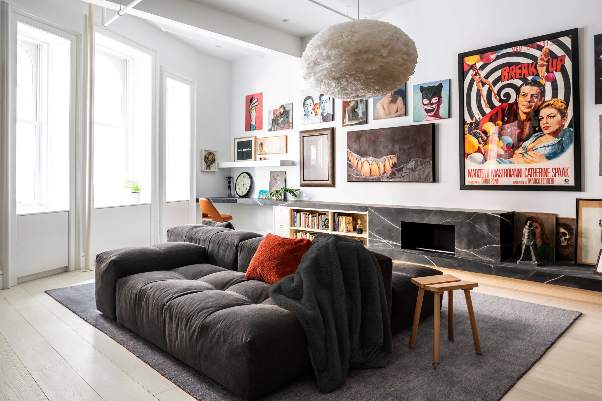
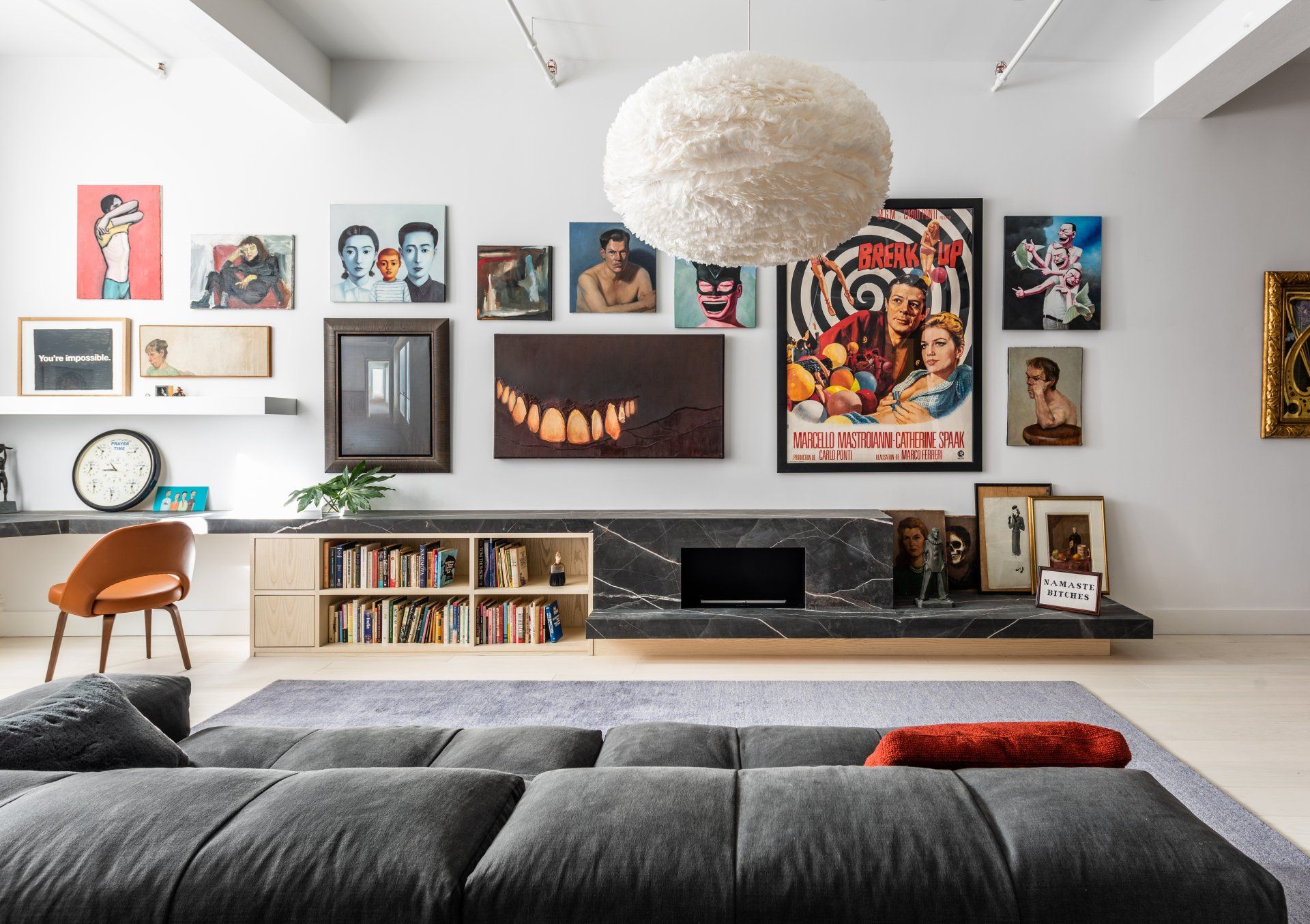
Hugging the living room wall, a long element of ash wood and richly patterned Calacatta Black marble integrates a desk, book storage, and a fireplace. The built-in lies low on the wall, leaving ample space above for a salon display of the couple’s vibrant art collection, including figurative paintings by Yue Minjun and George Segal, a portrait of the wife, and a graphic vintage poster for the 1965 Italian film Break Up, among many other works—some purchased from local artists and street vendors, some gifted from friends who are painters, and others which are family heirlooms. Tall windows that overlook Manhattan flood the desk and art wall with natural light.
In contrast, the kitchen is composed of a minimal, gray lacquered island and freestanding cabinet, with accents of the Calacatta Manhattan marble that anchors the heart of the apartment. Here, color enters the space through two large-scale, boldly graphic paintings of women.
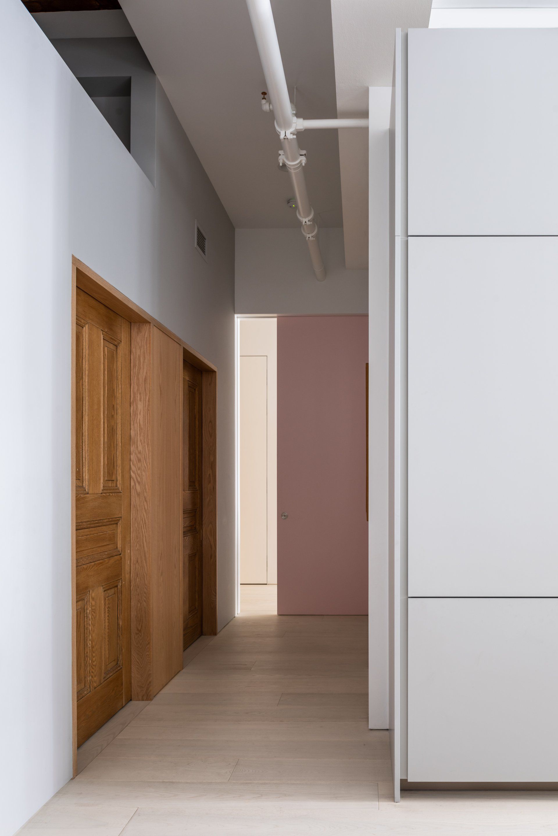
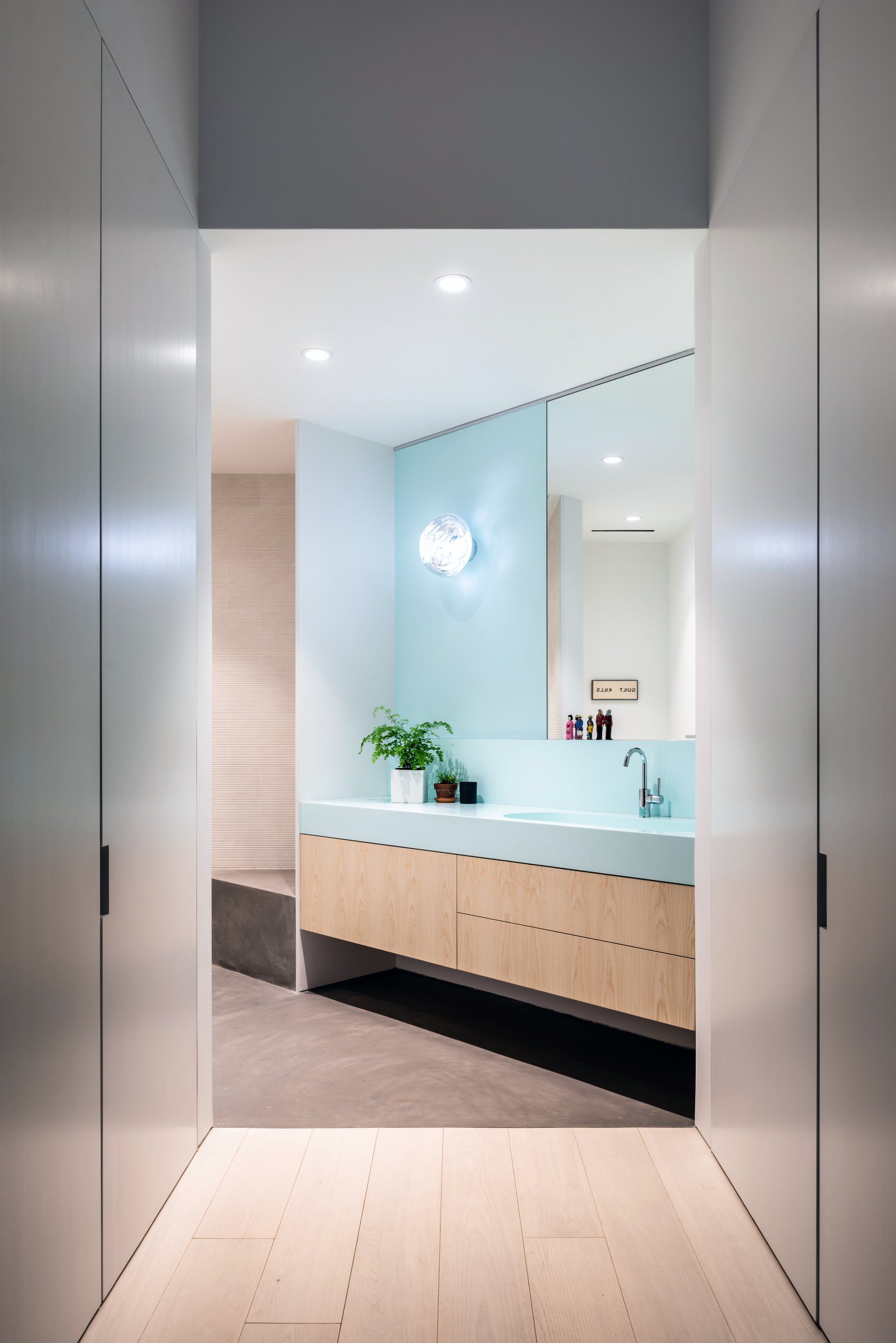
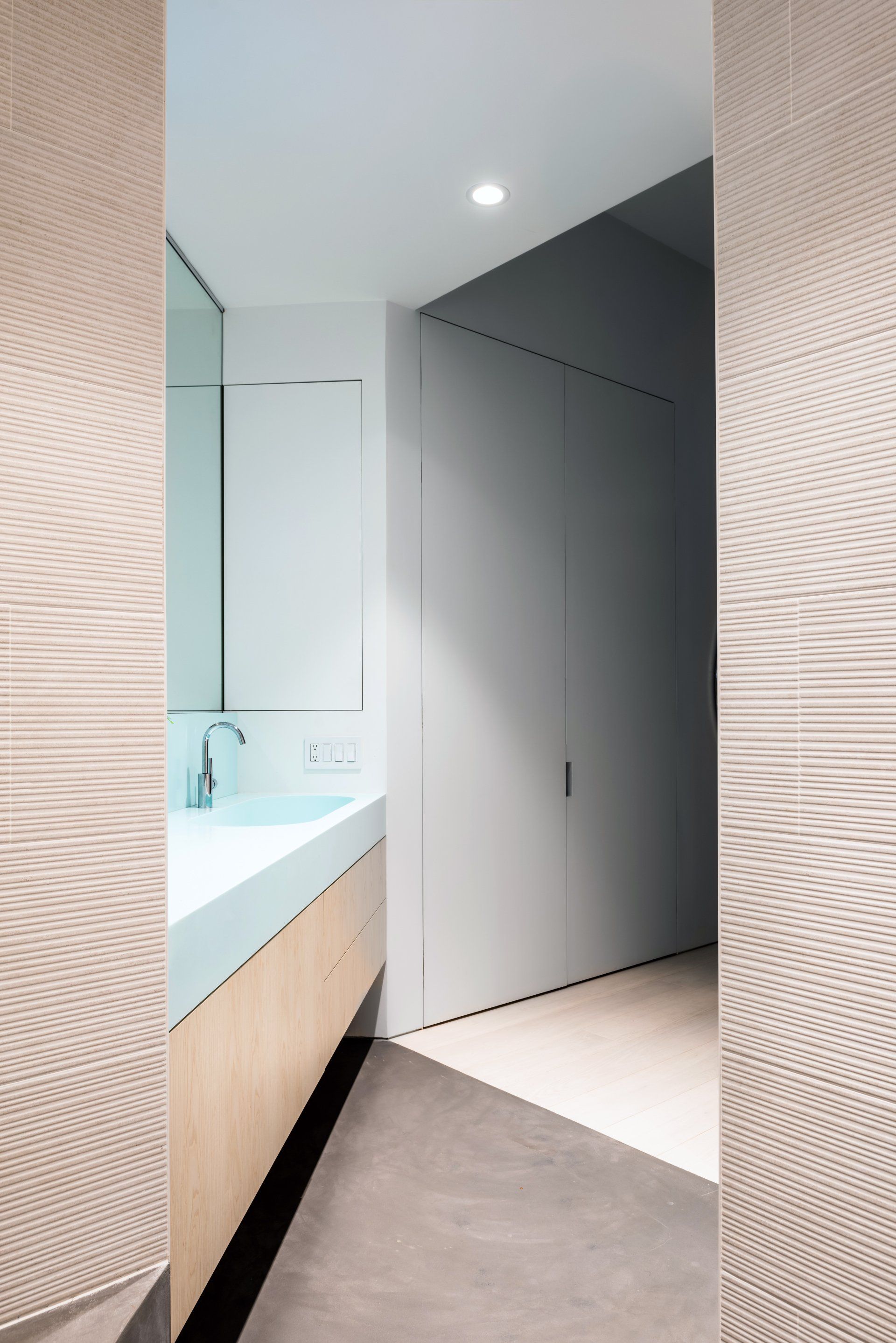
Throughout the apartment, white stained wide plank ash wood floors were used to brighten the space. Reclaimed wood doors previously salvaged in the loft, were re-salvaged and refurbished to create a deliberate historic insertion into the gray walls housing the guest bathroom and utility room. Complementing the salvaged wood doors, a graphic wall tile with a black-and-white wood-grain imprint clads one bathroom. The room is distinguished by bold patterns—the black-and-white floor porcelain tiles resemble terrazzo—and punctuated with pops of marigold yellow in the faucet and light fixture. The master bathroom is more muted, with a custom ash wood vanity and light blue resin vanity top against concrete floors and ecru, textured wall tiles with troweled striations.
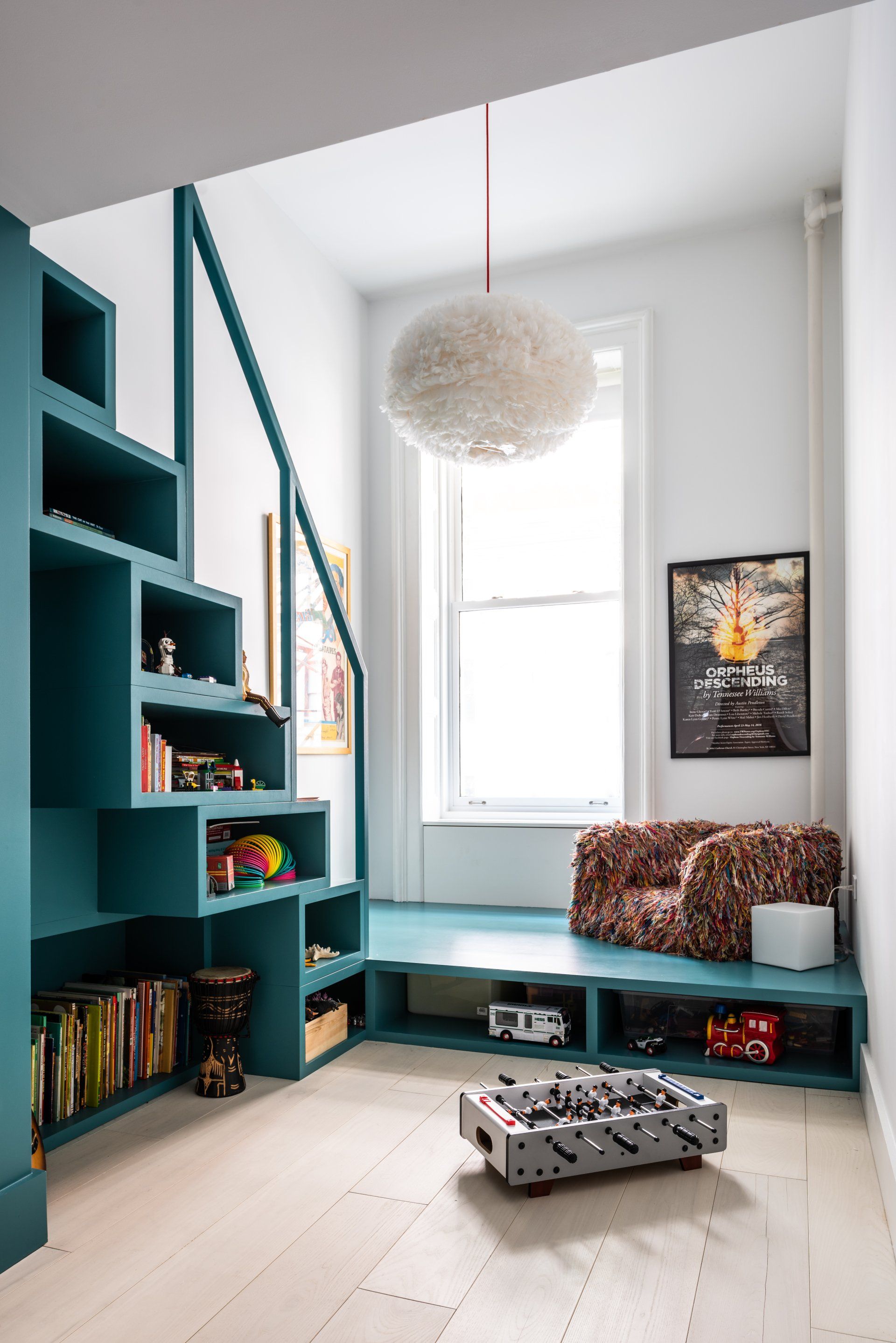
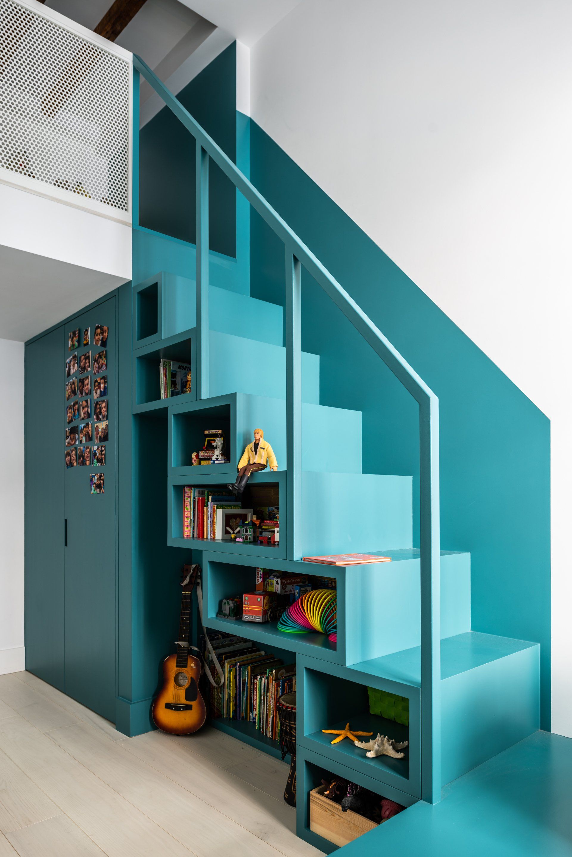
For the second bedroom, the organizing element is a deep turquoise staircase leading to a sleeping loft that doubles as a bookcase, storage, and play platform, providing a moment of vibrant color in the room that the child selected himself.
“The clients had some unique and fun requests such as crawling height sleeping lofts, bookcase stairs, sprinkler pipes painted pink, a blue sink. But we listened. It was a journey and mutual goal to see how playful we could be while keeping it sophisticated and timeless. We created an efficient layout that added an additional bedroom and bath, but also made the living space larger, more airy with more access to daylight.”
Photography Alan Tansey
Interior Design & Architecture
Worrell Yeung
SHARE THIS
Latest Edition
Mar / Apr 2026 edition is available now!
Contribute
G&G _ Magazine is always looking for the creative talents of stylists, designers, photographers and writers from around the globe.
Find us on
Latest News
Subscribe
Keep up to date with the latest trends!
Popular Posts
