The Naked House
Studio TAB transformed a Bangalore home into a simple and minimalist holiday retreat for a young NRI family.
"We wanted to explore what really defines minimalism. By stripping off every pretentious layer, every embellishment, every unwanted facade that shields the need; we unravelled the state of spatial nakedness. A home so distinctly stark and monotonous, and yet a home in every sense. Of a palette devoid of colors, of wood that is in its most bare form and a naked layout consisting of only the essentials."
The clients are a young NRI family settled in the US: they desired to revamp their old family home in Bengaluru and convert it as a holiday home. They intended that the home exudes a sense of novelty that is distinct from their everyday home and renders it a perfect holiday home vibe. Apart from it being their home during holidays, they wanted to let the house out for homestays during the rest of the year.
The space had to be a getaway from the urban jungle homes. Since the house will host many guests during their homestay visits apart from the family, it had to steer clear from reflecting a distinguishable design taste and rather be an open palette that welcomes all kinds of guests.
To represent a monotone ensemble across all surfaces, the design team unanimously agreed upon adopting the color grey. Grey represents a sense of muteness, of being unbiased, neither warm nor cold and works as a perfect contrast for every other material. To achieve the correct shade of grey for each of the surfaces; be it the floor or the walls or the ceiling or the furniture - the design team had to undergo a rigorous sampling process. If there ever was an architect’s version of '50 shades of grey', then this would be it.
The endeavour at each stage was to resist every other design application and stick to the rooted concept of nakedness. To begin with, we identified each of the partition walls that were rendering the rooms small. We opened up all walls and retained only those which are absolutely necessary. This allowed a fluidic nature of designing.
Foyer & Living room
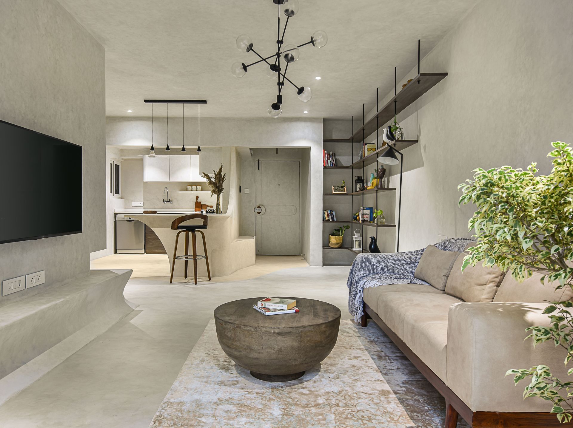
As we enter the house, the monotony of the space is seen immediately. An in-situ seating snugs to the curved wall flanking the adjacent open kitchen. The foyer and the open kitchen are enveloped in a beige colored lime plaster that adds a contrast to the overall grey palette.
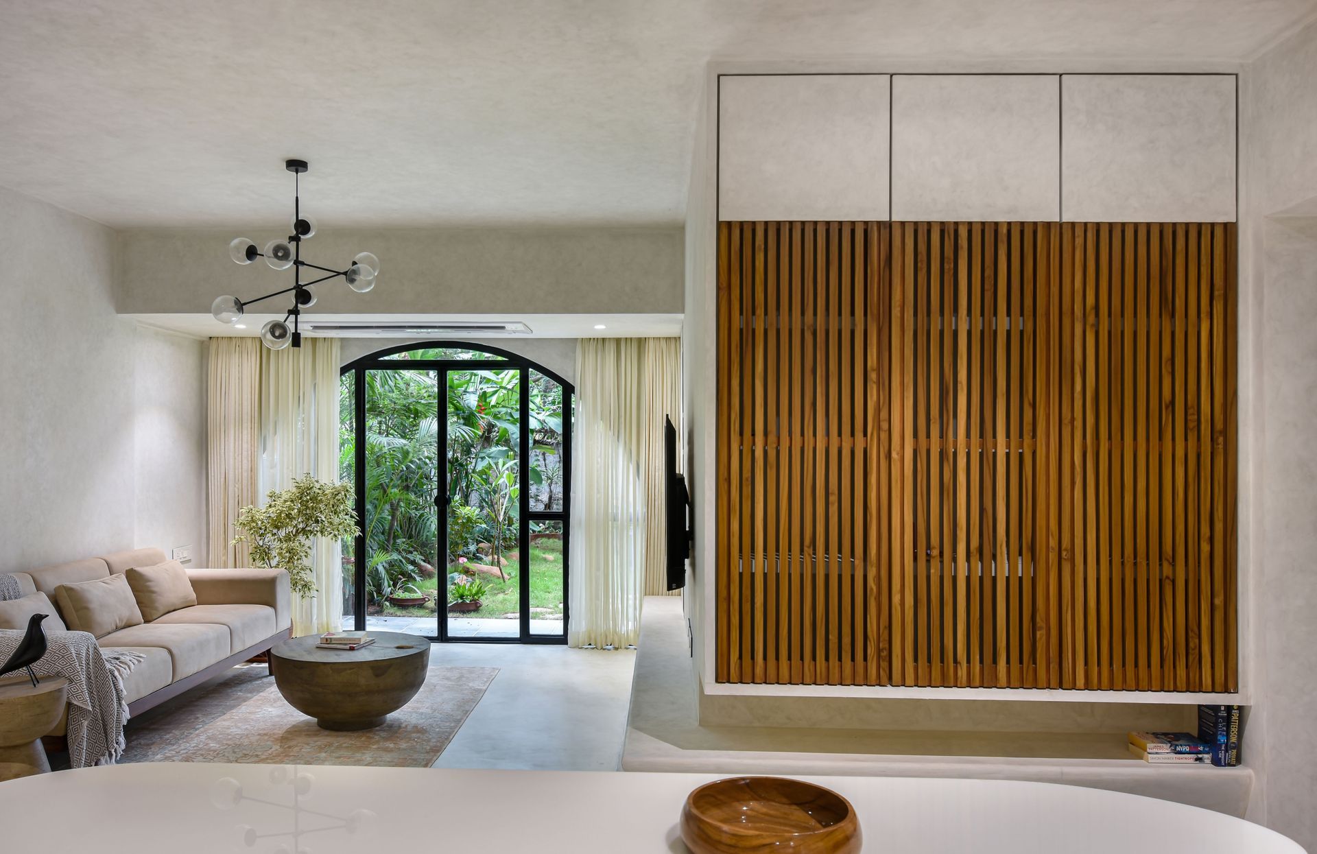
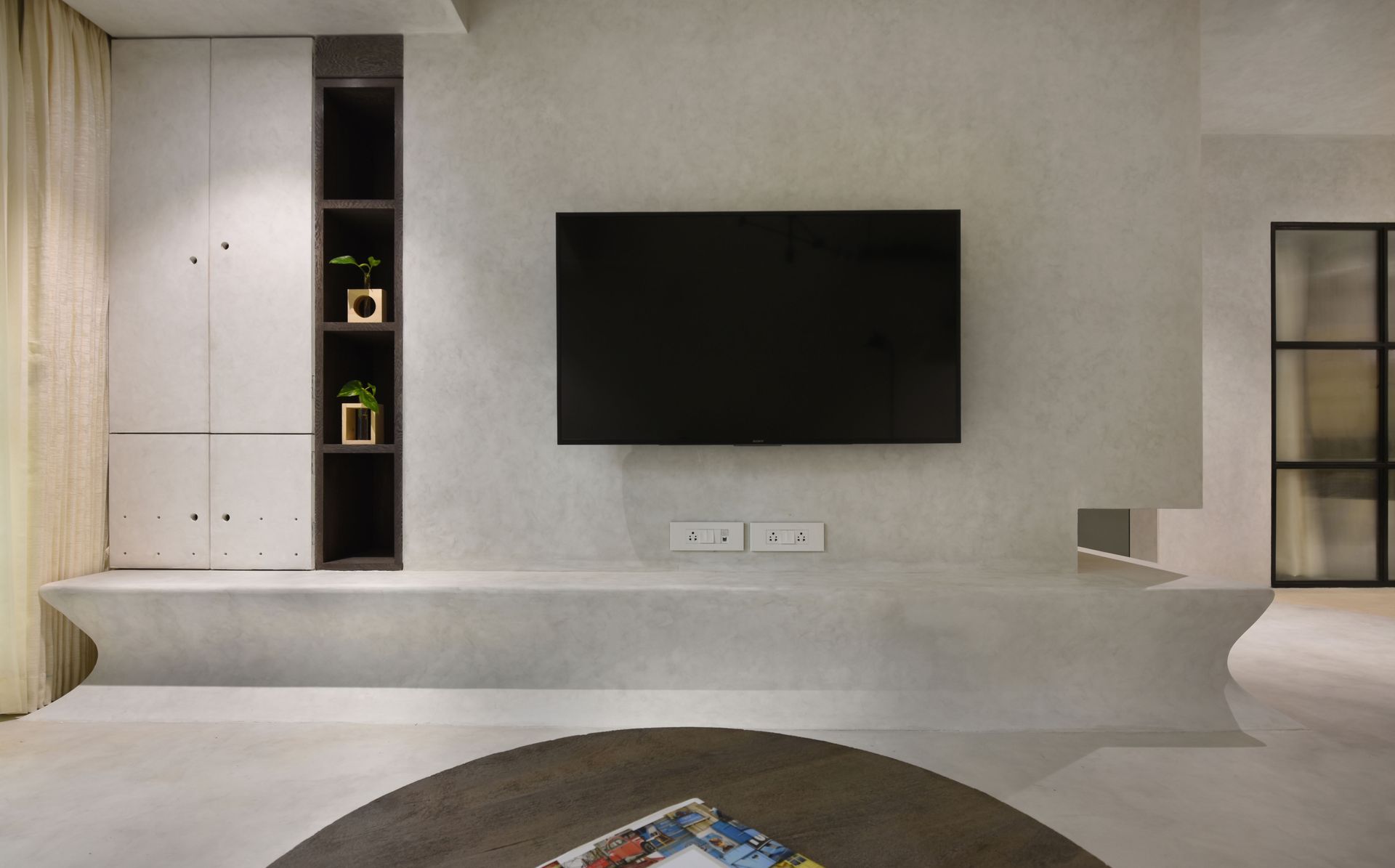
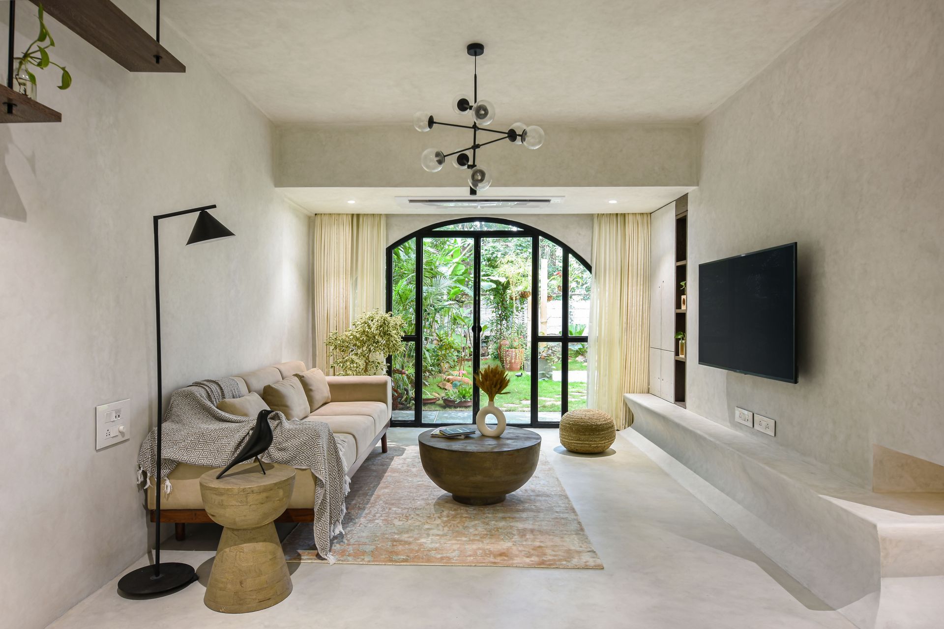
The living room is a sparsely populated space bereft of all embellishments that we see in a usual living space. One side has a series of long racks stacked up in clean horizontal lines. The wooden racks are supported by slim steel bars. These racks house the client’s book collection and curios picked up from across the world. Along the same wall is a custom made couch. On the opposite side is a cast in-situ tv unit that rises from the floor in a seamless fashion. This meanders onto the adjacent wall to be a part of the wooden-slit crockery unit.
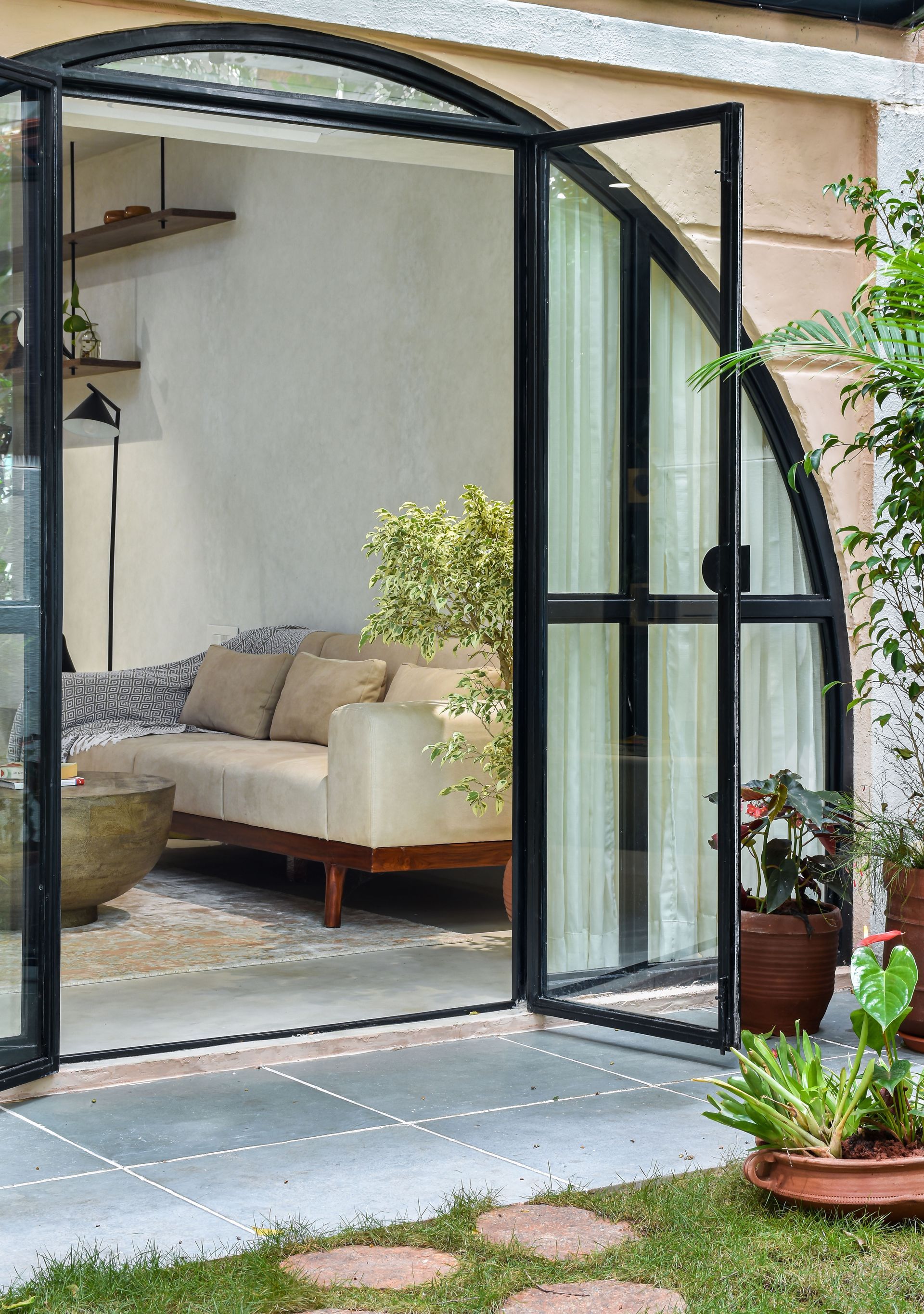
The living room opens up entirely onto the garden area through an arched doorway thus bringing the outside in. The idea here is to create a fine harmony between the indoor and the outdoor as one unified space. The whole living space has been designed so as to keep the outdoor as the main focal element.
Garden
This is the highlight of the project around which the house has been planned. The living and master bedroom opens completely into the garden space. The garden is a finely curated space with native trees, floral canopies and a cozy bistro space to enjoy the morning coffee.
Open Kitchen
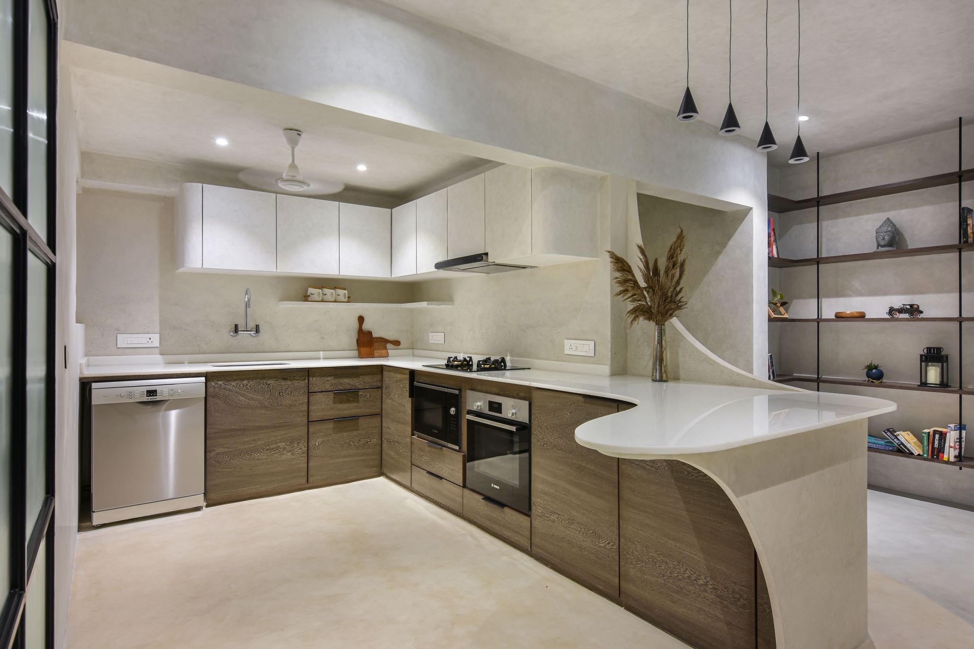
The kitchen is a fully equipped kitchen that amalgamates within the decor. Oak wood finish shutters make the under counter space that serves as a natural contrast to the beige floor. The counter is a C- shaped one that ends in a cantilevered form. This cantilever serves as the breakfast ledge for dining. The backsplash is again an in-situ terrazzo dado wall.
Master Bedroom
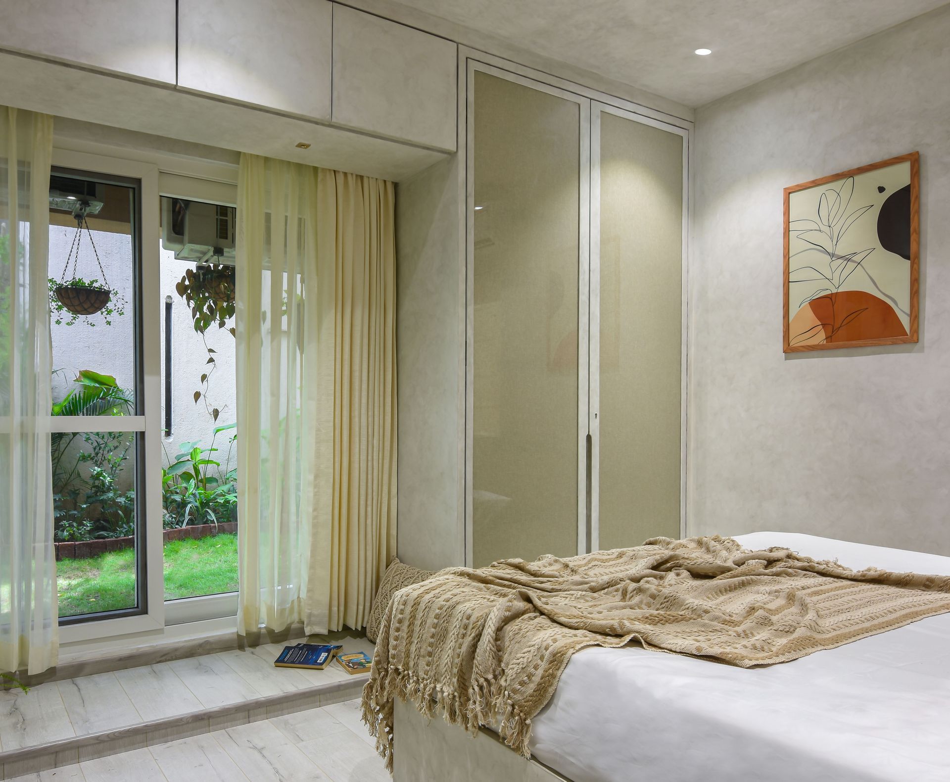
The master bedroom is again a minimalist one. A re-purposed wooden log acts as the headboard of the lime plastered box bed. The flooring is rustic white hardwood. The bedroom opens into the garden. The room has been designed so as to enjoy the view while resting. The wardrobe shutters comprise of linen fabric sandwiched within glass panels.
Bedroom
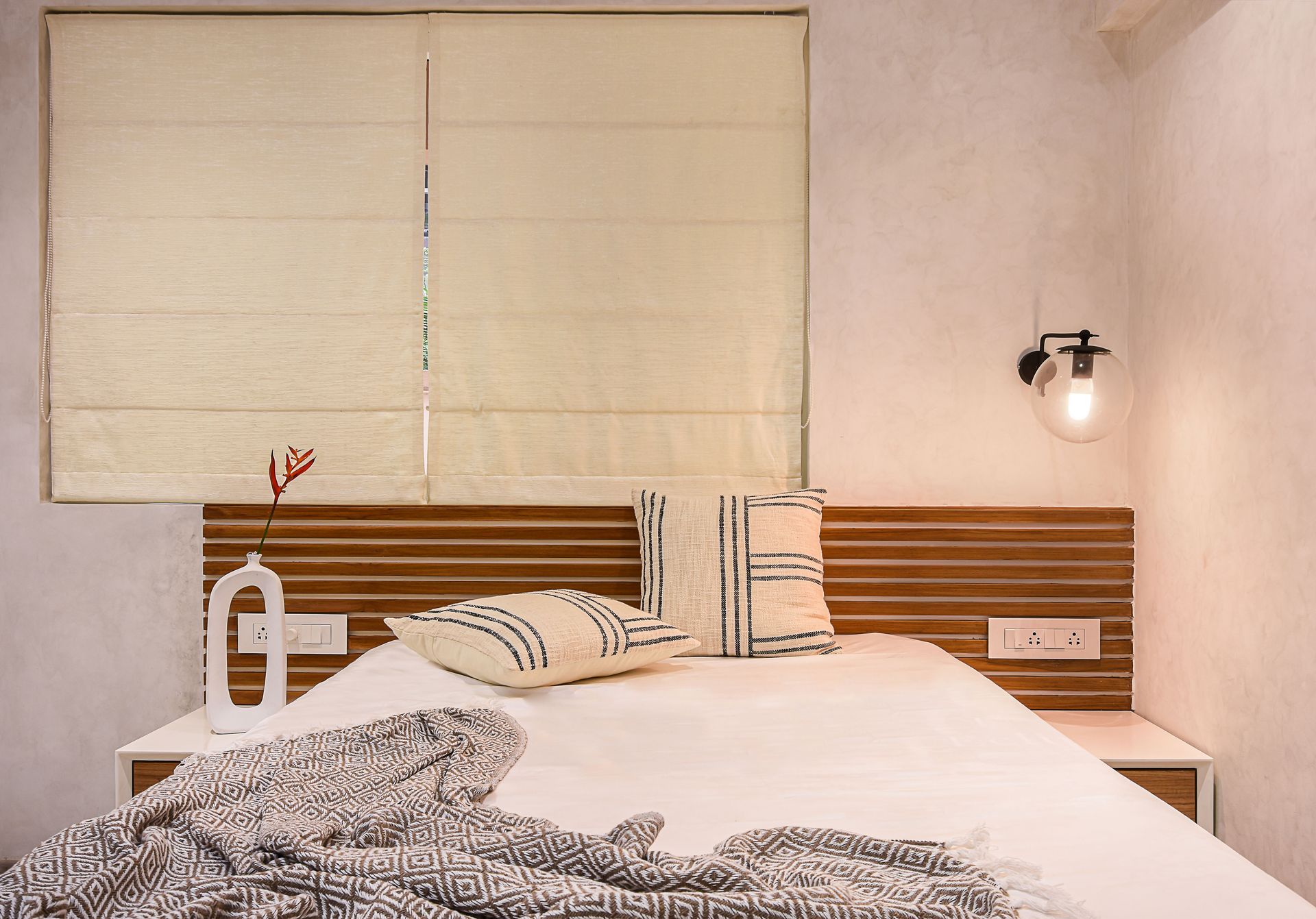
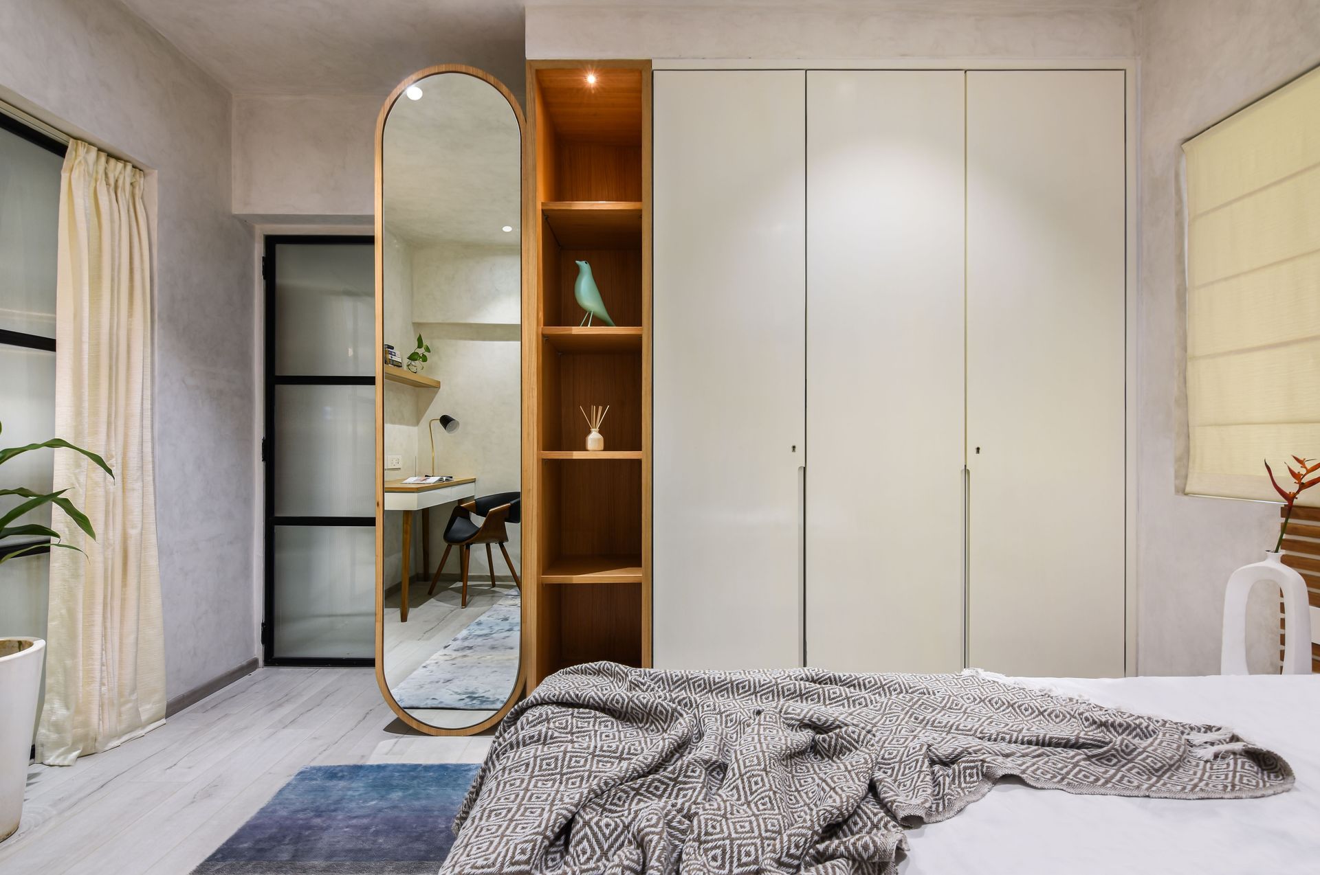
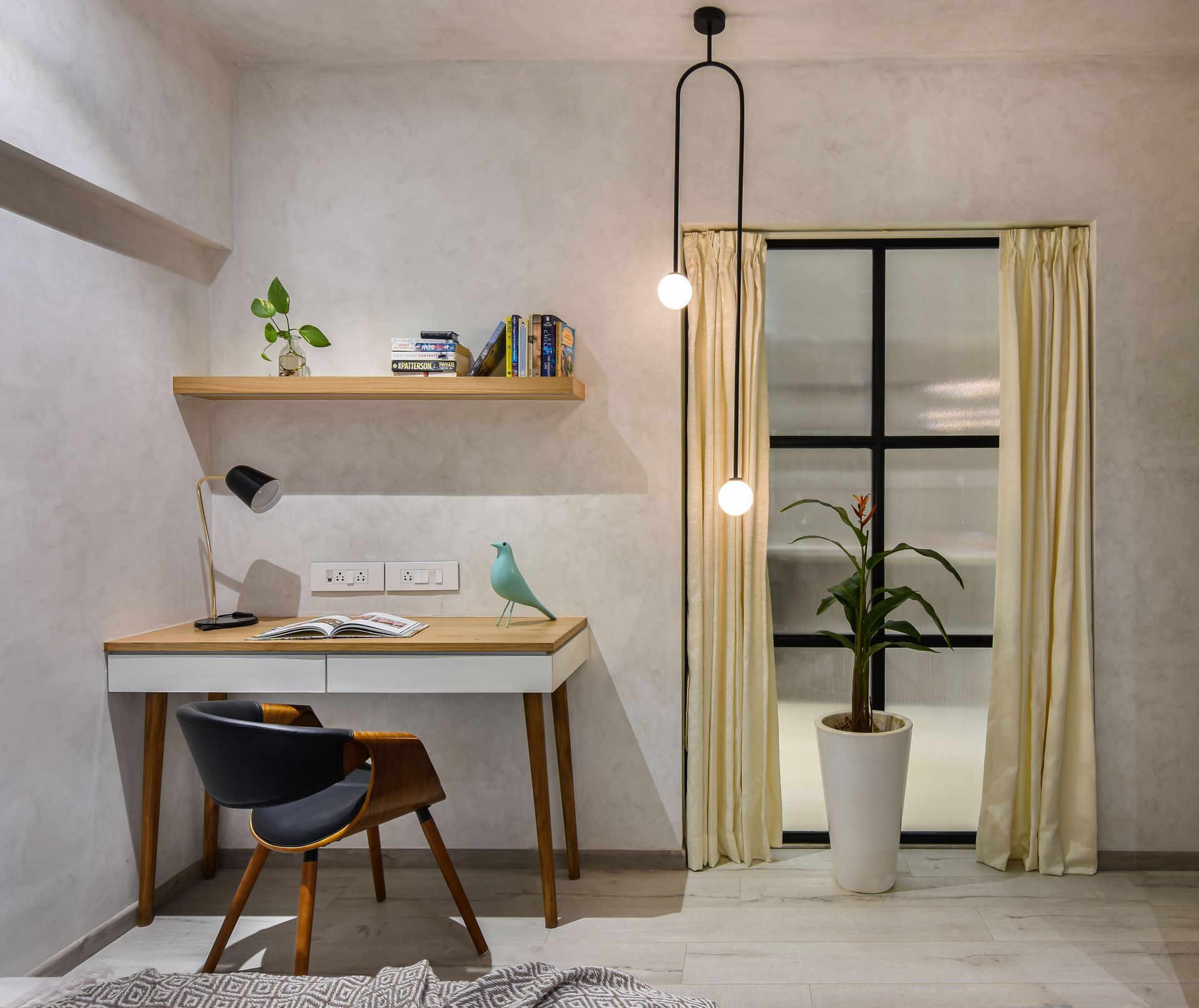
A fluted glass panel and door makes up one part of the bedroom wall. This fluted glass panels is visible from the Kitchen zone too. The work desk is a quaint little corner within the room. Made of wood, this is a perfect working zone for all the remotely working professionals. On the other side, is the standalone bed with wooden strips as back panel. The wardrobe in this room is a compact one which allows luggage to stack within it.
Bathrooms
This language of the project runs into the washrooms too. Lime plaster is sealed with a hardener substrate to ensure it withstands water and chemicals.
SHARE THIS
Contribute
G&G _ Magazine is always looking for the creative talents of stylists, designers, photographers and writers from around the globe.
Find us on
Latest News


Subscribe
Keep up to date with the latest trends!
Popular Posts
