Mohr life resort
March 11, 2020
noa* takes the stage with its latest project: a wellness area devised as a theatre with numerous different interpretations of the available space in Lermoos, Austria.
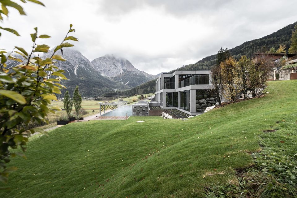
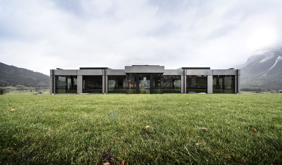
The South Tyrolean practice leverages the incredible nature at the heart of Tirol, Austria, to design a contemporary and ‘stirring’ building. The glass and cement are in constant dialogue with the environment’s morphology, culture, and history.
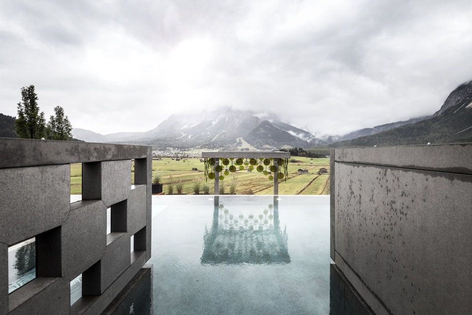
The new glass and cement structure was built organically on a gentle slope located below the hotel. It features a unique view across the spacious Ehrwalder Becken valley peppered with old farmhouses and barns; what’s more, the imposing 3,000 metres of the Zugspitze mountain – which represents a geographical border between Austria and Germany – overlooks the entire valley.
Architect Christian Rottensteiner, partner at noa*, explains how "the majestic and powerful presence of the mountain itself was our test bench. The Zugspitze generally – and its beauty, strength, and formal complexity specifically – was our inspiration and the project’s protagonist. The new wellness area is conceived as a theatre’s stalls, an ideal location to admire that extraordinary masterpiece. Guests are cocooned in a relaxing environment which harmonises with the environment. Our challenge is to create structures which expand and intensify the perception of spaces, thus creating restorative areas which stir new emotions in visitors."
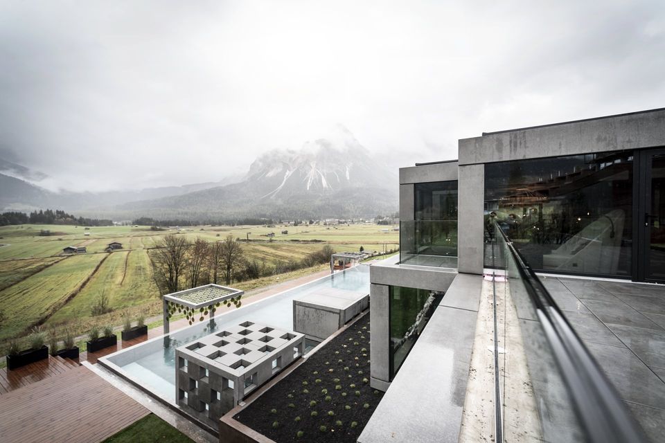
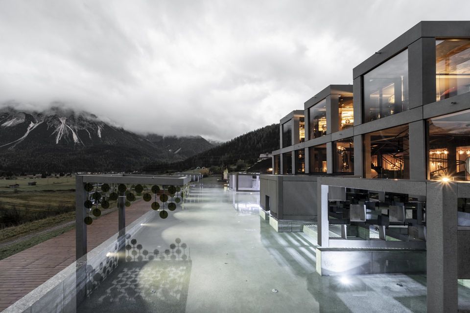
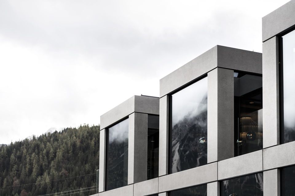
The new wellness area at the Mohr Life Resort stretches out across 600 sqm and features a roofed infrastructure built from scratch and an outdoor area with a swimming pool. The latter also connects the two buildings via a central extension into the spa. The glass and cement structure extends horizontally to create an artificial rib, mirrored by the dry stone walls running along its side. The project was specifically designed considering the gently sloping terrain and develops across two levels: this creates a height difference which allowed for the creation of the swimming pool. A sober and light building in the landscape obtained by the aggregation of simple shapes: glass cubes placed across the two levels create the structural grid for the edifice’s skeleton.
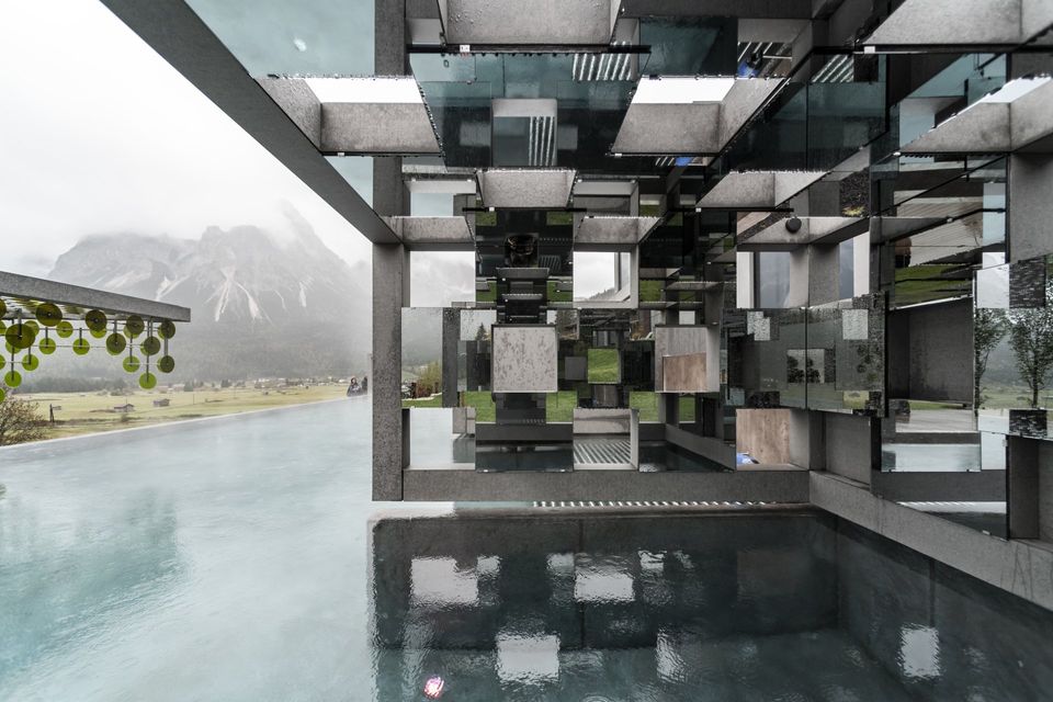
Moreover, using a reflective glass surface delivers an unexpected, scenic effect: the different shapes virtually fade into the background and meld into a ‘screen’ mirroring the gargantuan silhouette of the Zugspitze. And there’s more. The pool runs flush along the length of the Spa’s glass front, thus doubling the image of the mountain thanks to impactful chromatic mirror effects.
THE OUTDOOR AREA
The swimming pool represents the natural extension of the wellness area. It extends into the open and features chill-out areas boasting different sensorial experiences. Six ‘island boxes’ dot the water basin, reflecting the structure overlooking the pool: however, the group of shapes virtually dissolves and opens up the view across the landscape as much as possible. Both the indoor and outdoor elements of the pool feature ‘islands’ offering guests original and essential experiences.
The swimming pool represents the natural extension of the wellness area. It extends into the open and features chill-out areas boasting different sensorial experiences. Six ‘island boxes’ dot the water basin, reflecting the structure overlooking the pool: however, the group of shapes virtually dissolves and opens up the view across the landscape as much as possible. Both the indoor and outdoor elements of the pool feature ‘islands’ offering guests original and essential experiences.
MATERIALS
The harmonious integration of cement and glass gives the project a truly contemporary touch. The cement outlines the structure of the building and can be immediately spotted in the building’s facade, in the pool’s shape, and in the outdoor elements – the paths and garden ‘islands’. The glass’ reflection and transparency creates a harmonious balance between the building and landscape. The floors are overlaid with a continuous resin coating. Using cement and resin overcomes the need for joints, giving the surfaces more room to breathe. The two materials are perfectly combined even chromatically, without ever melding into one another thanks to the use of different textures (cement is coarse while resin is smooth).
The harmonious integration of cement and glass gives the project a truly contemporary touch. The cement outlines the structure of the building and can be immediately spotted in the building’s facade, in the pool’s shape, and in the outdoor elements – the paths and garden ‘islands’. The glass’ reflection and transparency creates a harmonious balance between the building and landscape. The floors are overlaid with a continuous resin coating. Using cement and resin overcomes the need for joints, giving the surfaces more room to breathe. The two materials are perfectly combined even chromatically, without ever melding into one another thanks to the use of different textures (cement is coarse while resin is smooth).
THE SPA: A CASCADE OF EXPERIENCES
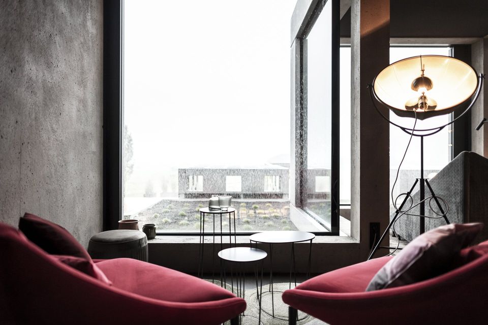
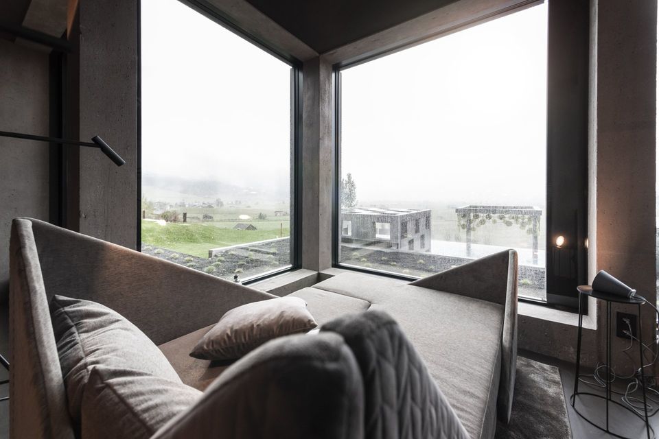
While the outer structure is all lines and stark shapes, its traits become softer, more organic, enveloping the viewer into its embrace once inside the building. The tension created by the contrast between indoor and outdoor language enriches the building both aesthetically and formally. The relaxation areas were developed to look like theatre stages with a view across the mountain. Every ‘booth’ includes two deckchairs featuring different designs: open, spacious areas with huge swings hanging from the ceiling enshrouded by drapery or metal cones framing the mountain alternate with closed balconies delivering increased privacy and relaxation with an omnipresent mountain view.
While the outer structure is all lines and stark shapes, its traits become softer, more organic, enveloping the viewer into its embrace once inside the building. The tension created by the contrast between indoor and outdoor language enriches the building both aesthetically and formally. The relaxation areas were developed to look like theatre stages with a view across the mountain. Every ‘booth’ includes two deckchairs featuring different designs: open, spacious areas with huge swings hanging from the ceiling enshrouded by drapery or metal cones framing the mountain alternate with closed balconies delivering increased privacy and relaxation with an omnipresent mountain view.
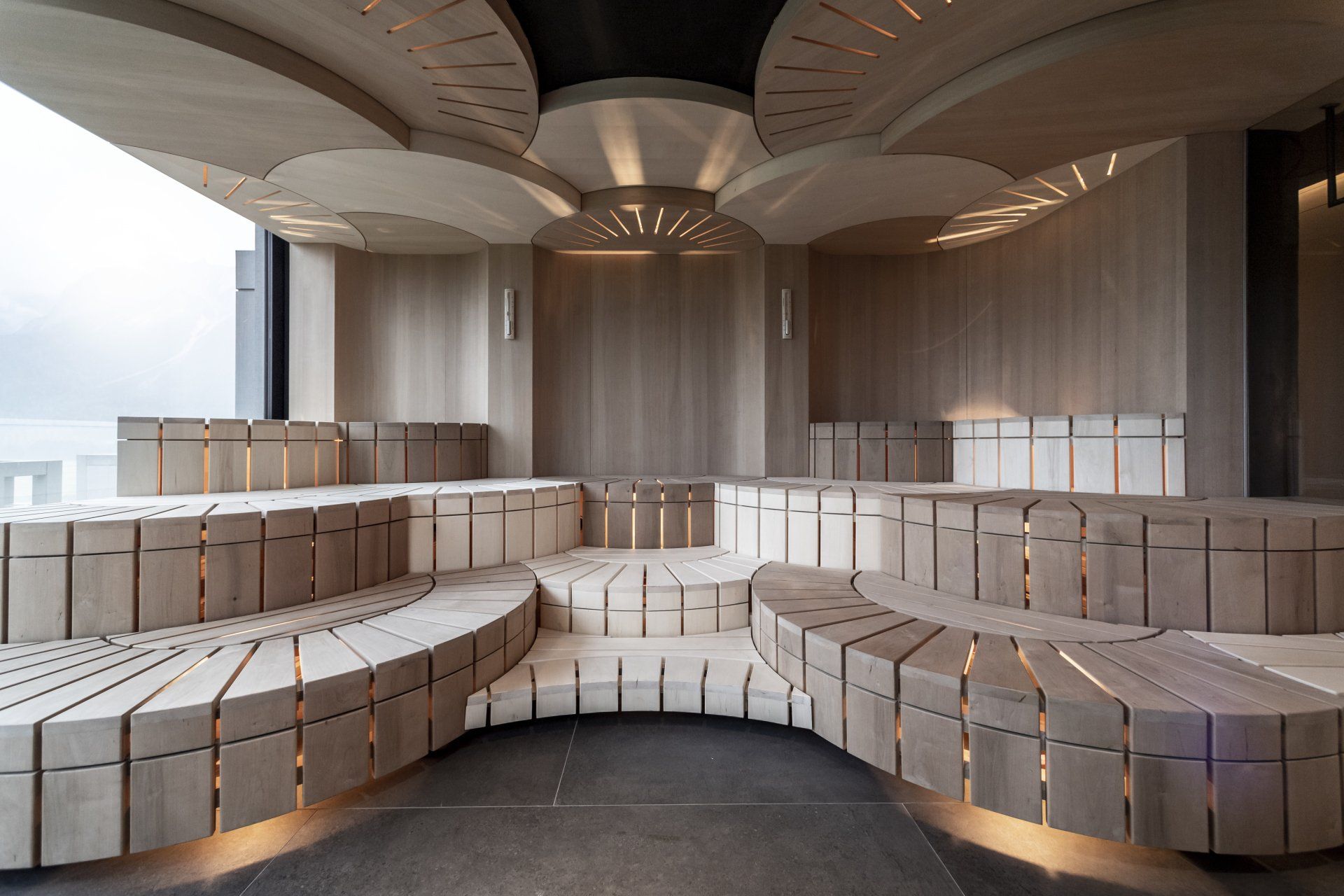
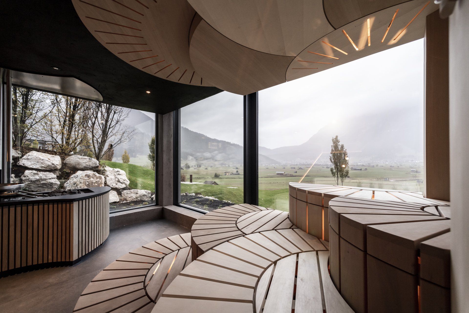
The ground floor also features a private lounge; a lobby and bar for refreshments; a Spa and scenic sauna for approximately 20 people featuring a mini bistro reminiscent of cinema halls, as well as changing booths and showers. Last but not least, a scenic spiral staircase pinpoints the centre of the building and takes revellers to the first floor where 10 symmetrical chill-out ‘stages’ await them.
COLOURS & TEXTURES
The building’s exterior dips into nature’s different hues thanks to its reflective surface, changing according to the time of the day and seasons. Inside, the colours and textiles were inspired by theatre stages: cotton and smooth velvet are steeped in warm hues of Bordeaux distempering into brown.
The building’s exterior dips into nature’s different hues thanks to its reflective surface, changing according to the time of the day and seasons. Inside, the colours and textiles were inspired by theatre stages: cotton and smooth velvet are steeped in warm hues of Bordeaux distempering into brown.
FURNISHINGS & LIGHTS
The 20 islands of the new Spa were designed by noa* and produced by artisans. Specific light sources where used to provide illumination, including atmosphere lights inspired by a single motif: a glass sphere. Depending on the environment and individual needs, the fixtures come in different versions: they can be scenic lamps following the twists and turns of the spiral staircase, or a thread of light bulbs reminiscent of the lights in a theatre’s dressing room, and then again, a simple sphere dotting the walls.
The 20 islands of the new Spa were designed by noa* and produced by artisans. Specific light sources where used to provide illumination, including atmosphere lights inspired by a single motif: a glass sphere. Depending on the environment and individual needs, the fixtures come in different versions: they can be scenic lamps following the twists and turns of the spiral staircase, or a thread of light bulbs reminiscent of the lights in a theatre’s dressing room, and then again, a simple sphere dotting the walls.
Photography by Alex Filz
www.noa.network
SHARE THIS
Latest Edition
Mar / Apr 2026 edition is available now!
Contribute
G&G _ Magazine is always looking for the creative talents of stylists, designers, photographers and writers from around the globe.
Find us on
Latest News
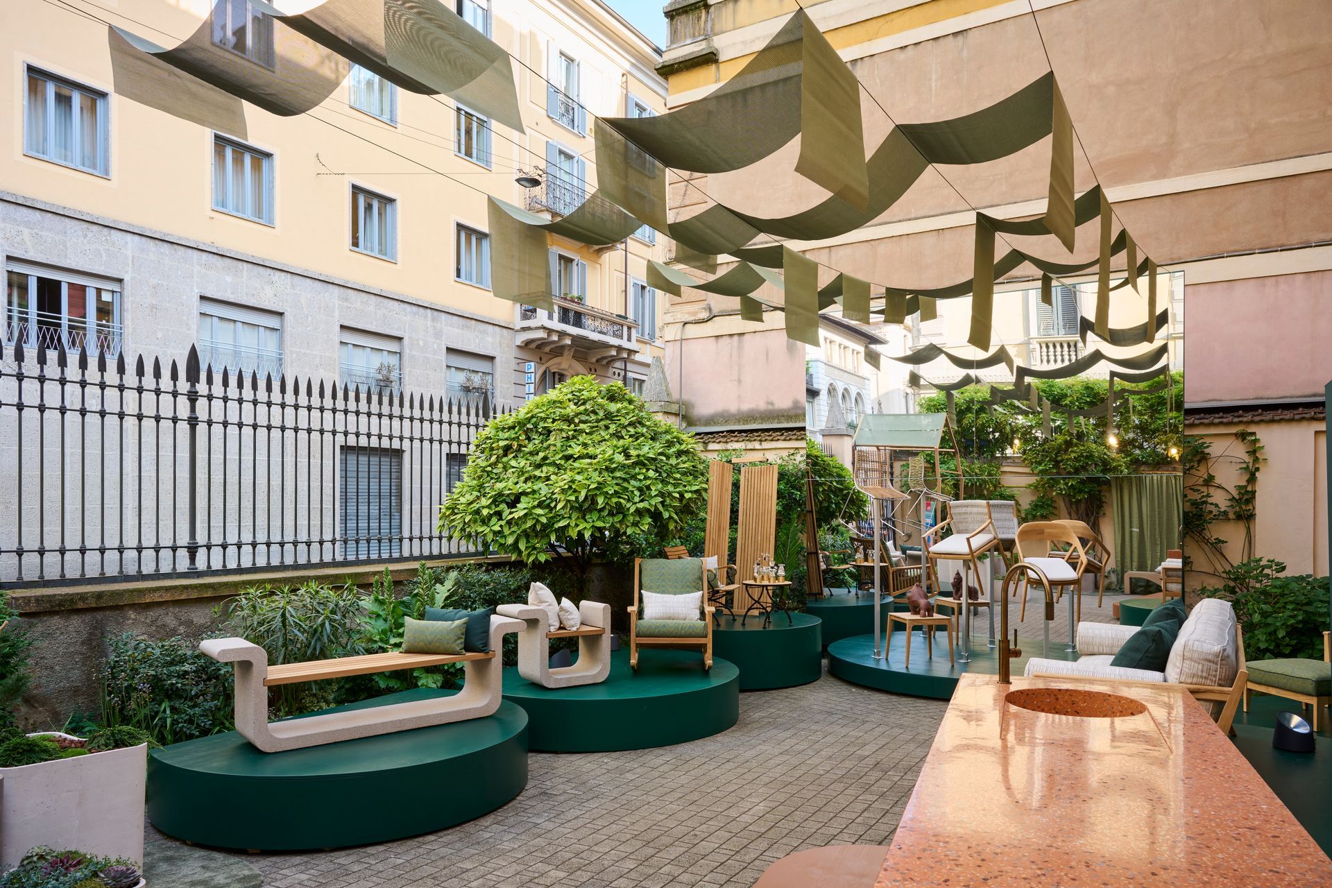
During Milan Design Week, where the city becomes an intricate map of overlapping visions and fleeting installations, Bodo Sperlein delivers a moment of rare coherence and depth with MENU exhibition that transcends the conventional boundaries of design to inhabit architecture as a living, breathing entity.
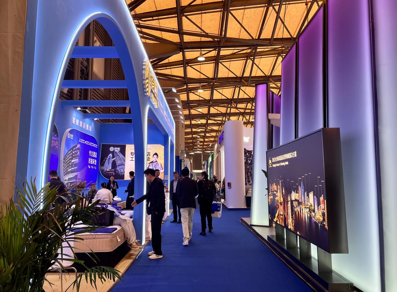
From March 31 to April 3, 2026, at the Shanghai New International Expo Centre, Hotel & Shop Plus 2026 Shanghai unfolded as far more than a trade fair: it emerged as a living, breathing platform where the very notion of travel dissolves, permeating every layer of contemporary lifestyle and spatial design.
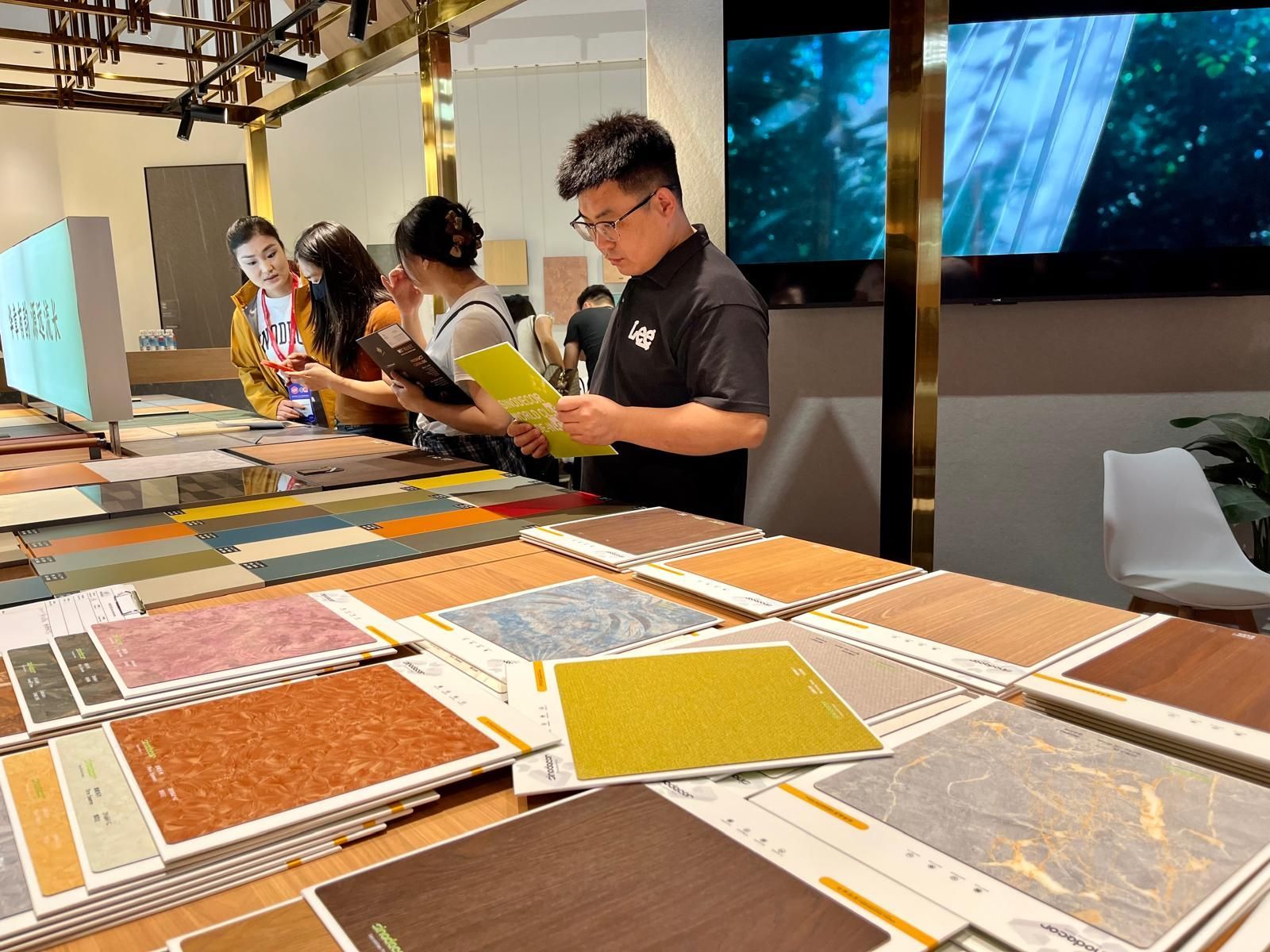
Held in two phases, from March 18–21 and March 28–31 at the Canton Fair Complex, the 57th edition of CIFF demonstrated how design is no longer something merely displayed but something to be fully experienced through the senses: deconstructed, re-engineered and ultimately redefined in its deepest essence: matter .
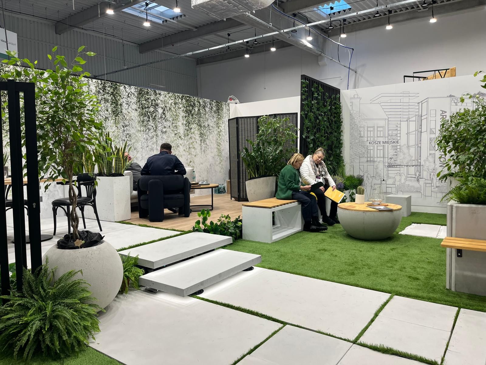
At a time when design is redefining its priorities, the contemporary landscape of interiors, décor, and outdoor living is clearly shifting from a digital-centric vision toward a more human, emotional and nature-driven approach. This transition was strongly evident during the latest editions of Warsaw Garden Expo and Warsaw Gift & Deco Show , held at Ptak Warsaw Expo from 10th to 12th February 2026.
Subscribe
Keep up to date with the latest trends!
Popular Posts
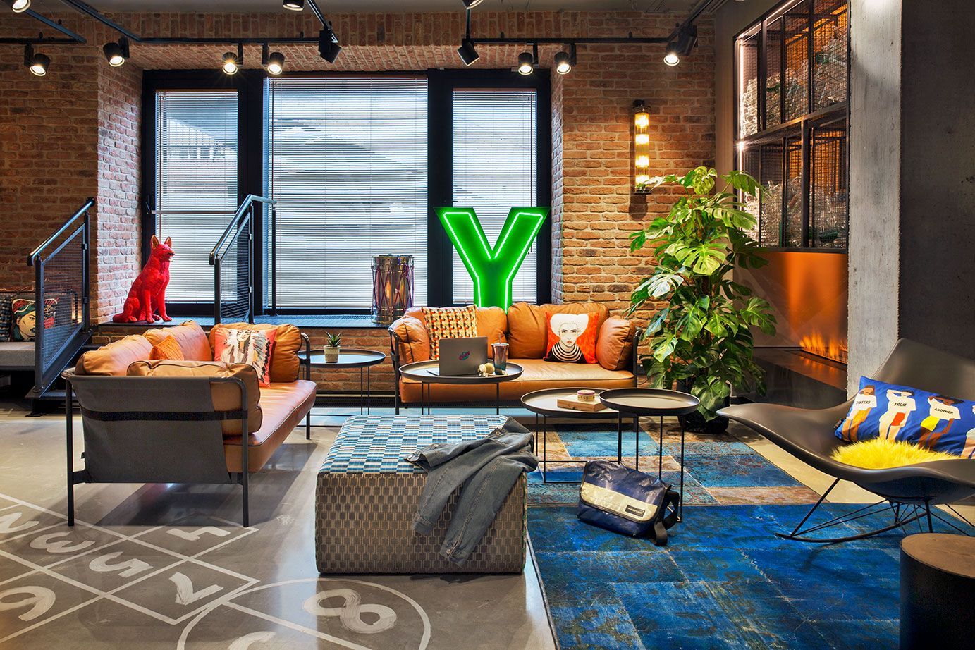
Praga district, once industrial and today filled with galleries, studios, cafés, and cultural spaces, is home to the vibrant Moxy Warsaw Praga . The hotel embraces the spirit of the neighborhood with a modern and playful design (typical of the Moxy Hotels concept) featuring industrial elements that echo the area’s historic character.
Between February 6 and March 8, Madrid Design Festival 2026 offered an intense program of exhibitions and events across the city. Throughout these days, it was possible to perceive the evolution of the festival, which expanded its program by integrating professional talks and meetings, revealing a strong desire among industry professionals to share the new Spanish approach to design with the world.
