Honeyz Concept store
Puntofilipino chose to avoid glitz and glamor in favor of industrial materials and an "apocalyptic atmosphere" for the Berlin home of honey and skincare retailer Honeyz.
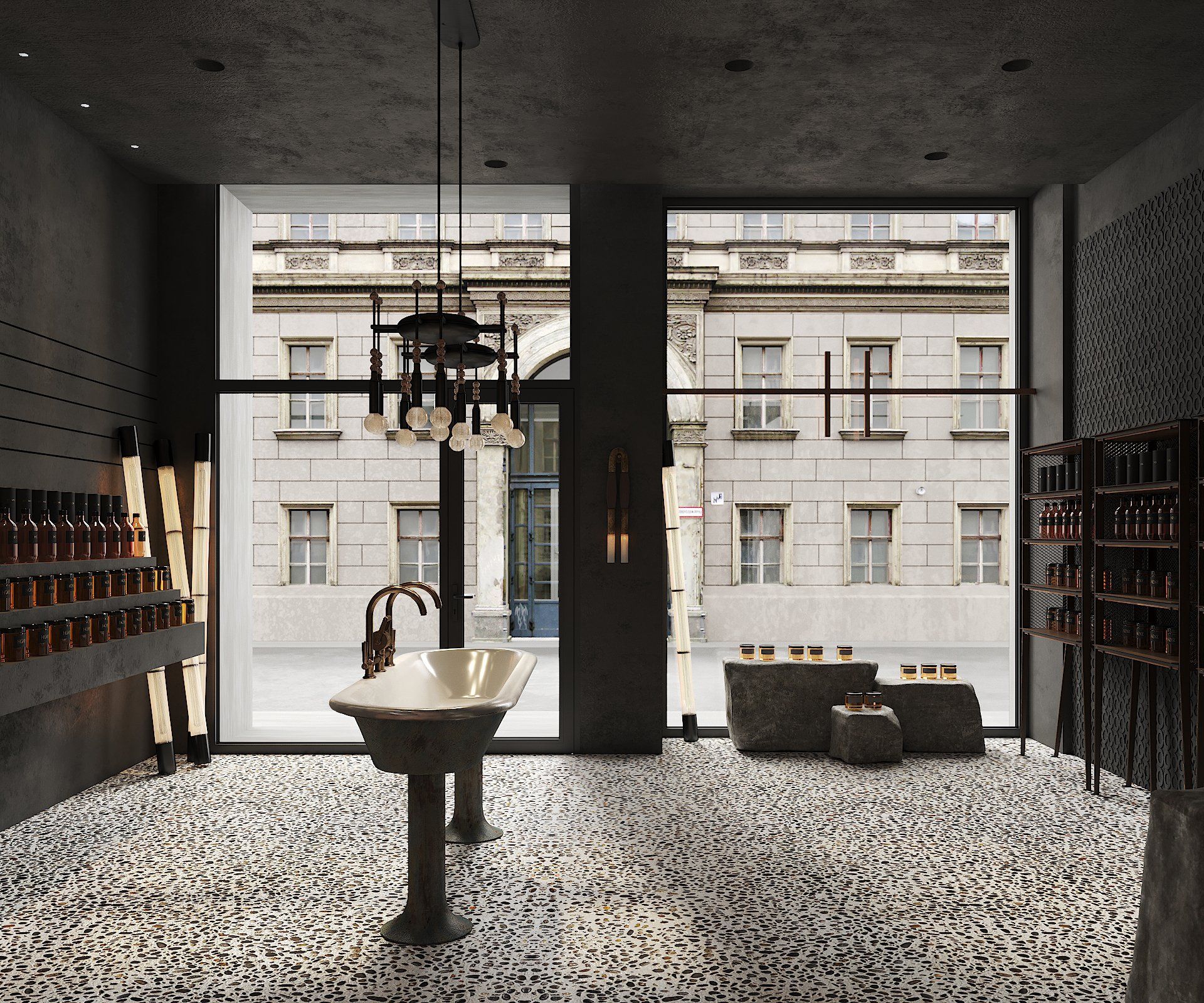
Hidden at the end of a beautiful avenue of century-old trees, the exit is within a group of several neoclassical buildings, each with great historical value. At just 75 square meters, the Honeyz store references the sophisticated history of a city that, for hundreds of years, has been celebrated as an epicenter of arts and cultural events.
"The charm of the building and the architectural setting was what attracted the founders of Honeyz to this place, with the intention of making it a destination of reference."
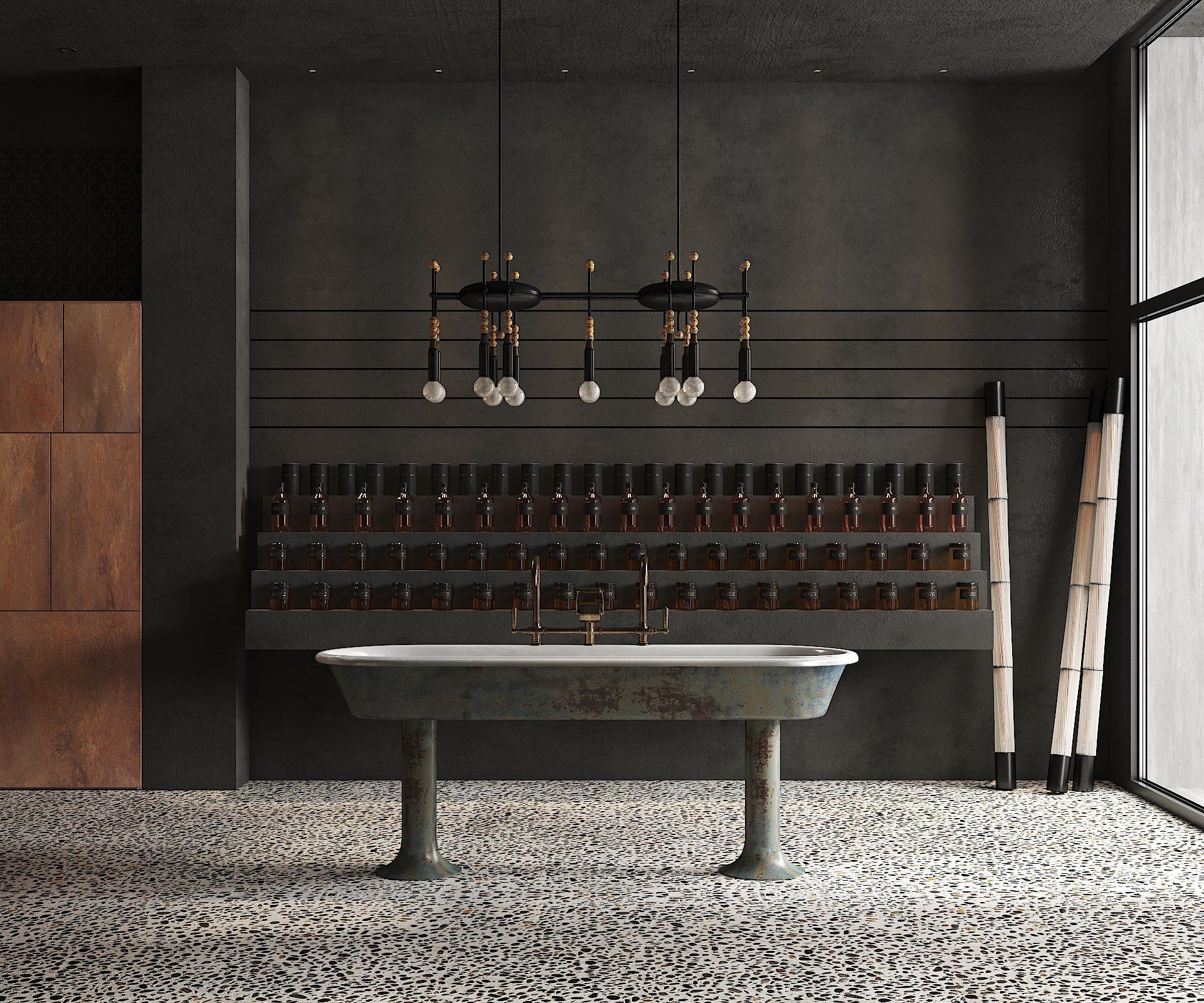
“While visually rich in contrast, color, texture and shape, the interior draws from a limited palette of materials, which resonates with an almost sacred sense of scarcity.”
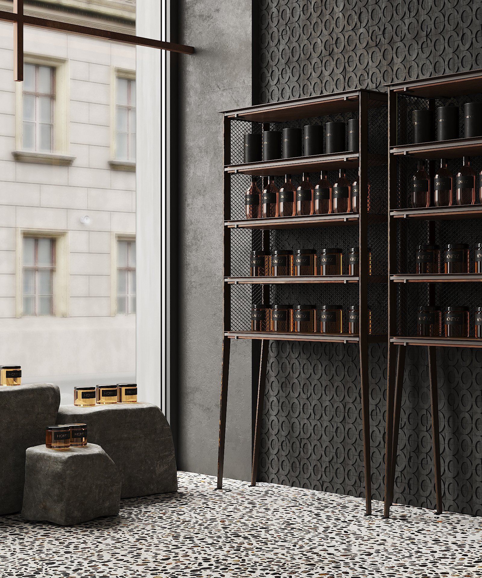
Driven by a commitment to preserve the building's historic character, Puntofilipino stripped the vacant building back to its essential elements and introduced an earth-toned palette. The space's stark aesthetic of concrete, pebble floors, and corten steel elements dates back to its bunker days.
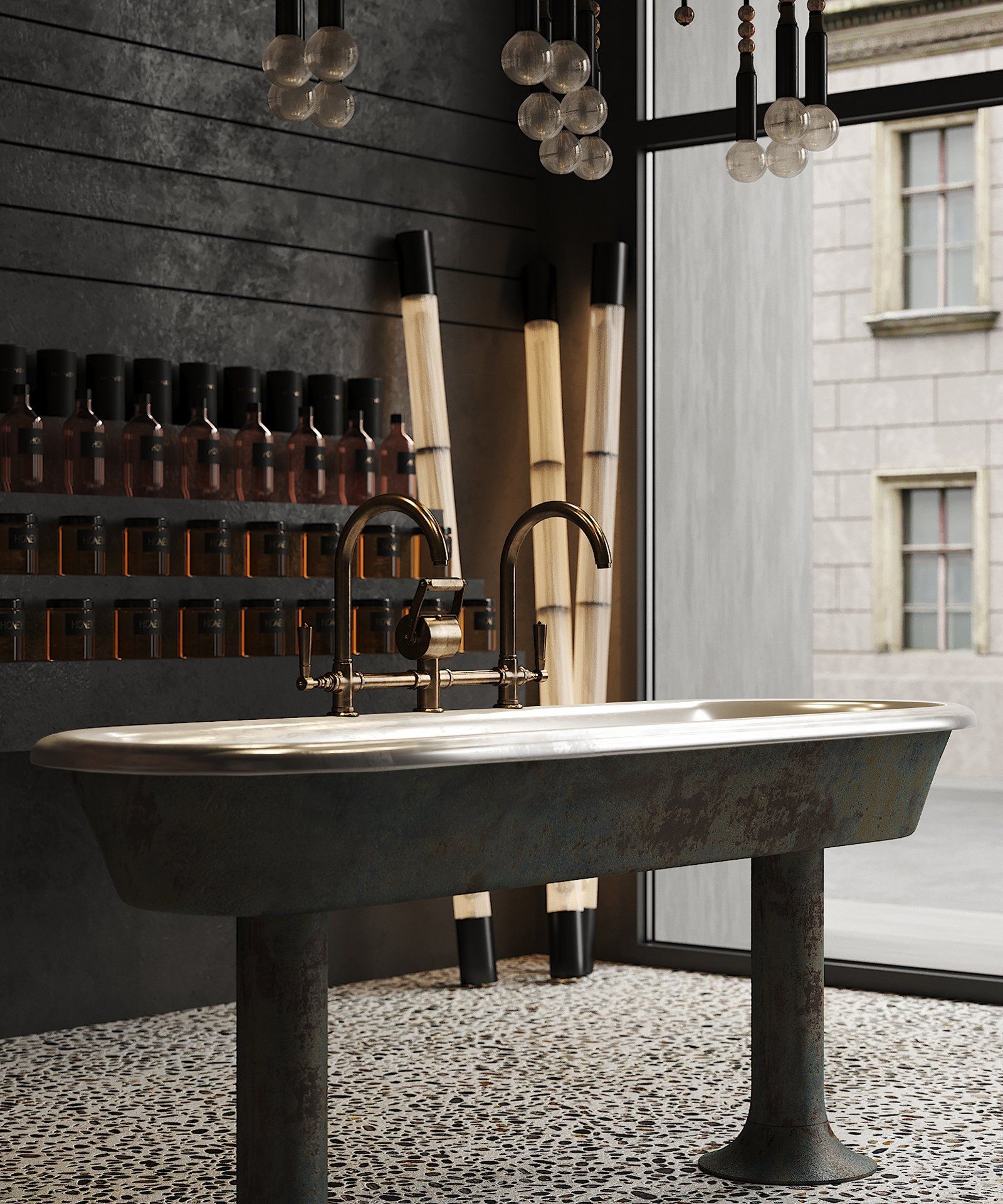
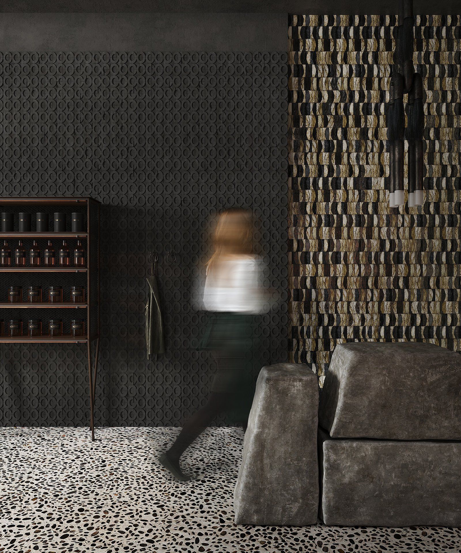
Natural materials such as wood, stone and Corten steel ensure that the furniture, many of which has been made to measure, blends in harmoniously. A collection of contemporary furniture infuses the space with subdued elegance. The complements that perhaps stand out the most are the natural stone blocks and the sculptural freestanding bronze washbasin designed by Puntofilipino.
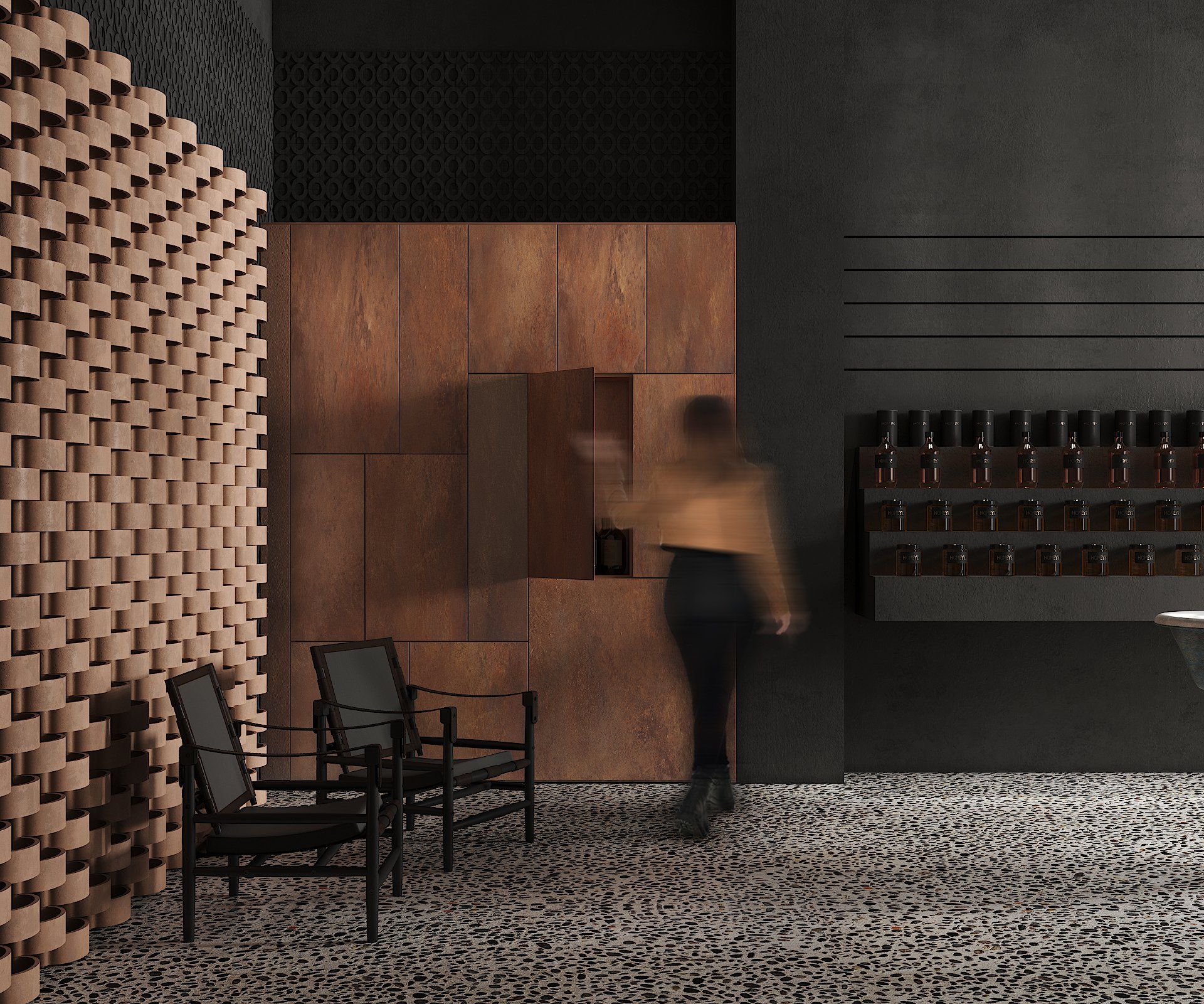
The studio approached this project as an exercise in "artistic expression" underpinned by the desire to create a unique space connected to the history of the city. Based on a nuanced palette of black tones and the predominance of concrete surfaces, the store is a good example of minimalist design and conceptual rigor.
Despite the monochrome color palette, the concrete landscape that Punotfilipino has evoked is far from sad. A variety of concrete finishes and textures, including polished, stained and rough stucco, create a rich spatial tapestry, enhanced by changing moving light and shadows as the day progresses. The use of concrete and pebbles, seductively illuminated by filtered daylight, creates a meditative atmosphere that resonates with the contemplative tranquility of nature.
The dominance of concrete is reinforced by the subtle presence of complementary materials, which appear in selected and bespoke furniture and accessories. As an eye-catcher, a suspended Apparatus lamp can be seen in the distance; At the back of the premises there is a clay lattice screen from the Spanish firm Cerámicas Ferrés.
But to give shoppers a truly unexpected experience, the designer leaned toward the dystopian theme, not the more common trope employed in beauty retail, resulting in dark areas like bunkers.
"We believe this is a mindset that more retailers should adopt with their physical locations; It's these kinds of Instagram-inspired story-inspired interiors that will really incentivize shoppers to spend their money offline."
SHARE THIS
Latest Edition
Mar / Apr 2026 edition is available now!
Contribute
G&G _ Magazine is always looking for the creative talents of stylists, designers, photographers and writers from around the globe.
Find us on
Latest News
Subscribe
Keep up to date with the latest trends!
Popular Posts
