His Loft
Kevin Veenhuizen Architects designed a tailor-made home with qualities derive from simplicity in the Top-Up building in Amsterdam-Noord.

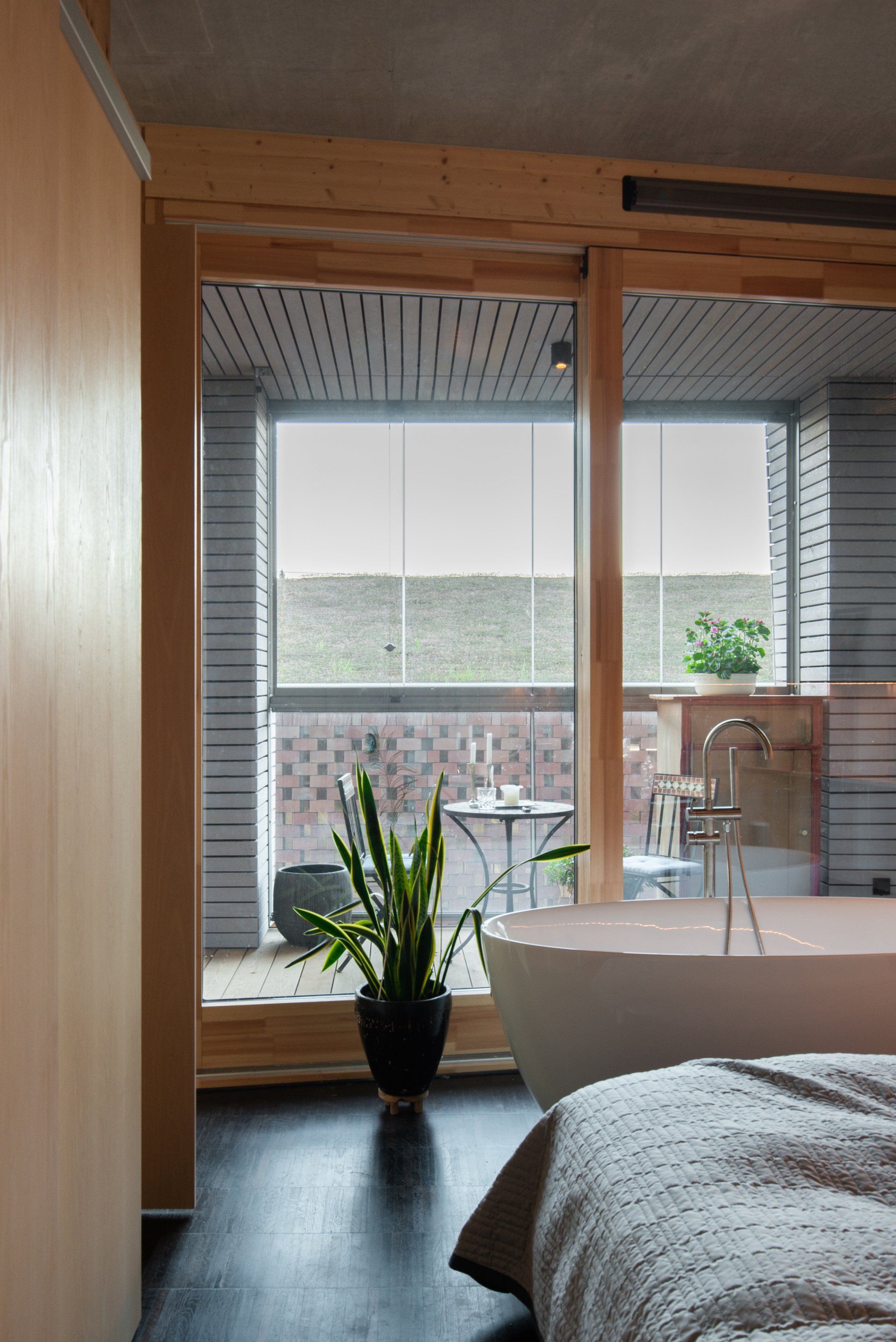
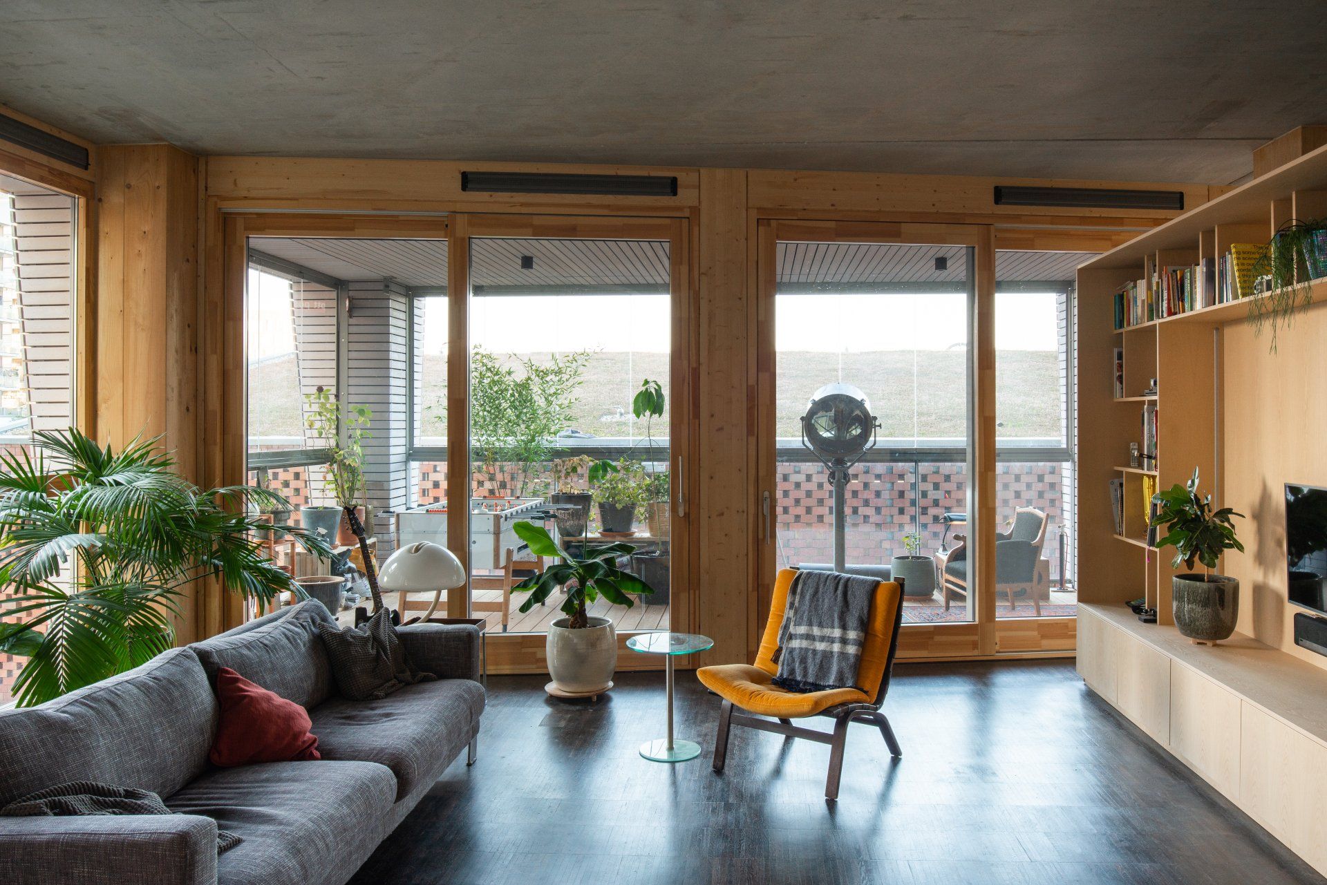
The beautiful casco, built according to the ‘’open building’’ idea, immediately called for a specific atmosphere. The simplicity of the available materials - concrete slabs and ceiling held together by massive timber columns - and the glazed facade brought up the strong spatial concept of the loft.
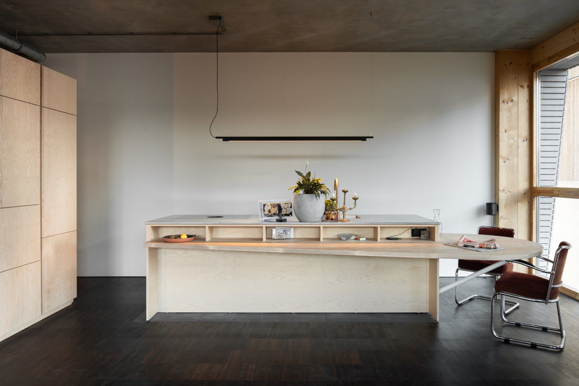
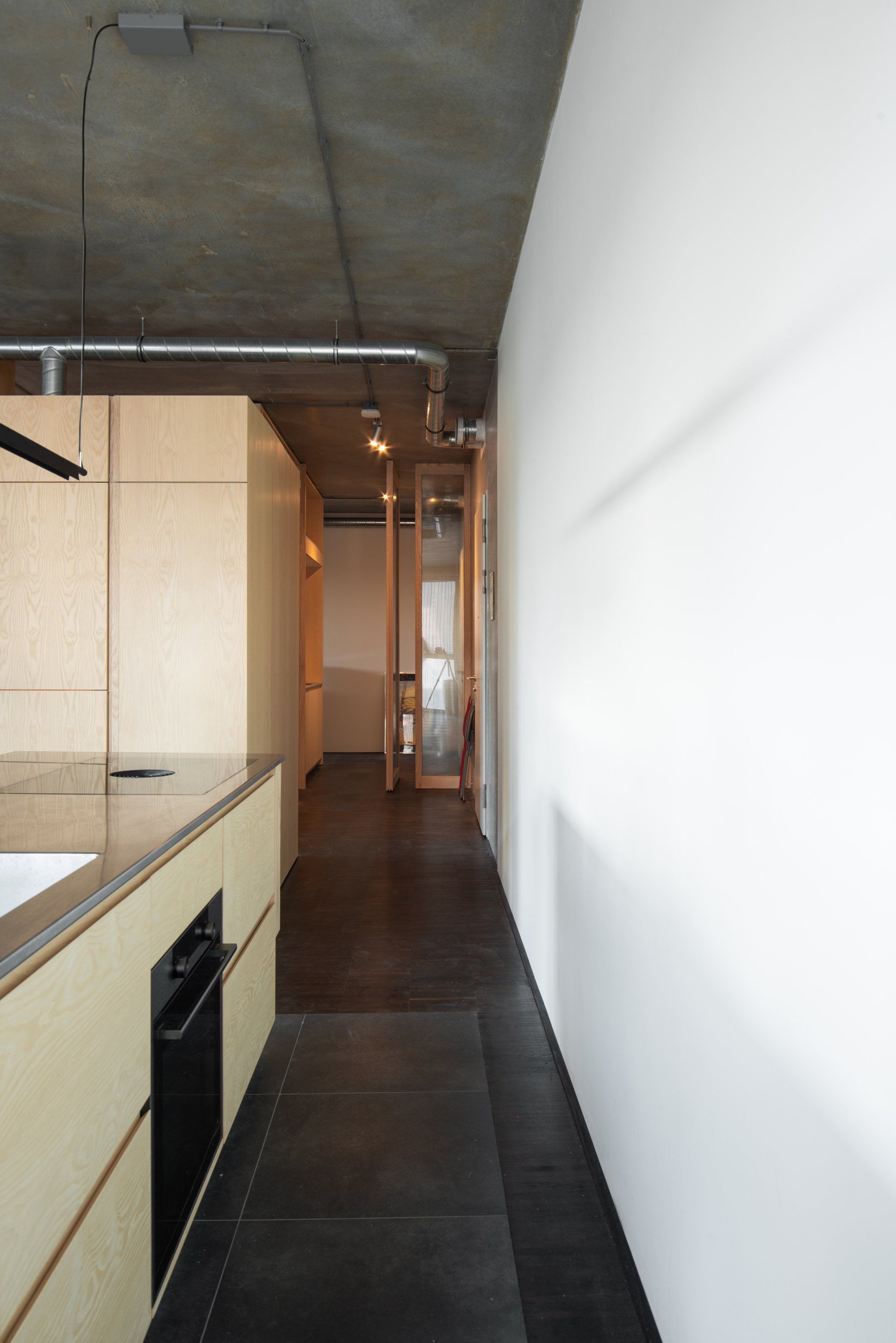
The design intends to blur boundaries between domestic functions and rather produce a feeling of continuity. This spatial concept is enforced by our humble material choice. Not more than two materials are added, barely touching the casco: a continues smoked oak flooring and three boxes cladded with Ash timber.
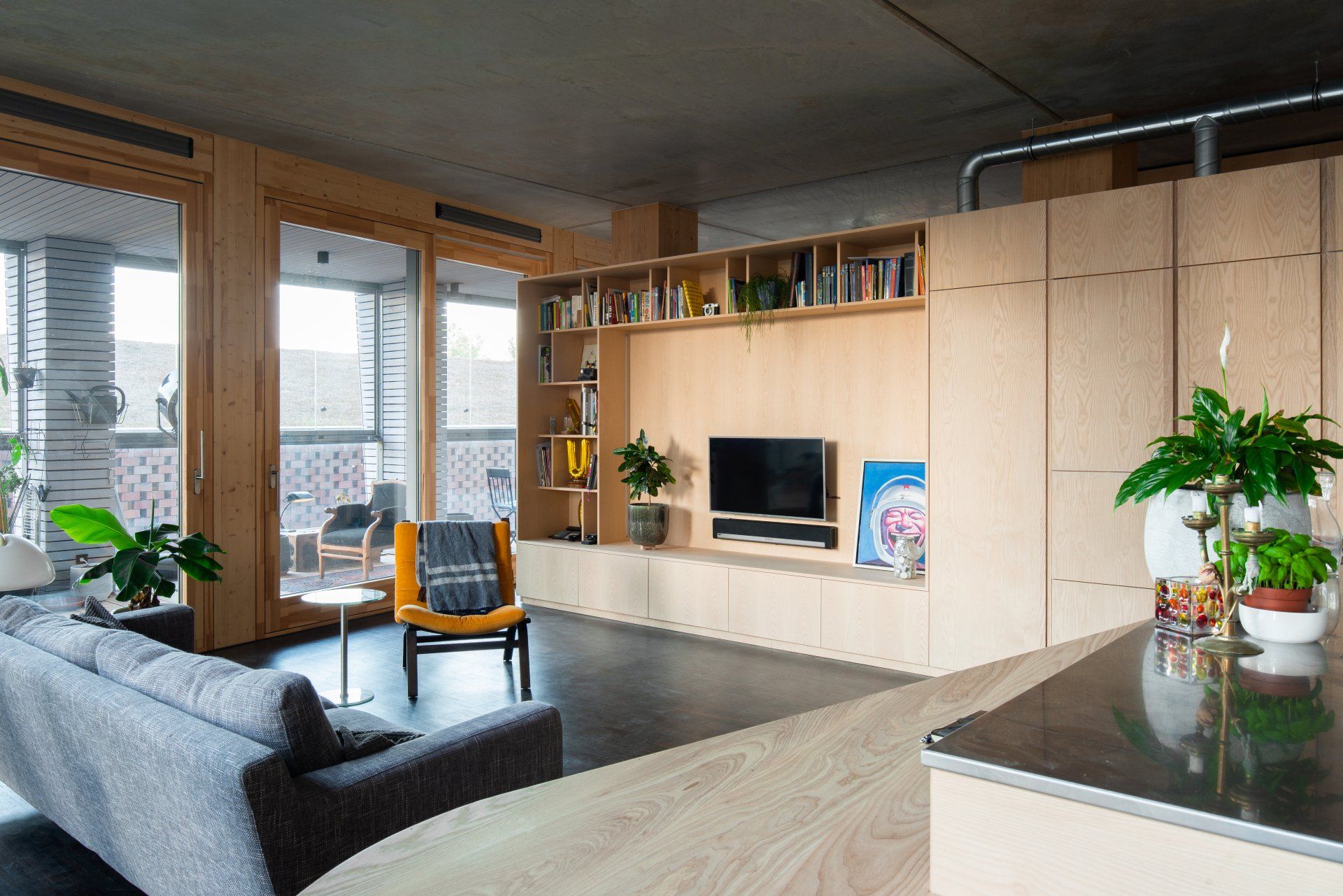
Of the physical envelope twenty-five percent needed to be dedicated to professional activities. All services such as electricity, heating, running water and ventilation are delivered at the doorstep for the two areas. Combined with the use of a raised floor, it offered maximum flexibility to design the interior.
Three boxes, which can be seen as big pieces of furniture, house specific functions such as bathroom, WC, storage, kitchen and open shelves. Spaces flow in between, from an intimate sleeping zone to a comfortable living area or a generous professional work environment, all inserted in the space between the boxes.
The first box sits on an excision in the floor that is filled with tiles, and is an angular kitchen island merged with the circular shape of a dining table. The result is a tailor-made furniture linking the cooking, eating and living functions within the area dedicated mostly to day activities.
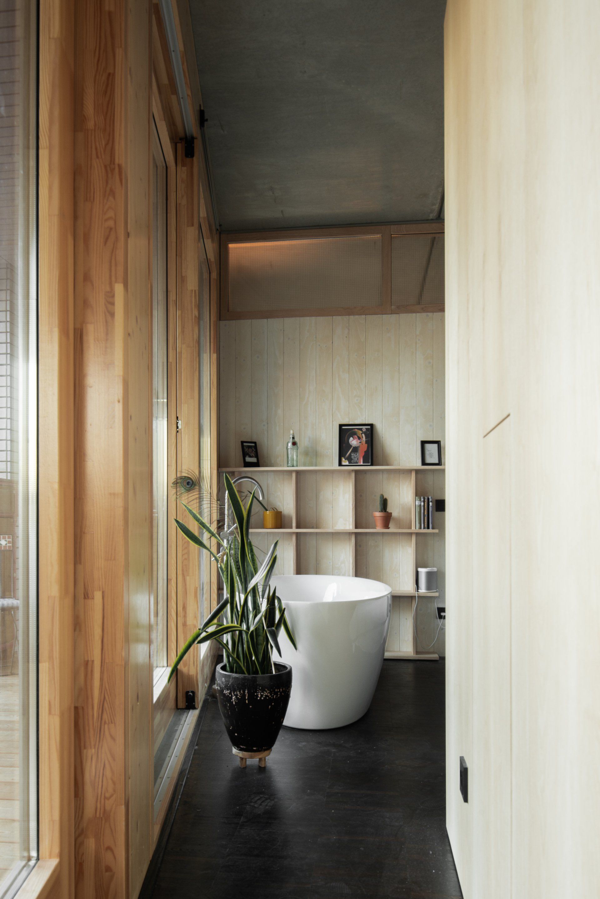
The second box is two-faced: one side presents itself to the living area with open shelves - a small library - and relevant appliances. On the other side are the bathroom and the WC, generating an intimate sleeping zone at its back. Yet no physical boundaries are created.
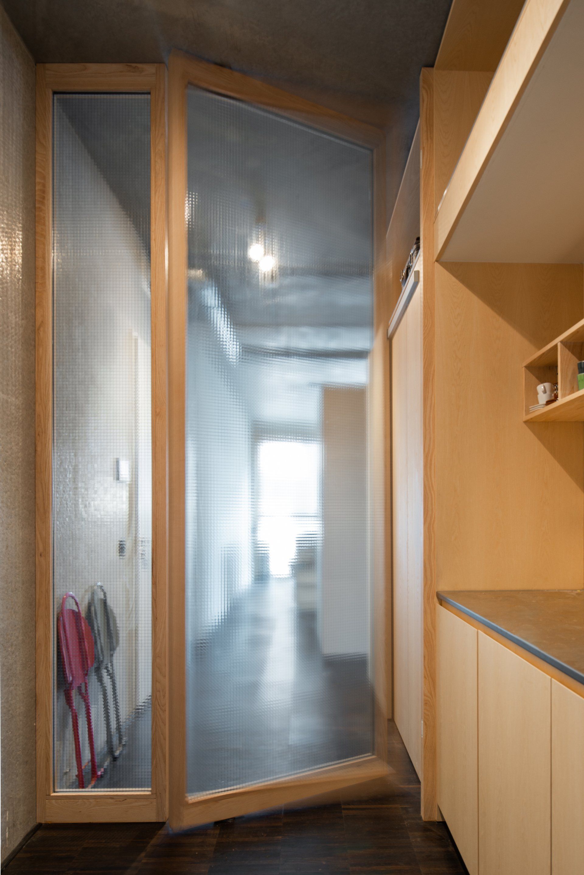
The third box defines the workspace and houses a closet, a storage room, a visitor’s toilet as well as a pantry and open shelves. Also designed to function as a fully autonomous guest room with shower and kitchenette, this space is marked by a wall, slicing the third box in its middle and topped with waffle-glass to remove visual barriers. A full height pivoting door connects the living and work functions.
Responding to the simplicity of the casco, the boxes are carefully crafted. The scaled-up furnitures are covered with a refined ash finish. Contrasting with this delicate appearance, the concrete ceiling is left rough, as delivered, with ventilation and electricity services visible, displaying their technical ballet.

Photography MWA Hart Nibbrig
Interior Design Kevin Veenhuizen Architects
SHARE THIS
Contribute
G&G _ Magazine is always looking for the creative talents of stylists, designers, photographers and writers from around the globe.
Find us on
Latest News

Subscribe
Keep up to date with the latest trends!
Popular Posts
