De Witt: Breathe new life
Studio Modijefsky was commissioned to add an all-day brasserie to the three-screen cinema De Witt located in the heart of Dordrecht.
The design concept captures the building’s rich history: before settling as a cinema, it served as a convent, school and laboratory. Studio Modijefsky wove these historical layers into a timeless visual language with expressive shapes, warm colours and materials that incorporate and evoke echoes of the past. The result is a new combination of fantastic flavours and visual entertainment in and outside the cinema.
From the convent the iconic motifs are: the cloister (the secluded walkways that nuns use for meditations); the wimples (the head covering nuns wear); and the habits, the nuns’ clothing. The school’s presence is felt in the corridors, with tiled walls, windows looking into classrooms, bulletin boards and class benches. Chemistry sets represent the laboratory in the shape of test tube and their holders, and protective glass screens. Finally, for the cinema, Studio Modijefsky evokes the old-school glamour of the silver screen with curtains, luxurious drapery and spotlights.
To firmly root De Witt in its community, the colour palette developed by Studio Modijefsky adheres to the ‘Dordtse kleuren’. This the city’s official colour palette, based on Dordrecht’s historic buildings. As Dordrecht was the first city in the Netherlands to adopt its own palette, it’s a further symbol of civic pride. It marks De Witt out as a Dordrecht icon, rooted in the past, that will offer everyone pleasure for years to come, open to the whole city, whether for a film, food or a coffee.
Ground Floor // Grand Entrance
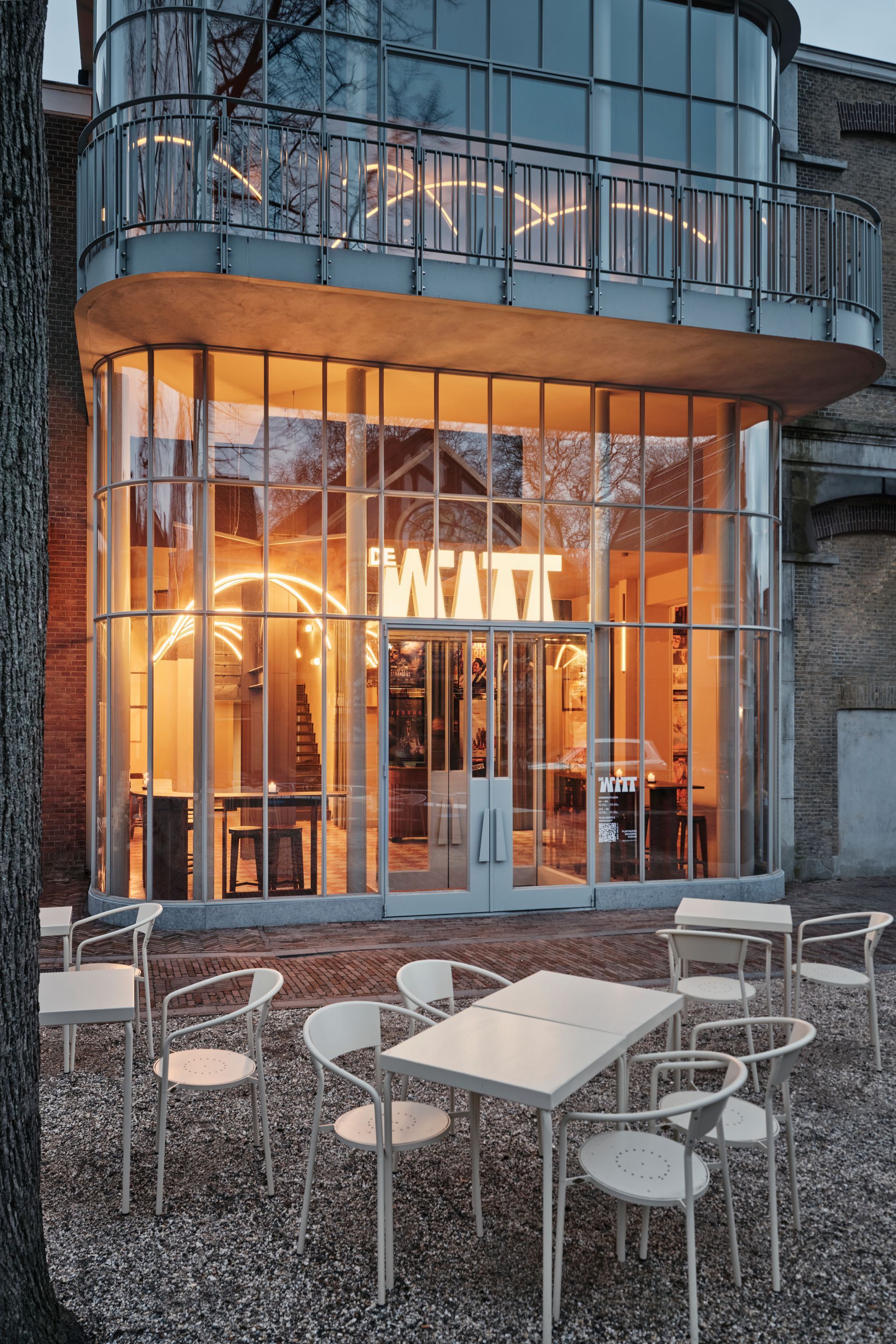
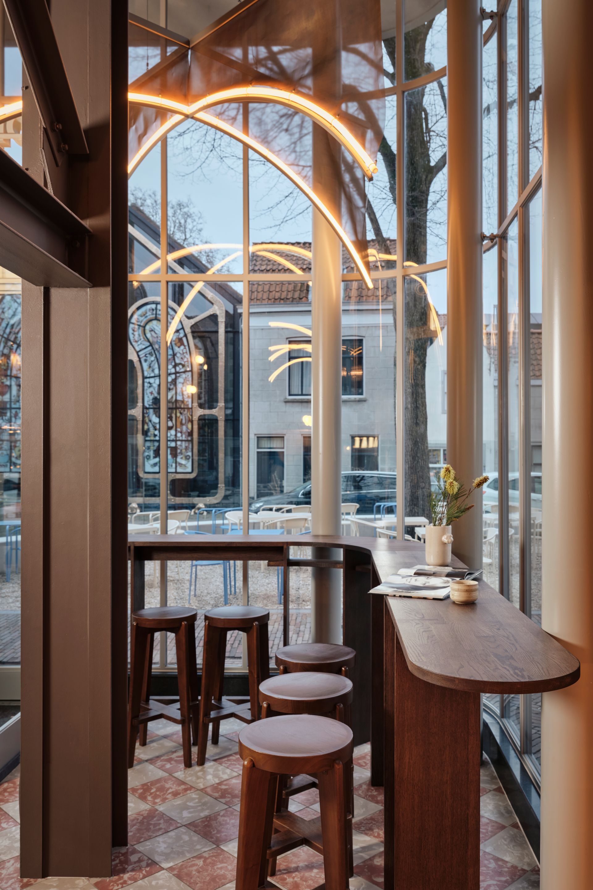
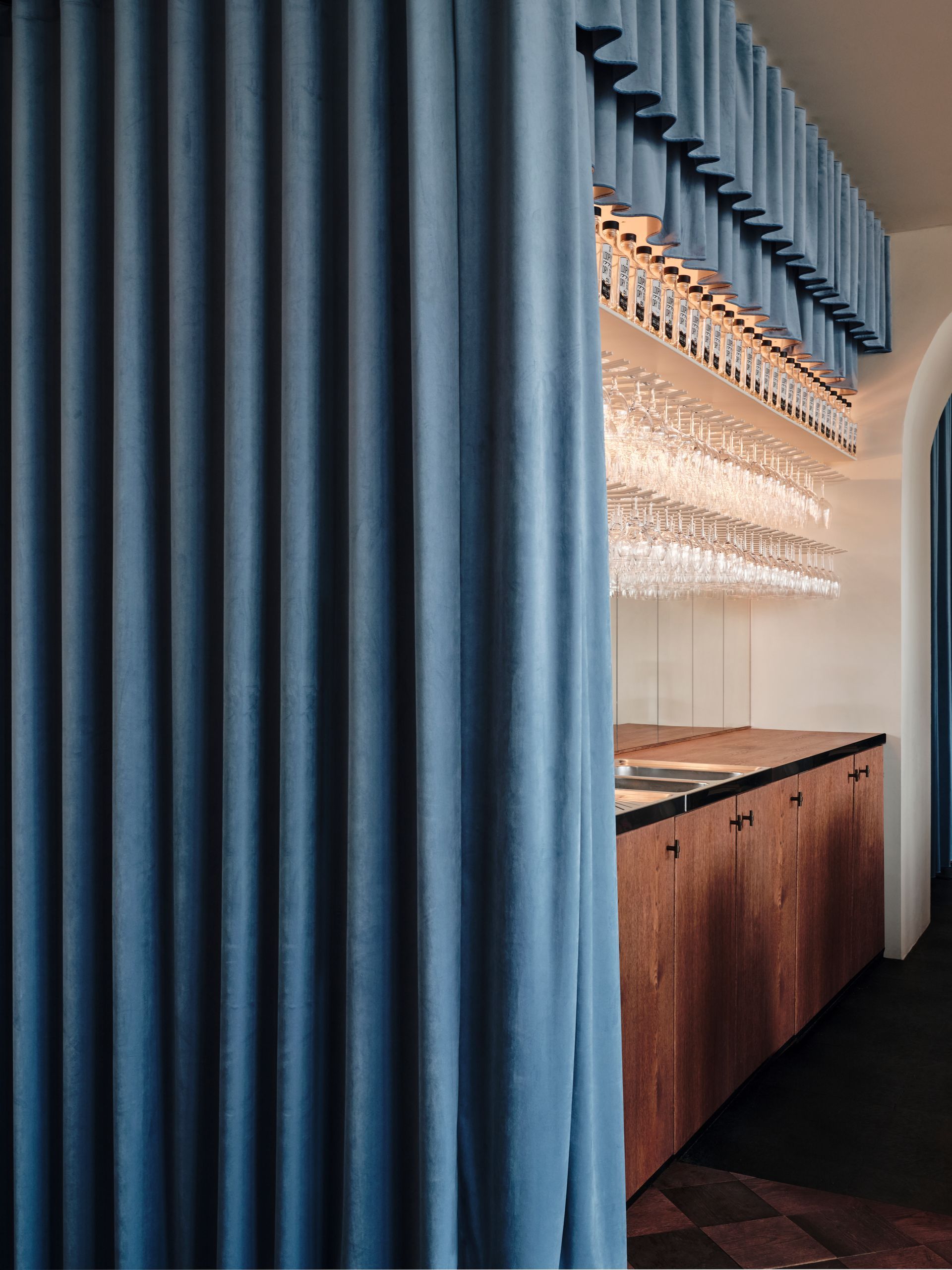
In De Witt’s old guise as The Movies, there were two entrances to the building. Now visitors are routed through a new main entrance designed by Lugten Malschaert Architects. The old façade was broken through to uncover old windows and create access to new ones, allowing natural light to fill the interior via the stunning floor to ceiling glass façade. Upon entering you see the ticket booth, which is encased in light blue velvet curtains hanging floor to ceiling and a huge wall of movie posters behind them. Spotlights add a dramatic edge to the booth and mark the beginning of a journey that will immerse you in the glamour of the silver screen.
Brasserie
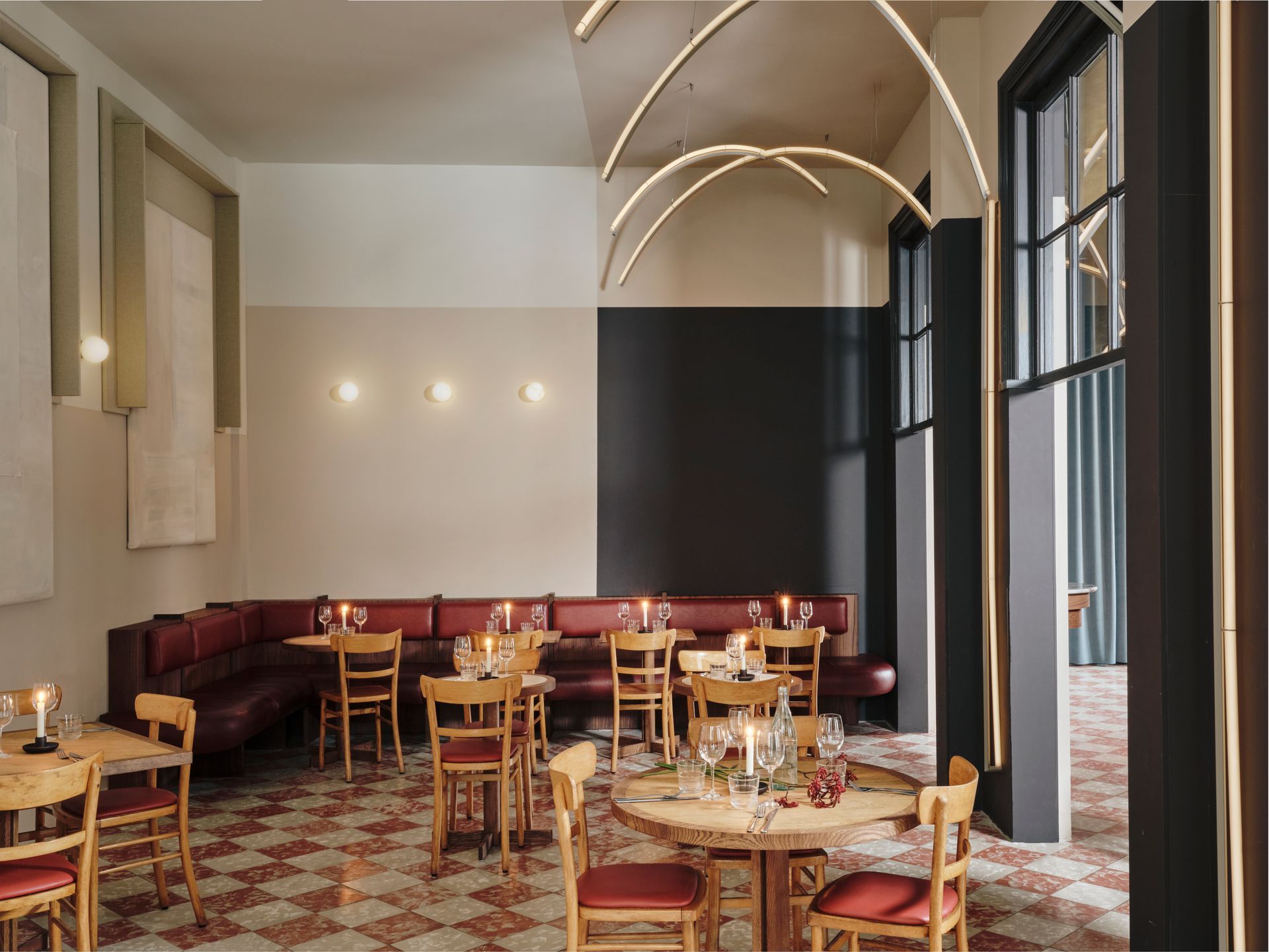
The former café and restaurant have been replaced in a radical reshaping of the ground floor. Studio Modijefsky opened up the entire space, removing walls and an elevator, to create one larger brasserie boasting a main area, three smaller areas and a bar. They’re all connected by clear sightlines that allow light to flood in from outside. To make the space more welcoming, the orientation was rotated to face the square outside and invite the city inside.
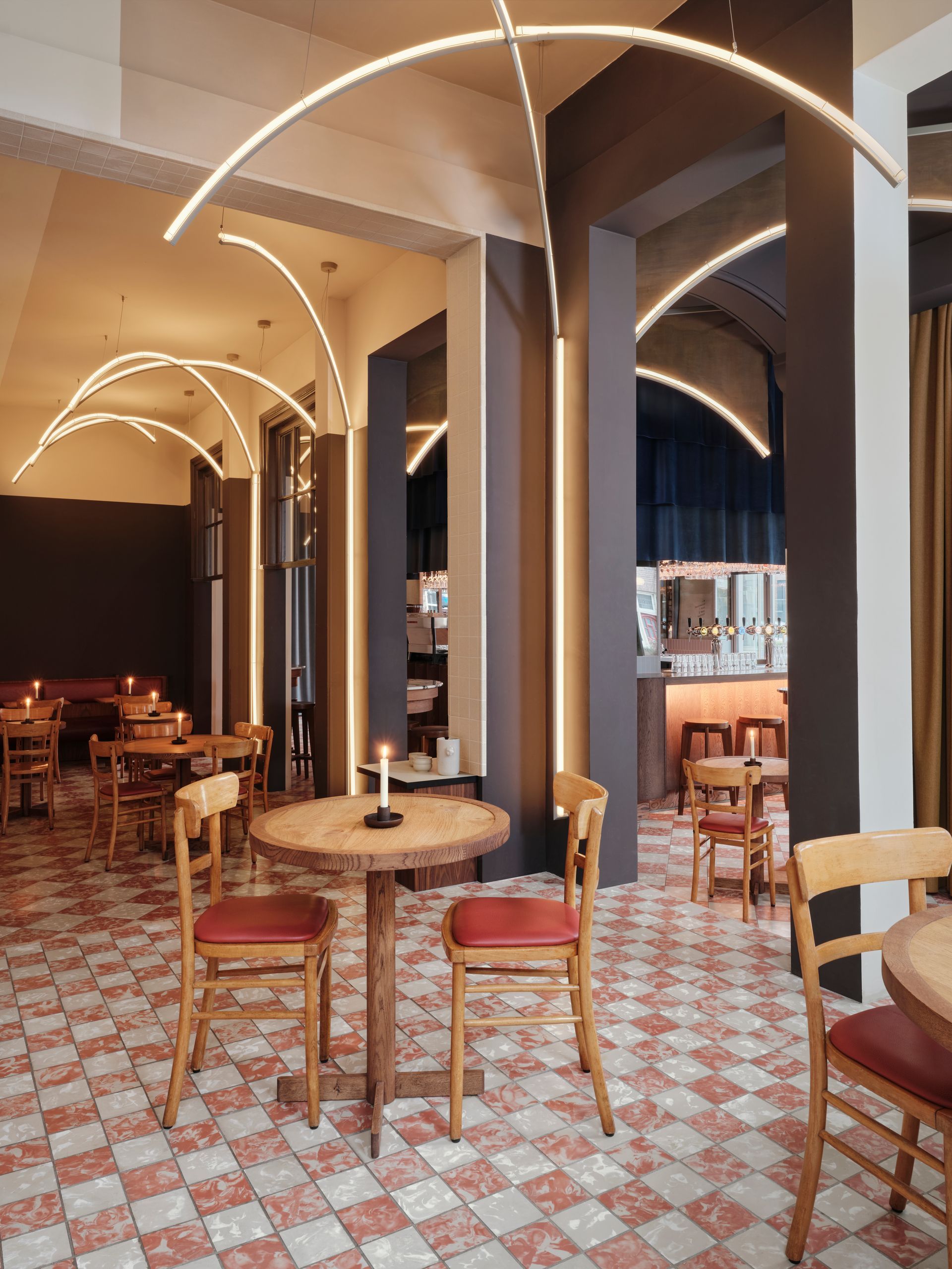
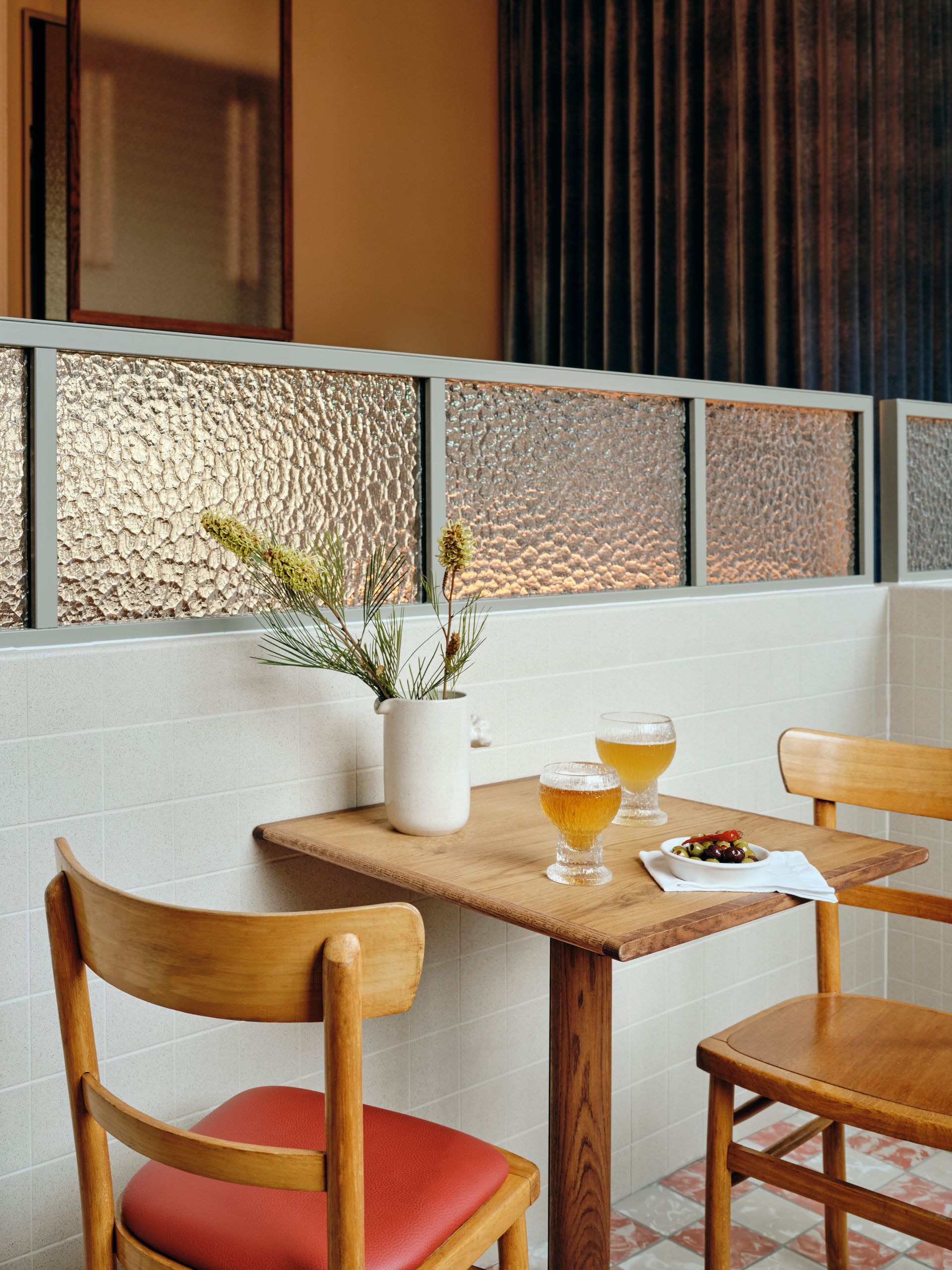
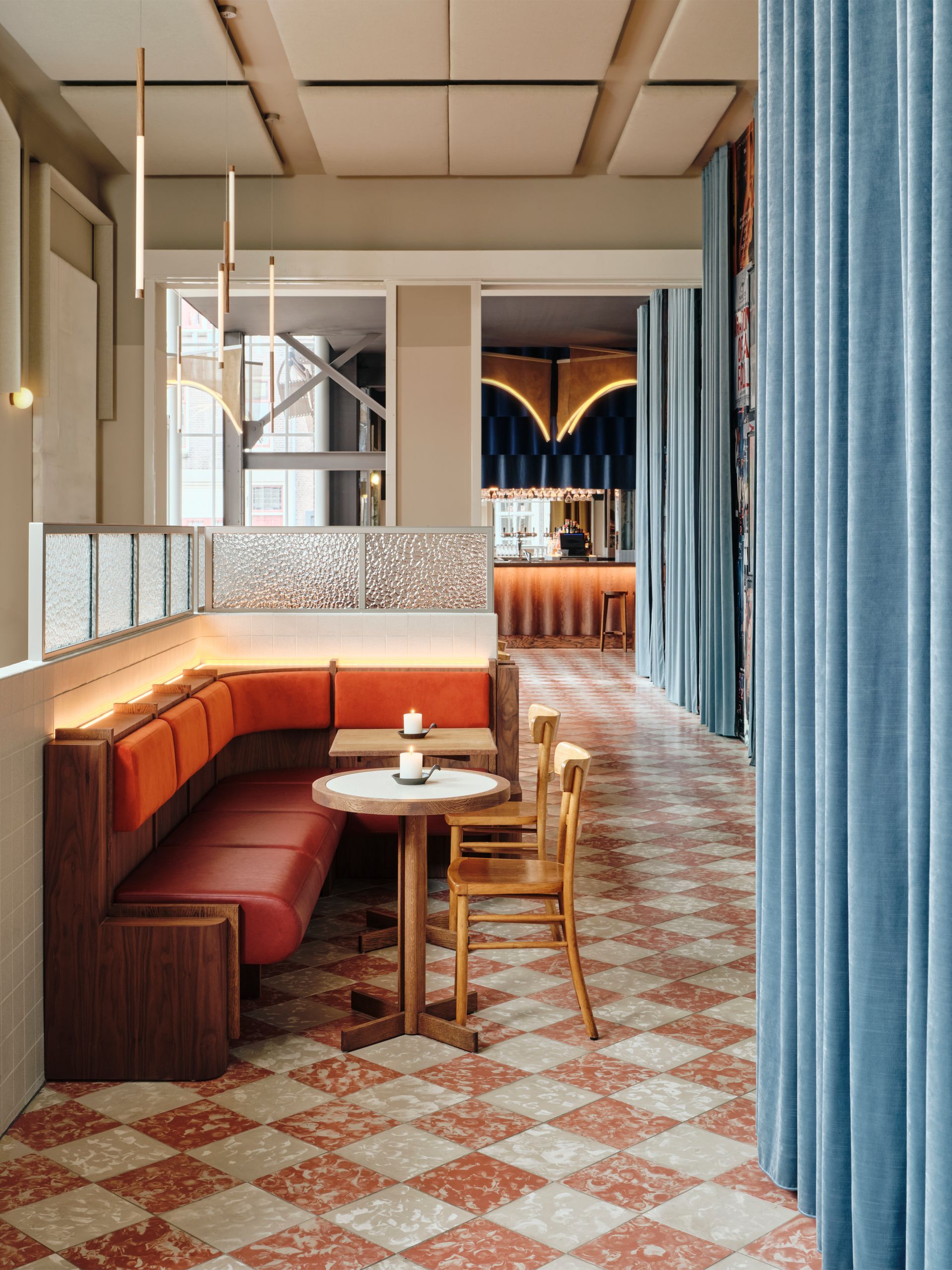
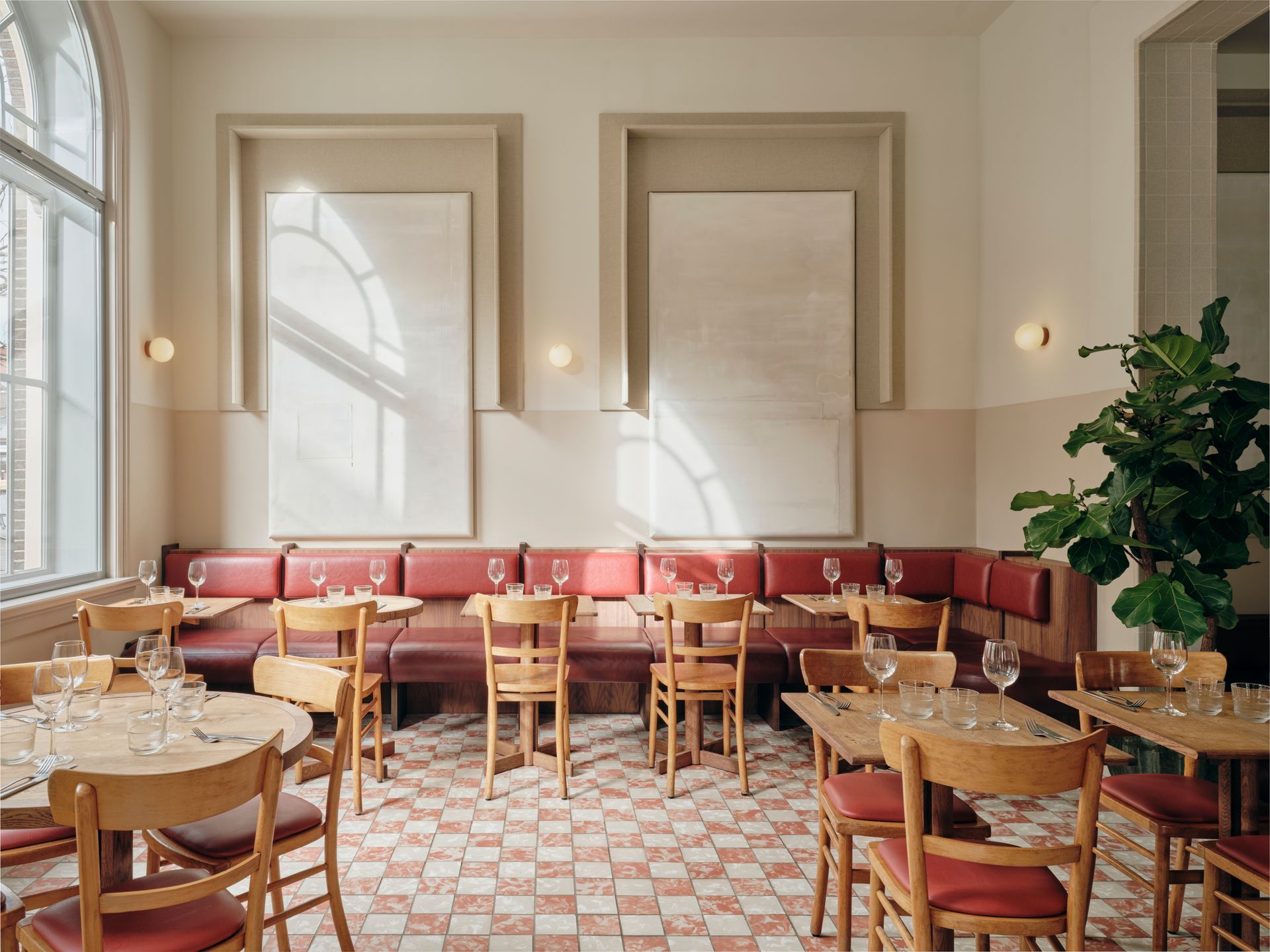
You enter the main brasserie by turning right immediately after entering the building. Here’ll you find an open kitchen with a long vermillion bench opposite, at which diners can sit at to watch their food being prepared. The kitchen features tiles and windows that recall the building’s past as a school, as well as custom lights inspired by the time it was a laboratory. These lights consist of layers of bronze mirrors, lights and glass panels that allude to the protective screens used during experiments. The long bench opposite has lighting integrated under the leather back rests that reflect the speckled tiles and glass panelling above it – another reference to the old school inspiration. Further lighting in this area is provided by wooden hanging lights. The shape of these strip lights alludes to the test tubes that used in the laboratory and come in three dynamic forms: with the oak part on top; in the middle; or at the bottom. While the chairs in the brasserie are vintage chairs given a new life, the tables are custom-made. There are two types: round and square, made with two types of wood with different edgings and interiors.
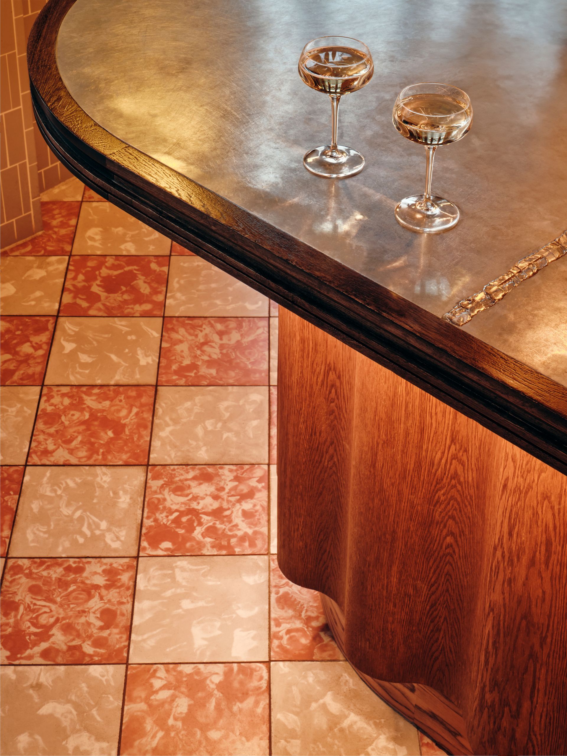
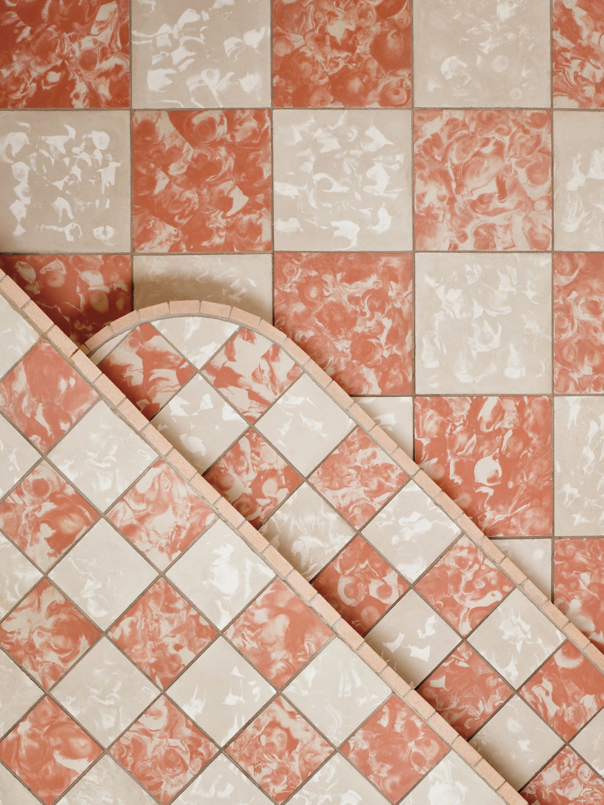
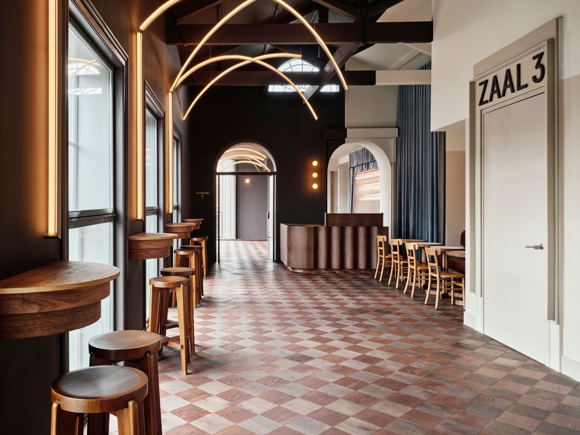
Two parts of the brasserie have been elevated to play with height: one corner of the brasserie has been elevated so that you can now look out of the high windows, which were previously too high; while the main space opposite the kitchen is also elevated. They both stand on a warm-coloured, chess-patterned stone floor consisting of Aigües tiles handmade in Mallorca. The elevated parts of the brasserie are differentiated by an alternative floor pattern that has square instead of diagonal floor tiles.
Seating in the three smaller areas is provided by custom benches in the same shade of vermillion as in the main brasserie, but with leather back rests and seats. The presence of the school is felt in the wooden divisions that demarcate where you should sit – however nobody will mind if you break the rules here. The softening of etiquette is indicated by the rounded details at the edge of the seating where the bench meets the wall.
Windows in these spaces, and throughout the ground floor feature wimple frames. This shape is inspired by the head covering of the nuns who used to live here, and they are made of made of dark thick linen and a warmer shade of grey. Wimples also surround a series of ‘fake windows’ that mirror door openings in the brasserie. These are made of recycled canvas and have been painted in shades of ivory, off-white and subtle power dues to create new artworks that capture the interplay of light and shadow throughout the interior. Between these windows are handcrafted alabaster lights that decorate the entire interior of De Witt.
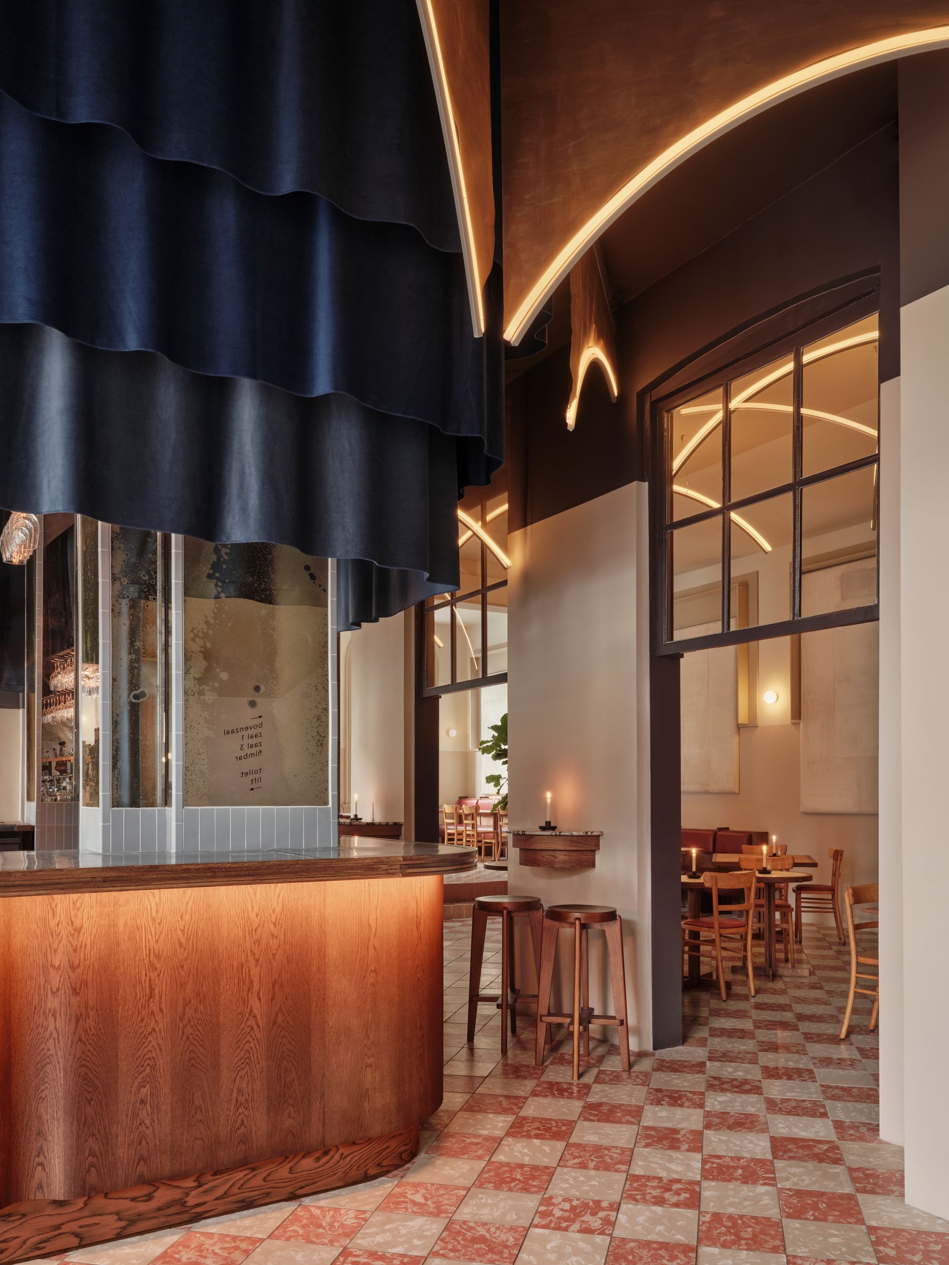
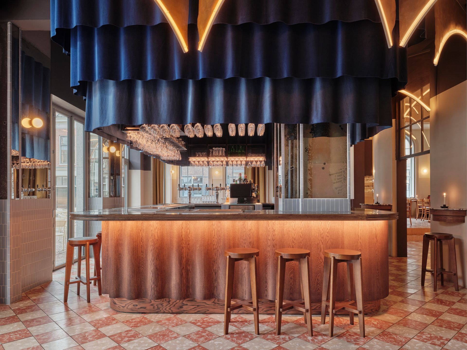
All the areas of the brasserie are visually connected by hanging lights in the shape of cloister arches given extra depth by aged brass mesh crowns above them. The lights reflect gently off the darker walls and ceilings surrounding them to create an intimate atmosphere and lead you to the heart of the brasserie: the dramatic bar. It’s an ode to cinema and the performing arts: a stage with a majestic three-layered velvet curtain in shades of indigo, from which delicious cocktails are served under a spotlight. You can enjoy this performance from all around the bar thanks to seating that extends the bar space and offers direct access to the brasserie around you and the terrace outside.
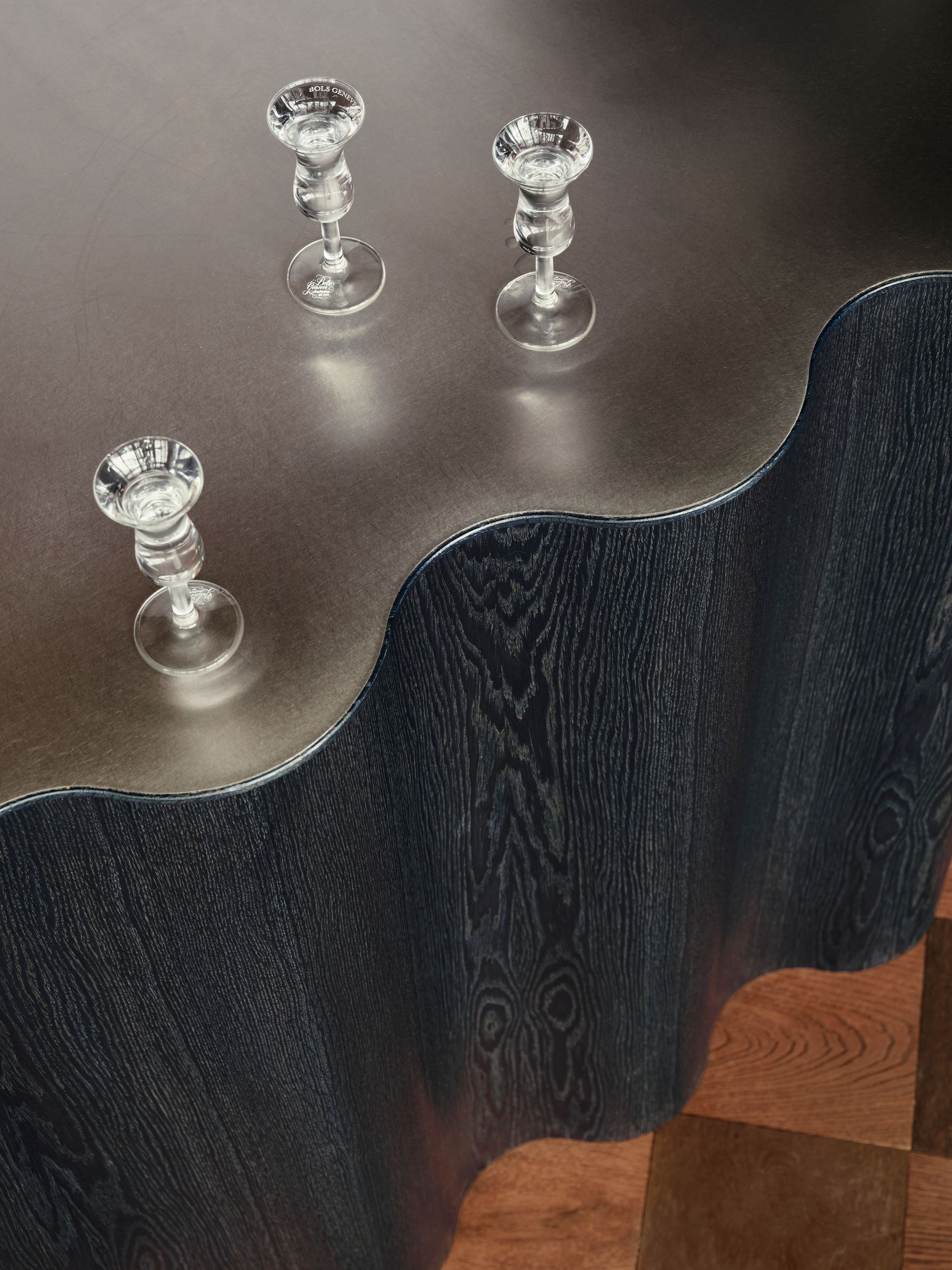
The bar itself is crafted like a curtain, with waves carved into its wooden base. The veins of the oak travel in two directions to form an eye-catching contrast: vertical on the bar, horizontal on the base. As a nod to a classic brasserie the bar top is made of zinc. Columns in the corners of the bar have been tiled with pale blue tiles and handmade aged mirrors, designed to fit in precisely with the city’s colour scheme. As a final allusion to the performing arts, the feet of wine glasses have been positioned to hang just beneath the curtain, appearing like a ballerina’s dress beneath the curtain.
As you make your way around the bar, you’ll notice three standing tables in the walls between the door openings. These feature stunning Italian marble tops set above two layers of dark oiled oak, and are perfect for enjoying an intimate drink while waiting for a film or in anticipation of a delicious meal.
A private space can be created in one corner of the brasserie by closing off the impressive yellow curtains that fall 4 metres from floor to ceiling. These are the only curtains in De Witt that are not made entirely out of velvet: they are velvet on one side and linen on the other, to create an eye-catching visual contrast.
Upstairs
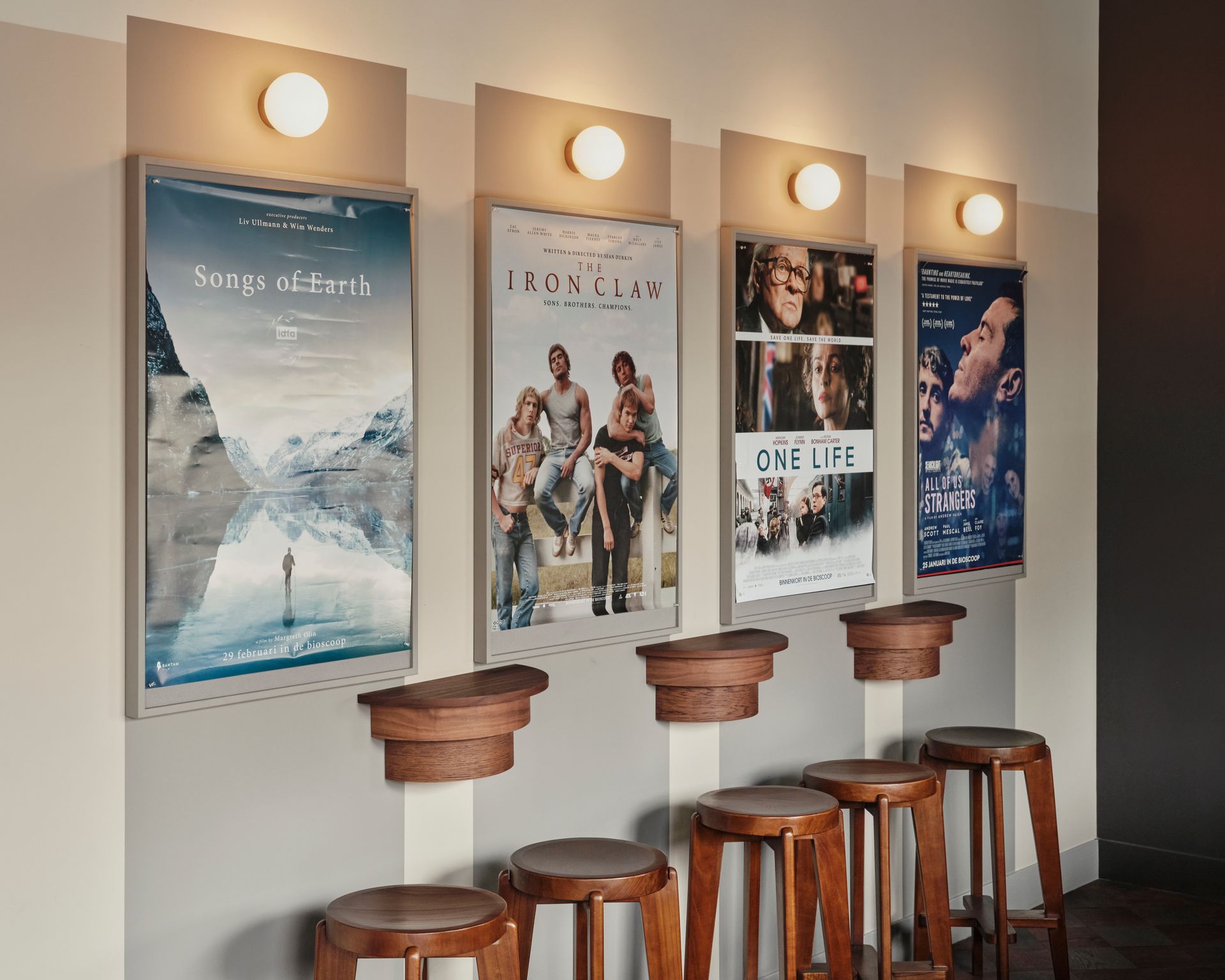
There are two staircases leading upstairs, both of which are lined with custom made boards for movie posters that have alabaster sphere lights above them, and wimple shapes around them, to raise the excitement on the way to the two large cinema screens upstairs. At the top of the stairs, you’ll find a film lounge with a bar and ticketing area. The floor pattern is the same as downstairs, but up here’s the floor is made of two shades of oak instead of tiles. Routing between the lounge and the two cinema screens is conducted by a simpler version of the cloister arch lights without the aged brass mesh crowns.
The film lounge is split by a wall, with a ticket booth on one side and a bar on the other. The bar seemingly travels between the wall – it’s the same wavey shape as its counterpart downstairs but different colours on each side of the wall: dark oak for the ticket booth, painted blue for the bar.
The bar area has a blue velvet curtain backdrop, in front of which stands the bar itself, which is topped with brushed stainless steel and has a relief on one side. It stands proudly against a back wall filled with mirrors placed vertically and 3 layers of velvet curtains in different sizes. The bar on for the ticket booth is the shape and material, but in dark oak, and is surrounded by curtains in a darker shade of blue. Opposite the bar there is a new balcony overlooking a wild flower garden: a great spot to relax with a cocktail before watching a movie.
If you move to the terrace side of the lounge, you can take a seat in one of the luxurious loungers with vermillion suede seats positioned between the windows and enjoy a view over the Kunstkerk and the square opposite.
Event Room
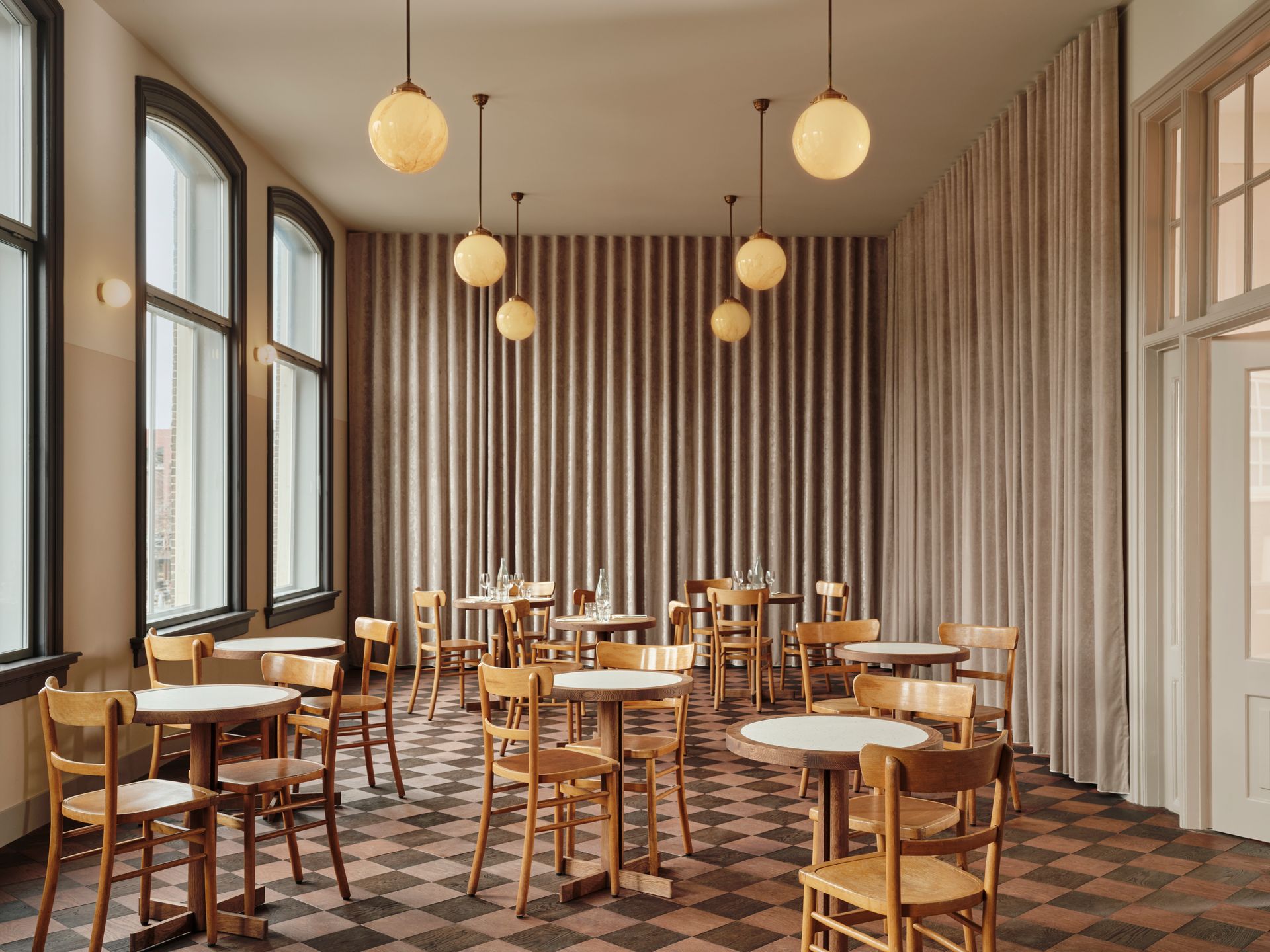
This multifunctional event room is perfect for hosting anything from poetry recitals to dance performances. Dark brown and taupe velvet curtains hang all around the worlds, concealing a door to a kitchen which allows events to be fully catered. Lighting is provided by coloured glass hanging lights that hang like planets from the ceiling, and the De Witt signature alabaster lights on the walls. The window frames here are darker to better frame the view over the picturesque houses on the other side of the street. It’s the perfect culmination of a collection of carefully designed spaces that will host many unforgettable evenings for the people of Dordrecht.
Address Nieuwstraat 62, 3311 - Dordrecht, The Netherlands
Photography
Maarten Willemstein
Graphic Design & Brand identity
Offff Studio
Interior Design Studio Modijefsky
SHARE THIS
Latest Edition
Mar / Apr 2026 edition is available now!
Contribute
G&G _ Magazine is always looking for the creative talents of stylists, designers, photographers and writers from around the globe.
Find us on
Latest News
Subscribe
Keep up to date with the latest trends!
Popular Posts
