Baan Akard Yen
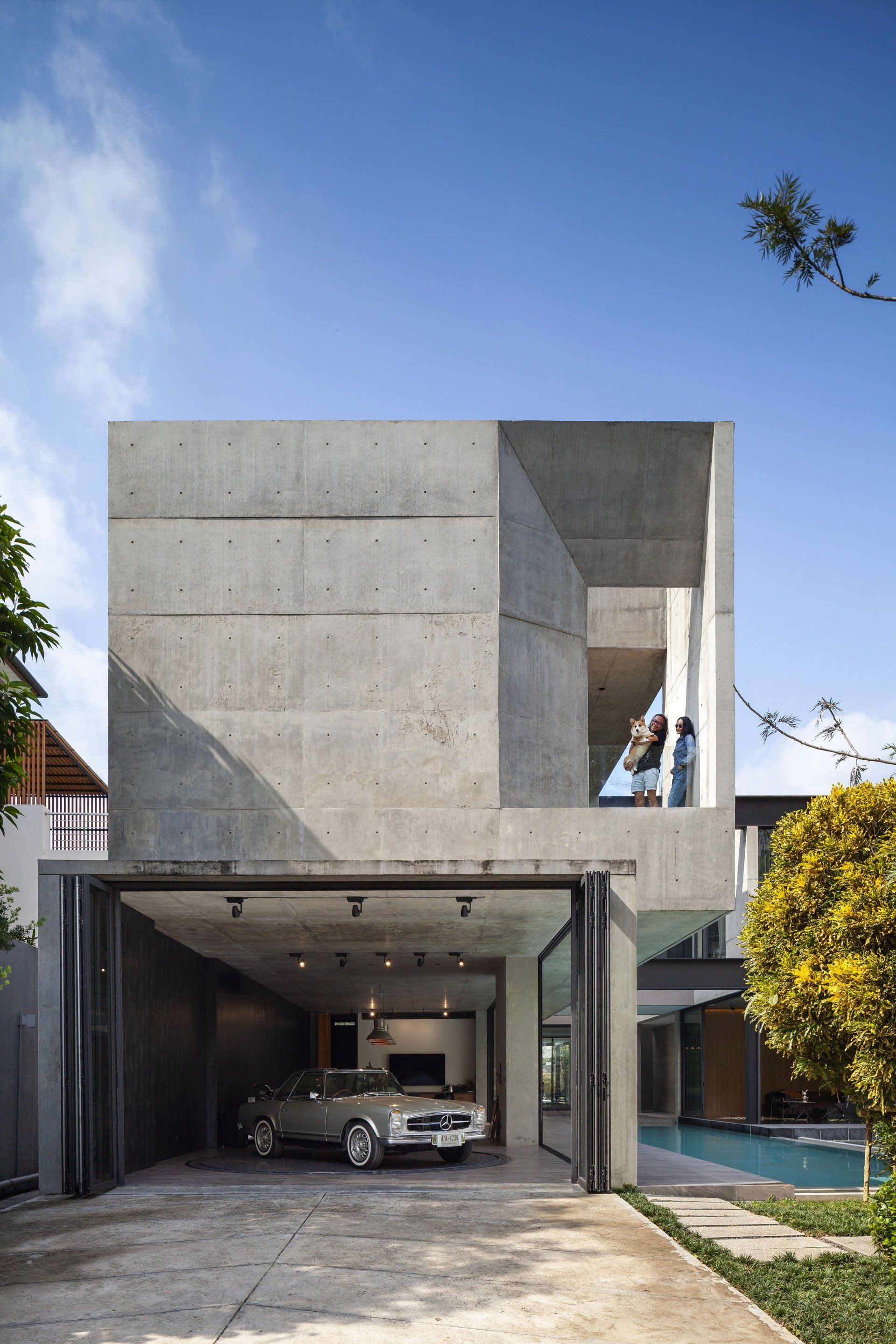
Studio Krubka presents a two stories residential project located on Yen Akard street in Bangkok, Thailand.
Yen means Cool while Akard is Air. The name of this project is given by the owner as a play on the name of the address as well as a wish for the house to be filled with comfort and cool breezes as it’s name sake.
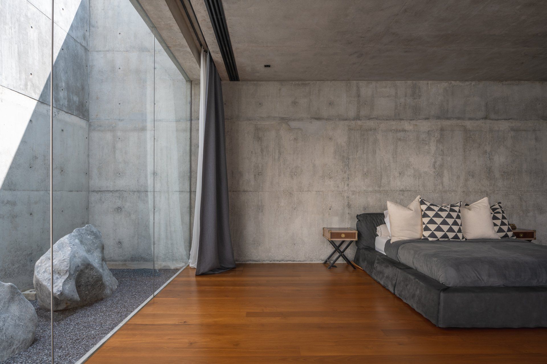
The project, Baan Akard Yen is around 1.600 square meters and went through two design processes. Initially, the property was located on only around 400 square meters land, with a concept of voyeurism as a visual interaction between different spaces through framed views so that one will know where the other is within the house. Due to the constraint of the area in comparison to the spatial requirements the owner wished to have, the first design for Baan Akard Yen focused on circulations and openings to help navigate and join each of the complex internal organization of functions and spaces. However, just before the construction started, a new plot of land right next door was acquired, requiring the design to be overhauled. Keeping the original visual interaction of each space, the new design took on the challenge of adding the relationship between the exterior and the interior. Due to having a larger land, the original complexity of spatial organization can be unfolded, allowing for a more simplified and straightforward planning.
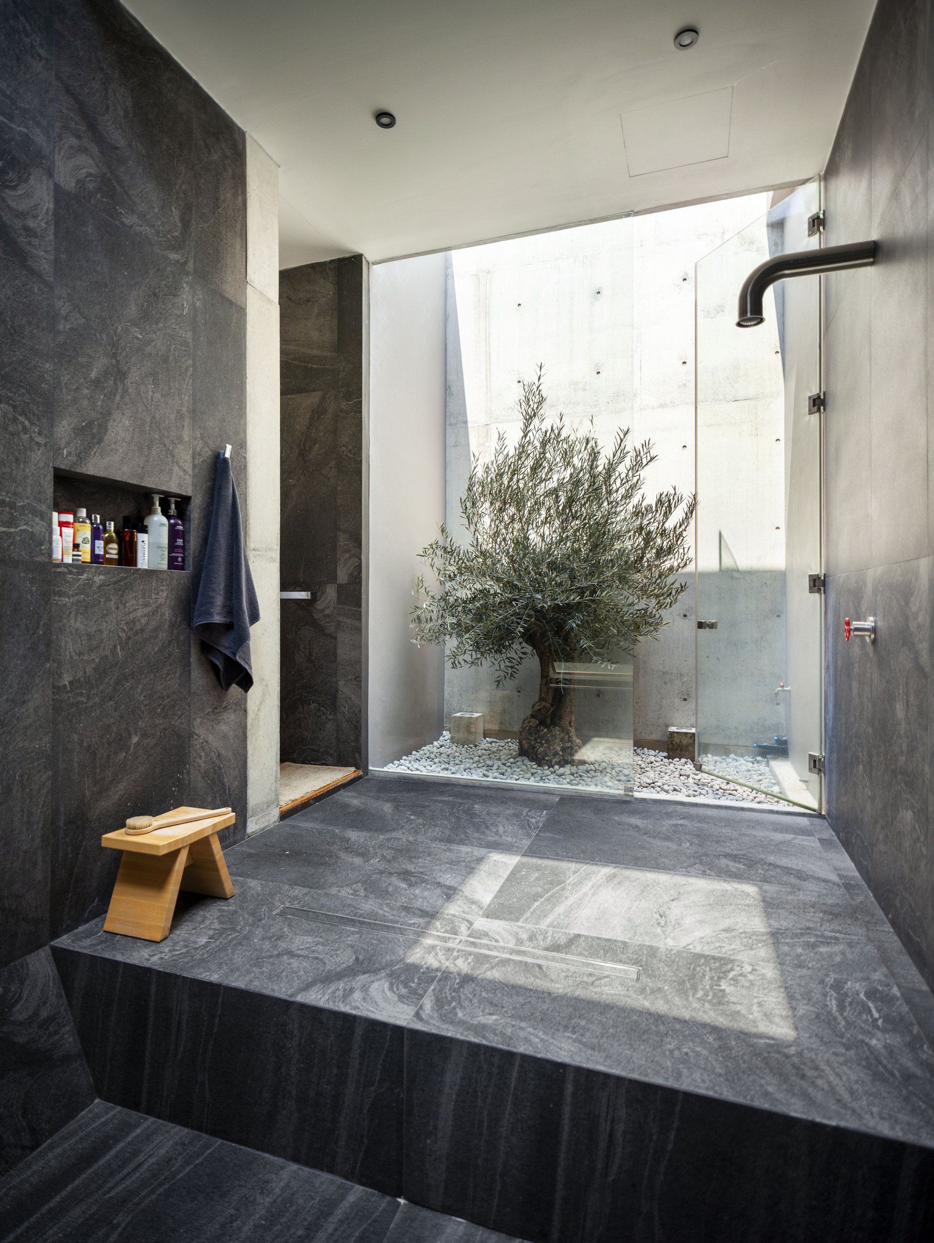
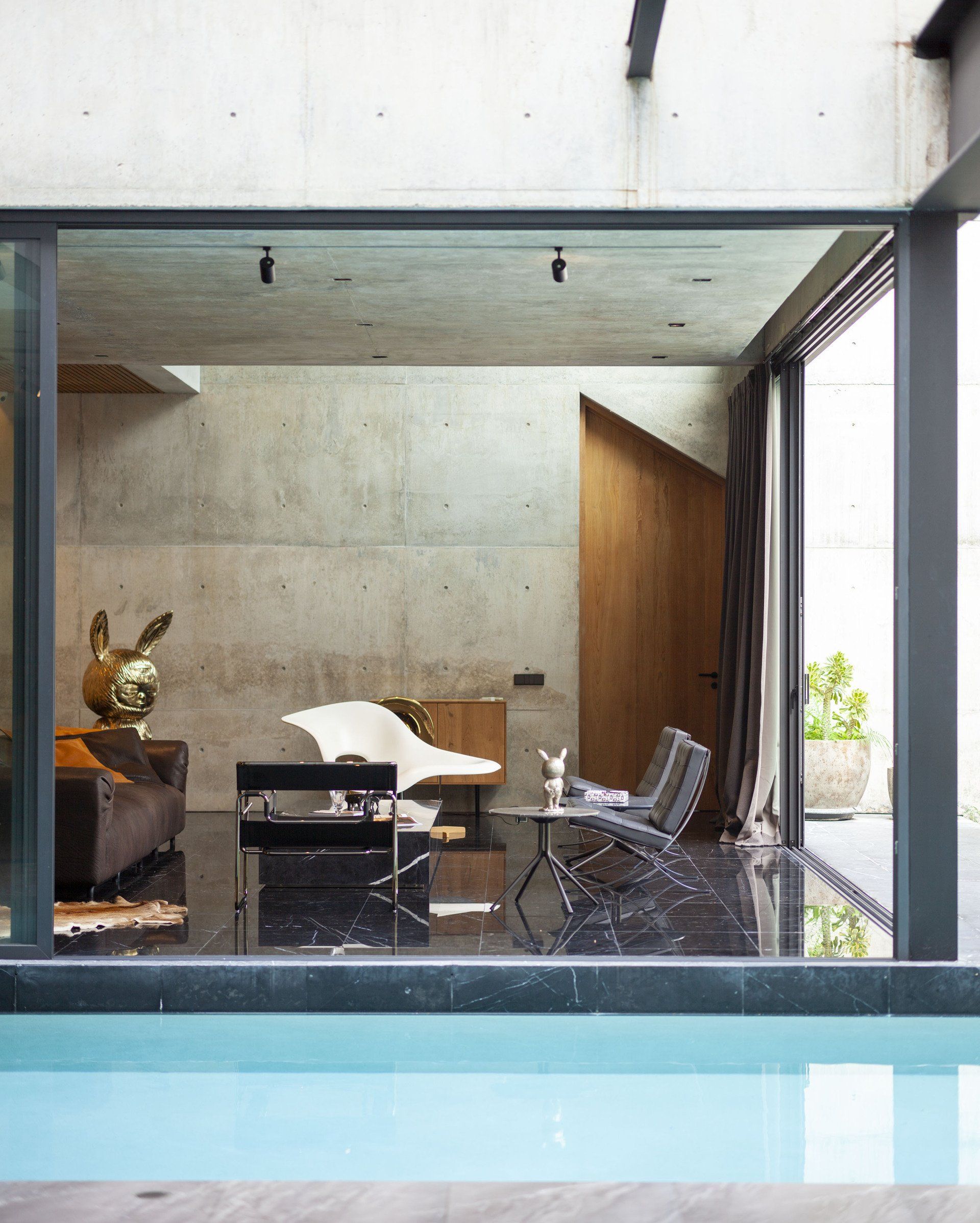
Five different designed courtyards within, encourages the users to experience different landscapes throughout the project as well as allowing the house to be light and comfortable and not too expansive. Seven cast concrete walls become the main visual structure and define separate different zones within the project yet allowing for each to be linked through specific openings located within these main structures. Because the layout of the house spreads out more than the original design, the courtyard functions as a visual linkage between different areas, permitting the habitants to visually access different parts of the house, and thus, the owners will be always be connected to each other.
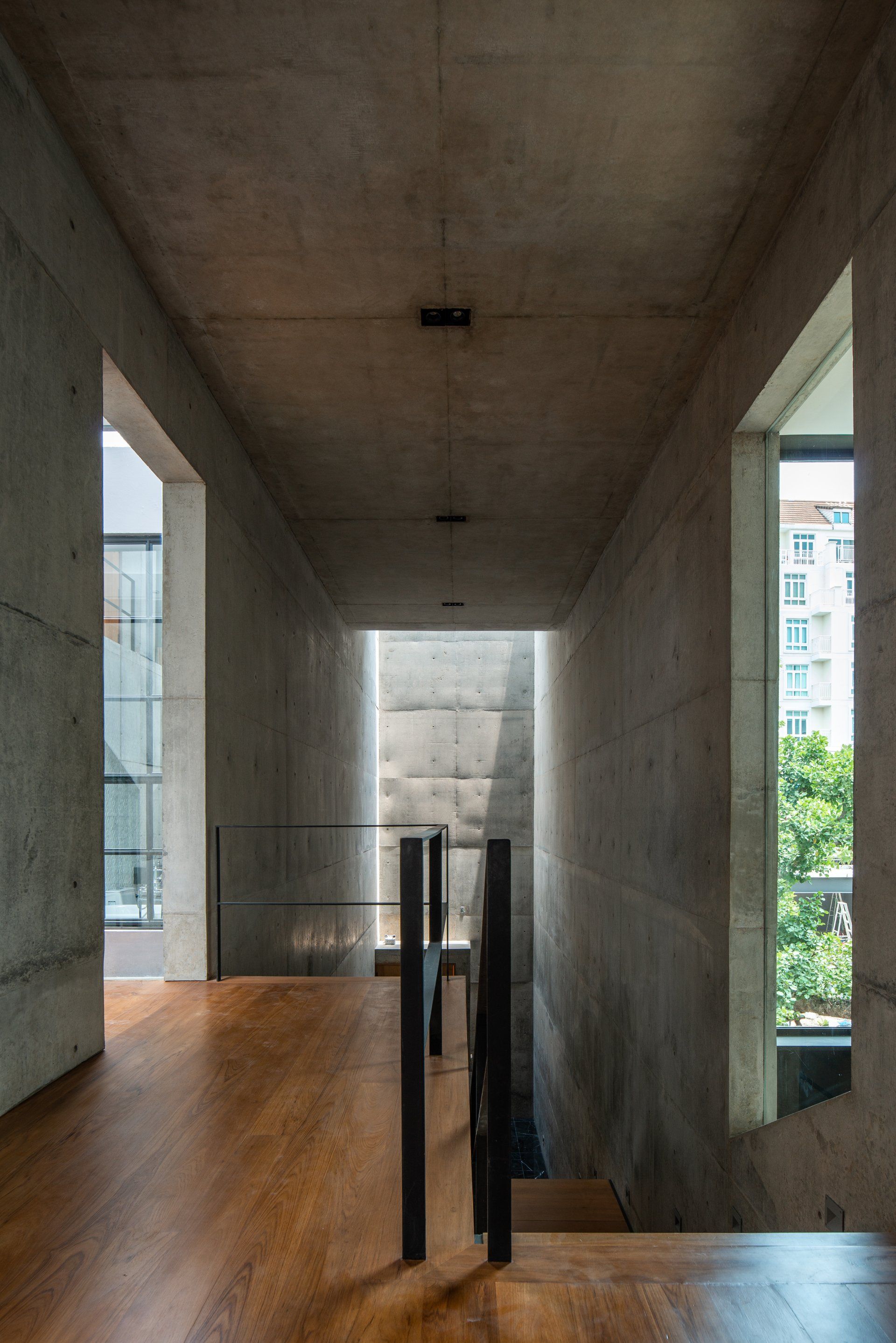
One of the signature of this project is the main “terminal” or the main hall of this building, acting as the center of the project, it was also one of the most difficult to construct. Setting with four, fourteen meters tall, cast concrete walls and cast concrete ceiling, the central terminal is a commanding center piece and the first thing one sees as one enters the residence. To lighten up this space, and visually lift the ceiling, two curved concrete ceilings with skylights were located at each end of the corridor, permitting for a stream of light to penetrate the central-most part of the building. The imperfect nature of the concrete allows the light to touch the surfaces and creating a play of miniature shadows and light during different time of the day.
Phototography
Beer Singnoi &
baanlaesuan
Architecture & Interior Design
Studio Krubka
SHARE THIS
Latest Edition
Mar / Apr 2026 edition is available now!
Contribute
G&G _ Magazine is always looking for the creative talents of stylists, designers, photographers and writers from around the globe.
Find us on
Latest News
Subscribe
Keep up to date with the latest trends!
Popular Posts
