Playful Mood
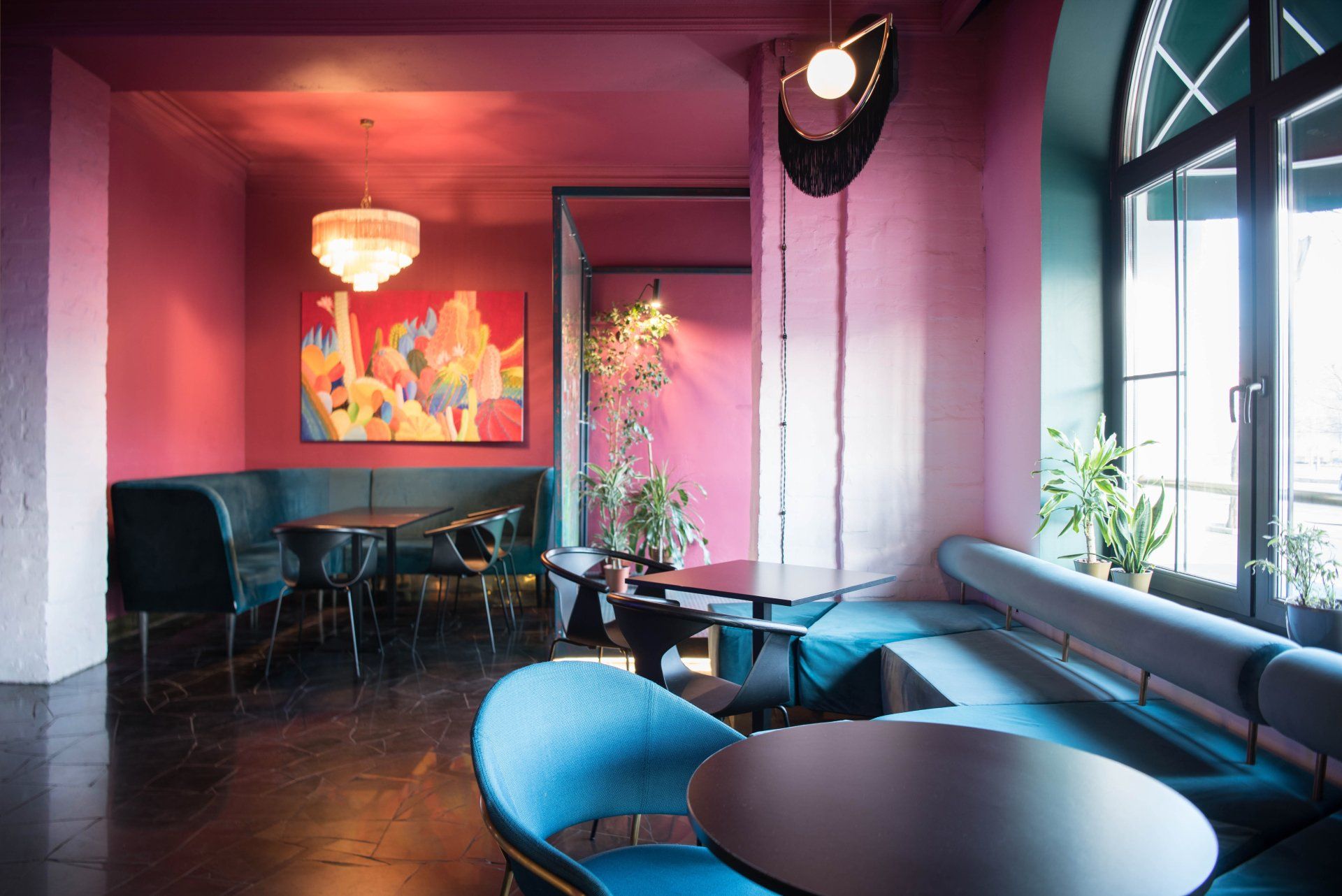
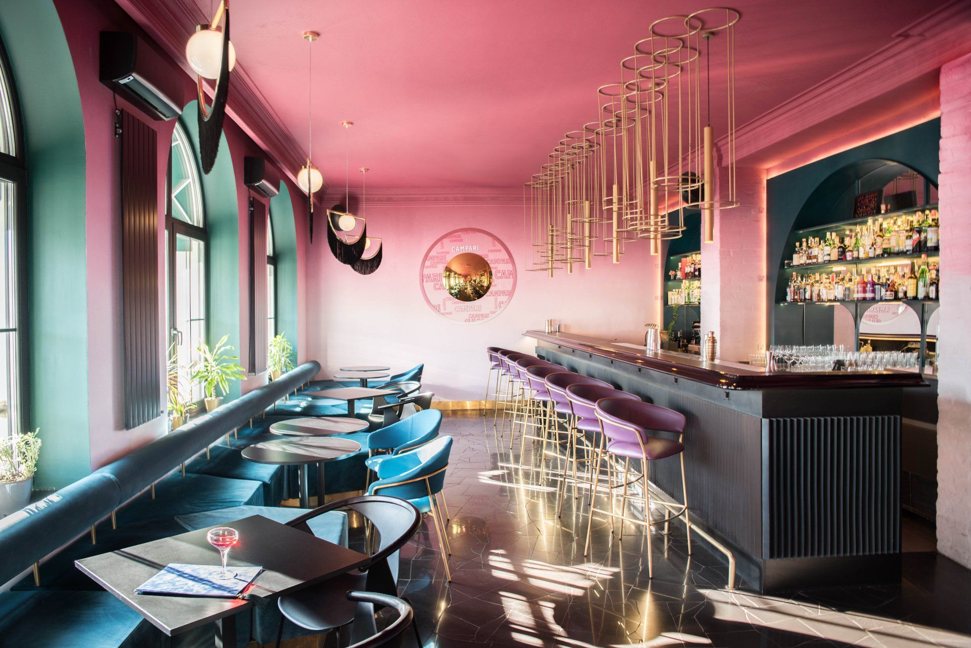
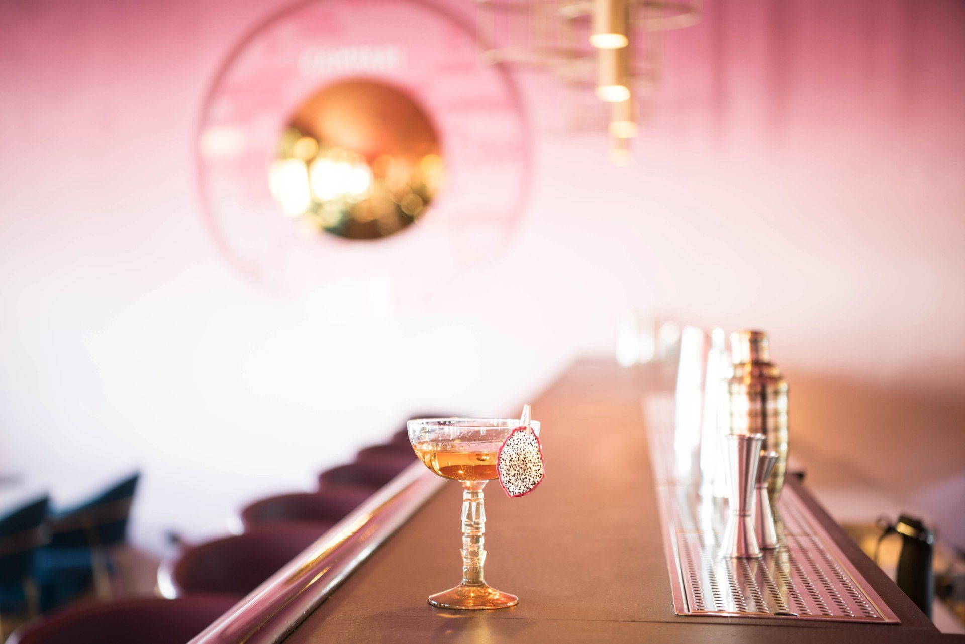
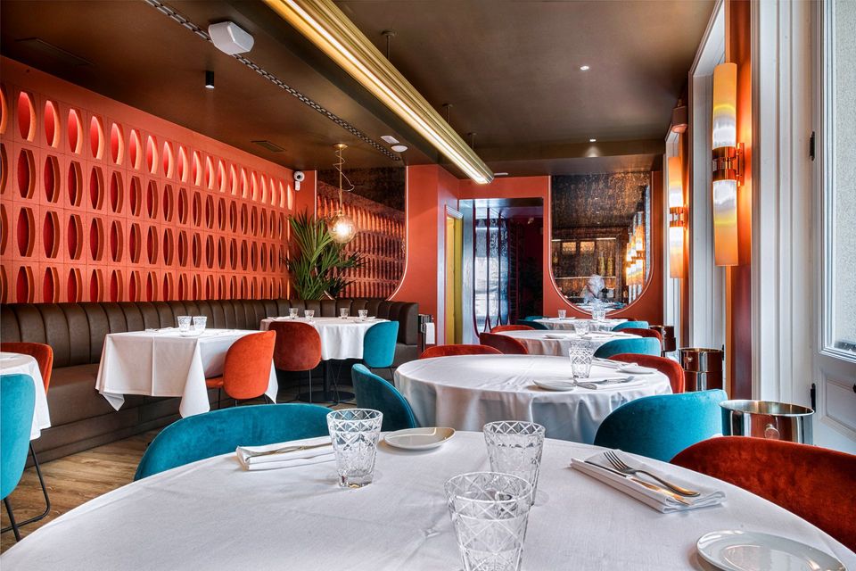
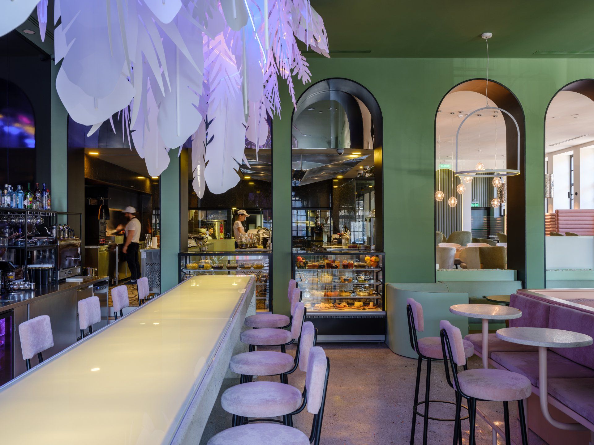
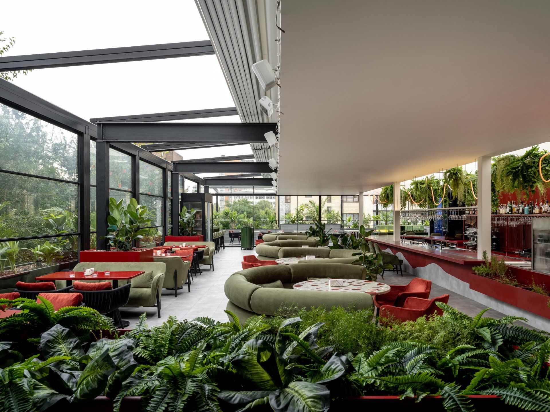
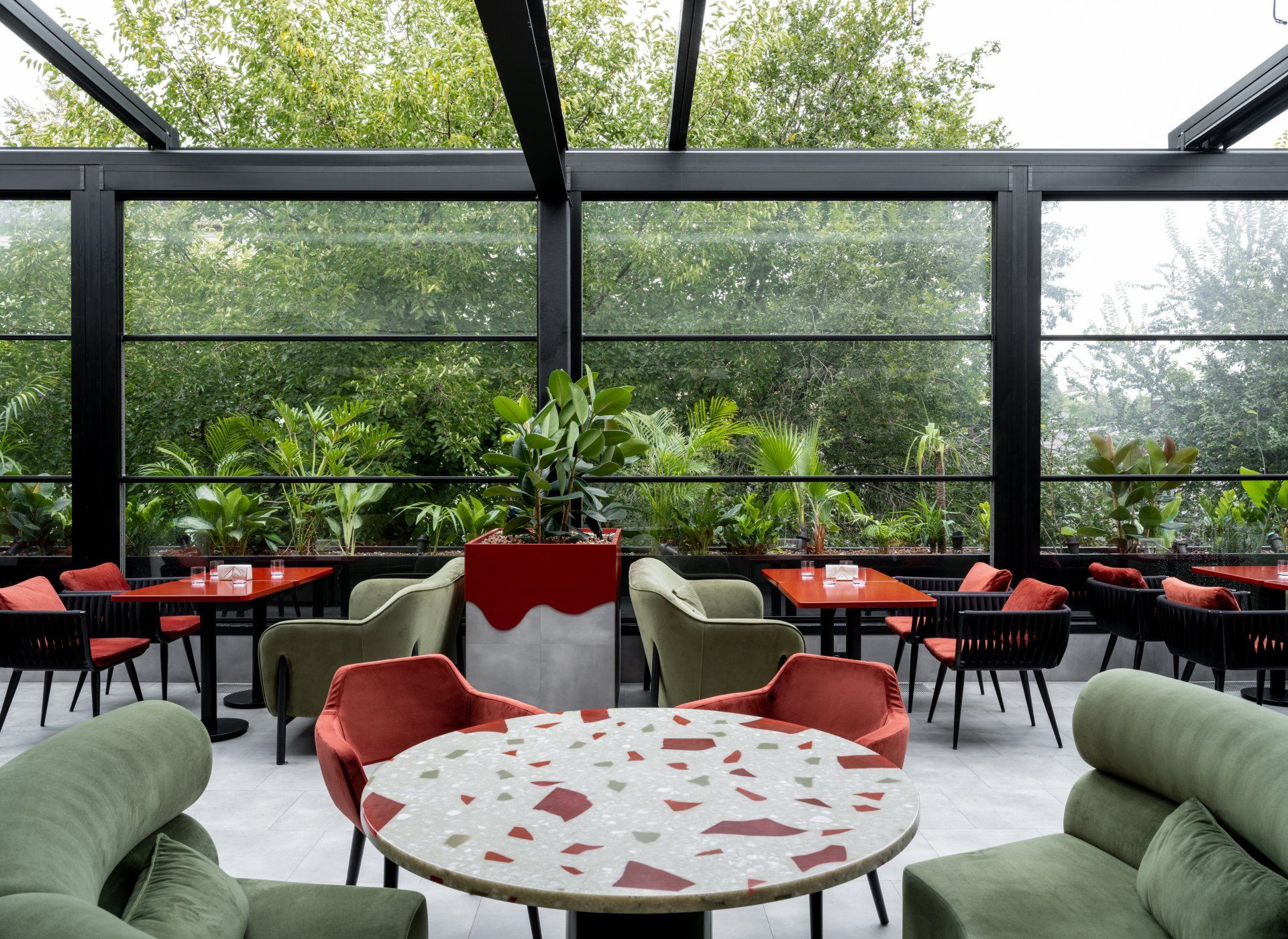
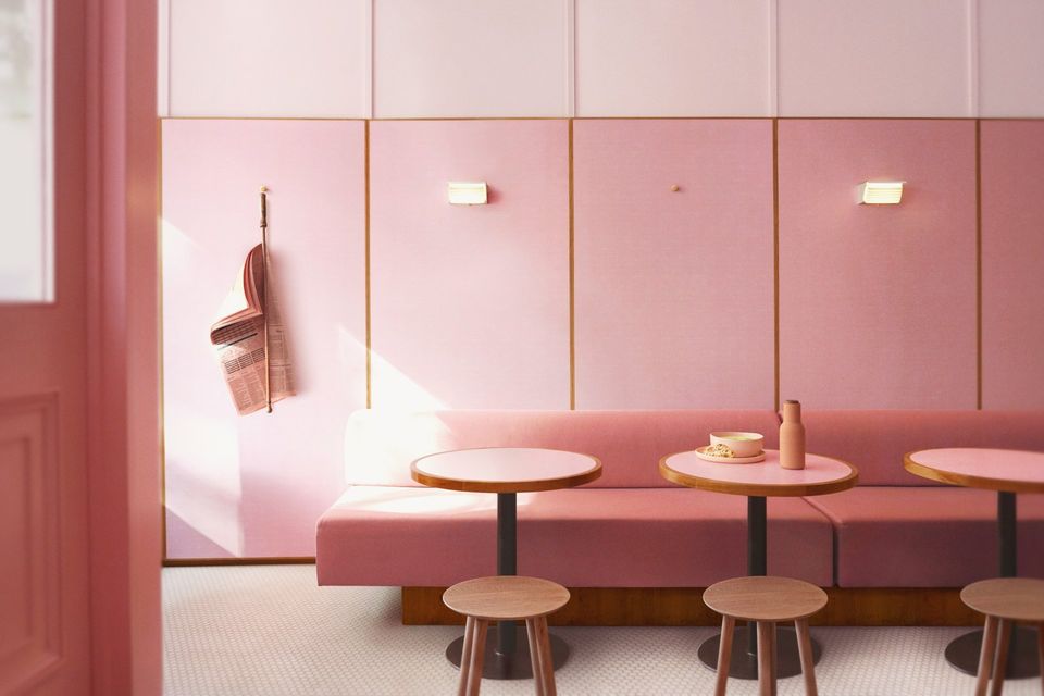
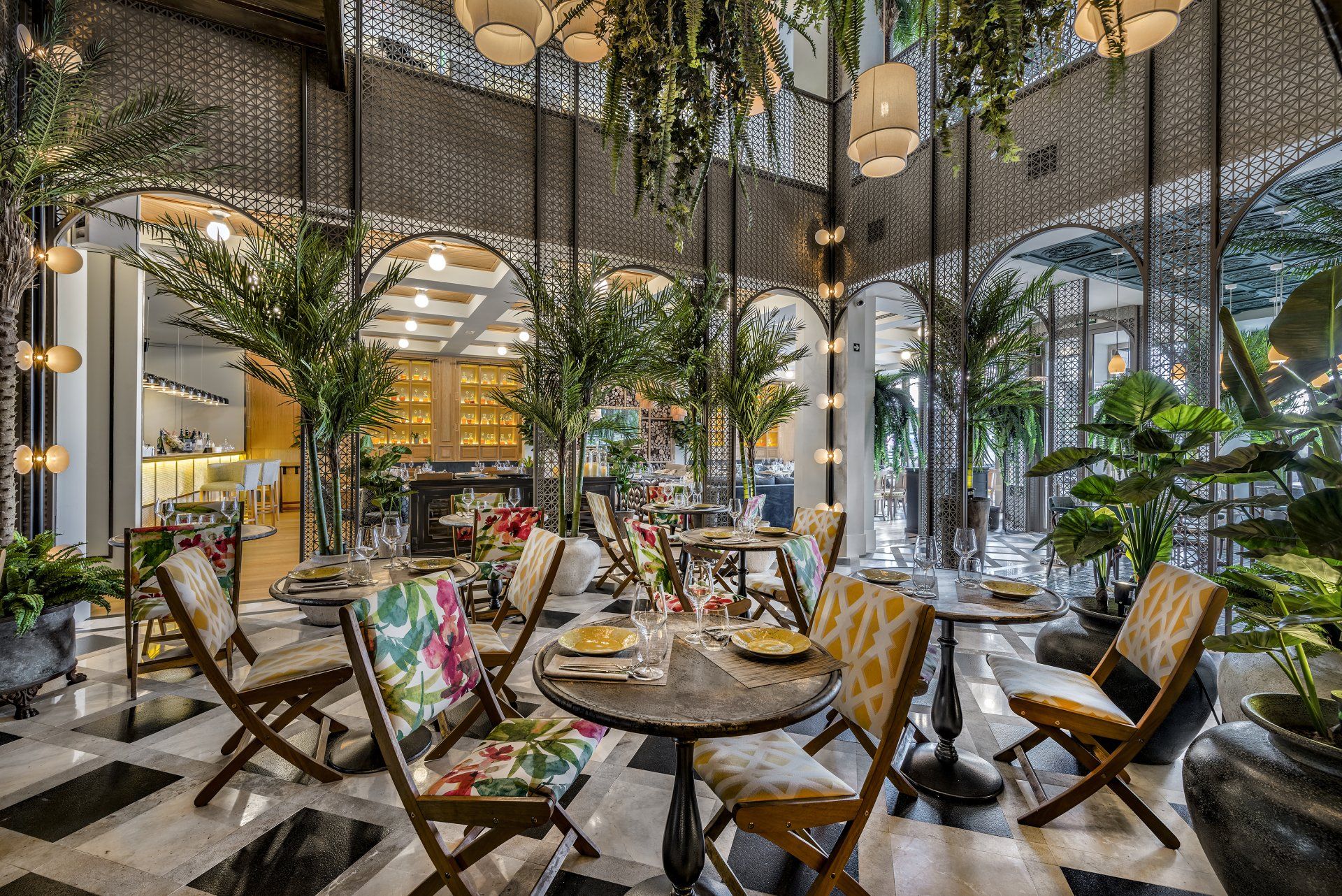
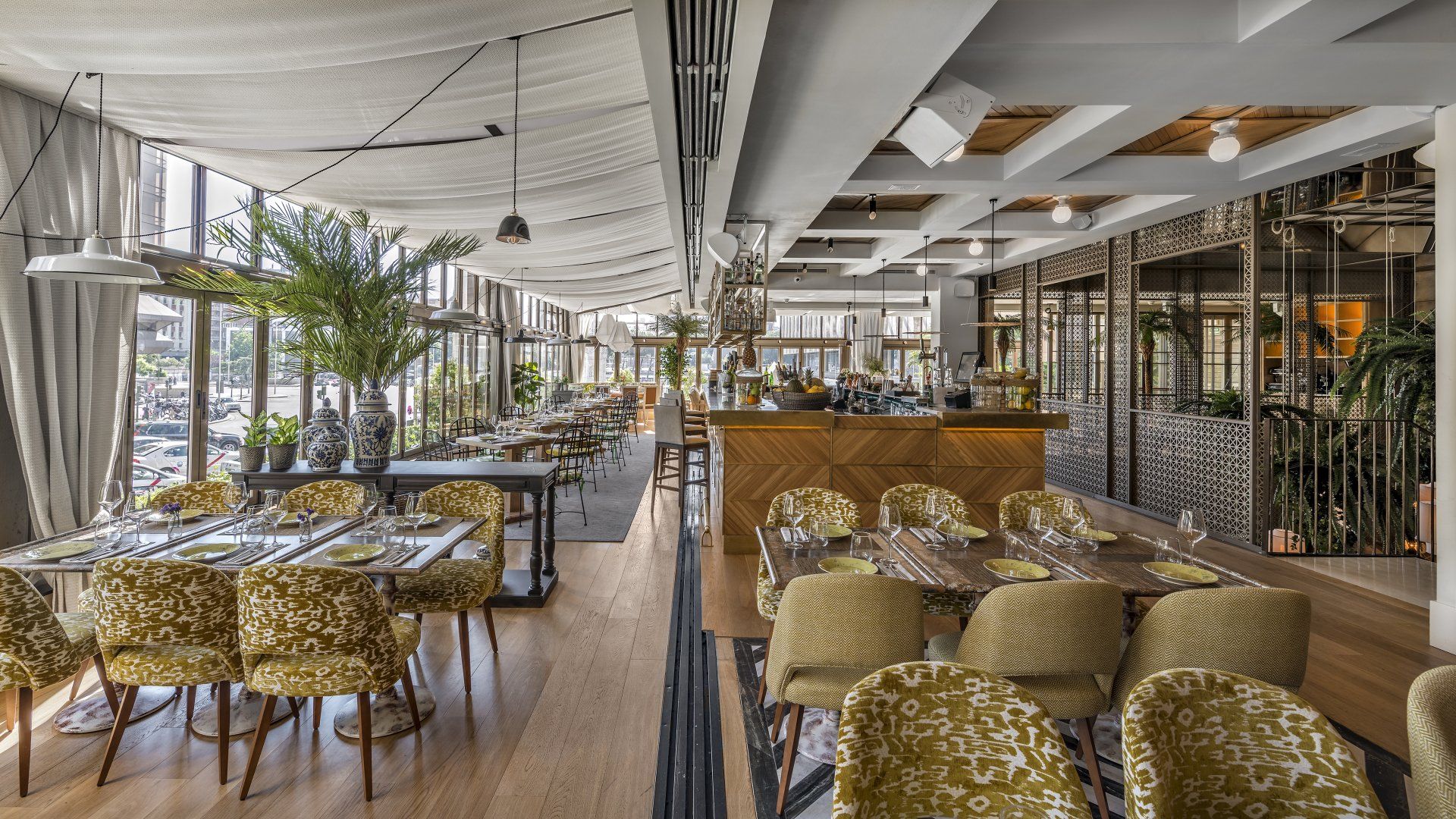
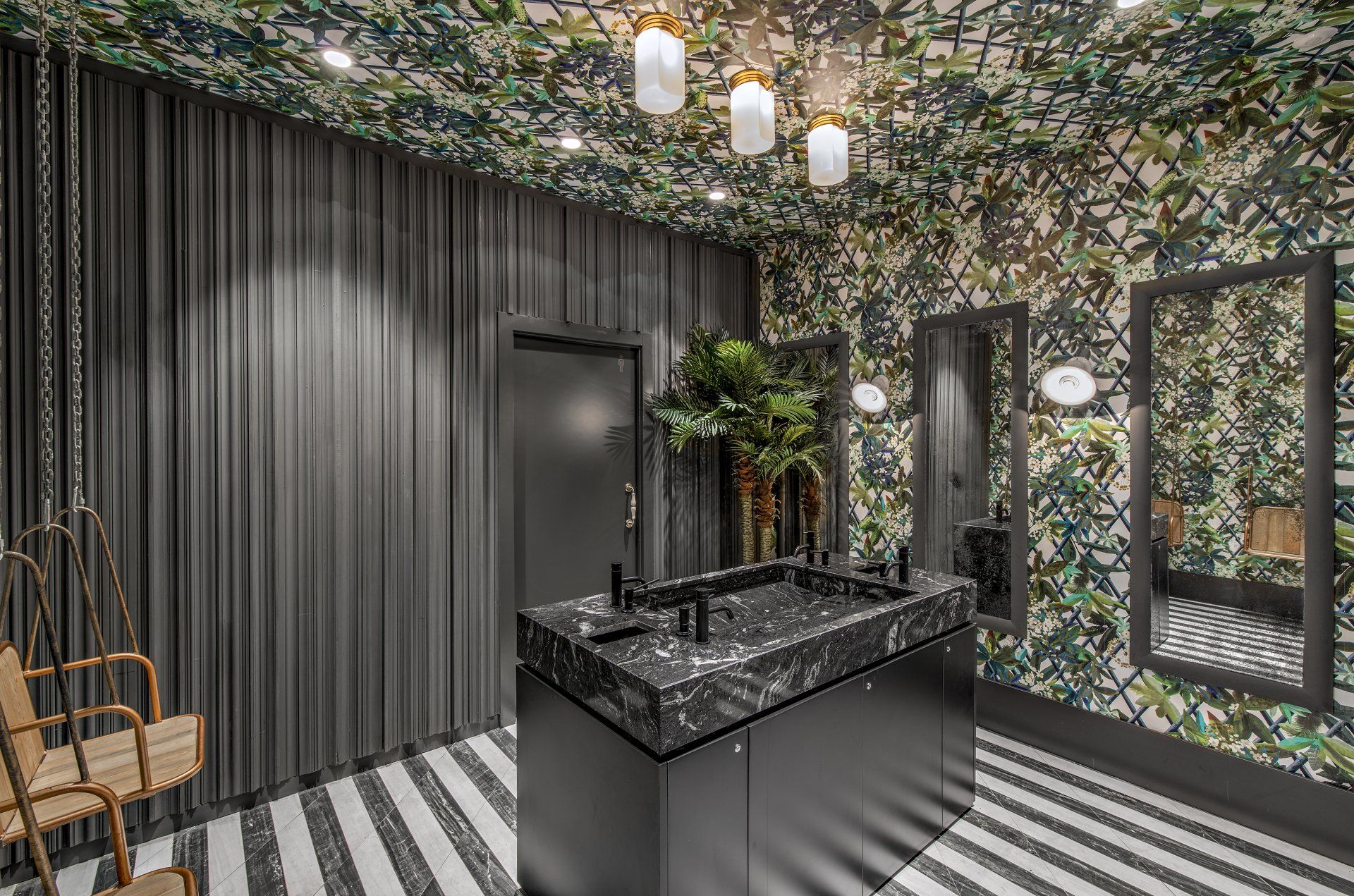
G&G _ Magazine reveals a sophisticated selection of Restaurants & Bars with the Best Coloured Interiors: from deep green to pastel pink to transgressive orange and so on.
1.
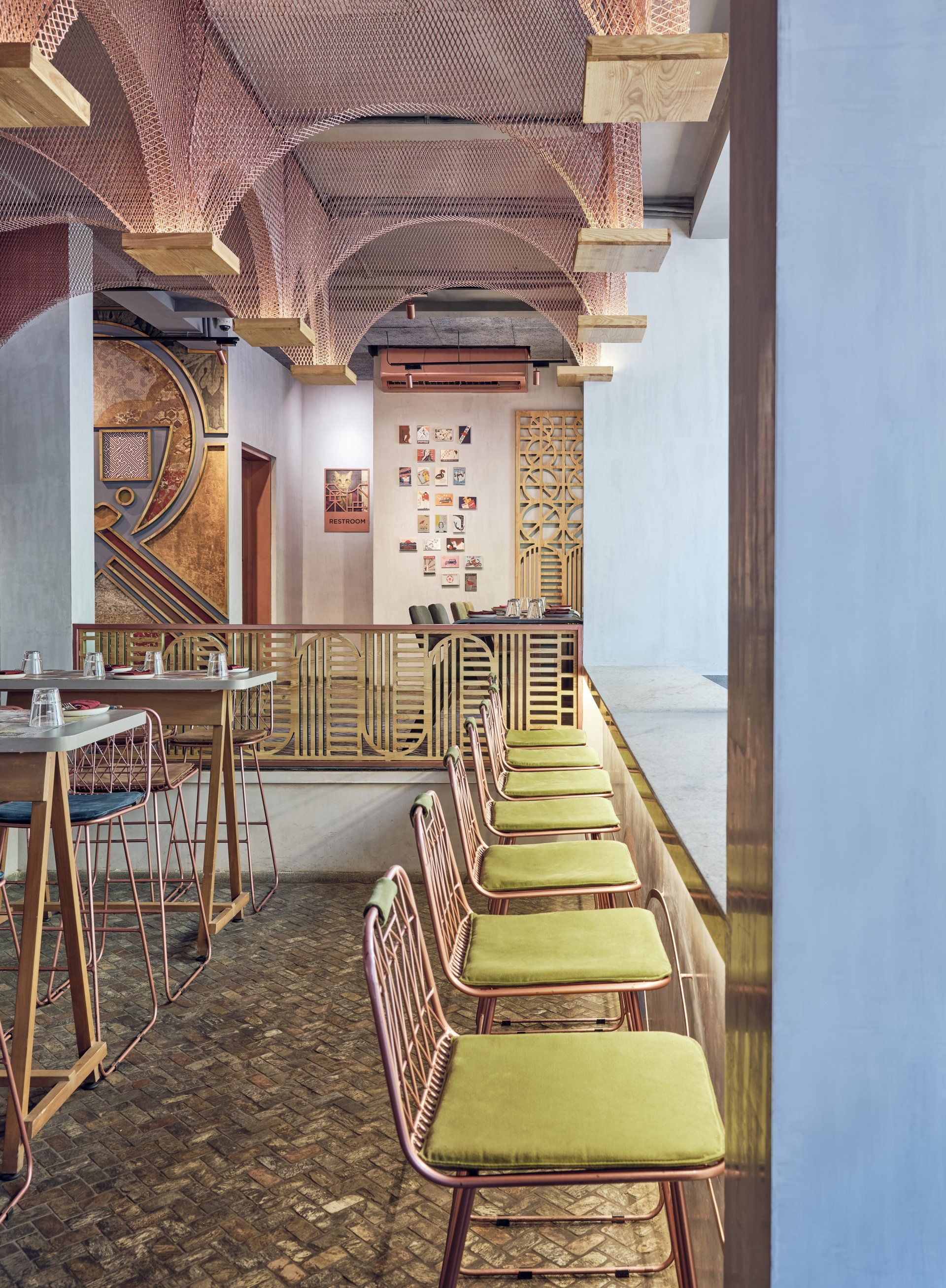
MISU by FADD Studio / Bangalore, India
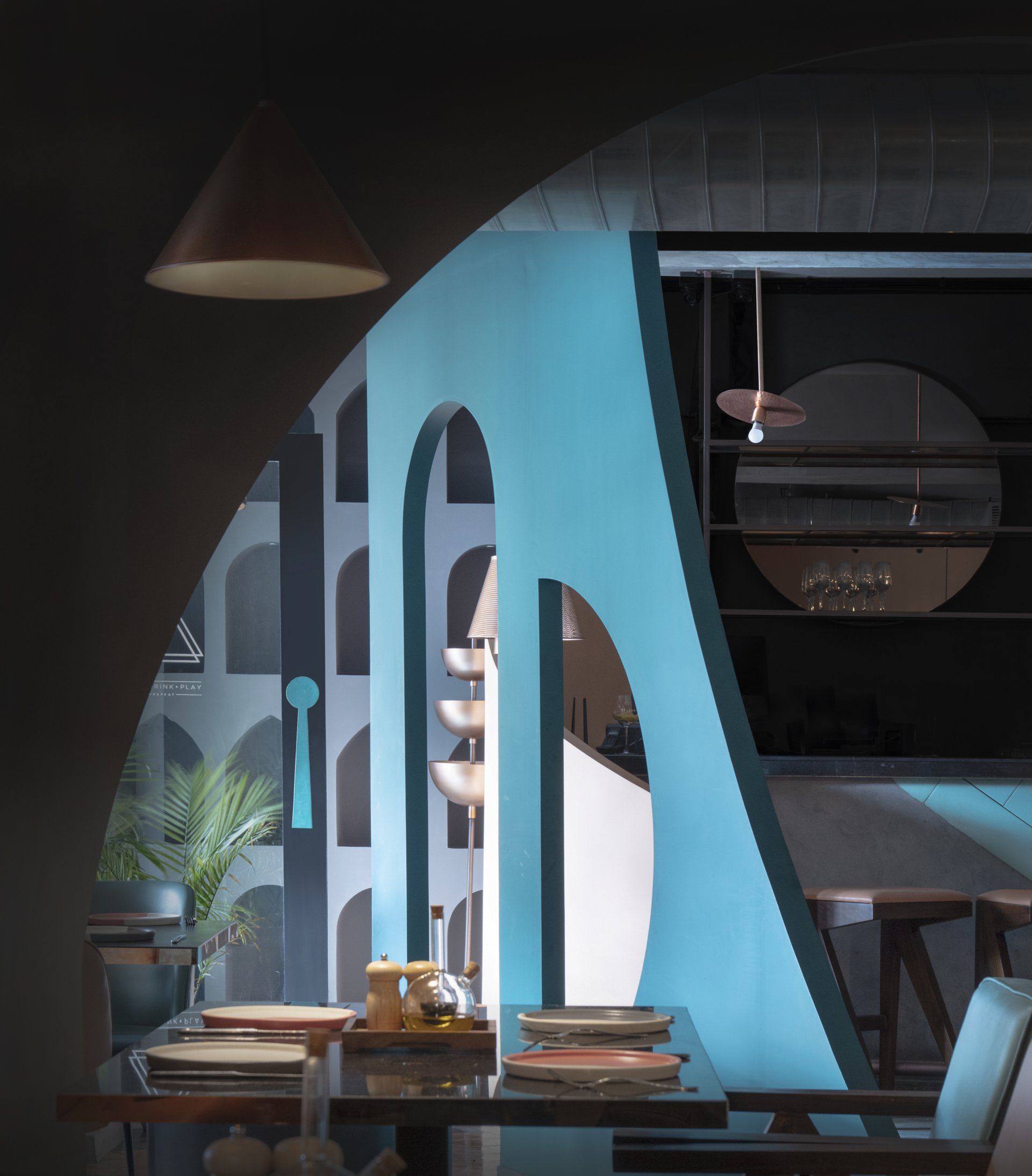
MISU is the contemporary and edgy interpretation of a restaurant inside a church with classical and colonial western elements meeting fine and minimal Japanese shapes in a beautiful and mesmerising confluence of glamour and grunge. Indirect lighting softly illuminates the mesh arches and hand painted walls to create an intimate atmosphere at night. FADD Studio has chosen the deep colours of blue, green and mustard and crimson, and opted for abundant use of copper.
Address: 4th Floor Halcyon Complex, St Marks Rd, 560025 - Bangalore, India
2.
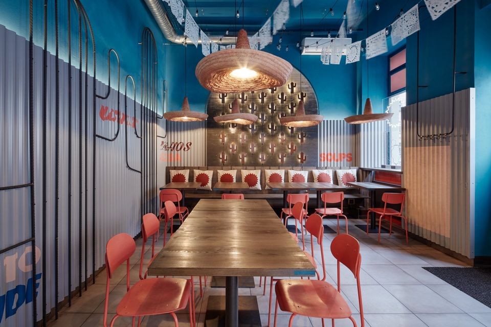
Burrito Loco by Formafatal / Prague, Czech Republic
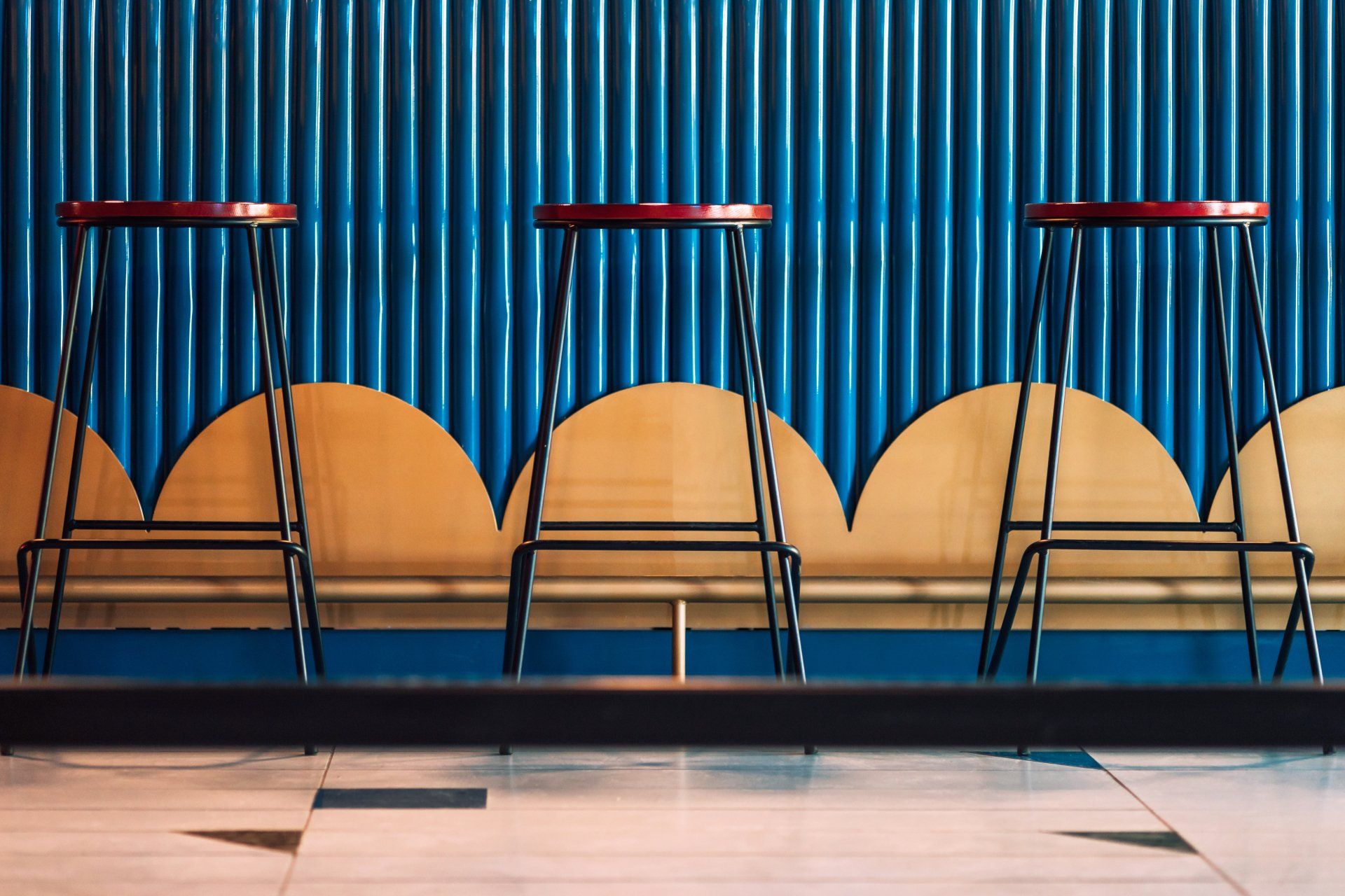
The design of the interior is inspired by the theme of Mexican cuisine and its colors. A distinctive feature is variety and glamour. Formafatal has kept the same materials and elements in the design of the individual branches but with different color combinations for each of them. The color palette of the cladding of the corrugated sheet metal, the paintings, the ceramic tiles and also on the chairs is changing. The designers have intentionally replaced the characteristic Mexican tiles by monochrome tiles and we have brought the touch of Mexico through some symbols typical for Mexico. The essential element is the cactus symbol, which is dominant in the interior and stylized in different forms. Other features include sombreros and garlands. The hanging lights are made of typical Mexican hats. The garlands could not be missing at any Mexican party, so they are hanging on the trees nearby each tin stand with refreshment. There are combined garlands of small light bulbs and garlands decorated with a cut pattern in the Burrito Loco interiors.
Address: Prague, Czech Republic
3.
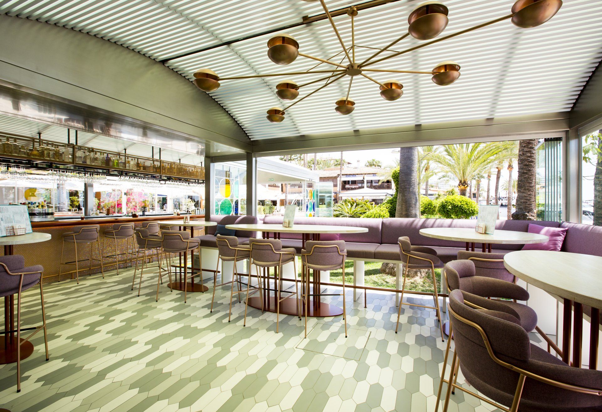
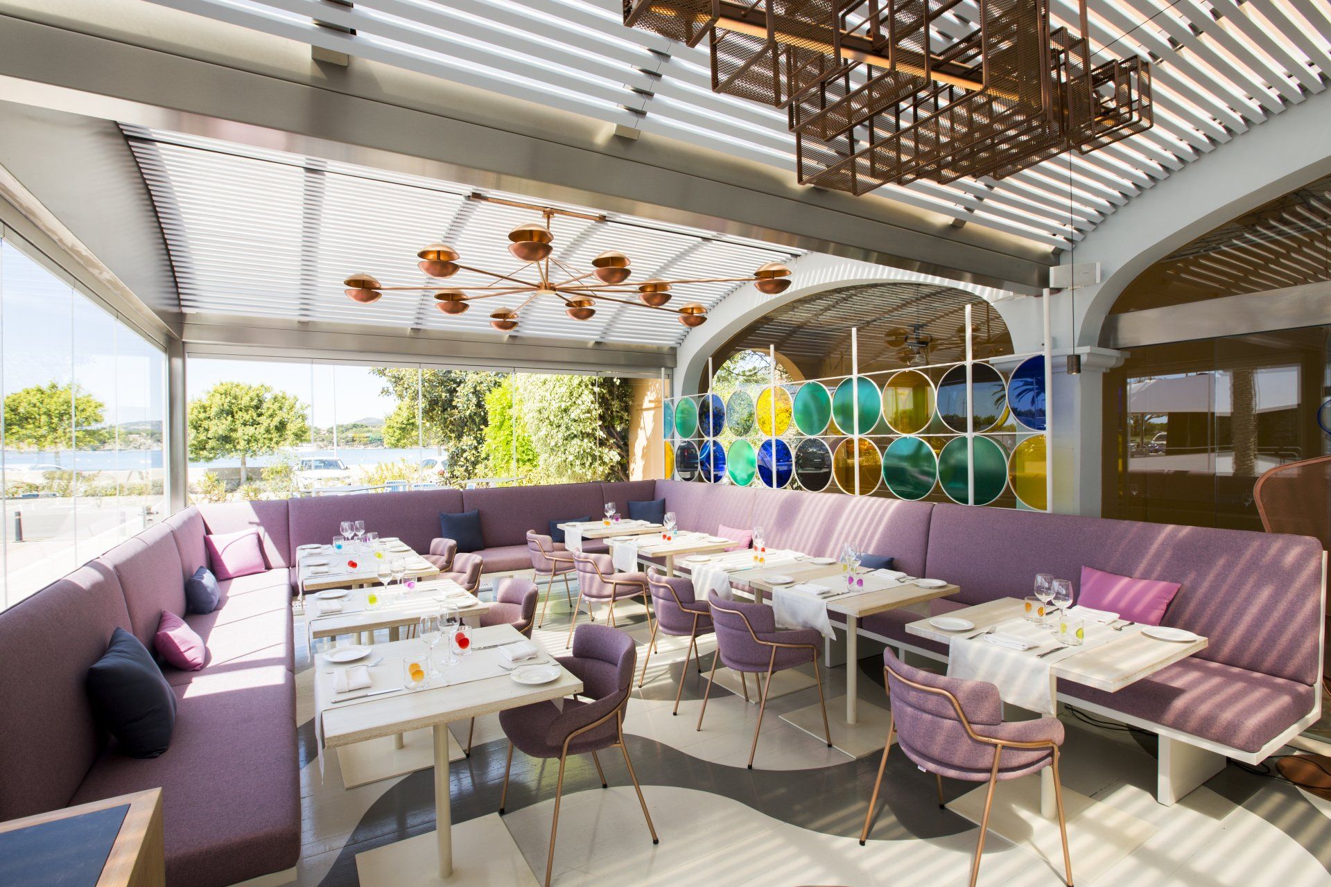
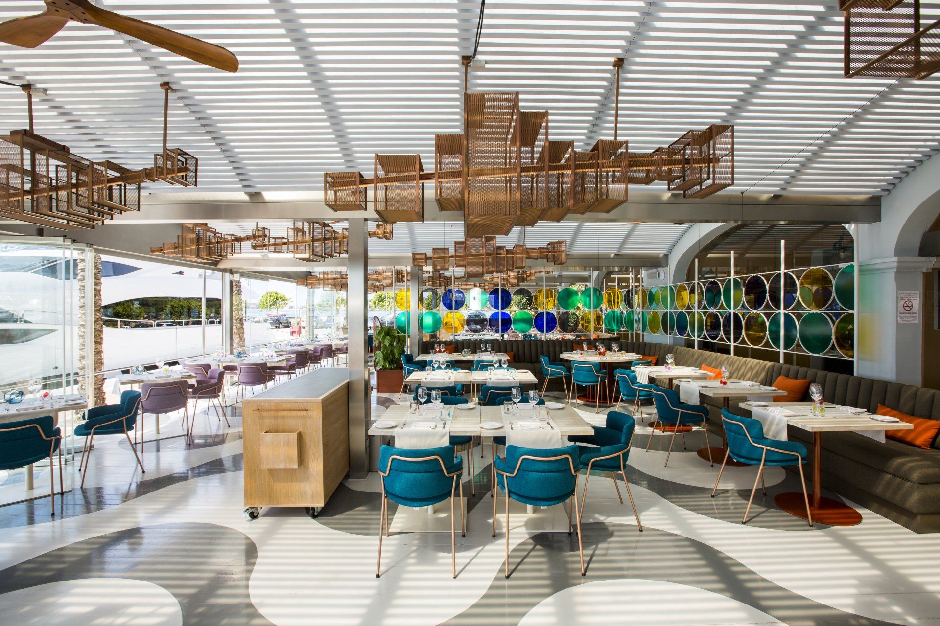
Baiben by Ilmiodesign / Palma de Mallorca, Spain
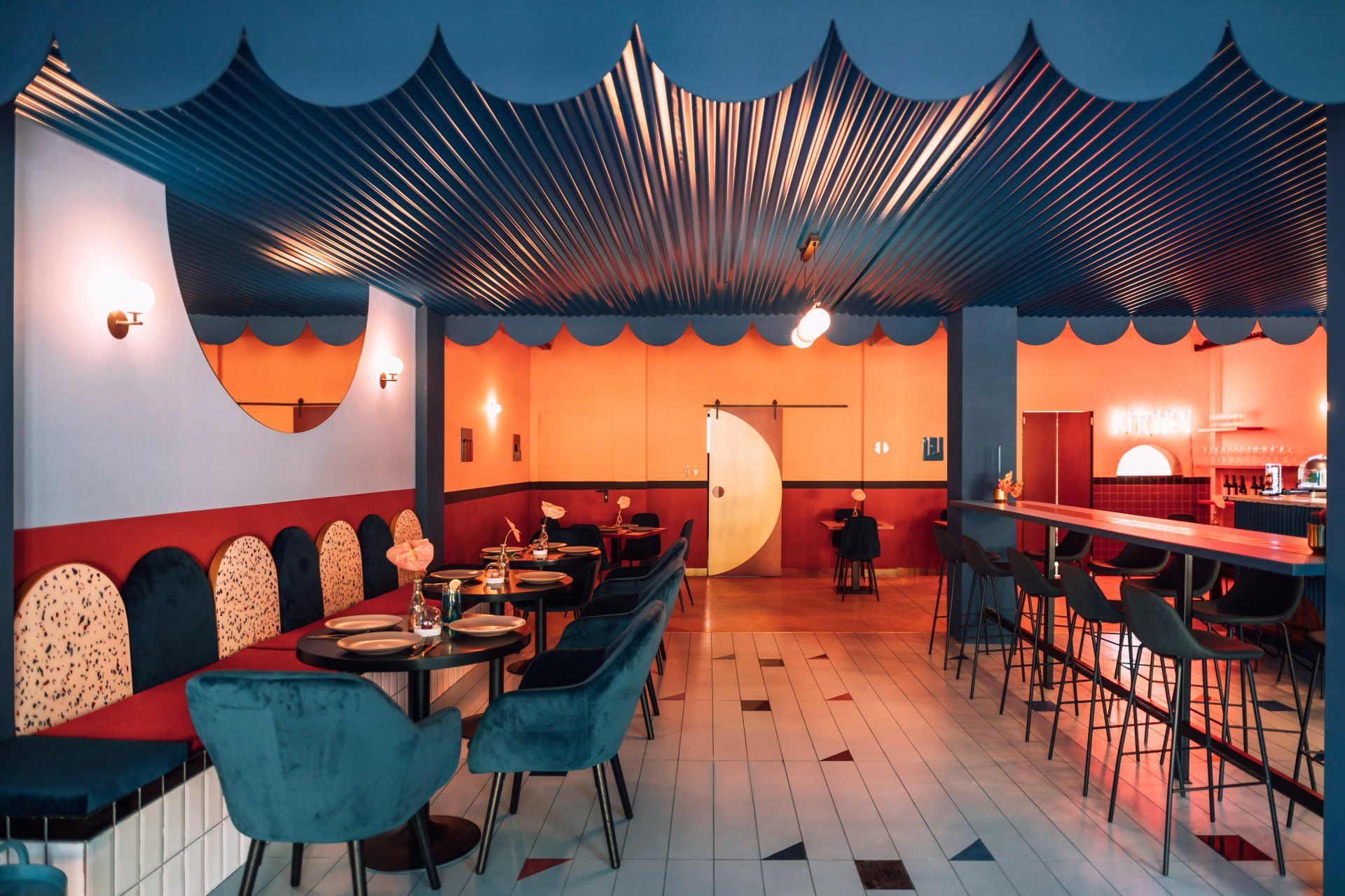
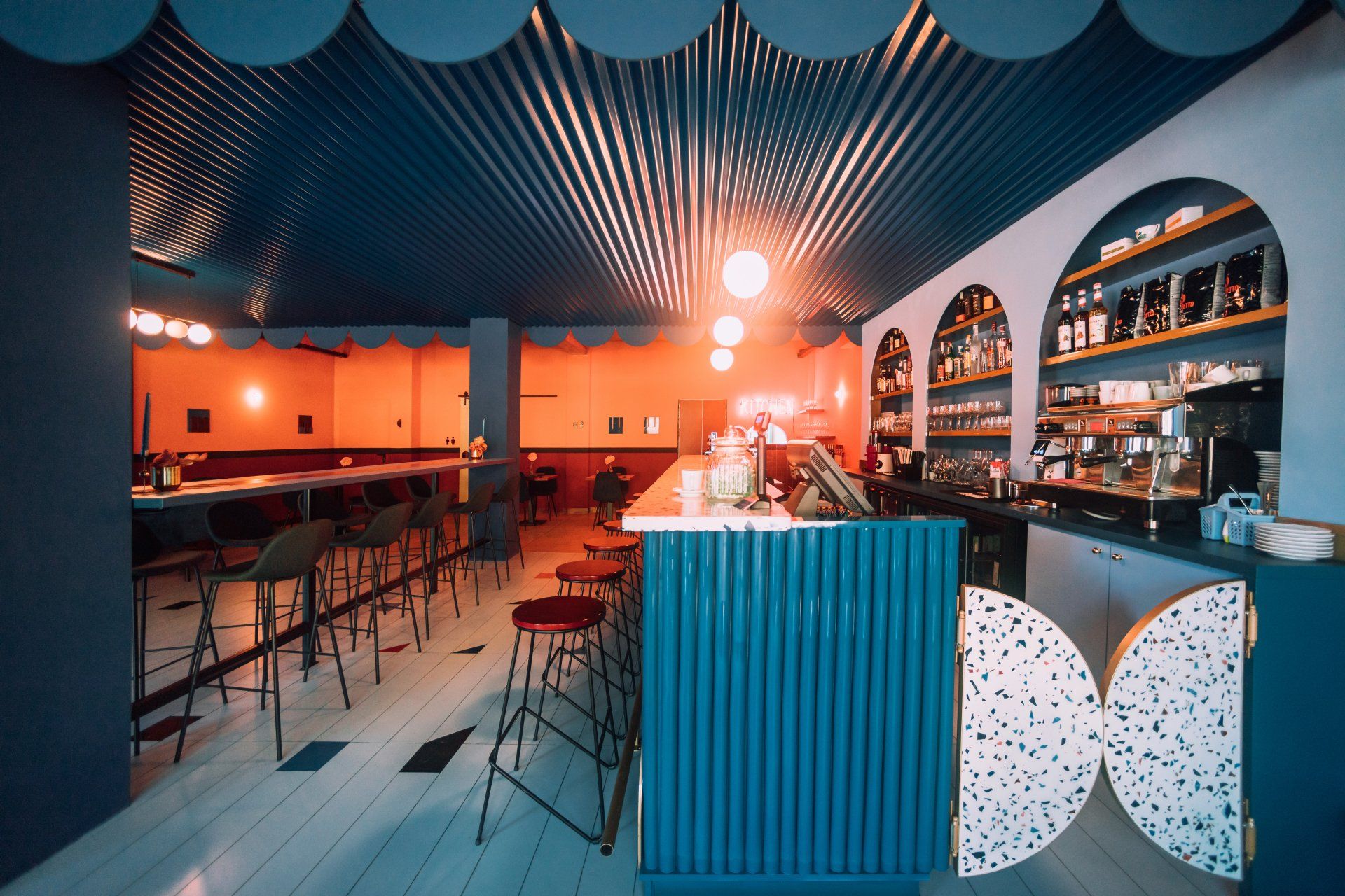
Everything in Baiben, such as its colours and its forms, evokes the beaches of Mallorca, with their seabed and myriad of living beings. Handmade stained-glass windows that separate spaces and, with their amber and turquoise tones, remind guests of the fusion between sand and sea. The vaults of the restaurant, as if they were a seabed, are populated by schools of fish and corals, making it easy to let imaginations run free and enjoy the truly unique spaces.
Address: Carrer d'Antoni Maria Alcover, 1, 07181 - Palma de Mallorca, Spain
4.
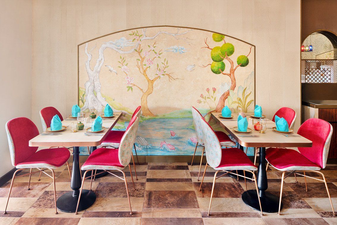
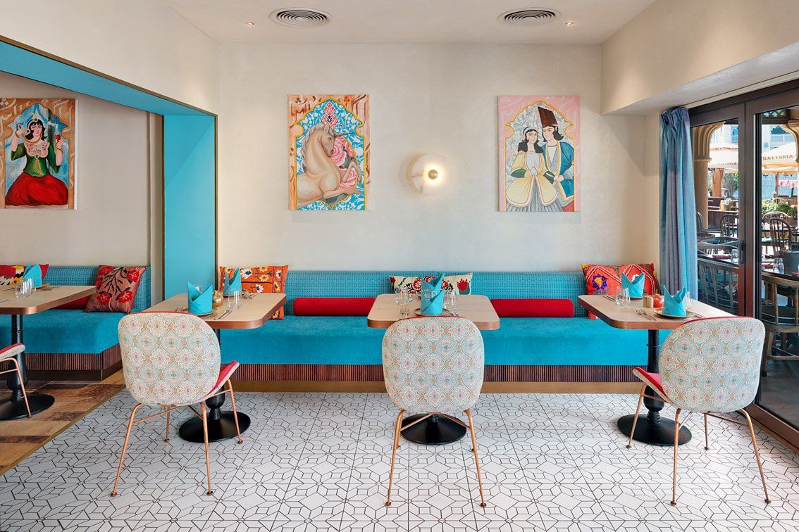
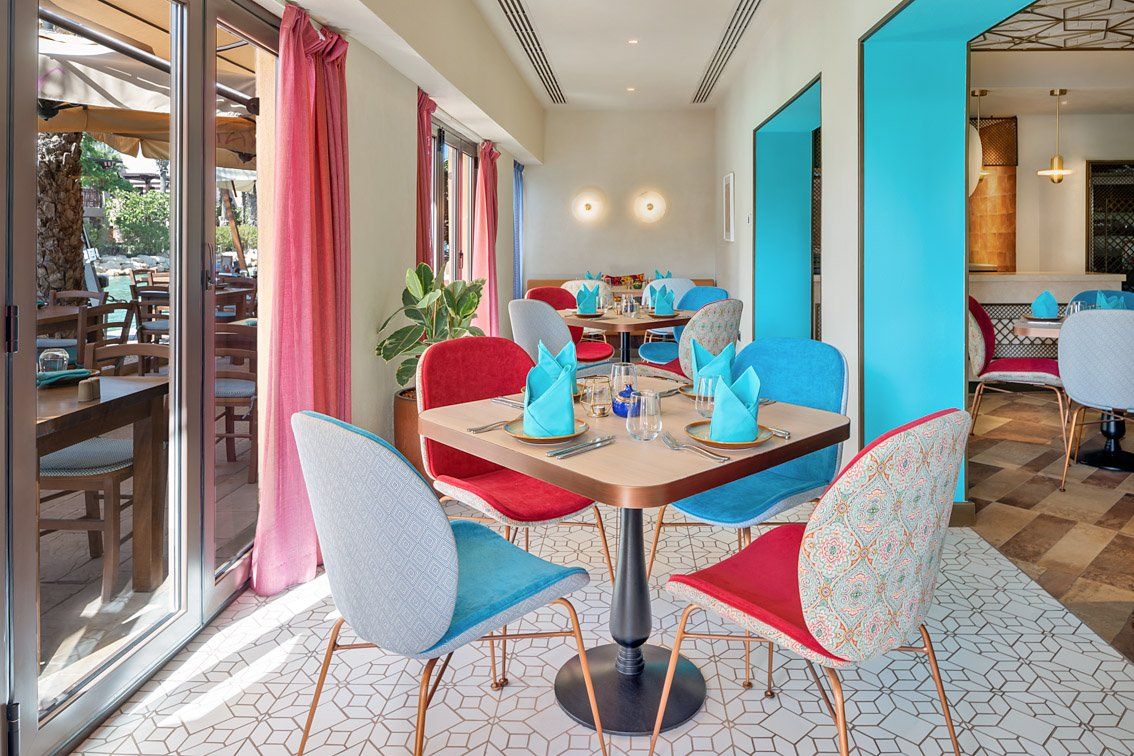
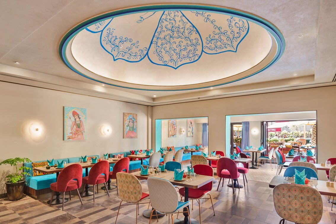
Anar by H2R Design / Dubai, UAE
This Persian restaurant evokes the traditional spirit adding modern twists and feast-worthy tones. H2R Design studied the colour palettes of Persian design including traditional art, music, language, tastes and flavours to delve deep into the cultural context and bring it forward to the modern world. With that as a goal, the design team curated interiors that brought icy lapis lazuli together with igneous burgundies, timbers, metallics and ambient lighting to create a newly refined version of Anar.
Address: Al Sufouh Rd, Jumeirah - Dubai, UAE
5.
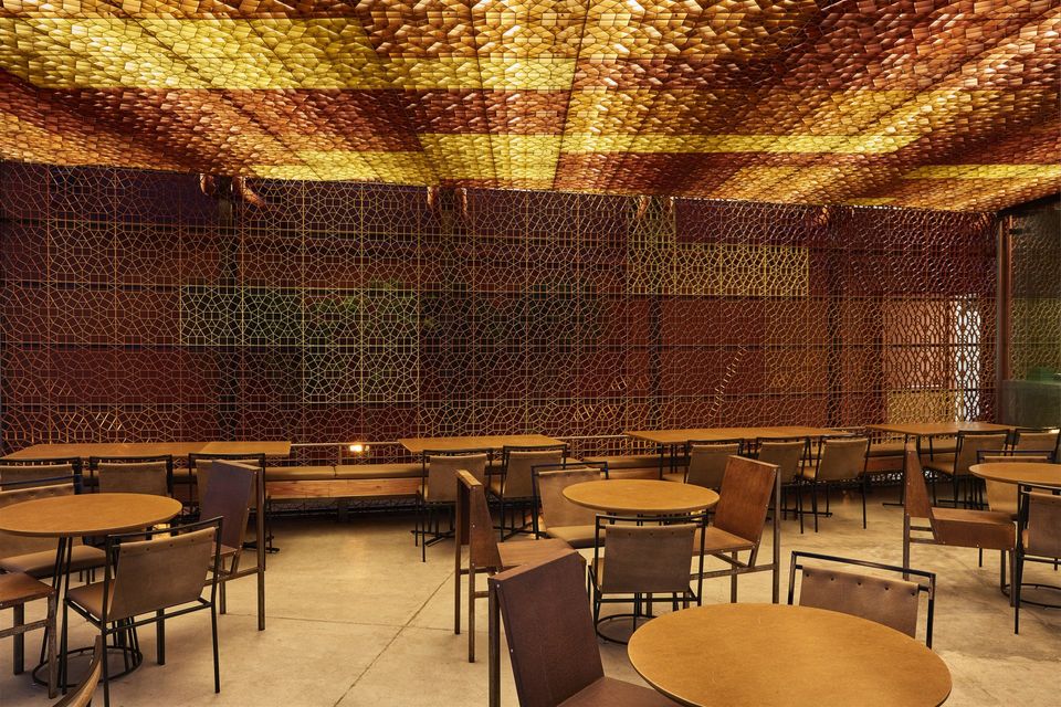
OssO by Gustavo Penna / Nova Lima, Brazil
The fire in the color of the walls and ceiling and the amber-tinged lights bring the customers a feeling of coziness. Exclusive furnishing was created for the restaurant by Prodomo Design, who used everything from tables made out of heat-treated eucalyptus boards to seats molded in eco-friendly leather. One of the focal point of is the big Grim Grid ceiling – made out of metallic panels designed by Greco Design especially for the restaurant – is sure to attract the customers’ attention. Over the Grim Grid panels, there are layers of foam coated with clear fabric in order to better reflect the light. Painted in gradients of yellow, red and orange, the panels resemble flames.
Address: Mg-030 Serena Mall - Nova Lima, Brazil
6.
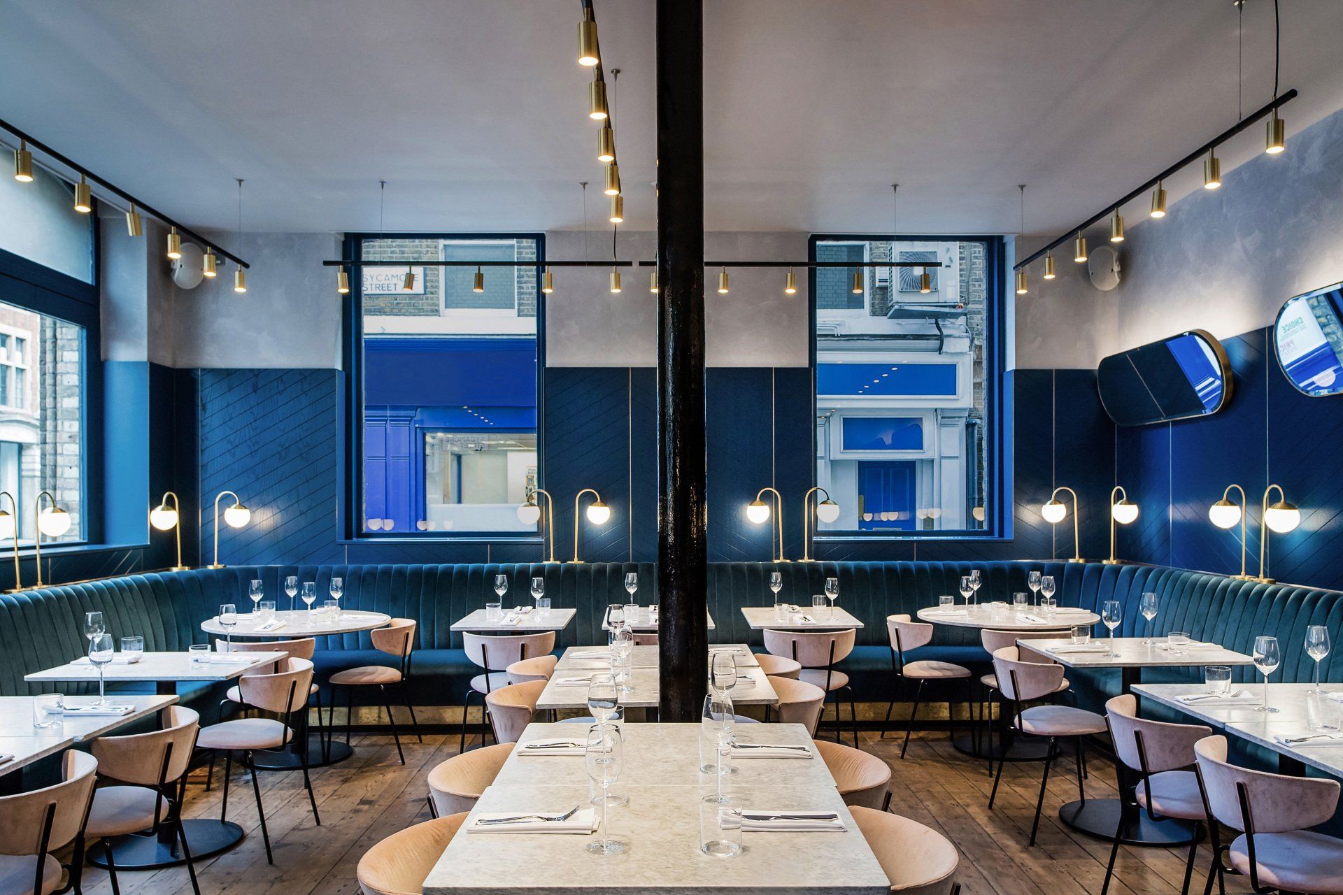
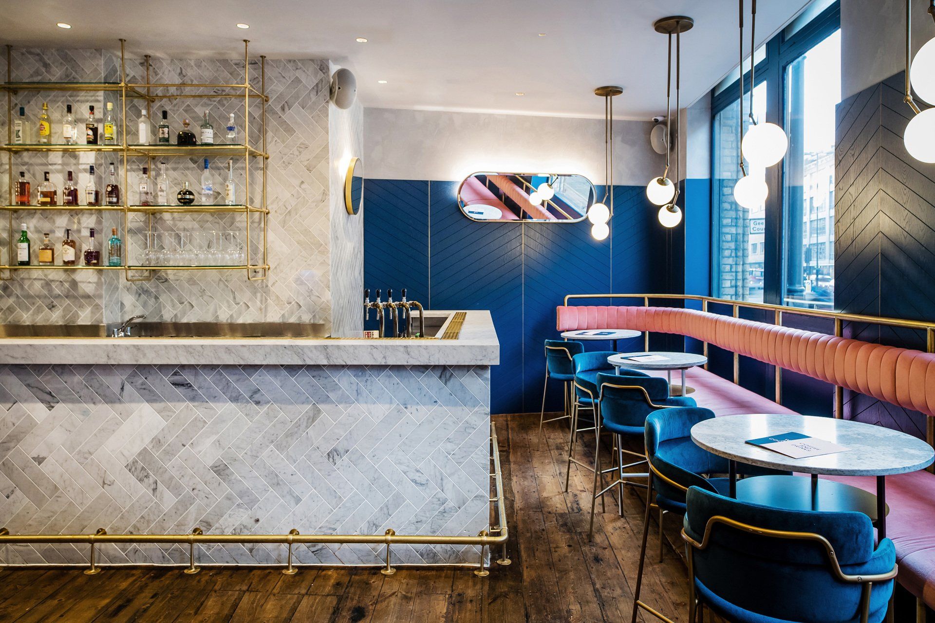
Clerkenwell Grind by Biasol / London, UK
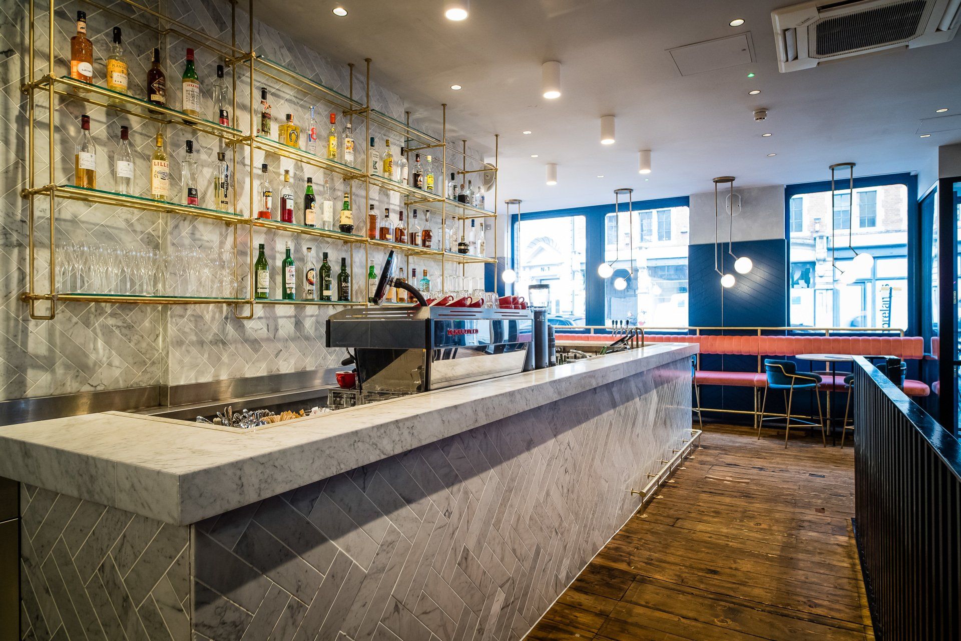
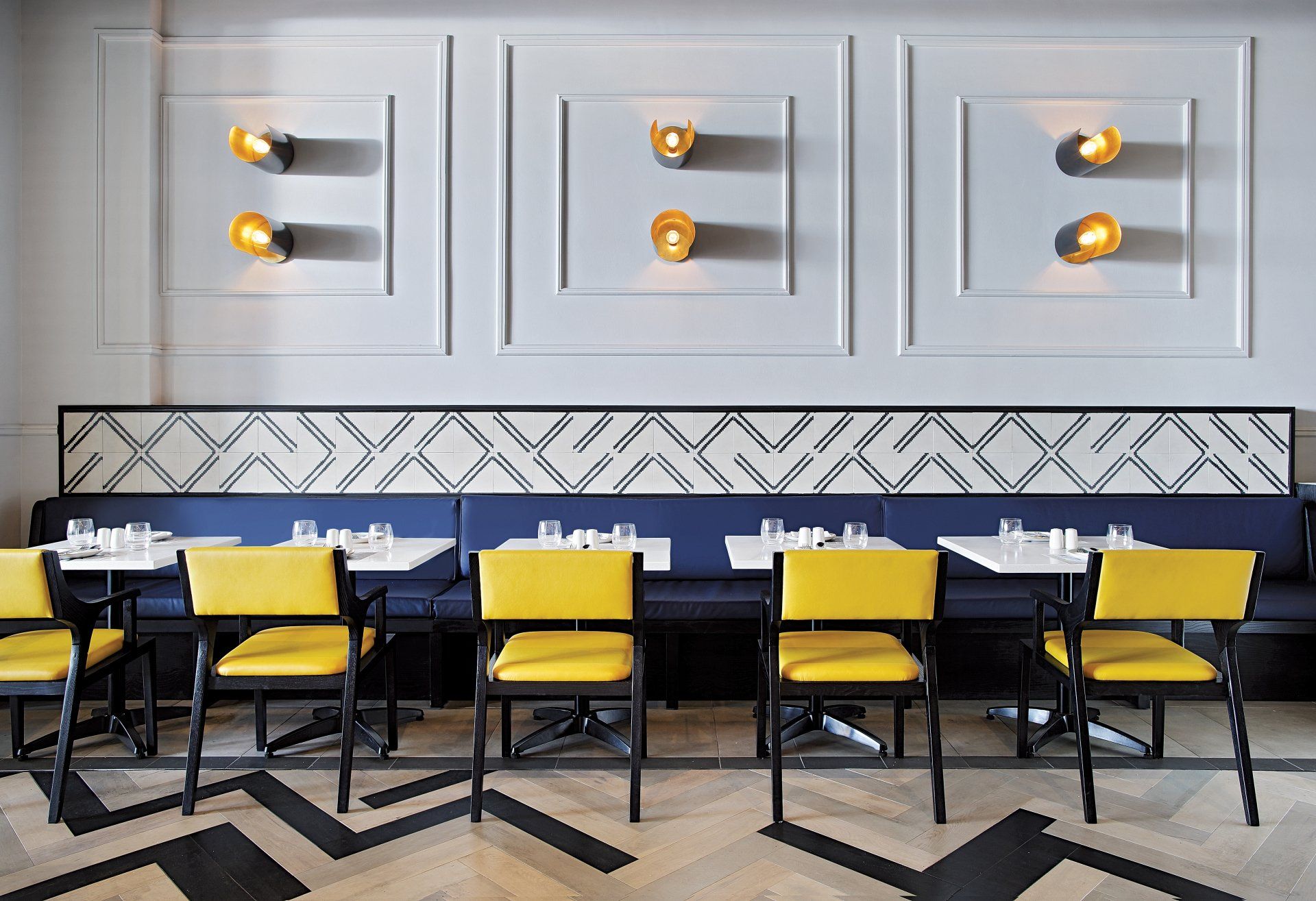
The designers opted for a light and elegant furniture: marble-topped tables in circle, square and rectangle configurations with slender Ferm Living chairs upholstered in dusky pink velvet. While a plush banquette in a navy blue velvet wraps around the walls, below navy timber panels with a chevron pattern. Slender brass lamps and beautifully worn timber floors nod to the building’s history while, overhead, angled oval mirrors create unexpected connections between groups of diners.
Address: 2-4 Old St, EC1V 9AA - London, UK
7. Surround by H2R Design / Riyadh, Saudi Arabia
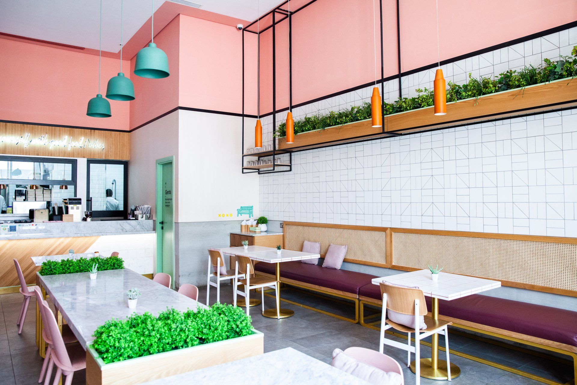
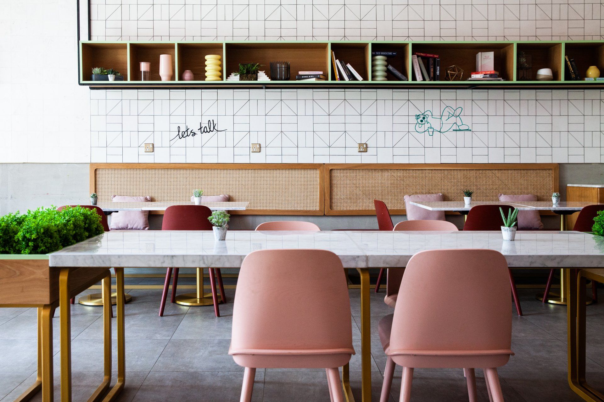
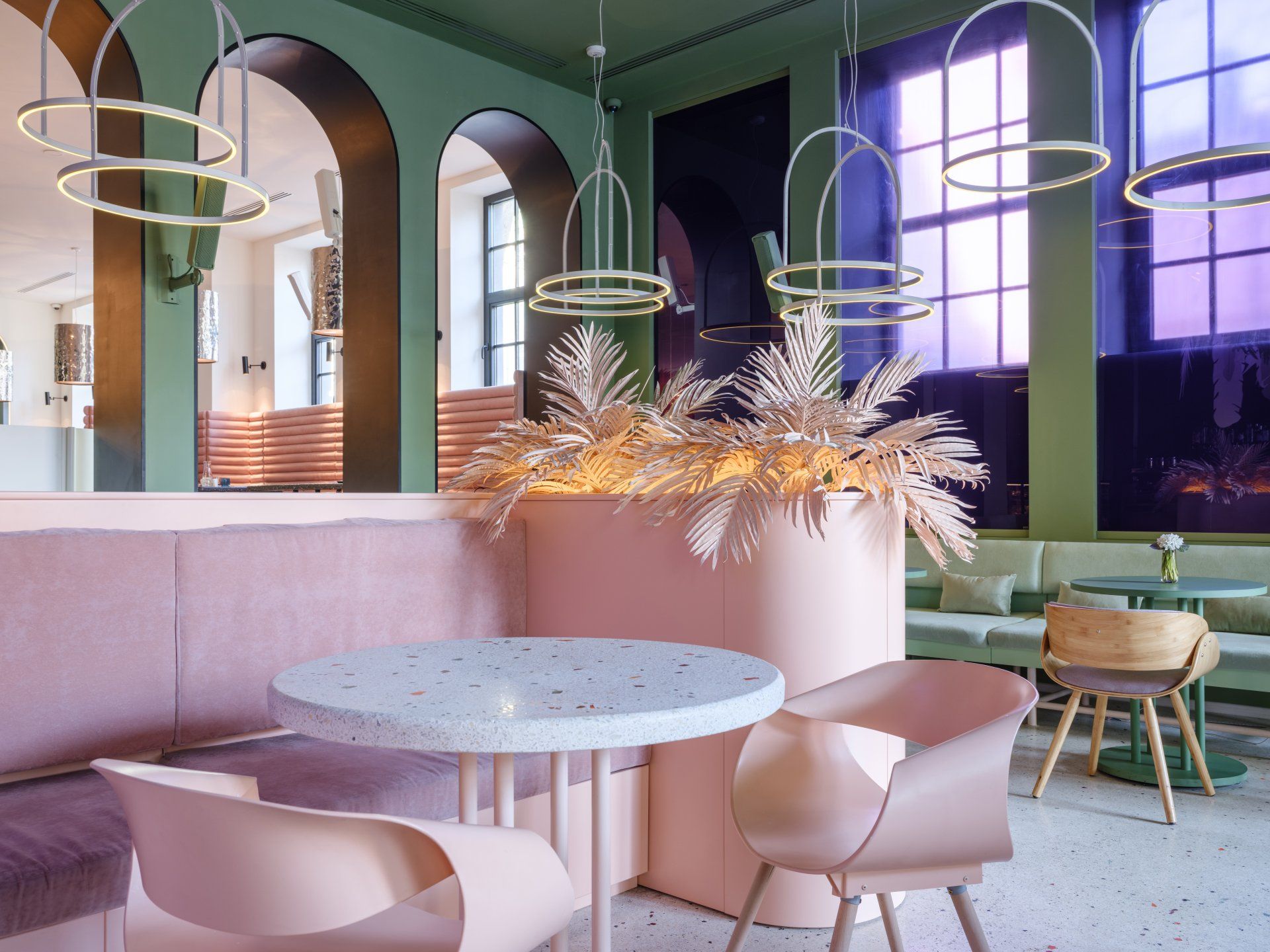
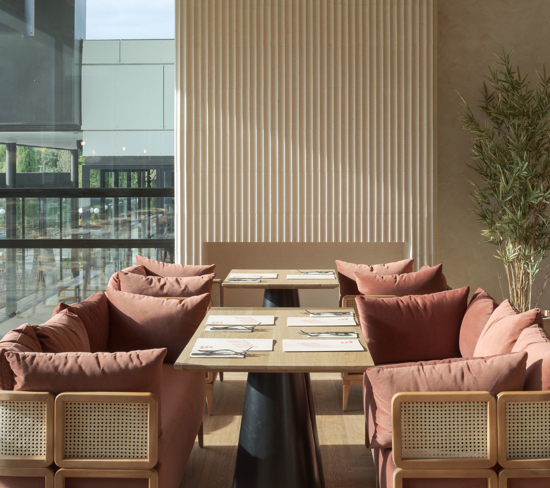
The interiors are vibrant and eye-catching, filled quirky design features which displays the character of the space. This can be seen with brave colours like pink in the furniture that form the sense of fun, while the use of wood and rattan add a bit of temperateness. In addition, warmth is activating with the terracotta wall and lighting that are in line with the pinks and greens.
Address: Prince Turki Al Awwal Rd U Walk, 12373 - Riyadh, Saudi Arabia
8.
Authoral by BLOCO Architects / Brasília, Brazil
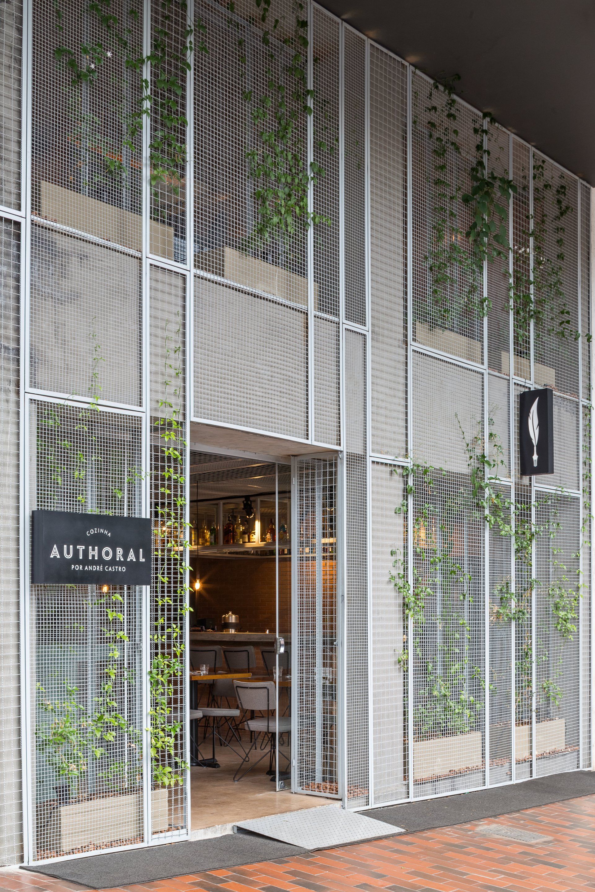
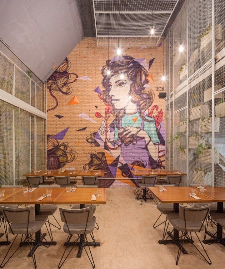
The goal is to reinforce the idea that the space of the restaurant is the continuity of the urban space. In the tables’ halls the designers maximised the visual connection with the outer space by creating retractable skylights. This allows to the hall turn into an open terrace at night during the city’s long dry spell. To give the color for the ambiance, three artists intervened on the inner walls with its modern designs.
Address: SCLS 302 B bloco A loja 10 - Brasília, Brazil
9.
Kanto by Fabio Gianoli / Colico, Italy
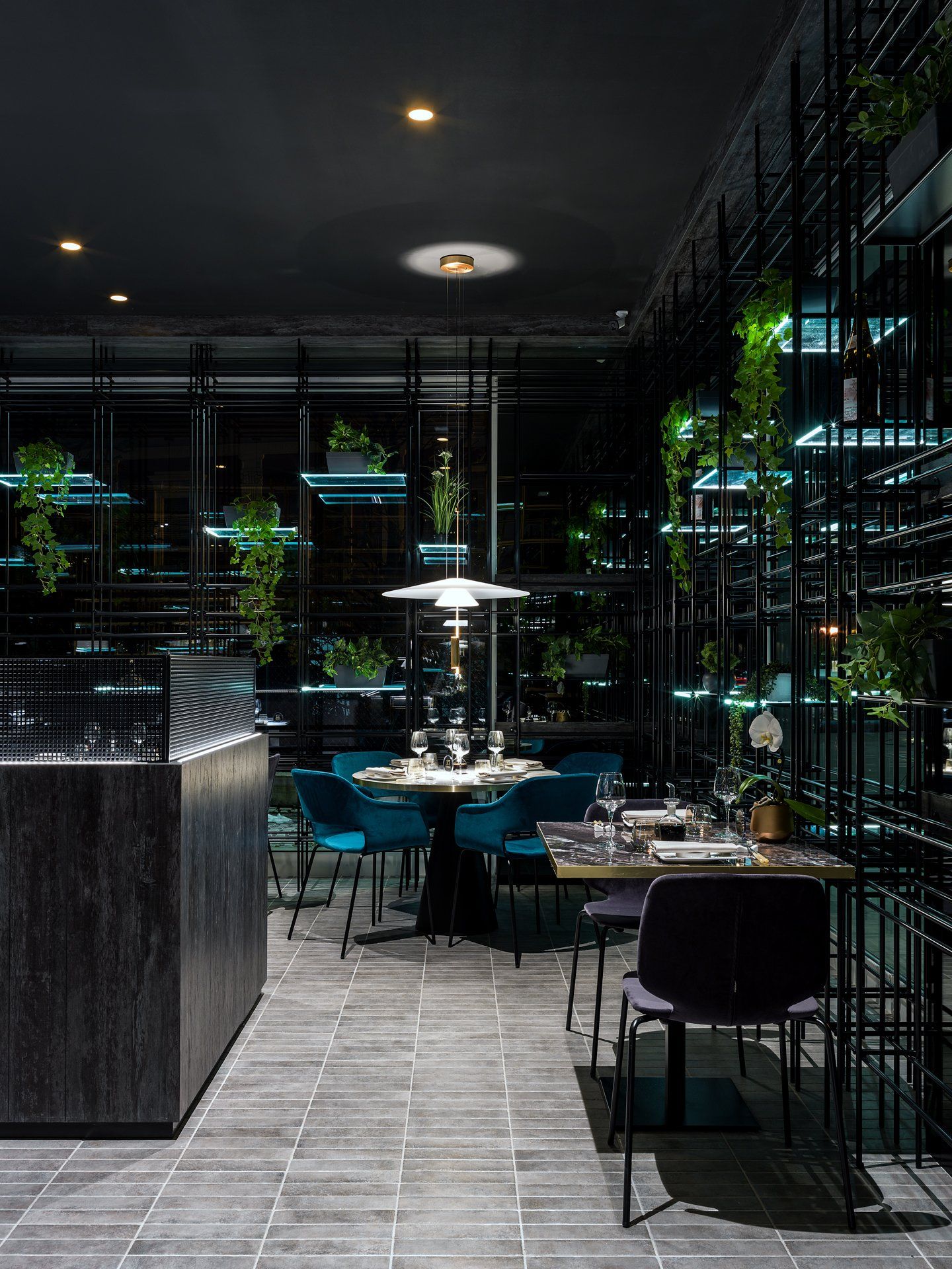
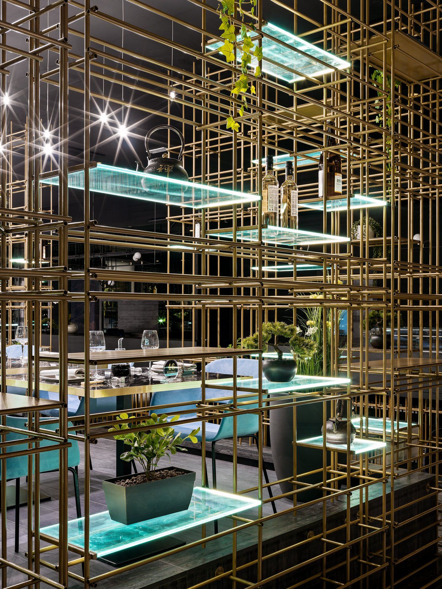
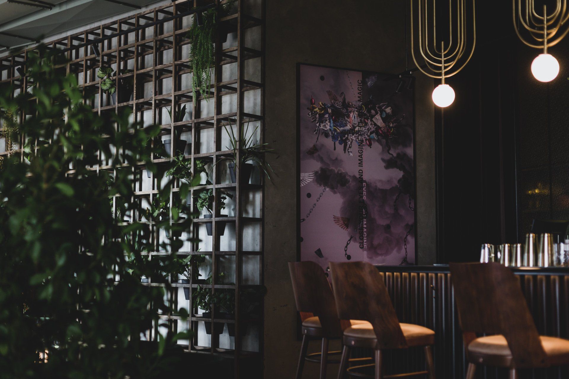
Inspired by the Japanese culture and style, Fabio Gianoli designed the interiors by a strong character but at the same time with important details. The restaurant is highlighted by a scenic perimeter cage in iron tubes to which were added bright shelves with resting of the sagging green plants and various objects in oriental style, all amplified by the mirror coatings of the walls that give even more depth and breadth.
Address: Via Nazionale, 130, 23823 - Colico, Italy
10.
Ramona by Studio Modijefsky/ Amsterdam, the Netherlands
The interior references the tradition of classic bars with plenty of dark wood, stained glass, protective wall panelling, and mirror finishes; all reinvented with a much younger attitude. This unusual combination results in a bohemian space, where bold details and unexpectedly layered materials create an eccentric vibe in its own right. Features of the existing architecture have been embraced, inspiring and adding a quirky edge to the new design. The geometrical pattern found in the original stained-glass top windows has been used as inspiration for the sculptural shape of the bar, built out of beige travertine block, white terrazzo tiles and different coloured bricks. Another fragment of the same shape is then repeated again, this time turning into a bespoke steel & coloured-glass wall cabinet, hanging above the back bar. The ceiling is graphically divided, using the building’s structure as guidelines, into a grid of acoustic panels, framed by linear lightboxes. The latter emit a diffused warm light, shining through old fashioned yellow figure glass, creating an inviting and cosy atmosphere.
Address: Sint Jansstraat 33 - Amsterdam, the Netherlands
11.
Secret Room by Studio Paolo Ferrari / Dubai, UAE
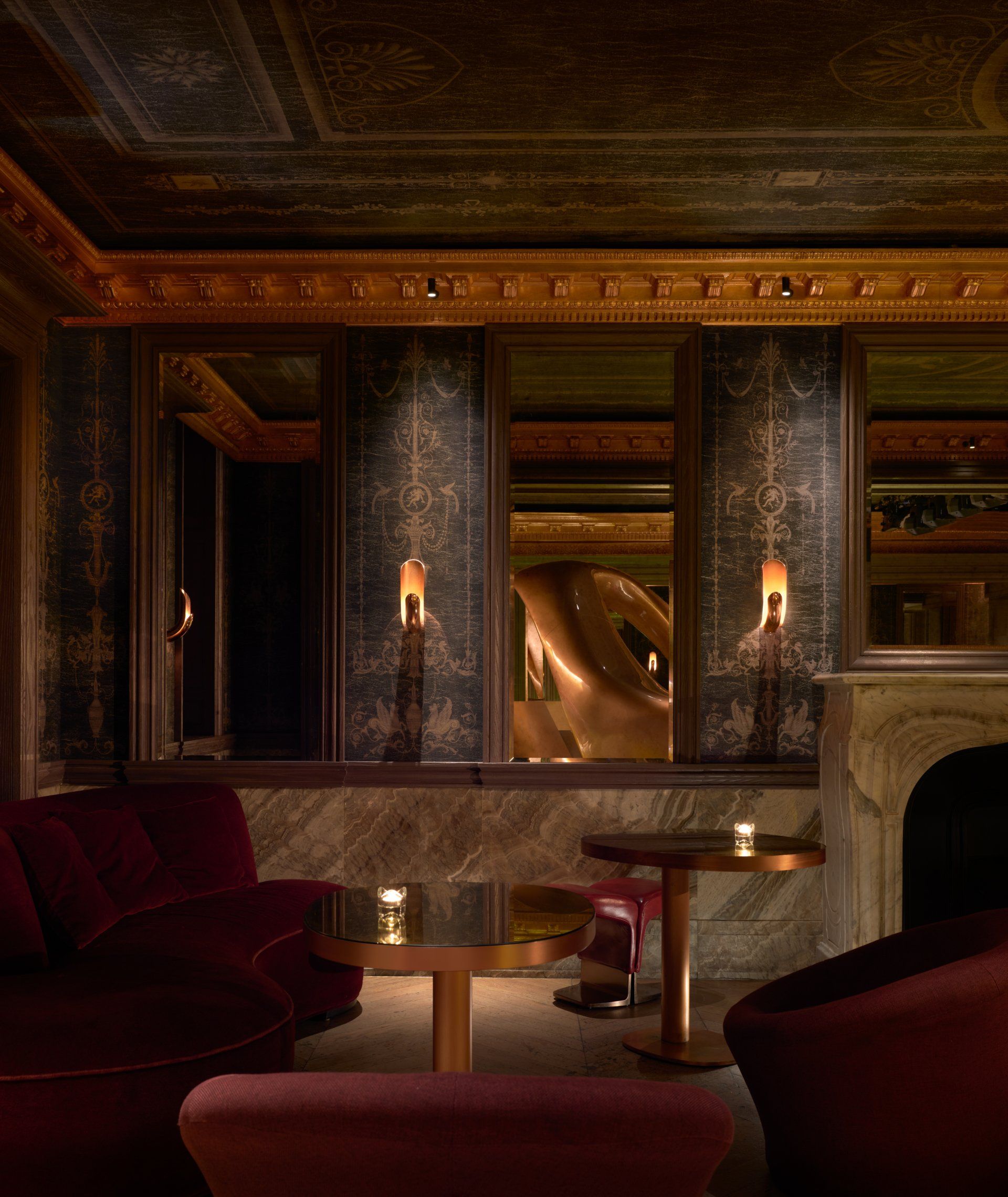
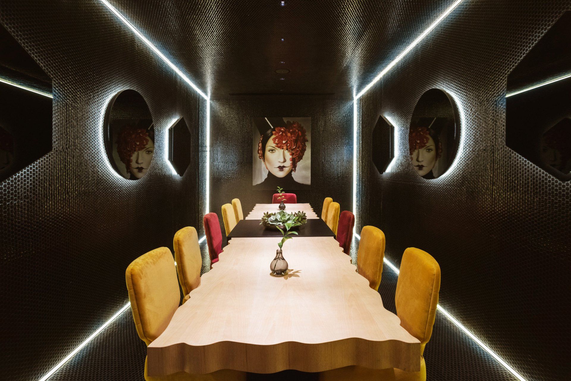
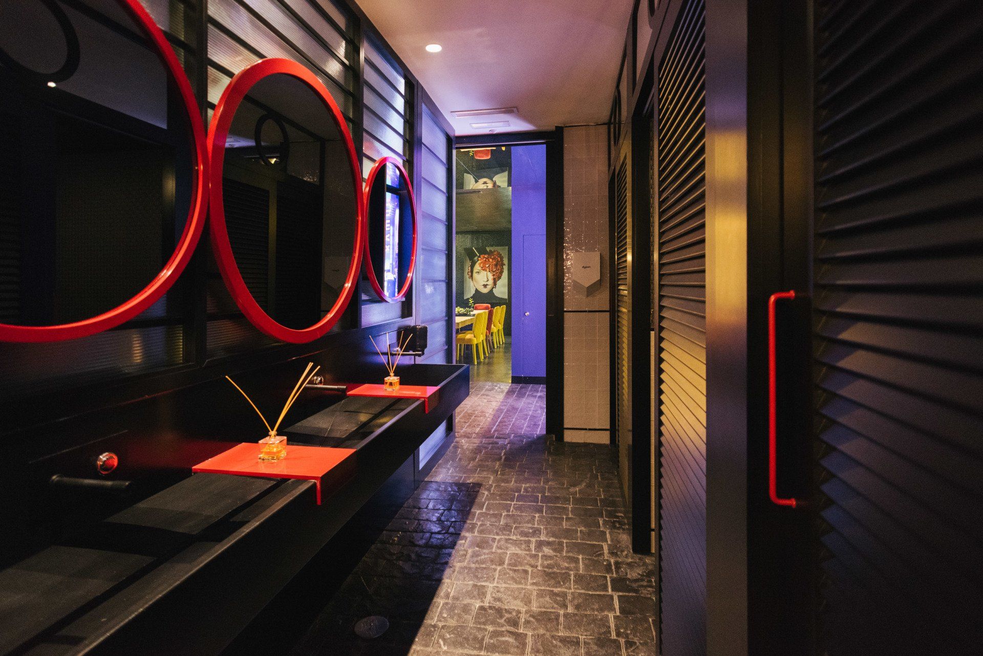
Hidden through an underground passage of the Five Palm Jumeirah hotel, the Secret Room is a destination that embodies the unexpected. Its complex design threads together aesthetic elements of both past and future, creating a surreal space that feels at once exuberant, artistic and unconventional.
Address: No. 1 Palm Jumeirah - Dubai, UAE
12.
Chin Chin by JK Lab Architects / Zaporizhia, Ukraine
The highlight of the project was the facade arches that have been extended with arched mirrors above the bar. A bar counter is located along a long wall. The design above the bar is designed for seasonal flowers and herbs, as well as thematic decoration for various holidays. The floor is covered by thousands of pieces of broken black tiles, which were laid out like a mosaic.The Blueberry Cocktail color was chosen as the shade of the walls to give the feeling of layers of a cocktail.
Address: Shevchenka Blvd 24 - Zaporizhia, Ukraine
13.
Atlantic Seaboard Restaurant by OKHA Studio / Cape Town, South Africa
This contemporary fusion restaurant draws inspiration from the bold and graphic language of Turkish and Moorish design as well as a taught Eurocentric classicism. These diverse and opposing aesthetics come together to create a balanced and synergetic fusion. The extreme proportions of the Neolith clad bar and its minimalist design, give the restaurant a dramatic and somewhat theatrical tone. The Bar display utilizes dark stained, slatted timber sliding panels and LED strip lighting to accentuate the horizontal perspective. The monochromatic, graphic geometry of the Moroccan tiles is echoed in the over-sized herringbone parquet flooring. Diagonal slats of differing stains create large abstract gestures across the floor area. The bold
use of colour showcases both the black and white graphics and the bespoke furniture custom designed for the restaurant.
Address: 157 Victoria Wharf - Cape Town, South Africa
14.
Bonnie by Studio Modijefsky / Amsterdam, the Netherlands
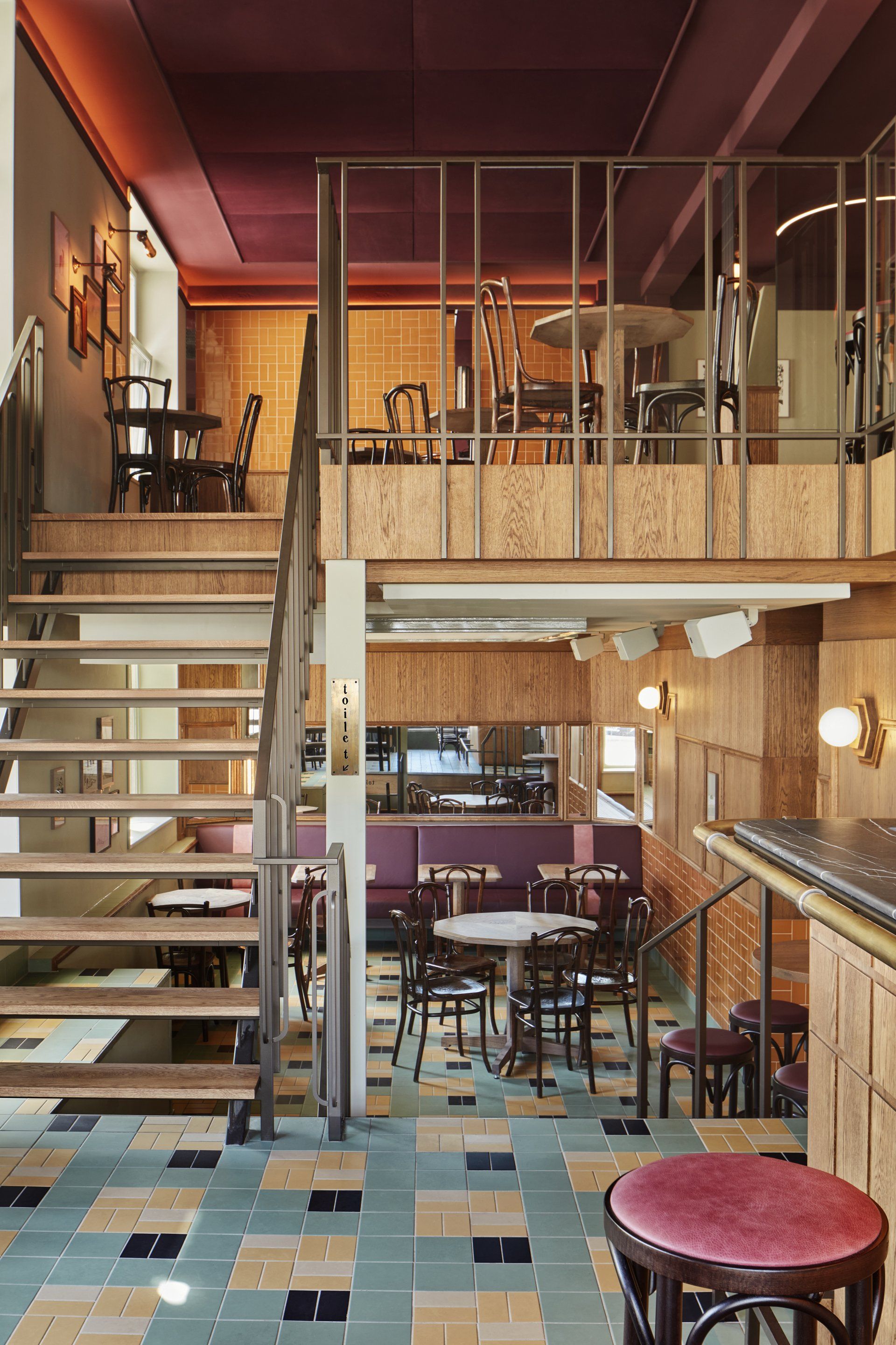
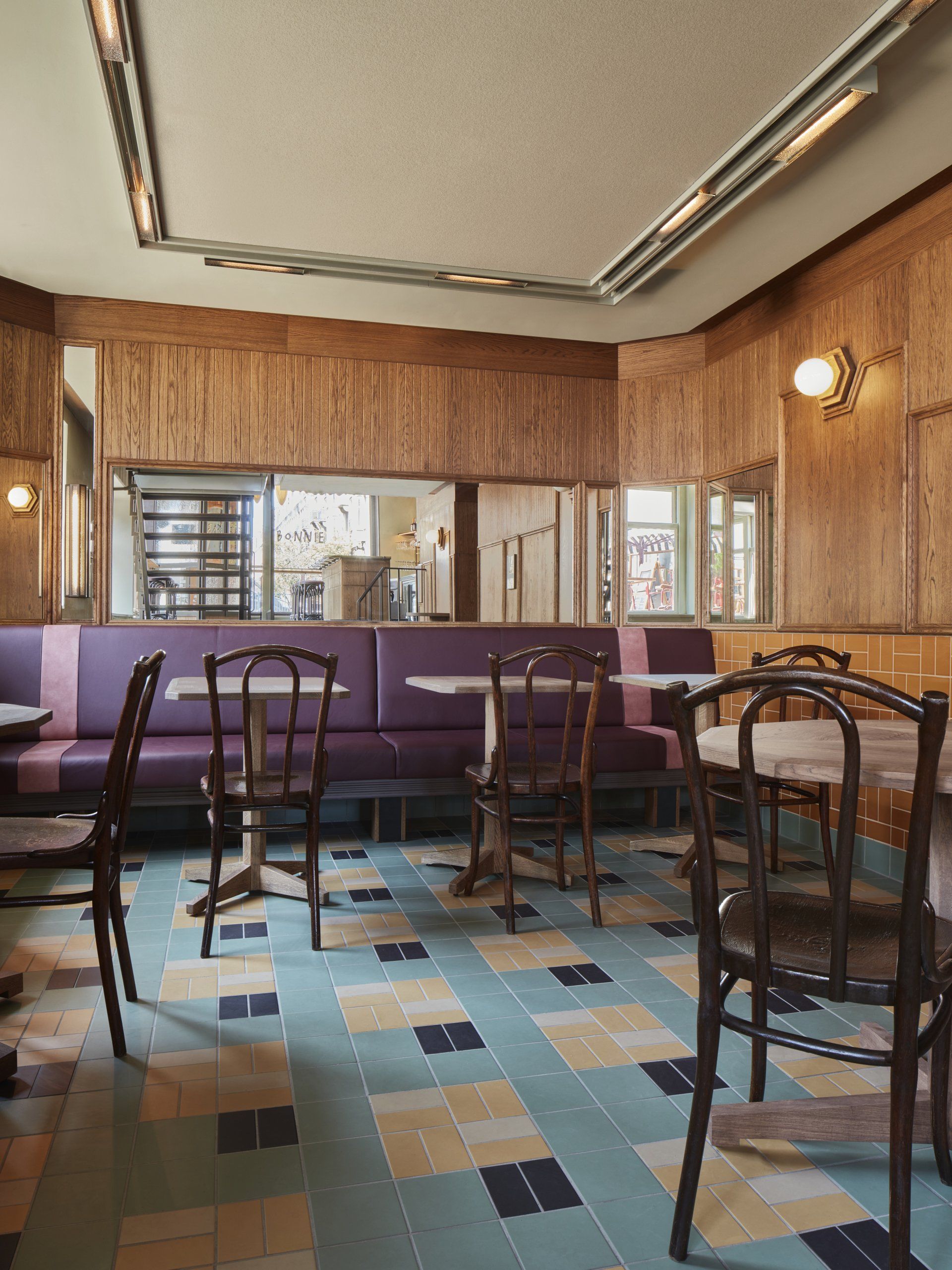
Studio Modijefsky has designed a finest, traditional bistro bar with all its quintessential elements: mirrors, classic tiles, old fashioned wood and neon lights. The venue is divided into three distinct areas, located on different floor levels. The main bar, placed directly by the entrance, gives the space a welcoming vibe. A simple, symmetrical pattern carved in oak on the front of the bar has been inspired by the wooden panelling of the previous, original counter. Materials such as purple red marble with strongly articulated veins, combined with strokes of mirror, oak wood and warm grey marble add a contemporary touch to the space. The eye-catching back bar repeats the curves of the window frames, with glossy dark purple tiles and coral coloured neon light arching over the illuminated bar name: Bonnie. Creating a strong connection between the levels, wooden stairs with a refined geometrical, bronze-coloured steel railing lead down to the souterrain and up to the mezzanine. Designed to be a continuity of the bar area, the souterrain floor is covered with the same square patterned tiles in muted hues of yellow, green, white and black, forming a striking traditional pattern. Wooden panelling with linear strokes covers the walls, interrupted by mirror panels, orange tiles and hexagonal wall lights, which beautifully blend in and dictate the shape of the hand-crafted wainscoting border.
Address: Amstelveenseweg 226HS, 1076 - Amsterdam, the Netherlands
15.
Noi by Ilmiodesign / Madrid, Spain
The key inspiration when developing the project was 'Italianness': from the use of colours and materials to the iconography. The colour palette harmoniously fuses terracotta tones, reds and greens, typical of the country and its capital, Rome. Meanwhile, the materials used were ceramic, terrazzo and concrete lattices, reflecting Italian architecture of the 70s.
Address: Calle de Recoletos 6, 28001 - Madrid, Spain
16.
Amedeo Restaurant by MODO / Livorno, Italy
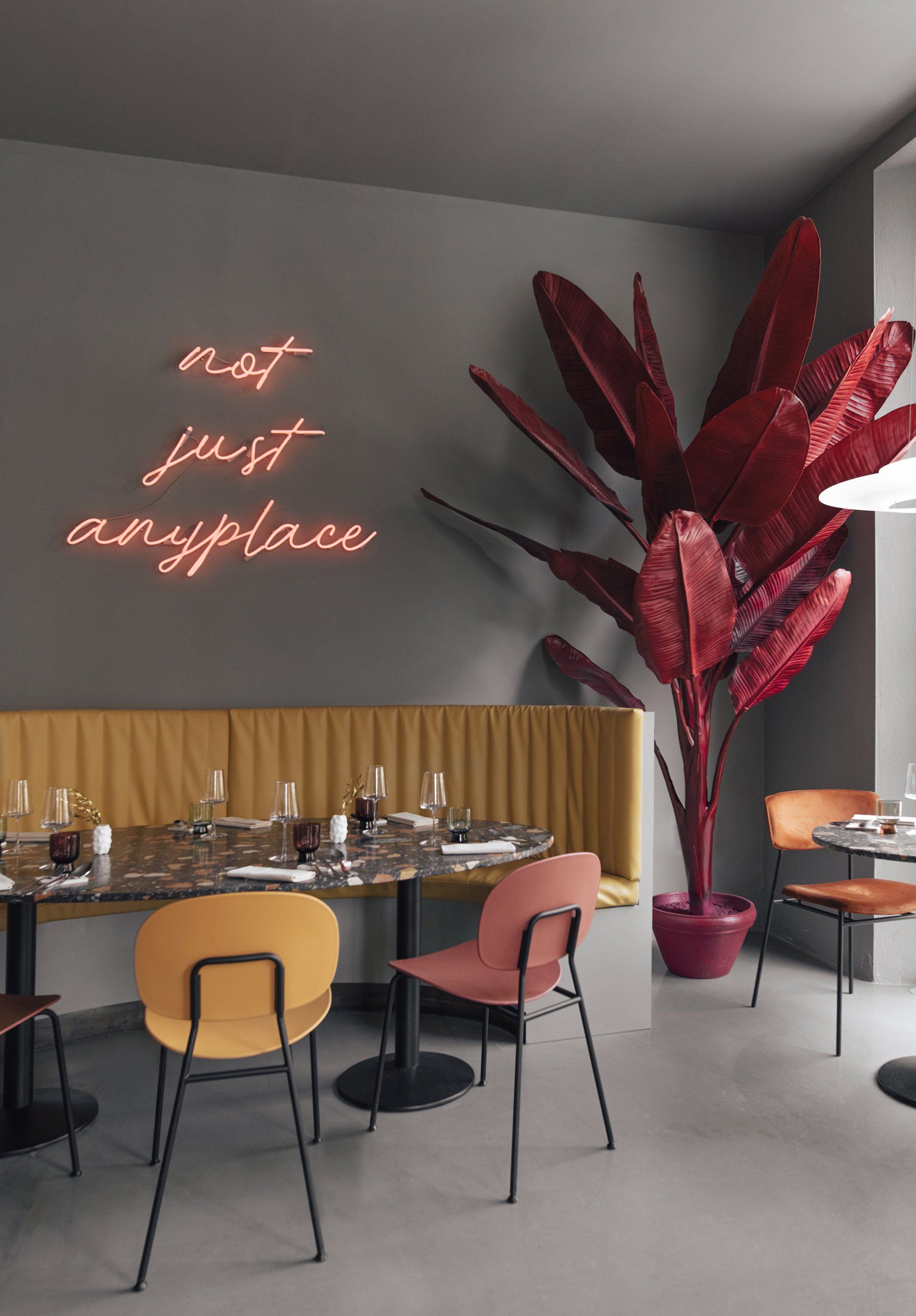
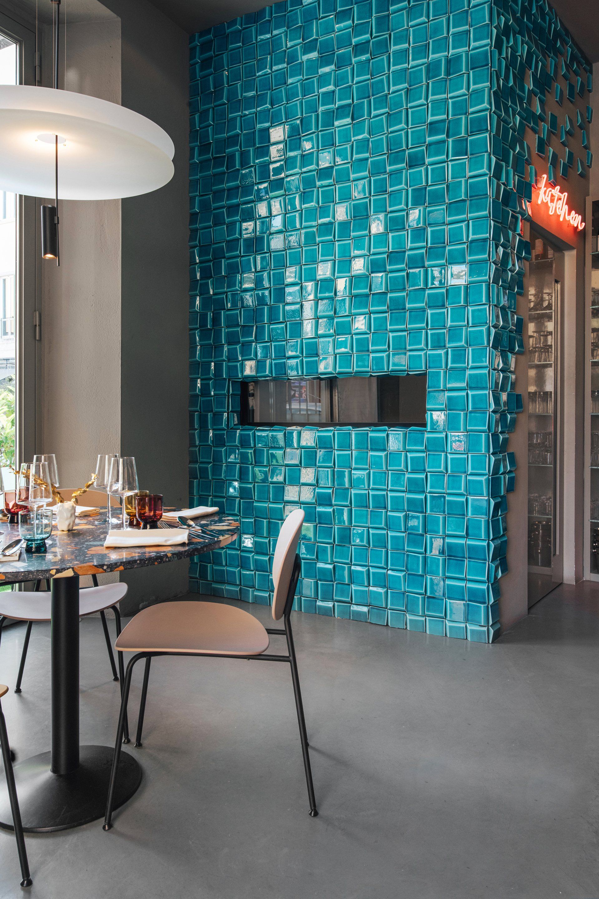
Amedeo is divided mainly into two indoor rooms connected by a corridor. In the first room the large suspension lamp is protagonist, with strong and vibrant colors, inserted in an environment with petrol green walls that highlight its uniqueness. Around the lamp develops the whole room with the counter area, enhanced by the 3D tiles from Theia and by the wallpaper by Moooi with the amazing illustration subject the extinct animals of our planet. The large central lamp is accompanied by a series of Vibia lights, with a very minimal design, that give the room elegance and warmth. All the tables and benches have been made using research materials with a strong aesthetic character such as the Marmoreal terrazzo slabs used for the tops. The chairs and stools vividly synthesize the colors of this environment and create a connection with the second room, where the walls are painted of a warm gray, the table tops are still in terrazzo, but with a black base color, creating a chromatic contrast with to the first room. The larger table, with a mustard colored leather bench, is illuminated by an eccentric pink neon with the restaurant's motto: “not just anyplace”, framed by two artificial dark red banana plants by Pols Potten. In this room, the kitchen cube stands out, covered with the same 3D tiles as the bar-counter in the first room. The visual effect of these tiles make it almost look like scales featured by a deep petrol color.
Address: Via Enrico Mayer 52 - Livorno, Italy
17.
The Gallery at sketch by India Mahdavi / London, UK
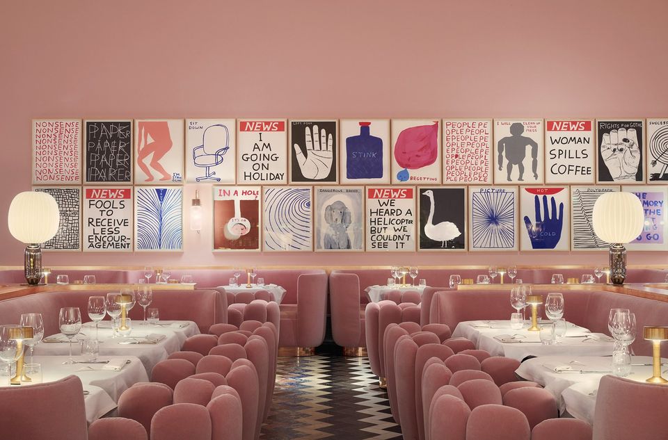
India Mahdavi has created a soothing and monochrome interior. With benched seating lining the walls and tailored ‘Charlotte’ armchairs, the designers has soaked the place in an audacious Hollywood pink to modernise the archetype of the brasserie. While, on the request, the flooring realised by Martin Creed has been preserved. The walls are wrapped by a limited-edition selection of 250 ceramic tableware created by illustrator David Shrigley and made by the british ceramicist Caverswall, which give a rawer touch to the ambiance.
Address: 9 Conduit St, Mayfair, W1S 2XG - London, UK
18.
Marco Restaurant by FMJPC / Lisbon, Portugal
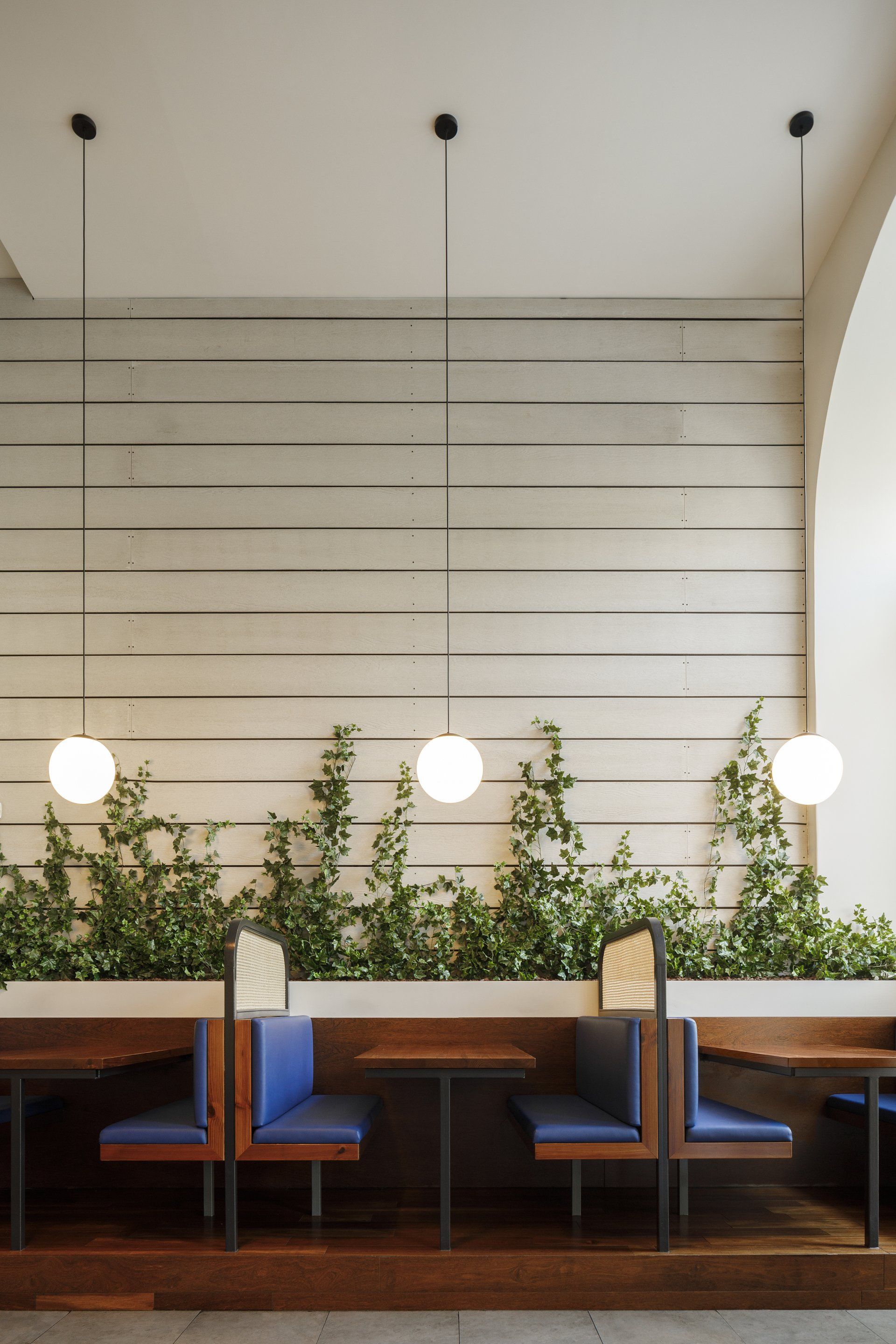
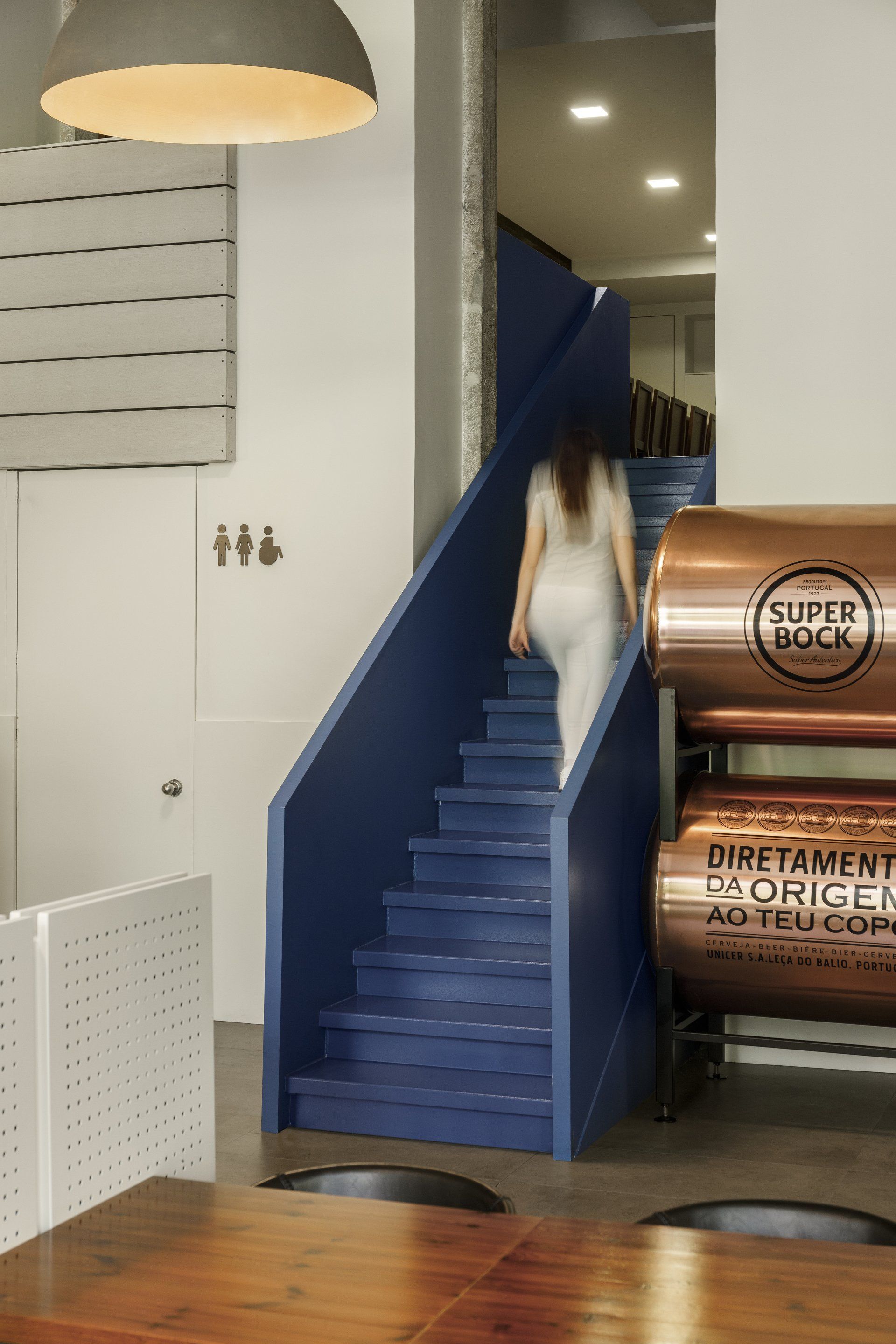
FMJPC have created the interiors with a simple and affordable design, retaining the distinctive existing features of the old local, like the columns, arches, dining table side fixings and the finishes on the walls. On the unique features of the room, it was proposed to use colours from the restaurant brand to create visual contrast and to connect the room. The fabrics, furniture, staircase and the main counter are an example of this use of colour. It was crucial to connect and balance the existing materials, features and colours with the proposed details and furniture. This was achieved by replacing the existing table screens, tables, illumination and seating.
Address: Largo Santos 14D, 1200-808 - Lisbon, Portugal
19.
Italy by PAUM design / Saint Petersburg, Russia
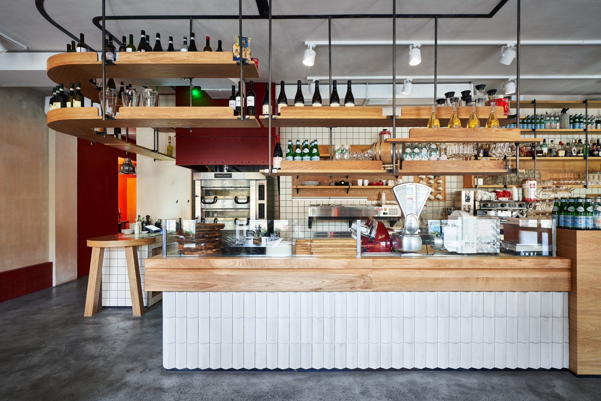
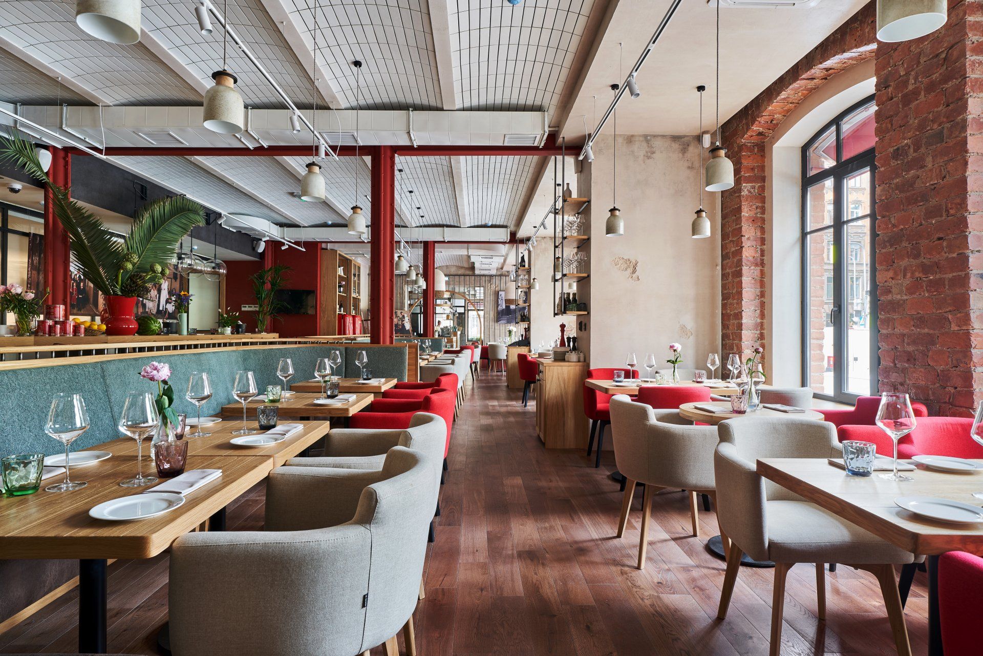
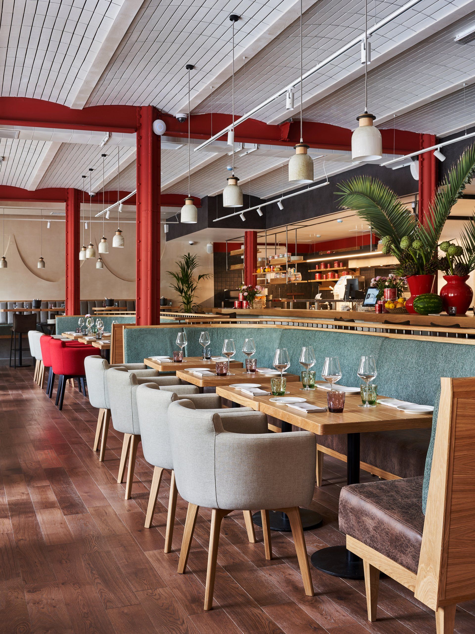
The interior is inspired by the motives of modern Italy, the street elements of the exterior, the special feeling of the mixture of eras that we enjoy just by walking, for example, in Milan. The ceilings are finished with facade tiles, they are supported by centennial metal structures. Author's glass and ceramic lamps complement and decorate the upper level. All furniture and accessories in the restaurant were created according to the design project - it is maintained in one direction, carries a light shade of vintage, remaining quite complex and sophisticated. But the key point of Italy is the fully open kitchen, separated from the guests by an extended contact counter, enveloping two cast-iron columns and turning smoothly into a four-meter communal table.
Address: Vilenskiy prospekt 15 - Saint Petersburg, Russia
20.
Bosfor by AD Project Dorohov Architects / Rostov-on-Don, Russia
Bosfor Turkish restaurant is a fusion of Asia and Europe. Every detail is important for the atmosphere and the correct perception of the space. Each floor is a separate story with its own flavor and sophistication of the interior. The spirit of oriental culture on the 1st floor is expressed in details - arched structures, natural stone and smooth lines in a modern interpretation. The open rooftop bar is the highlight of the interior, reflecting Turkish character in a modern twist. The bar counter with a low seating position for guests is also a bright dominant. Above the bar is a composition of hanging greenery. During the day, it is lit with natural light, through a hatch located between two laconic volumes, neon softly shines at night, emphasizing the atmosphere of the lounge.
Address: Ulitsa Maksima Gor'kogo 213, 344000 - Rostov-on-Don, Rostov Oblast, Russia
21.
Humble Pizza by Child Studio / London, UK
The vibrant space is clad in wall-to-wall candy pink Formica, which continues along counter fronts and across tables tops. The rhythmic pattern is highlighted with cherry wood framing each laminate panel. Other subtle winks to the past include mosaic tiled flooring, cherry wood shelving and neon signage. The cafe is accessorised with the classic mid-century lighting pieces by European designers Poul Henningsen, Jacques Biny and Luigi Massoni.
Address: 342 King's Rd, SW3 5UR - London, UK
22.
BAY by Rabih Geha Architects / Beirut, Lebanon
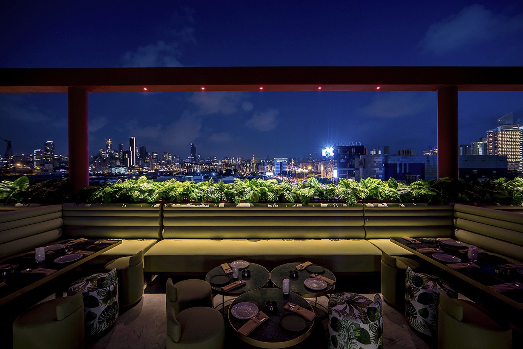
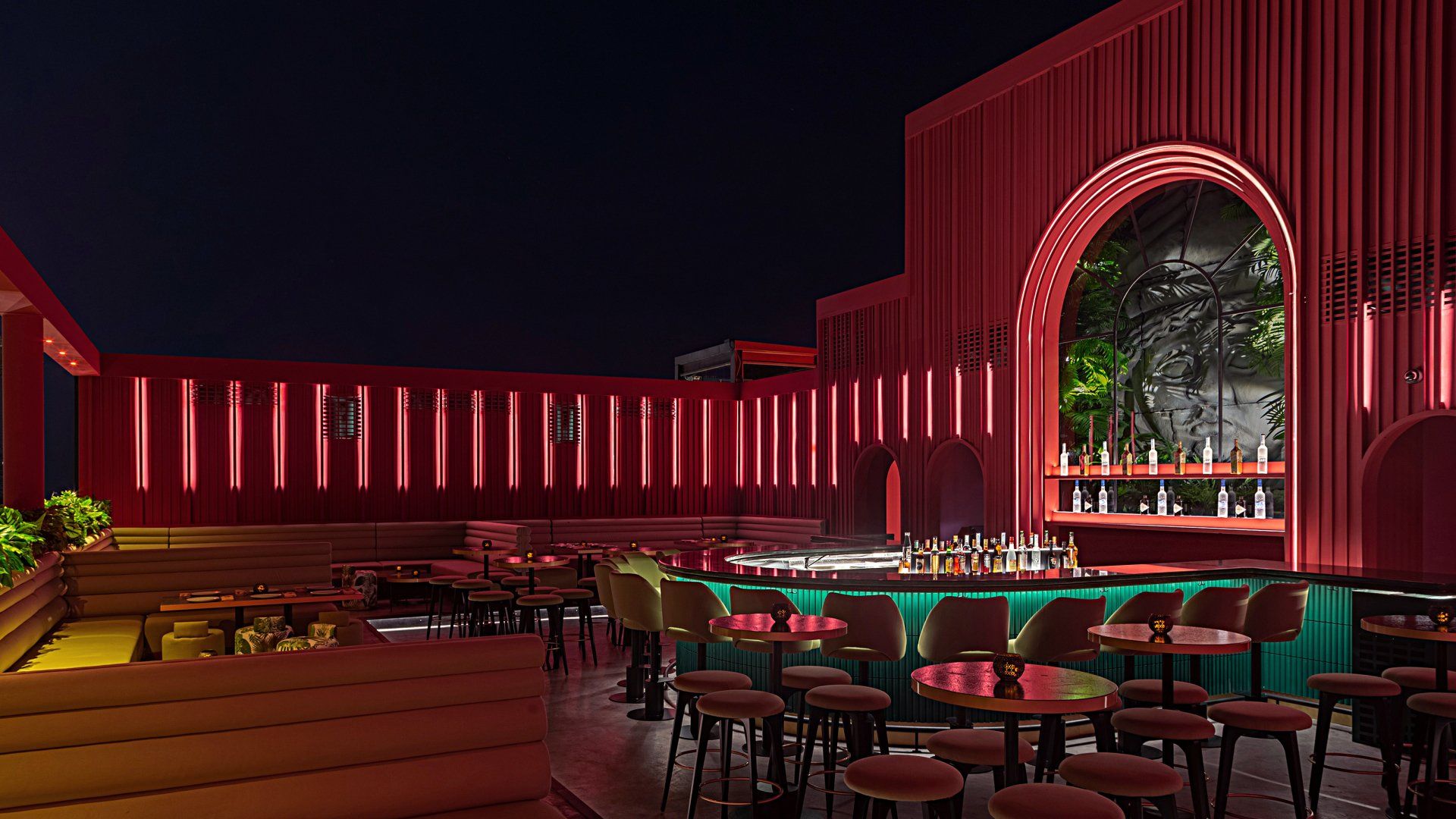
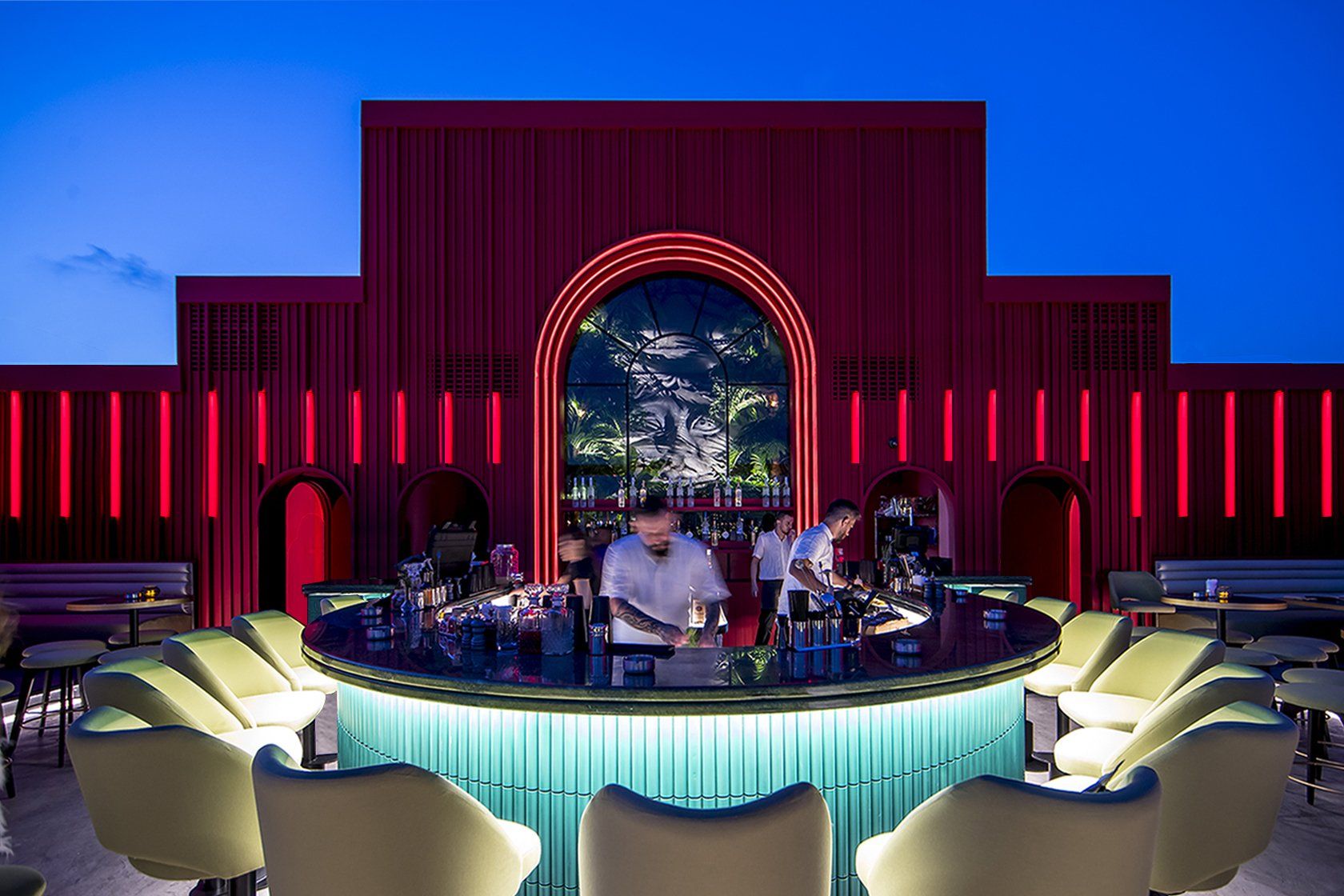
Inspired by the Mesopotamian goddess of healing Bau, Rabih Geha Architects have created a rooftop in waterfront Beirut, based upon Asian temples and their monumental presence and hierarchy, framing the city’s spectacular skyline. Characterised by high walls, repetition, symmetry and rhythm, Rabih Geha Architects have used many different textures, vivacious colours and a continuity between the indoor and outdoor spaces typical to their innovative design process. Drawing from a colour palette of natural greens and strong vermillion reds, signifying happiness and joy, these colours are aligned with harmony that are then juxtaposed against monochromatic flooring. The main area has an envelope of red alluding to fire and symbolizing good fortune. Natural greens, associated with health, prosperity, and harmony, are introduced in the main space while interspersed yellows, linked closely to the earth, signify neutrality and good fortune. Moving to the bar, guests encounter green metal tubes resembling the bamboo columns found in Asian temples, with brushed brass skirting and a Verde Guatemala marble bar surface. An arch at the back of the bar is adorned with a sculpture of BAU herself, covered with plants forming a jungle and closed with translucent black glass.
Address: Bloc market, Waterfront - Beirut, Lebanon
23.
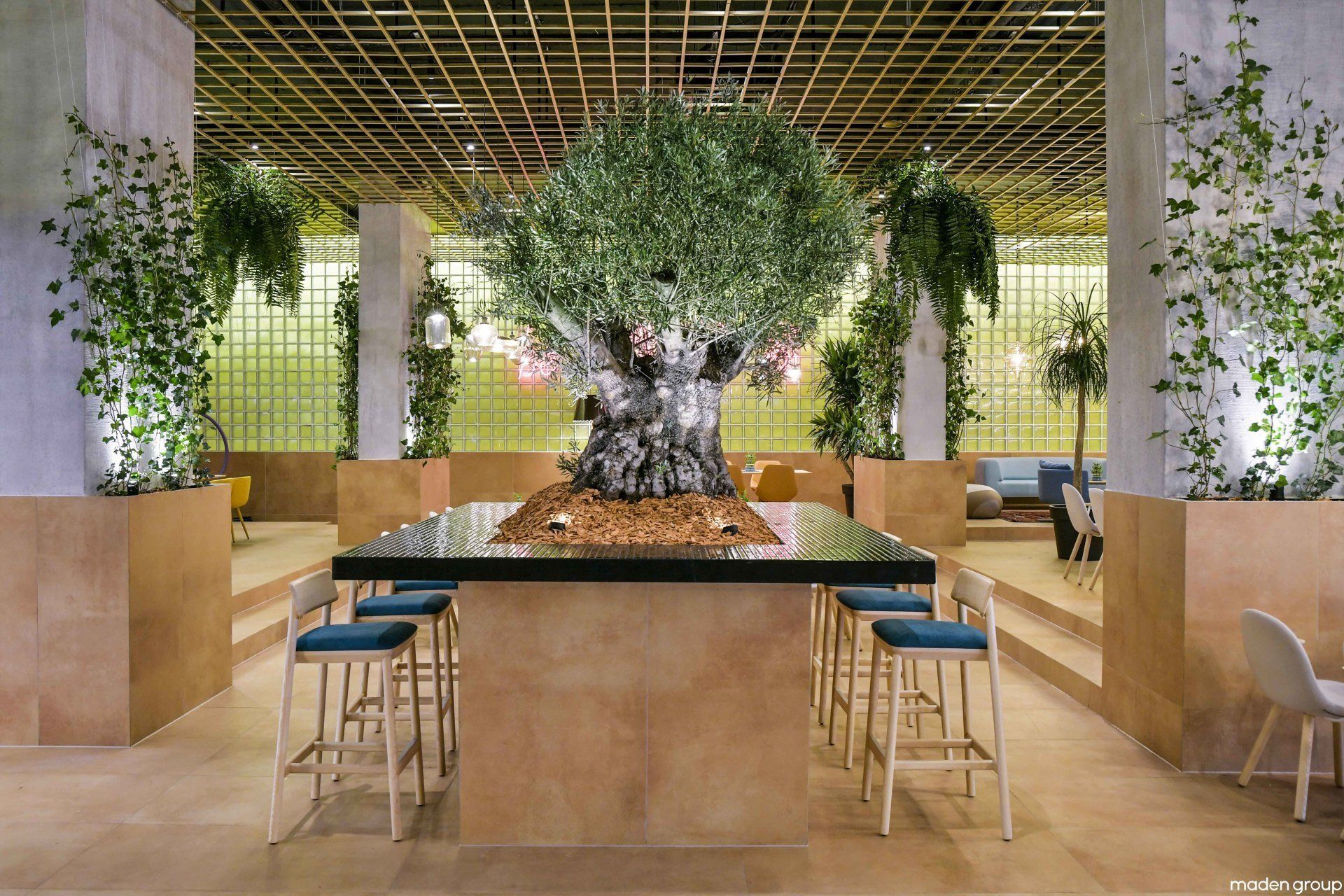
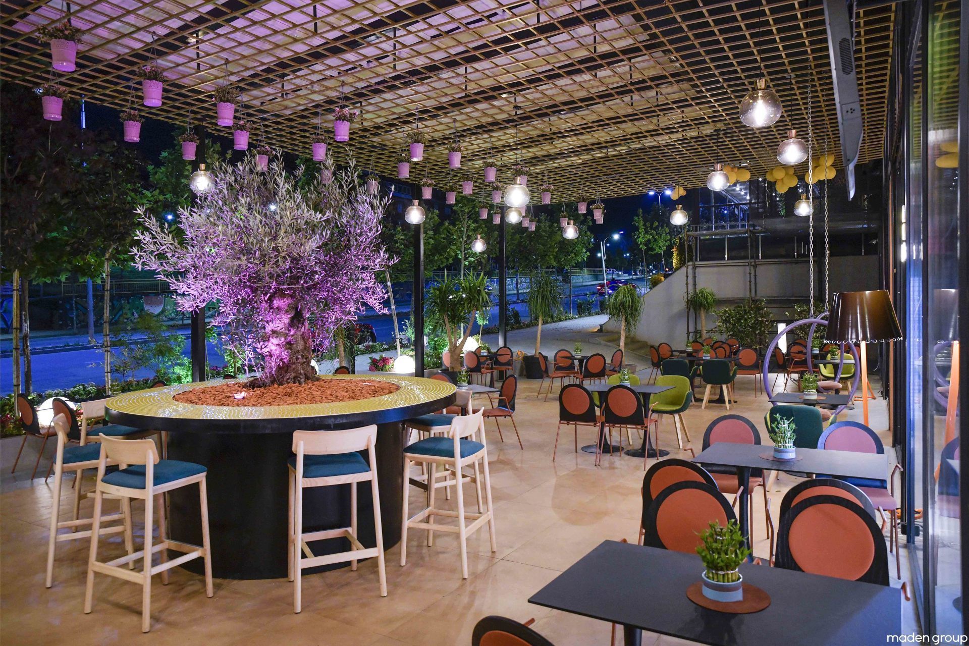
HEB’S by Maden Group / Prishtina, Kosovo
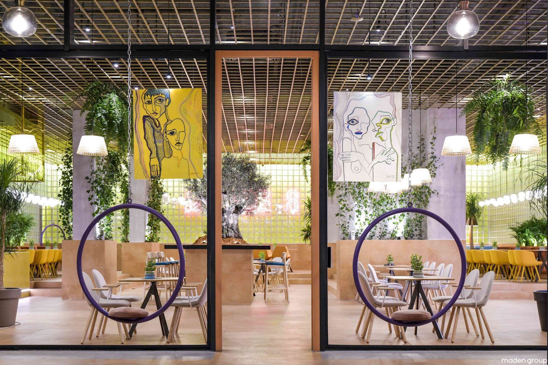
The designers used glass blocks for the walls, in this way the restaurant is always look like spring. Also the greenery colour in itself creates a connection between the interior and exterior space, as well as illuminates the entire design making it comfortable and natural. Light and metallic sheets perforated from the ceiling create a dynamic play of light and shade and add charm to the space during daylight hours as well as late evenings. Hebs has also found support in artistic works which are scattered in space by the artist Fitore Berisha.
Address: Prishtina, Kosovo
24.
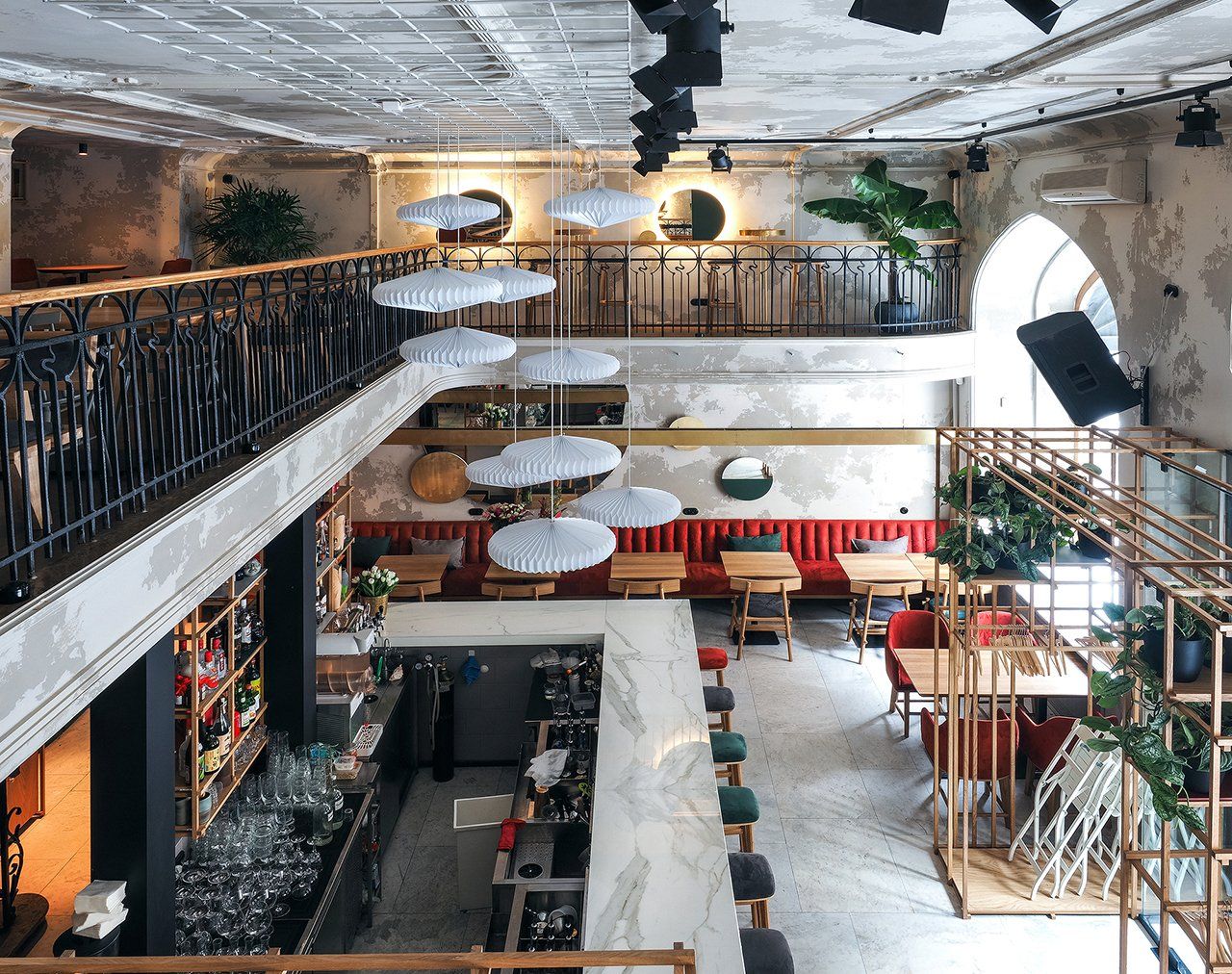
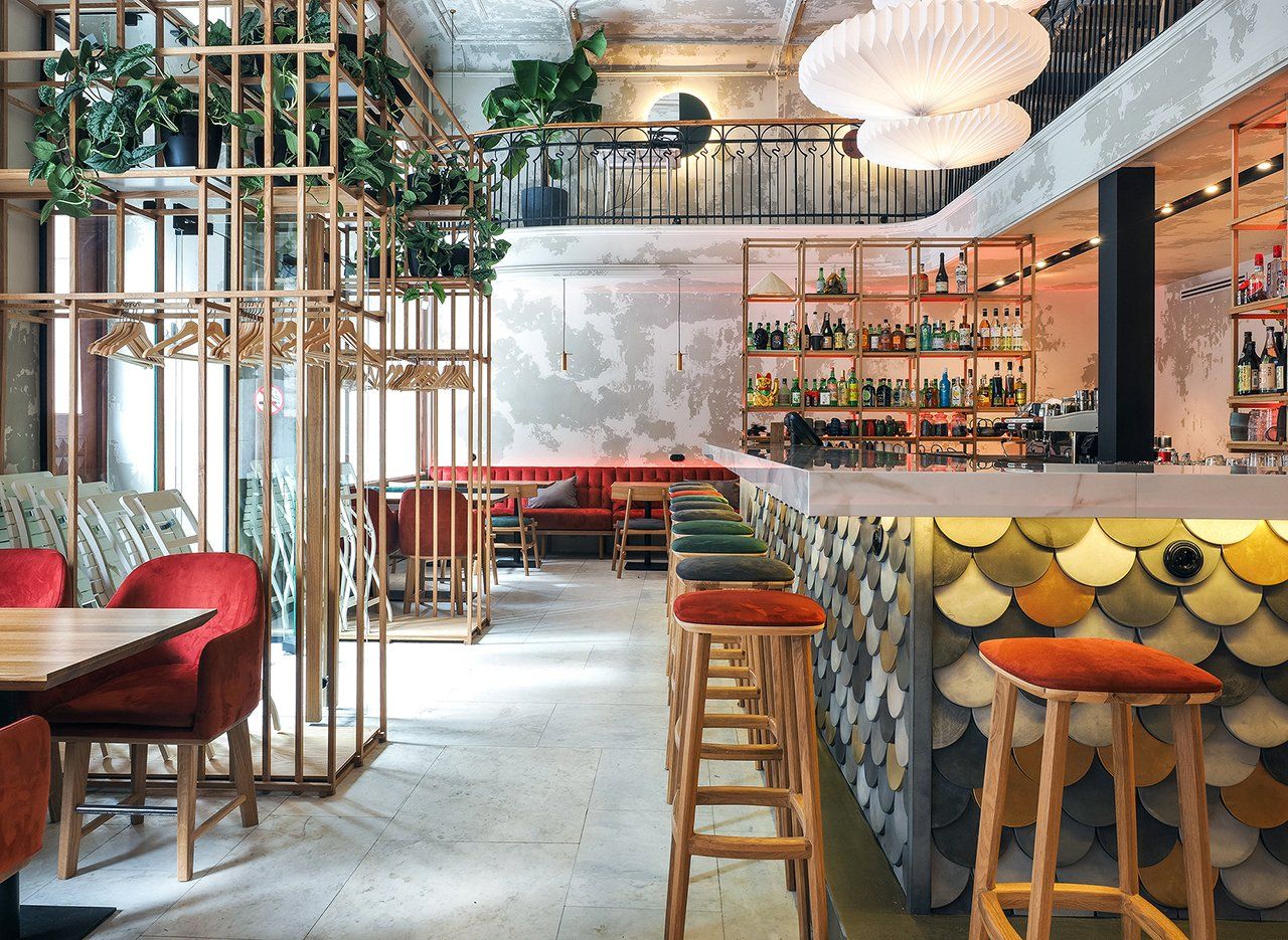
Made in China by DA bureau / Saint Petersburg, Russia
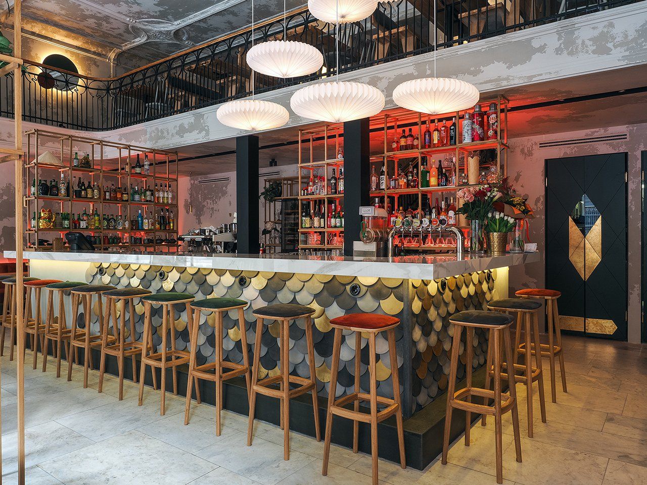
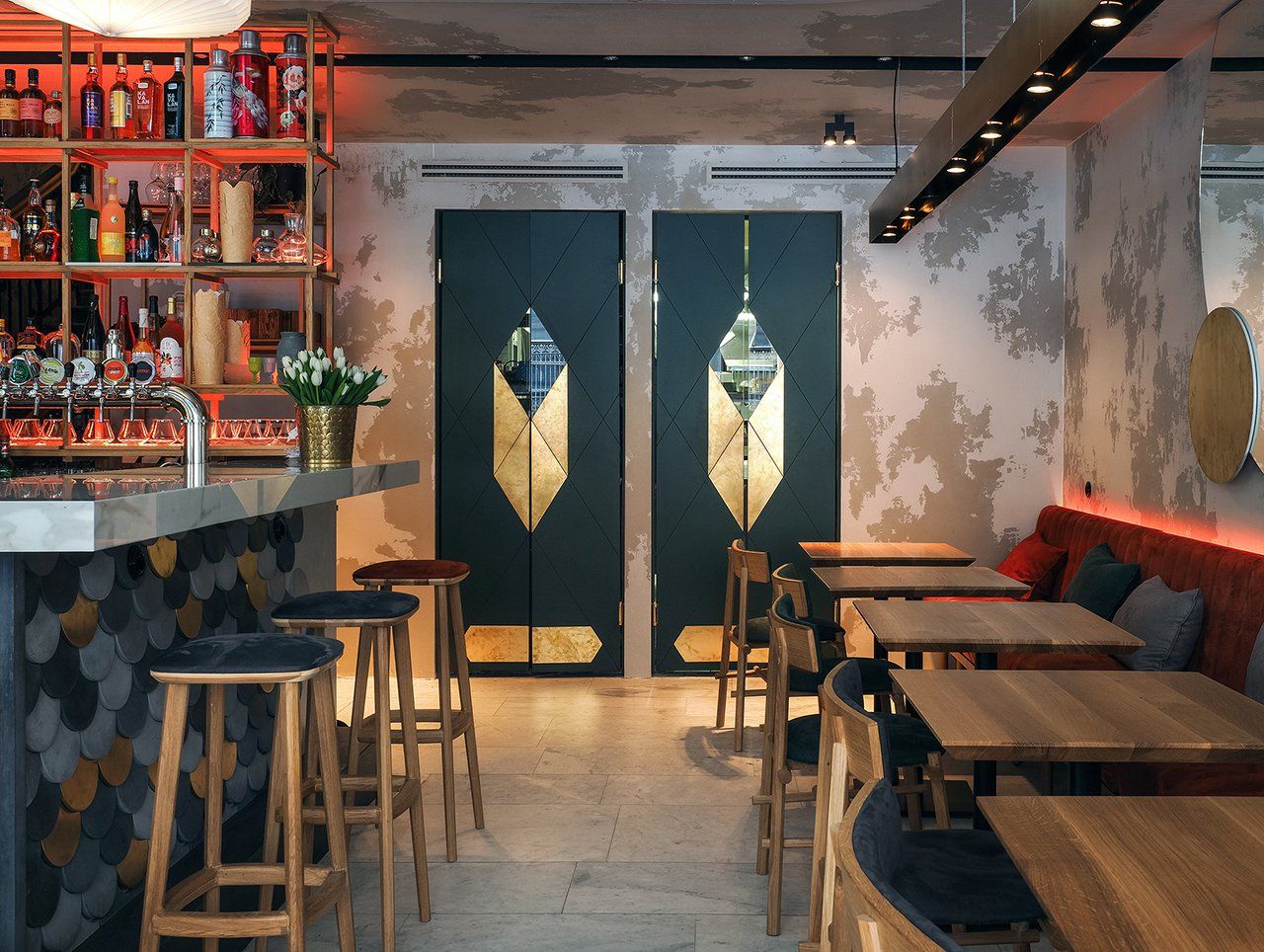
Made in China is a modern Asian cafe that emphasizes the authenticity and historical heritage of the premise. The bar, which is located in the center of the space and meets all the guests entering Made in China, immediately creates a comfortable atmosphere and is the compositional center of the whole space. While the center of the hall is the focal point of interest and the main visual attraction. Stressing the fact that the cafe is Asian, DA bureau tried to avoid direct associations, but at the same time a visitor is able to identify the style with the cuisine of the place at the first sight. Therefore, almost all the details of the interior refer to some Asian motifs, from red velvet to the neon signs in the windows. Light lamps above the bar resemble Chinese lanterns and create a visual connection between the first and second tiers. All racks and shelves are made of overlapping wooden bars resembling typical Asian architectural constructions. The concrete tiles used as the finishing material in the bar resemble fish scales.
Address: Bol'shaya Morskaya Ulitsa, 35, 190000 - Saint Petersburg, Russia
25.
Barca's by Fabio Fantolino / Turin, Italy
With its large windows the restaurant is on three floors, strongly characterized by a design that puts the ground floor and the first floor in close connection: the white of the walls and objects is interrupted and tied by the insertion of a blue wallpaper framed by American walnut profiles. Furniture concur to create a warm and relaxing atmosphere: the custom‐designed lights made from chromed cylindrical profiles, the tables, made with different colored laminates and the Alivar chairs in Alcantara, evoke the elegant design of the 70's. Particular attention has been paid to the fabrics of the sofas and chairs. The sea‐blue velvet, the green of the dry herringbone cotton and the hazelnut‐colored alcantara cover the seats of the three levels and, alternating, they warm up the atmosphere of the room.
Address: Corso Vittorio Emanuele II, 24, bis, 10123 - Turin, Italy
26.
Cake and Breakfast by Hotels Only / Saint Petersburg, Russia
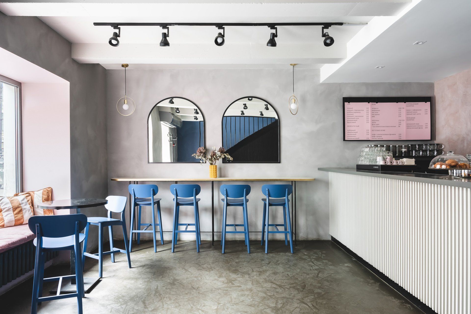
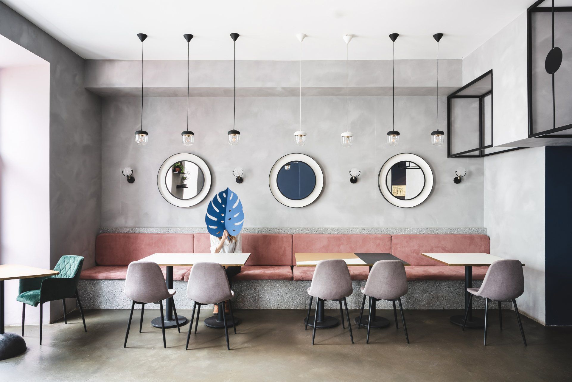
To preserve the interior contrast was the main wish of the customers, so the designers combined cute details, pink color and brutality of concrete. There is a bar counter for takeaway orders ont the 1st floor and two rooms for a pleasant breakfast on the 2nd floor. Hotels Only used concise surfaces: concrete, terrazzo, plaster, slatted texture. Details and furniture were made in local workshops: concrete hemispheres, triangular countertops using brass, mirrors with a white backing in the form of a bowl.
Address: Malaya Morskaya Ulitsa, 5, 191186 - Saint Petersburg, Russia
27. Motta Milano 1928 by COLLIDANIELARCHITETTO / Milan, Italy
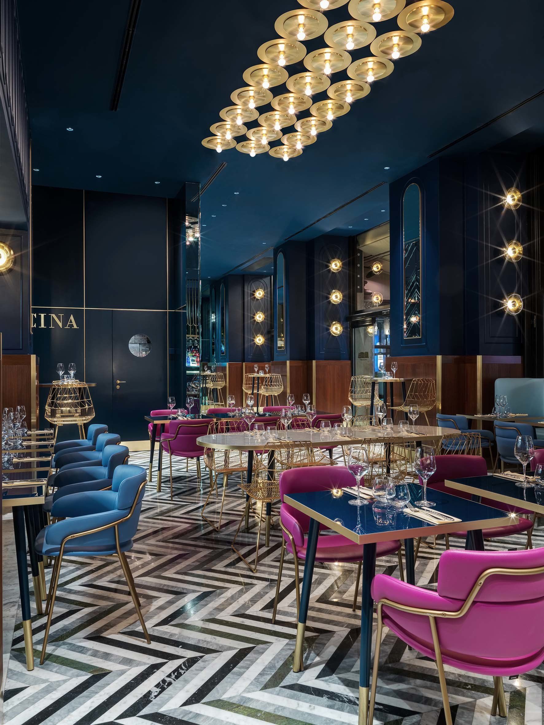
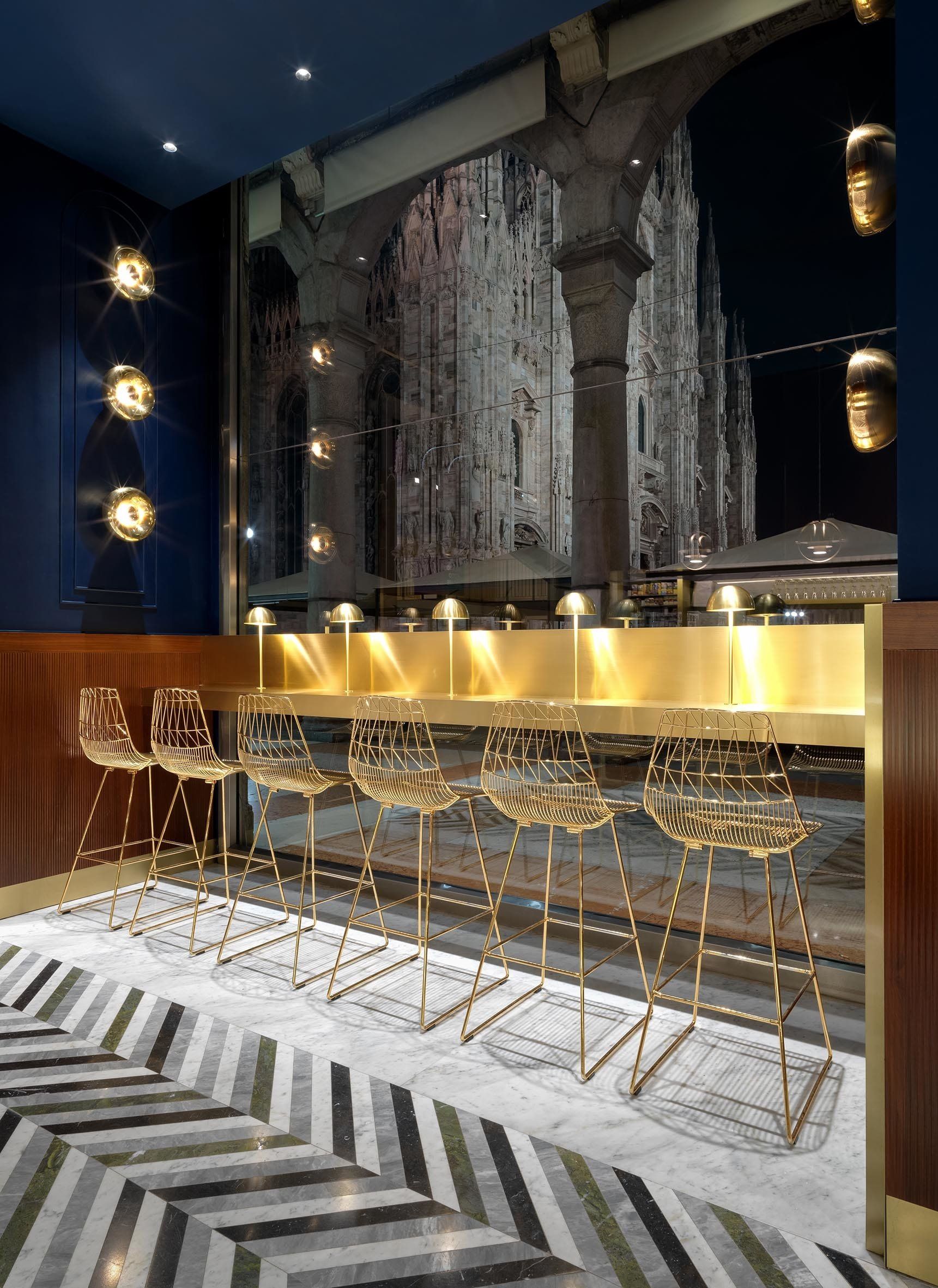
The venue embraces its guests in an inviting atmosphere, through the reinterpretation of the stylistic elements of the past among large surfaces in Canaletto walnut, polychrome marble and sculptural mirrors from which vibrating walls rise, reflecting the beauty of the gallery and echoing the frenetic flow of people. The dynamism of the dismantled geometry of the marble floor, which climbs sculptural walls in mirrors and glass, sets the rhythm of the customer’s journey. Thin lines, inspired by the spiers of the Duomo, generate three-dimensional elements and decorative patterns enhanced by the brand’s color palette, linking Motta to its city, through an elegant mix of local identities, traditional materials and elements of contemporary design.
Address: Vittorio Emanuele II Gallery, at the corner with Piazza Duomo - Milan, Italy
28. Burleigh Pavilion by Alexander & Co / Burleigh Heads, Australia
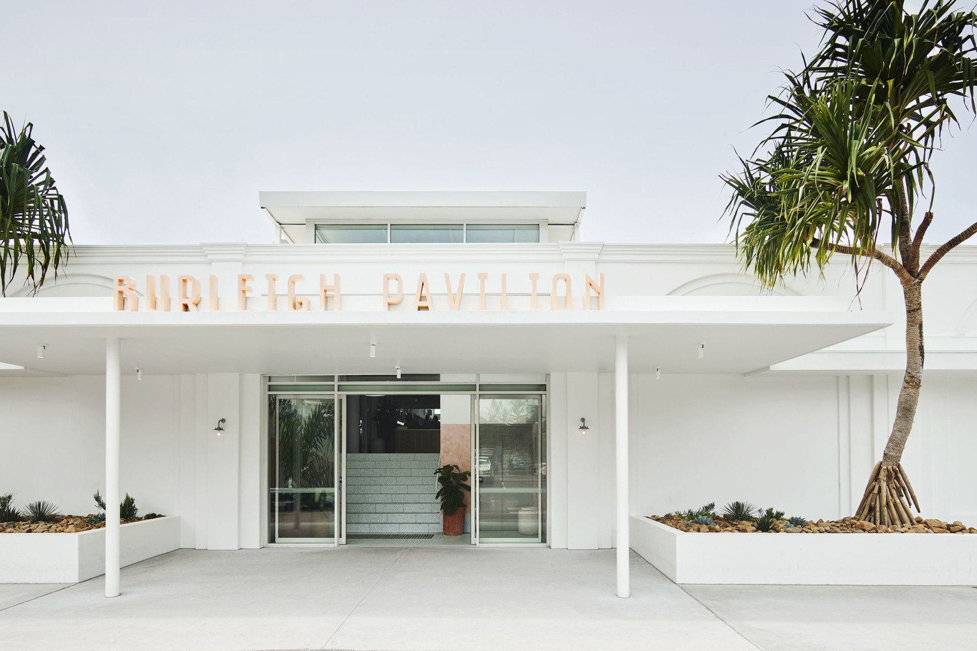
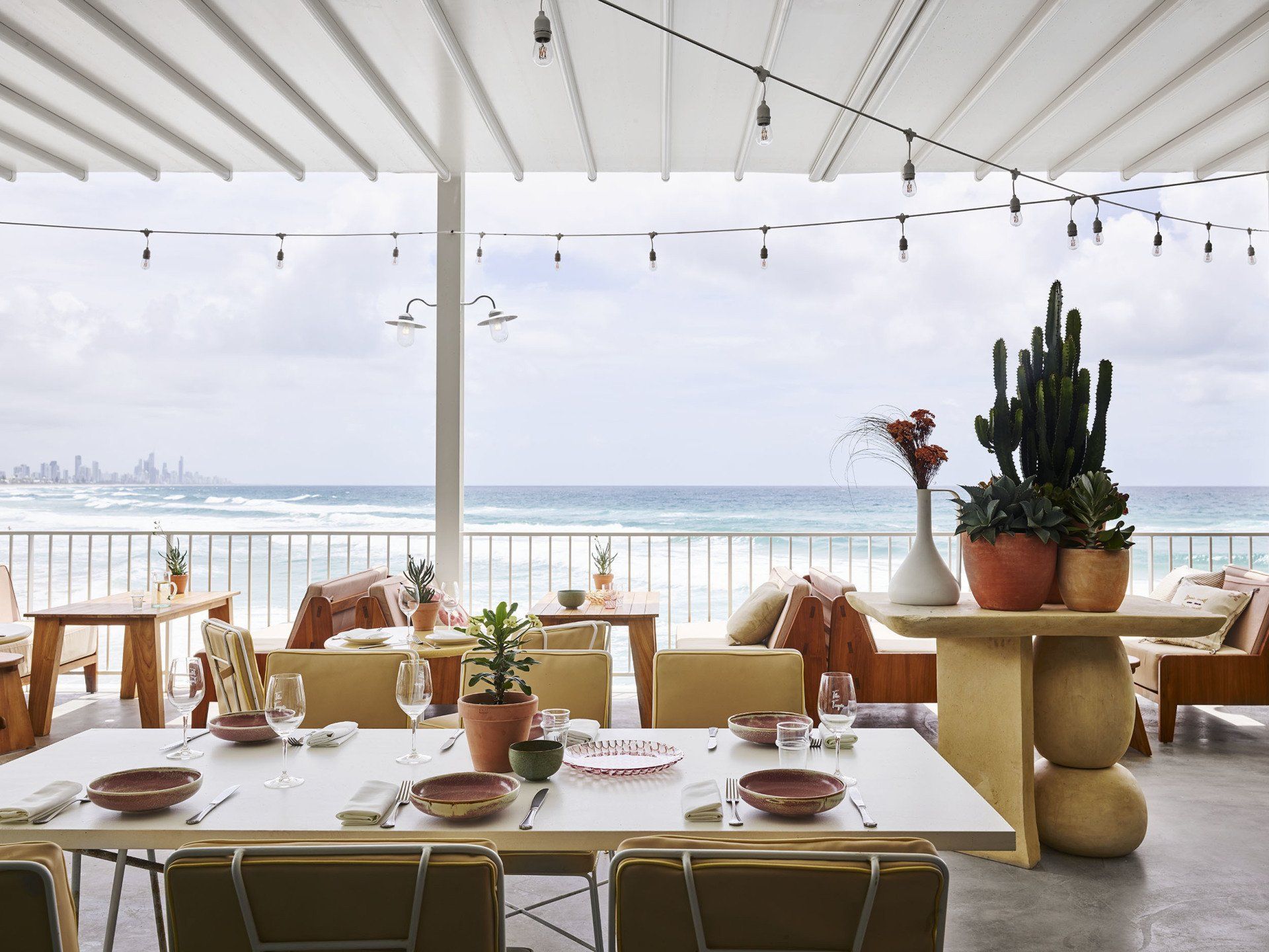
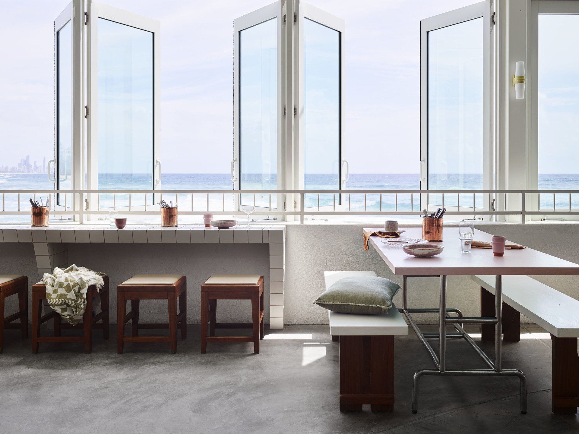
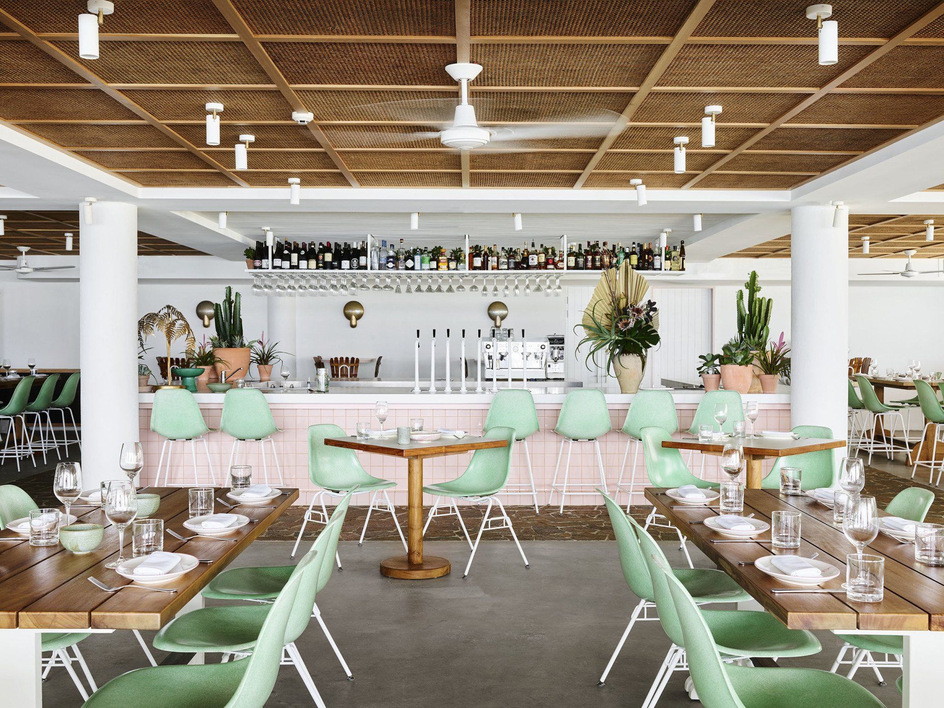
The venue is divided into three three spaces within a beach Pavilion structure; an a la carte restaurant, a coastal brasserie and a main outdoor beach bar. Creatively the client wanted the project to evoke memories of his childhood spent holidaying in Burleigh Heads; a 70’s Gold Coast beach nostalgia. Beautiful volumes and architectural shapes are accented with faded pastels, corbeled blockwork and bold awnings. These materials were selected for not only their aesthetic value but their unique ability to withstand heavy wear from the elements. The restaurant area marks itself clearly with its rattan ceiling, crazy paved floor and pink and brass highlights. The main beach bar is a vast open volume with expressed structures and views in every direction. High bar seating cascades down to the tiled window nooks which perch over the waters edge. While the pavilion bar to the south is an open expanse with painted concrete block detailing, ample foliage and a robust energy underneath an umbrella canopy.
Address: 43 Goodwin Terrace - Burleigh Heads, Gold Coast, Australia
29.
Habanera by Proyecto Singular / Madrid, Spain
Habanera emerges as a colonial Cuban house inspired by the story of Christopher Columbus. He discovered the Island on the 28th of October of 1492. With neoclassicist aesthetics, colonial architecture in old Havana usually had patios around which the rooms were organized. The understanding of the essence of these spaces helped to he designers developed the concept; keeping the patio as the central space. Functionality is always one of the greatest challenges. In this case, the kitchen needed to provide for two separate floors as well as some outdoor seating. The bar is strategically located to work for the inside and outside without compromising any circulations. Following our inspiration of a colonial house, a patio full of vegetation and with informal seating was generated uniting ground and first floor. Its 8‐meter height is enhanced by the use of mirrors, creating the feeling of an open ceiling. The use of wood and patterns with natural motifs as well as a carefully chosen illumination, specific to each of the environments makes it all work together.
Address: Calle de Génova 28, local Habanera, 28004 - Madrid, Spain
30.
Básico by MS Estudio / Mexico City, Mexico
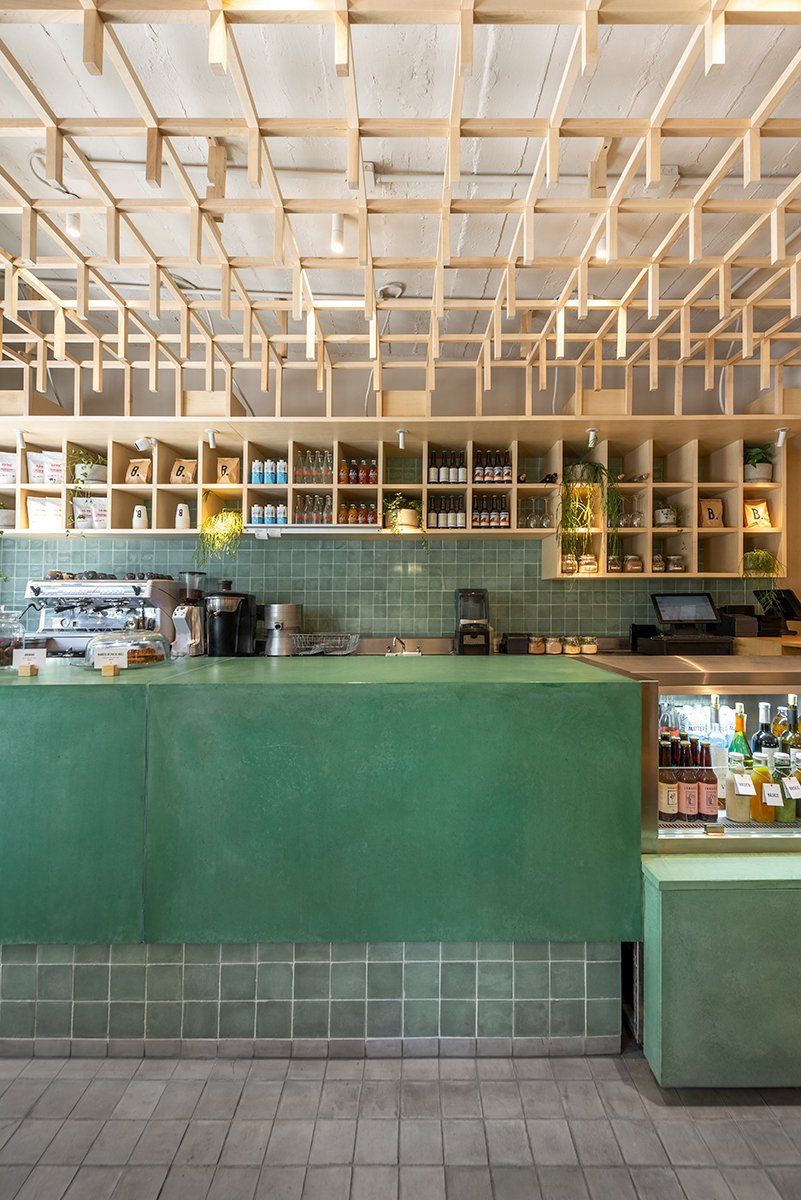
Using a ”greenhouse “ as a frame of reference, the ceiling generates a maple wooden grid that wraps the entrance access and points out the main countertop bar constructed with pigmented concrete panels. This same grid unfolds at the back of the bar’s counter creating a tridimensional space for display. Two colors dominate the space trough handmade pasta mosaics produced in Cholula, Puebla, specially commissioned for this project. Predominantly green color translate the experience into a “greenhouse”, with real plants and trees being the most important element. At the back of the space a coral color cube contrasts with the rest of the area.Grey mosaic floor translates the paved flooring of a greenhouse.
Address: Virgilio 8, Polanco, Polanco III Secc, Miguel Hidalgo, 11560 Mexico City, Mexico
31.
Bloom Eatery by Yova Yager / Minsk, Belarus
The design team made Bloom eatery interior with an abundance of different textures and living plants. The main challenge was irregular shape of the main room with an elongated entrance group and a fully open hall. To balance the space and give it intimacy, were added dividing verticals in the form of wooden screens, textiles on the windows and lots of plants. Roughness and monumentality of the room was smoothed out with radial shapes, which run through the entire restaurant, including corridors. The interior has elements of mid-century style. Smoothness and softness of forms, colorfulness and tactility, peculiar to elements of mid-century style, added to the interior, echo the trend of naturalness. Terrazzio worktops in the interior are adjacent to rusty metal, wooden textures to concrete ones. An amber-colored glass partition located behind the bar reflects daylight, showing silhouettes of cooks who work behind it.
Address: Ave. Pobediteley, 110-1 - Minsk, Belarus
32.
New York Burger by Proyecto Singular / Madrid, Spain
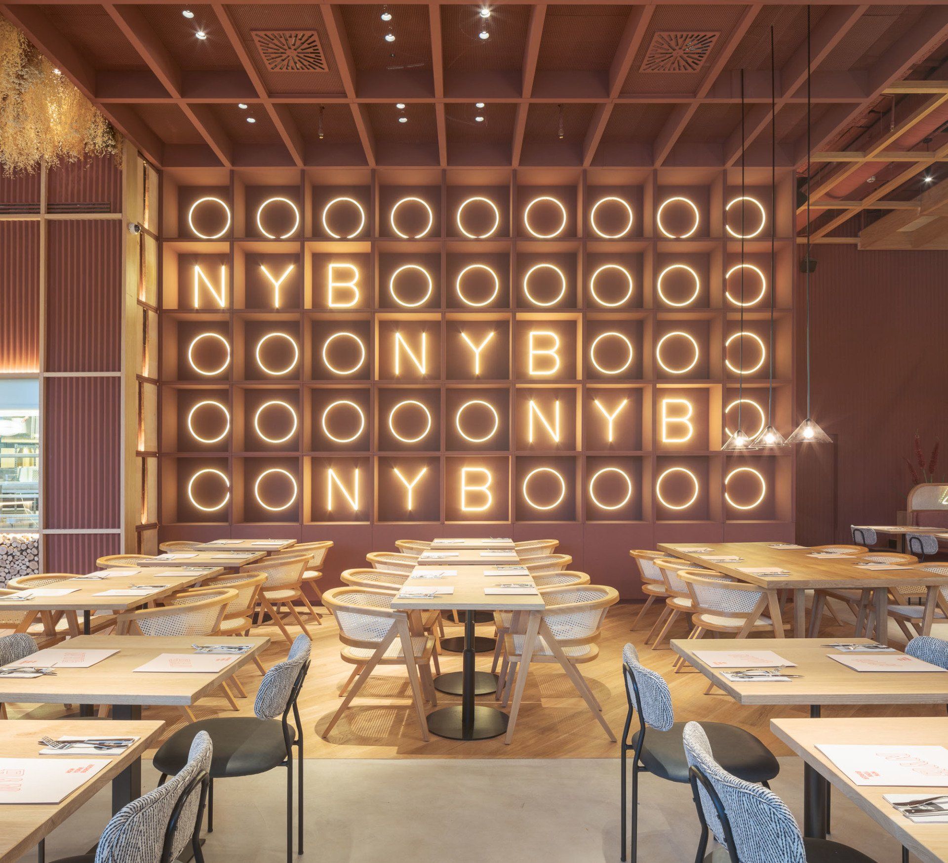
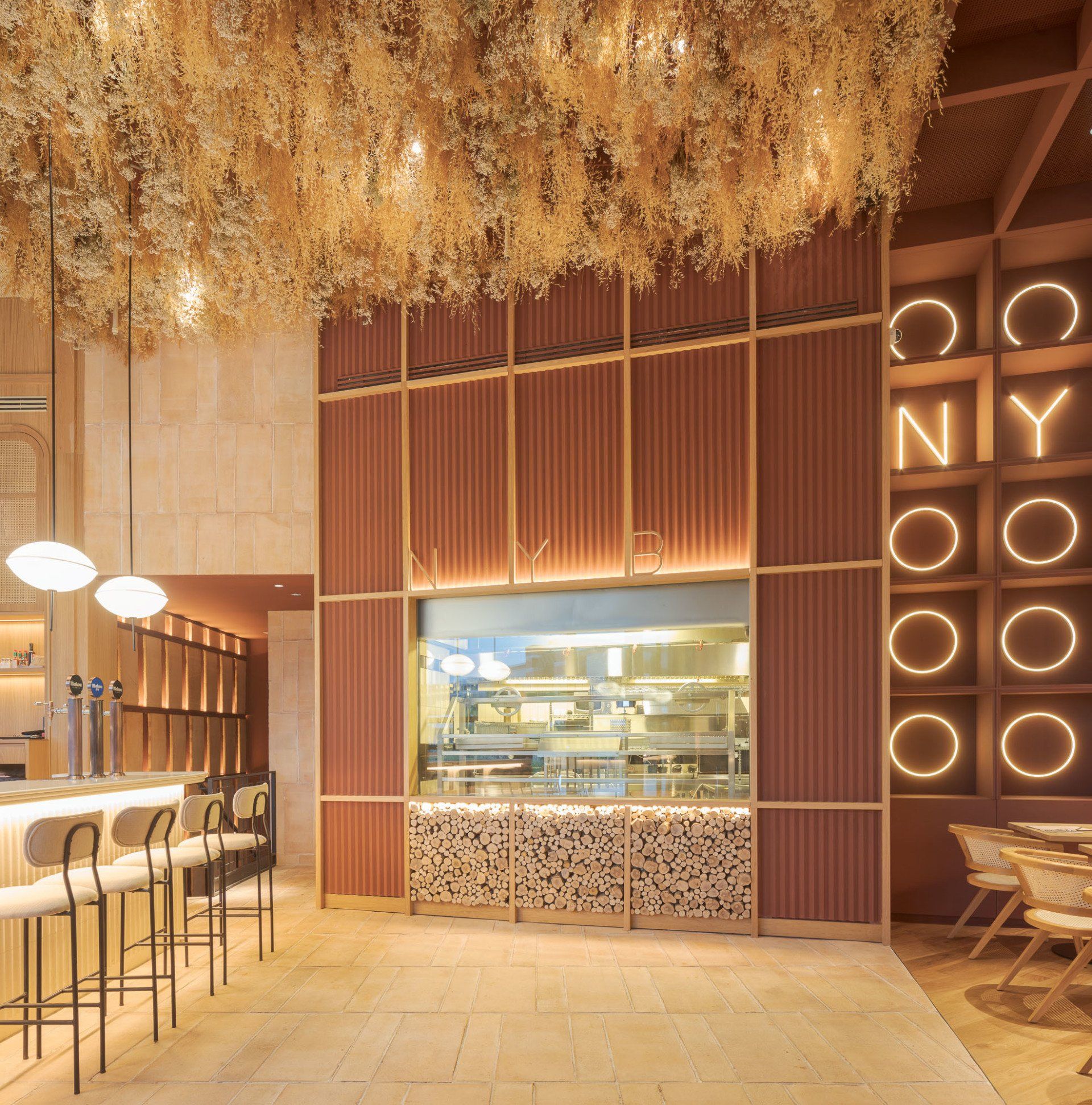
Coal, wood and smoke are the three essences captured in the design. With coal as the main character in New York Burger’s cuisine and core of the designing process, sophistication is achieved through the different materials and decoration. Craftmanship is another distinctive ideal of the company: everything is naturally and manually elaborated. Natural materials, ash colors and textures remind us of this quality. In terms of functionality, the Back of the House takes the back of the building, giving the long façade, where there is a maximum daylight, to the clients. There are different areas that work independently, achieving the previously mentioned versatility. The space becomes a warm and relaxed environment where one can go an enjoy great food anytime!
Address: Avenida de Europa 10, Edificio Sur SJ, 09, 28108 - Madrid, Spain
33. Kai La Caleta by In Out Studio / Santa Cruz de Tenerife, Spain
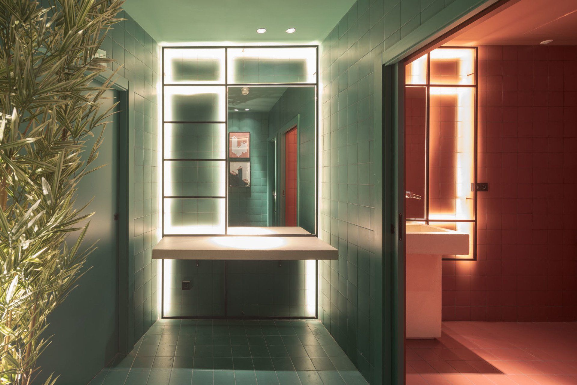
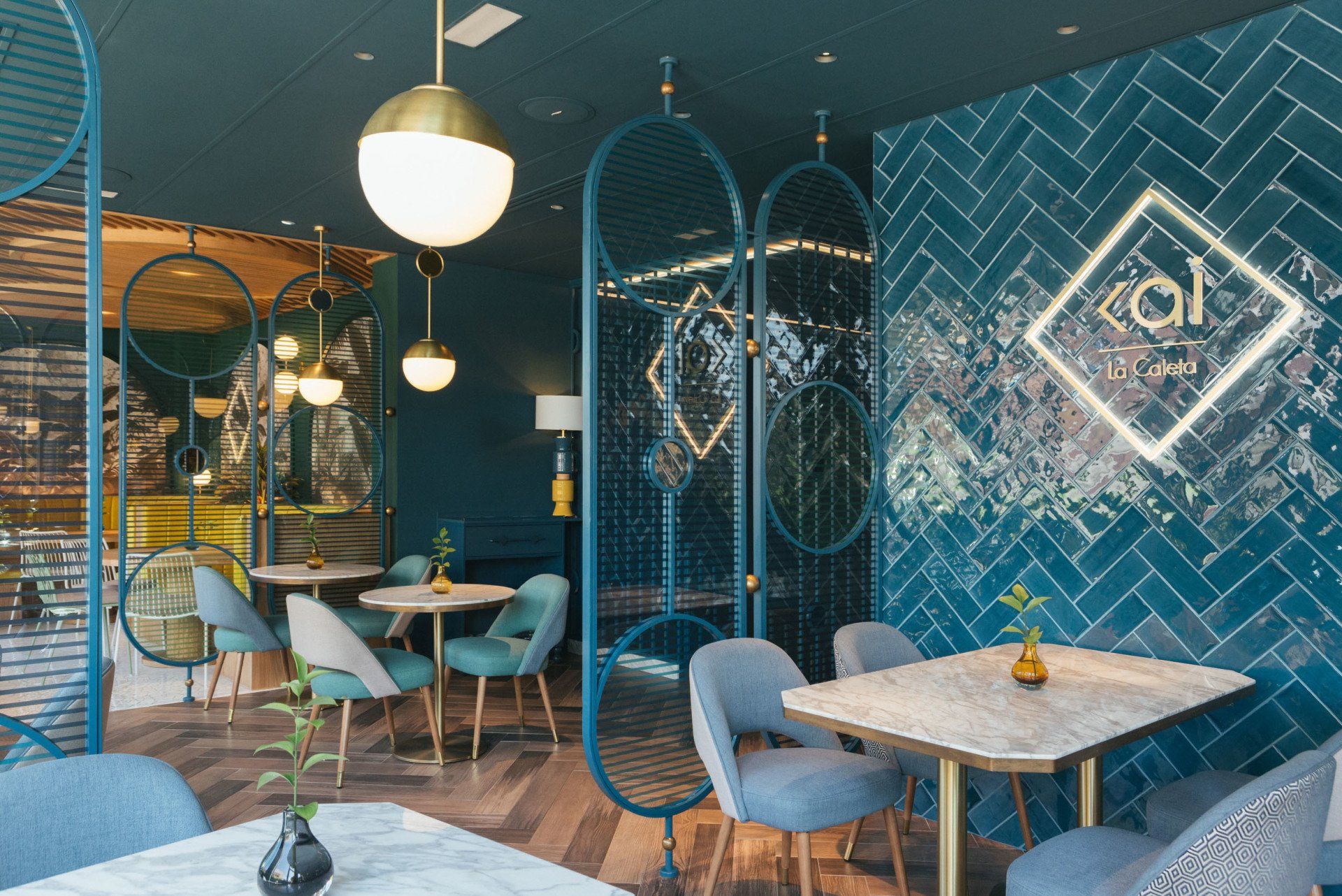
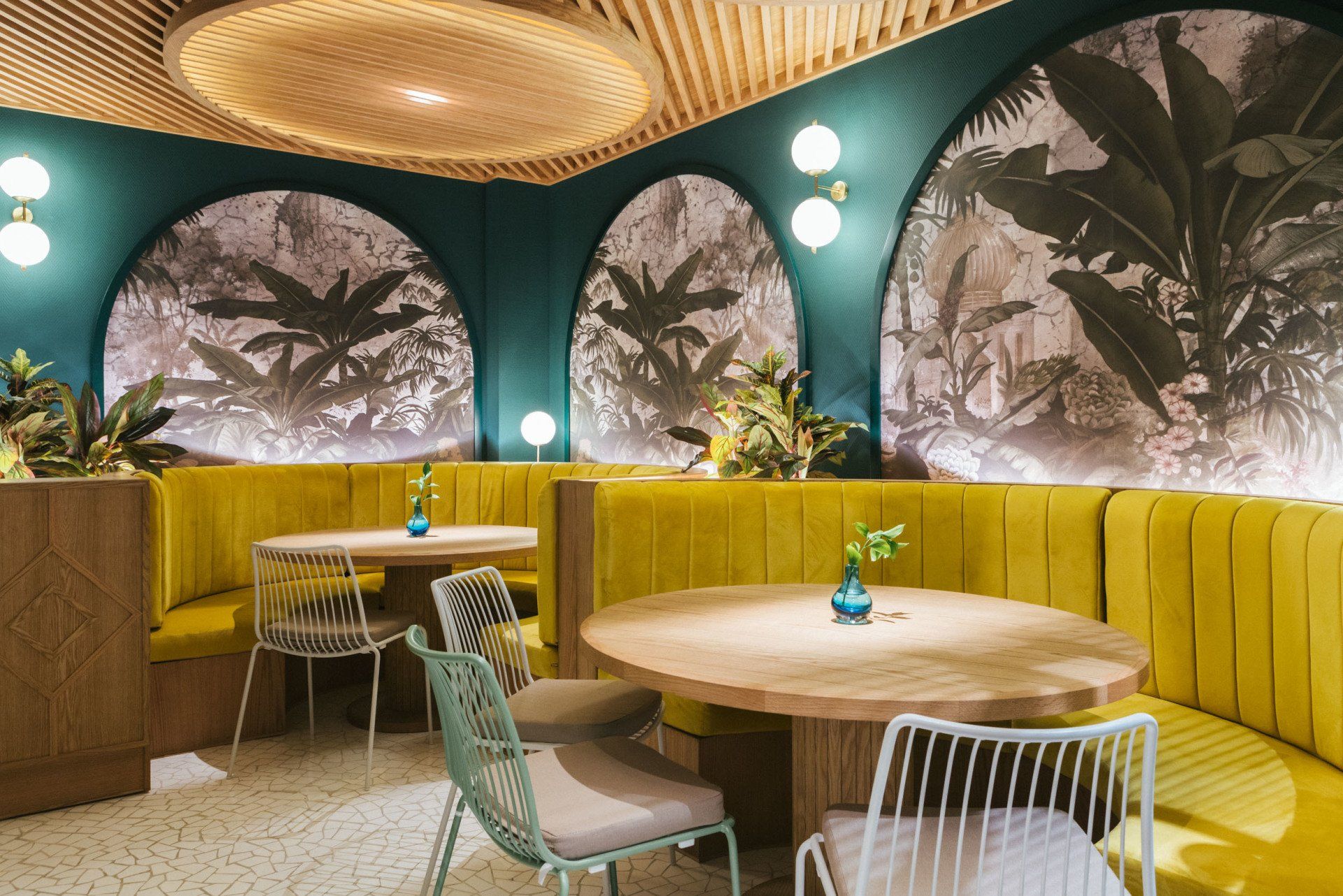
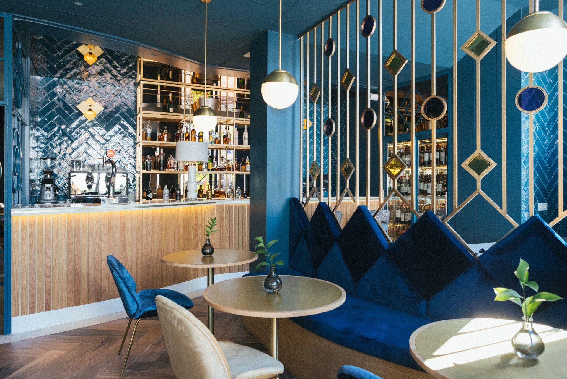
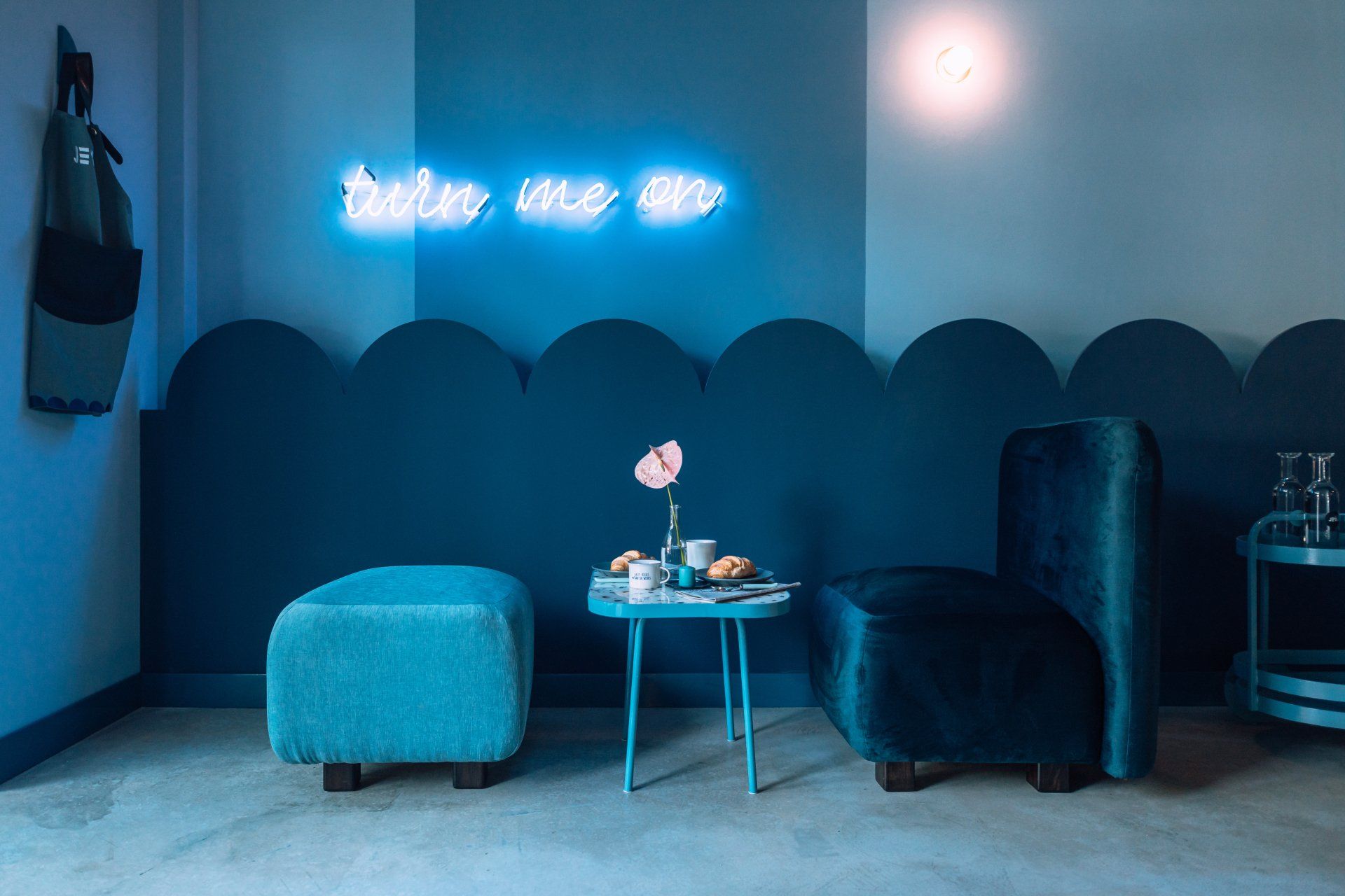
The blue color permeates the whole place as if it were an underwater landscape. With this color In Out Studio wanted to generate a relaxed, magical and mysterious experience where Asian styles are interspersed with touches of art deco. One of the strong points of this interior design, are the different coatings that contribute to generate a marine environment. The use of handmade ceramic tiles surrounds the space as if it were some scales. Provoking the contrast with the tiles, the floor connects with the earth with a two-tone wooden parquet. The restaurant is divided into two very different environments. On the upper floor there is the kitchen and the main dining room, while the basement is reserved for the toilet nucleus and a private dining room. The space on the ground floor is divided into four small rooms through spectacular jewel screens designed by the studio and made of screen-printed color glass, metal and bronze mirror inlays.
Address: C/El Muelle, No.2 Edit. Famar, local 3/4, 38679 - La Caleta, Santa Cruz de Tenerife, Spain
34. Tapa Tapa by Quarta & Armando / Shanghai, China
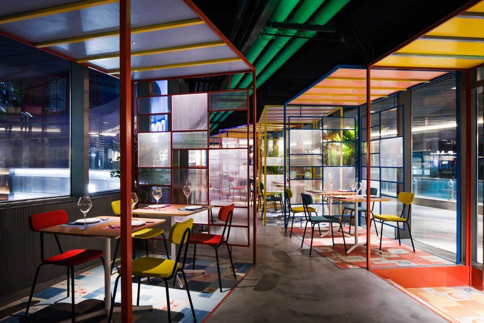
Tapa Tapa is a Spanish tapas and wine bar in which traditional snacks are re-interpreted and enjoyed with a view. In contrast with the looks of both traditional Spanish restaurants and the ubiquitous indus-trial-chic eatery, Quarta & Armando’s proposal pairs tapas and drinks with colors and tex-tures belonging to the mercado as much as to Shanghai’s gleaming skyline. The use of few simple materials combined with a color palette based on primary colors of-fers a naive reinterpretation of vernacular motives. Aggregated in small clusters, the “open rooms” form a miniature village that praises open-ness and communality. The steel-framed polycarbonate panels separating each “room” from the next one define different depths throughout the whole space while letting sunlight shine through during the day. On the floor, printed ceramic tiles with custom-made illustrations contrast with the grey concrete flooring. The same principle is then reflected on the ceiling completing the virtual separation of “indoor” and “outdoor” space.
Address: East Daming Road - Shanghai, China
35.
Piur by Masquespacio / Valencia, Spain
Thereby, the design first of all seeks to find a concept that could con-nect with the Valencian origins of Piur’s founders and at the same time could work as an attraction point for the restaurant visitors. The designers opted for materials that remind to nature like wood and terra-cota tiles. The color palette equally is a reference to earth, next to a touch of red that symbolizes the color of the tomato as one of the main ingredients used tu prepare a pizza.
Address: Carrer de Pascual i Genís, 19, 46002 - Valencia, Spain
36.
Todd English by SUPERFUTUREDESIGN* / Dubai, UAE
Keeping their contemporary and modern vibe at the centre of the designing strategy, SUPERFUTUREDESIGN* created the interiors of Todd English with distinct design elements. The generous lobby shaped in multiple curved lines hosts the cafeteria and sweet treats section, with several bar stations and a confined seating area. The mighty food hall promises to appeal to the sensibilities of the modern generation with a taste for global cuisine. The homely and warm décor strikes a familiar chord with the crowd: simple yet effective designs of marble flooring made quirky and modern with a mosaic pattern. Classic and elegant wood panelling accentuate the corners and joints while distinct tainted glass windows and judicious use of wall mirrors take this outlet several notches higher than its contemporaries. The neatly arranged wall décor and kitchen supplies bring back the memories of your childhood as you go through the broad and diverse menu. The rustic sitting arrangement has been designed to accommodate a large number of people without crowding the establishment though.
Address: Financial Center Rd, Downtown Dubai - Dubai, UAE
37.
The Geometrication by Renesa Architecture Design Interiors / Gurgaon, India
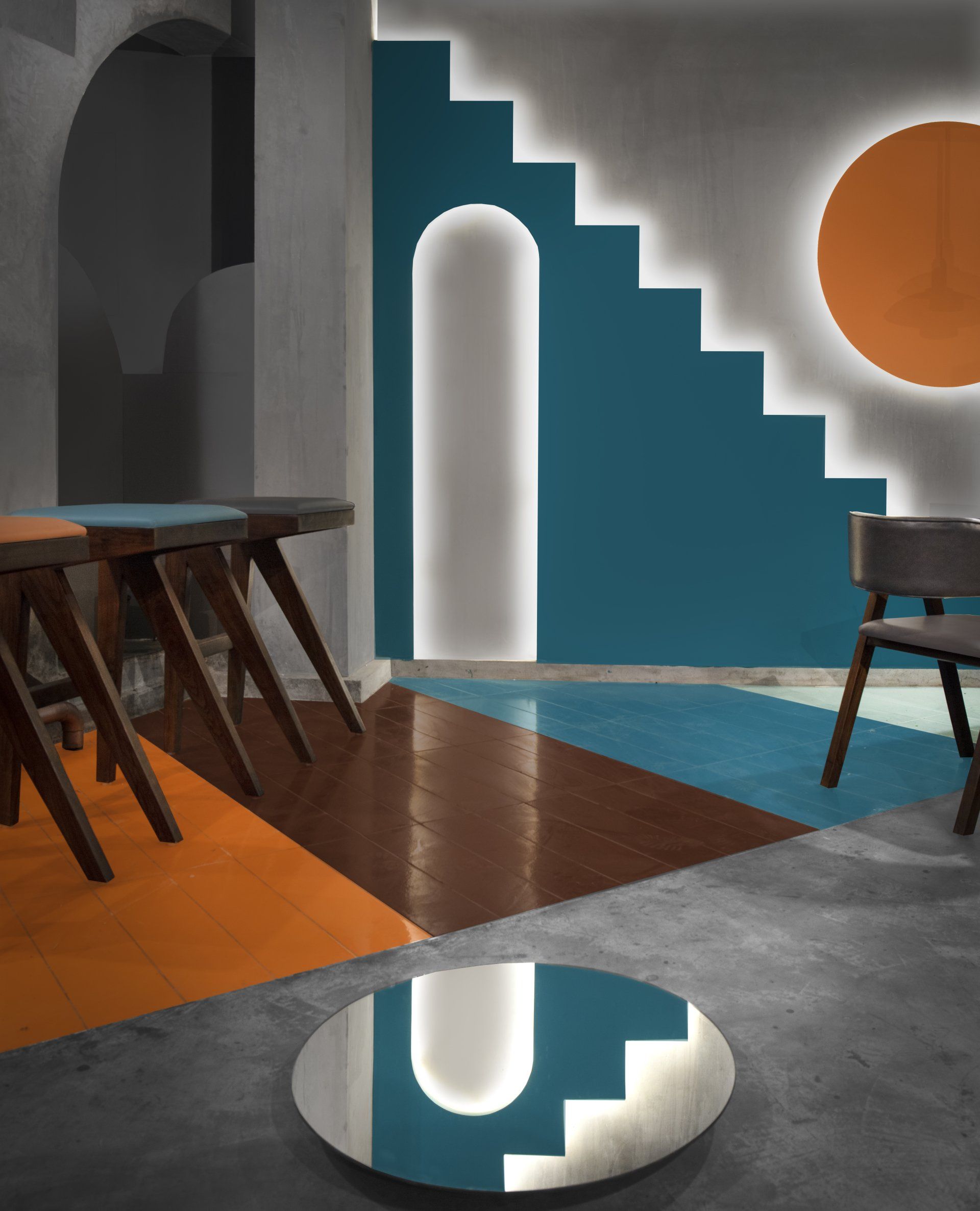
For this project Renesa Architecture Design Interiors Studio took cues from the original deconstructive architecture to create a spatial experience filled with volumetric galleries and partitioned masses. Upon entering, the visitor is instantly transported to an uncertain realm, characterized by geometric shapes that reflect a modern intake on traditional Indian architecture. The consistency in applying successive regular geometries on different scales of design collaborates with a clear color palette of warm and vibrant materials. The variation in color and materiality forms these partitioned masses that govern the grouping of distinct but interconnected volumes, each with a particular function. These colored partitions are offset against exposed concrete walls. One of the main walls also feature niches in the shape of semicircular and pointed arches. A playfulness continues in the surfaces, fixtures and furniture across the restaurant.Distinct sculptural lighting design chosen for the project serves to distinguish the different volumes- cove lights light the walls of the cafe, while pendant lights and floor lamps in a rose gold scheme further add to the character and cast interesting shadows in the space.
Address: Gurgaon, India
38.
Park House by Alexander & Co / Mona Vale, Australia
This restaurant hosts internal double height dining areas, external courtyard with retractable roof and various private dining rooms, an open kitchen, internal cocktail bar, external main bar, large open internal and external fireplaces and externally exposed timber and steel structures. The restaurant has been conceived as a loft style art warehouse, a sympathetic attempt to reconcile the old motel; 70’s coastal and retro. Somewhere between Donald Judd and Scandinavian modernism the loft is both robust and curated, well equipped to cater to the heavy traffic and coastal location. The project explored various masonry (brickwork) forms, arches, corbels and coursing, and combined them with an array of specific lighting, furnishing and artwork. Alexander &CO. augmented and exposed the existing steel and timber structure to create a double story volume both internally and externally under the retractable roof. This volume is illuminated by custom high bay pendants and includes custom oversized paintings to the loft void.
Address: 2 Park St - Mona Vale, Australia
39.
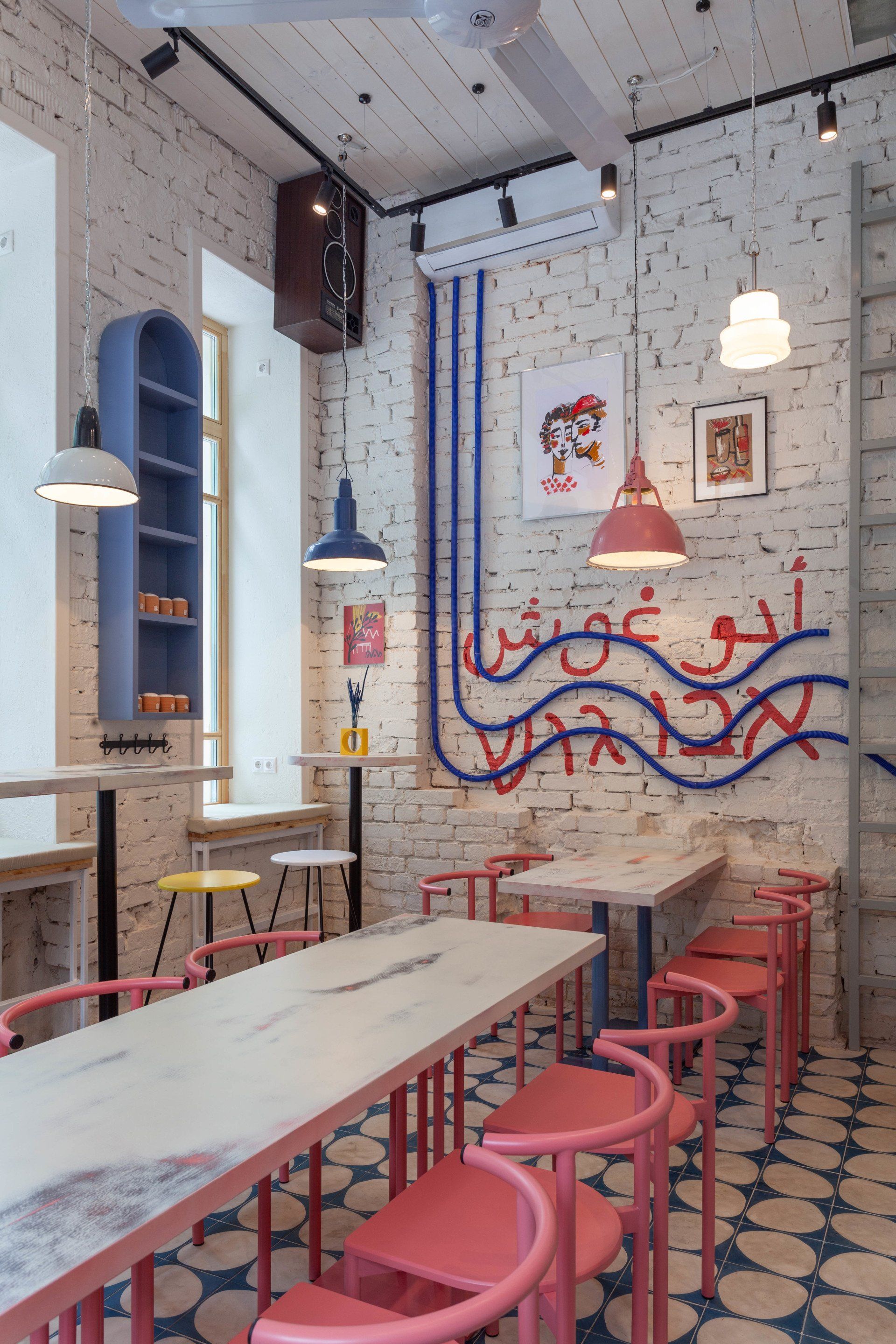
Abu Gosh by Studio Shoo / Moscow, Russia
Abu Ghosh is a conceptual street food with authentic Israeli food. In the center of a small room there is a large communal table was designed for large noisy companies of friends, and in the windows, there is a high landing with soft pillows. Near the entrance there is a showcase with Israeli products and decorated with patterned handmade tiles, a kitchen counter through which you can observe the magical process of preparing Israeli cuisine. Therewith, we see vintage decorative lamps from the 50s hanging from the high ceiling, giving warm and dim lighting, creating a cozy and comfortable space. With the high and bright space of the pavilion, the interior was kept in bright colors with the addition of dotted color accents. Bold shades of blue, pink and yellow are combined with the restored ancient walls of the pavilion and handmade cement lacy tiles. All elements give the space freshness and lightness. Through restored windows with a unique historical pattern, the maximum amount of sunlight reflected from the white walls enters the space.
Address: Sivtsev Vrajek alley 42, bld 5 - Moscow, Russia
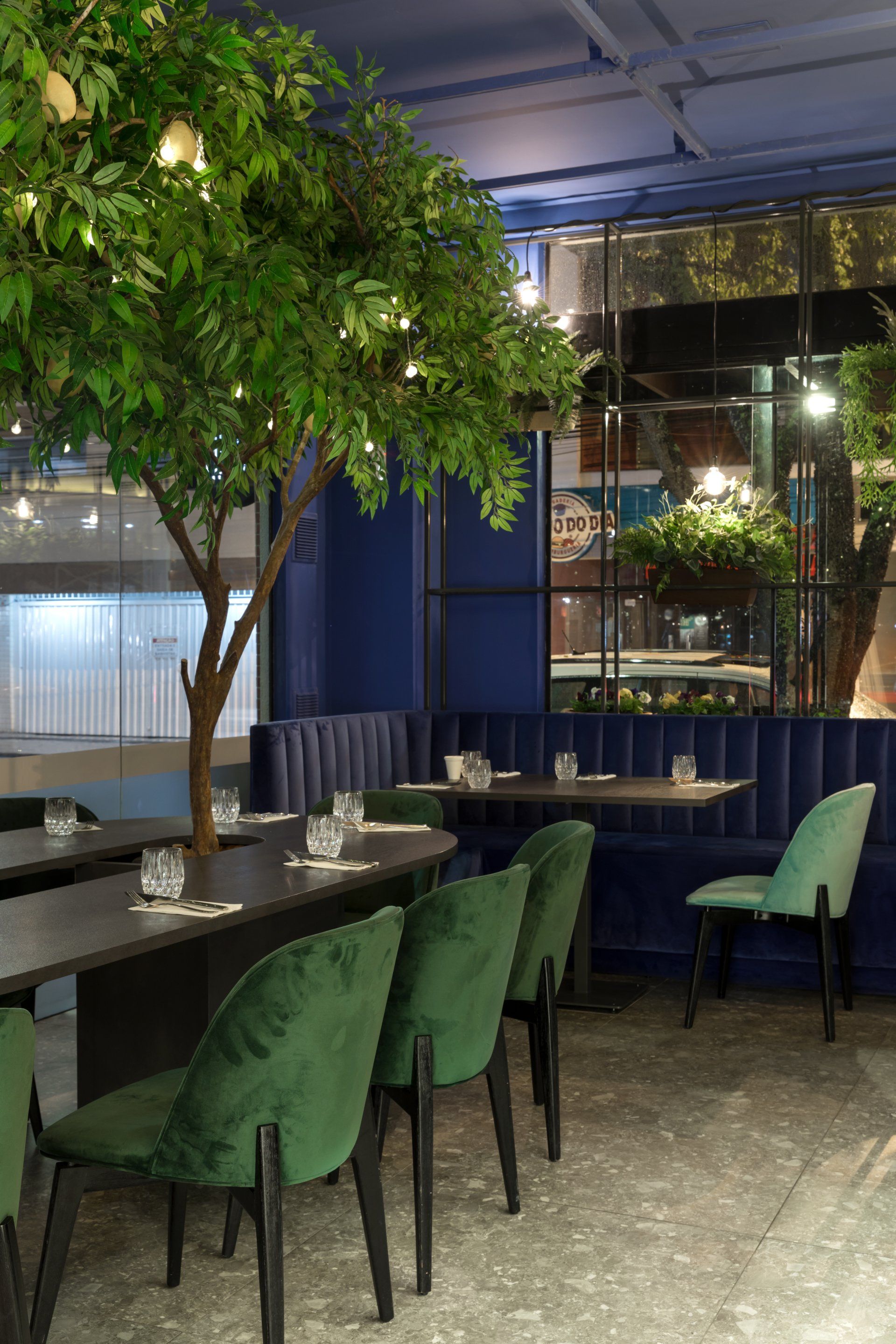
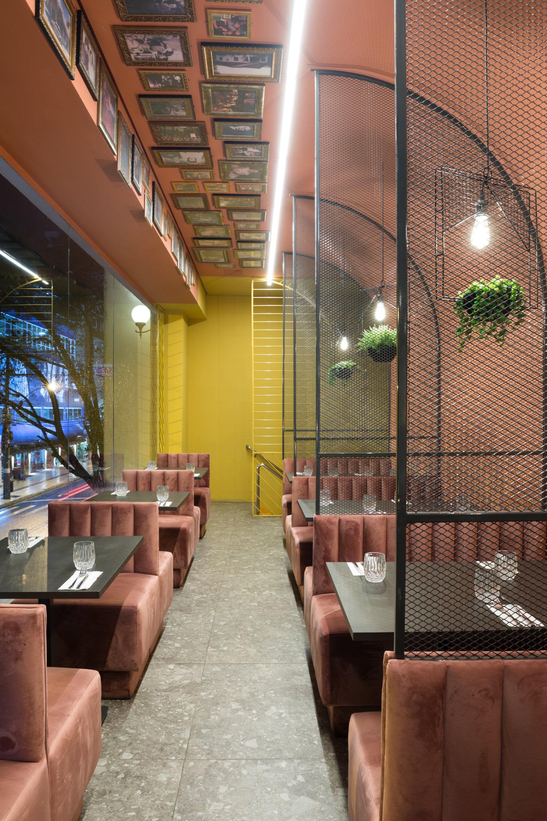
40. Mino Osteria by Vanessa Larré Arquitetura / Balneário Camboriú, Brazil
The key point of the restaurant is the shared table on the feet of Sicilian lemon to absorb in it among so many shapes, colors, textures and smells our little retelling of Italy. There are also spaces to those who prefer intimate corners: the small high tables and stools wrapped in arches inspired by Italian wineries. For the more reserved, Vanessa Larré Arquitetura created a completely separate space and affectionately called it “antisocial”. In it we warm the colors and pay homage to the family and Mino's trajectory with pictures displayed on the ceiling.
Address: Rua 3300, 361, sala 02 anexo Passeio San Miguel - Balneário Camboriú, Brazil
41.
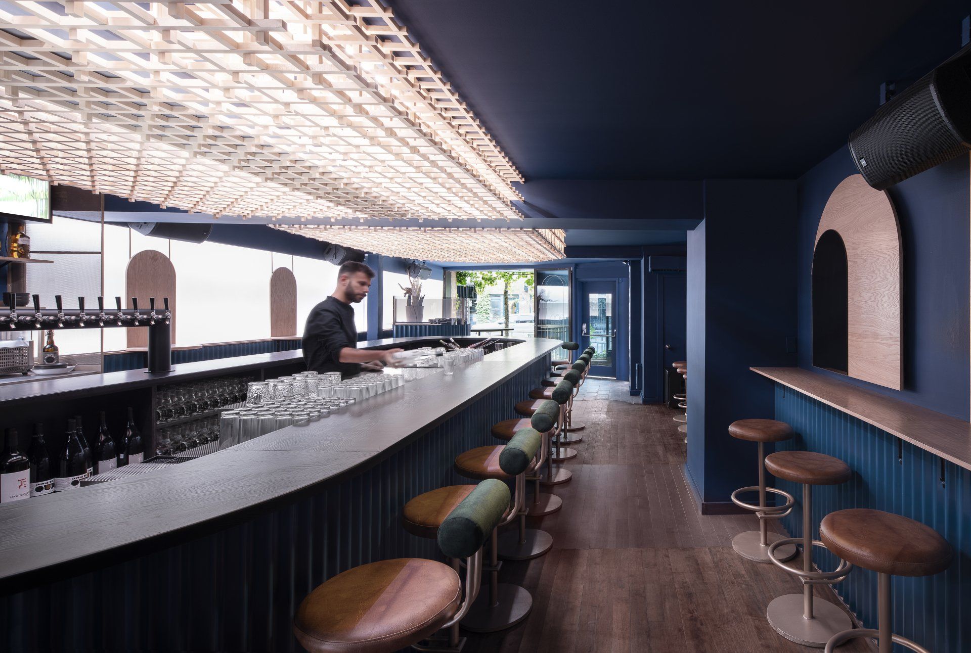
Minéral by Blanchette Architects / Montréal, Canada
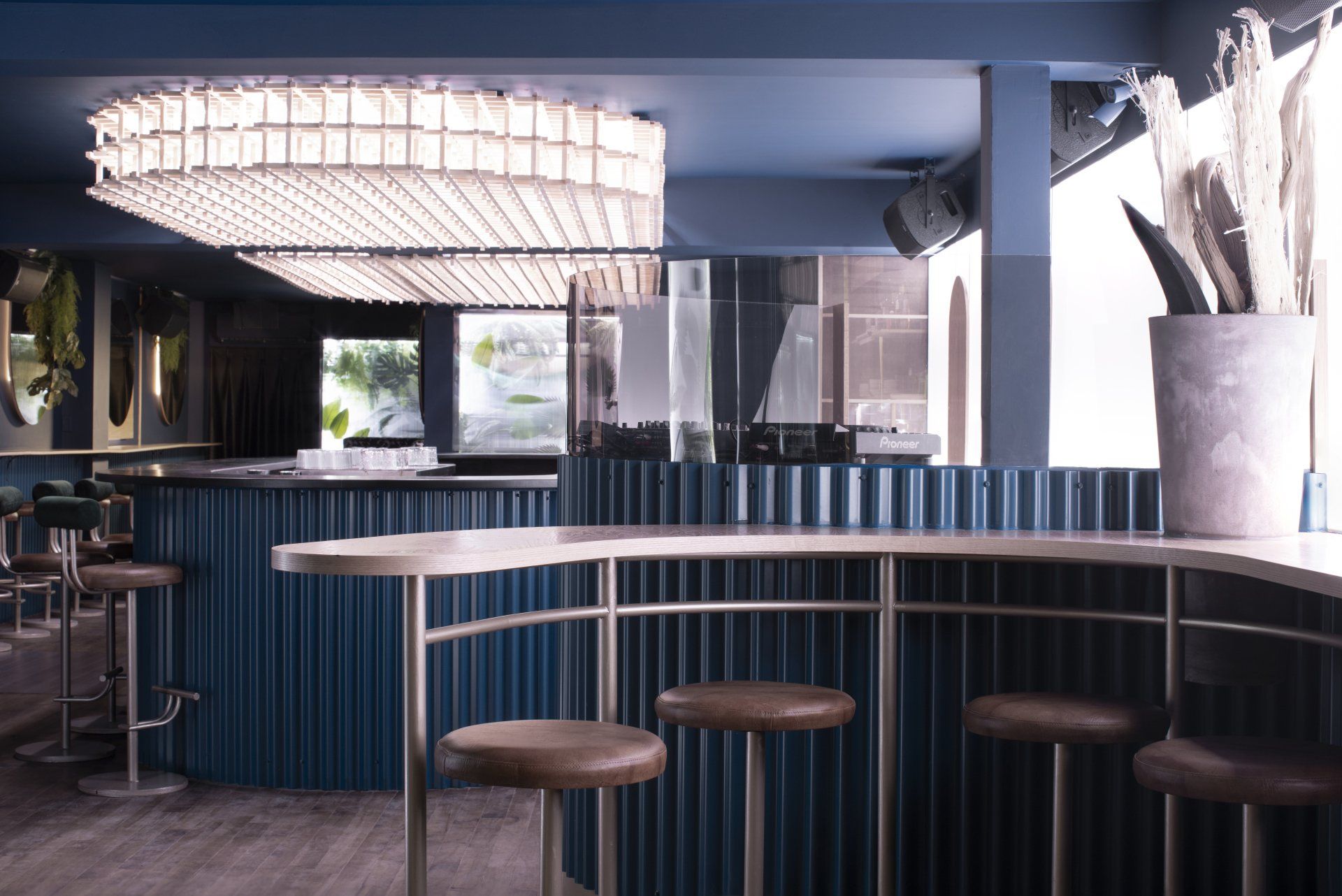
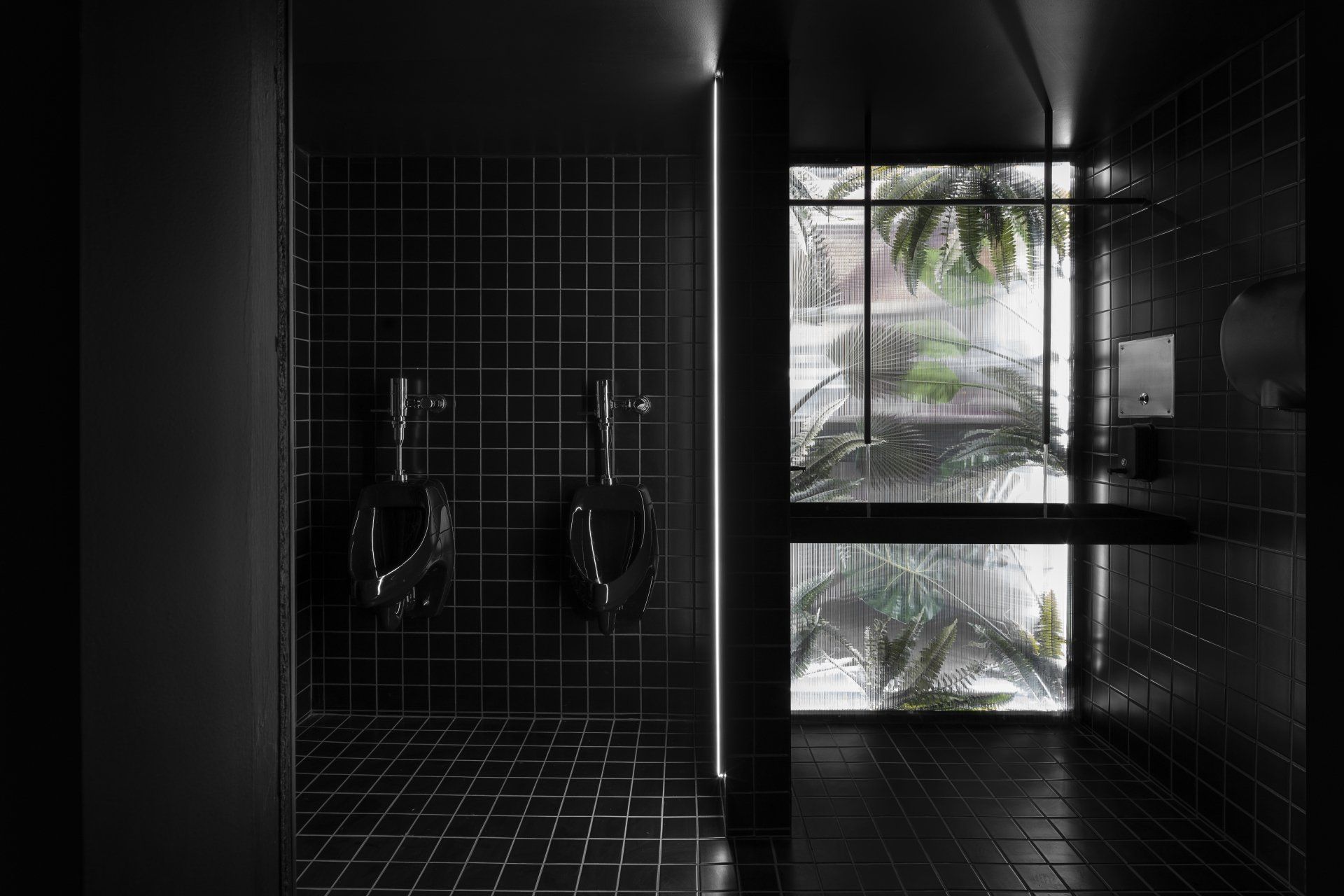
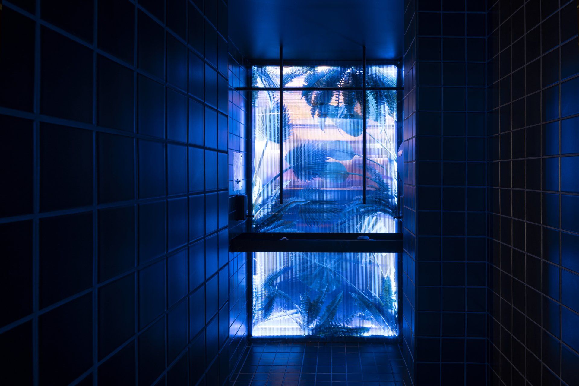
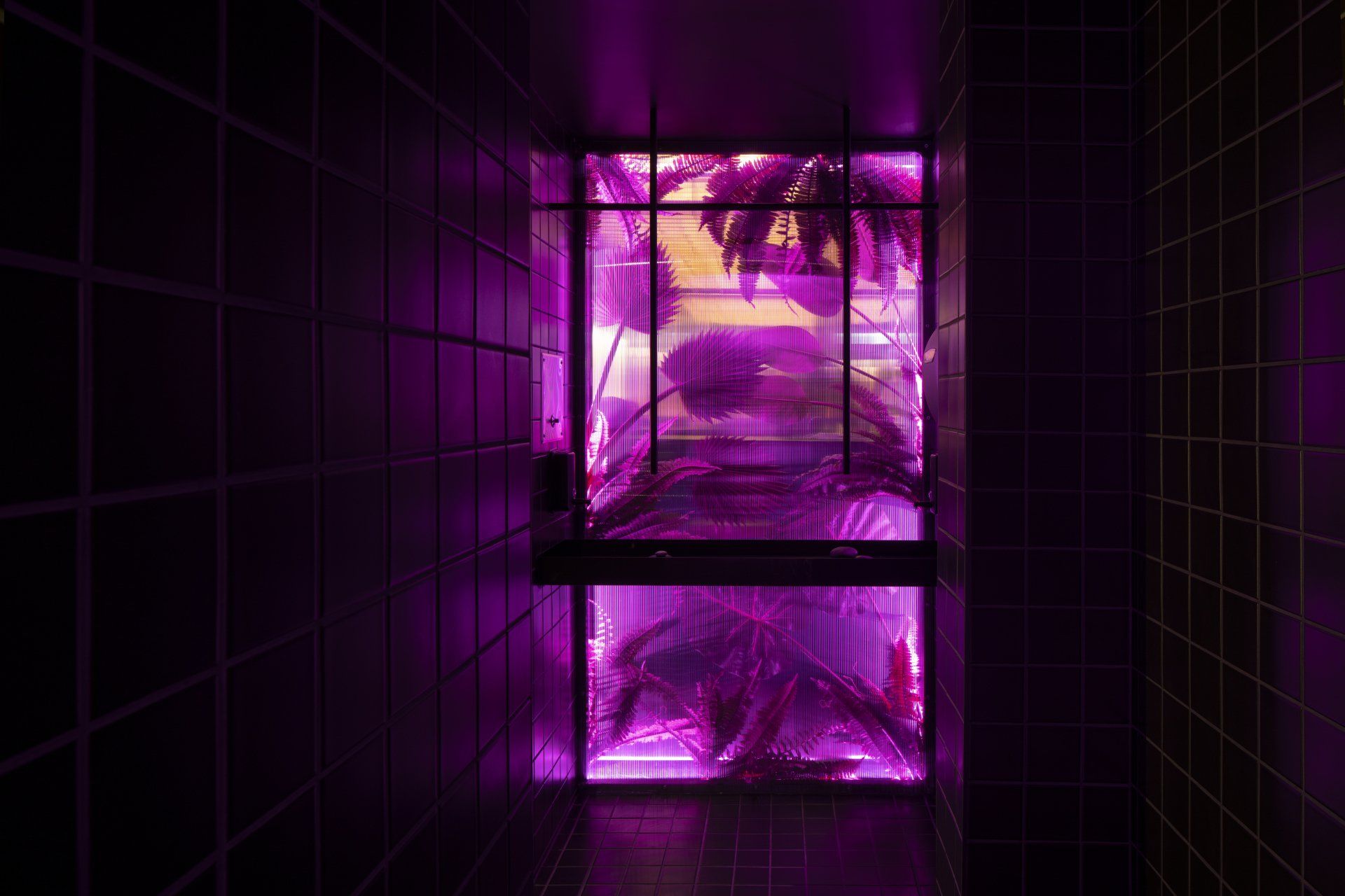
This is a wine bar by day and a nightclub after dark. The design team imagined a space whose atmosphere could change radically from its late-afternoon opening to its late-night peak. Working in close collaboration with the client, Blanchette Architects imagined an evolving scenic design where “sound vibrations translate to waves of colour, staying with the guest from their first after-work cocktail until late at night.” Architecture, light and the soundscape were all handled as raw materials to frame the bar’s atmosphere at different times of day. The “warmly glacial” space plays on the warm-cool duality of colours, materials and light. Soothing light is projected onto wall-mounted canvases, reminiscent of art installations like those of James Turrell.
Address: 1641 R. Atateken - Montréal, Canada
42.
PILOTKA by Yudin Design / Kyiv, Ukraine
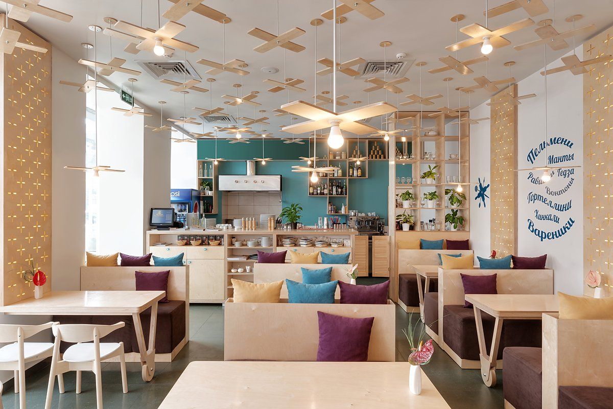
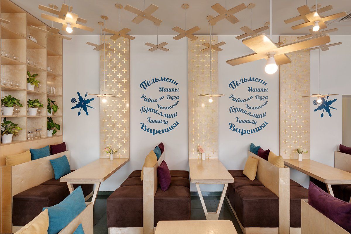
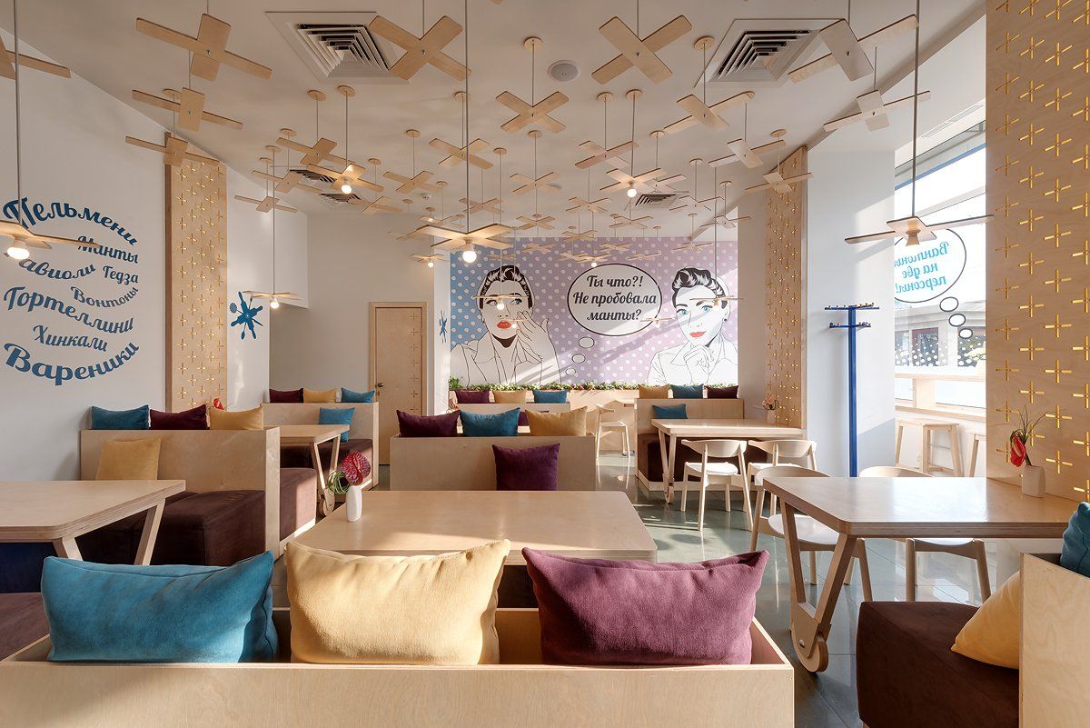
Pilotka is the bistro aimed at families with children, couples or office employees nearby. For the interior design of the cafe, the designers used a pop art style with the addition of typical aviation elements. The color scheme on which the interior decor is based consists of turquoise (bar area and ceiling), milk (walls and ceiling) and wood.
Address: Velyka Vasylkivska 74 - Kyiv, Ukraine
43.
Tehnikum by Form Bureau / Moscow, Russia
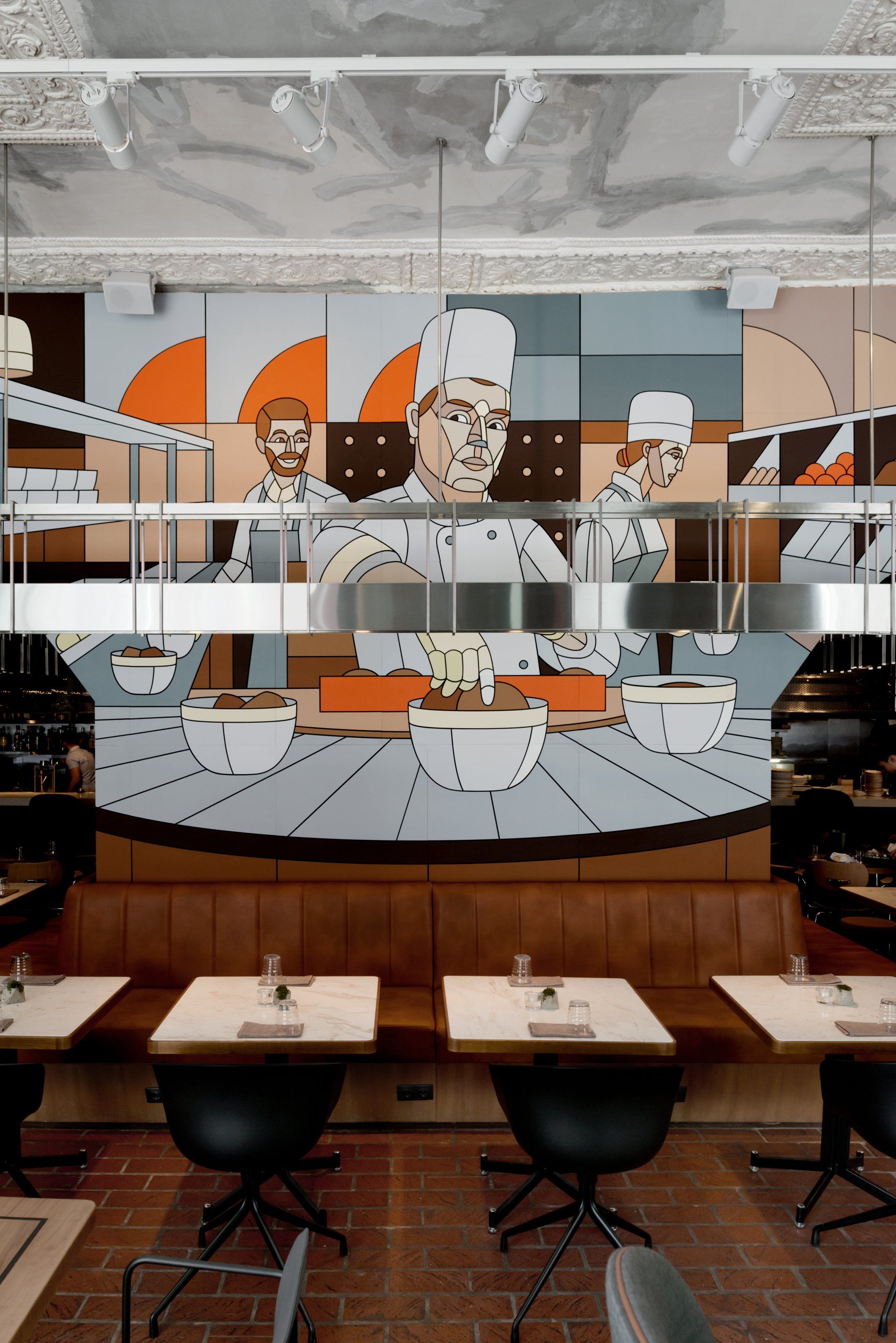
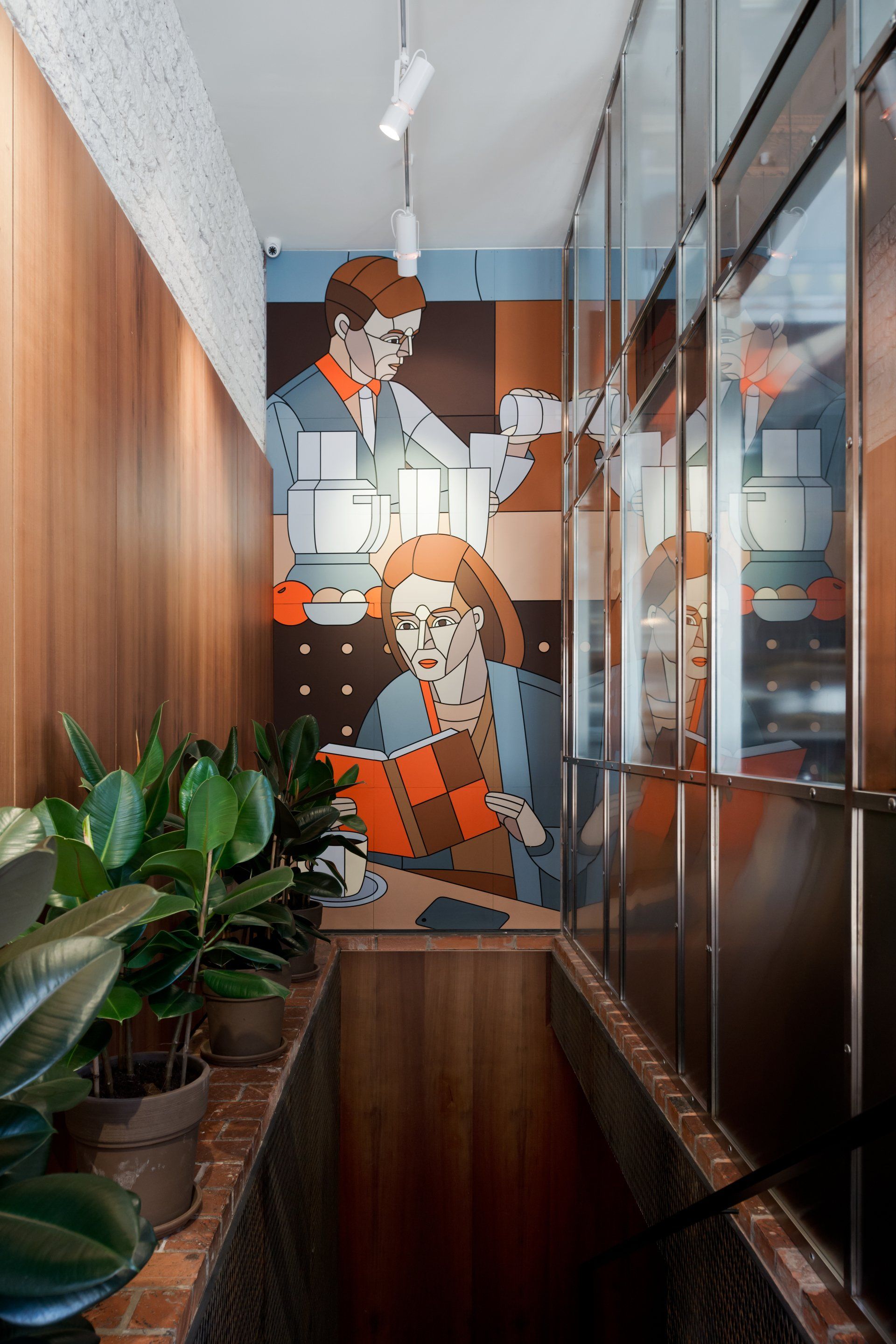
The interior of Tehnikum evolved with several themes in mind. The wall to wall painting installed by artist Dmitry Aske recalls soviet canteens, where epic mosaics or murals often took centre stage in an otherwise utilitarian interior. The former history of the restaurant as a shop for drafting ecquipment is reflected in details of the furniture and lighting, which include drafting lamps by Le Corbusier among others. The central custom designed chandelier references Moscow metro light fixtures from the 60s and 70s.
Address: Ulitsa Bol'shaya Dmitrovka 7/5 с2 - Moscow, Russia
44.
Brewpub by SER-ra / Sintra, Portugal
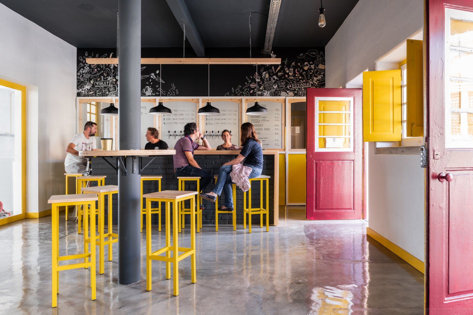
This project aimed at the transformation of the Old Colares Tram Station into a craft beer factory and bar. The production area and the bar are connected by a huge space that offers a moment of contemplation. Thus, sitting at the counter, visitors can watch the production of the beer they enjoy, realizing the process. The intervention sought the reuse of existing elements and the application of durable materials and industrial aesthetics. The balcony was built with solid brick and wood from the tram line, using all of the old materials that were left on the space. The existing frames and shutters were treated and kept in their original yellow color, which extended to some of the new elements.
Address: Avenida do Atlântico 1 - Sintra, Portugal
45.
Jess by Biancoebianca / Timișoara, Romania
The concept of this project follows a constrast of bright and dramatic colors, and has a strong geometrical symbol that keeps on repeating in the space throw different materials, shapes, colors and objects. Simple patterns and materials are combined to create a minimal but pop up interior. The designers used a Wes Anderson color palette. Bubbly shapes, curves, "yummy" materials are mix to create the mood of the space. The customized resin - terrazzo pattern is the key in the design of Jess, which was designed and made piece by piece by the designers mixing some materials, like acrylic resin. The same color shades are overused and used as table tops, backrests, bar door details, and bar counter. Biancoebianca customized and designed the flooring in the center area of the restaurant, creating a 180 c change between the rought concrete flooring that gives it a neutral feeling and the geometrical, colorful new pattern. The back part of the restaurant represents the maturity, the design approach is more simple, with a twist of colors, bold lines. The combination of royal colors in contrast with the baby bright colors was a challenge to highlight the 3 spaces and the mood for each one of them.
Address: Calea Torontalului Nr 50, 300254 - Timișoara, Romania
46. Botanique Café Bar Plantas by Moca / Curitiba, Brazil
This venue embodies the merger between the plants store Borealis and the Latin-American themed café Negritta - both commercial facilities with their own identity and strong personality. The pursue of coziness guided the development of the proposal and materialized as plants all over the place, bright colors and second-hand furniture collected in local flea-markets. "Tropical Destroyed". That was the expression used by the architects to describe the style found in the Botanique project. That is because not everything found there has impeccable finishing, and that, alongside the nature's green and the furniture selection (which goes from last century armchairs to contemporary design objects, as the lamps designed by Moca Arquitetura itself), creates a contrast that emanates a warm atmosphere that embraces, despite being "imperfect". Botanique is where jungle meets urban.
Address: R. Brg. Franco, 1193 - Curitiba, Brazil
47.
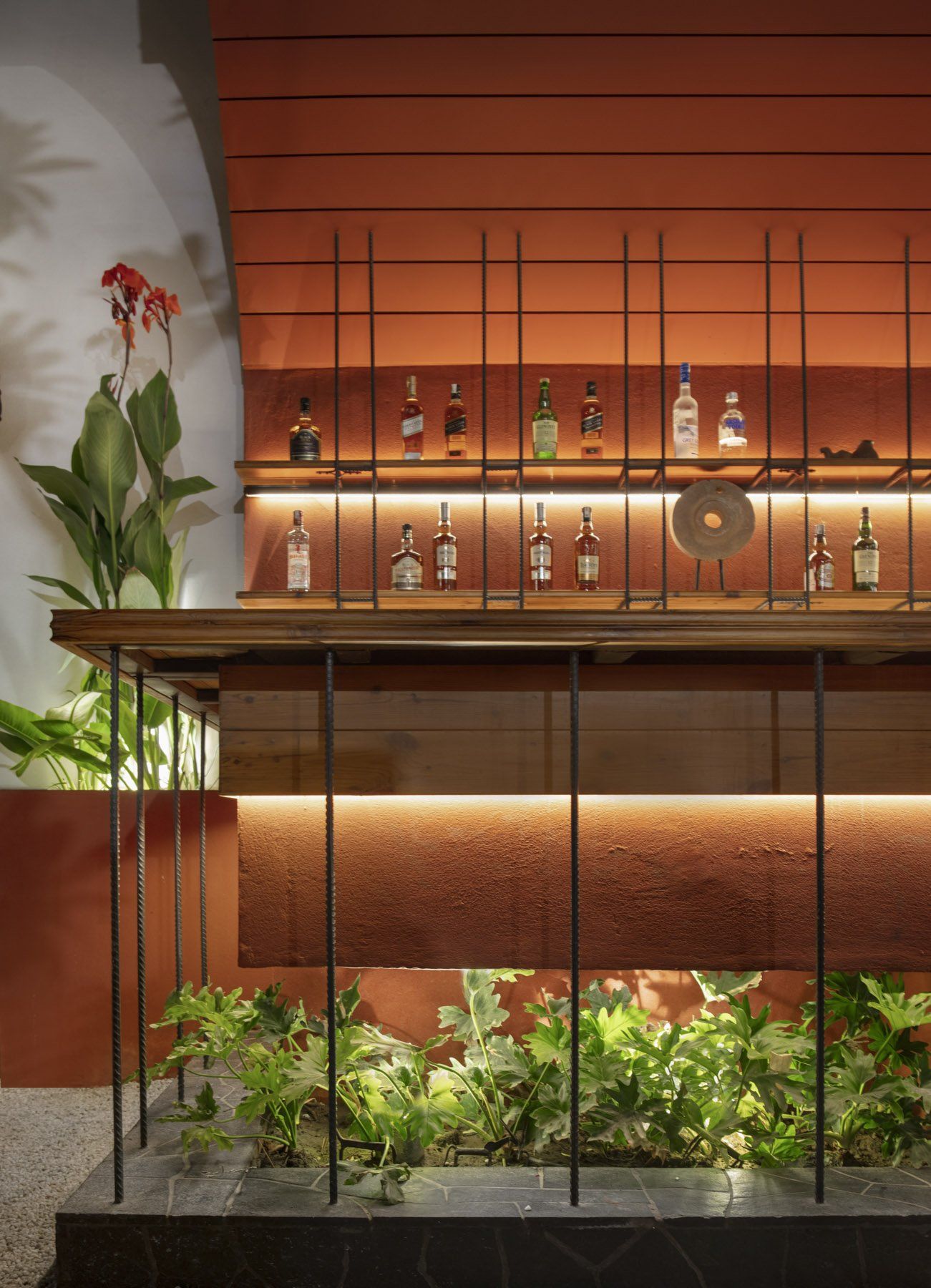
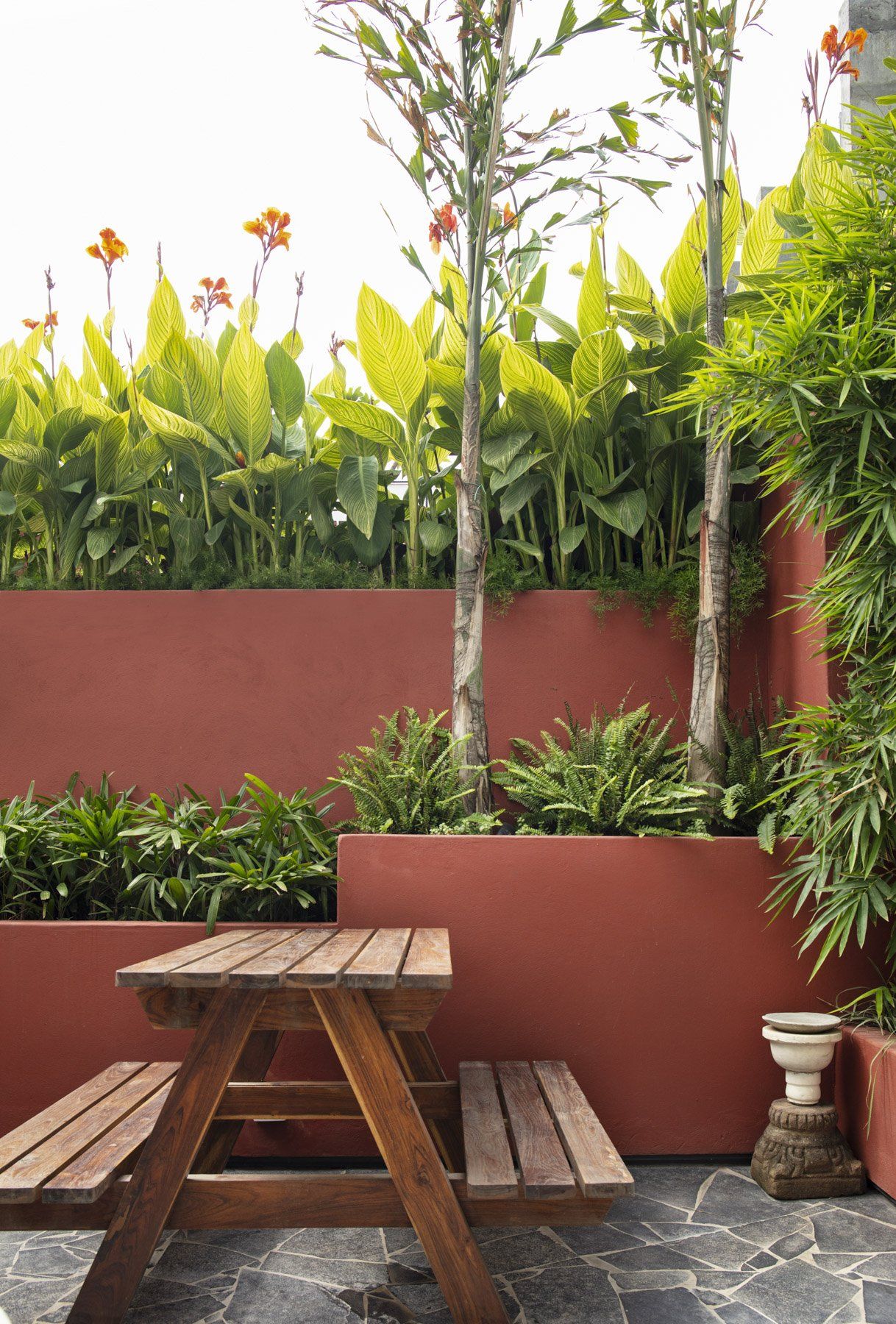
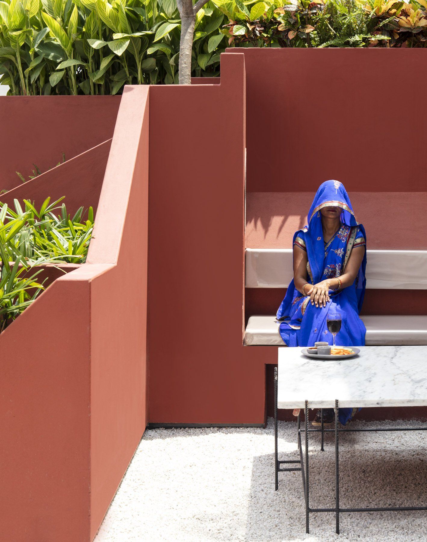
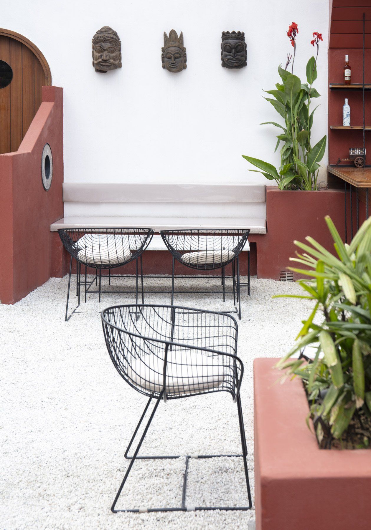
The village cafe by Portal 92 / Moradabad, India
Textures and volumes of the space have been designed to reference an experience, reminiscent of rural Indian settlements. Shaded gathering spaces which are semi-shielded from direct view form the larger sitting zones. The possibility of various movement patterns, give the illusion of an intimate organic settlement wherein the regulars find their own path, seldom taken by new visitors. The form of the planters and walls have been carefully modulated to generate a surreal impression of rural settlements. The terracotta plaster was achieved after various trials to lend warmth and vibrance to the space, while the exposed concrete rings cast in iron sheets puncture these walls exposing glimpses across. The plant species were locally curated to ensure their survival with least resistance. Brass vessels of different sizes were incorporated in the décor to reference this local trade. Indoor pendent lamps were customized to be suspended from the ceiling using wooden posts with carvings. The flooring of the central court was composed using broken slabs of rough black Kadappa stone found locally in India.
Address: Kanth Road - Moradabad, India
48.
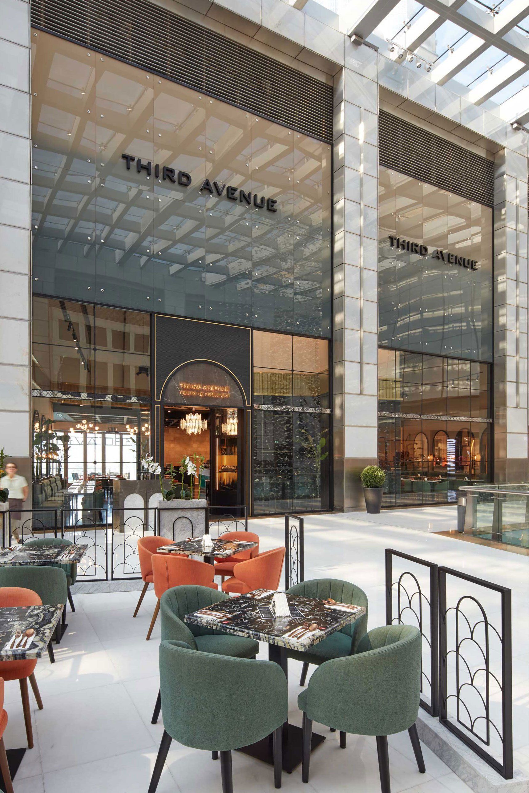
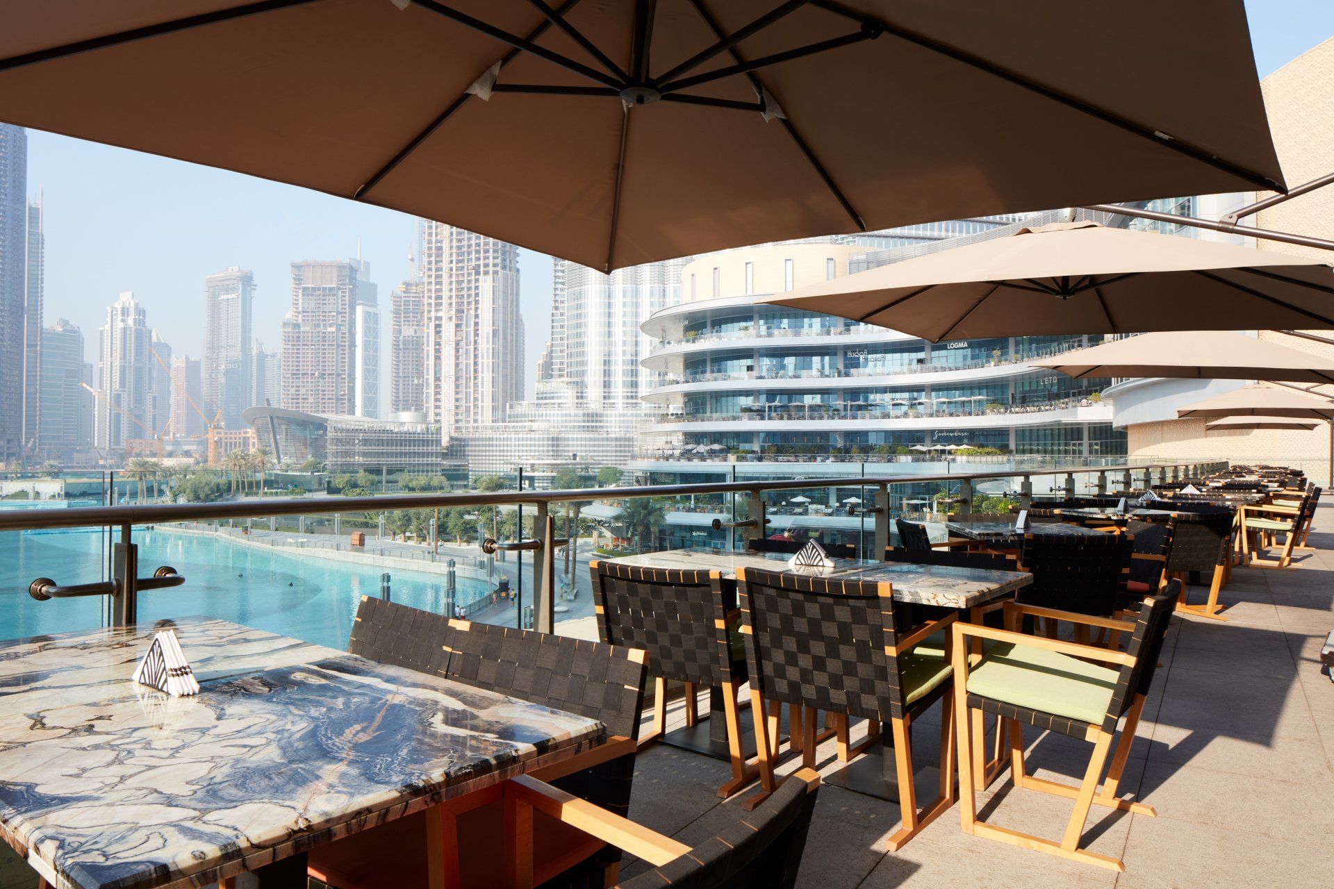
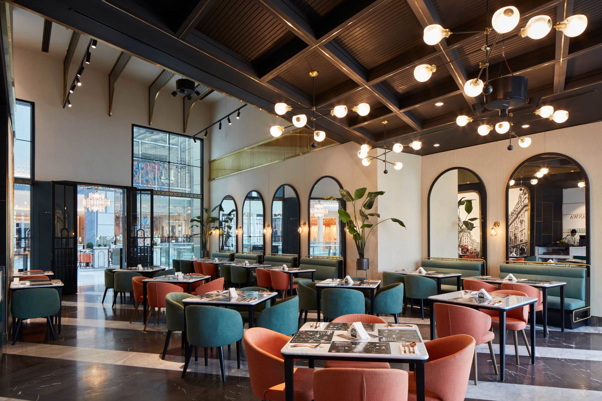
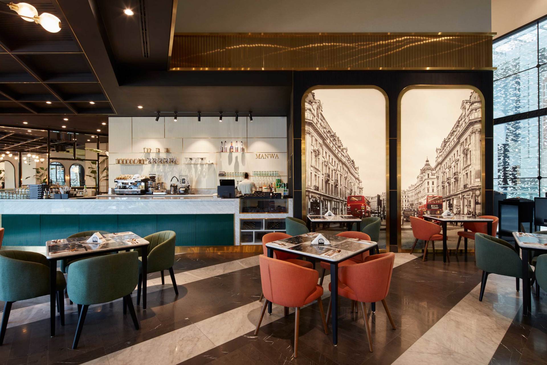
Third Avenue Boutique by H2R Design / Dubai, UAE
Third Avenue Boutique is a quintessentially stylish fine dining restaurant with the Dubai Mall’s largest terrace overlooking the world-famous Burj Khalifa and fountain views. The design aesthetic of Third Avenue Boutique is wholly contemporary from the shopfront glass façade with large scale gradient, respectfully classic to its metal arches, to the layered ceiling paneling. Marbled flooring, with the most extravagant natural stones cover the ground as a luxurious and cultural symbol of architectural refinement. Carrara White and Armani Grey stones were used to display refined taste. Alternate marbled coloured patterns where placed angled to space to create depth, and a dynamic feel and movement. The team incorporated a Piet Mondrian inspired wall of vertical and horizontal line compositions to strengthen asymmetries. Characterized by a rigid geometry of squares and rectangles, that are striking in their simplicity, the rich Mondrian Style black ribbed wood paneling was designed to pronounce the complexity and character of the space while the gold accent strips create definition.
Address: Financial Center Road The Dubai Mall - Fashion Avenue Downtown - Dubai, UAE
49.
La Visione by Ippolito Fleitz Group / Denkendorf, Germany
La Visione is an Italian restaurant, but also a co-working space, slash team meeting place, and a bar for everyone. Above all, it is a point of contact for Object Carpet, the renowned carpet supplier from Denkendorf, to engage with the world. The idea behind the campus is to create synergies, and the restaurant follows suit: La Visione consciously positions itself between different worlds in every respect. The restaurant is divided into 3 sections: a lounge, a dining area and a vinoteca. In the first space, a counter that is not actually a counter, as it brings the charm of the kitchen to the bar, effectively dissolving all divisions between guest and server. Not only the different roles have fluid boundaries, but also the different functions: this is a co-working space at lunchtime, an aperitif lounge in the evening and where the party starts when there is something to celebrate. While in the dining area the aim here was to render Object Carpet’s furnishing expertise tangible – in a subtle yet palpable way. Thus textile wall collages of damask and hessian enter into tantalising dialogue with carpet and cord. And finally, the well-stocked vinoteca is certain to prove the perfect setting for many exciting encounters - and for one or the other new vision.
Address: Marie-Curie-Straße 3, 73770 - Denkendorf, Germany
50. Mexican Restaurant Masaryk by Vrtical / Mexico City, Mexico
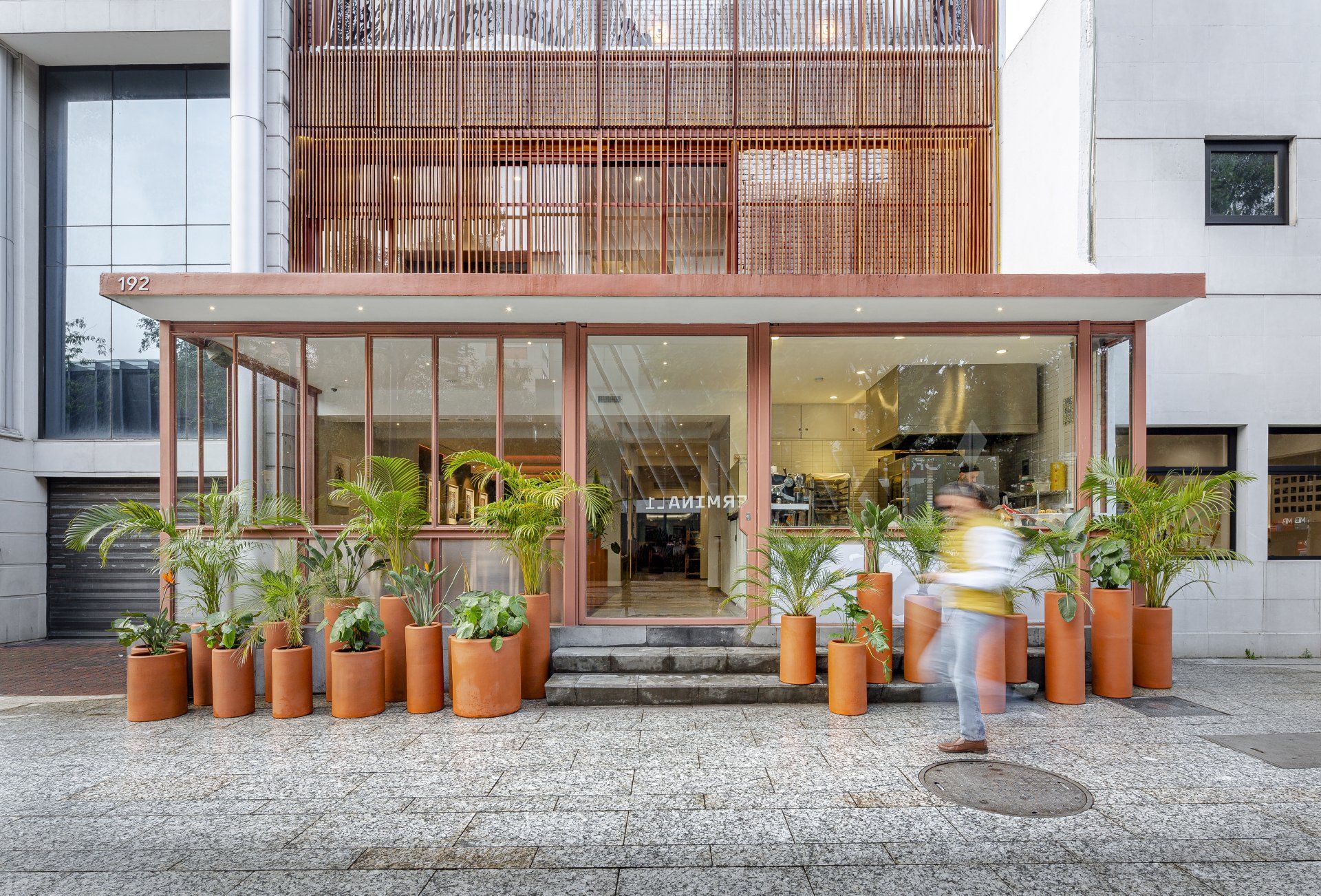
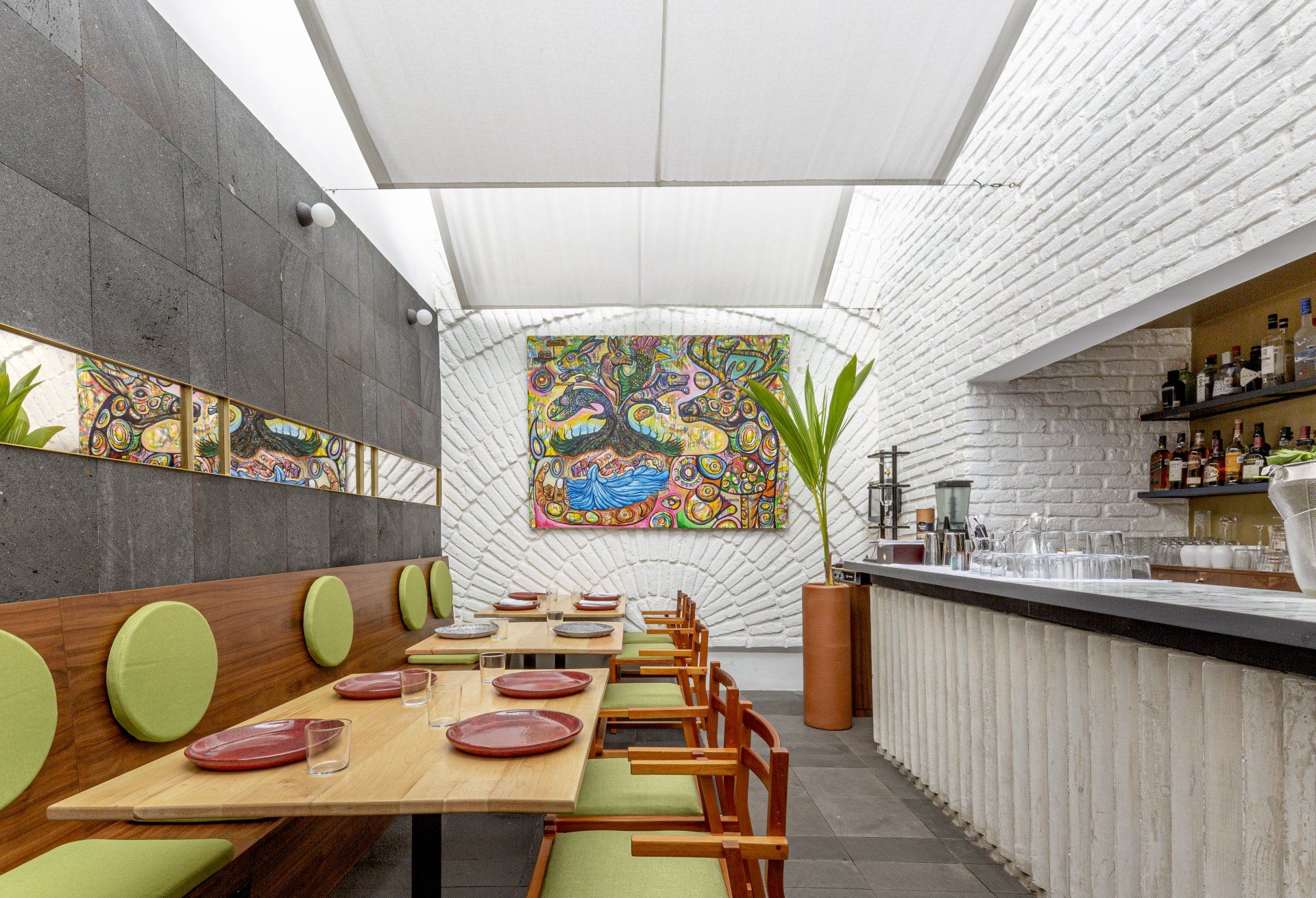
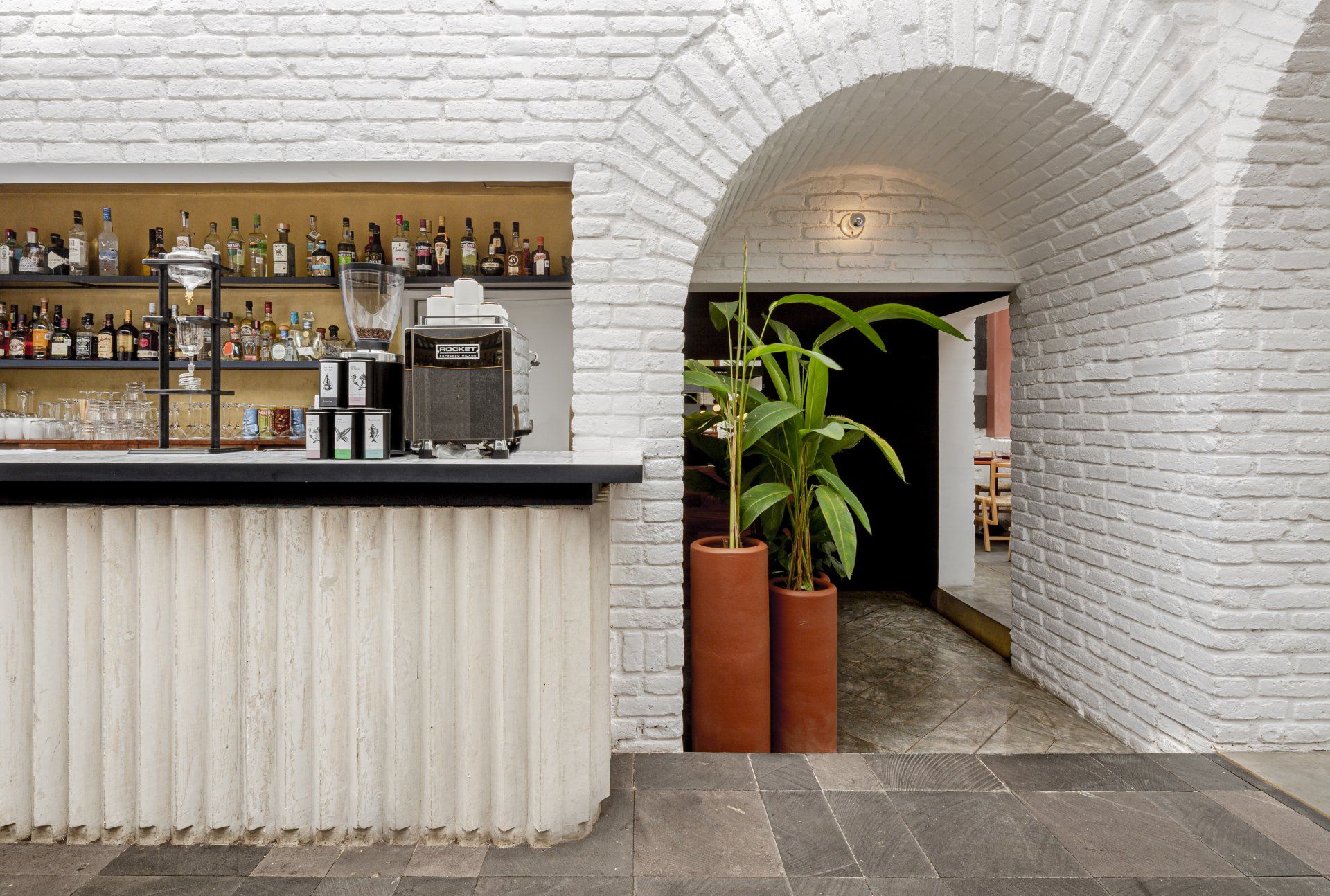
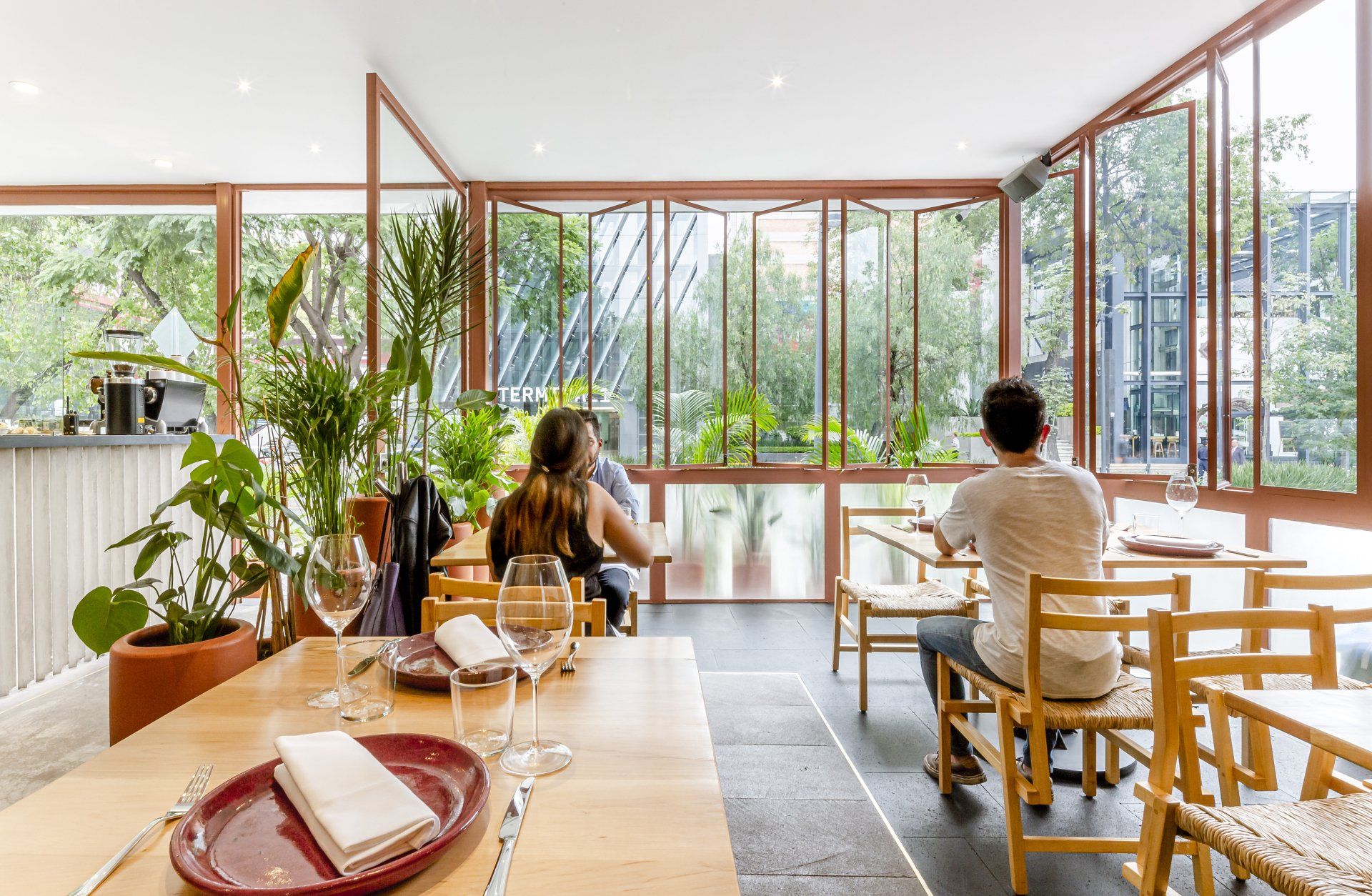
The color palette of the restaurant emerged in a natural way, first assimilating the dark color of the volcanic rock floors, and then the red tones of the cumarú and tzalam woodworks. Yet Vrtical wanted a compliment, an accent that would be brought by the green of the vegetation, first the existing one from the avenue, then trough the proposed layers of tropical plants in the exterior and interior of the ground floor, and at last in the upholstery of the seats and backrests. Also, the clay pots were painted in different earthly colors, trying to get to an honest image of the colors of Mexico.
Address: Av. Pdte. Masaryk 192, Polanco, Polanco V Secc, Miguel Hidalgo, 11560 - Mexico City, Mexico
SHARE THIS
Latest Edition
Mar / Apr 2026 edition is available now!
Contribute
G&G _ Magazine is always looking for the creative talents of stylists, designers, photographers and writers from around the globe.
Find us on
Latest News

Subscribe
Keep up to date with the latest trends!
Popular Posts
