MISU
FADD Studio projected an Asian restaurant inside a church in with classical and colonial western elements Bangalore, India.
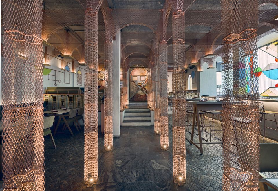
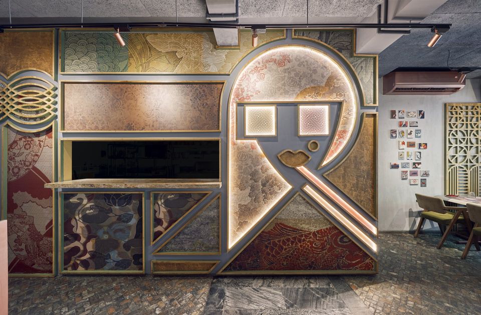
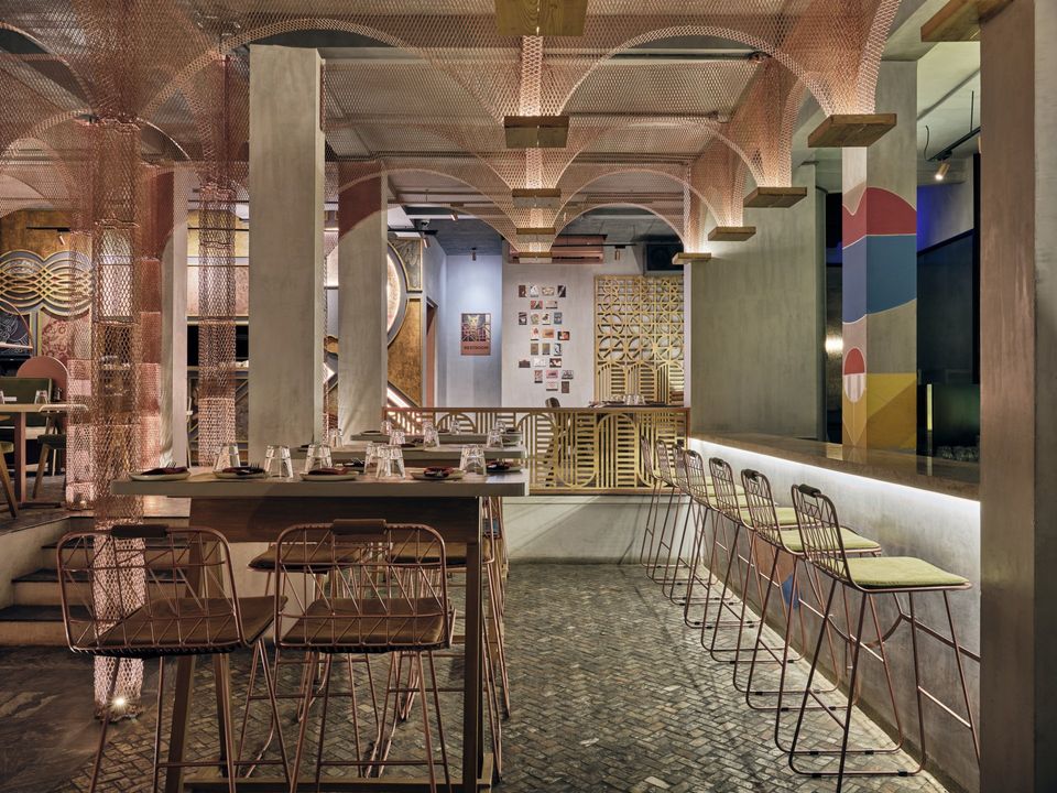
FADD Studio laid out some ground rules for this projecy like bring back all studio's deep colours of blue, green and mustard and crimson, and use copper in abundance. The space is divided by a central passage that brings to the central point - the deconstructed, almost cubist portrait of a girls face.
It stays to a trend that Asian restaurant often have an Asian face that is larger than life. But also it breaks away by the way the face is done. It is abstract using lines and shapes.
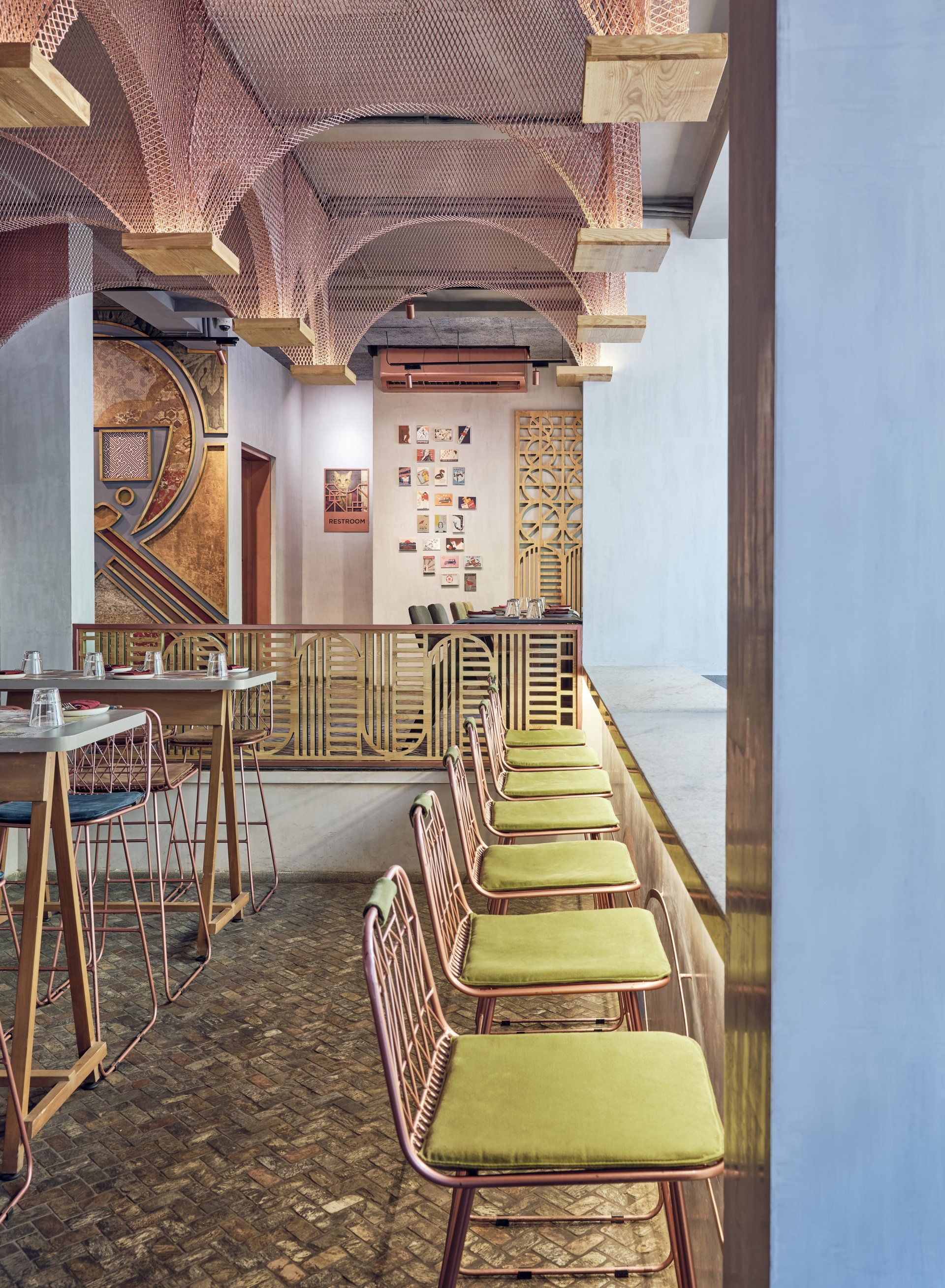
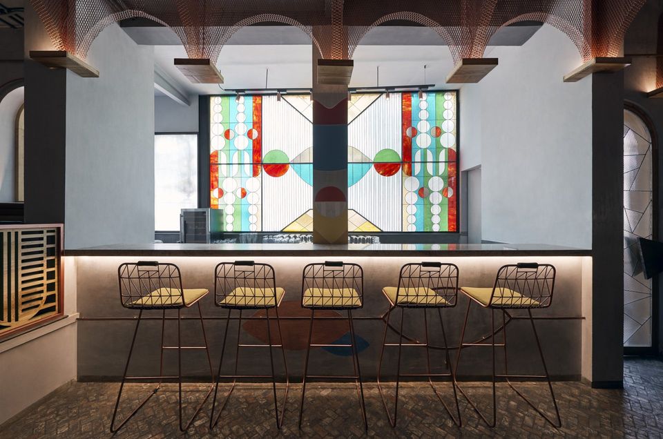
Inside this contemporary restaurant the fine and minimal Japanese shapes meet a beautiful and mesmerising confluence of glamour and grunge. Indirect lighting softly illuminates the mesh arches and hand painted walls to create an intimate atmosphere at night. During the day the abstract stain glass at the back of the bar overpowers the area becoming the focal point for a fresh and hip ambience.
The setting itself breaks away from the trend that Asian restaurant have to look typically “Asian” with elements like bamboo, greenery, cane, and natural materials, Asian symbolism and typography. When you see an Asian restaurant, usually you can spot it from a mile away. With this, we used Roman church elements like stain glass, wall painting and a central isle to create a counterintuitive feel for an Asian restaurant.
Indirect lighting softly illuminates the mesh arches and hand painted walls to create an intimate atmosphere at night. During the day the abstract stain glass at the back of the bar overpowers the area becoming the focal point for a fresh and hip ambience.
SHARE THIS
Latest Edition
Mar / Apr 2026 edition is available now!
Contribute
G&G _ Magazine is always looking for the creative talents of stylists, designers, photographers and writers from around the globe.
Find us on
Latest News
Subscribe
Keep up to date with the latest trends!
Popular Posts
