LULU
DC. AD projected a bar and restaurant on ground floor of an early nineteen century building, located in the Santos parish in Lisbon.
The functional programme includes a bar area, with seating and service counters; a customer area, with seating and a dance area; customer sanitary facilities; and technical areas with restricted access, such as the kitchen, pantry and storage.
The initial idea of the proposal was to insert the technical programme in the secondary areas of the space, without natural light and close to the existing patios, in order to enable the installation of the technical equipment for air conditioning and ventilation. As regards the positioning of the bar, was considered a solution facing the entrance, which faces directly on to the restaurant’s main façade, serving both as a waiting and customer service area.
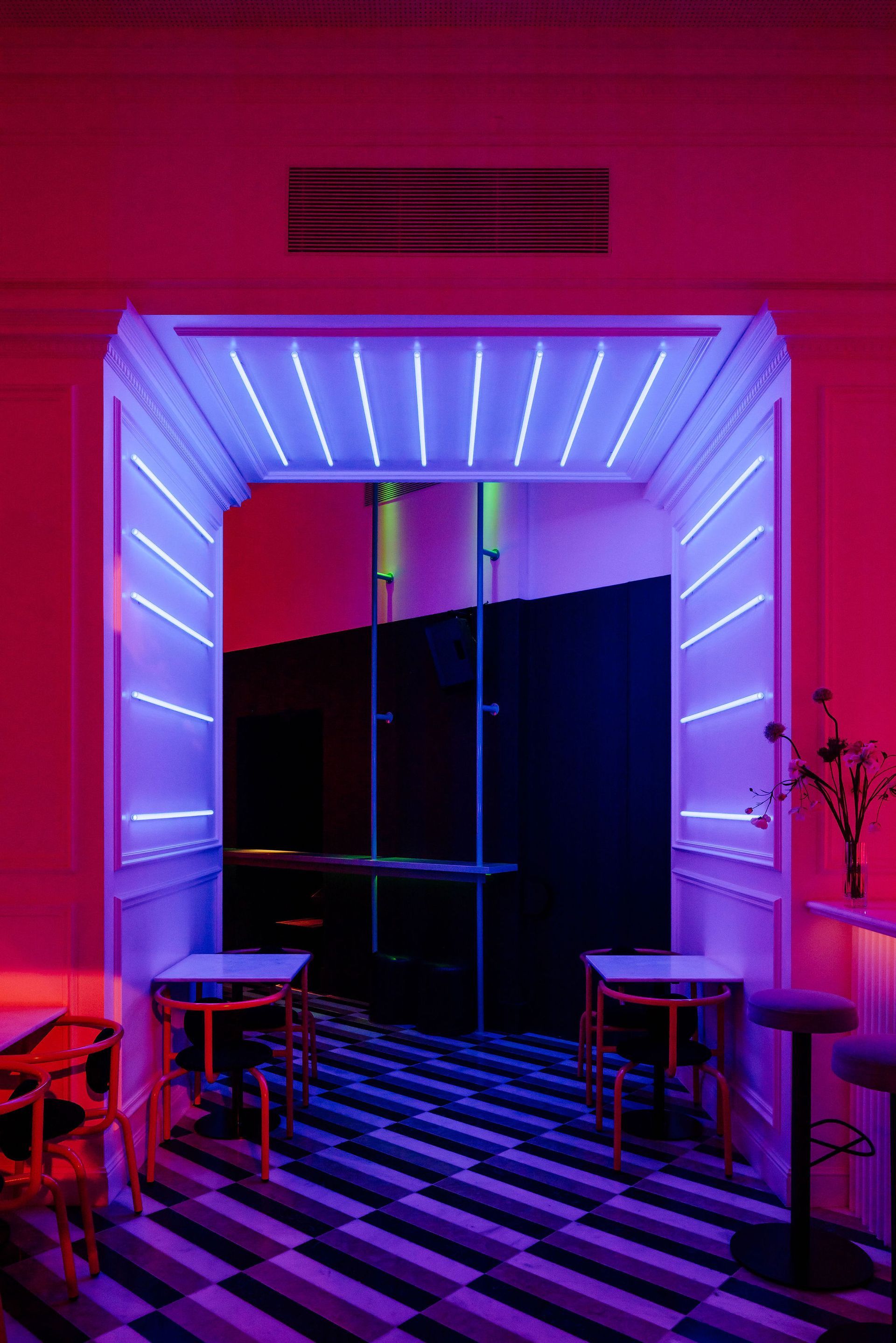
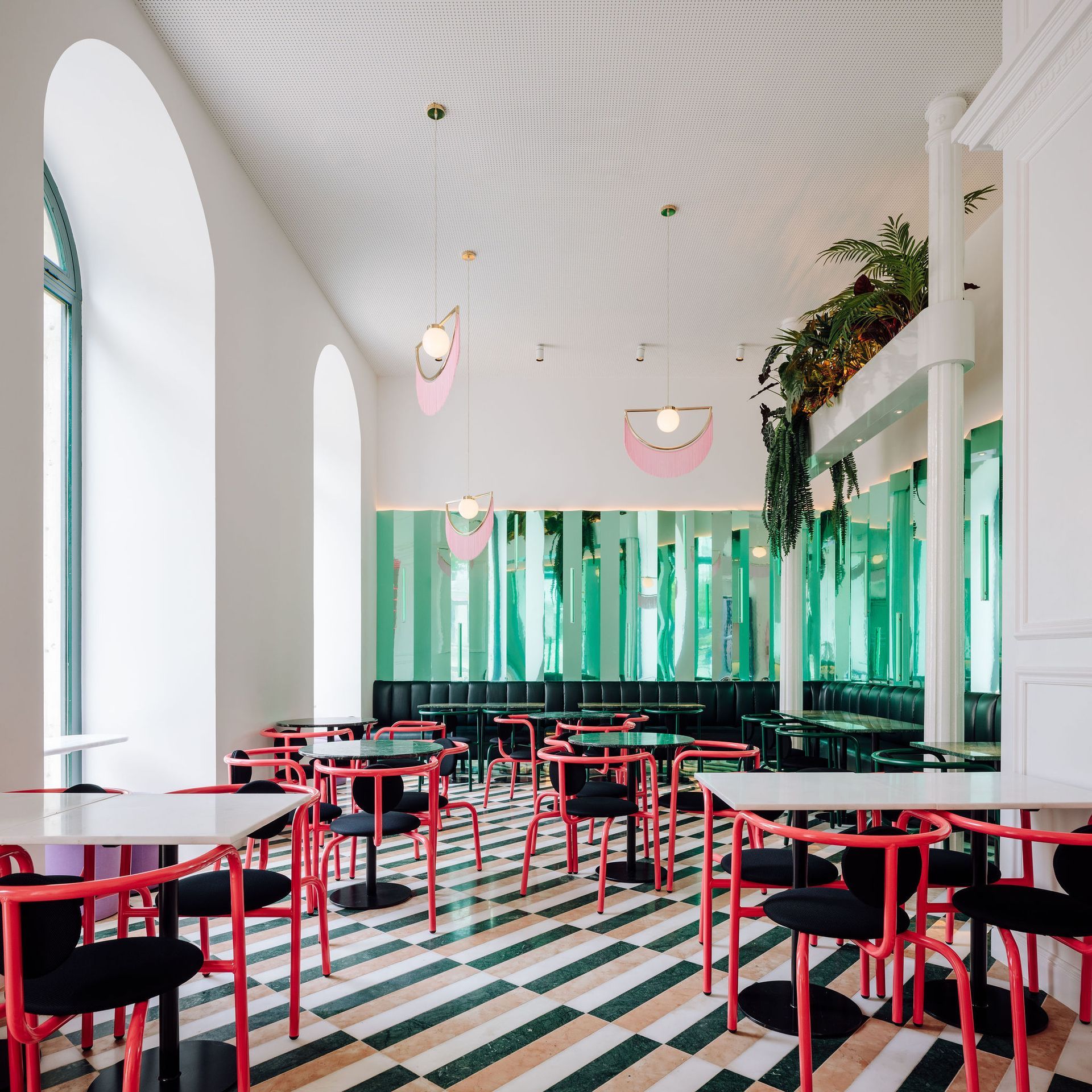
Through this arrangement, the “core” of the space, which is large and with a generous ceiling height, remained free for the use of customers. Given the geometry of the lot itself, two rooms with distinct environments were created, aiming for greater diversity of use. The first one, adjacent to the main façade, is characterised by the strong entry of natural light and clear visibility to the public thoroughfare, since the previously opaque shutters have been replaced by shop-window type openings. A fixed L-shaped sofa was designed along the bordering walls, which combines with individual tables that can be freely grouped; next to the exterior openings, two-person tables have been placed for more intimate use. For the second room, an interior one with limited natural lighting, a more relaxed environment has been created, through the positioning of a single ample sofa that, with its fluid organic design, is able to streamline the use of the space. With a central focus on a DJ table and punctuated by low tables and separate poufs, this room can be used freely, somewhere between a bar and a dance floor.
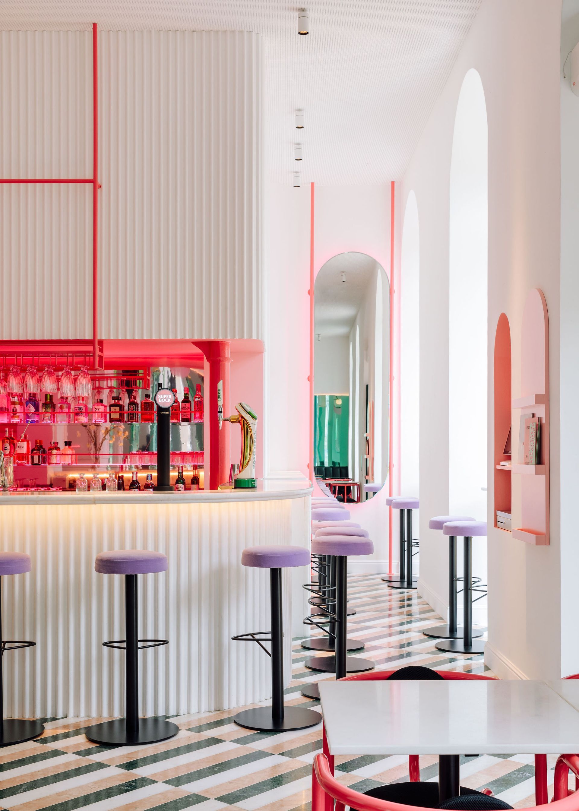
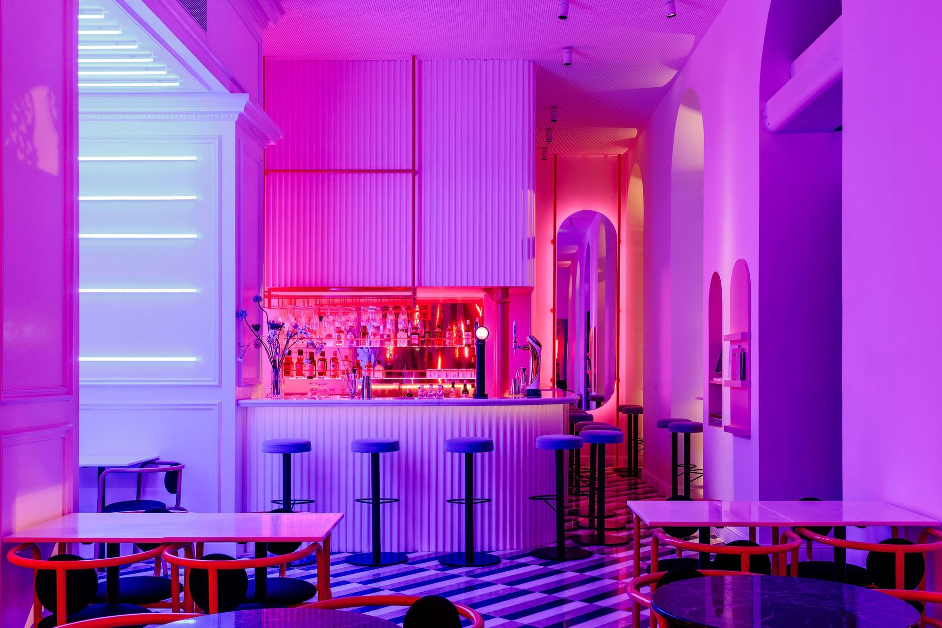
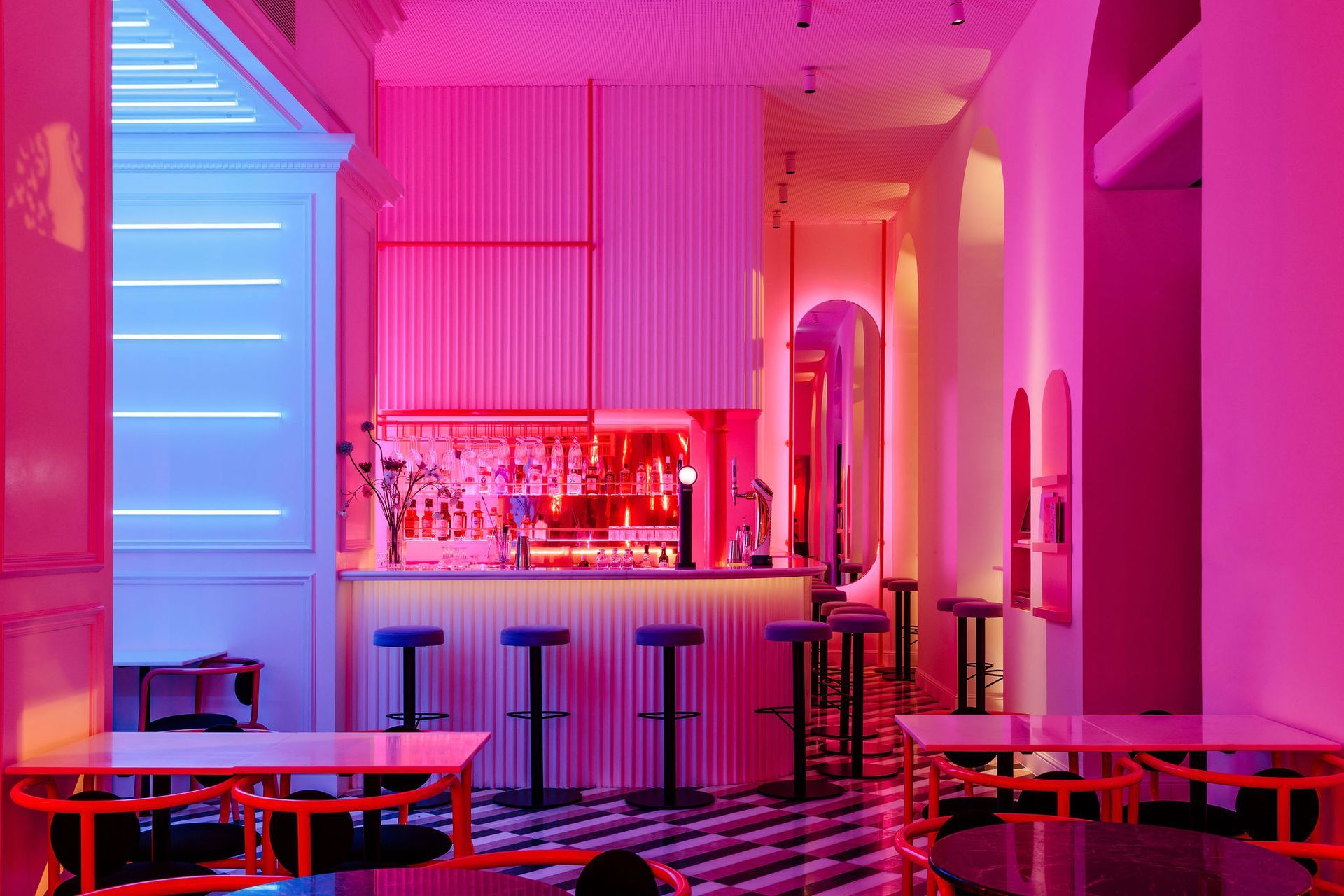
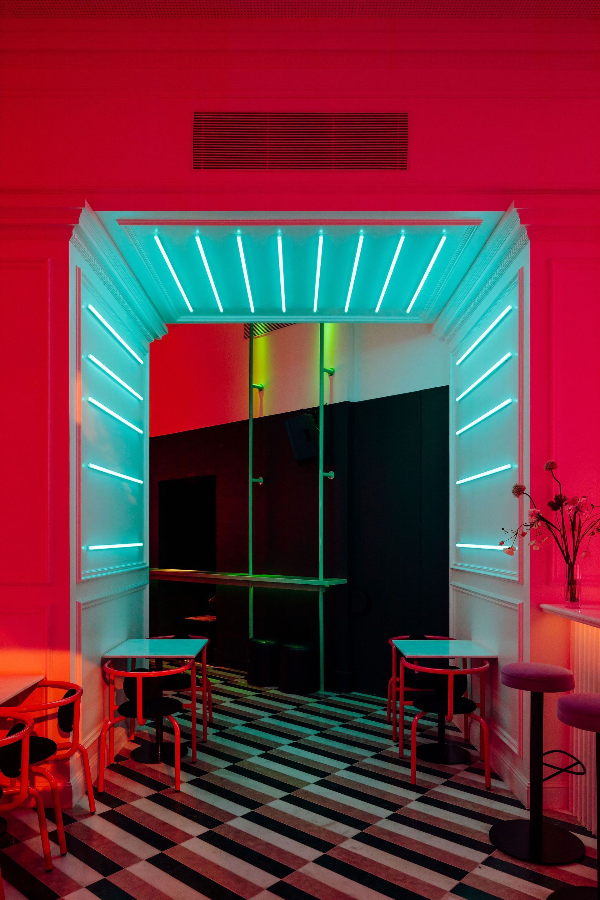
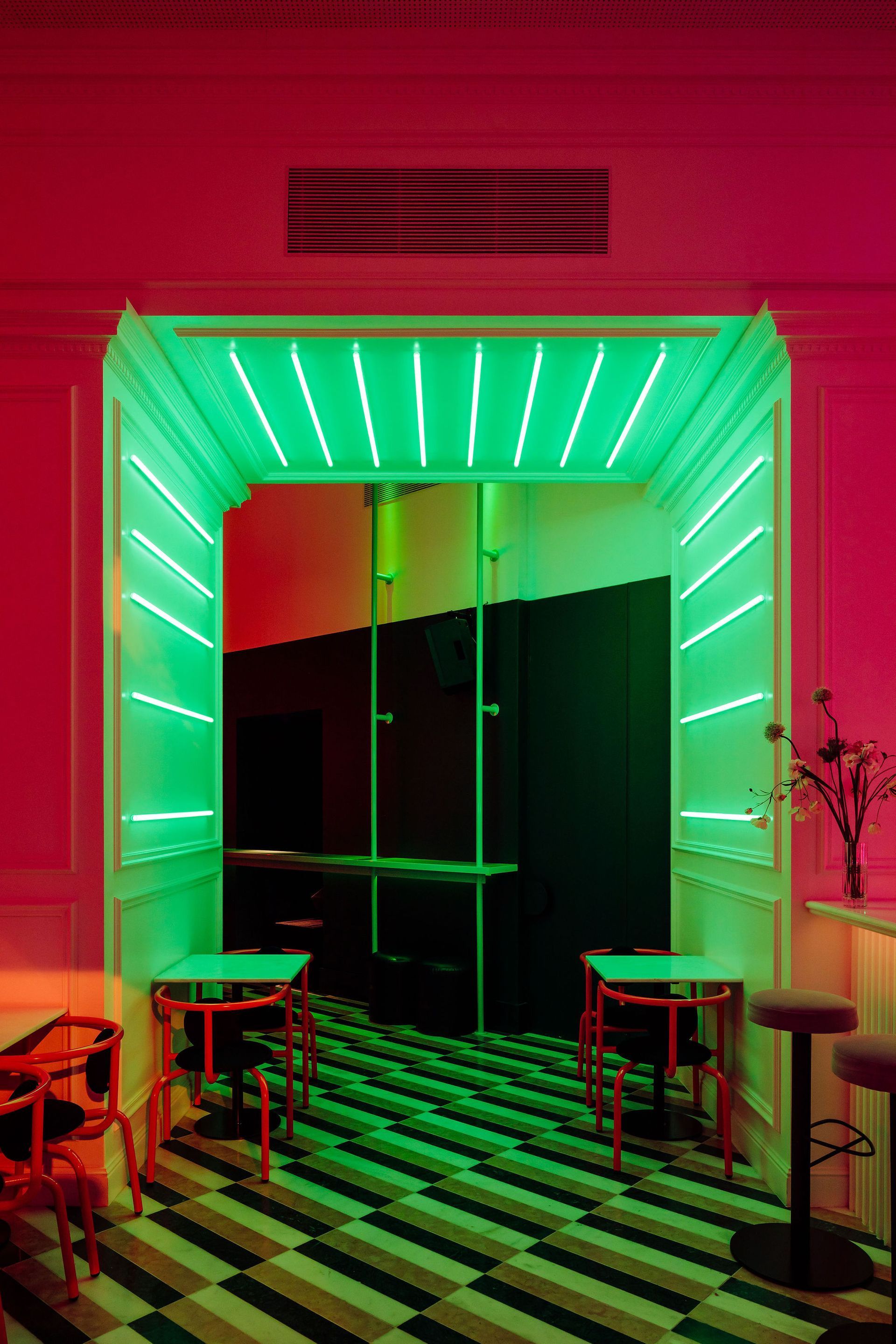
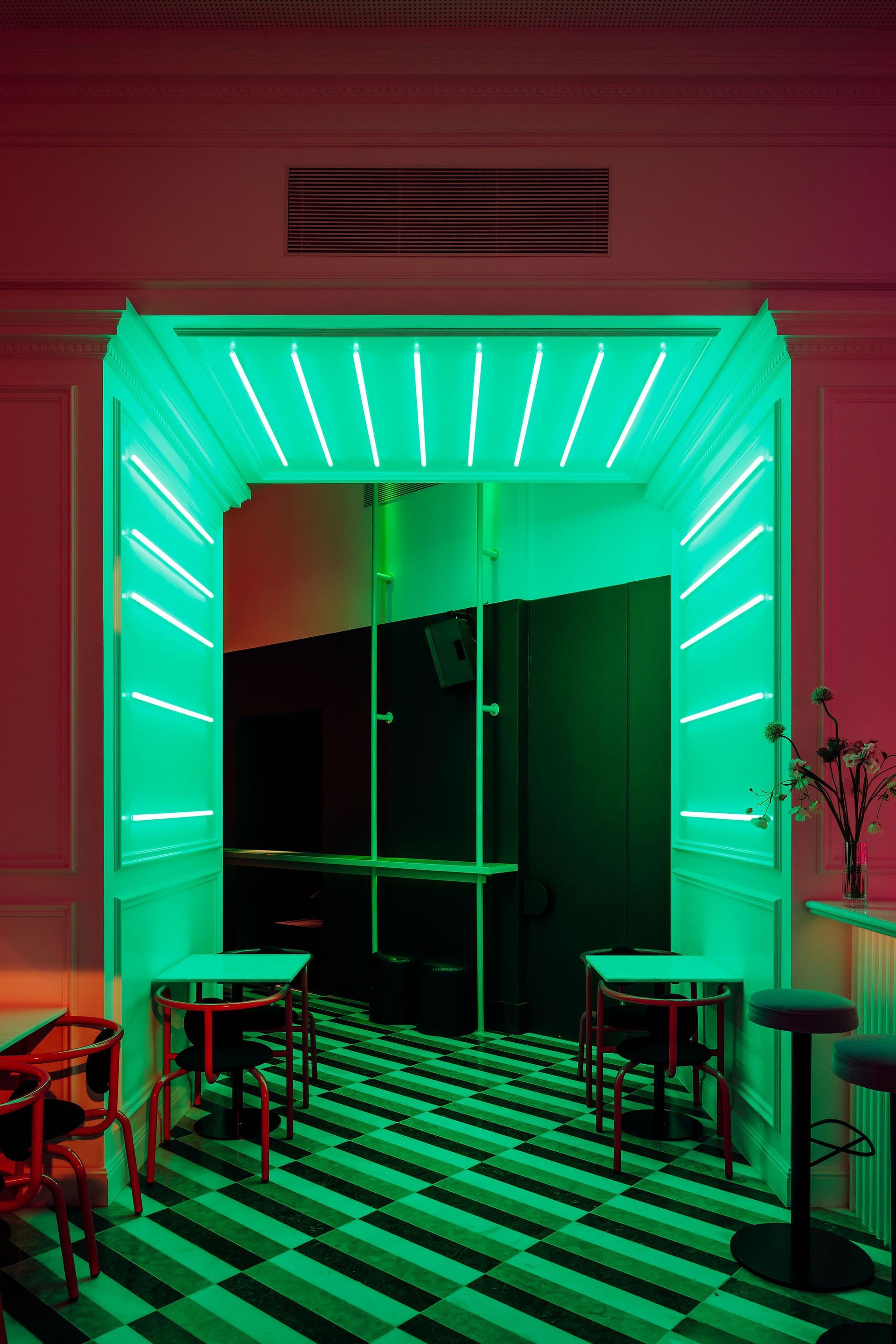
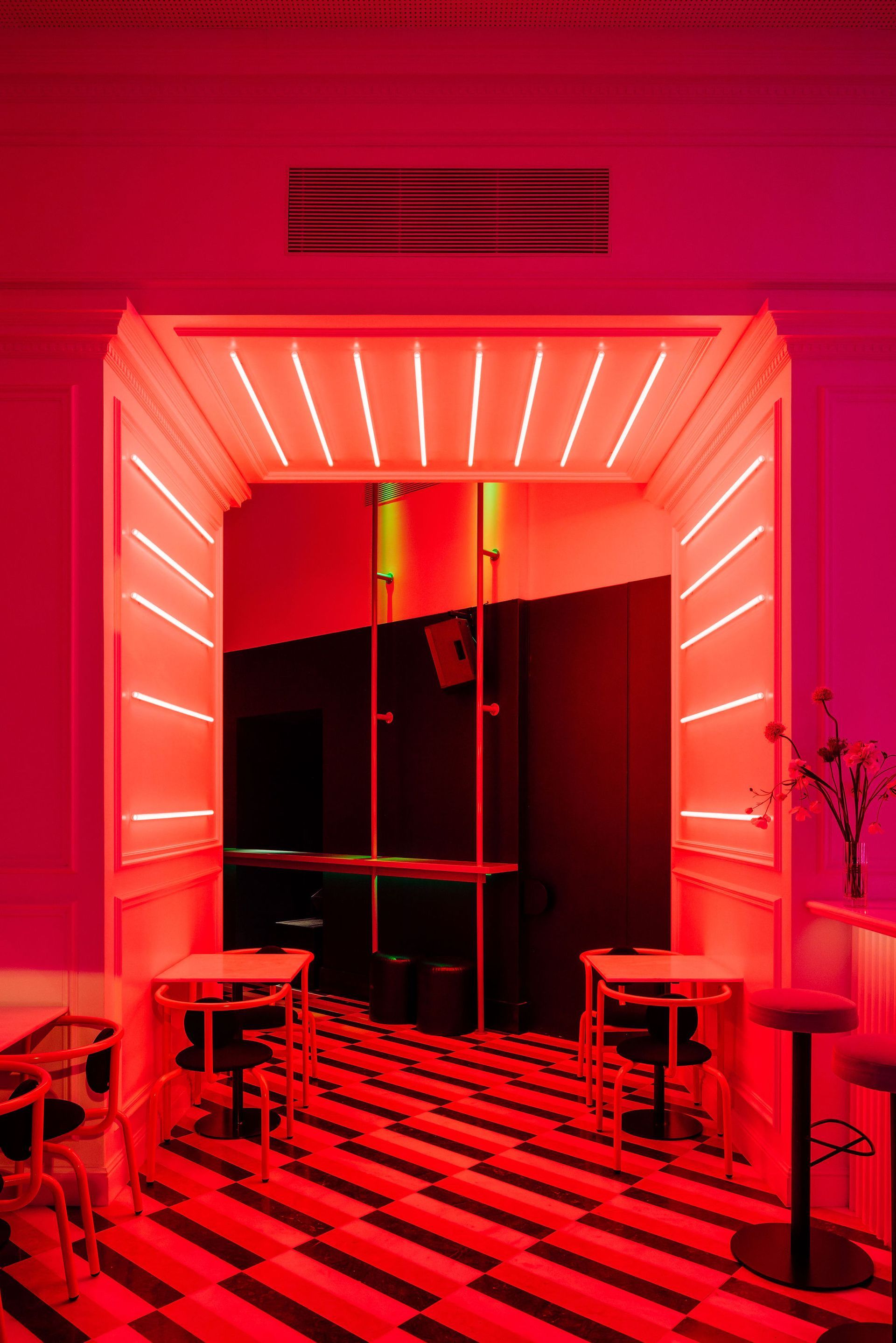
The colour palette - pink, dark green and white - was based on the colours of the main façade, creating a strong visual connection between the interior and the exterior. The use of each of these colours was also measured, creating various moments in which a certain colour is predominant, thereby marking the function of each space. There is also meticulous artificial lighting which, through a control system, provides for changes between various scenarios and, consequently, a total alteration of the space throughout the day and night, resulting in an exuberant, enveloping and specific atmosphere for each use.
As far as the ambience sought for the project, the intention was to create a space inspired by the artistic period of the 1920s and specifically in an Art Deco style - as personified in the figure of the actress Louise Brooks, who gives the restaurant its name. The designers tried to develop a new interpretation of the aesthetic characteristics of this movement, through exhaustive attention to details and the careful selection of the textures, colours and finishes. The geometric patterns of the natural stone floor, the rhythmic lacquered wooden slats or the multifaceted surfaces in coloured mirror add various dimensions of graphic, luminous and sensorial intensity. Softened by the introduction of vegetation or intensified by the rhythmic harshness of coloured neon lights, the decoration has played an essential role in the balance of the general ambience of the space, which was intended to be somewhat nostalgic but simultaneously up-to-date.
The customer toilets were placed in the annexed volume, adjacent to the western façade of the building, and these can be accessed via a flight of internal stairs.
Photography Francisco Nogueira
Graphic Design Joana Areal
Lighting Design Joana Forjaz Lighting Design
Interior Design DC. AD (DUARTE CALDAS ARQUITECTURA.DESIGN)
SHARE THIS
Latest Edition
Mar / Apr 2026 edition is available now!
Contribute
G&G _ Magazine is always looking for the creative talents of stylists, designers, photographers and writers from around the globe.
Find us on
Latest News

Subscribe
Keep up to date with the latest trends!
Popular Posts
