Laminex x YSG
Invited by Laminex to create adjoining residential spaces, YSG Studio conceived a kitchen and living area that incorporates a study nook in Melbourne.
The aspirational design needed to reflect the multi-tasking demands placed upon homes as places to relax, work and play. Equally, it had to showcase how Laminex laminates can play a key role in delivering these interiors, bringing inspired colour and texture, incredible design flexibility and hardwearing durability to the finished project.
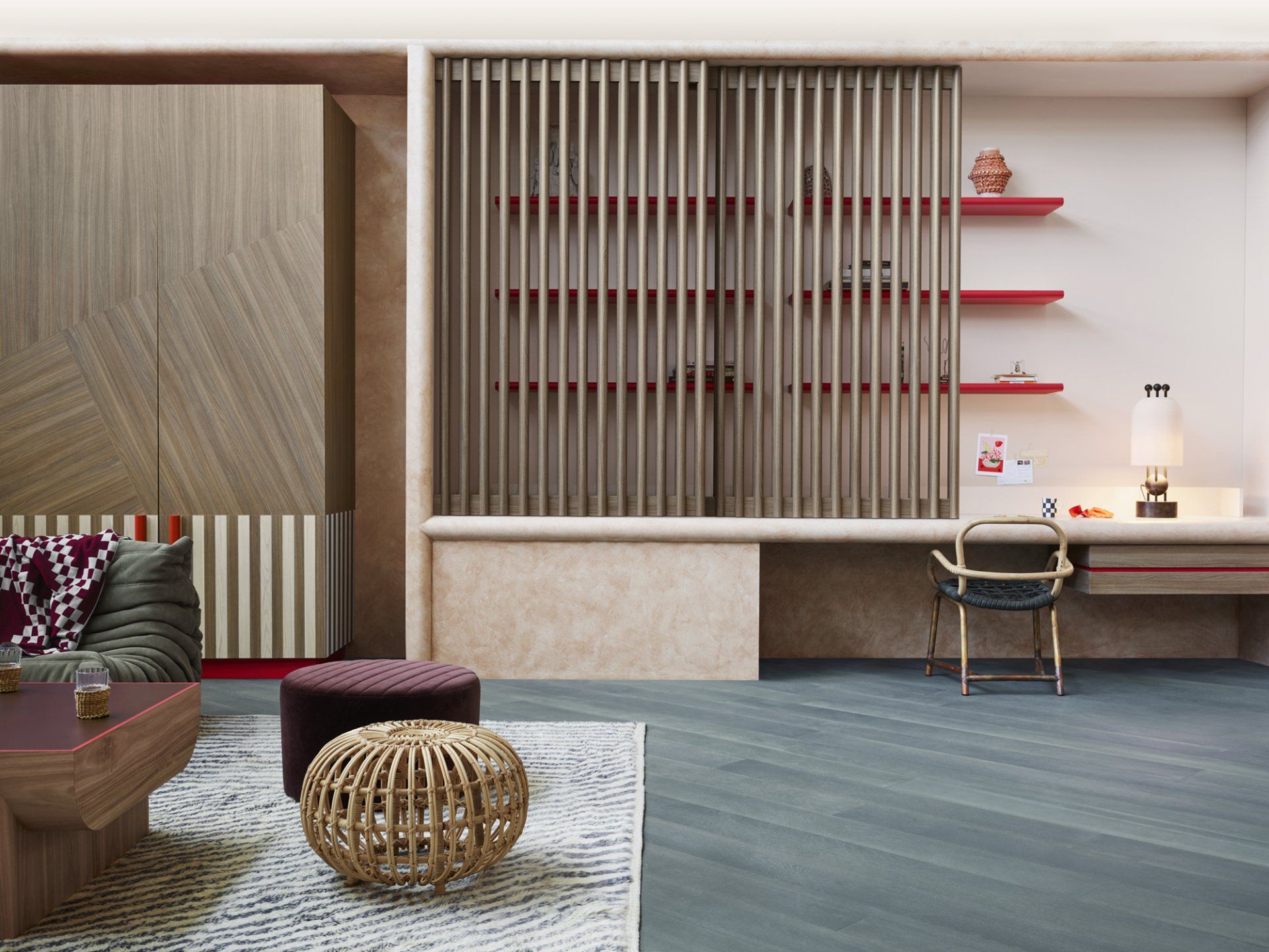
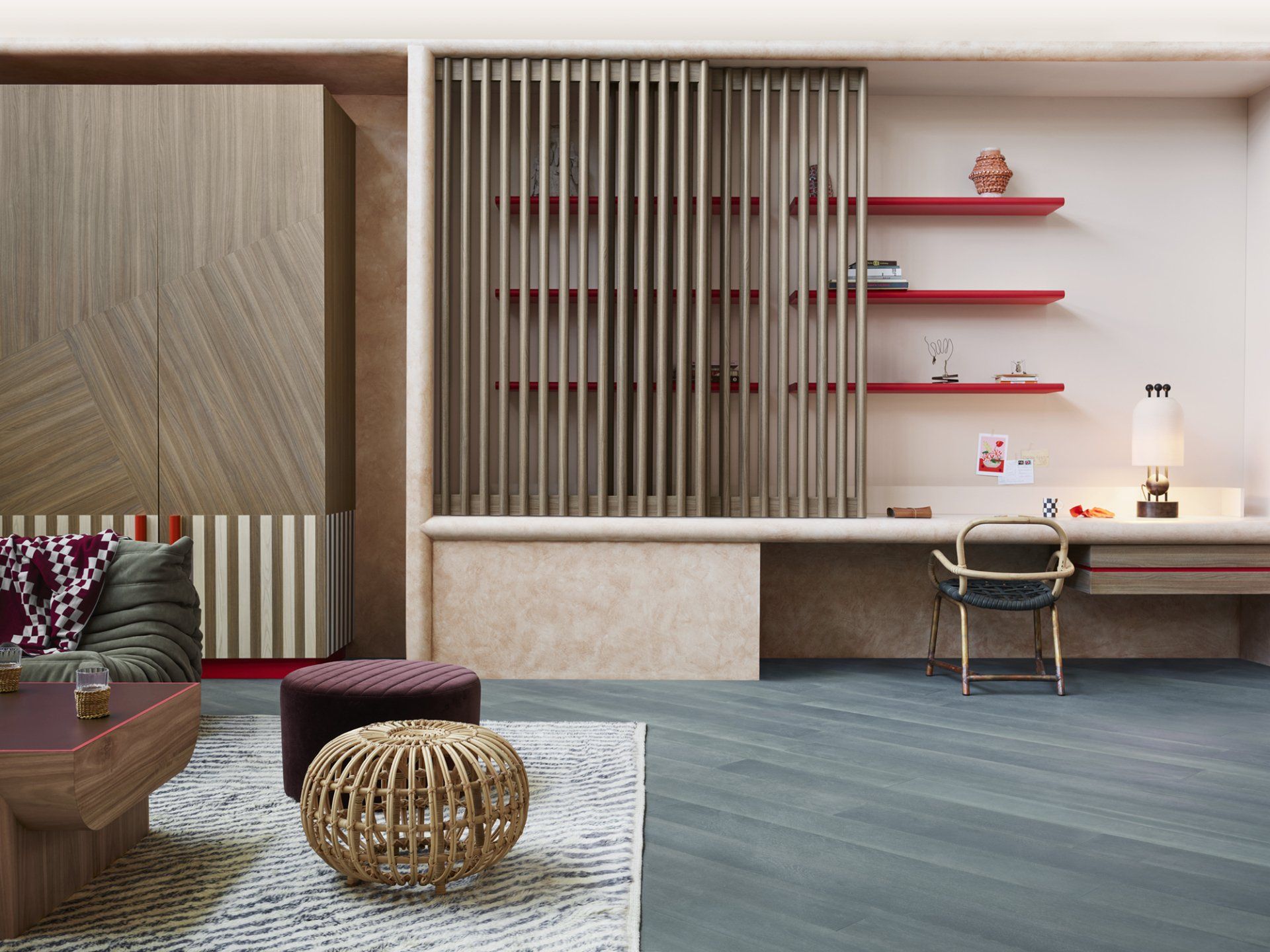
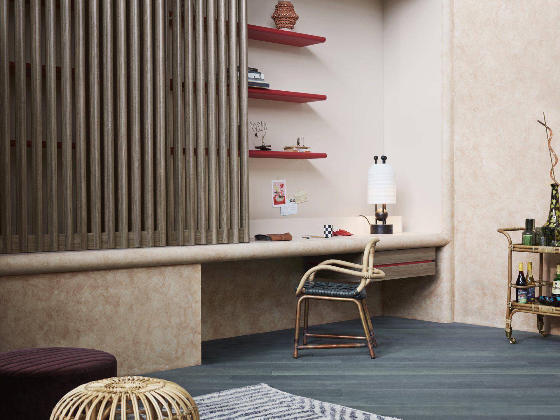
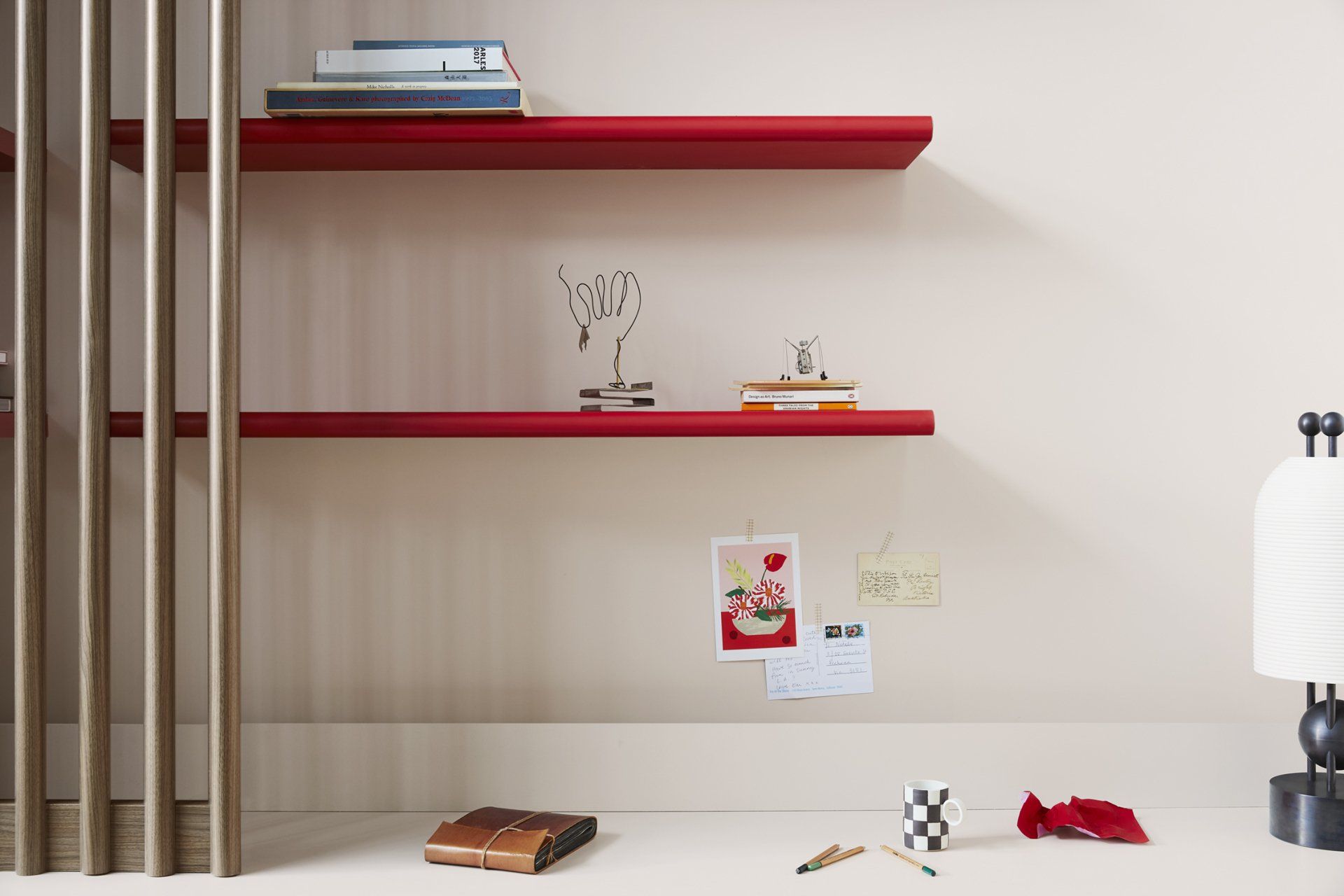
The bullnose linear screens above the desk surface comprise two units with the outer screen permanently fixed between the desk and ceiling and the inner screen being able to slide across to conceal equipment and paperwork on the desk area should guests be arriving or the home owner wanting to switch off from work for the day. Using a solid laminate would have darkened that corner of the room into a dense mass, and we liked the idea of the shelves and their ornaments piquing visual interest even if the screen was partially drawn over them. On a practical level, each batten fits snugly within a hand grip to pull the screen over or push it back.
COLOUR
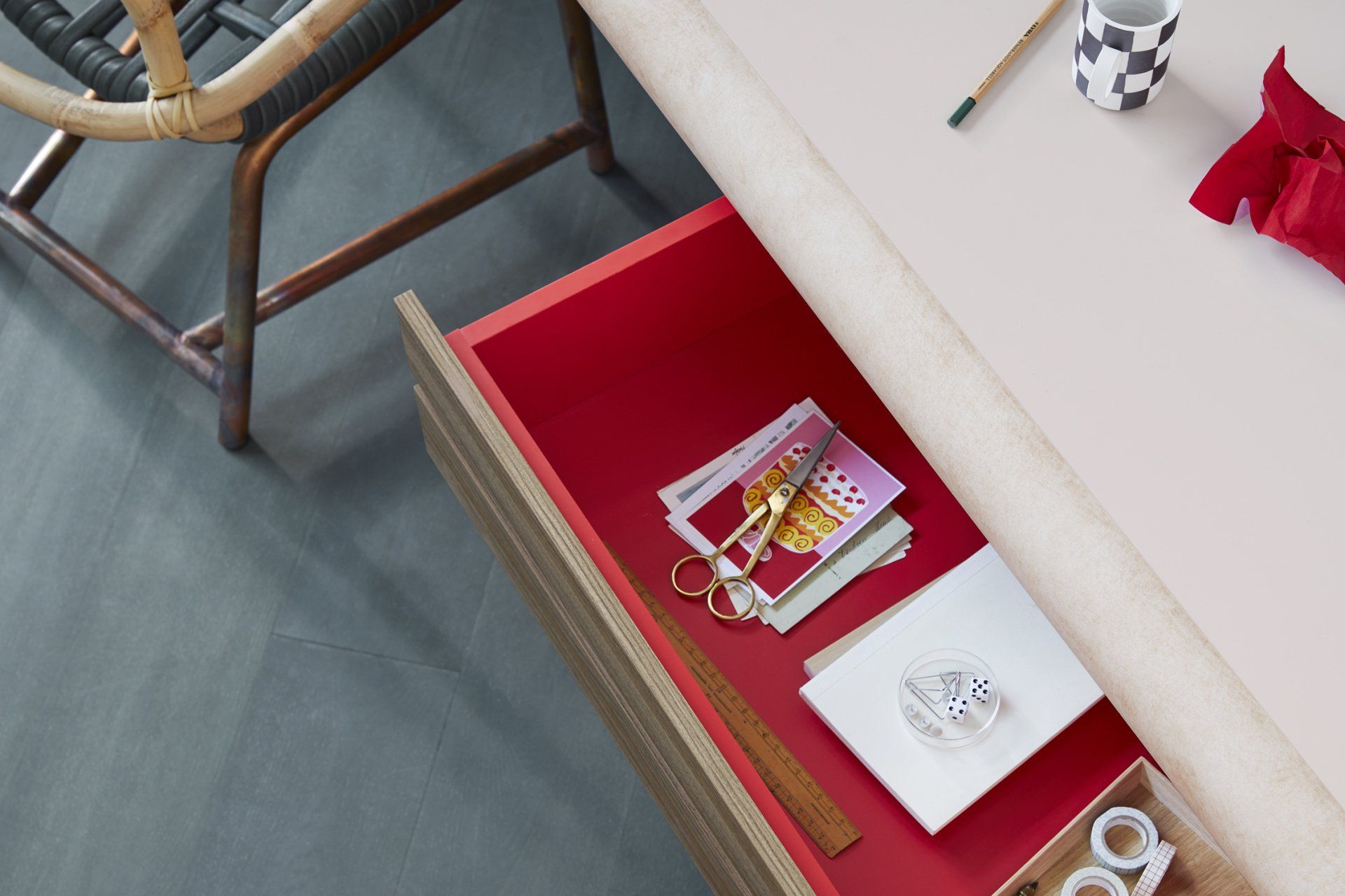
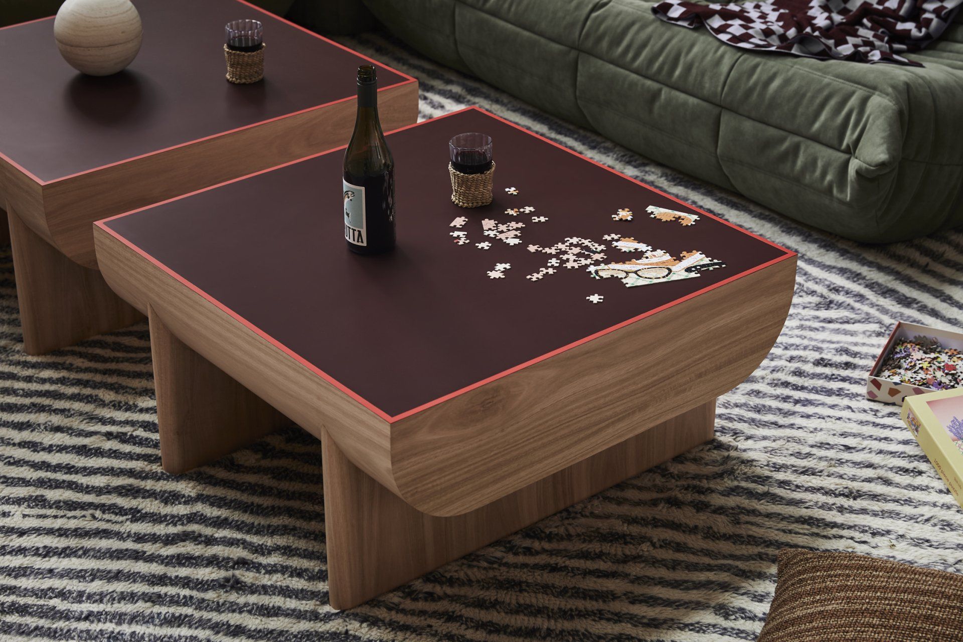
Pops of Pillarbox Natural Finish red are blended ainst the more neutral woodgrain backdrops to ignite visual interest around the room and within joinery internals which also added visual depth and blushing surprises.
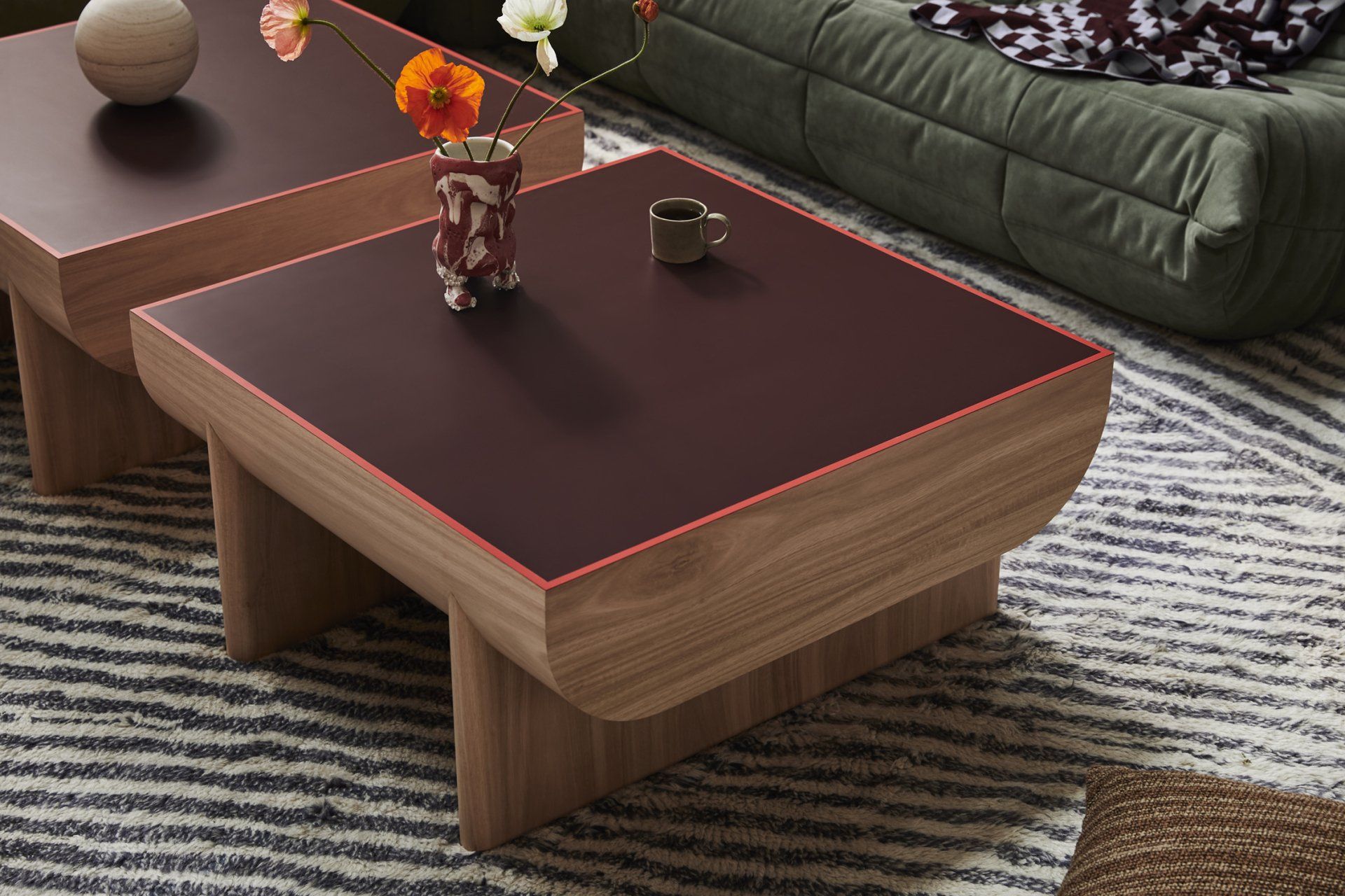
"We balanced its saturation on the exposed shelves to subtle glimmers on the low handles on the cupboard doors (and its recessed base) plus the strip across the desk’s drawer and the perimeter of the two coffee table surfaces to encourage visual exploration up, down and across the room as opposed to just eye level, making the room appear larger."
TEXTURE
Working with Laminex reduced the need to explore other materials such as solid timber and natural stone, so it was a huge time and budget saver. Case in point is the surface of the two coffee tables. A slick pouring of Kalamata laminate glides over sculpted table legs laminated in Tasmanian Oak woodgrain, tonally anchoring the room.
"For the cabinet doors I mismatched the Danish Walnut Chalk finish laminate so the two cupboards possess tapestry-like appeal with their abstracted linear patterns that are grounded by vertical bands of Laminex Milkwood Natural finish at their base."
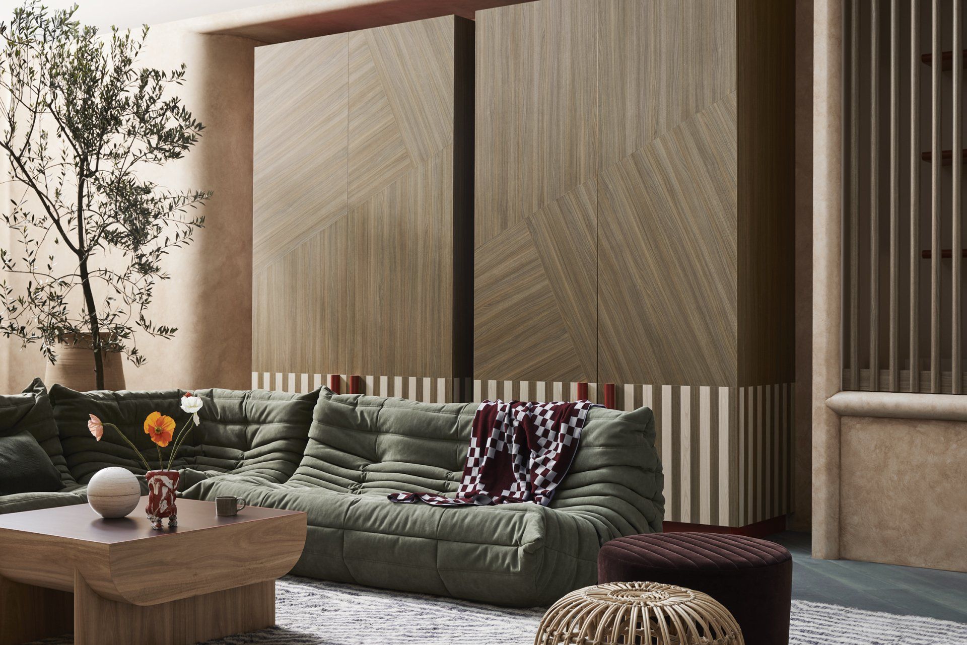
Danish Walnut Chalk finish laminate also covers the recessed library nook with bull-nosed profiles. Heights vary to accommodate publications and ornaments of various heights to add a personal touch. The woodgrain laminates are more concentrated in the sitting area to achieve a weighty gravity away from the work area. Floor to ceiling cabinets and chunky coffee tables really stabilise the room.

The Fantales living space needed to fluidly connect to the kitchen (hence no doorway – just a curved entry/exit portal), and the integrated study nook needed to be a dedicated working area which is why it faces a wall at one end of the room, furtherest from the lounges. Essentially, the combined spaces needed reflect the new reality of residential design, that homes are places where we must be able to live, work and play.
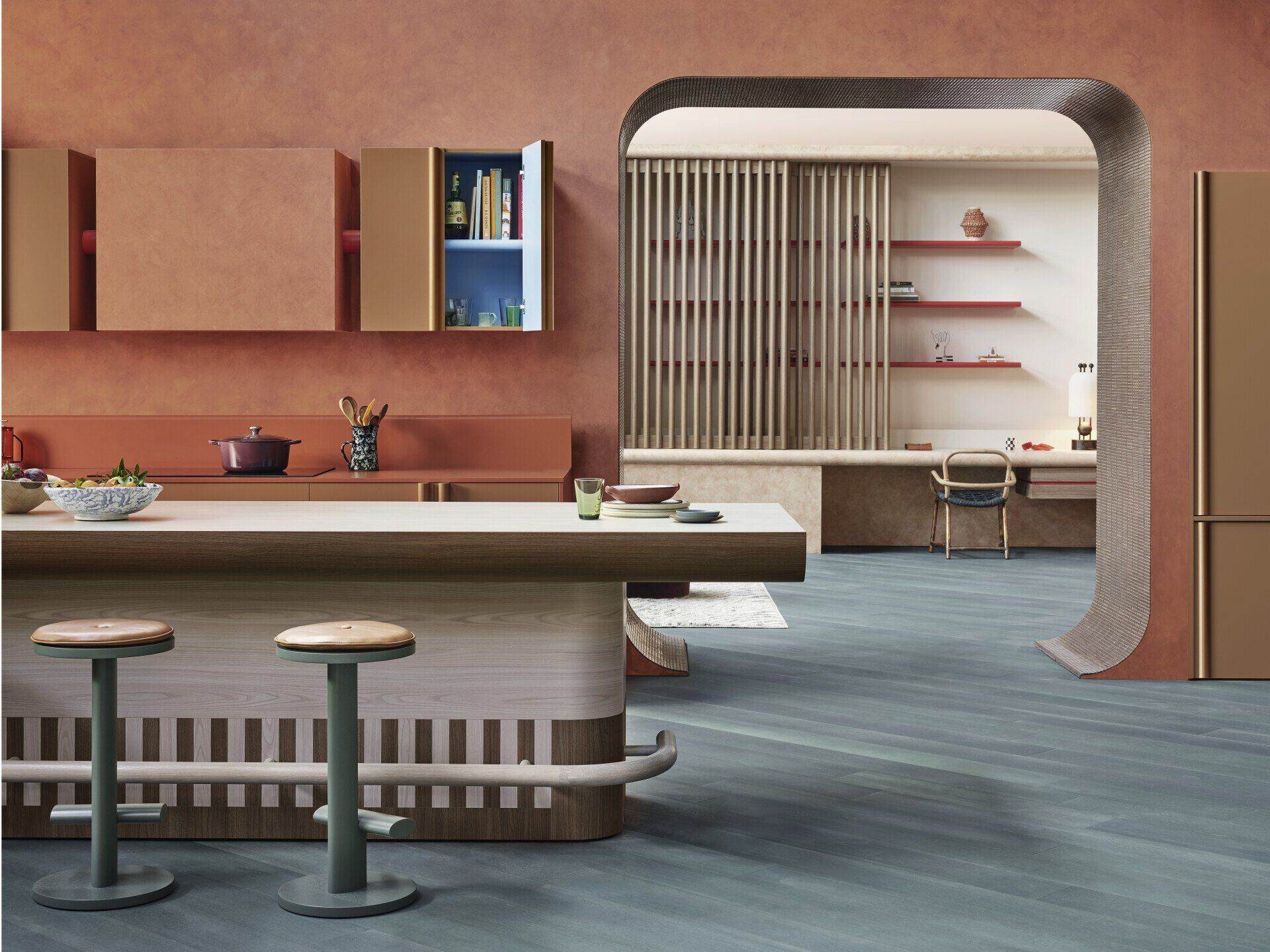
The kitchen brief was essentially to design a hub – the soul of the home where everyone tends to circulate (both family and guests). As it’s the hardest working room in the home, it literally needed to be ‘fit for purpose’ featuring considered storage facilities and space for meal preparation, plus innovative dining facilities.
KITCHEN CONCEPT
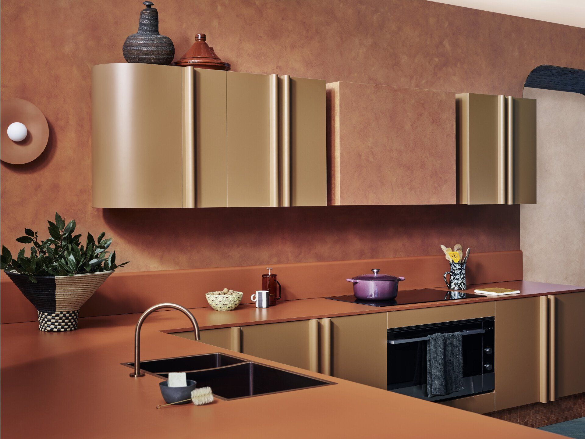
Presented with the entire Laminex Colour Collection, YSG Studio chose to feature the latest solid-colour decors together with timeless classics and authentic woodgrains. These decors are specified in both decorated board and high-pressure laminate, harnessing the unique properties of Laminex products to carve sculptural shapes that balance angled and curved outlines plus gentle bulges and flattened planes within the kitchen’s envelope.
COLOUR
YSG Studio aimed to immortalise a mood by capturing the essence of ‘afternoon delight’ – that warm, cosy time of day when the sun filters into the home and there’s nowhere else you’d rather be because the world seems to stop in that golden moment. Enhancing the nature of filtered sensations emanating within, a diagonally laid Eucalypt green-stained timber floor visually expands the kitchen’s dimensions.
Creating an immersive feeling of being dipped into a pot of sweet, warm caramel, a mottled velvet-like French wash seeps into the walls, whilst two luscious new Laminex decors – Burnt Ochre and Moroccan Clay – define the primary task area (the L-shaped bench joinery). Dowel cabinet door pulls and a curved splashback return post-formed with high-pressure laminate plus the chunky overhead cabinetry cold-formed into a sweeping return demonstrate the dexterity of the laminate materials. Elevated above a platform of gently glimmering glass mosaic tiles, the entire unit has a levitational quality befitting the desired dreamy state we wanted to achieve. A large portal lined with finger-like ceramic tiles in a similar tone neatly frames the horizontal and vertical planes within the living room’s study nook.
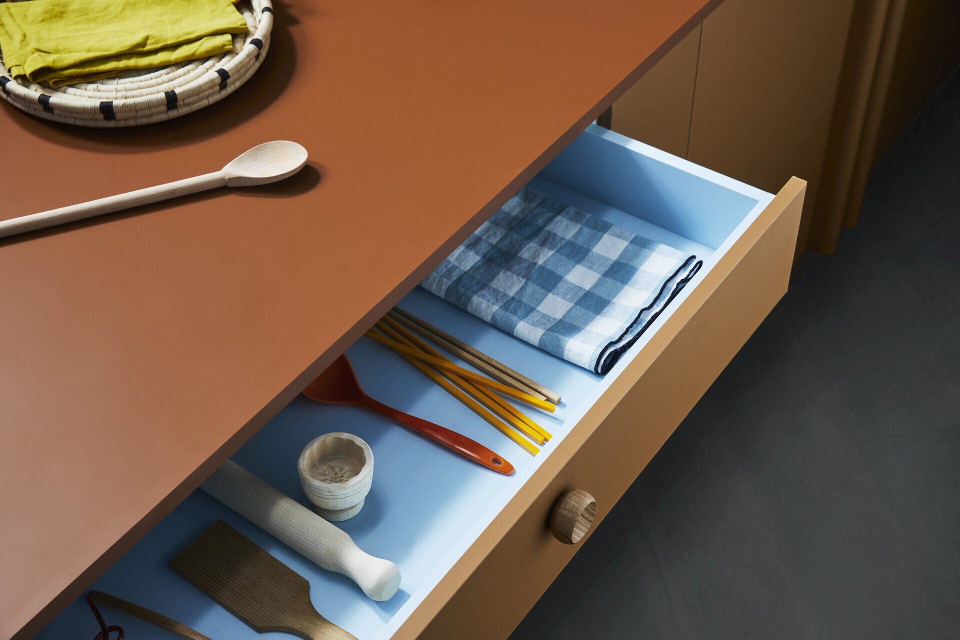
Taking cues from Rothko’s Colour Field paintings, the eye-catching pops of colour are blended within joinery internals. Fresh Spring laminate adds bursts of blue summer skies when drawers are opened and peeps from behind cupboard doors. Sweetening the offering, petite round timber draw pulls recall edible caramel buttons.
TEXTURE
Laminex encouraged a liberated approach to experimenting with their woodgrain finishes, so the island bench features two contrasting grains and tones. It tends to be the hardest working piece of furniture in the house these days (a desk to spread out on, a surface to prepare meals upon, a social hub to gather around to drink, and a screen-free zone for families to congregate around at meal times), so applying an organic, tactile finish upon its surface was essential to stimulate the senses. Replicating the natural look and feel of raw timber, YSG Studio selected the Milkwood woodgrain with a natural finish. The counter’s shape with its curved underside was inspired by the inverted hull of a boat. Given it’s neutral shade, it floats within the kitchen’s darker frame.
"Above all, working with Laminex reduced the need to explore natural materials such as timber and stone. We often stain timber with interesting hues and are drawn to leathered or roughly hewn stone surfaces for their tactile appeal. So in this case, it was liberating to have all our colour and texture resources at our fingertips."
"Laminex were after a really liberated approach to experimenting with their woodgrain finishes. They add organic texture given their grain-like raised swirls and visually arresting patterns given the way I’ve applied them to surfaces... The team was really open to carving and sculpting my design ideas. Their flexibility enabled me to craft some great features living area – from the bullnose profiles of the shelves to the curved coffee table supports.
It’s a super light product, so you can basically apply it upon any surface you wish. And unlike natural stone, it can handle harsher cleaning agents. It’s not porous either, so it doesn’t stain like stone can if something like lemon juice spills across its surface. Truth be told, I’ve always considered natural timber and stone essential interior design materials. I’m completely liberated now."
Photogrpahy
Derek Swalwell
Interior Design
YSG Studio
SHARE THIS
Latest Edition
Mar / Apr 2026 edition is available now!
Contribute
G&G _ Magazine is always looking for the creative talents of stylists, designers, photographers and writers from around the globe.
Find us on
Latest News

Subscribe
Keep up to date with the latest trends!
Popular Posts
