In black and white. Two different worlds interconnected by Zuzana Bošková in a house at Černošice
Zuzana Bošková designed the interiors of a home for a family at Černošice, Czech Republic.

Different tastes of the couple, focus on durability and safety in regards to little children, and a limited budget were the instructions given to Zuzana Bošková for this project.
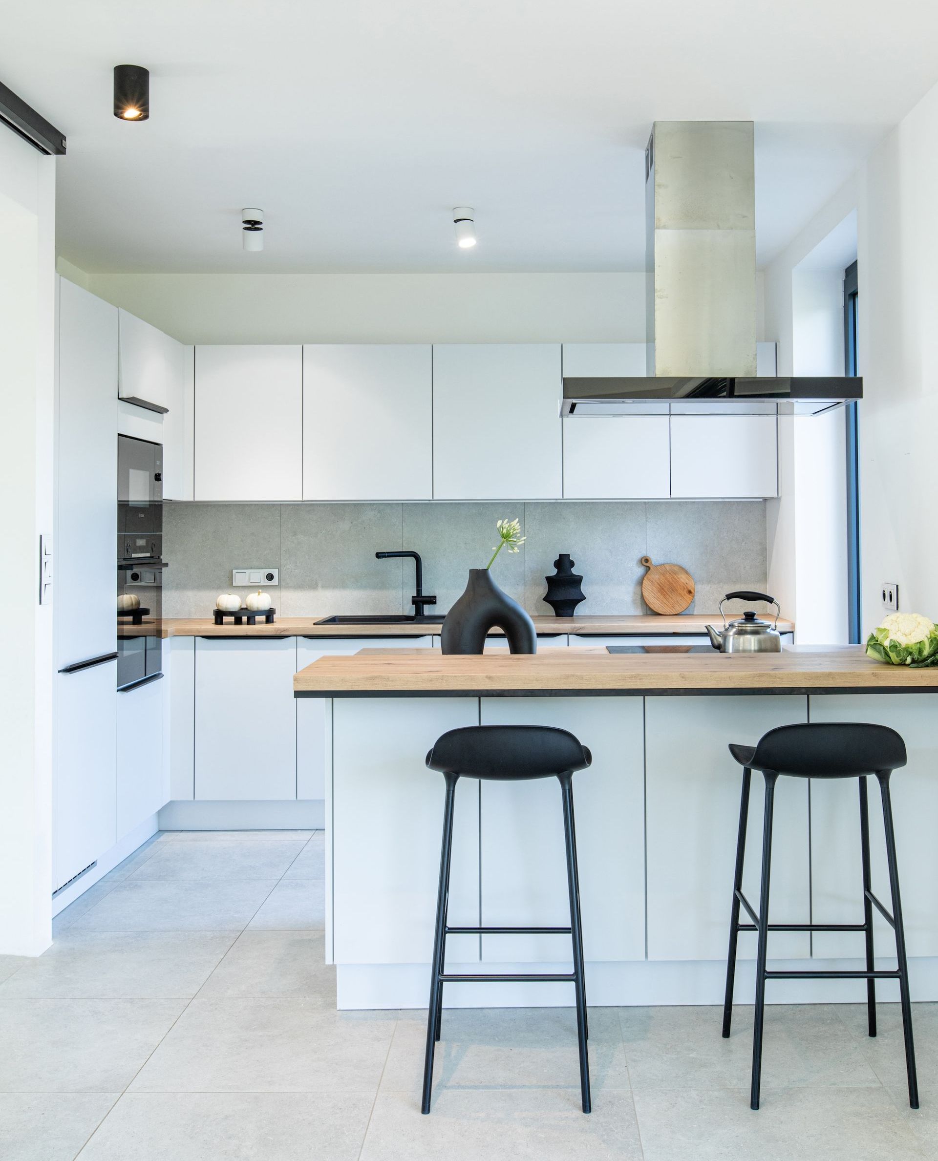
The interior design of the new-build property, projected together with the architectural one, included all rooms except for the study and the children’s bedrooms. Matching light colours and black details were used in the kitchen living room, master bedroom, hallway with a staircase, and two bathrooms in light colours and black details. The materials include wood, metal, and grey small-grained floor tiling.
“The biggest challenge was to functionally interconnect the requirements of both clients, which reflected their differing tastes. While the lady of the house preferred light tones and cosy elements in the minimalist style of japandi, her spouse wished to include numerous items in black colour. Fortunately, the combination of black and white is an all-time classic which never goes out of fashion. Therefore, we may even describe this interior as timeless.”
Zuzana Bošková
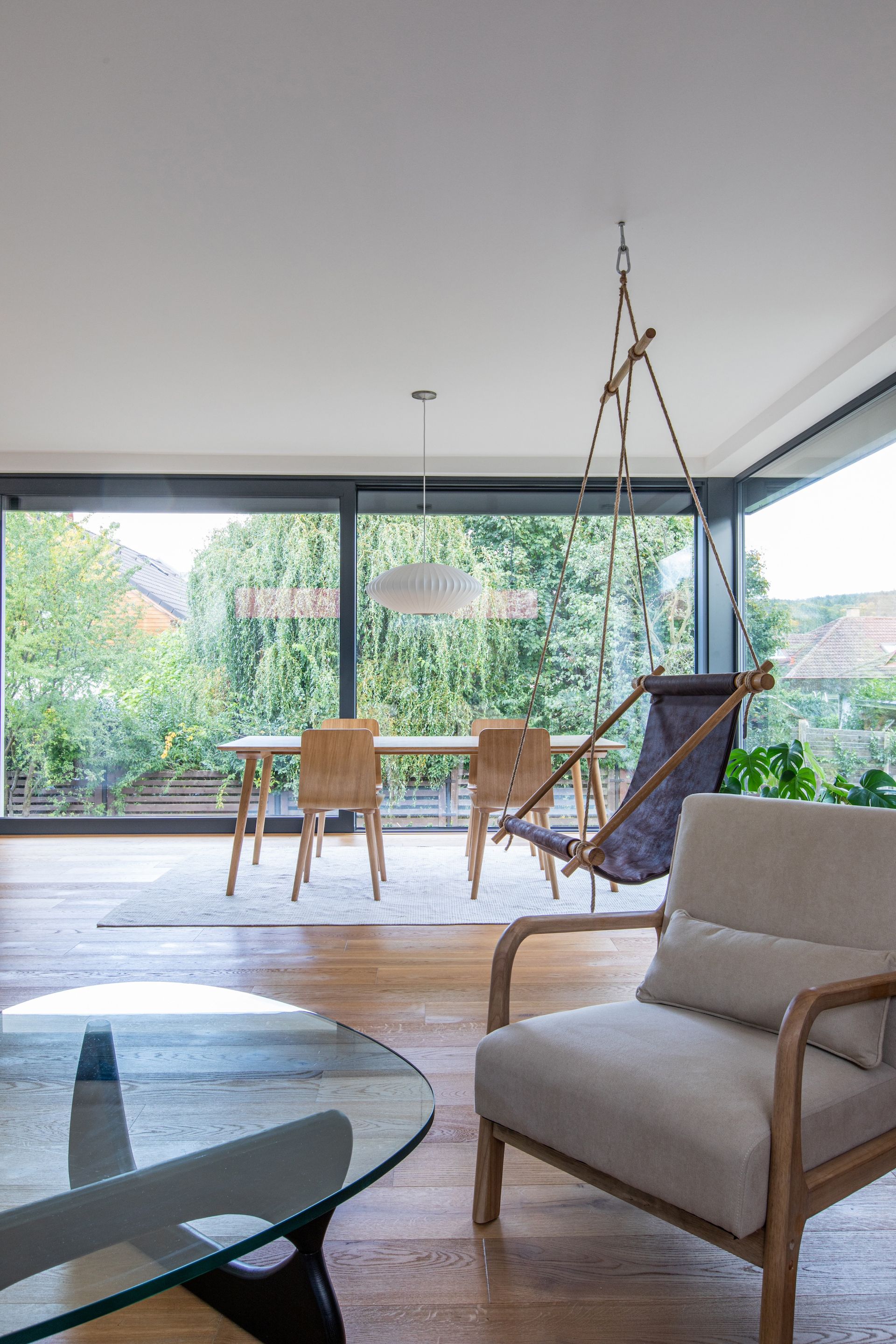
The heart of the house can be found in the living room, opening into the kitchen, serving also as a dining room. The dividing line between the two spaces is made with a kitchen island as well as two types of flooring – oak wood changes here into tiles. In the light-grey kitchen, wooden counters and black details such as the water tap and knobs catch your eye. The hob is integrated into the kitchen island so that the cooking person can still partake in social gatherings taking place here; the host may attend to guests who can sit on Normann Copenhagen bar stools right at the island.
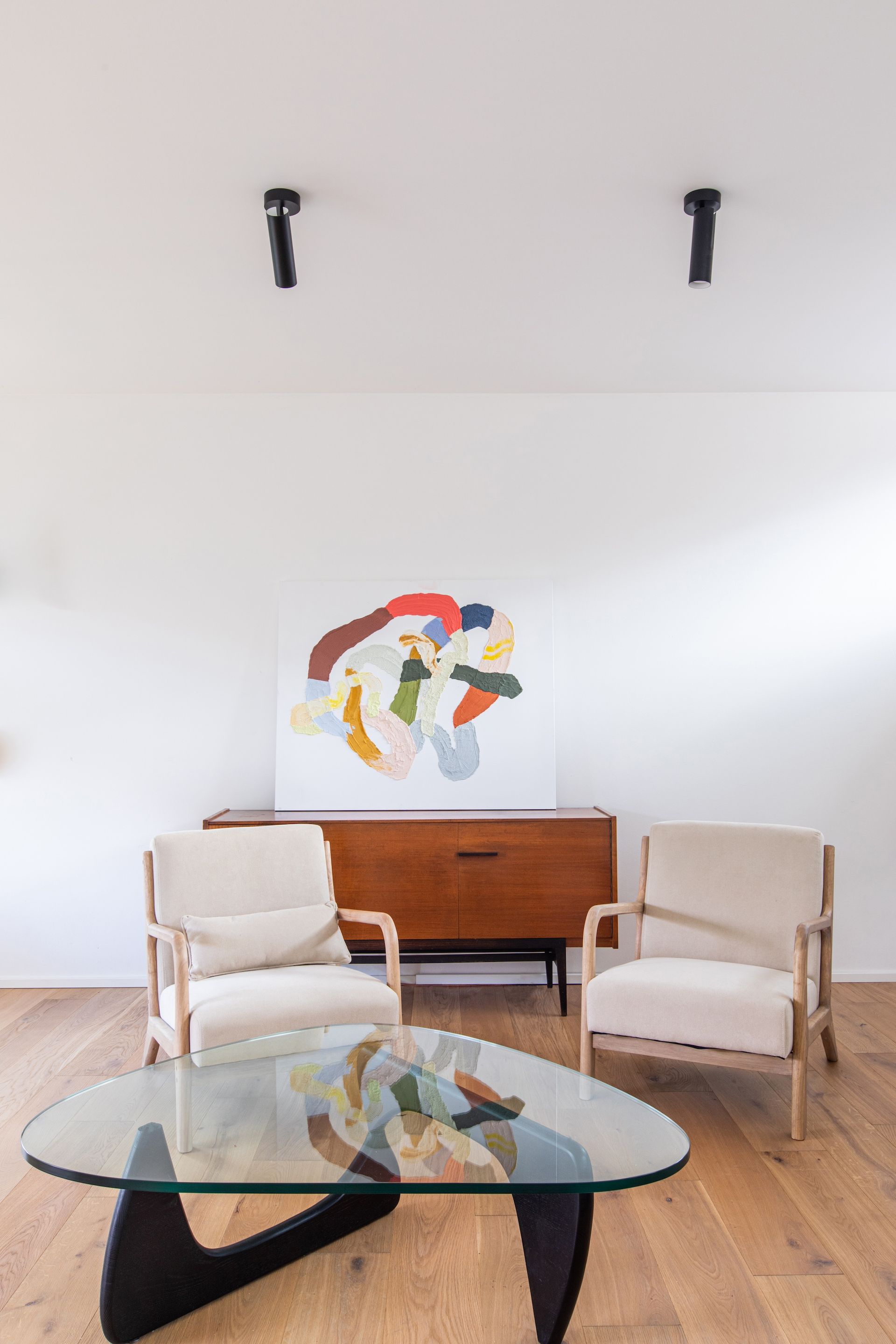
The living room area is dominated by a made-to-order hanging chair created out of oak round timber and leather (by the house owner himself to a great extent) as well as a vintage chest of drawers. Other pieces of furniture include a sofa and armchairs in the same cream colour, placed around an organic coffee table with a glass top. More black details can be also found in this part of the room in the form of ceiling lights.
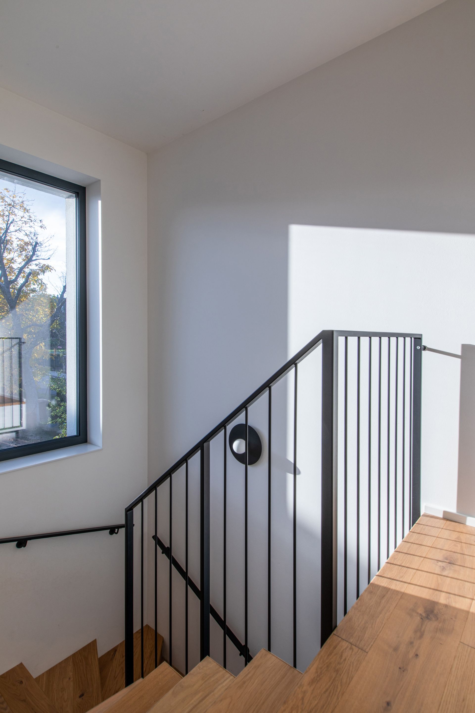
The oak staircase was also made to order, bordered with an anthracite metal handrail and illuminated with circular wall lamps.
“This is the area where the black-and-white contrast can be enjoyed the most. On white walls, you can see black-bordered light switches, the doors are opened with black handles, and most of the lights are black, too. The handrail can be considered the most prominent element, completing the composition hand-in-hand with the wooden staircase.”
Zuzana Bošková
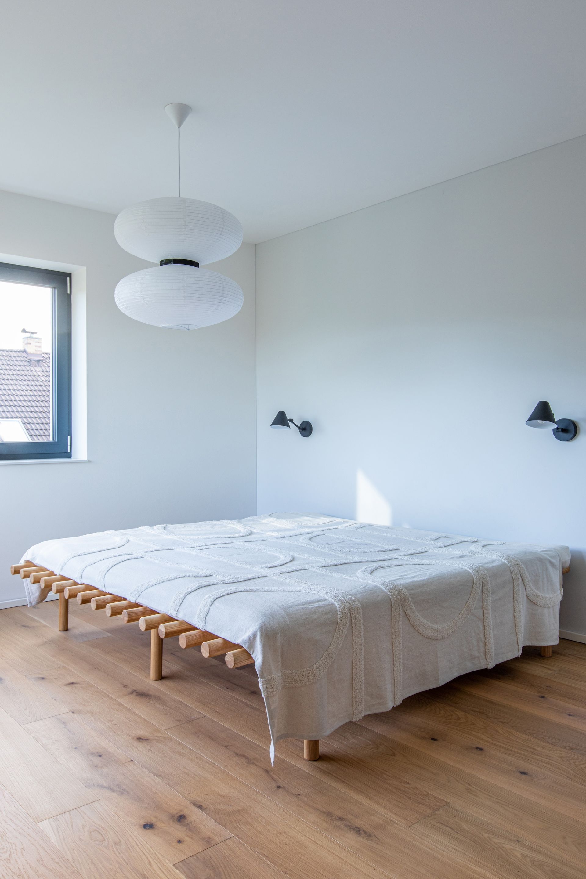
The master bedroom is designed in the style of japandi (the combination of Japanese and Scandinavian minimalism). A made-to-order wooden bed defines the room, complemented by a hanging paper light and black wall lamps.
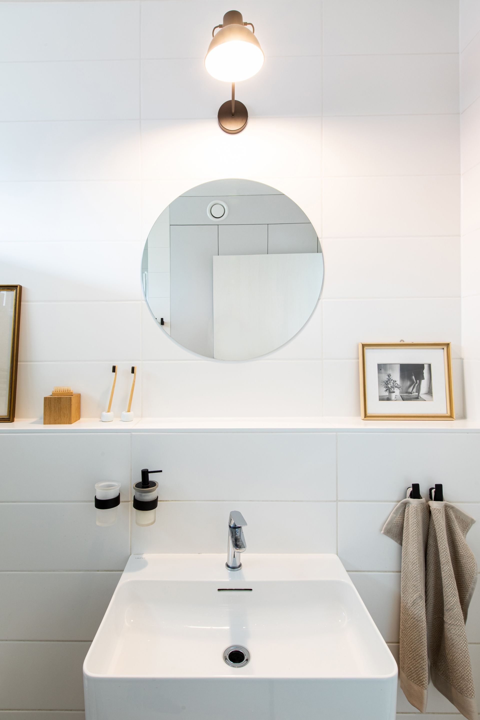
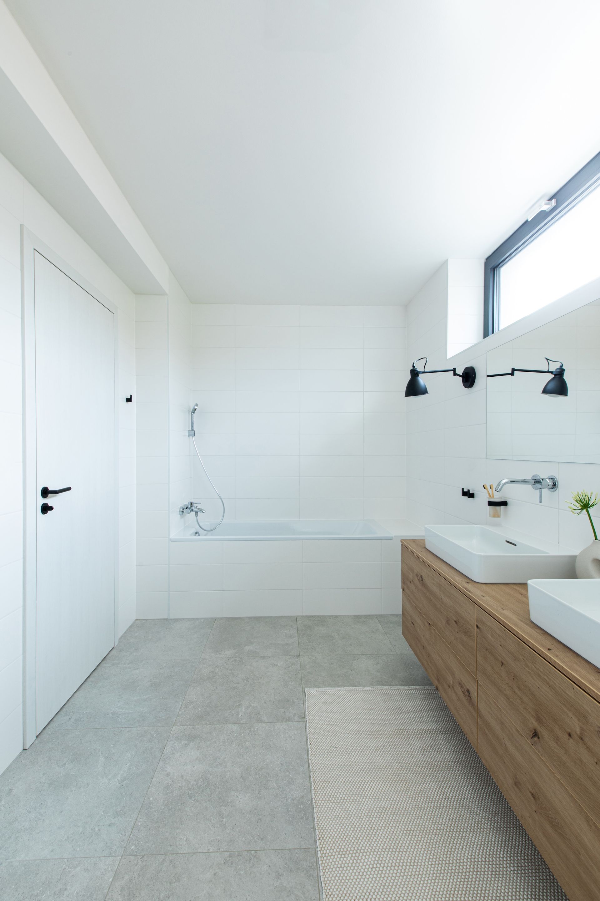
On each of the floors, a bathroom can be found, designed in the same style. In her project, Zuzana re-used the concepts of simplicity and timelessness. Just like in other rooms, the colours grey and white on the tiling work perfectly with black additions.
“Zuzka has helped us to finally have our home where we feel nice. We love the way she unified the colours and materials in the whole interior.”
Owners
The result of the entire project is a modern, graceful, and practical interior for everyday use, carefully blending black details with light and cream-toned colours.
Photography Pure stuff studio
SHARE THIS
Latest Edition
Mar / Apr 2026 edition is available now!
Contribute
G&G _ Magazine is always looking for the creative talents of stylists, designers, photographers and writers from around the globe.
Find us on
Latest News
Subscribe
Keep up to date with the latest trends!
Popular Posts
