Ich Porto Alegre
The Brazilian interior designer Melina Romano realised the interiors of the hotel "Ich Porto Alegre".
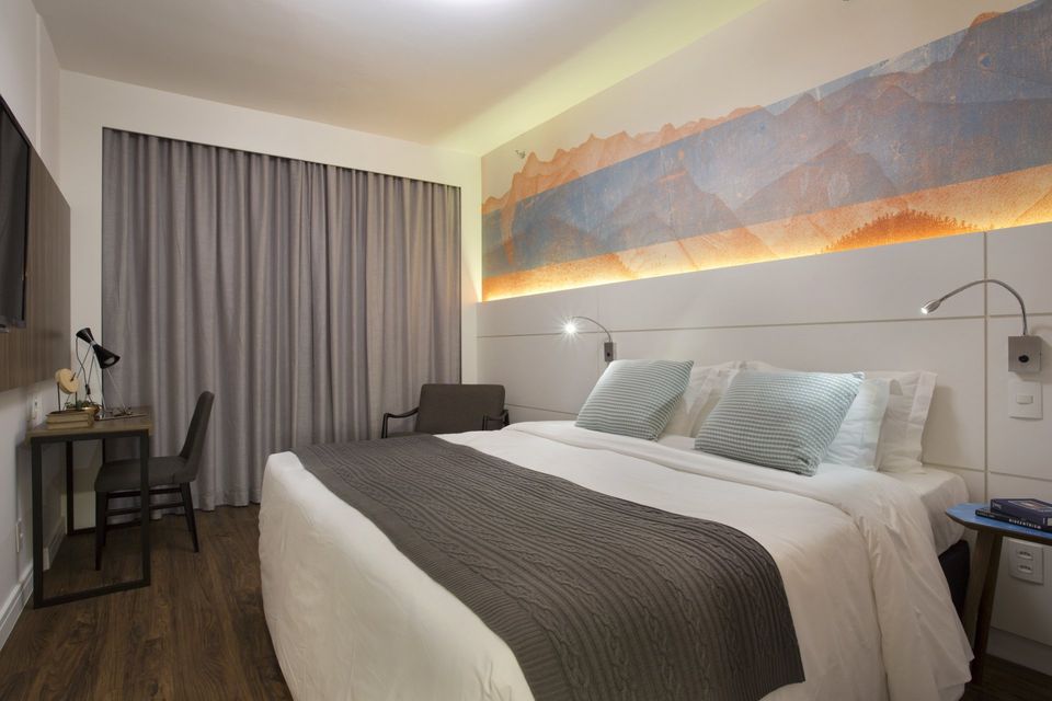
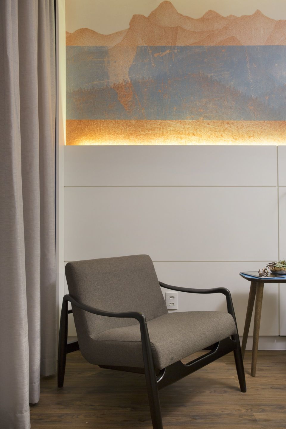
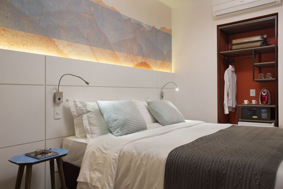
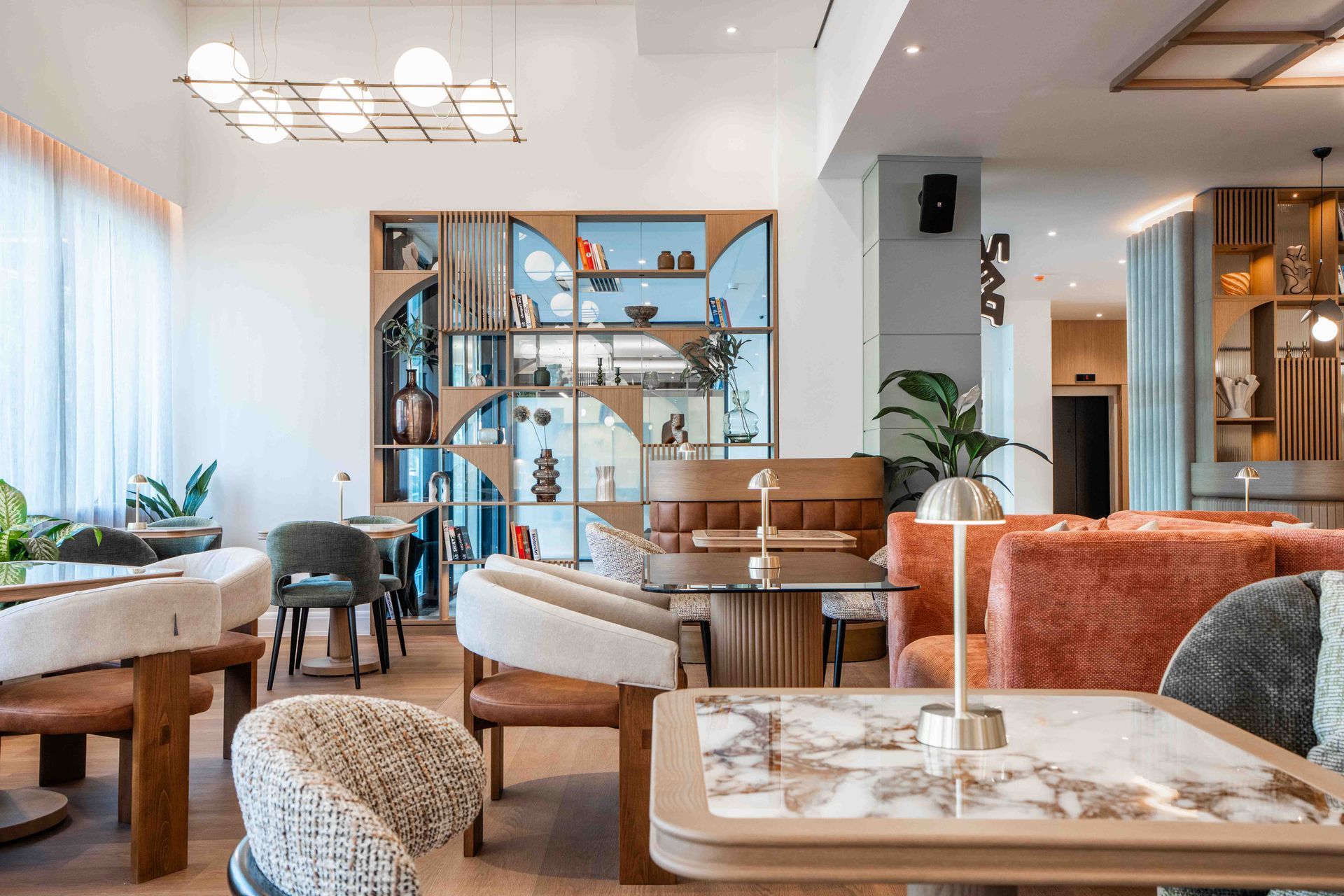
The proposal for the rooms was to think in modern spaces, using a comfortable lighting as well as functionality for guests who usually have brief stay. About color palette, Melina Romano used orange tones, the company's predominant color.
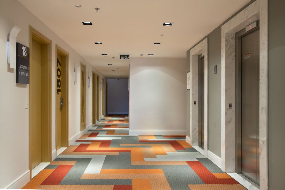
The corridors bring a carpet with bright and vibrant tones, using a layout that fits the modern context of space.
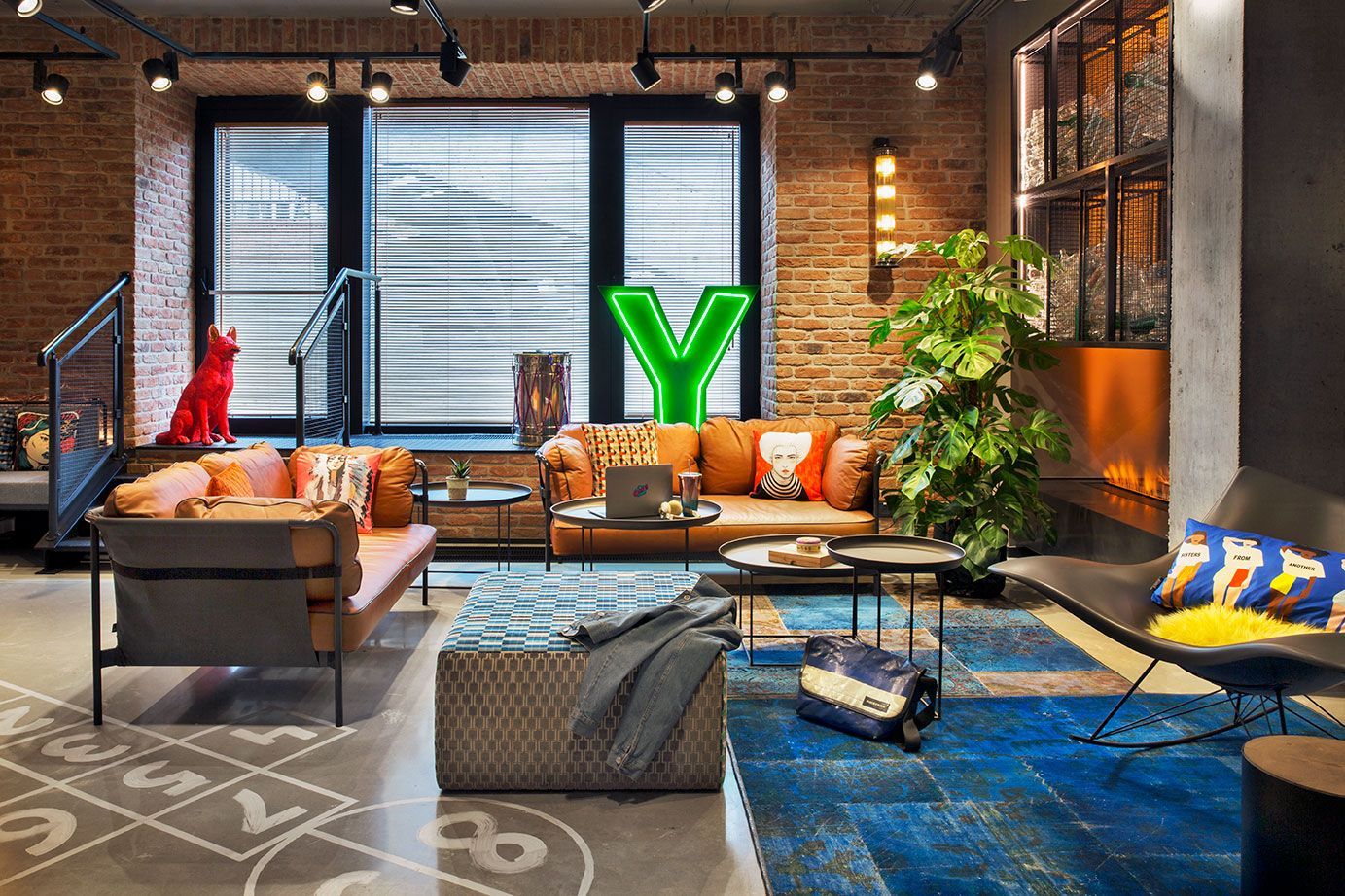
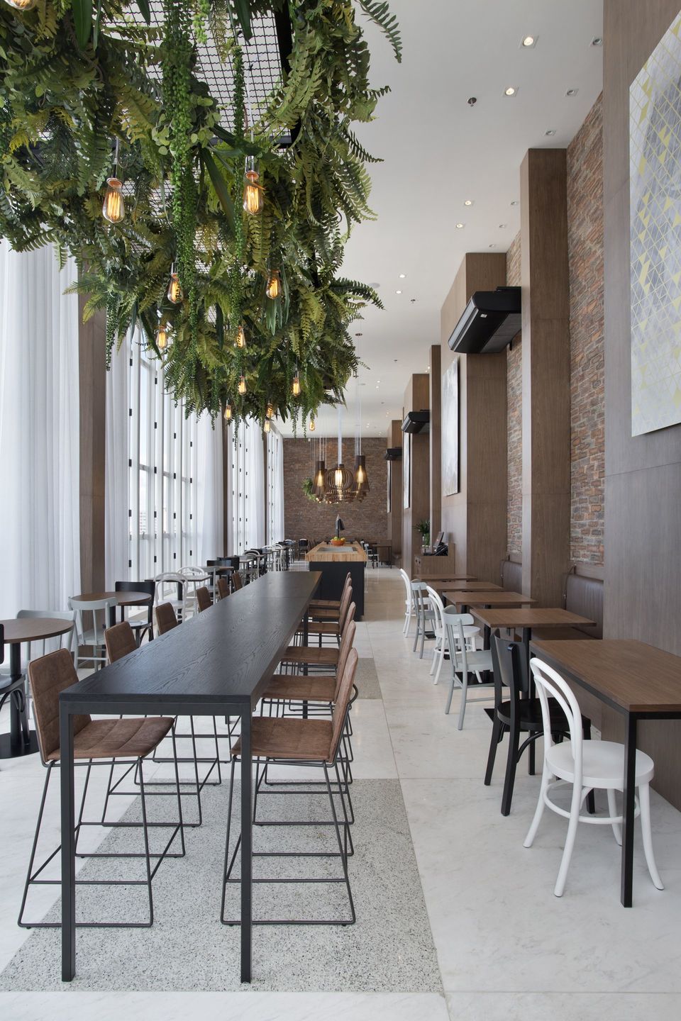
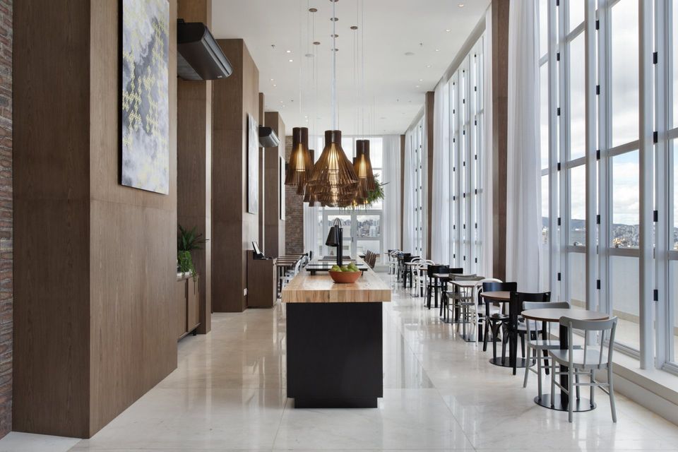
The restaurant is at the top of the building, with a privileged view of the city and become a touristic spot, not just for guests but for the locals who use it for meals, so the designer think of an attractive design in a different style from the rest of the hotel.
The style follows an industrial proposal using different compositions of chairs allowing to enjoy the space in a relaxed way or even in a formal meal. We highlight the two central bench with a distinguished illumination and landscaping.
The space was narrow and long so designer wanted to do custom-made forniture for better suitability. The restaurant has the function of having community and versatile tables, so people who are alone can share the spaces.
www.melinaromano.com.br
SHARE THIS
Latest Edition
Mar / Apr 2026 edition is available now!
Contribute
G&G _ Magazine is always looking for the creative talents of stylists, designers, photographers and writers from around the globe.
Find us on
Latest News
Subscribe
Keep up to date with the latest trends!
Popular Posts
