Amber House
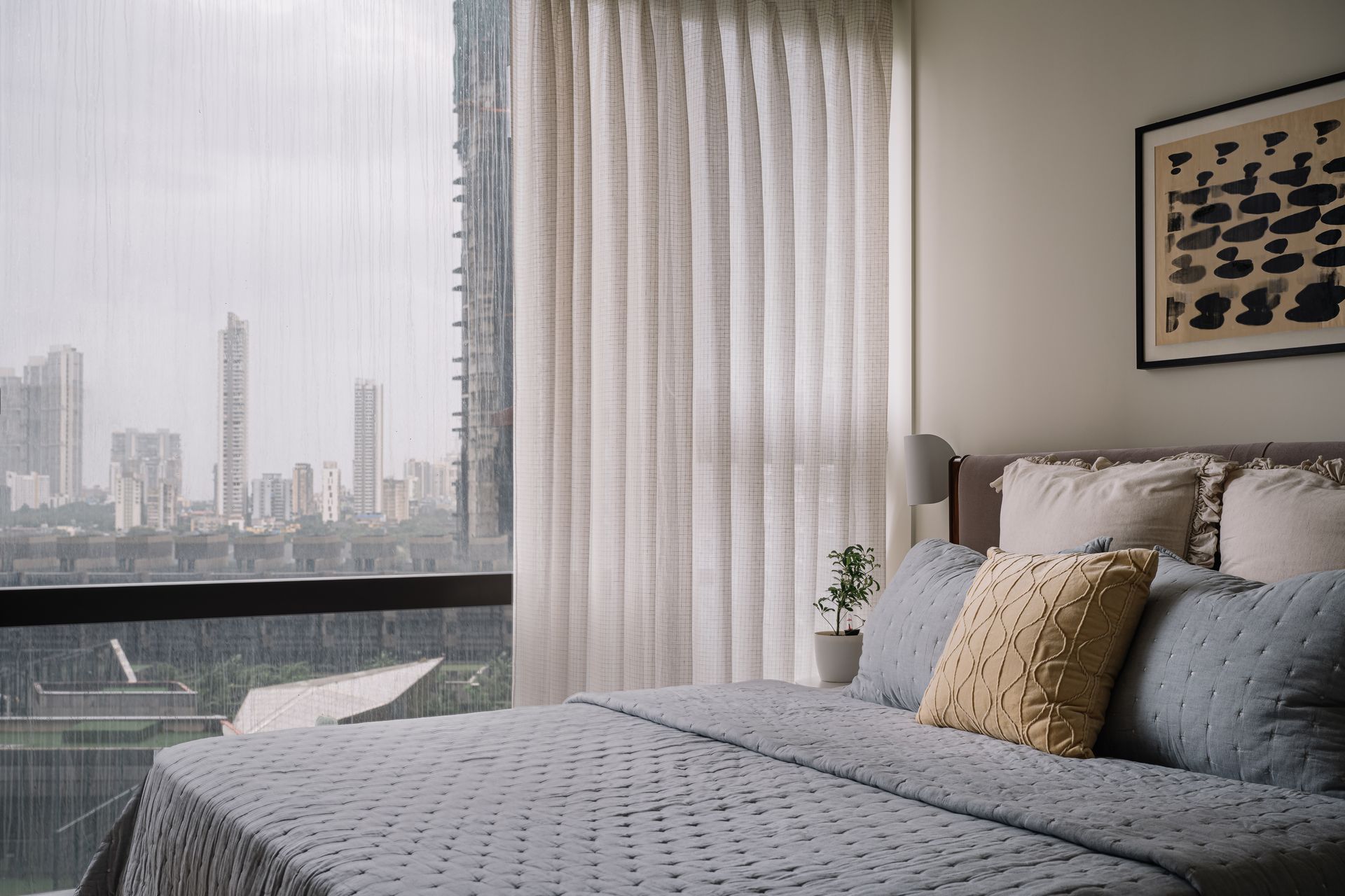
Purple Backyard designed an apartment located in the iconic structure called Marquis, near the Trump Tower in Mumbai.
The clients were the kind of homeowners that are absolutely in love with the process of building their home. Thanks to their attentive engagement with the project, it took almost two years to complete this house. Careful attention was paid to the colours and textures, with the clients forming an active part of the design process. To avoid a flat, basic colour scheme as per their instructions, the fabrics, textiles, and wallpapers took an entire week to figure out. The space was originally a tight 2.5 BHK apartment which has been turned into a spacious 3-room house, the third room being the den.
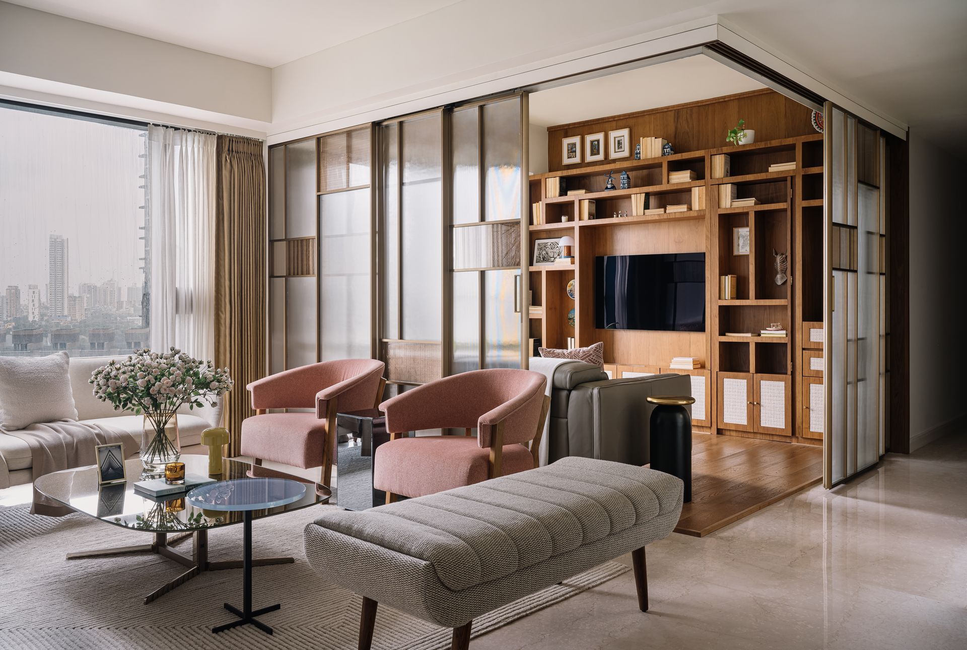
Amber House is built on the idea that a house needs to be soothing, warm, and opulent. This idea, conceived by the client who owns a travel agency, was woven into the narrative of the house. There is a full glass façade on one side that offers beautiful views. The light filters in through the glass façade, creating an interplay of warmth with the coppery, amber-coloured reflections. The moving partition between the den and the living room is gold and amber-inspired glass and captures these reflections very well.
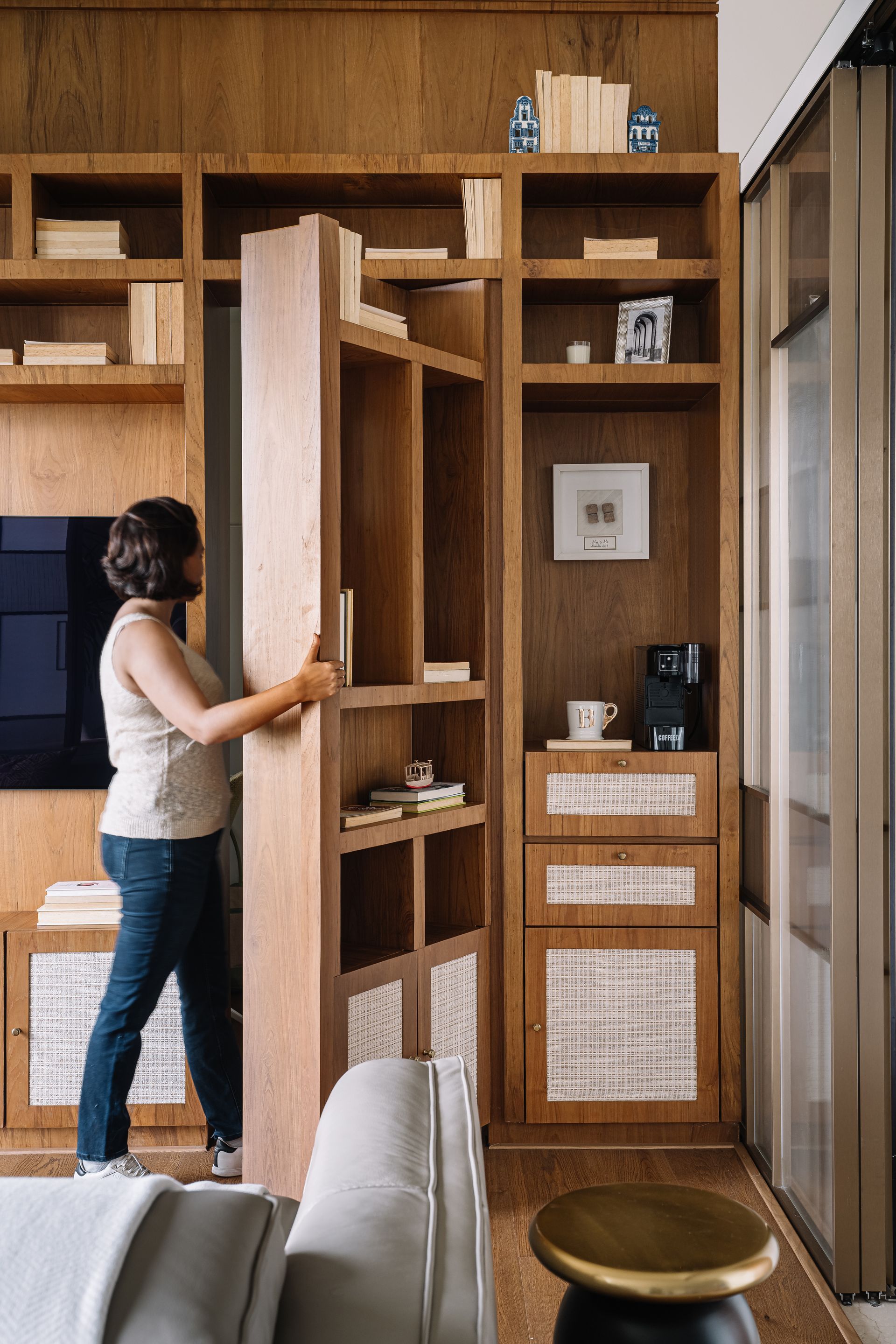
For the den, the sliding panels almost become a revealing element – a Purple Backyard signature. The firm’s projects feature a build-up of curiosity as one moves through the space. In Amber House, one walks into the living room and then enters the den through the shutters. A hidden door in the den’s bookshelf opens to reveal a study. The apartment is small but there is a surprise element to each space. The curation of the whole house has been a journey of making sure that these subtle intricacies mesh well together.
Opulence is always imagined to be luxurious. The space is luxe in terms of décor elements, but at the same time, it is not meant to be over-the-top. The living room does not have a TV. It is a formal entertaining set up. The den can be opened to watch TV from the living room, or it can play in the background with a nice study setup. The panel-like library shelving displays collectibles acquired from the clients’ numerous travels.
A sense of open space has been provided in the house. The wall in the dining room functions as library shelves and as a back panel when the shutters are open. The square dining table is supported by this back panel. There is an artwork behind the dining table that creates a distinct play of light and shadow. The wood veneer and mirror finishes are different than most, adding an understated charm to the interiors.

The client’s desire was for the whole house to look like a statement collectible. There is a Flos lamp, a sofa by Natuzzi, and another sofa by Pinakin. The wardrobes are done by Chesterfield, the lights are by Kaleido, and the flooring is by Squarefoot. The black mirror side tables are by Bo Concept, a centre table by Natuzzi, and a beautiful rug by Cocoon Rugs. The beautiful, curated lights have been ordered from the UK. The wardrobe is beautifully complex: fabric sandwiched in glass, with lacquer on the shutters and metal handles.
SHARE THIS
Latest Edition
Mar / Apr 2026 edition is available now!
Contribute
G&G _ Magazine is always looking for the creative talents of stylists, designers, photographers and writers from around the globe.
Find us on
Latest News
Subscribe
Keep up to date with the latest trends!
Popular Posts
